
Someone I know scrolled for months trying to find a temporary design that looked convincingly real in photos. The problem was not the artwork. It was knowing which techniques and placements read like a real healed tattoo, and which ones quickly look sticker-like. I spent time in five shops across Brooklyn and saw the same handful of styles land well on people who wanted a low-commitment look. These twelve ideas focus on realism, placement, and what makes a temporary hold up in real life.
1. Fine Line Arrow on Inner Forearm

Someone I know first saw this on a friend and booked the same placement. The inner forearm shows off crisp linework and reads like a real tiny tattoo in photos. For a temporary, ask for hairline spacing and a faint dot at the nock so the arrow looks etched instead of pasted on. The common mistake is asking for a super-thin arrow that disappears after a few days. Go slightly bolder than you think and the transfer will last longer. Expect no pain and a session under ten minutes for application. Over time the line will soften and edges may feather where skin creases, so plan touch-up decals if you want it to last a week or more.
2. Micro-Realism Mini Portrait on the Collarbone

Fair warning: the collarbone moves a lot with breath and clothing. That motion makes high-detail portrait work tricky for permanent tattoos. For a temporary, ask the designer to compress contrast slightly so shadows hold up on photos. A frequent error is asking for extreme detail that reads like noise on darker skin tones once the transfer settles. This is a good choice if you want realistic likeness without commitment. Expect the image to appear sharp in the first 48 hours and to soften after that. If likeness matters, supply a clear headshot and note the exact facial angle you want reproduced.
3. Botanical Sprig on the Ankle

I’ve noticed ankle botanicals photograph like real ink when the stems have tiny stipple shading and the leaves have solid anchors. People often pick a busy leaf cluster and regret it because small veins blur on moving skin. Tell the artist to emphasize stem linework and use negative space inside leaves. Pain is negligible for a temporary, placement time is short, and the ankle works well for short-term wear under socks or shoes. At six months the pattern will be gone, but for weekend wear it mimics healed detail very well. Swap placement to the opposite ankle and the same design reads entirely differently in sandals.
4. Tiny Script "Breathe" on the Ribcage
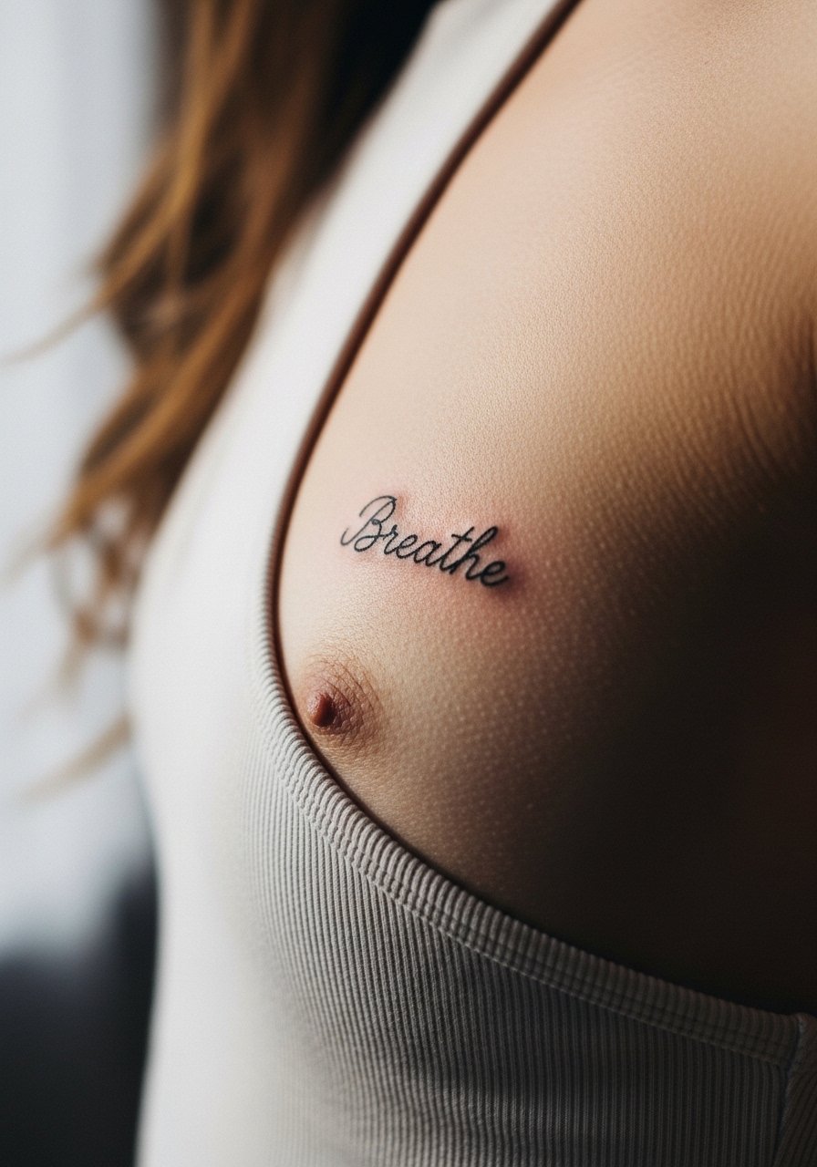
When you sit down with a designer for script on the ribcage, bring the exact word and a sample of the cursive style. Fine line on ribs splits artists into two camps. One group says the stretch and thin skin blur fine letters within a year on real tattoos. The other group argues that with correct spacing and depth the letters settle well. For a temporary, choose slightly wider letter spacing and a calm baseline so the word reads at a glance. Sensitive placement note: ribcage work needs an experienced hand for permanent pieces, so be mindful when translating a temporary to a commitment.
5. Mini Animal Portrait on Upper Arm
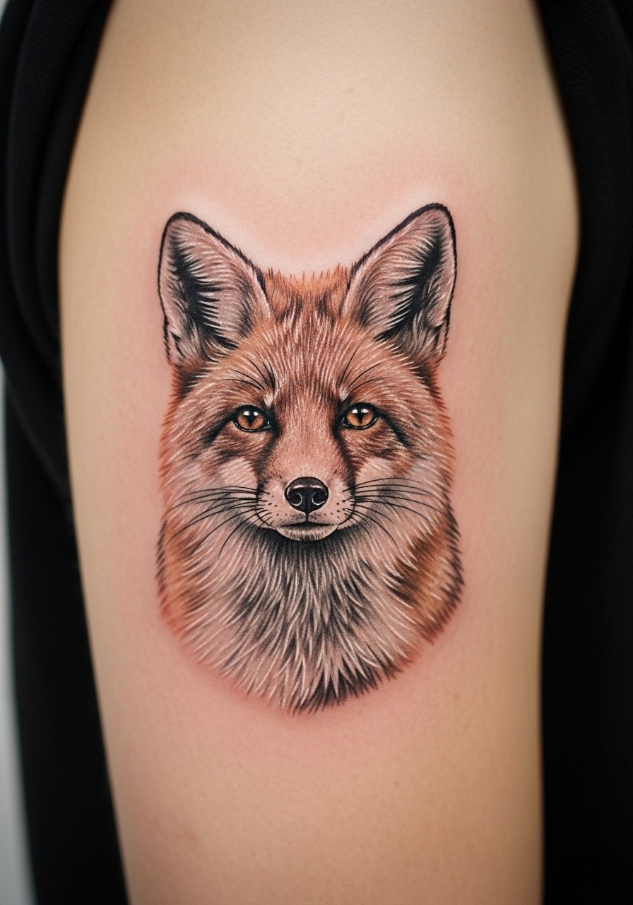
The upper arm gives a smooth canvas for tiny animal faces and often photographs like a small permanent. A common mistake is asking for too many tiny eyes and whisker details. Tell the designer to focus on one focal point, such as the eye, and let fur be suggested with soft tonal strokes. Session time is quick and pain is low. Over weeks the darkest shadow spots may fade first, so plan a second transfer if you want it for longer than a few days. This placement keeps blowout risk low on real pieces, which is why many people test animal portraits here first.
6. Watercolor Splash Floral on Shoulder Blade
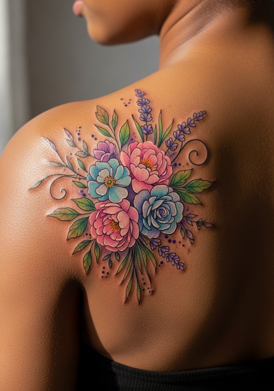
Most watercolor designs for permanent tattoos lost crispness in early trends because artists tried to mimic paint without solid anchors. For a temporary that looks real, ask for thin outlining at focal petals and softer washes farther out. There is debate about whether watercolor reads as real on darker skin. One group says bright washes pop; the other group says they can look like smudges. Choose richer contrast for darker tones so shapes remain legible. Shoulder blade placement moves with the scapula, but it is forgiving for short-term wear. If you plan photos, pick a pose that flattens the area to show the washes.
7. Geometric Mandala over Sternum
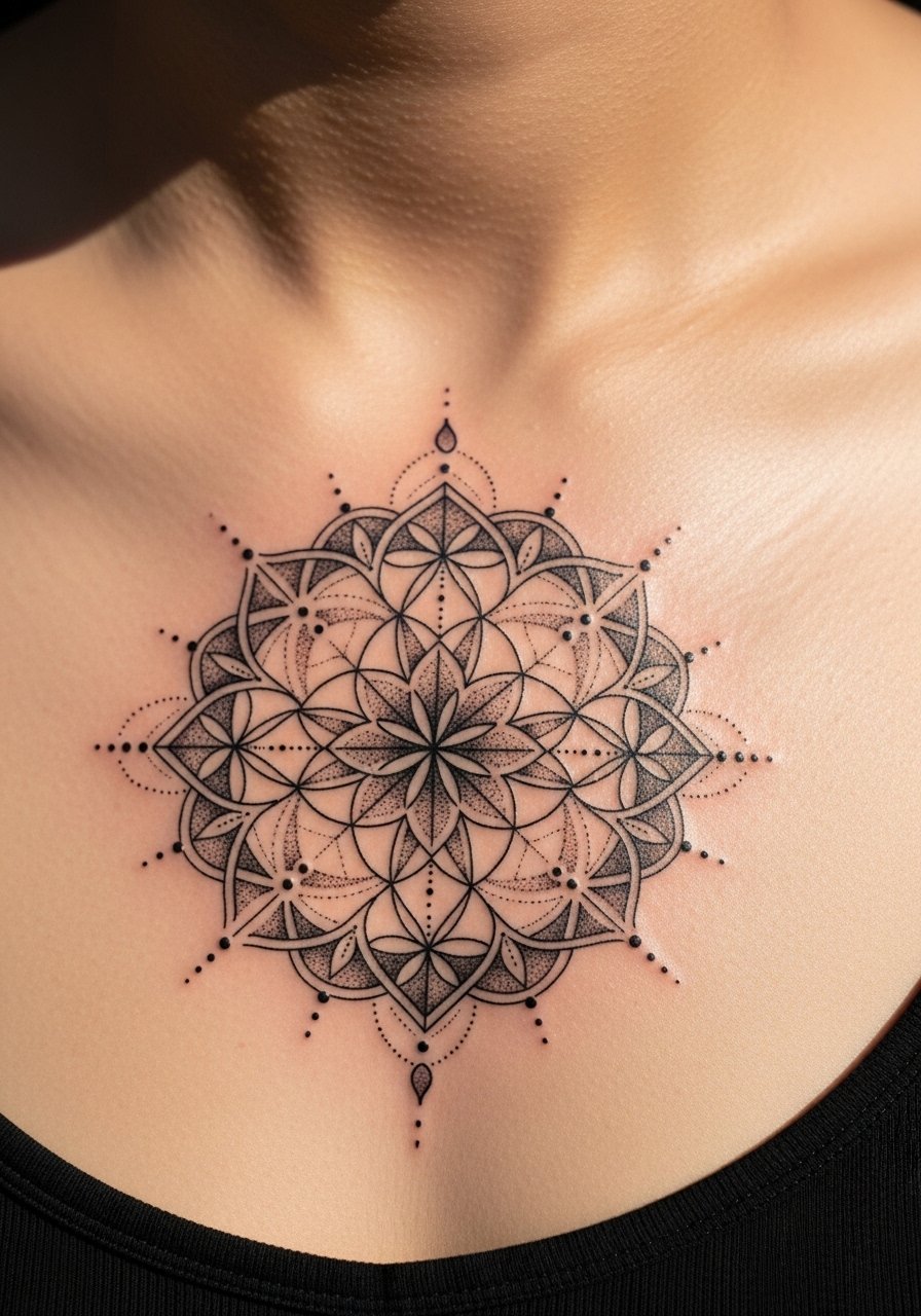
This pattern traces to sacred geometry in several traditions, so consider slight personal edits rather than copying a ritual design exactly. The sternum reads well for mandalas because the curve frames concentric layers. A common mistake is compressing too many rings into a small space. Ask the designer to keep gaps between elements wide enough for the decal to show crisp points. Sensitive placement note: sternum pieces can be intimate and may require a specialist for permanent work. Expect the pattern to photograph strongly for a few days before edges soften.
8. White-Ink Look Minimal Mark on Inner Wrist

The white-ink look mimics healed pale tattoos. I’ve seen it work best on lighter skin tones for temporary wear. On medium and dark tones the effect can read as a sticker unless subtle texture and shadows are included. A frequent mistake is asking for pure white without surrounding tonal hints. Tell the designer to add tiny shadowing and a faint outline for depth. The wrist is prone to abrasion so expect edges to lift first. If you plan a real white-ink piece later, check how the temporary photographs in daylight first.
9. Minimalist Mountain Range on the Ankle

When you want a small landscape, simplicity wins. The biggest error is packing cliffs, trees, and clouds into a one-inch band. Instead, ask for a single silhouette with a small shaded base to suggest depth. For comparison across placements, on an ankle the horizon reads horizontally while on the forearm the same line becomes a band that can wrap. Session time is fast and pain is negligible. Over days the shaded base will soften, so consider reapplying if you want consistent photos. This is a great test design before committing to a permanent landscape.
10. Blackwork Dot-Work Moon on Calf
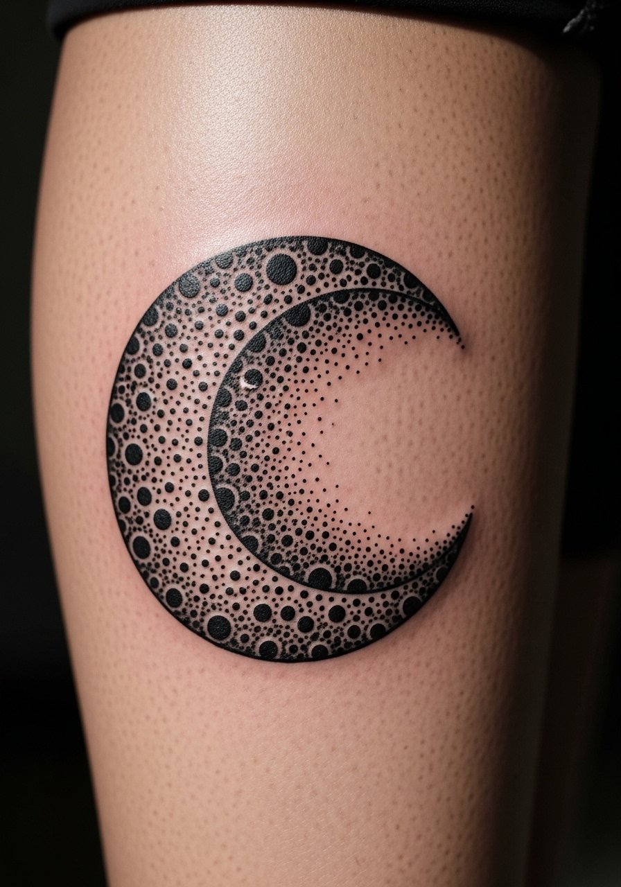
There is visual impact in saturated blackwork that carries through photos. For a temporary that looks like a healed piece, insist on dense stipple transitions rather than abrupt fills. A common mistake is under-saturating the core black so it reads like a faded sticker. The calf gives a broad, flat area that avoids distortion. Expect the decal to look bold for the first week and then mellow. If you later get a permanent piece, dot-work translates well but requires touch-ups to maintain rich saturation over time.
11. Single-Needle Stipple Stag on Thigh

The thigh is forgiving for single-needle stipple work because the skin is thick and moves less. The most common mistake is asking for extreme single-needle thinness on a small scale. For a realistic temporary, ask the artist to build up dots into tonal areas while keeping the antlers defined. In pictures the stag will read as textured shading rather than a flat decal. Expect low pain for temporary application. If you later seek this as a permanent piece, plan for touch-ups to keep dot density consistent over several years.
12. Vintage Matchbox Flash on Upper Chest
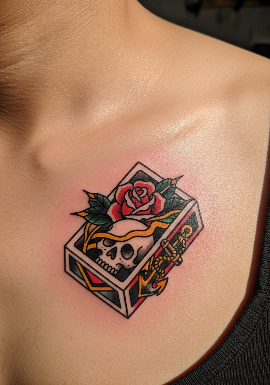
An audience-focused pick for people who like retro imagery, vintage flash reads like a real healed tattoo when outlines are strong and color is slightly muted. The upper chest allows the flash to breathe and sit symmetrically with collarbones. A common error is choosing neon colors that photograph as stickers. Ask for muted fills and a thin halo of shadow to suggest healed ink. The chest can be more sensitive on application for permanent tattoos, so keep that in mind if you are testing placement. This style photographs well in low-angle natural light.
Tattoo Prep and Aftercare Essentials
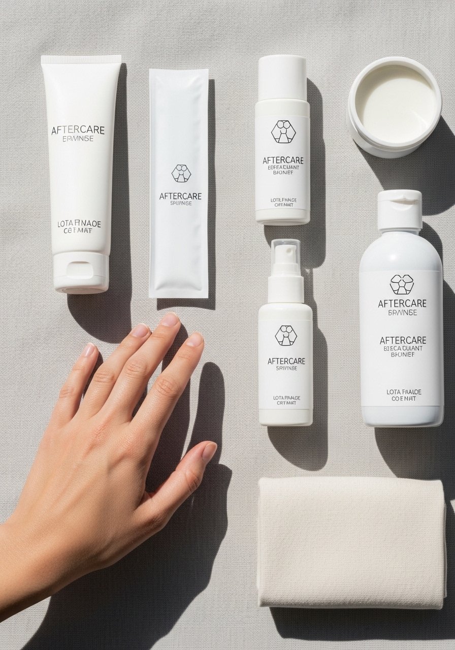
Fragrance-free gentle foaming cleanser for tattooed skin. Use this to wash the area before applying a temporary decal so oils do not lift the transfer. Apply gently and pat dry.
Lightweight fragrance-free balm for short-term hydration. A thin layer keeps edges from peeling and helps the decal look settled in photos.
Medical-grade second skin bandage, small sheets. Use for overnight wear or to protect a fresh temporary from rubbing.
Pure aloe vera gel 99 percent. Apply sparingly if skin feels irritated after prolonged wear.
Micellar water gentle cleanser pads. Good for quick clean-ups and removing adhesive residue.
Broad-spectrum mineral sunscreen SPF 30. UV exposure fades both real and temporary pigments in photos.
Medical adhesive remover wipes. Helps remove stubborn glue without heavy scrubbing.
Aquaphor Healing Ointment. A single mainstream option that soothes minor irritation and can smooth decal edges, used sparingly.
Every tattoo is different. Always follow your artist's specific aftercare instructions. Consult a dermatologist if you have skin concerns or unusual healing issues.
Frequently Asked Questions
Q: Will fine line temporary tattoos blur faster than bolder temporary styles on the forearm?
A: In my experience fine line transfers show edge softening sooner than bolder work. The forearm flexes and rubs against clothes, which can feather delicate lines. If you want a longer-lived look, ask for slightly heavier lineweight and small anchor dots at junctions. That keeps the design readable longer while still looking delicate in photos.
Q: Do watercolor-style temporary tattoos need different aftercare than blackwork pieces?
A: Yes. Watercolor decals rely on subtle washes that can smear if they get wet or are rubbed. Use a thin layer of balm rather than water if you need to smooth edges. Blackwork needs UV protection to avoid washout in photographs. Both types benefit from a protective bandage overnight if you want to keep them intact.
Q: Why do geometric mandalas sometimes appear fuzzy on the sternum but crisp on the forearm?
A: The sternum curves and moves with breathing, which changes the spacing between elements. The forearm is flatter, so lines stay consistent. For sternum mandalas, increase spacing between rings and keep central points bold so the pattern reads even as the skin stretches.
Q: How should I brief a designer for a temporary portrait so it looks convincing?
A: Send a clear headshot with the exact angle you want reproduced and note one focal area, like the eye or mouth. Ask the designer to favor contrast in the focal area and soften peripheral detail. That approach keeps the likeness legible once the decal settles.
Q: Are there career or cultural considerations for visible temporary placements like hands or neck?
A: Hand and neck placements still affect first impressions in some workplaces. For culturally specific imagery, consider adapting motifs rather than copying sacred symbols directly. A small edit can show respect and avoid unintended appropriation.
Q: How long should I expect a realistic temporary to look convincing in photos?
A: It depends on the technique and placement. Bold blackwork or vintage flash can photograph convincingly for several days. Fine line and watercolor styles typically look most like healed ink in the first 48 to 72 hours. Reapply or plan photos accordingly.
