
Names can feel risky to ink, but the right approach makes them read like a considered accent rather than a headline. Pick a script with room to breathe, match the name to a placement with low friction, and plan for one realistic touch-up instead of hoping the first pass lasts forever. Below the hero image you will find the first idea, starting with a forearm script that proves the point.
1. Interlocking Script Names on Inner Forearm

This classic reads like a single composition rather than two separate names. Recommend a slightly heavier single-needle weight for longer names so the letters do not blur together after healing. In the consultation bring two scale references so the artist can show the script at three inches and five inches and explain touch-up timing. The inner forearm is flat and low on blowout risk, and a small touch-up at six to twelve months is common when linework settles. This placement pairs well with a rolled sleeve linen shirt for showing the script without overexposing it during casual wear.
2. Infinity Symbol with Both Names on the Wrist

An infinity loop helps small text read as one compact motif, which is handy at the wrist where space is tight. Ask for slightly wider spacing between loops so the names do not compress into one illegible knot after a few years. The wrist sees lots of washing and friction, so expect a one-year check for saturation and a possible light touch-up. For showing it off, stack it with a thin chain bracelet on the opposite wrist and avoid bracelets on the tattooed side during the session. Try a thin chain bracelet for outfits that highlight the tiny piece.
3. Heart and Initials Pairing at the Ankle

Tiny symbols at the ankle look intimate but face heavy friction from socks and shoes. Make the heart slightly open and the initials a bit bolder than your first instinct to preserve clarity. The common mistake is going microscopic and then needing a touch-up after healing. For session ease, wear shorts or a skirt so the artist has full access and you do not disturb the area getting dressed. Cropped jeans and ballet flats show the piece well for warmer months and keep the tattoo from rubbing against heavy boots.
4. Classic Cursive Name Under the Collarbone

The collarbone is flattering for script that reads like jewelry, but the skin is thin and can be unforgiving. Ask for slightly bolder linework than a Pinterest reference so letters do not soften into a grey smudge after a year. Expect moderate session pain because of proximity to bone, and plan for a single short session for a name-only piece. For outfits that frame the curve, try an off-the-shoulder top that lets the script sit like a necklace.
5. Name Inside an Infinity Heart on the Inner Wrist

Combining two familiar symbols keeps the design compact and legible at small sizes. The mistake is asking for the thinnest possible script inside the shape. Instead request letterforms that breathe into the negative space of the infinity heart so the whole motif reads at six months. The wrist is a high-movement area, so expect a touch-up between six months and a year. Finish the look with petite stacking rings and a bracelet on the opposite wrist to balance the piece.
6. Floral Name Tattoo on the Inner Forearm

Botanical framing softens a name and gives the piece composition room to age well. For a clean long-term read, specify dot work or stipple shading rather than faint watercolor filler that loses contrast. Mention how much negative space you want so the rose does not compete with letterforms after healing. Expect two sessions if you add subtle color saturation or layered shading, and plan a touch-up around the one-year mark. For everyday outfits, pair this placement with an oversized button down for a relaxed editorial vibe that still shows the ink.
Session Day Picks
Those wrist and forearm pieces above need slightly different first-week care than a calf anchor or a shoulder crown. These picks smooth the chair-to-shower window.
-
Tattoo Goo Alternative Balm. A thinner balm that some clients prefer over heavy ointments when fine linework is present on wrists and forearms.
-
After Inked Moisturizer. Lightweight lotion that helps maintain saturation during the second week for script pieces without clogging the pores.
-
Bepanthen-style Healing Ointment. A gentle option for the very first 48 hours when small tattoos need a light protective layer.
-
Plain Unscented Shea Butter. For dry skin types who want a natural moisturizer during the later healing phase.
-
Second Skin Tattoo Bandage. Useful for protecting wrist and ankle work from friction on the first night and during travel.
7. Watercolor Wash Name on Outer Upper Arm

Watercolor effects add personality but they age differently from black linework. Ask for heavier black outlines around the script so the name holds contrast as the pigment in color washes fades. Color saturation generally needs a second session for depth, and lighter pigments can migrate into muted tones over years. This placement shows well in sleeveless tops and tanks, so plan session wear that is easy to remove. For summer looks, pick a racerback tank to show color without sun exposure that fades pigments.
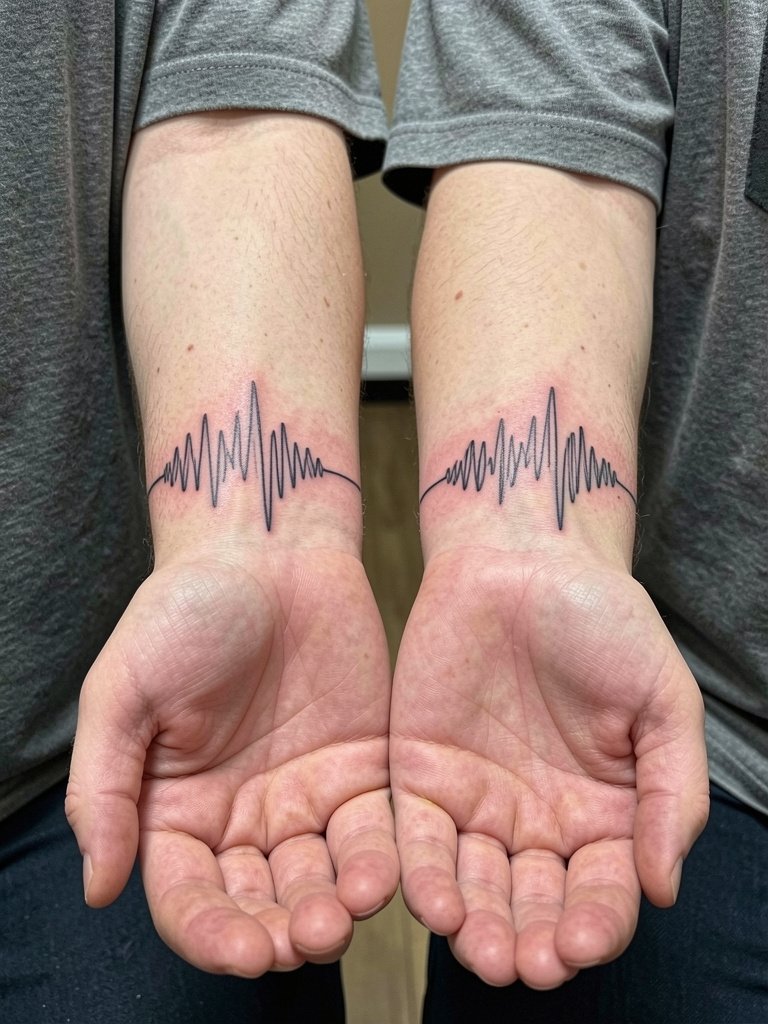
8. Heartbeat or Soundwave Name on the Wrist

Soundwave tattoos are emotionally specific and modern, but the linework must be plotted to real-world scale so a scanner can read the waveform if that is the goal. Bring a high-resolution audio-to-wave reference and ask the artist to proof the scale. Fine line waveforms on the wrist risk softening faster than bolder text, so plan a touch-up at about a year. The wrist requires simple session clothing, and a minimal watch on the opposite arm balances the look during everyday wear.
9. Lock and Key with Names on the Forearm

The lock and key gives designers room to balance a name inside negative space, which helps longer names remain legible. In the consult, specify how much banner overlap you want and ask for healed portfolio shots of banner text. Forearm pieces show nicely with rolled cuffs and slim jackets. Expect moderate session time for the illustrative detail and a possible light touch-up after the first year to keep saturation crisp. Try a rolled cuff shirt for a tidy way to show the art.
10. Anchor and Compass Pair with Names on the Calf

Calf pieces tolerate bolder saturation and hold detail well, which makes them ideal for illustrative pairings with names. Discuss line weight and color saturation in advance so the compass numbers and rope texture remain readable at a distance. A medium session length is typical for both pieces, and touch-ups are less frequent than on wrists. For seasonal showing, midi skirts or cuffed shorts are reliable; try cuffed shorts and ankle boots in cooler months to frame the art.
11. Crown Framing a Name on the Shoulder

Crowns add a regal frame without forcing a literal portrait. Ask the artist how crown scale relates to the name size so it does not overpower the lettering. Shoulder placements sit between easy visibility and low daily friction, so they age predictably with moderate saturation. For clothing that highlights the line and the shoulder silhouette, a square neck top is a simple complement that keeps focus on the composition. Plan for one session and a possible small touch-up where the crown meets the skin fold.
12. Moon and Star Name Tattoo at the Side Neck

Side neck tattoos are very visible and require careful discussion about career and social visibility. The skin there responds well to fine work but may need slightly bolder spacing than a reference image to avoid blurring from daily neck motion. For the session, clip hair up and avoid collars touching the area afterward while it heals. Small hoop earrings and simple crew neck shirts frame the area without crowding the composition. Note that some studios require extra experience for neck work, so confirm that the artist has healed portfolio shots of side neck single-needle pieces.
13. Puzzle Piece Names at the Ankle

Puzzle-piece tattoos are readable and conceptually direct, but ankle friction is a practical concern. Keep the pieces slightly larger than the instinctive micro size so edges remain crisp after a year of shoes and socks. The common mistake is compressing all interior details into a very small area. Session wear should be shorts so the artist can work with an unobstructed ankle. Cropped jeans and low-top sneakers are perfect for summer styling and keep the tattoo from rubbing under tall boots.
14. Complementary Layouts That Match Without Mirroring

Couples are divided on identical versus complementary tattoos. One camp says identical pieces signal shared intent and are instantly recognizable as a pair. The other camp prefers complementary layouts so each person has a design that suits their anatomy and style. Both camps are valid, so decide whether you want the immediate visual match or a design that reads better on two different bodies and plan the line weight accordingly.
15. Coordinates or Anniversary Date with a Name at the Nape

Coordinates keep the meaning private and resist the "too literal" trap of a name-only tattoo. Exact spacing and font size matter here, so ask the artist to show a stencil with the coordinates and the name to confirm legibility. Nape pieces pair naturally with hair-up styles and claw clips that let the ink peek through during evenings out. Clip hair up on session day and wear a loose neckline so the artist can access the area without fabric pressure. For showing off, an open-back top works well.
16. Ambigram Name That Reads Both Ways on the Ribcage

Ribcage ambigrams are elegant but the area moves and stretches, which affects fine detail. Artists split into two camps here. One group says ribs make tiny script blur quickly and they advise thicker strokes and spacing. The other group will do fine-line ambigrams when the client accepts that a touch-up may be needed to maintain crispness. If you choose this spot, request a stencil mock-up and a plan for touch-ups, and expect higher pain because the ribs are sensitive.
17. Minimal Initials on the Ring Finger

Finger ink is extremely visible and wears differently than forearm work. Ask the artist about expected touch-up intervals for finger initials because hands see constant washing and abrasion. The common mistake is assuming a single session will be permanent; many small finger tattoos need a touch-up within the first year. For showing the piece, go with petite stacking rings on the opposite hand and avoid tight rings on the tattooed finger for the first few weeks.
18. Name in Barcode or Morse Code on the Wrist

A barcode or Morse code is a low-regret way to keep the name private while keeping the design readable. Confirm exact spacing and the exact characters with the artist so the encoding remains accurate after healing. Wrist placement still demands realistic line thickness to avoid merging lines. For everyday wear, a minimal watch on the non-tattoo arm balances the look and keeps the tattoo comfortable while you heal. A minimal watch is a neat pairing.
19. Tiny Portrait Silhouette with Name on the Upper Arm
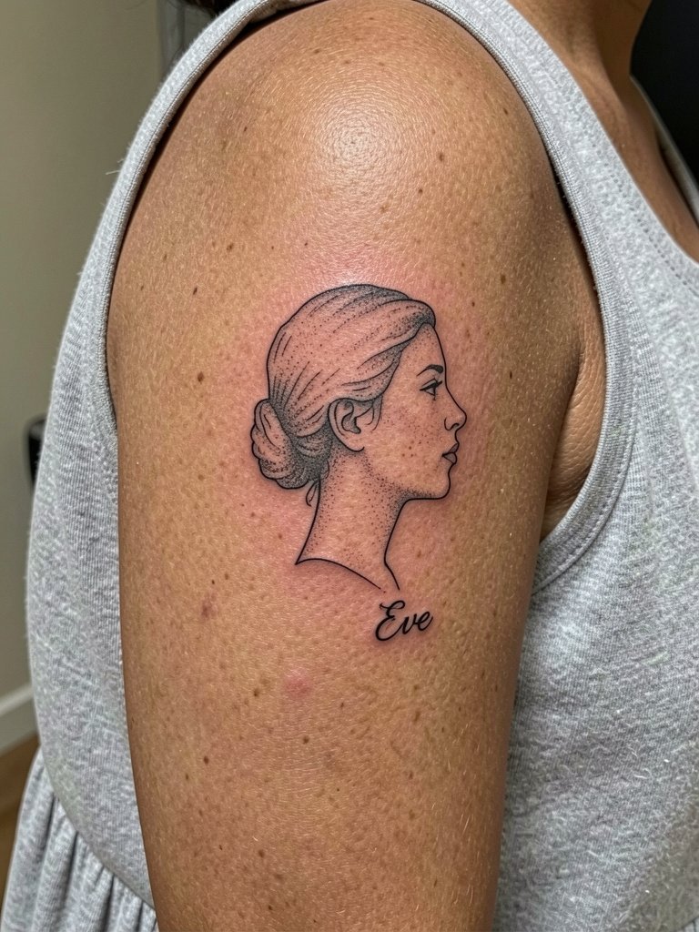
Integrating a small silhouette with a name reads like a badge of intimacy rather than a portrait. Ask for healed photos of similar scale so you can judge how the stipple shading and silhouette hold up. The outer upper arm is forgiving for shading and stands up to touch-ups less often than high-friction areas. For summer dresses and tank tops, a wide-strap or sleeveless cut keeps the design unobstructed.
20. Script Name with Stipple Floral Background on Forearm

A stipple background gives depth without heavy color and helps the name remain the focal point. The mistake is asking for dense shading that crowds the letters. Instead request open stippling that frames rather than competes with the script. Forearm pieces are low blowout risk, and stipple ages into soft texture rather than muddy blobs. For outfits, a relaxed denim jacket with sleeves rolled showcases the forearm while keeping the aesthetic editorial.
21. Matching Soundwave Halves That Form Whole When Together
This is a modern take on matching tattoos where the design only completes when you are together, which some couples love and others find too literal. If you want the scan-to-play option, bring the same high-quality audio file for both stencils. Inner wrist motion means plan on a touch-up window in the first year for alignment and saturation. For outfits, small bracelets on the opposite wrist keep the look balanced without covering the soundwave.
22. Name Tucked into a Heraldic Badge on the Shoulder Blade
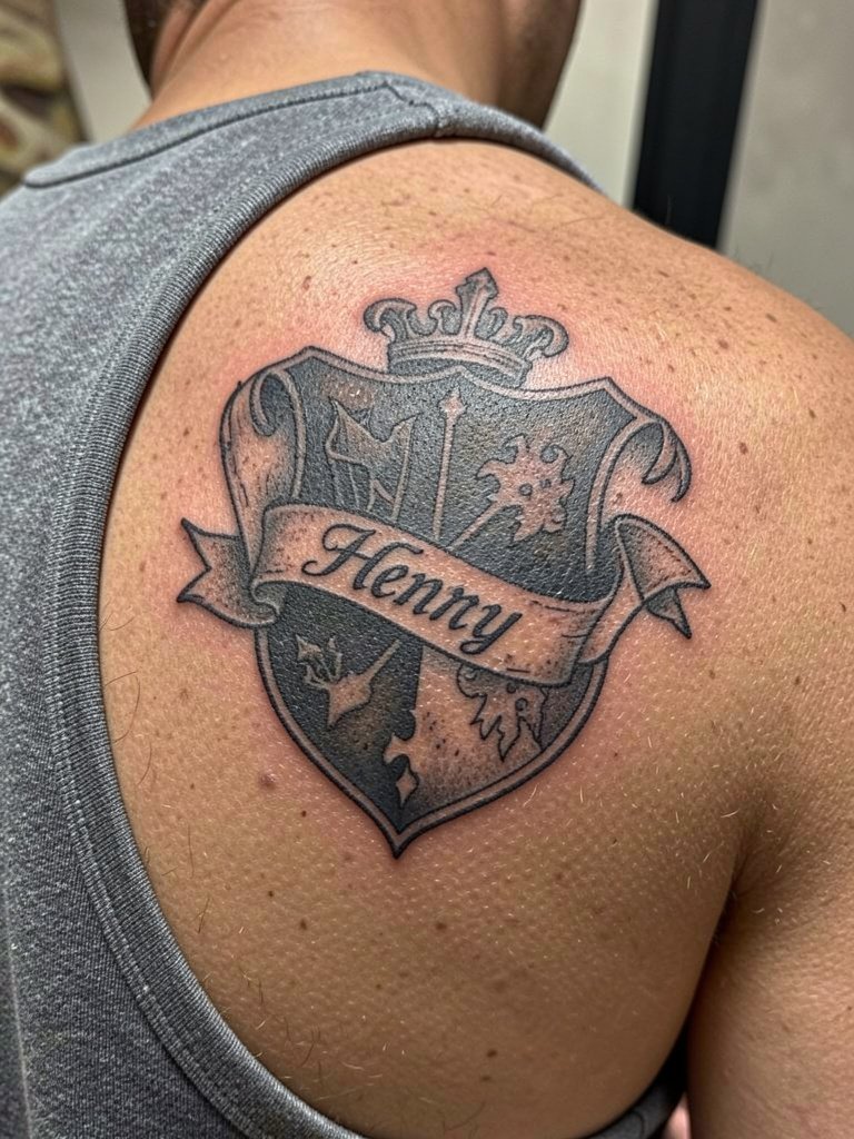
Crest-style designs let you include a name without making it the headline. Ask the artist about how weathering looks in their healed work so the badge keeps its structure over time. The shoulder blade tolerates heavier black outlines and holds saturation well, which reduces the need for frequent touch-ups. Tank tops and square-neck dresses expose the area when you want to show it off while keeping it covered when you do not.
23. Hidden Inner Bicep Signature or Handwriting Name

Inner bicep signatures are intimate and easy to hide, which reduces regret risk. The common error is asking for ultra-fine handwriting at a very small scale on this softer skin. Instead request slightly bolder strokes and ask the artist to map how the signature reads at different sizes. Arm relaxation during the session helps the artist place the script where muscle movement will have the least effect on linework. Plan session wear with a loose tank so the artist can access the whole inner arm without fabric pressure.
Frequently Asked Questions
Q: How much does a small name tattoo typically cost in the United States?
A: Small custom name pieces usually fall into a range based on shop minimums and line time. Expect a typical price band of low hundreds to around mid-hundreds for most small scripts if you book with a quality studio. Shop minimums can be the deciding factor for tiny work, so call studios to confirm their base rate before booking.
Q: Are names on wrists or collars more likely to age poorly?
A: Wrists and collars age differently because of movement and sun exposure. Wrist pieces face frequent washing and friction which can soften very fine lines faster, while collarbone pieces sit near bone and thin skin which shows every machine pass. For both spots you should plan for one realistic touch-up window within the first year to restore line saturation.
Q: Matching versus complementary designs, which is better for couples?
A: One camp favors identical tattoos because they are immediately legible as a shared symbol and feel cohesive in photos. The other camp prefers complementary designs because each partner can choose a layout that flatters their own body and style. Both positions are valid and the choice should come down to whether you want a visual twin or a pair designed to sit well on two different bodies.
Q: Should we get a name tattoo or a symbolic alternative to avoid regret?
A: Some people argue names read most clearly and leave no ambiguity, which is why they choose them. Others prefer symbols because they feel less tied to one relationship and age better emotionally. If you are unsure, an in-between option is a name paired with a private symbol or coordinates that adds meaning while softening the literalness.
Q: Where can I find local healed portfolio examples and real client experiences?
A: Use relevant hashtags and location filters on social platforms and check community threads for healed photos and pricing chatter. Search tags like #coupletattoo and #scripttattoo while applying a city filter on Instagram or TikTok, and browse subreddit threads in tattoo communities for first-hand accounts and touch-up timelines.
Q: What should I wear to my appointment for different placements?
A: Wear clothing that gives clear, natural access to the placement without being adjusted during the session. For collarbone work wear a scoop or off-the-shoulder top that sits normally on the shoulders. For inner thigh bring loose shorts you can lift comfortably. For shoulder or upper arm pieces wear a tank top you can remove without tugging the area. A loose tank is a universally safe choice.
Q: How do skin tone and pigment choices affect name legibility?
A: Darker skin tones often need stronger line weight and higher saturation to keep thin scripts readable over time, while lighter tones can carry finer single-needle work with less contrast loss. If you have medium or deeper skin, ask to see healed photos at similar tone ranges so you can judge spacing and saturation before committing.
