Faint single-needle scripture on the forearm can look gorgeous on day one and unreadable two years later. I prefer medium-weight scripts that respect the arm’s curve because they keep letterforms intact as skin settles and avoids crowded florals that swallow words. Below are eleven forearm scripture approaches that balance legibility, ageability, and how they sit with everyday clothes and session wear.
1. Vertical Scripture Wrapped Around Inner Forearm
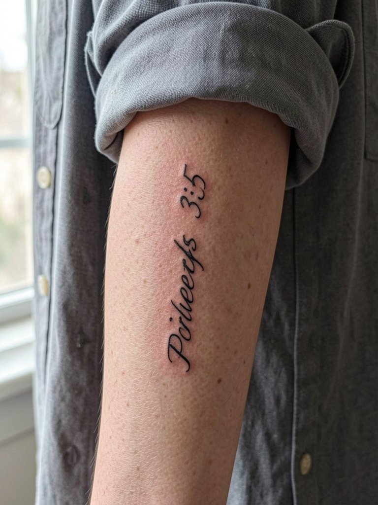
A vertical line of verse suits the inner forearm because the surface reads top to bottom with the arm relaxed. I recommend a medium-weight single-line script here rather than the single-needle micro-script people save on social because medium weight keeps counters open and slows blurring over time. In the consult bring a three-inch and a five-inch stencil so the artist can show how spacing changes at scale. Expect a one-session piece that feels like light scratching near the wrist and a steady pressure closer to the elbow. Common mistake is squeezing a long verse into two inches. At six months the letters should still read crisp. By year two the lowest-contrast strokes can soften without proper spacing, and a touch-up around year three often brings back crispness. For showing it off, rolled linen sleeves frame the verse. [https://www.amazon.com/s?k=linen+button+down+shirt+women&tag=inkalerts-20] and layered dainty bracelets look intentional during the first photos. [https://www.amazon.com/s?k=dainty+gold+stacked+bracelet+set&tag=inkalerts-20]
2. Horizontal Single-Line John 3:16 on Outer Forearm
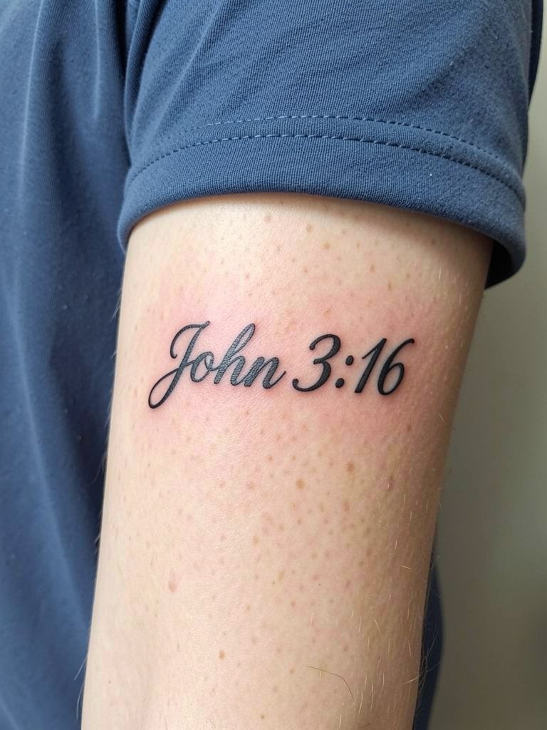
A single-line horizontal verse reads loud and visible and suits an outer forearm that you want people to notice. This style ages well when the letters use solid, slightly thicker strokes that resist blowout on movement zones. Tell the artist you want the stroke width bumped up a hair from the reference JPEG so the counters do not close after healing. The session is straightforward and feels like steady vibration and pressure. A common regret is choosing a cursive reference that is too thin for the forearm surface. Expect six-month healed contrast to be strong if saturated properly, and a touch-up at two to three years may be advisable. For everyday wear, this pairs with solid tees and bold bracelets. Try a [https://www.amazon.com/s?k=solid+color+t-shirt+men&tag=inkalerts-20] or a chunky silver cuff for contrast. [https://www.amazon.com/s?k=chunky+silver+bracelet+men&tag=inkalerts-20]
3. Philippians 4:13 in Micro-Realism with Fuel Tank Detail
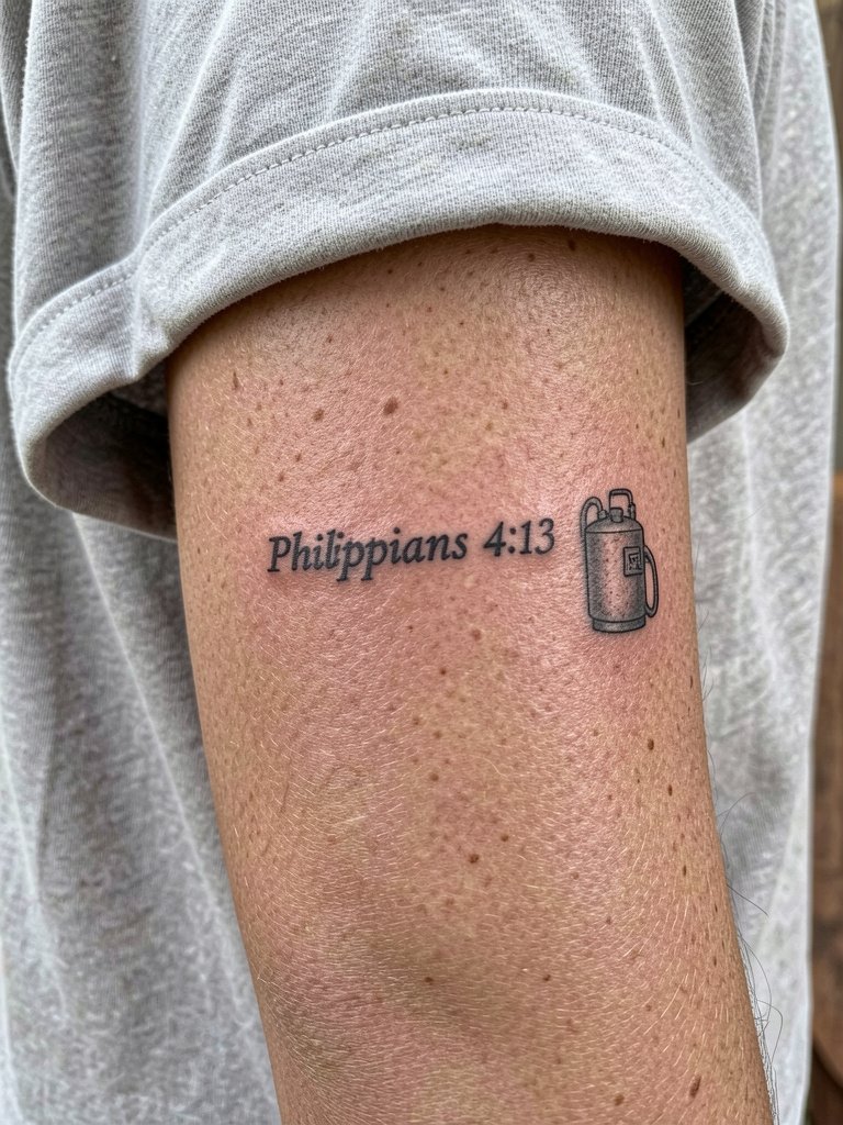
Pairing a short verse with a micro-realism icon creates a visual metaphor that reads on two levels. Micro-realism asks for very deliberate spacing and contrast. For this design, specify the icon size to the artist in millimeters so the fuel tank reads like an accent, not a smudge. The inner forearm is forgiving but single-needle detail can fade quicker than medium-weight text, so limit the number of tiny letters. At six months the icon should hold shape; at two years the thinnest cross-hatching may soften and benefit from a targeted touch-up. A common mistake is placing the small icon too close to text. During the consult show the artist the reference at actual print size and ask for healed examples at similar placement. Session pain is mild to moderate and often interrupted by position shifts if the icon sits near the wrist crease.
4. Psalm 23:4 in Ornamental Mandala Frame
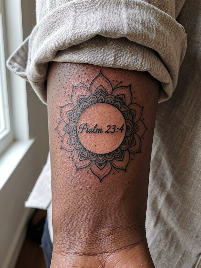
Enclosing a verse in an ornamental mandala softens the geometry and gives the text breathing room. Artists split on surrounding elements here. One camp argues the verse should breathe with negative space to preserve legibility and spiritual focus. Another camp says a mandala or floral frame makes the design feel finished and protects margins when you build a sleeve later. Both positions matter. If you want a framed look, ask for wider spacing between the lettering and the mandala edge. That spacing protects the text from edge blur as the skin ages. This style is slightly more session-time heavy because of stipple shading in the mandala. Expect moderate pain and a one-session duration. For showing this off, a rolled cuff linen shirt keeps the inner forearm visible and softens contrast. [https://www.amazon.com/s?k=rolled+cuff+linen+shirt&tag=inkalerts-20]
5. Isaiah 41:10 in Handwritten Cursive on Inner Wrist/Forearm
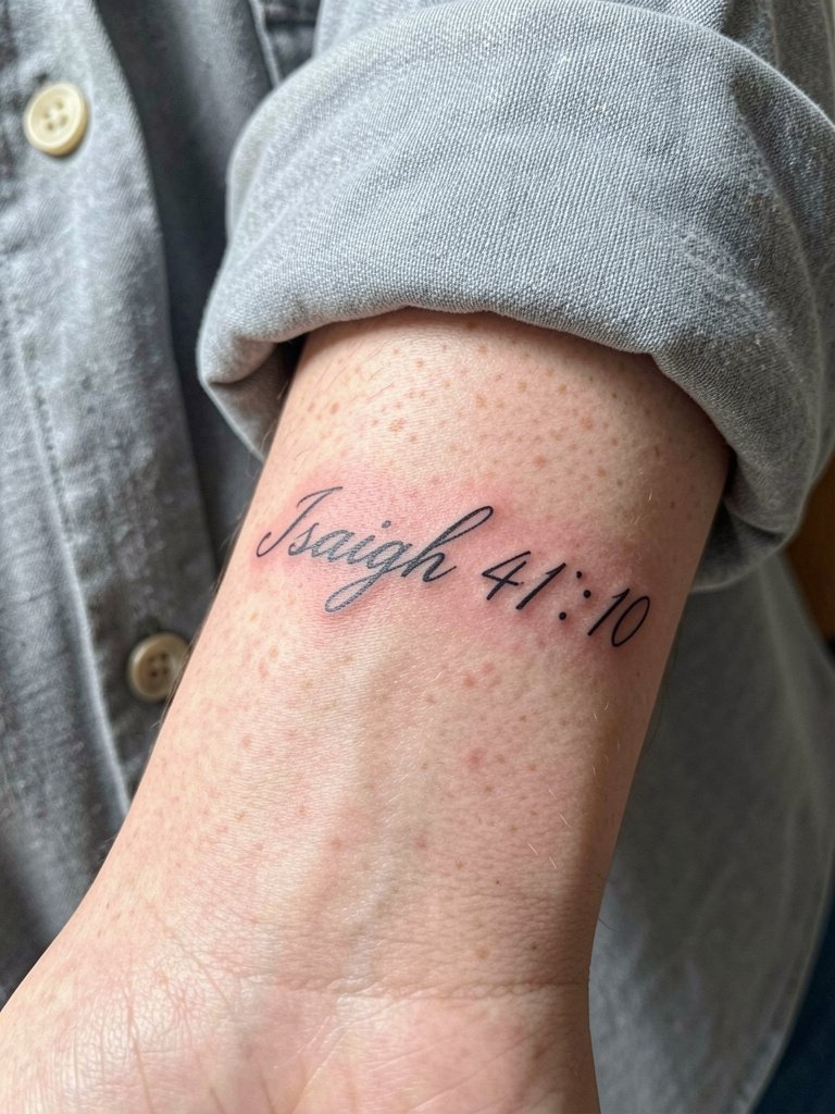
A handwritten cursive verse reads intimate and like a note on the body. The wrist is a high-motion surface, so increase line weight just enough to keep counters open. Instead of the generic "ask your artist" line, bring one preferred pen-script reference and request the artist mock it at two sizes. The common aging problem is picking the skimpiest version of a script. At six months the loops will still hold. By year two tiny cross-strokes can merge if the weight is too light. Session discomfort is focused near the wrist bones. Wear a loose long sleeve that can be pushed back comfortably for the appointment. Artists will advise a small touch-up window once the piece fully settles.
6. Black and Grey "Fear Not" Text with Cross
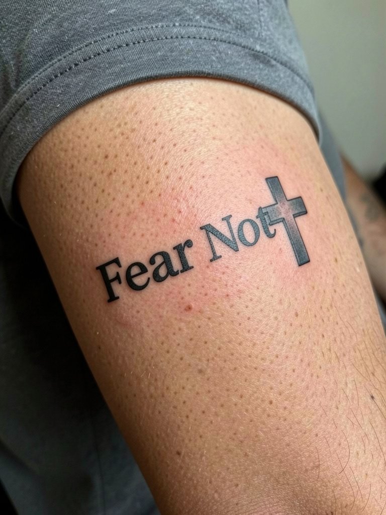
The color-versus-black-and-grey debate is active with two clear positions. One group insists that color fades into muddiness on forearms and that black and grey offers the best long-term legibility. Another group says color can work if the artist uses high-quality pigments and proper saturation, adding emotional punch that monochrome lacks. I steer people toward black and grey for text because it maintains contrast as skin tone shifts and as small touch-ups age. For a bold word like "Fear Not" choose solid black letterforms and grey fill on any icon to keep healing predictable. The outer forearm is lower risk for blowout but still benefits from slightly heavier strokes. Session pain is moderate and quick. Expect a possible touch-up in two to three years depending on your sun exposure.
7. Two-Column Vertical Psalm Line on Inner Forearm
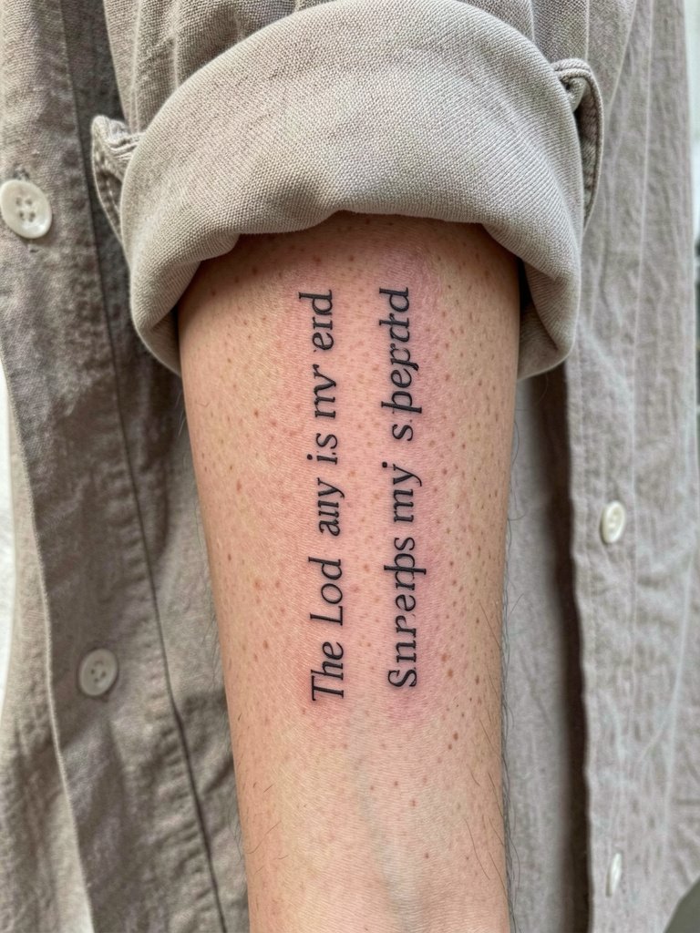
Splitting longer verses into two narrow columns helps maintain readable line length and reduces the temptation to shrink type too small. I recommend bringing a printed two-column mock-up so the artist can adjust kerning and inter-column spacing. A common mistake is making the columns too close, which causes the white space between columns to disappear as the skin ages. At six months the vertical rhythm will read well if spacing was respected. By year two the thinnest strokes near column edges may soften a touch. This placement is friendly for touch-ups because the skin is flat and accessible. Wear a shirt the artist can roll without pressure during the session. For subtle show-off styling, a dainty bracelet on the opposite wrist balances the visual weight. [https://www.amazon.com/s?k=dainty+gold+stacked+bracelet+set&tag=inkalerts-20]
8. Roman Numerals with Cross and Vine
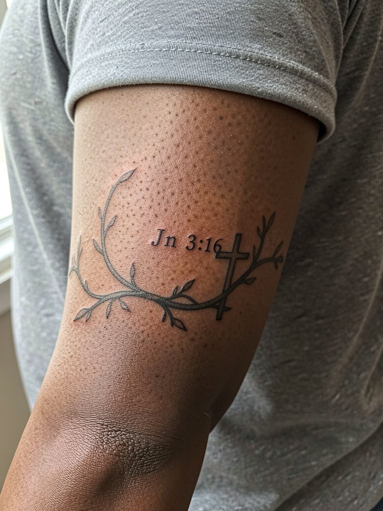
Using abbreviations or Romanized references can make a verse more private and subtle. Keep letterforms open and avoid ornate serifs that create tiny hairlines prone to blur. The vine detail adds organic movement but do not let it encroach on the letters. A real mistake is wrapping the vine so tightly it touches the numerals, shortening the negative space between elements. At six months the vine and cross should hold as delicate shapes. Expect slightly longer session time if the vine uses fine stipple shading. This looks modern with vintage tees and pairs well with cuffed short sleeves for visibility.
9. "God Is Good" in Bold Sans-Serif on Outer Forearm
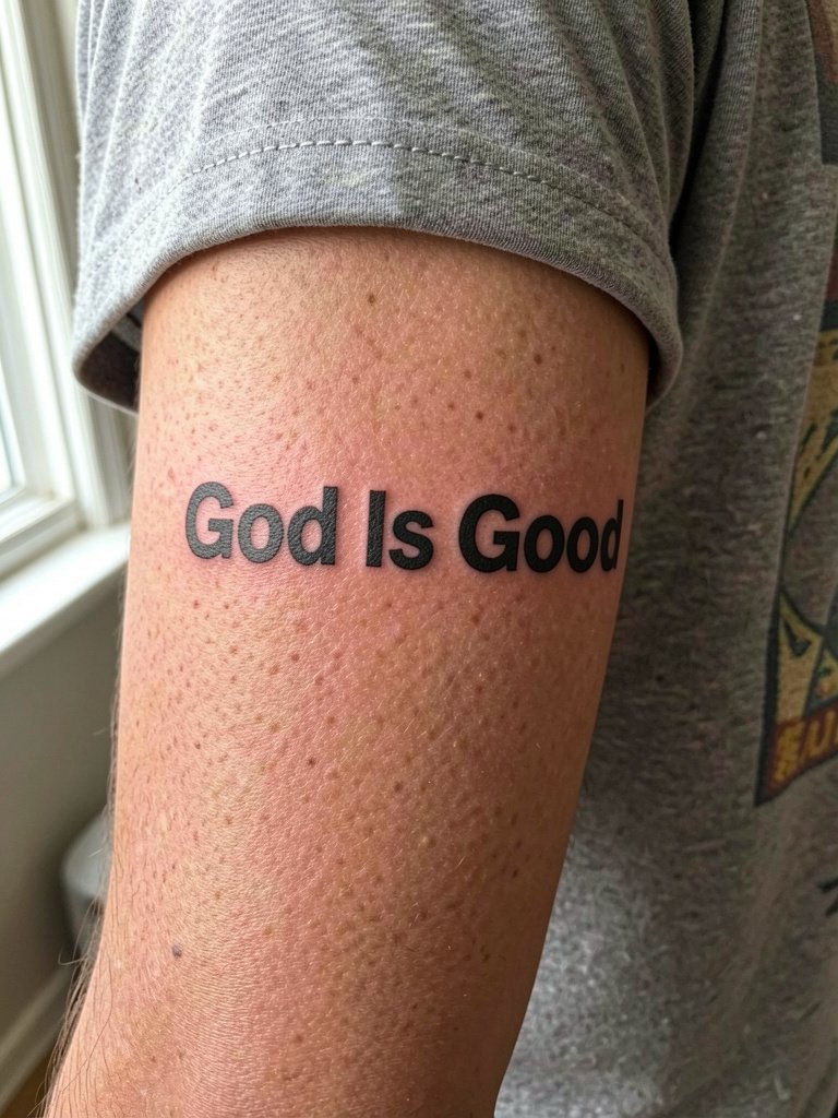
A bold sans-serif statement reads clearly from a distance and resists blurring because of the generous negative space inside letterforms. This is a good choice when you want maximum long-term legibility with minimal fuss. Discuss exact cap height and tracking in the consult so the word stack sits centered with the forearm anatomy. The outer forearm tolerates thicker strokes and a single-session approach. Expect low blowout risk if the artist avoids pushing lines too deep near the wrist crease. For a clean look pair with a vintage tee cut and keep accessories minimal so the typography stays the focal point.
10. Scripture with Negative Space Dove
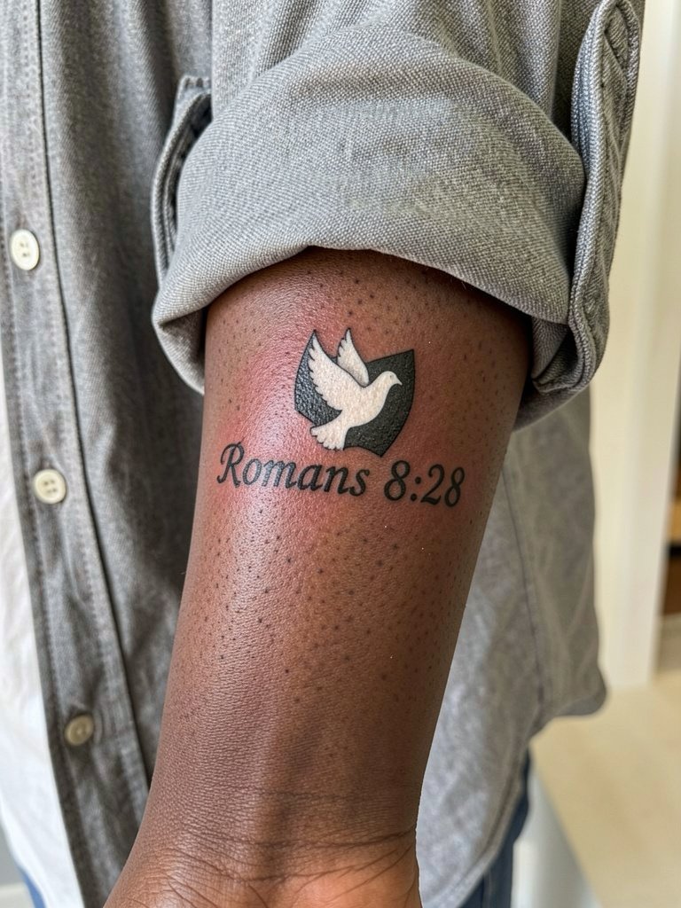
Negative space elements make symbolic imagery read as light without adding color. A carved-out dove over a verse keeps the palette minimal while adding a symbolic silhouette. Ask the artist to map the negative space in blackfill as a single shape so edges stay crisp during healing. A common failure is trying to micro-cut the negative shape with too much internal filigree. At six months the white silhouette should still read as an intact void against black, and by two years edges may need a small crisping touch-up. This pairs beautifully with rolled linen shirts and layered bracelets for a soft editorial look. [https://www.amazon.com/s?k=linen+button+down+shirt+women&tag=inkalerts-20] [https://www.amazon.com/s?k=dainty+gold+stacked+bracelet+set&tag=inkalerts-20]
11. Vertical "Be Still" with Wave Lines
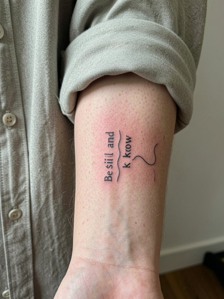
Combining a short verse with graphical wave lines gives a calm, rhythmic read that suits ocean lovers. Vertical stacking follows forearm anatomy and keeps the wave accents from crowding the letters. For legibility pick a slightly heavier single-needle or thin two-needle weight so the tiny wave lines do not fight with letter counters. The inner forearm is a low-blowout zone, but wrist-adjacent placement can blur if strokes are ultra-thin. Bring a mock-up that shows the wave width at actual size and have the artist place it while your arm is relaxed. A touch-up at two or three years is a realistic expectation. Pair with rolled linen shirts for lifestyle photos. [https://www.amazon.com/s?k=rolled+cuff+linen+shirt&tag=inkalerts-20]
Studio Day Picks
Those first six forearm styles cover a range of scale and motion zones, so a few practical items smooth the session and the first week of healing.
-
Stencil transfer paper kit. Lets you preview exact letter spacing on skin before the needle starts, which is crucial for vertical or two-column scripture layouts.
-
Topical numbing cream. Applied per product directions about 45 minutes before can ease wrist sensitivity without changing how the linework sits in the skin.
-
Thin protective film roll. Useful for covering the wrist or outer forearm where friction from sleeves and typing starts within the first 48 hours.
-
Fragrance-free gentle body wash. Cleans the healing area without additives that can irritate fine line work.
-
Aquaphor healing ointment. A thin layer in the first two to three days protects fine single-needle work without clogging the channels when applied sparingly.
Frequently Asked Questions
Q: How large should letters be so scripture stays readable on the forearm?
A: For forearm text I usually recommend a minimum x-height of about three to four millimeters for single words and slightly larger for multi-word verses. If you plan a long verse, split it into columns or a framed layout rather than shrinking the type. Bring reference stencils at the exact sizes you like so the artist can mock up how each size reads at arm scale.
Q: Will black and grey really age better than color for Bible verse tattoos?
A: Many people notice black and grey holds contrast longer, especially on the forearm where sun and friction are factors. Some artists will still use color successfully if pigments and saturation are top quality. If long-term legibility is the priority, black and grey is the safer route.
Q: How soon will I need a touch-up on script work?
A: Healed stability varies with placement, ink saturation, and sun exposure. For medium-weight scripts plan for a potential small touch-up around two to three years. Micro-script often needs refreshes sooner. Keep sun protection and a gentle wash routine to stretch out the timeline.
Q: What should I wear to the session and to show the forearm off afterward?
A: For session day pick a loose button-down or short-sleeve top so the artist can roll the sleeve without pressure. For showing off inner-forearm script, rolled linen shirts in neutral tones and dainty stacked bracelets frame the tattoo. For outer-forearm statements, solid tees and chunkier metal cuffs create contrast.
Q: Where can I find healed forearm scripture portfolios and local artists without naming people directly?
A: Search hashtags like #bibleversetattoo, #scriptureink, and #finelinetattoo on Instagram and TikTok, then filter by location to find nearby portfolios. Tattoodo lets you search keywords like "fine line bible verse" and shows healed examples. Reddit communities such as r/tattoos and r/christiantattoos surface peer-shot healed photos across skin tones. Use Booksy or the Inked App to filter studios by specialty and check for healed work in gallery sections.
Q: Horizontal or vertical for a forearm verse, which holds up better?
A: Artists split into two camps on this. One camp argues horizontal text is the most readable orientation and avoids forcing viewers to tilt their head, which can make a verse feel immediate. The other camp says vertical text follows the forearm anatomy so the piece looks integrated rather than stamped on. Both positions are valid. Choose orientation based on how often you want the verse to be readable at a glance versus how much you want it to flow with the arm contours.