
Someone I know spent six months scrolling lower back galleries and still felt unsure which styles actually age well on skin that moves. After time in five shops across Brooklyn and a dozen conversations with artists who specialize in linework and blackwork, I noticed the same designs keep healing clean. Below are 20 easy lower back tattoos that work on different body shapes, with what to ask your artist and how each style holds up over time.
1. Ornamental Mandala Centered on the Spine

Someone I know got a mandala to sit exactly over their spine and it reads like jewelry under a crop top. Mention symmetry and scale in the consult so the artist maps the central axis to your vertebrae. Cultural origin sensitivity matters here, so note the design borrows from Buddhist and South Asian patterns and consider a respectful variation instead of a direct replica. Pain is moderate because the spine area is bony near the center, and a typical session runs one to two hours. Fine line mandalas can blur if made too tight. Ask for slightly wider spacing between rays to avoid early touch-ups.
2. Tribal Sunburst at the Upper Lower Back

Fair warning, bold black fills pull attention and heal with strong contrast. Tell your artist you want clean negative space rather than solid blobs so the pattern breathes with hip movement. Tribal motifs trace to cultural practices, so ask about origin and opt for contemporary motifs that honor the source. Session time is usually under two hours and pain is low to moderate on fleshy areas. A common mistake is shrinking the design too small. Larger spacing helps prevent blowout over time. Expect high saturation that stays visible longer than very thin linework.
3. Symmetrical Butterfly Wings Spanning the Hips

If you want a feminine shape that moves with the body choose wings that follow the hip curve rather than rigid symmetry. In the consultation bring photos showing how the wings should sit when you bend. Fine line fans debate aging for this placement. One camp says the gentle curves keep lines crisp, the other says thin strokes over mobile skin fade sooner. For better longevity, ask for slightly bolder outer contours with delicate internal stipple shading. Session time is usually one hour. Common mistake is tiny antenna details that disappear after six months.
4. Mirrored Floral Hearts on Lower Back Dimples

A nostalgia-forward pick that reads modern when you request simplified petals and muted pastels. When you sit in the chair describe exact placement relative to your dimples so the design sits symmetrically. Pain is low since the fleshy outer hips tolerate needlework well. The typical session fits into one hour if you skip dense color packing. Where people go wrong is asking for tiny script inside the petals. That text will likely blur. If you want permanence pick compact shapes with clean linework and book a six-week touch-up if colors soften.
5. Decorative Vine Script Along the Lower Spine

When you plan a curved script, insist the artist sketches it on while you stand and arch so letters read correctly when you move. Pain is moderate because the spine area can feel sharp. Sessions vary from 30 minutes to 90 minutes depending on letter size. Fine line script that sits too small will fade or blur. A practical tip is to request slightly heavier downstrokes and loosen tight cursive loops. Tell the artist the exact phrase and font weight you want. Expect a touch-up window around six to twelve weeks for crisp edges.
6. Blackwork Lotus Panel That Covers the Lower Back

There is comfort in high-contrast work because it photographs well on many skin tones. Ask the artist for defined negative space so saturation does not read as a single blob on curved skin. Pain can be higher when your artist packs large solid areas, and the session often divides into two shorter sittings. A common aging issue is uneven saturation where the skin folds most. Plan for a touch-up once the piece heals and the artist can rebalance fills. Mention you want crisp outer linework to prevent early blowout.
7. Minimalist Star Constellation Scattered Near the Tailbone

Most people pick micro constellations for low maintenance and subtle reveals. Tell the artist you want spaced dots with short connector lines instead of clusters so each dot has room to hold. Pain is low at the tailbone flank area unless you sit on the spine. Sessions are quick, under 45 minutes. Fine point work may fade faster than bolder dots. If you want it to last, ask for slightly larger dot sizes and plan a touch-up at year one if visibility drops. Avoid asking for detailed shading inside tiny stars or the effect dissolves when healed.
8. Watercolor Dreamcatcher Centered with Feather Trails

Most watercolor pieces attract people who want soft color without heavy outlines. The aging reality is that wash effects can blur faster on skin that stretches. Ask the artist for a subtle outline around key elements so the composition keeps shape as colors fade. Pain is moderate when shading reaches toward the hips. Session time is one to two hours depending on color layering. A typical mistake is asking for neon washes that do not saturate well. For better longevity pick muted pigments and expect color softening within one to three years.
9. Ignorant Style Butterflies in a Playful Cluster

This naive look relies on raw, almost childlike linework that reads casual and cool. In the consult tell your artist you want confident imperfect lines and avoid overwork. Pain is low on the fleshier hip zones and sessions are short. Avoid the common mistake of crowding too many tiny motifs. Leave breathing room to prevent merge during healing. These pieces often look intentional even as they age, but thin single-needle strokes can soften, so schedule a touch-up if lines fade unevenly.
10. Symmetrical Dragonfly Wings with Micro-Realism Texture

There is a cinematic quality when veins and tiny highlights are placed right. Tell your artist you want micro-realism, not photo realism, so the wings hold in small format. Pain is moderate to low and most of these take one session. The trick is avoiding over-detail in a small footprint. Too many fine veins cause the design to blur together after one year. Ask for slightly bolder primary veins and stipple shading for texture. Expect a touch-up as pigments settle and highlights fade.
11. Traditional Rose and Thorn Wrap Toward the Hip
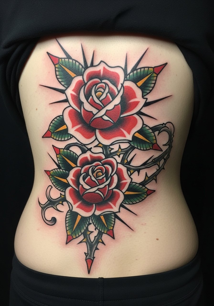
Classic lines age predictably and well because the work relies on saturated color and strong linework. When describing this, say you want bold outer lines and solid color saturation rather than soft blended petals. Pain is low on the hip flank and sessions often conclude within ninety minutes. A common mistake is asking for ultra-fine petal detail. That detail gets lost in time. If you want longevity, pick higher contrast palettes and ask about a six-week touch-up to refresh saturated fills.
12. Fine Line Peacock Feathers Fanned Across the Back

Fine line feathers look delicate and elegant when spaced correctly. Artists split on fine line longevity. One group says very thin barbs blur within two years. The other group says careful depth and spacing allow crisp feathers well past that. To protect detail, request slightly thicker barbs and plenty of negative space between feather eyes. Pain is low to moderate and session time is about an hour. The usual mistake is cramming too many eye details. Give each feather room to avoid merge and to reduce blowout risk.
13. Curved Spine Script That Reads When You Arch

When you want script that works with motion have the artist draw the lettering while you arch and relax so letter flow matches posture. The pain level sits at moderate near the vertebrae and session time depends on phrase length. Small script fades quickly if the stroke weight is too thin. Ask for slightly heavier downstrokes and simple letterforms. A common error is choosing ornate calligraphy for a curved area. Keep fonts clean so letters age predictably and plan a touch-up window around the three-month mark if edges soften.
14. Lower Back Dimple Jewelry-Like Dot Cluster

This placement reads like a discreet adornment when centered on the dimples. Tell your artist you want a jewelry mockup drawn on while you stand so proportions match your anatomy. Pain is low on fatty tissue and sessions are quick. Dot work relies on even stippling and too-tight clusters risk merge. A smart move is to space dots so the skin has room to hold each point. Expect touch-ups if any dot loses contrast. These designs photograph well and stay low-key in professional settings.
15. Geometric Mandala Band That Follows the Hip Curve

There is visual calm when geometry respects body curves. In the consult ask the artist to wrap key radial points to your iliac crest so the band hugs natural contours. Pain is moderate near bone pinch points and sessions can break into two sittings. Tiny concentric circles that are too close create a risk of blowout. A common mistake is overly complex tessellations for a small band. Keep scale readable and request slight spacing increases to help the design last.
16. Micro-Realism Moon Phases Along a Curve

Moon phases translate well into small repetitive pieces that follow the lower spine. Tell your artist you want clear full and crescent shapes rather than feathery gray blobs. Pain is low and session time is short. Fine shading in micro realism can soften with time. The best approach is to ask for defined silhouettes with soft interior shading. People often ask for too many phases in a small strip. Leave space between moons to prevent visual merge and plan a possible touch-up after the initial healing.
17. Weight-Adaptive Vine That Flanks the Hips

If body changes concern you pick designs that adapt, like vines that can stretch. When consulting, ask the artist to simulate placements on varied body shapes so you can see how lines move with gain or loss. Pain is low on the outer hips and session time is usually under an hour. The common mistake is insisting on rigid symmetry that warps with weight change. A flowing vine disguises shifts and reduces the need for future modifications. Plan occasional touch-ups if long-term visibility drops.
18. Celtic Knot Row Centered Low on the Back

Knots read crisp when the linework is consistent and the scale allows the interlacing to breathe. In the consult explain you want a pattern that repeats cleanly at the hip joints. Pain is low and sessions are moderate in length. Too-tight interlace is a common error because small loops are prone to blur. Ask for slightly broader loops and strong outer edges so the knotwork keeps structure as the skin settles. Mention the design has ancient roots and consider a simplified motif rather than an exact historical copy.
19. Small Sailor Anchor or Swallow Near the Hip

Retro nautical icons still hold because they are simple to maintain. Tell your artist you want classic bold lines and solid fills rather than soft shading. Pain is low and sessions are quick. Tiny ornate details often disappear. If you want the look to last pick slightly larger line weights and saturated color. A touch-up at six to twelve months keeps the icon crisp. These pieces are good if you plan to add on later as they sit nicely next to larger panels.
20. Stipple-Shaded Fan That Mirrors the Spine Curve

Dot work fans read like texture when the stippling density is planned carefully. In the consultation ask for gradients that use dot density rather than solid fills so the design breathes with movement. Pain is low to moderate and sessions vary depending on coverage. The usual mistake is overpacking dots which creates a muddy look as the skin heals. Request graded stipple shading with clear negative edges to maintain contrast. Expect a touch-up window if areas soften unevenly after the initial heal.
Tattoo Prep and Aftercare Essentials

I handle aftercare like a small toolkit that addresses washing, protection, and moisture without overdoing it. Below are practical items I recommend. Saniderm gets one mention because the community splits on barrier bandages versus dry healing. If you pick Saniderm know the debate and follow your artist's stance.
Medical-grade second skin bandage, single-patient size search. Use for the first 24 to 48 hours when you expect friction from clothing. It reduces rubbing and helps scabbing stay flat.
Fragrance-free gentle foaming cleanser. Clean twice daily for the initial week to remove sweat and residue without stripping.
Lightweight fragrance-free balm for tattooed skin. Apply a thin layer after washing to prevent the area from drying and cracking.
Breathable tattoo-friendly low-profile wrap. Handy for travel or tight clothing to avoid repeated rubbing.
Antimicrobial sterile saline spray. Use for gentle misting if skin feels crusty without scrubbing.
Saniderm protective film single roll. One mainstream option to consider if your artist prefers occlusive wound protection.
Mineral sunscreen stick SPF 30, travel size. Use on fully healed tattoos to protect color and linework from UV fade.
Silicone scar management sheet, small size. Helpful long term if raised scarring appears and you want to smooth texture.
Every tattoo is different. Always follow your artist's specific aftercare instructions. Consult a dermatologist if you have skin concerns or unusual healing issues.
Frequently Asked Questions
Q: Will fine line designs on the lower back fade faster than bolder work?
A: From what I have seen, fine line work is more likely to soften because the lower back moves and stretches. One camp of artists says careful depth and spacing preserve thin lines, and another camp prefers slightly thicker contours for this placement. Ask your artist how they balance needle depth and spacing for fine work before booking.
Q: Should I use Saniderm or dry healing for a lower back piece that rubs against clothing?
A: The community splits. Pro-Saniderm advocates say it prevents constant friction and keeps scabs flat. Dry-healing advocates worry that trapped sweat can cause infection on the lower back. My practical suggestion is to follow the artist's preference and consider a breathable wrap if you sweat a lot. If you try Saniderm, monitor the area and remove it if irritation appears.
Q: How do I communicate weight-fluctuation concerns for hip-flanking designs?
A: Ask your artist to sketch the design while you stand and while you sit to see how lines move. Choose flowing motifs like vines or fans that hide stretching. Insist on mockups that show the piece at different scales so you can evaluate how gaps or overlaps may change.
Q: Do watercolor tattoos need different aftercare than blackwork lower back pieces?
A: Color work benefits from gentle washing and minimal friction during the first two weeks. Watercolor styles that rely on soft washes can show earlier fading, so long-term sun protection is especially important. Use a mineral sunscreen stick on healed pieces to slow pigment loss. See the shopping list for a travel-size SPF option.
Q: If my lower back script blurs, what is a realistic touch-up timeline?
A: Expect to revisit the shop between six weeks and twelve months depending on how thin the script was and how much the area moved during healing. Many artists offer a six- to eight-week touch-up window to address early settling. Clarify that policy before booking so you know what to expect.
Q: Where should I look to find artists who specialize in ornamental lower back work?
A: Search hashtags like #lowerbacktattoo and #ornamentaltattoo on Instagram, check Tattoodo tags for regional portfolios, and use Booksy to find guest spots in your city. Scan healed photos on Pinterest and r/tattoos threads to see how similar placements aged before you book.
