
The smallest wrist ink often gets the most second guesses, because what reads crisp at appointment does not always read crisp three years later. For coordinates on the wrist, line weight and placement choices matter more than the exact font you pin. Read through these wearable coordinate ideas, with practical notes on longevity, session prep, and wardrobe pairings so you can pick a version that keeps its shape as it ages.
1. Minimalist Coordinate Script on Inner Radial Wrist
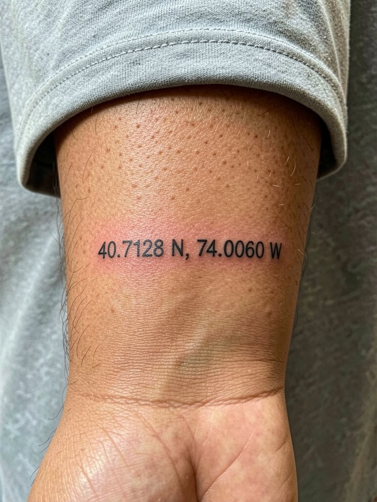
This classic single-line numbers look reads like a quiet secret on the inner radial wrist. If you want this route, plan for slightly heavier single-needle work than the absolute thinnest reference so the digits hold up under regular hand washing and sunlight exposure. Artists and clients split on how fine is too fine. One camp says single-needle fine line on the wrist blurs within one to two years because the skin stretches and gets constant friction. The other camp says fine line can stay crisp past three years if the design uses slightly wider spacing and careful needle depth. For session wear, choose a loose short sleeve so the artist can roll the sleeve without tugging. This placement pairs nicely with a thin chain bracelet set layered on the opposite wrist to keep the focus on the script.
2. Coordinates Wrapped Bracelet Style, Circumferential
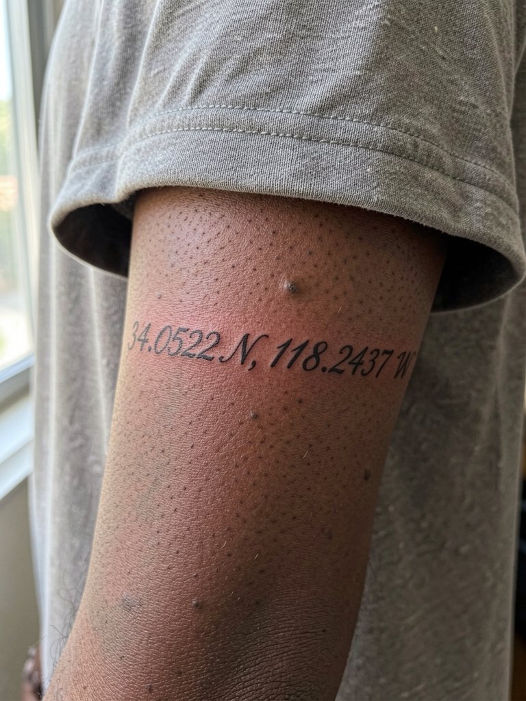
This wrap design reads like jewelry and works best when the numbers follow the wrist curve rather than bend across a knuckle. During consultation, bring a photo of the bracelet width you imagine so the artist can map how many characters sit on the top versus the underside. A common mistake is packing too many digits into too tight a curve, which creates compression and early blurring. For session day, wear a loose short sleeve so the artist can access the full circumference. For showing it off, try a delicate gold layering chain on the same wrist and pair with a gold layering chain bracelet for a cohesive jewelry look.
3. Coordinates + Tiny Globe Outline, Inner Forearm Transition
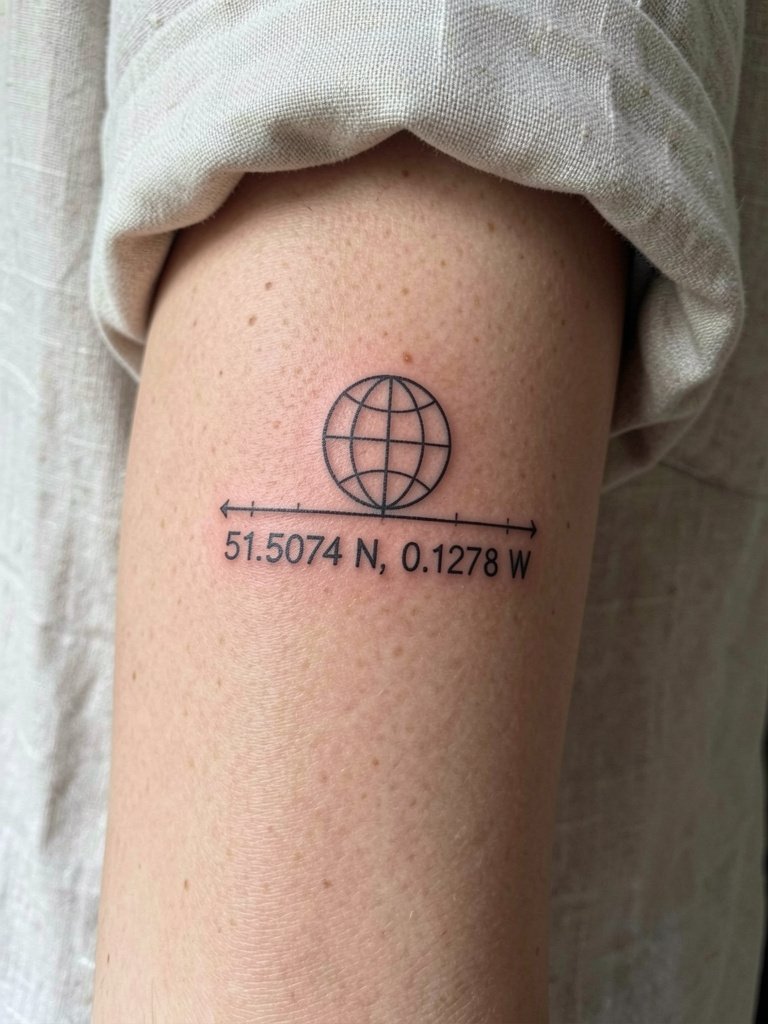
Pairing a tiny globe with numbers gives the coordinates context and helps viewers interpret the digits as a place, not a random sequence. If you want the globe to age well, keep the continents reduced to a two-line suggestion and avoid tiny island details that fill in over time. A scenario where this design wins is when you want slightly more visual weight than plain text but still want to stay minimalist. For the session, wear an open cuff linen shirt so the artist can work across the forearm-wrist junction without fabric tug. Expect a light touch-up timeline typical for fine-line illustrative pieces.
4. Coordinates + Compass Dot by the Thumb Side
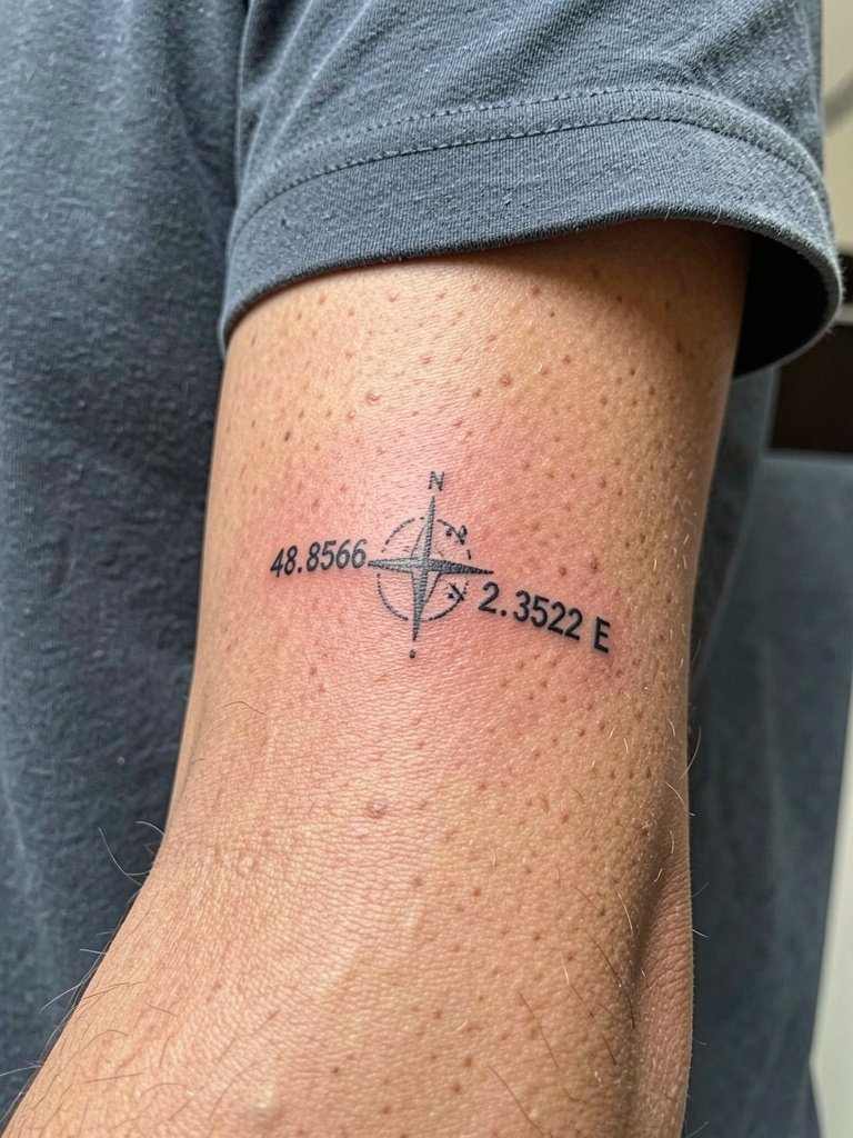
A small compass dot next to coordinates reinforces direction and intention without adding visual clutter. For people who want symbolism but minimal size, place the dot slightly above the numbers so the two elements do not compete. The biggest mistake is asking for a compass with tiny ornamental points that become a muddy smudge as the tattoo heals. In the chair you will feel sharp but brief buzzing because the skin is thin near the thumb. For showing it off, a minimalist watch on the opposite wrist balances the look. Consider a minimalist watch women style on the other arm so the compass reads like a paired accessory.
5. Dotted Map Coordinates Bracelet, Full Wrap
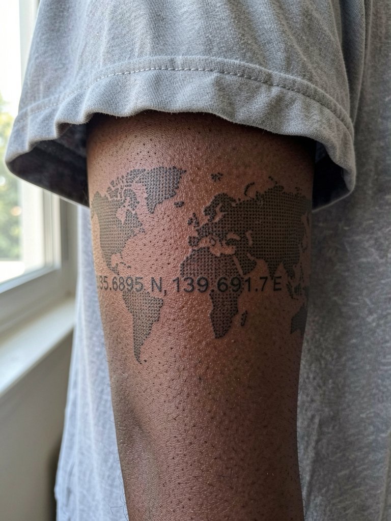
This dotted bracelet style reads modern and app-like, but it demands careful spacing because dots close up over time. A practical consultation note is to ask for slightly larger dot diameter so the pattern keeps its negative space after a year. People often request a full wrap without accounting for watch friction and daily handwashing. If you wear a watch, plan to avoid it for the first two weeks while healing. For a layered look, pair with a leather cord bracelet on the opposite wrist rather than bulky metal that can press into the wrap.
6. Vertical Coordinate Stack, Narrow Inner Forearm
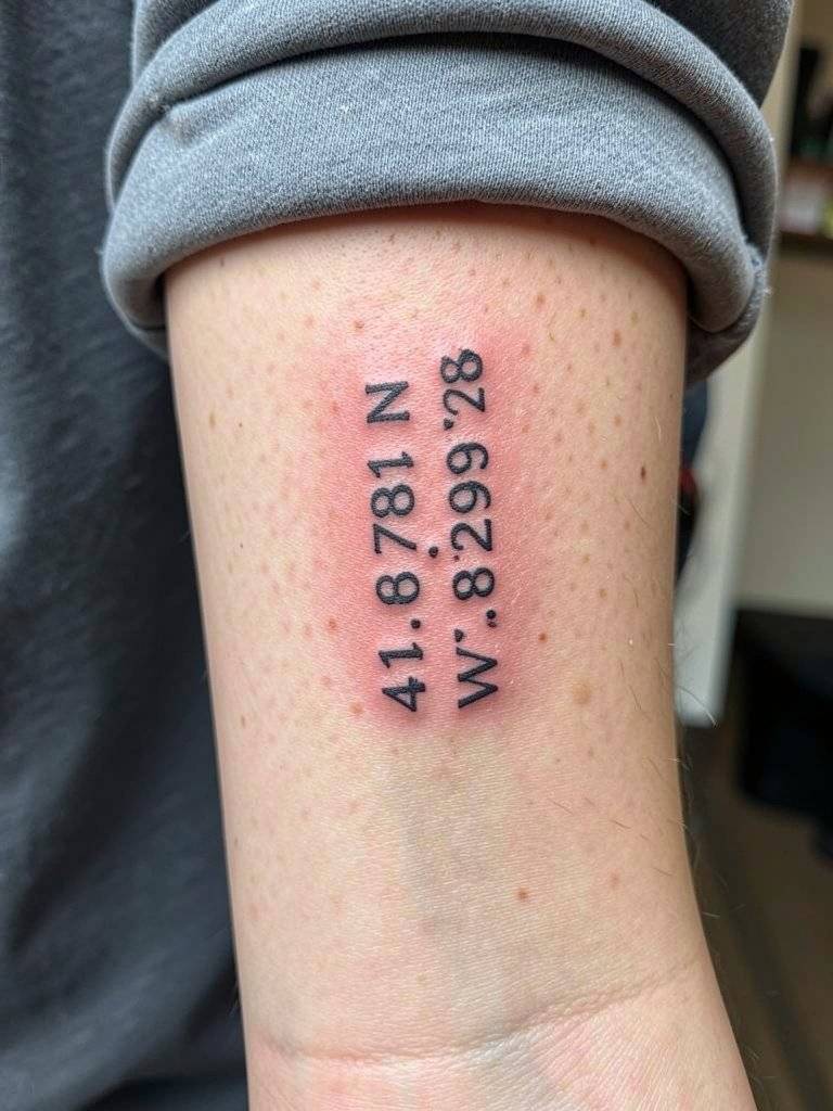
Stacking latitude and longitude vertically avoids horizontal compression on narrow wrists and makes the numbers more legible as they age. Tell the artist you want the digits spaced for readability at 1.2 inches of height rather than trying to cram everything into a half-inch column. A common aging mistake is using a sans-serif font with tight tracking that turns into a gray block after a couple of years. Session time is short and discomfort is moderate because the forearm skin is less thin than the exact wrist crease. Wear a loose short sleeve shirt so the sleeve can be rolled without tugging.
Session Day Picks
These first six wrist ideas share the same healing window and friction risks, so a few products smooth the chair time and first week.
- Tattoo Life Balm. A lighter balm option that people report doesn't trap heat on small wrist pieces, helpful for fine-line healing.
- Hikari Tattoo Aftercare. Thin, non-greasy balm users say keeps single-needle work moist without clogging the tiny channels.
- Skin & Ink Serum. An oil-based serum some users prefer for color retention on darker skin tones, applied after the initial scab phase.
- Fragrance free body wash. Gentle cleansers reduce irritation during the first three days when the wrist is most vulnerable to fading.
- Hustle Butter Tattoo Balm. A single mainstream balm choice for keeping the wrist area lightly moisturized without heavy residue.
7. Coordinates with Date Integration, Inner Radial Wrist
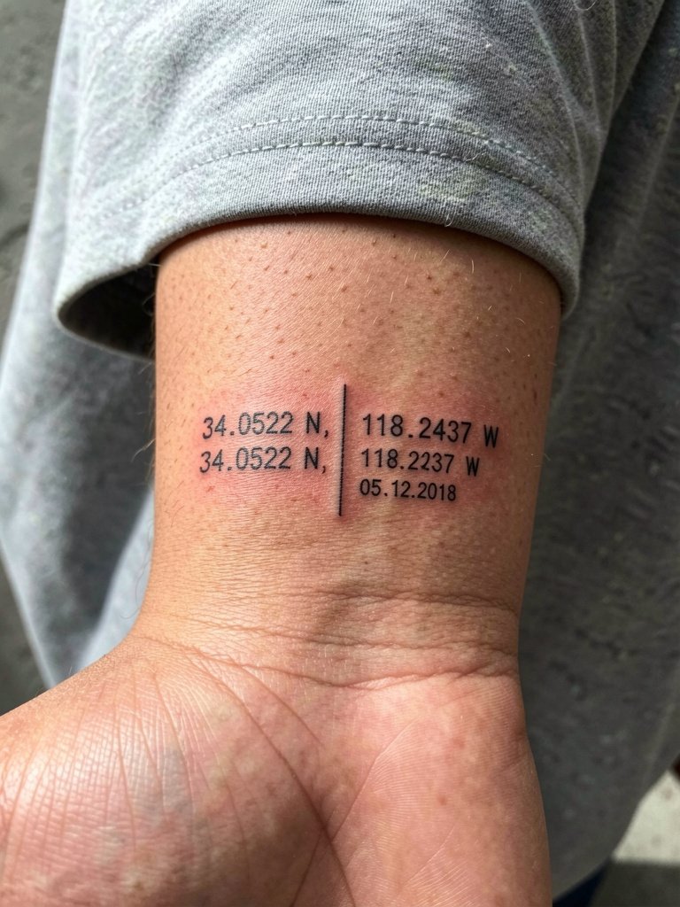
Combining a date with the coordinates lets the piece mark both place and moment without extra ornament. A useful consultation detail is to specify separator style and size so the date does not crowd the numbers. People often request very small dates that fill in and become unreadable; keep numerals spaced and slightly bolder than the minimalist digits. On dark skin, stick to saturated black ink for the numerals and avoid pale washes. For session wear, choose a short sleeve top to give the artist unobstructed access.
8. Geometric Coordinate Frame, Outer Radial Wrist
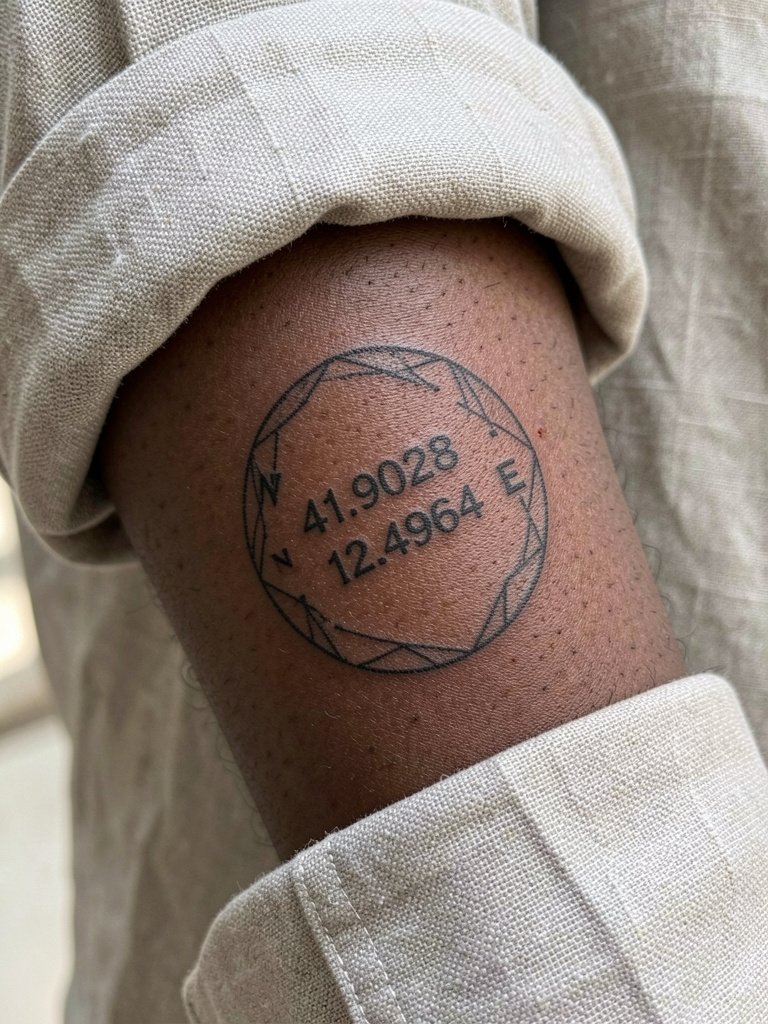
Putting coordinates inside a geometric badge gives structure and reduces the "floating numbers" look that some clients dislike. The frame needs to be sized to leave breathing room around the text so lines do not touch after healing. Ask for a minimum of 1.5 times the stroke width between the numbers and the frame edge in the stencil review. For wearing, a rolled linen cuff pairs well and keeps the frame visible. Try an rolled cuff linen shirt for a casual yet elevated way to show the geometry.
9. Watercolor Coordinate Splash Behind Numbers
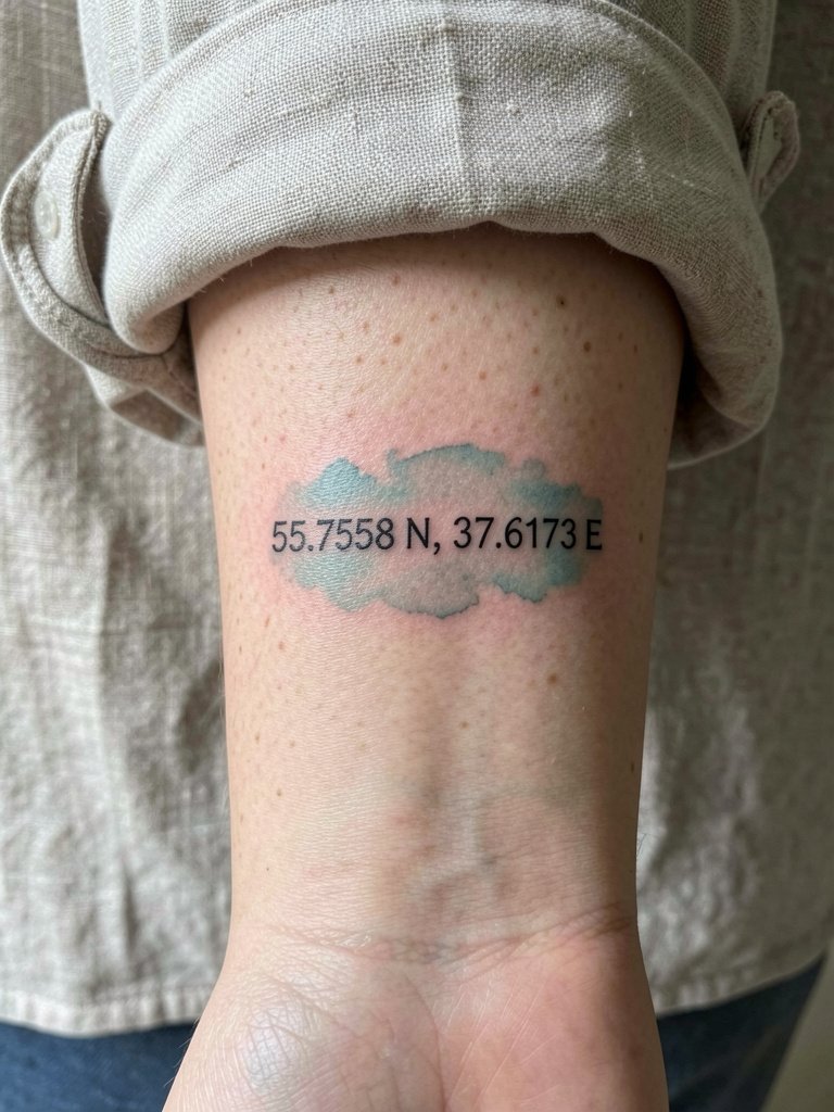
Watercolor behind coordinates creates that travel-journal vibe, but the wrist is a high-friction spot and color can soften quickly. One camp argues watercolor washes on the wrist fade and blur into a muddy halo within a year, especially with frequent sun exposure. The opposing camp says careful dilution and placement of color away from the smallest line edges can keep the wash readable for two to three years before a touch-up. If you choose color, keep the wash away from the digits and budget for a color touch-up sooner than you would for black-only work. For evening wear, an open-cuff linen shirt keeps the arm relaxed and shows the color without tight fabric rubbing.
10. Sepia Tone Vintage Coordinates, Inner Radial Side
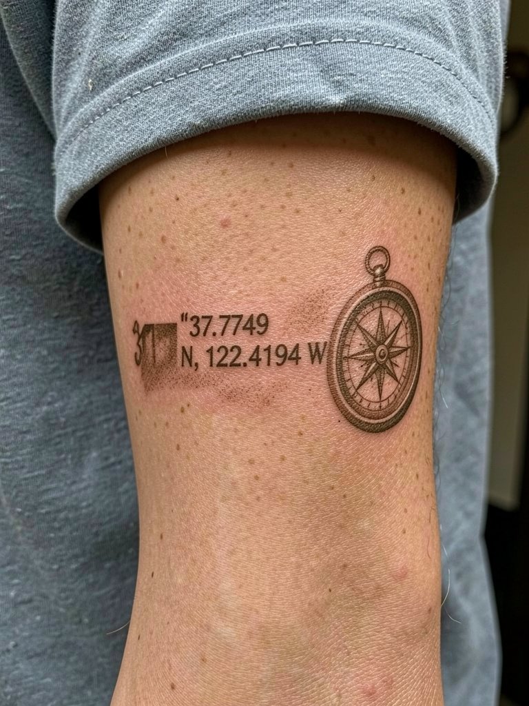
Sepia ink gives coordinates a vintage journal effect, but pigment choices affect longevity differently across skin tones. If you want the aged paper look, ask for a slightly denser saturation in the numeral strokes so contrast stays readable as the sepia patinas. A session note is that brown-leaning inks may appear subtler on darker skin, so plan for slightly heavier linework. For outfits, a neutral palette like cream or sand keeps attention on the subtle ink tone.
11. Abstract Shape Map Coordinates, Outer Radial Side
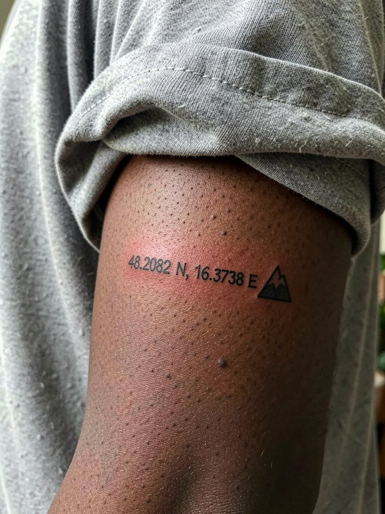
An abstract token beside coordinates gives a personal visual shorthand without being literal. This works well when the place holds an idea rather than a map identity, for example a triangle for mountains or a circle for a city. The main mistake is picking a shape so fine it loses silhouette; ask for clean negative space around the icon in the stencil stage. For session comfort, a loose shirt with sleeves that can be rolled is ideal.
12. Coordinates + North Star Highlight, Top of Wrist
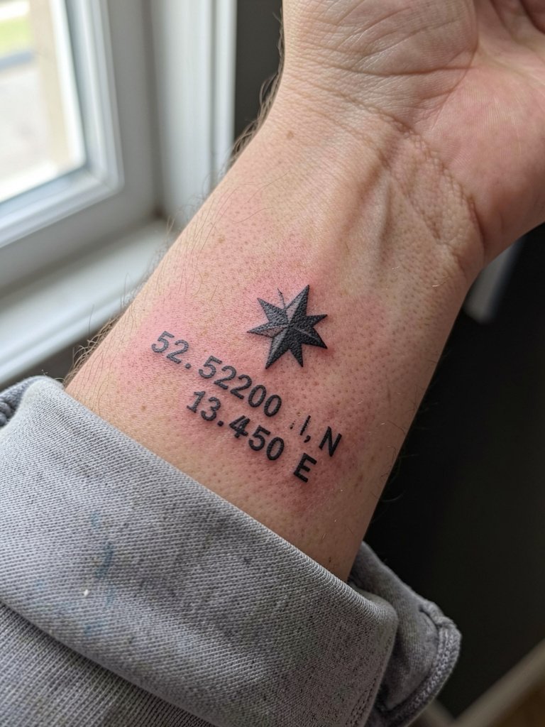
A North Star acts as a compact guide symbol when paired with coordinates and reads clearly even at smaller scales. For longevity, place the star slightly above the numbers rather than between characters so each element preserves margin. A practical consult note is to have the artist show the star and number spacing in a mirror before inking. For styling, a dainty ring set on the opposite hand provides balance when your wrists are visible. Try a dainty ring set for subtle hand styling that does not distract from the wrist piece.
13. Micro-Realism Coordinate Detail, Tiny Scale
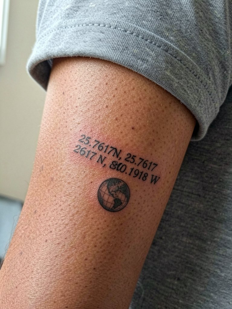
Micro-realism pushes the limits of fine detail on the wrist and should only be chosen by collectors aware of the maintenance. The session feels precise and long for such a small area because the artist often repeats tiny passes for texture. A realistic mistake is expecting micro-detail to behave like bold blackwork; these small textures will soften sooner and usually need touch-ups. If your goal is permanence with minimal maintenance, consider slightly enlarging the micro elements.
14. Coordinates + Journey Route Line, Wrapping Narrative
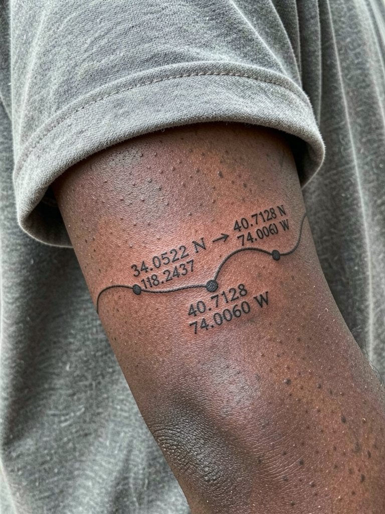
Route-line pieces tell movement stories rather than single-place stories. If you want two locations, place them on opposite sides of the wrist so the connecting line reads as travel rather than a crowded cluster. A frequent error is drawing a long thin line too close to the wrist crease where constant motion breaks the continuity. For showing it off, layer thin bracelets on the opposite wrist rather than the same wrist so the route line remains visible. Session time can be a bit longer because the artist maps the full wrap before inking.
15. Hand-Drawn Coordinate Script, Personalized Handwriting Look
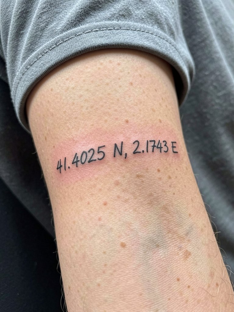
Handwritten coordinates read as a personal keepsake and avoid the robotic look of standard system fonts. A useful consultation move is to provide a scanned sample of the handwriting you want and ask the artist to redraw it for skin so spacing and weight are optimized. A common mistake is copying a handwriting sample at too small a scale, which turns into a blobby script after healing. This style pairs well with a simple leather bracelet on the opposite arm for contrast.
Frequently Asked Questions
Q: How long will a fine-line wrist coordinate remain legible?
A: Expect most pure single-needle wrist pieces to need a touch-up within one to two years in high-motion users. Some practitioners and clients report crisp results beyond three years when spacing and a slightly heavier line weight are used, but plan for at least one touch-up if you want the numerals to stay sharp.
Q: Should I pick black-only or add color behind my coordinates?
A: Black-only ink offers the best longevity on the wrist because color washes lose saturation faster with sun and friction. Other people prefer the watercolor look for aesthetic reasons and accept more frequent color touch-ups; if you choose color, place the splash away from the digits and budget for maintenance.
Q: What exact coordinates should I bring to the appointment and how do I verify them?
A: Use Google Maps "Share" latitude/longitude and copy the numbers to a note app, then verify with a second GPS or mapping source so you have the exact decimals you want. If you care about readability more than extreme precision, consider rounding to four decimal places and have the artist show the stencil on skin before committing.
Q: Where can I find healed portfolio examples and local artists without naming individuals?
A: Search hashtags like #coordinates tattoo, #minimalistwrist, and #finelinetattoo on Instagram and TikTok and filter by location tags to find nearby shops with healed shots. Tattoodo, Booksy, and the Inked App let you search by keywords such as "handwritten script coordinates" and show portfolios, while Reddit communities can surface peer-shared healed images across skin tones.
Q: Does skin tone change how a coordinate should be designed?
A: Yes, darker skin tones usually benefit from bolder line weights and solid black saturation to preserve contrast over time. On lighter skin, you can comfortably run slightly finer lines but still avoid the absolute thinnest strokes if you want easy legibility after two years.
Q: What should I wear to the appointment for a wrist coordinate piece?
A: Wear a short sleeve or loose long sleeve that can be rolled without tugging so the artist can access the full wrist circumference. For designs near the forearm transition, an open-cuff linen shirt is convenient and keeps the skin relaxed while you work.