
A small script on the wrist can read like a private reminder or like noise after a few years if spacing and weight were wrong from the start. I find that verse tattoos that still look crisp later are planned with breathing room, with lettering that respects movement and daily wear. Below are focused ideas that balance meaning, placement, and longevity so you get a design that looks like you, not like a trend that fades.
1. Inner Forearm Script, Single-Line Verse
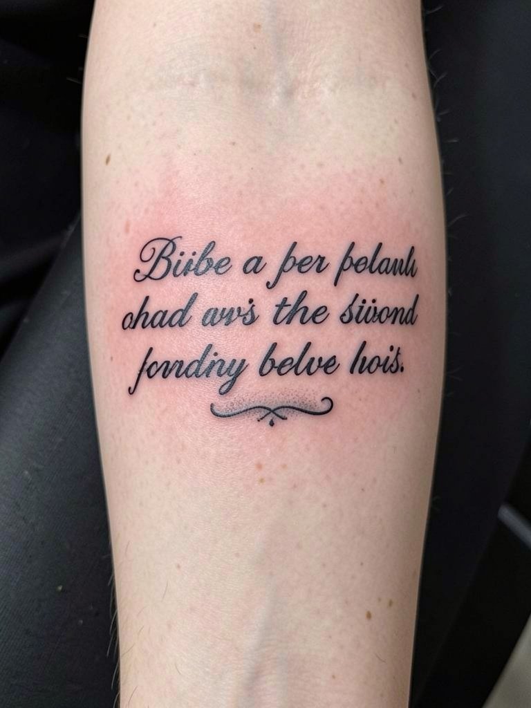
A single-line verse on the inner forearm is readable and works well with everyday motion. I recommend planning the phrase at three to five inches long so letters have room to age. Bring two reference images that show the exact script size and spacing you want so the artist can show a stencil at scale. Common mistakes are choosing ultra-thin single-needle script and placing it too near wrist creases, which leads to softening by year two. Pain is low to moderate and most sessions finish under an hour. For showing it off, a rolled-sleeve linen shirt pairs well with the horizontal placement, try rolled-sleeve linen shirts to frame the ink.
2. Vertical Ribcage Quote, Serif Letters

Vertical quotes on the ribs have a strong visual pull and can follow natural curves for a graceful effect. Fair warning, rib work is in the higher pain range, and sessions can run longer if the quote is long. One camp of artists warns that fine serif micro-letters on ribs blur within two years because of skin stretch. The other camp says that slightly wider spacing and moderate line weight settle well and will show healed photos to back that up. If you want a long passage, plan it across two sessions so saturation stays consistent. Wear a fitted sports bra on session day for easy access, and consider a midline placement so the text reads cleanly when standing.
3. Collarbone Micro-Script with Small Cross Accent
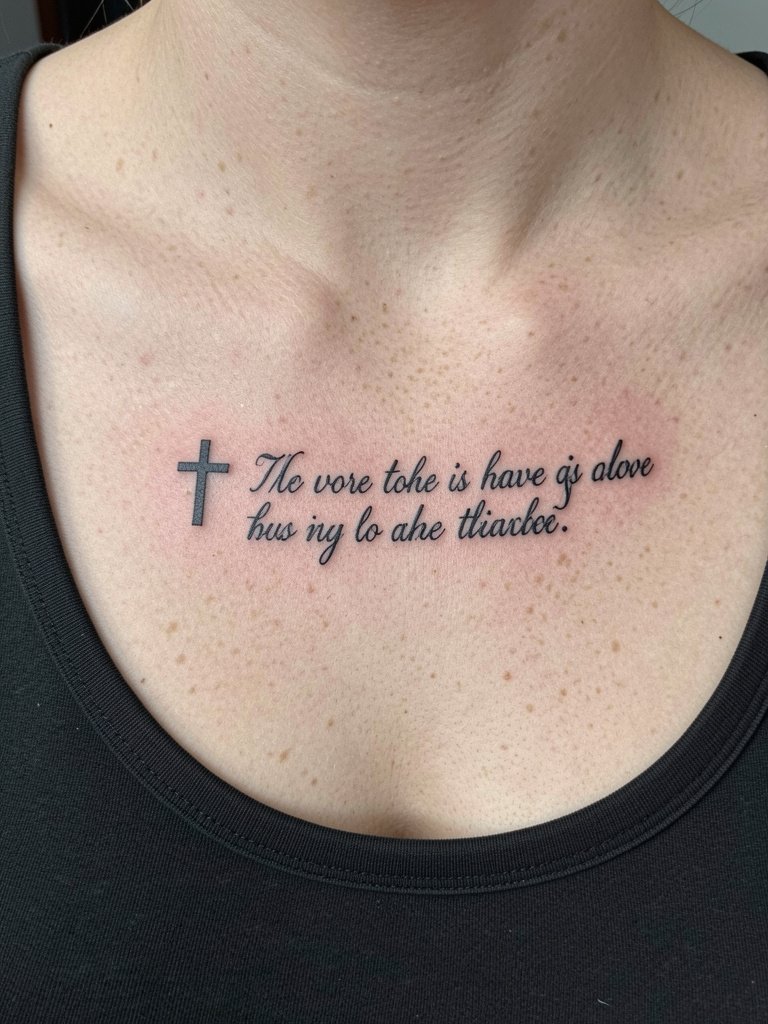
Collarbone text reads like a necklace and is a natural spot for short phrases. Because the area sees movement with breathing, pick letter spacing that allows the script to relax without merging. Common errors are going too fine visually and placing the cross too close to the letters, which makes the composition cramped as it ages. Session time is short, usually under an hour, and pain is moderate. For outfits, a wide V-neck top highlights the placement for evening wear. If you choose the sternum-adjacent area, select an artist experienced with chest anatomy.
4. Finger Verse, Single Word in Tiny Caps
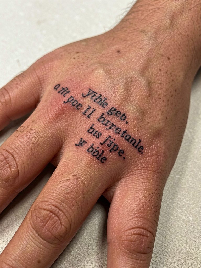
Finger text is intimate and visible, but fingers are one of the highest wear zones. Expect faster fading and a likely touch-up within a year. One camp of customers accepts this as part of the look and plans a maintenance session. The other camp avoids fingers for permanent verse work because of repeated washing and friction. If you choose this placement, pick a slightly heavier stroke and limit the phrase to one short word. The session is quick but sharp in pain. For showing it off, stack thin minimal rings that leave the knuckle area clear.
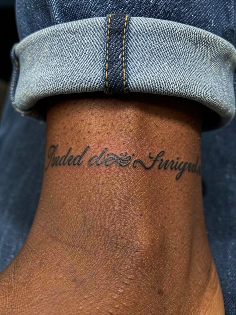
5. Side Wrist Vertical Script with Date

A date paired with a verse on the wrist makes the message feel anchored. The wrist endures bending and contact so choose vertical orientation to reduce distortion. A common mistake is placing text too close to the wrist crease, which softens the letters after months of movement. During the consultation specify exact numeral style and the spacing relative to the crease so the stencil can be placed just above the high-movement zone. Sessions are short and sensitivity is moderate. Show it off with short-sleeve shirts or bracelets, try a dainty leather cuff bracelet that frames the area without rubbing.
6. Inner Thigh Lines, Long Passage in Slim Type

Inner thigh pieces let you carry a longer passage in private and avoid daily abrasion. The skin here is softer and sessions may feel more tender than forearm work. Most long-passage mistakes come from compressing text into too-small type to fit a quote. Instead, plan for two sessions if the line count is high so saturation stays even. The environment is intimate, so pick an artist who is comfortable with inner-thigh placements and has clear professional experience. Wear modest bike shorts to the appointment so the artist can access the area without exposure.
Pre-Session Essentials
Those first six ideas show a range of placements that heal differently, so a compact kit for session day smooths the experience and the first week.
-
Stencil transfer paper kit. Useful to preview how your chosen verse will sit on the skin, especially for forearm and collarbone placements.
-
Topical numbing cream. Applied as directed before longer ribs or sternum sessions to reduce sharp pain.
-
Thin protective film roll. Handy for small wrist or finger pieces that meet friction from clothing.
-
Fragrance-free gentle body wash. Cleans the healing area without scent-based irritation when showers are frequent.
-
Aquaphor healing ointment. A mainstream balm for initial moisture control during the first few days of fine-line and script work.
7. Sternum Centered Phrase, Bold Script

Sternum verses read as centerpieces and can feel like armor. Tattooing over the sternum needs an artist experienced with curvature and occasional breast shadowing. One group of artists advises avoiding single-needle script here because the skin shift can make lines blur in a few years. The other group performs slightly bolder lines with tighter spacing and says it holds when placed carefully. Sessions on the sternum can be painful and often require two short breaks. If you choose this area, confirm the artist has healed photos of sternum work. For appointment wear, a fitted bandeau allows access without fabric in the way.
8. Behind-the-Ear Tiny Word

Behind-the-ear verses are discreet and work as a personal talisman. The area needs a fine hand and steady needle control because the skin is thin and the canvas small. Typical mistakes are trying to cram longer phrases here, which simply will not hold. Sessions are short and surprising in sensitivity because of surrounding bone. If visibility matters, style hair into an updo or short cut when you want to show the piece. Try a lightweight hair claw for a casual updo that frames the area.
9. Ankle Cuff Text with Tiny Flourish
Ankle script wraps read like jewelry and are easy to hide. The ankle is exposed to boots and socks so plan spacing to allow for a slight blur over time. A common error is placing script too tightly around a bony area, which causes the letters to distort as the skin moves. Sessions are brief and the pain ranges from moderate to high near bone. Wear rolled jeans or skirts to show off the cuff, and consider a pair of low-profile ankle boots that keep the design visible without rubbing.
10. Bicep Band Verse in Block Script

A bicep band holds thicker letters well and ages predictably because the area gets less daily friction. I favor block or slab serif for this placement because the bold strokes resist blowout. The common mistake is over-detailing the interior of letters which can fill in over time. Sessions are moderate in length depending on band width. For show-off outfits, sleeveless tops or muscle tees work best, and a casual sleeveless linen top complements the upper-arm placement.
11. Back-of-Neck Latin Phrase

A nape piece sits under hair and feels private unless worn up. The area tolerates bold letters better than ultra-fine script. People sometimes underestimate how hair and friction affect small caps and choose tiny type that becomes illegible. Session time is brief and pain tends to be low to moderate. If the text uses an original language like Hebrew or Greek, take care with translation and letterform authenticity to respect origins. For quick reveals, use an easy hair tie pack to pull hair up without fuss.
12. Foot Arch Verse, Curved Layout

Foot verses are delicate and often need touch-ups because shoes and walking create constant abrasion. The curved layout works if spacing is generous and letters are slightly bolder than micro script. A typical mistake is picking a script that reads well flat but collapses on the curve. Sessions can be more uncomfortable due to thin skin and proximity to bone. For showing the design, sandals and low-profile shoes help. Try pairing with simple slide sandals that expose the arch without extra straps.
13. Shoulder Blade Paragraph, Mixed Type
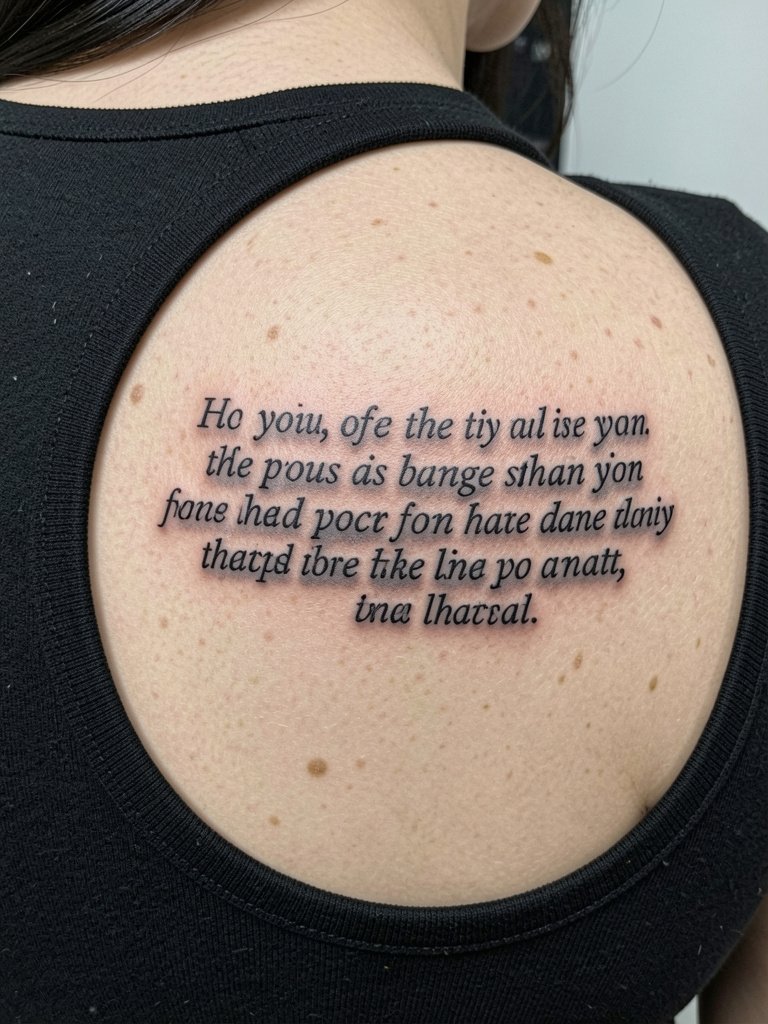
Shoulder blade passages let you scale up a verse without crowding. The area is forgiving because it sees less constant friction. Common errors are uneven line wrapping that fights the scapula curve. Plan line lengths in the stencil stage so the text sits with the bone structure. Sessions can run one to two hours for longer paragraphs. For outfit pairings, a scoop-back dress frames the area elegantly, try a scoop-back dress that shows the tattoo when you want it visible.
14. Sternum Ribbon Script, Feminine Sweep

Sternum ribbon scripts are intimate and elegant, and they require planning for the chest's three-dimensional shape. Some practitioners insist fine ribbon curves blur over time on sternum skin. Others perform slightly stronger strokes and controlled spacing and show healed examples to support that approach. If you pick this placement, specify exact curvature and ask to see comparable healed pieces. Sessions can be intense and usually include short breaks. When choosing clothing for healing, avoid bras with underwire in the first week to reduce pressure on the area.
15. Behind-Rib Mini-Motif Plus Verse

Adding a tiny motif beside a verse helps with composition and draws eyes to a particular line. The rib area is sensitive and the skin moves when you breathe. A real mistake is insisting on micro detail in the motif that cannot hold under the stretch there. Expect a longer session and plan for pain management. For showing the piece, off-shoulder or cropped tops reveal the placement. Consider a cropped athletic top for casual reveals.
16. Sternum to Upper Abdomen Vertical Line

A vertical midline text creates a strong visual anchor and can be scaled to read at different distances. The key is spacing, because the abdomen stretches with movement and weight changes. Avoid cramming a long passage into tiny type. Sessions for this area can be medium length and are usually tolerable if broken into sections. If you want to keep the verse private, choose clothing cuts that cover the midriff. For appointment day, high-waisted jeans and a cropped tee make access simple.
17. Scripted Heartbeat Line with Verse Fragment

Combining a motif with text can make a short phrase feel dynamic. The collarbone area moves and breathes, so the heartbeat line helps the verse flow with natural motion. People sometimes request ultra-fine heartbeat lines that vanish, so choose a slightly more substantial stroke for longevity. Sessions are short and the pain is moderate. For a casual reveal, open-neck tops help. Try pairing with open-back midi dresses for evenings when you want to show the upper chest art.
18. Script Near an Existing Floral Piece

Adding verse next to a floral piece requires type that complements existing linework. A common error is matching a script that fights the flow of petals instead of harmonizing. Bring high-quality healed photos of the floral work so the artist can match scale and ink saturation. Sessions for integration can be longer because of blending the edges. For station wear, choose clothing that keeps the hip and thigh accessible, and consider low-rise jeans that do not compress the fresh ink.
19. Small Verse on the Back of the Hand

Hand text has high visibility and high wear because of frequent washing and contact. Plan for heavier strokes and expect a faster fade. People often pick delicate scripts here and are surprised by quick softening. The session is sharp but brief. For style pairings, keep rings minimal and avoid bracelets that rub the area while it heals. A small set of minimal rings will accent the hand without disrupting fresh ink.
20. Inner Wrist Tiny Verse with Dot Work Border

Inner wrist verses are classic and versatile but they meet bending and daily exposure. A dot-work border keeps attention on the phrase and helps with definition as edges soften. Mistakes include tiny lettering with no protective spacing near the wrist crease. Sessions are brief and the pain is moderate. For revealing the wrist more, try short-sleeve or cuffed shirts. A stack of slim bracelets can frame the area without constant rubbing during healing.
21. Upper Thigh Vertical Passage with Decorative Initial

Upper thigh passages are private and survive well because they get less friction. A decorative initial gives a focal point for long text. The main mistake is compressing the passage into too-narrow columns. Stagger out the line breaks and consider two sessions for saturation. Pain varies and is typically lower than ribs. For showing, midi skirts and dresses reveal the area subtly, pair with a midi skirt for graceful glimpses.
22. Sternum Crescent Text, Small Caps

Crescent text across the sternum feels intentional, but the area can shift and stretch. Artists are split on the ideal approach. One group contends that tiny caps blur on sternum skin over a few years because of movement and chest compression. The other group argues that when you use slightly wider spacing and moderate strokes it settles cleanly, and they will show healed images to support that. If you pick this placement, request healed examples and plan the session with short breaks.
23. Mini Verse on the Side Rib with Leaf Motif

A leaf motif adds a natural flourish to a rib verse, and the combination draws eyes along the body. Because ribs respond to breathing, choose spacing that allows for a small amount of stretch without crowding letters. The real mistake is dense dot work that cannot be sustained in that zone. Sessions are sensitive and may require a numbing strategy. For wearing, cropped tops frame the area, and a lightweight cropped athletic top is practical for both the session and the reveal.
24. Inner Elbow Short Line
The inner elbow sees a lot of motion and sweat, so placing text here requires resilience. Avoid micro scripts that will lose form with bending. A common oversight is ignoring how the crease compresses letters, which leads to illegibility. Sessions can be uncomfortable because the skin is thin, and you may need to book shorter appointments. Wear short sleeves and bring a loose top to access the area easily for the session.
25. Clavicle Edge Script with Small Dot Accent

Edge-of-clavicle text reads like jewelry and responds well to short phrases. The most frequent mistake is placing lettering too close to clavicle bone where the skin compresses and letters lose shape. Discuss exact stencil placement relative to the bone so the artist can prove the layout before inking. Sessions are short and sensitivity is moderate. Pair the placement with open-neck tops, and try a linen open-neck blouse for an everyday elevated look.
26. Small Verse on the Hip Bone

Hip bone text shows when you want it and hides when you do not. Because the area can be affected by waistbands and jeans, place the verse above the top of the waistband and confirm with the artist while standing. A common mistake is placing the text too low where jeans compress it, which leads to distortion. Sessions here are tolerable and usually short. For reveal outfits, low-rise jeans and crop tops do the job, and a pair of low-rise jeans keeps the art visible without rubbing.
27. Chest Pocket Quote, Small Paragraph

A pocket quote is a nice nod to keeping a passage close to the heart and it pairs naturally with button-up shirts. The trick is to size the paragraph so it reads at a glance without looking crowded next to shirt seams. The usual mistake is overlong paragraphs that require tiny type. Sessions vary by length but are usually completed in one sitting for short paragraphs. For daily styling, a button-down or open-collar shirt frames the area, try a classic button-down shirt that hints at the placement.
Frequently Asked Questions
Q: How do I pick the right Bible verse length and font for different placements?
A: Short phrases work best on wrists, ankles, and fingers. Longer passages fit chest, back, or thigh. Choose a font with deliberate spacing for high-motion areas and bring scaled reference stencils so your artist can place the text at true size before inking.
Q: Are there religious objections I should consider before getting a Bible verse tattoo?
A: Yes, communities vary. One camp views permanent scripture on the body as a heartfelt testimony and embraces visible verse tattoos. The other camp worries that tattoos can be seen as immodest or inappropriate in certain worship contexts. Think through how your congregation or family might perceive permanence and pick placement accordingly.
Q: Where can I find portfolios and healed examples for inspiration without naming specific artists?
A: Search hashtag combinations that match your idea and scope, for example #VerseTattoo, #ScriptInk, and #HealedScriptPhotos while filtering by location on photo platforms. Browse community forums and dedicated tattoo pages focused on healed work, and look for portfolios that show the exact placement and skin tone you want so you can assess longevity.
Q: How often will I need a touch-up for script pieces in high-wear spots like fingers and hands?
A: Expect touch-ups sooner on fingers and hands, often within a year if you want crispness. Wrist and ankle pieces commonly settle for two to five years before a minor refresh. Plan touch-ups based on how the design reads in photos taken six months and two years after healing.
Q: What should I wear to the appointment for placements like ribs, inner thigh, or hip?
A: Pick clothing that gives your artist easy, comfortable access while keeping you covered. For ribs and sternum, a fitted sports bra or bandeau lets the artist work without fabric bunching. For inner thigh, modest bike shorts are a good option. For hip work choose low-rise jeans that are fully zipped and buttoned so the waistband sits below the tattoo site.
