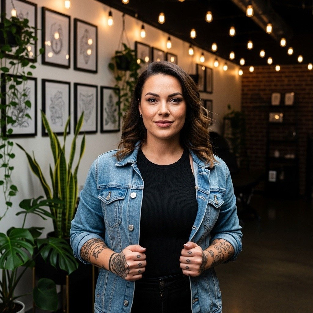
The whisper-thin numbers everyone saves on their phone rarely tell the whole story. On the wrist, small choices about line weight, spacing, and placement decide whether a birth-year tattoo still reads at year two. Pick a layout that gives the digits room to breathe, plan for a realistic touch-up window, and wear the right session clothes so the artist can work clean. Start there and the design ages with you.
1. Minimalist Roman Numerals (Vertical Stack)
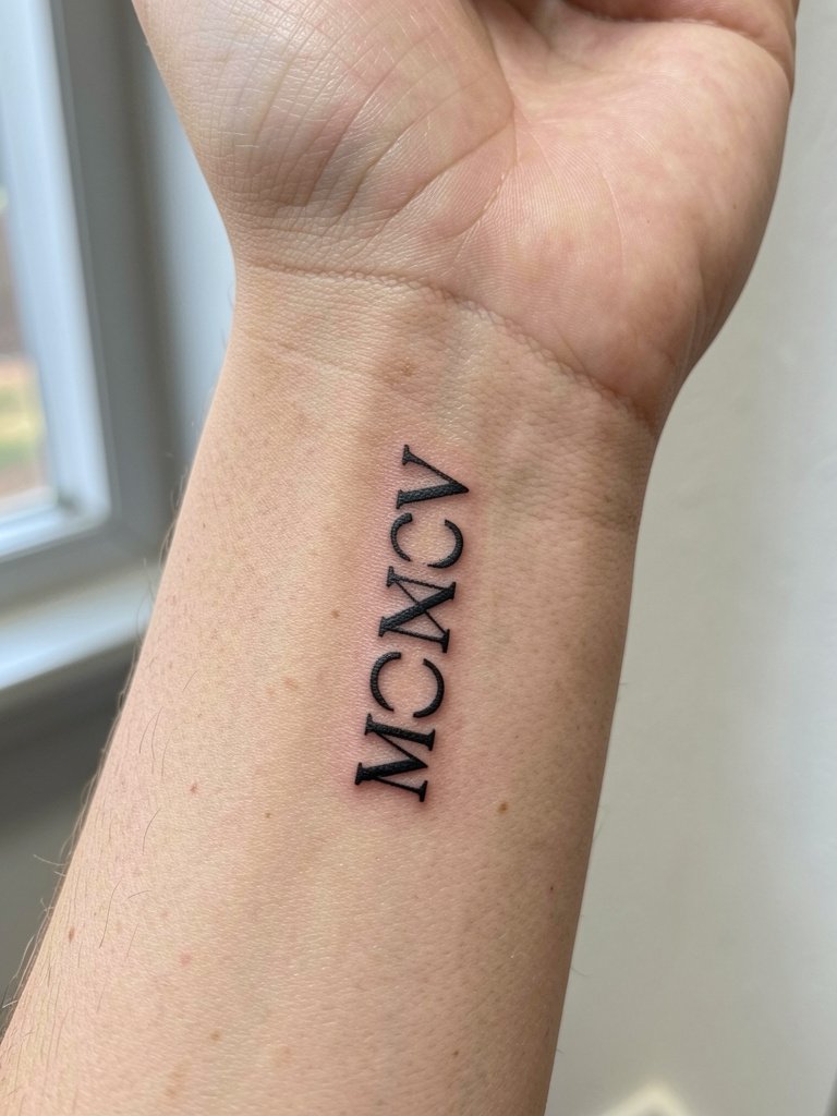
Roman numerals feel archival, but on wrist skin they need extra room to stay legible. Use a vertical column to give each character breathing space, and specify serif terminals so the shapes hold rather than bleed together. For the consult, show a printout at actual size and ask for linework at a hair heavier than the reference, so the strokes are near 0.6–0.8 millimeter in visual thickness rather than whisper-fine. One common mistake is copying a Pinterest single-needle sample without scaling it up for the wrist bone, which is what causes early blurring. For showing this piece off, rolled-up linen shirts in cream and a dainty gold stacked bracelet look clean and let the numerals read in photos [https://www.amazon.com/s?k=linen+button+down+shirt+women&tag=inkalerts-20].
Fine line Roman numerals split artists into two camps. One camp says the complex strokes blur into a dark mass on high-movement skin unless you start with wider spacing and heavier terminals. The other camp argues that with perfect depth and single-needle discipline the numerals can settle beautifully and look like delicate type for years.
2. Clean Sans-Serif Birth Year (Horizontal)
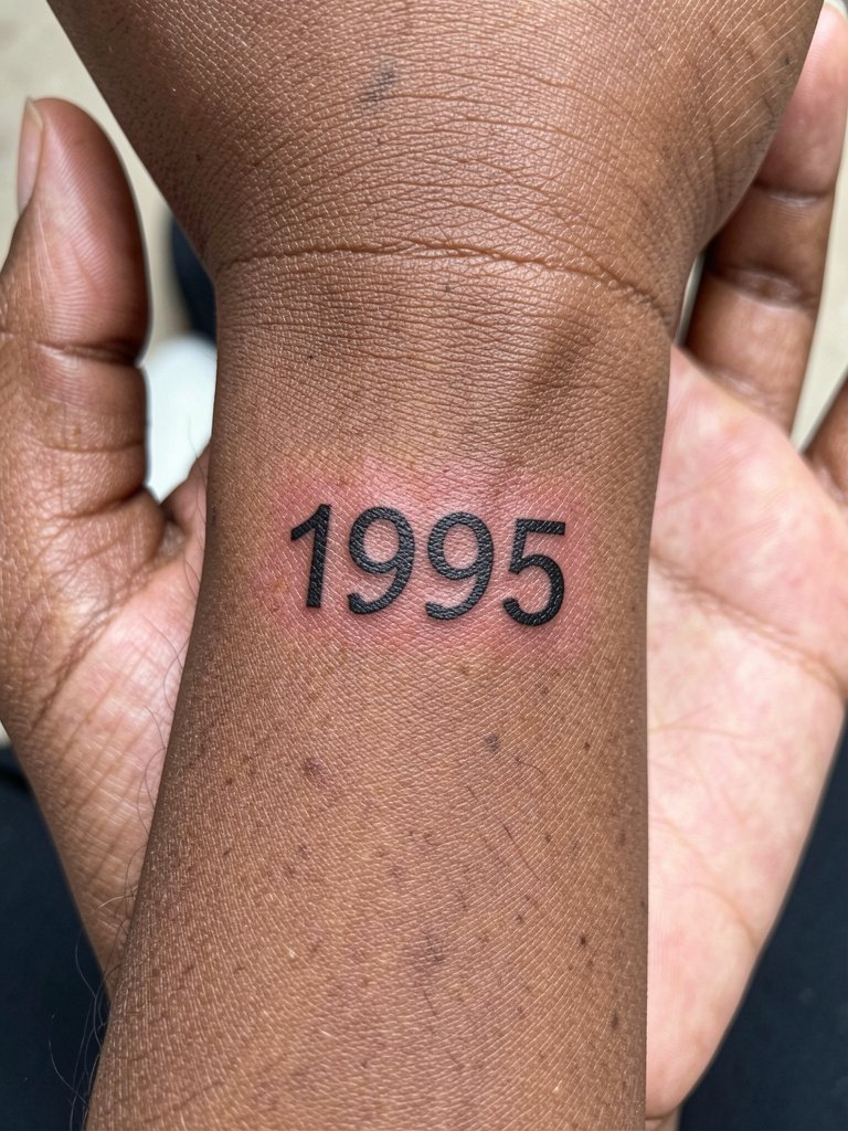
A horizontal sans-serif year reads immediately and ages predictably because digits are simple shapes. Recommend this for a first-timer who wants readability in phone photos and a low chance of early smudge. Bring two reference widths to the consult so the artist can mock up the exact spacing at the size you want. Healed at six months the digits usually look intact. By two years the thinly packed versions can soften, so plan a touch-up around the six- to twelve-month mark if your skin shows early fading. For session comfort, wear a short sleeve or loose tee so the artist has full wrist access, and pack a neutral [https://www.amazon.com/s?k=loose+fit+cotton+t+shirt+women&tag=inkalerts-20] in case you need to change out of something tight.
3. Birth Year + Micro Butterfly (Fine Line)
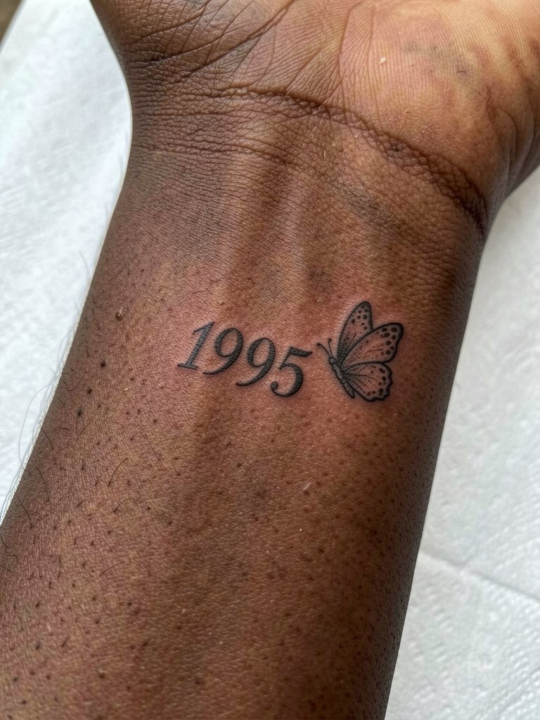
Pairing a micro butterfly with the year softens the numeric block and gives a sentimental accent without turning into a floral cluster. On darker skin choose slightly bolder linework for the butterfly so it keeps contrast in photos. A frequent mistake is asking for the thinnest butterfly possible and then being frustrated when the wings photograph gray. Discuss line weight and dot density for the butterfly specifically, and ask the artist to show a healed example on similar skin. Expect a sharp pinch on the inner wrist. Plan for a short touch-up at six months when micro details usually need reinforcement. Session wear is a sleeveless top or short sleeve so the artist can position your arm palm-up with room to work.
4. Birth Year + Micro Laurel Sprig
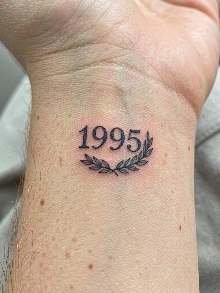
A minimal laurel frames the year without turning into a floral wrist sleeve. Recommend this if you want a badge-like composition that still photographs clean. Ask the artist for leaf spacing that keeps negative space clear when the wrist flexes. The mistake people make is requesting densely packed foliage around tiny digits, which creates early merging during healing. For showing it off, try a rolled cuff linen shirt in olive tones and a dainty gold bracelet set linked here [https://www.amazon.com/s?k=dainty+gold+stacked+bracelet+set&tag=inkalerts-20]. During the session keep your arm relaxed so the artist can plot the curve around the bone accurately.
5. Zodiac Glyph + Birth Year Combination
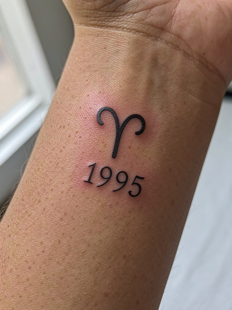
Merging a zodiac glyph with the year turns the numbers into a compact emblem. Choose a tiny glyph shape rather than a detailed portrait so the whole piece reads at a small scale. Talk specifics: pick a glyph that matches your preferred height relative to the numbers and request a mockup that keeps the glyph at one third to one half of the number height. A common misstep is overscaling the glyph so it competes with the digits. This layout fits either wrist side depending on whether you want subtlety or visibility. If you like showing it, pair with a short sleeve neutral tee or roll a sleeve up deliberately.
6. Underlined Birth Year (Graphic Style)
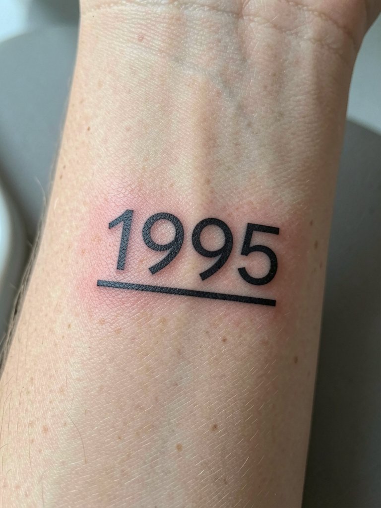
The underlined year reads like a tiny label and photographs like a fashion tag if executed with even stroke weights. Ask the artist to match the underline weight to the numerals so the line reads intentional rather than tacked-on. A frequent error is making the underline too thin, which turns it into noise after a year. For session wear, short sleeves are fine. For showing it, try linen or neutral-toned rolled sleeves and a minimalist watch so the underline sits in a quiet frame [https://www.amazon.com/s?k=rolled+cuff+linen+shirt&tag=inkalerts-20]. Expect a crisp pinch along the wrist bone and plan for a possible six-month touch-up on the join between line and digits.
Heal Smart
The first six designs above highlight small, exposed wrist linework and micro accents, which face the same early healing risks. These picks help with session comfort and first-week care.
- Tattoo Goo aftercare balm. A thin, non-greasy balm that some artists recommend for fine-line pieces on wrists where heavy greases can smudge detail during the first week.
- Mad Rabbit Tattoo Soothing Gel. Gel texture absorbs quickly and feels lighter on wrist skin that rubs against cuffs and bracelets.
- Dr. Woods Black Salve. Used by some for its anti-inflammatory properties on small, high-movement tattoos during the initial swelling window.
- Hustle Butter Salvage. A mainstream balm alternative that many people switch to after greasy ointments because it sits thinner on fine-line ink.
- Saniderm second skin bandage. A protective film that keeps wrist tattoos moist and reduces scabbing where clothing friction is constant.
7. Birth Year + Tiny Heart Accent
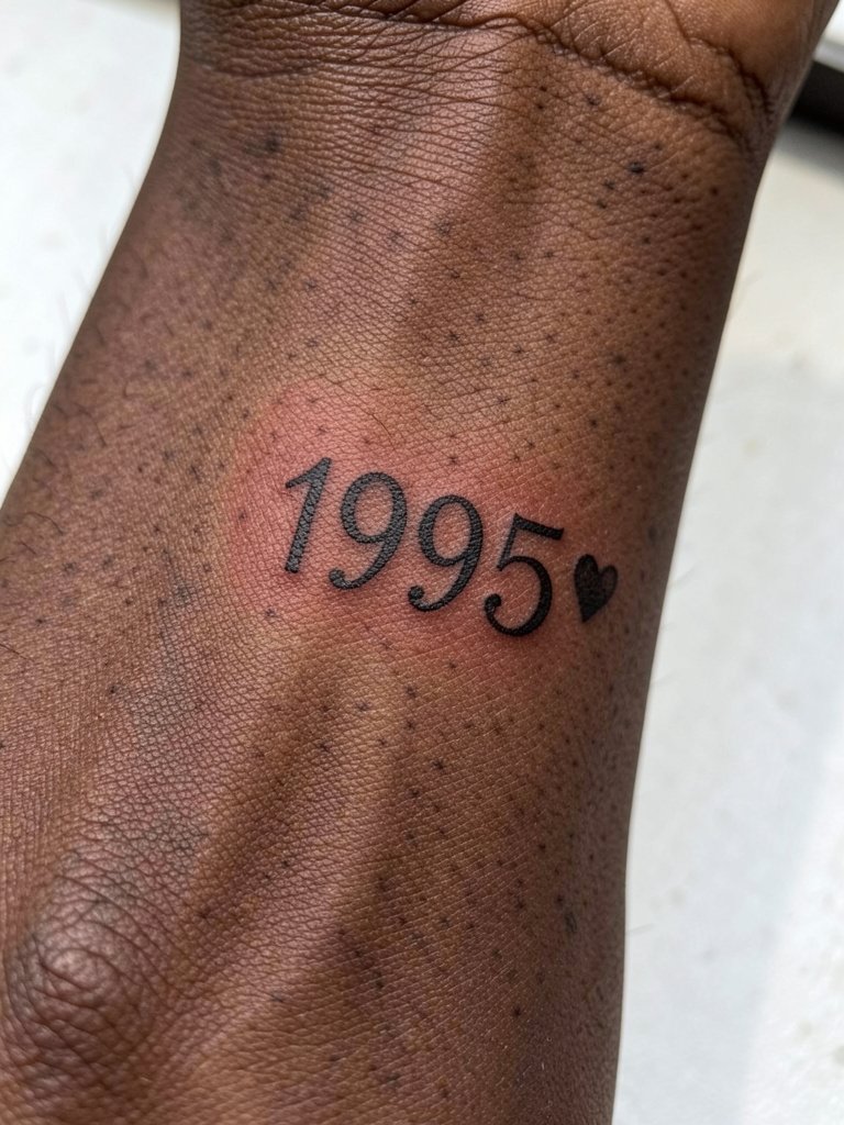
A micro heart gives the year an emotional accent without crowding the layout. For darker skin plan a slightly thicker heart so it keeps solid contrast in photos. During the consult ask for heart diameter relative to the numeral x-height so the mark reads as a dot replacement rather than a separate motif. People often request an impossibly tiny heart that looks good in a mockup but disappears in low-light phone images. Session sensation is a sharp pinch on the inner wrist. For showing off the piece, balance with stacked bracelets on the opposite wrist so the accent is the subtle focal point.
8. Roman Numerals Wrapped Around Wrist
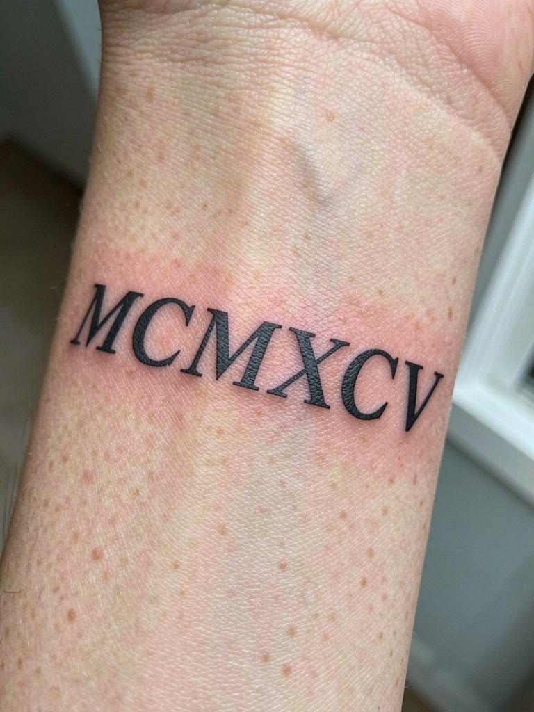
Wrapping numerals across the wrist uses anatomy to create flow. Ask the artist to draft the curvature on your wrist before inking so the text doesn’t read crooked after healing. The chief mistake is ignoring wrist flexion and placing the curve too tight, which shortens the glyphs visually when you move. For session wear, a sleeveless top gives the artist room to rotate your arm into the exact position for stencil placement. Expect two short passes as the artist follows the bone contour, and plan a touch-up if the outermost stitches settle shallowly.
9. Birth Year + Angel Number Detail
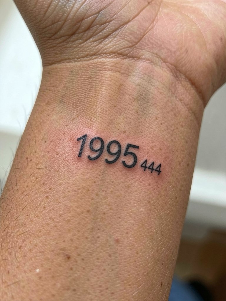
Adding an angel number or spiritual digit cluster gives the design an extra layer of meaning without adding bulk. Decide which sequence sits best beside the year and ask the artist to show the exact kerning because small numerals can merge. A mistake is picking multiple micro numbers that create visual clutter at a small scale. This layout is great for people who like an easter egg in the tattoo. For the session, bring a photo of how you normally wear bracelets so the artist can test composition against your usual jewelry.
10. Vertical Birth Year Down the Spine (Statement Alternative)
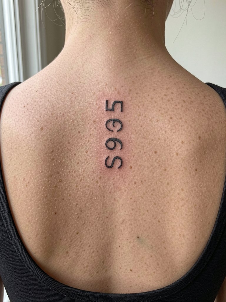
If you want a bolder, vertical read without wrist fragility, the spine is a strong alternative. Expect longer session time than a wrist micro piece because the column is taller and requires consistent spacing top to bottom. Tell the artist exactly how much of your spine you want covered and bring reference photos of open-back clothing you plan to wear. A common regret is choosing a too-tall column that interferes with clothing lines or daily sun exposure. During healing avoid direct sun on the back and schedule a touch-up at six months if tiny spacing softened.
11. Custom Symbol Mashup (Year + Personal Icon)
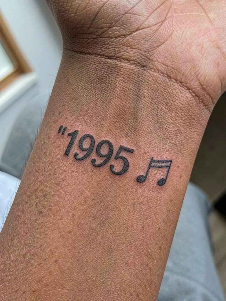
Personal icons make the year more than a number. Pick an icon whose visual mass complements the numerals rather than competes. For example, a musical note reads well if its stem height aligns with the number x-height. Ask the artist to scale the icon so it sits in balance. A mistake is packing a detailed icon into a micro space and losing definition. When showing this pair off, wear a neutral tank or loose-fit cotton tee so the wrist is visible, and consider a slim bracelet on the opposite wrist to balance the look [https://www.amazon.com/s?k=neutral+tank+top+women&tag=inkalerts-20].
12. Brush Lettering Birth Year (Large Scale)
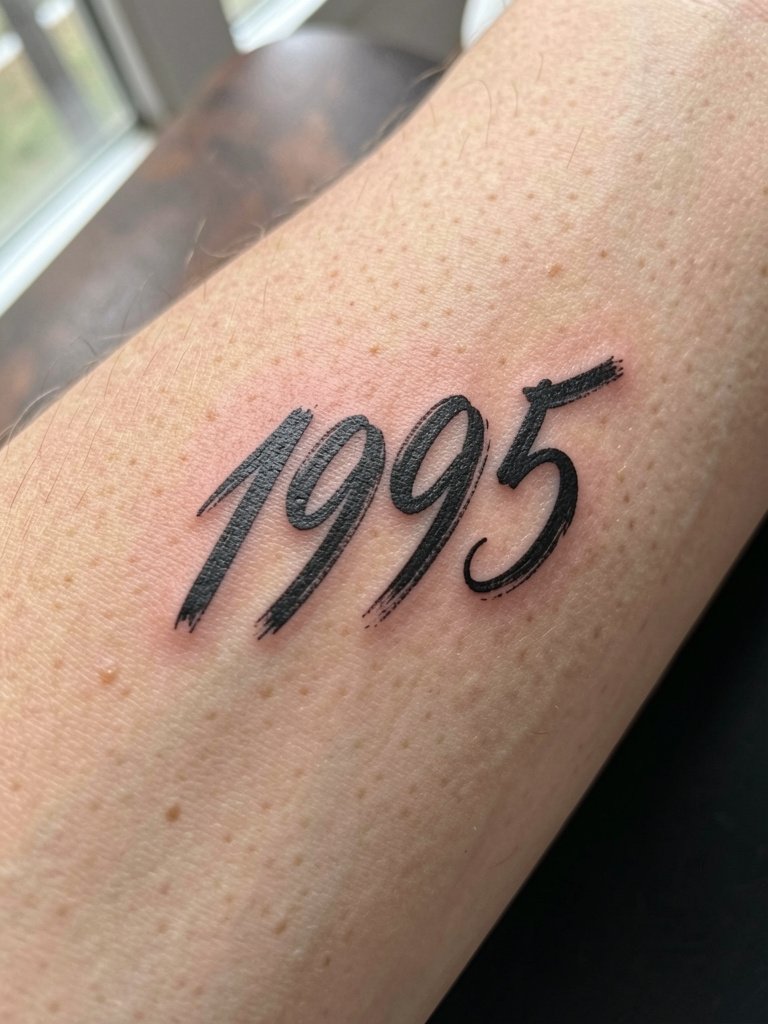
Brush lettering reads best when scaled up because the variable stroke widths need space to breathe. This is ideal for someone who wants the birth year to have an artistic presence on the inner forearm rather than a discreet wrist mark. Ask the artist for a few freehand sketches to capture the stroke rhythm you like. Mistakes include forcing a brush script into a tiny wrist area where the thick-to-thin transitions disappear. Wear a short sleeve for the session so the artist can access the full forearm without fabric bunching.
13. Micro Boxed Numerals (Label Vibe)
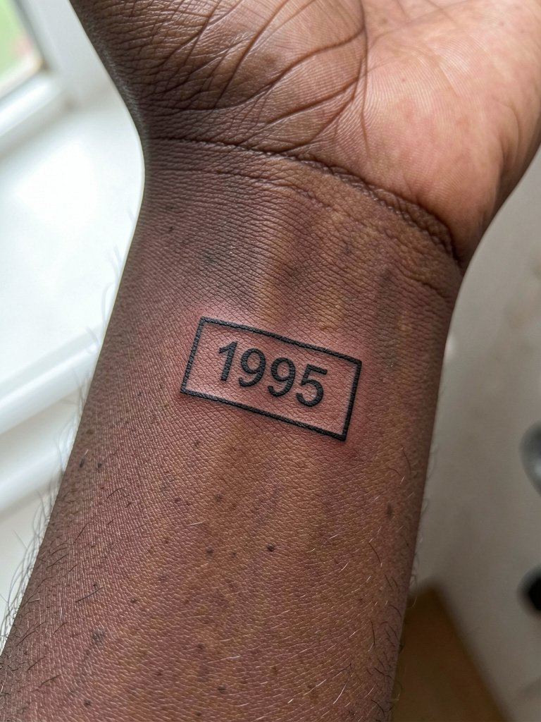
The "museum tag" or label aesthetic uses a tiny box to make the year feel like a curated object. The key is matching the box stroke to the numerals so the whole stamp reads intentional. Ask the artist to show the exact clearance between numerals and box in a stencil preview. A common error is a box that's too tight, which makes the interior look cramped after healing. For wardrobe pairings, a rolled cuff linen button-up gives the same curated vibe and frames the boxed year nicely [https://www.amazon.com/s?k=linen+button+down+shirt+women&tag=inkalerts-20].
14. Birth Year in Dot-Spaced "Label" Style
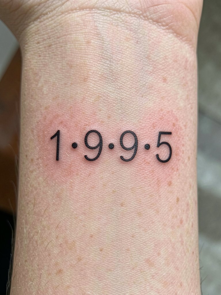
Spacing the digits with small dots creates a label effect that slows the eye and reads deliberately. The risk is over-compressing the dots and numbers so they merge into a string. Tell the artist the exact dot diameter and spacing you want and have them show the mockup at actual size. If your skin tends to blur fine detail, ask for slightly larger interpuncts and a bit more kerning between numerals. Session wear is a short sleeve or sleeveless top so you can rest the arm palm-up comfortably while they work.
15. Birth Year + Minimal Coordinates Style
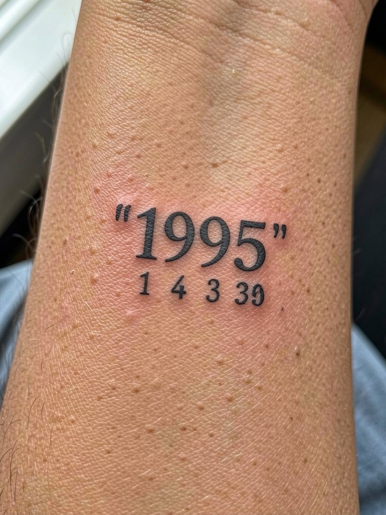
Pairing the birth year with minimalist coordinates turns the numbers into a personal locator without bulk. For a crisp result request monospace numerals and precise alignment so the stack reads as deliberate. The common mistake is inconsistent baseline alignment that creates a lopsided feel. For session clothing, a loose short-sleeve tee keeps the forearm accessible and prevents cuffs from rubbing the fresh ink. If you plan to photograph it often, avoid shiny bracelets that create glare over the digits.
16. Negative-Space Year in a Tiny Geometric Badge
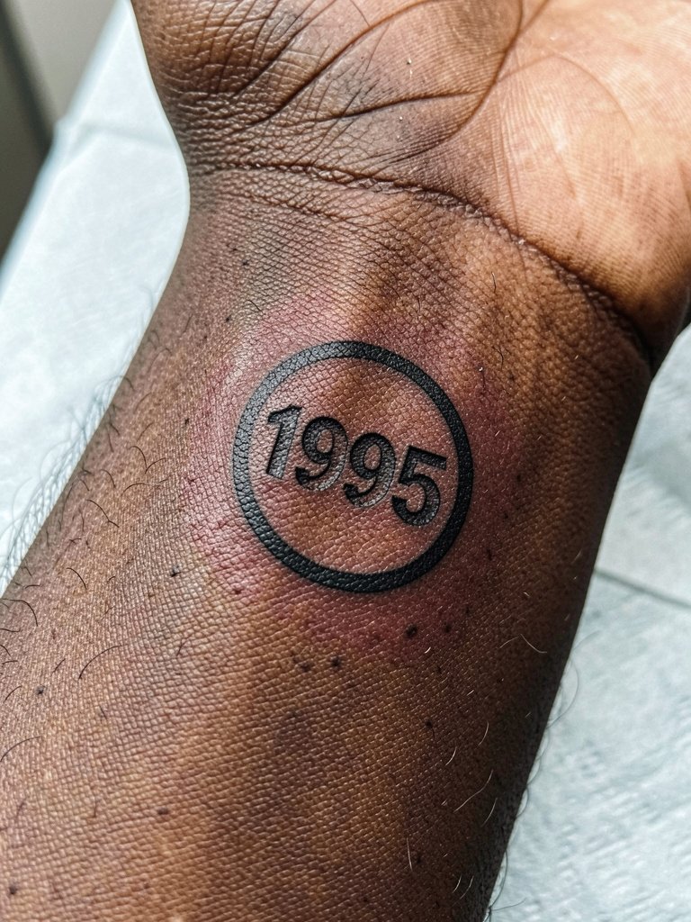
Using negative space creates a tiny badge effect that reads from a distance because of the strong silhouette. Discuss exact badge diameter and the proportion of black fill versus negative digits. A miscalculation here makes the numerals disappear into the fill. This layout is ideal if you want the year to read as a graphic mark rather than typographic digits. For showing off try a dainty bracelet on the opposite wrist and neutral sleeves so the badge becomes the focal point [https://www.amazon.com/s?k=dainty+gold+stacked+bracelet+set&tag=inkalerts-20].
17. Stacked Two-Line Arabic Year
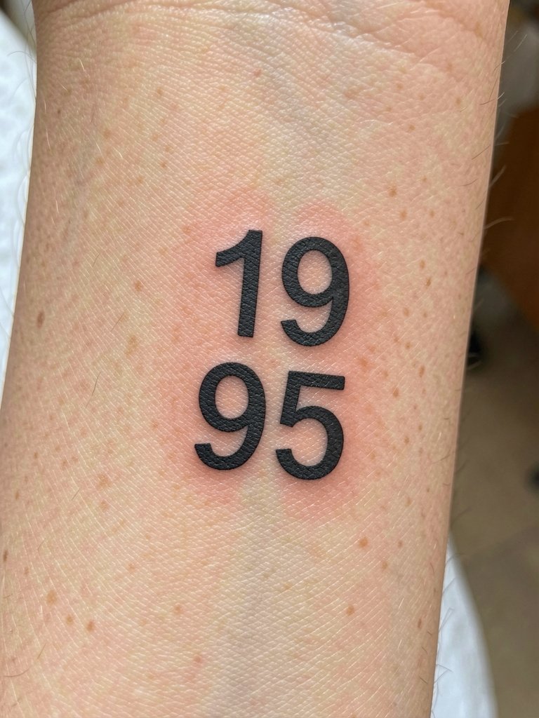
A two-line stack lets the year sit vertically while still using Arabic numerals. It gives a compact, badge-like footprint that still reads clearly. Ask the artist to preview both stacked and single-line versions at the actual inch size so you can judge legibility in photos. Many people make the mistake of compressing numerals vertically which narrows counters and leads to a gray, muddy look during healing. Session sensation is quick and sharp on the wrist, and most stacks are complete in a single short appointment.
18. Micro Monogram With Year Underneath
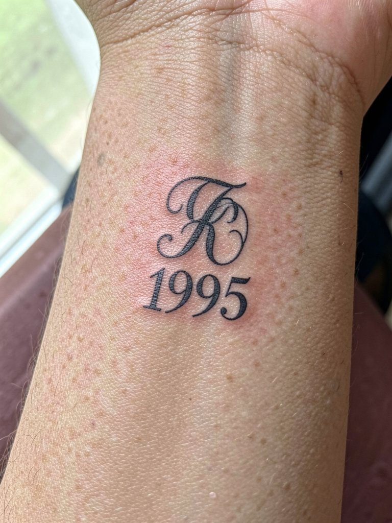
A tiny monogram plus year compresses identity into a compact emblem. Make sure the monogram lines are not so thin that they vanish in lower contrast photos; a little saturation helps. People often ask for filigree monograms at micro scale and then regret the unreadable mess. For showing off, wear short sleeves and a minimalist watch so the emblem sits in a clean frame. During the consult specify the exact spacing between monogram and numbers to avoid visual crowding.
19. Block Numerals With Slight Distress
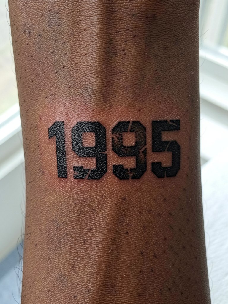
Block numerals with controlled distress give a graphic, slightly aged look without sacrificing readability. Ask the artist to preview the distress scale so the gaps do not become full breaks after healing. Too much distress at a micro scale creates patchy healed results. This style pairs well with rolled sleeves and a casual watch for a modern, editorial feel [https://www.amazon.com/s?k=short+sleeve+loose+tee&tag=inkalerts-20]. Expect a firmer sensation on the wrist bone where the machine follows the hard contour.
20. Tiny Script Year Along Bracelet Line
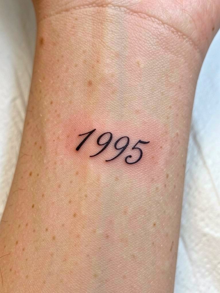
Placing script along the bracelet line mimics jewelry and looks integrated with accessories. Have the artist write the script freehand on paper first so you can confirm slant, size, and rhythm. Many scripts fail because the slant is wrong for the wrist curvature, which creates awkward foreshortening. For showing the piece, wear open bracelets or cuff styles that sit below the ink so the script remains unobscured. During the session take micro-breaks if the needle vibration becomes fatiguing.
21. Minimal Negative-Outline Year
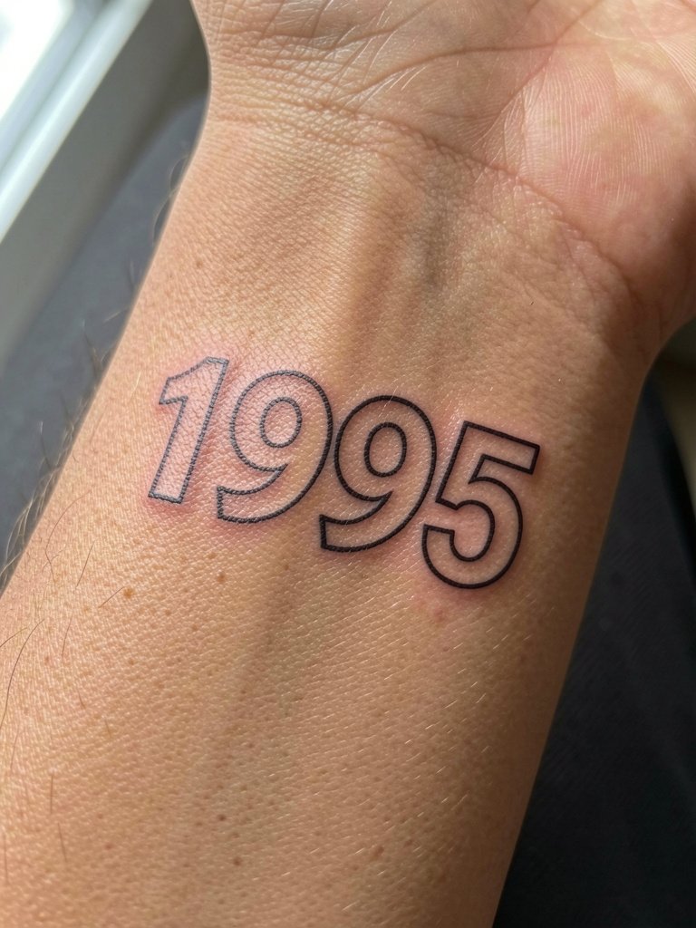
An outline-only approach reads airy and modern but it relies on crisp edges to remain legible. Ask for slightly reinforced outer lines so that counters do not collapse into gray smudges. A common error is asking for ultra-thin outlines that transform into faint shadows in photos. This style pairs best with minimal wardrobe choices like neutral tees or rolled sleeves so the outline stays the focal point. Expect a short appointment and plan a quick touch-up at six months if thin outlines show early softening.
Frequently Asked Questions
Q: Will Roman numerals blur faster on the wrist than Arabic numbers?
A: They can if the numerals are tight and the linework is too thin. One camp favors Roman numerals for their classic look and accepts slightly larger characters to prevent blur. The other camp prefers Arabic digits for simpler shapes that hold up on moving wrist skin with less spacing. If you like Roman numerals, ask for wider spacing and slightly heavier terminals so the strokes do not merge over time.
Q: How painful is a wrist birth-year tattoo for a first-timer?
A: Expect a sharp pinch on the inner wrist and a firmer scrape on the outer wrist bone. The inner wrist feels more like a quick, acute pinch for most people. Bring a light snack, stay hydrated, and wear a short sleeve so the artist can move your arm into a comfortable, stable position during the session.
Q: What line weight should I request for dark skin so numbers don’t look gray in photos?
A: On melanin-rich skin choose a slightly bolder visual stroke so the saturation stays black instead of gray in pictures. Specify that you want the numerals to read as solid black in healed photos and ask the artist to show healed work on similar skin tones. If you want a very fine look, plan for a realistic touch-up timeline because micro detail can need reinforcement.
Q: Where can I find local artists and healed portfolio examples without naming specific studios?
A: Search hashtags like #birthyeartattoo, #minimaltattoo, and #finelinetattoo on Instagram and TikTok and filter by location to find nearby portfolios. Tattoodo and the Inked App let you search by keyword combinations such as "Roman numerals wrist" and often show healed examples. Reddit communities like r/tattoos and r/tattooadvice surface first-hand photos and booked-artist feedback that help you compare healed results across skin tones.
Q: How soon should I schedule a touch-up for a wrist year piece?
A: Plan for a touch-up around six months to a year if you want the lines to stay crisp. Wrist skin moves and rubs a lot, so even well-executed fine-line work sometimes needs a small saturation pass. If you notice early softening at the three- to six-month mark, a quick touch-up can restore contrast and prolong the design’s clarity.
Q: What should I wear to the session for a wrist or forearm year tattoo?
A: Wear a short sleeve, sleeveless top, or loose-fit cotton tee so the artist can position your arm palm-up with no tight cuffs pressing on fresh ink. For spine or back placements bring a button-down or zip hoodie that you can remove easily to give the artist full access. If you want simple outfit ideas for showing the finished wrist piece, a rolled-cuff linen shirt or a neutral tank pairs well [https://www.amazon.com/s?k=open+back+dress+women&tag=inkalerts-20].
Q: How do I avoid early blowout on a wrist micro number?
A: The key is starting with the right line weight and spacing. Ask the artist to keep line depth consistent, avoid cramming letters, and leave extra negative space. If an artist pushes single-needle ultra-fine lines for a wrist number, have them show healed examples on wrist skin to confirm the technique works for your placement and skin type.