
Lettering tattoos look simple from a distance—but every artist knows they’re one of the hardest styles to execute cleanly. One wobble, one poorly placed stroke, one smudged stencil, and even the most beautiful word can turn into a future blur.
Before needle meets skin, it helps to see how clean lettering should look.
If you’ve ever wondered how pros keep scripts crisp, lines consistent, and fonts readable for years, this guide breaks down everything—needles, spacing, stencil secrets, pressure control, and the aging science behind clean script.
Let’s dive in.
Start With the Right Stencil (Your Tattoo’s Blueprint)
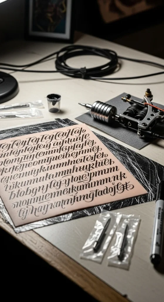
A lettering tattoo is only as good as the stencil. This is your map, your guide, and your safety net.
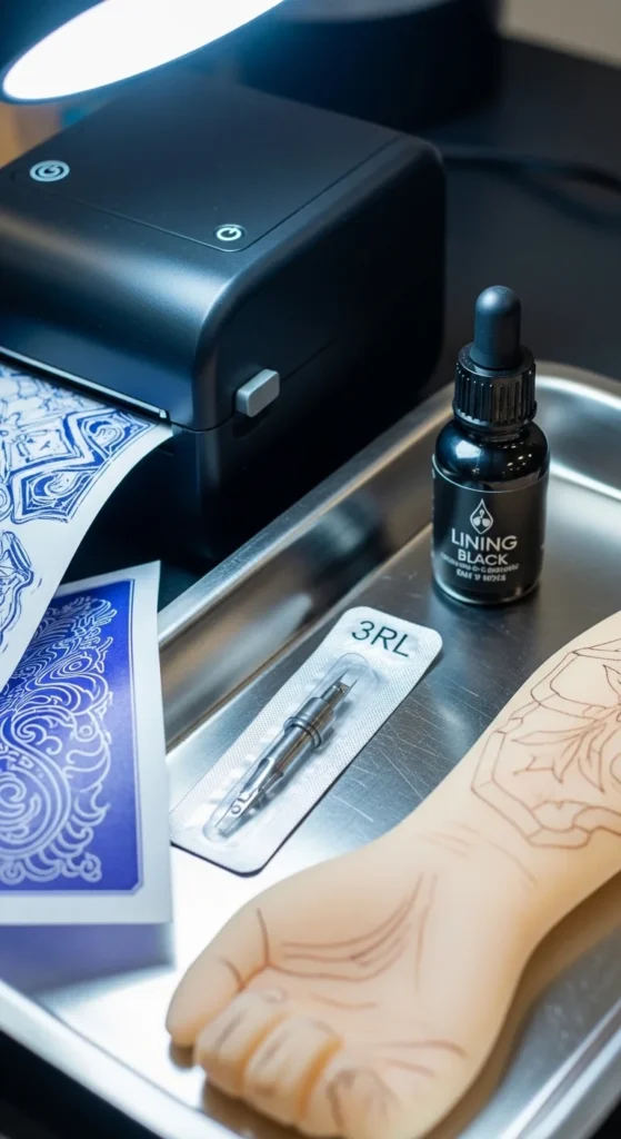
Choose high-clarity stencil paper
Top choices include:
- EZ Tattoo — loved for crisp detail accuracy
- Spirit Classic — the industry standard for beginners
- S8 red transfer sheets — great contrast on lighter skin
- Ozer — ideal for tiny dots and micro-details
Let the stencil dry fully
Artists from multiple studios agree:
If you rush the drying process, the stencil will smear.
Give it 10–15 minutes minimum—more on sweaty or humid skin.
Create enough spacing
Remember: ink migrates.
Letters placed too close together (<10–20% spacing) can “melt” over time.
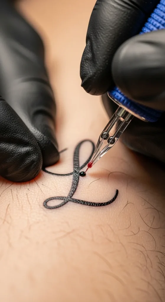
Master Your Needle Sizes (The Secret to Line Consistency)
Lettering has extremely specific needle needs. Using the wrong needle is the #1 cause of thick, shaky, or “blobby” text.
Best needle pairings for fonts
- Cursive / Script Fonts:
3RL or 5RL for graceful, thin upstrokes and smooth curves. - Gothic / Blackletter:
7RL or 9RL to keep wide blocks readable and bold. - Sans-serif minimalist text:
3RL for timeless, delicate lines that age well.
Pressure + float technique
Float your needle lightly during upstrokes—pressing too deep causes blowouts.
Downstrokes can be firmer but still controlled.
Keep the skin stretched
Always:
- Use your stretch triangle (thumbs + fingers)
- Pull the skin before the stroke begins
- Maintain equal pressure through curves
You’ll feel the difference immediately—your lines stop wobbling.
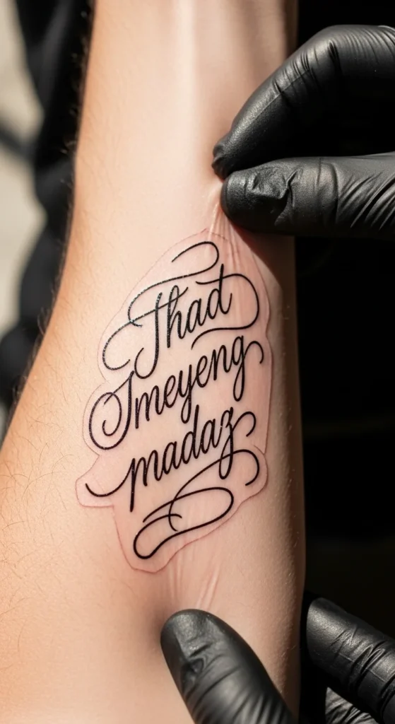
Outline First, Then Shade or Add Weight
Lettering should never be filled or weighted before the outline is perfect.
Why outline first?
- It sets the boundaries of each letter
- Prevents accidental thickening
- Keeps curves symmetrical
- Ensures baselines stay aligned
Once the outline is locked in, you can go back and add:
- Brush-style thick downstrokes
- Subtle graywash shadows
- Weight variations for cursive dynamism
Create Consistency With Flow Lines
Professional lettering artists often lay down invisible guidelines to keep everything straight and clean.
Use three essential flow lines
- Baseline — where letters sit
- X-height — height of lowercase letters
- Cap line — height of uppercase letters
This tiny step instantly improves proportion, especially in longer quotes.
Italic slant matters
For cursive lettering:
- Use a consistent rightward slant
- Keep the angle the same for every letter
- Match upstrokes and downstrokes
It gives the entire word a “moving” feel instead of an uneven wobble.
Avoid Common Mistakes That Destroy Lettering Over Time
Even beautifully executed tattoos can age poorly if these details are ignored.
1. Fonts that are too small
Anything under ¼ inch is at high risk of becoming a smudge in 1–3 years.
Ink spreads — especially on wrists, ribs, ankles, and hands.
2. Poor aftercare
Lettering demands:
- No sun (fades strokes)
- No over-moisturizing (murky lines)
- No scratching (breaks strokes apart)
3. Wrong placement for thin scripts
Areas that move and twist a lot can distort lettering:
- Sides of fingers
- Wrists
- Inner elbows
- Ankles
4. Not checking spelling 3–5×
Misspelled tattoos are still the #1 lettering regret worldwide.
Always confirm:
- Spelling
- Punctuation
- Language translation
- Accent marks
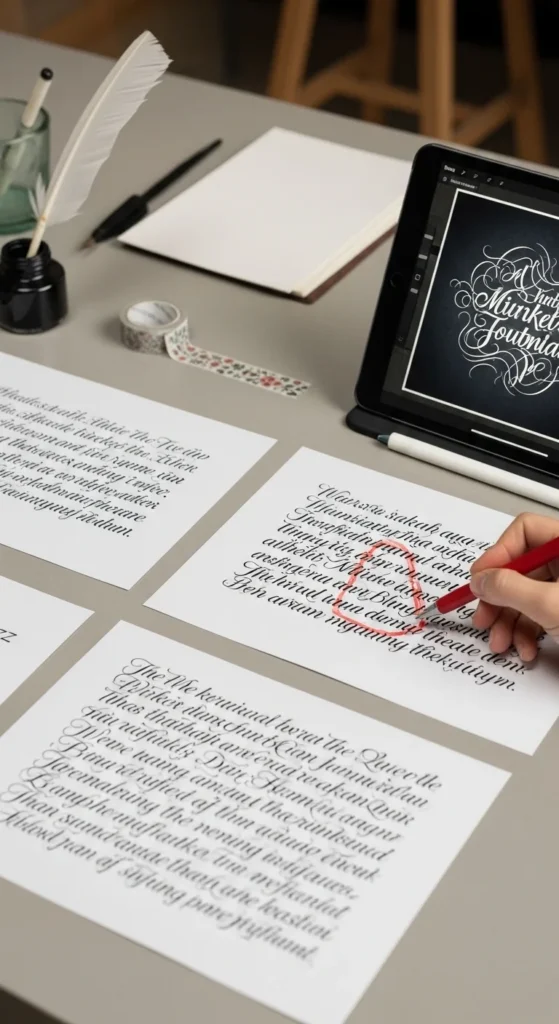
Practice Routines That Build Skill Fast
If you’re still getting comfortable with lettering, regular practice builds muscle memory faster than anything else.
Use practice skin for drills
Try:
- Straight baseline lines
- 5–10 repeated cursive “e” loops
- Brush-style thick-thin transitions
- Gothic block tests with 7RL/9RL
Practice dip rhythm
Dip ink:
- Once per line, or
- Every few letters
Fresh ink = cleaner contrast.
Improve your hand stability
Do these three drills:
- Air strokes over stencil before touching skin
- Shoulder-led movement (reduces wrist wobble)
- Slow movement through curves
The Longevity Formula (What Makes Lettering Stay Sharp)
If you want lettering that still looks crisp after 5–10 years, follow this aging formula:
1. Use slightly larger sizing
Small text is cute—but medium text survives.
2. Increase spacing by 10–20%
This creates room for natural ink migration.
3. Choose the right style
Best long-term styles:
- Minimalist sans-serif
- Medium-size block text
- Clean cursive with wider spacing
4. Use premium stencil paper + thermal printers
They create sharp blueprints that reduce error.
5. Prioritize aftercare
The sun is lettering’s #1 enemy.
Final Takeaway
Lettering tattoos look effortless—but the skill behind them is anything but.
Precise stencils, correct needles, skin tension, spacing, and pressure all work together to create a script that stays beautiful for life.
Save this guide for your next lettering session—and keep your lines crisp forever.
