
Choosing the perfect tattoo font feels simple—until you realize how many styles, scripts, and tiny details affect how it will look years from now. Fonts age differently on skin, some blur faster, some stay crisp for decades, and some turn into unreadable smudges if they’re too small. The good news? With a few smart steps, you can pick a font that looks meaningful, stylish, and long-lasting.
Let’s walk through exactly how to choose a tattoo font you won’t regret.
1. Start With Readability: The Rule That Matters Most
If you take away one thing, let it be this: readability beats aesthetics every single time.
Tattoos naturally blur 20–30% over ten years. Thin lines fade faster. Small cursive becomes hard to read. This is why artists obsess over bold, stable line widths.
What to do:
- Choose fonts with thick strokes and good spacing.
- Avoid ultra-thin cursive for anything smaller than 1–2 cm per letter.
- Print the font at actual size, tape it on your skin, and step back.
Quick Readability Hacks
- Look at the font from 6–8 feet away.
- Take a photo with your phone—blur shows instantly.
- Try bolding the font by 5–10% before sending it to your artist.
This “test first” approach prevents the #1 regret people share: “I didn’t think about how it would age.”
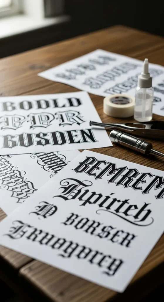
2. Match the Font Style to the Meaning
Different messages need different moods. A meaningful quote shouldn’t look like a sports jersey. A bold name tattoo shouldn’t look like wedding script. Matching the font to the emotion of the message makes your tattoo feel intentional.
Popular Style Matches:
- Script fonts → Romantic, emotional, soft messages
- Sans-serif → Clean, minimal, modern
- Old English / Gothic → Classic, bold, heritage-inspired
- Chicano script → Flowing, stylish, expressive
- Block letters → Strong, high-readability statements
Tip: Create a Mood Board
Gather screenshots from Pinterest, font websites, and Instagram healed tattoos. You’ll notice your taste forming a clear pattern.
3. Consider Longevity: What Ages Well on Skin
Some fonts simply age better:
- Sans-serif fonts (like Helvetica-inspired styles) stay crisp.
- Old English and Gothic hold their structure well.
- Thick Chicano scripts age gracefully if not too tiny.
What struggles long-term:
- Tiny cursive
- Ultra-thin lines
- Overly ornate flourishes
- Super-tight spacing
Think About Body Placement
Areas that move or stretch more will distort fonts faster:
- More stable: forearm, upper arm, shoulder, calf
- More stretch-prone: wrist, ribs, stomach, fingers
So if you want script on your wrist, consider choosing a bolder, cleaner style for better readability over time.
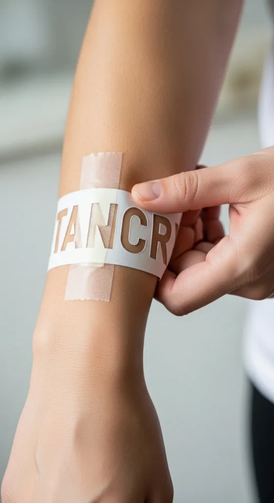
4. Test Before You Commit (The Printer Trick That Works)
One of the best-kept secrets in tattoo design is the print-and-preview test.
How to Test:
- Type your phrase in the chosen font.
- Print it at real-life tattoo size.
- Cut it out and tape it on the body part.
- Move your arm or body—see how the shape changes.
- Take photos from different distances.
You’ll instantly see whether a letter is too small, too tight, or oddly shaped with movement.
Bonus: Do a “10-Year Simulation”
Most artists will bold the lines slightly or widen spacing to make the tattoo hold up with age. Ask for a version that shows this.
5. Customize With an Artist (The Step Most People Skip)
Even the best digital fonts rarely transfer perfectly onto skin. Tattoo artists adjust fonts by hand to make them flow with body curves, bone structure, and natural movement.
Ask Your Artist To:
- Adjust spacing (called kerning)
- Thicken lines for longevity
- Simplify overly complex ligatures
- Align the tattoo with muscle lines
- Add subtle custom flourishes
A great artist will also show you healed examples of their lettering work—this is crucial. Fresh tattoos always look sharp; healed ones tell the truth.
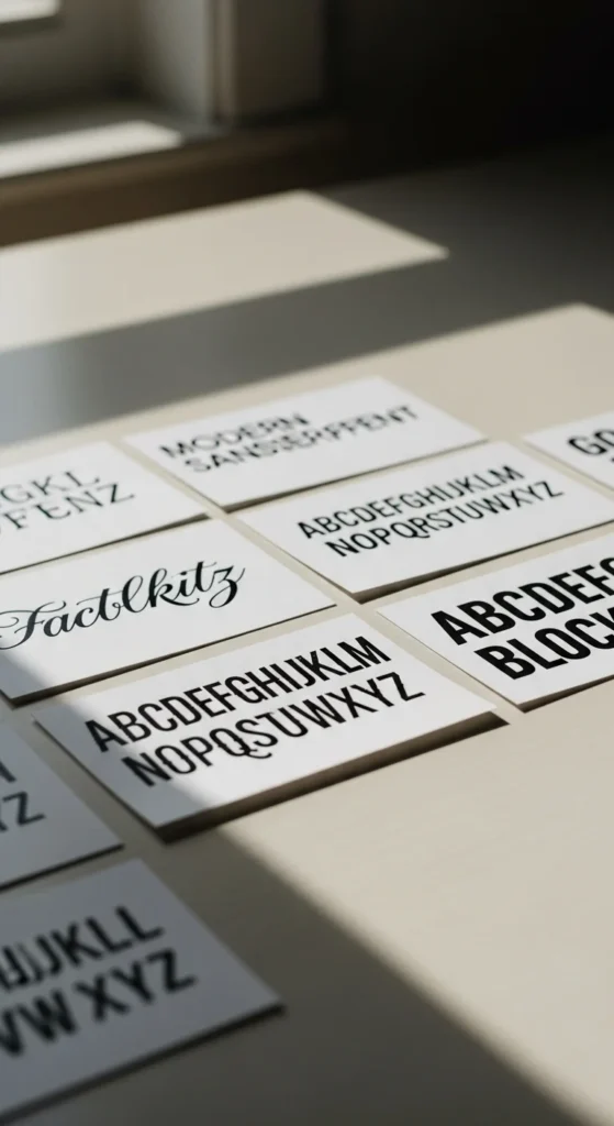
6. Avoid Overused or Low-Quality Fonts
Some fonts are so common they lose personality—basic cursive, generic handwriting styles, or system fonts from your computer.
Instead, explore:
- Chicano-inspired scripts
- Minimalist sans-serif
- Premium script fonts
- Soft bold scripts
- Modern serif blends
Want something truly unique? Ask for hand-lettered custom work. It’s one-of-a-kind and designed just for your body.
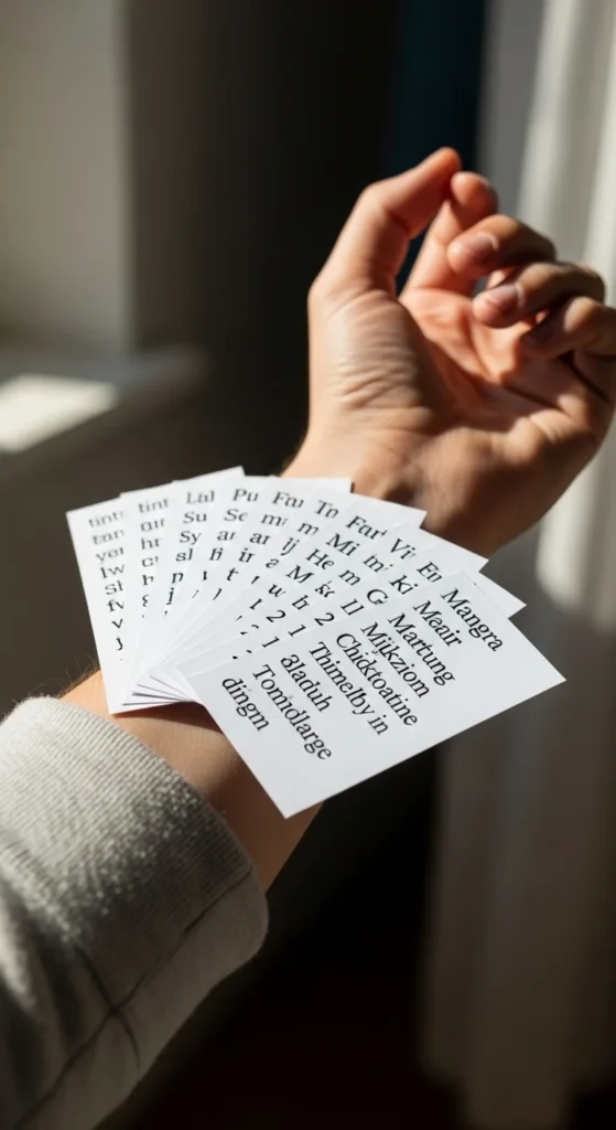
7. Use Online Tools to Preview Your Text
Font generators are perfect for fast experimentation. You can test dozens of options in minutes. Great for:
- Visualizing script variations
- Comparing thickness
- Checking uppercase/lowercase styles
- Screenshotting options for your artist
Just remember: don’t pick solely from a website preview—always print and test on skin.
Final Takeaway
Choosing the perfect tattoo font is about balancing style, meaning, and long-term readability. Test your designs, match the mood, and let your artist refine the details so your lettering looks just as good in ten years as it does on day one.
If this guide helped you confidently choose your tattoo font, save it for later or share it with someone planning their next tattoo!
