
Choosing a tattoo font sounds simple… until you’re staring at hundreds of options and suddenly can’t tell serif from script. Your tattoo’s lettering isn’t just decoration—it’s the entire tone of the message inked on your skin. Whether you’re planning a tiny quote or a bold name piece, the right font makes all the difference.
In this guide, you’ll learn how to pick a font that looks gorgeous on your skin, suits your message, and stands the test of time.
Understand the Meaning Behind Your Words
Before you even browse fonts, think about what your tattoo says—literally and emotionally. The message should guide the style.
A soft, sentimental quote pairs well with flowing scripts. A bold statement may deserve thick, sharp lettering. A date or initials might look best in something clean and timeless.
To narrow it down quickly, ask yourself:
- What feeling do I want the tattoo to give?
- Do I want it delicate, bold, modern, vintage, mysterious, or strong?
- Will this message still hold meaning decades from now?
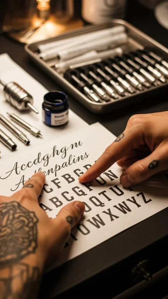
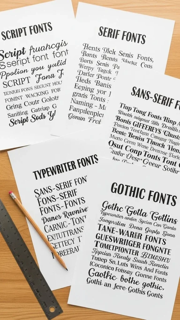
Know the Main Tattoo Font Categories
Understanding the big style families will help you match your message to the perfect look.
1. Script Fonts
Think flowing handwriting, elegant curls, or soft brush strokes. Great for names, romantic phrases, or personal mantras.
2. Serif Fonts
Classic and readable, with small decorative “feet” on the letters. Perfect for timeless, meaningful text.
3. Sans-Serif Fonts
Clean, minimal, and modern. Great for dates, coordinates, simple phrases, and subtle tattoos.
4. Typewriter Fonts
Vintage-feeling, textured, and nostalgic. Ideal for meaningful quotes that feel personal or poetic.
5. Gothic or Blackletter Fonts
Bold, dramatic, and ornate. Best for phrases that need intensity or old-world character.
Test the Font in Different Sizes
What looks pretty on your screen can become unreadable in tiny lettering. Tattoo fonts shrink, blur, and soften over time—so size matters.
Here’s how to check readability:
- Print the text at the exact size you want.
- Hold it at arm’s length.
- Glance quickly—can you still read it?
- Shrink it slightly. Is it still clear?
Thin scripts and ultra-detailed fonts often need more space. Bold or simple fonts can go smaller without losing clarity.
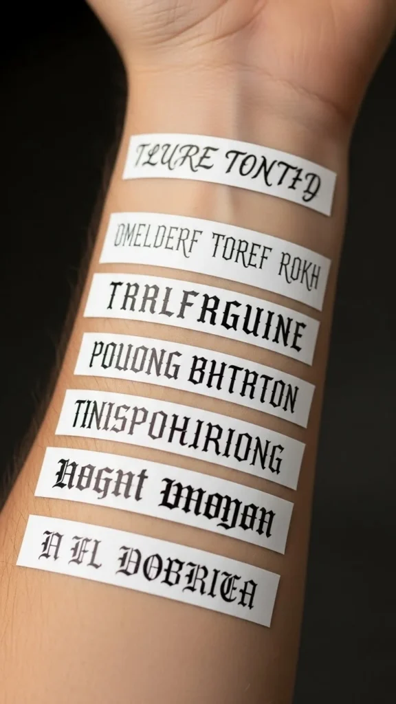
Consider Placement and Skin Texture
Different body areas change how a font ages. Areas with more movement or thinner skin may cause lettering to spread slightly over time.
Keep this in mind:
- Ribs, collarbones, ankles → fonts stay elegant but need clean, simple lines
- Wrists, hands, fingers → smallest details may blur quickly
- Forearms, shoulders, upper arms → best spaces for detailed fonts
If your placement has a lot of movement, prioritize readability over decoration.
Think Long-Term: How Will It Age?
Your tattoo evolves with your skin. Some fonts age gracefully, others lose shape faster.
Fonts that typically age well:
- Clean sans-serifs
- Simple serif fonts
- Medium-weight scripts
- Slightly bold typewriter-style fonts
Fonts that need caution:
- Extra-thin scripts
- Maximalist decorative fonts
- Super-tight spacing
A great artist can guide you, but your font choice still matters. A tiny, thin script might look perfect today… and fuzzy in ten years.
Match the Artist to the Font Style
Just like painters have different strokes, tattoo artists have different lettering strengths.
Look for artists who specialize in:
- Calligraphy-style tattoos
- Micro lettering
- Typography tattoos
- Script or gothic styles
Check their portfolios closely. Does their lettering look clean and consistent? Are curves smooth? Are lines crisp?
If you already know your font, pick an artist who does similar work beautifully.
Ask Your Artist for Custom Adjustments
Even if you find a great font, most artists will refine it so it flows better on your body.
They can:
- Balance spacing
- Adjust swirls or flourishes
- Make letters more readable
- Curve the text to fit placement
- Bold thin lines for longevity
This is where the magic happens—a custom tattoo beats a basic font every time.

Print, Trace, and Wear-Test
Before committing, “wear” your font for a day.
Try this:
- Print your text at full size.
- Tape it where you plan to put the tattoo.
- Look at it in:
- natural light
- indoor light
- photos
- mirrors
- natural light
- Ask yourself if you still love it after a few hours.
This simple test saves tons of regret.
Final Takeaway
Choosing the perfect tattoo font is part research, part intuition, and part visual testing. When you combine meaning, readability, placement, and style, your lettering becomes something you’ll love seeing every day.
