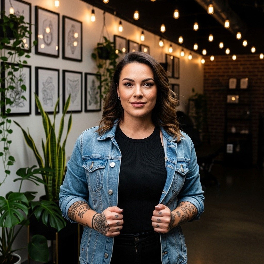
Dark surreal sleeves look like they should be made in one day, but they rarely are. Prices can swell as an artist adds depth, fine lines on the inner forearm often soften faster than clients expect, and too many focal points turn a sleeve into visual chaos. Read the next sections for specific sleeve types, what to bring to a consult, and how to keep surreal ink looking intentional for years.
1. Dark Surrealism Black & Grey Sleeve
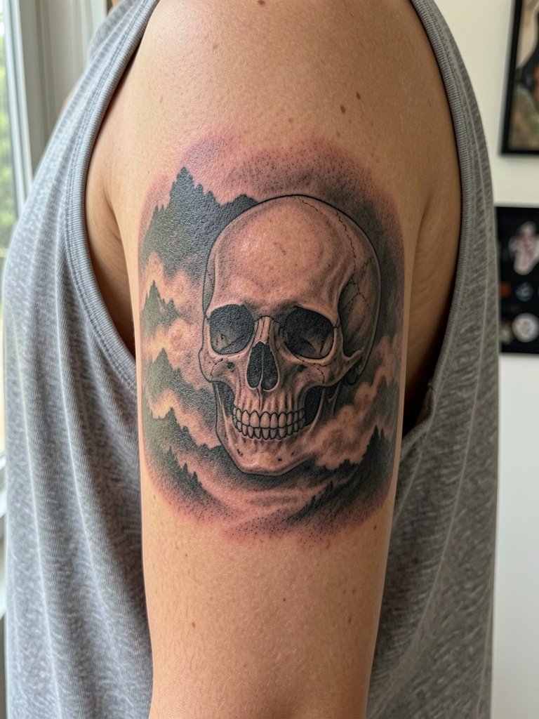
This is the go-to if you want cinematic depth and slow visual decay. Use heavy contrast and value range instead of tiny filigree. Bring two reference photos showing the skull at different scales so the artist can map where features need room to breathe. A common mistake is packing five focal objects into one arm, which removes places for the eye to rest. At six months the darks sit solid, at two years the mid tones mellow, and at five years the strongest blacks still hold the composition. Session feel: expect 3 to 5 long sittings and moderate discomfort on the inner upper arm.
2. Dalí-Inspired Surrealist Sleeve
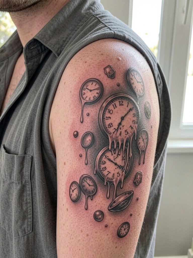
Floating objects and warped perspective read best where the canvas is broad. Talk with your artist about optical edges and where highlights should snap. Avoid tiny clocks with lots of micro-detail; those blur into mush on curved shoulder skin. At six months the gradients look smooth, at two years the soft edges need a gentle touch-up if you want crisp separation, at five years the bold highlights keep the illusion. For showing off this placement pair it with open-collar shirts that leave the shoulder visible.
3. Ethereal "Floating" Surrealism Sleeve
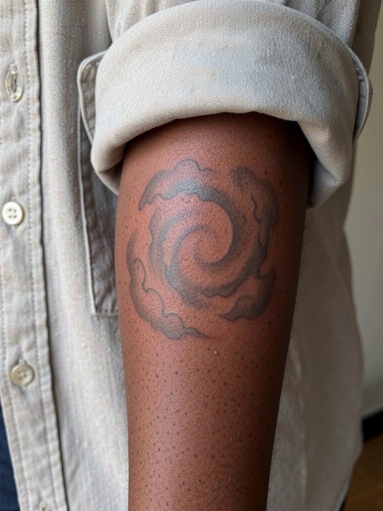
This soft spiral uses negative space as structure, so avoid stuffing it with more icons. Plan the value range early so the mist reads as depth rather than patchy gray as it heals. A real mistake is asking for single-needle micro shading on the palm-up forearm without wider spacing. At six months the fine gradients look airy, by two years the faintest stipple may need a touch-up, and after five years the stronger darks still anchor the flow. For the session wear a loose button-down so the cuff does not rub fresh ink.
4. Patchwork Surrealism Sleeve
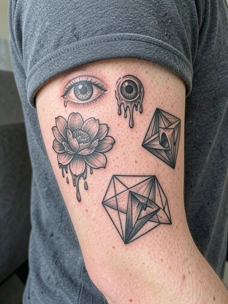
Patchwork lets you build a sleeve over years and control budget by spacing sessions. Decide a visual hierarchy before any single piece goes down. Bring a layout photo that shows spacing at arm scale so the artist avoids accidental crowding. The mistake people make is treating each small piece like a standalone flash without thinking about negative space between them. Healed at six months pieces look stitched together, at two years the gaps define the collage, and at five years the strongest fills still read. To show off the mix pair it with solid color polos.
5. Micro-Realism Surrealist Sleeve
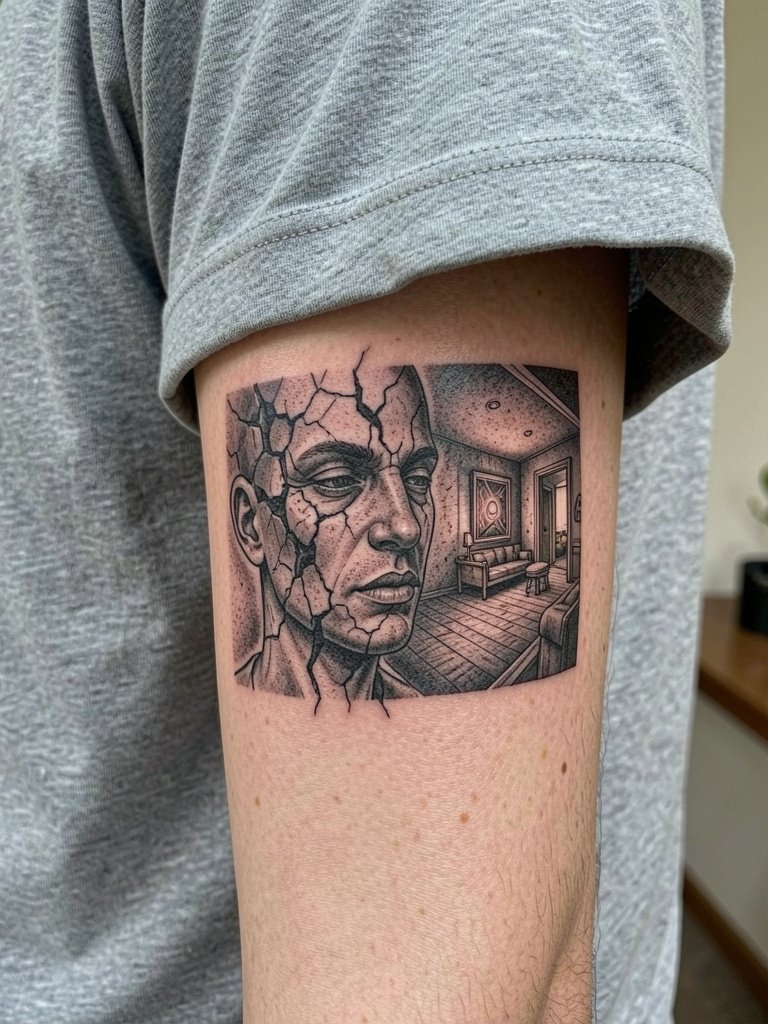
Micro-realism is the technical flex and costs more because of time and single-needle precision. If you want extreme detail tell the artist you expect a multi-session map for scale so each panel has breathing room. Inner forearm single-needle work risks early blur if done too small. At six months the detail snaps, at two years the tiniest lines soften, and by five years the composition needs strategic touch-ups to retain fine elements. Session feel is long and fussy, bring snacks, and wear a loose button-down so cuffs do not press on the fresh ink.
6. Neo-Traditional Surreal Sleeve
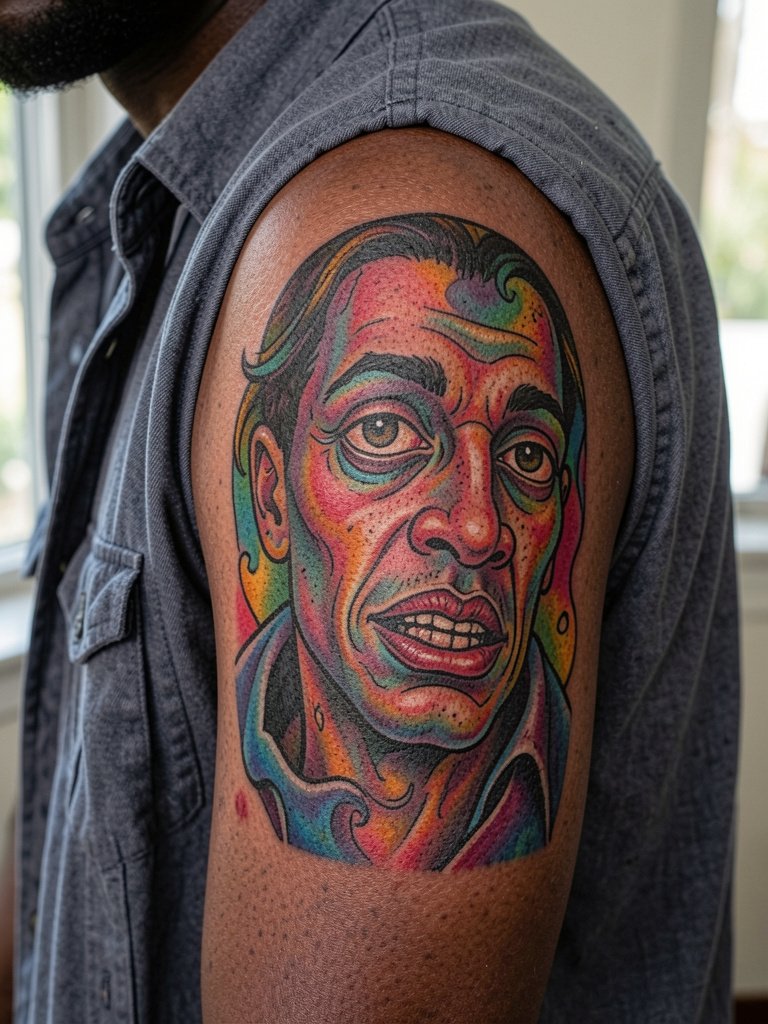
Color adds punch but it carries different longevity trade-offs than black and grey. One camp favors black and grey for cinematic depth. Another camp favors saturated color for visual dynamism. One sentence for each camp: proponents of black and grey say heavy contrast and sharp shadows create depth without hue fade. Advocates of color argue that vibrant saturation brings melting objects and floating figures to life in ways monochrome cannot. For this placement wear navy or burgundy polos to make colors pop when you show the piece off.
Before You Book
The inner forearm and shoulder pieces above each ask for a slightly different first-week routine, so these picks aim to smooth the chair day and early healing.
- Sculpt & Ink Balm. Thinner than heavy ointments, it helps preserve soft gradients without clogging pores on fine-line surreal shading.
- Koshimizu Aftercare. A less greasy finish that keeps black and grey tones looking crisp as the skin peels.
- Tattoo Therapy Spray. Gentle spray for the first 24 hours when heavy contrast needs protection and you want minimal rubbing.
- Saniderm second skin. Protects dense black fills through the first critical days and reduces scabbing that can flatten shading.
- Aquaphor healing ointment. Thin application option for short windows to lock in moisture on high-contrast areas without heavy residue.
7. Optical Illusion Surreal Sleeve
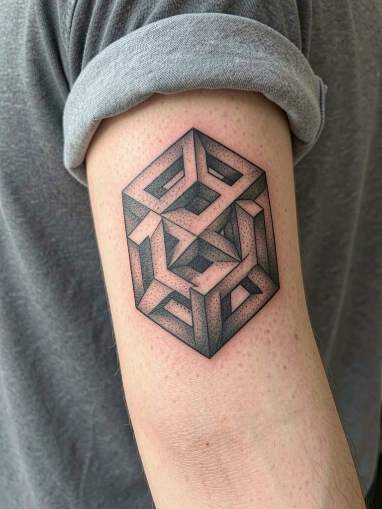
Impossible geometry is all about crisp edges. Ask for clean linework proofed at arm scale so vanishing points align when the arm rests. Common error: making optical gaps too small, which collapses into visual noise as the piece ages. At six months the 3D effect reads clearly, at two years you may want contrast touch-ups to preserve depth, at five years the strongest fills still define the illusion. For session comfort wear a short-sleeve shirt to let the artist roll the sleeve.
8. Minimalist Surreal Sleeve
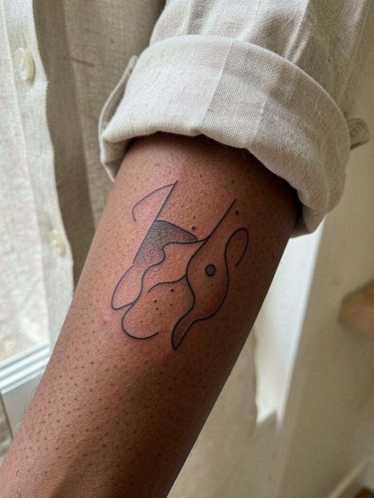
Minimalist surrealism leans on space and restraint rather than detail. Camp A on fine line says delicate textures are essential to a dreamlike feel. Camp B warns that fine lines on high-stretch inner forearm blur faster than bold line and lose form. One sentence for each camp: supporters of fine line accept slight softening as part of the aesthetic and design accordingly. The other group pushes for slightly heavier line weight in key areas so geometry keeps its edge at year three. During the consult bring a scaled mockup so line weight vs spacing is clear.
9. Surreal Botanical Sleeve
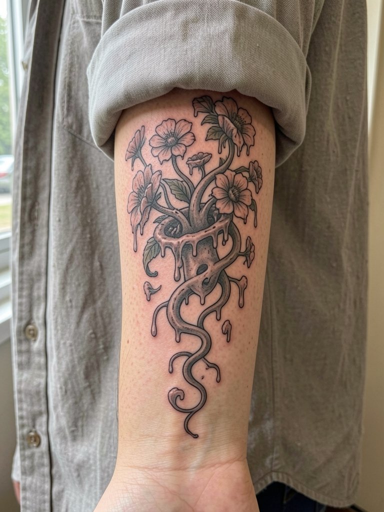
Organic motifs soften surreal imagery and solve the "too dark" problem some people worry about. Ask the artist to plan vine anchors that follow muscle lines so the vegetation curves naturally. A common mistake is over-detailing petals that end up as fuzzy blobs on soft skin. At six months the blossoms read as texture, at two years the main stems still guide the eye, and at five years you will likely only need small touch-ups on the finest dots. Pair with rolled-up linen shirts in neutral tones for editorial framing.
10. Surreal Architectural Sleeve
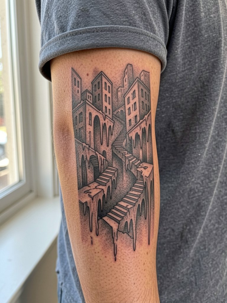
Architecture needs crisp vanishing points. Bring elevation sketches or a few architectural references so the artist can map vertical lines around muscles. Mistake to avoid: forcing horizontal buildings onto a curved forearm without depth fading, which makes perspective read wrong. At six months the structure is strong, at two years depth may need subtle dark touch-ups, at five years the main lines still anchor the silhouette. For session comfort wear a short-sleeve shirt.
11. Dark Surreal Skull-to-Landscape Sleeve
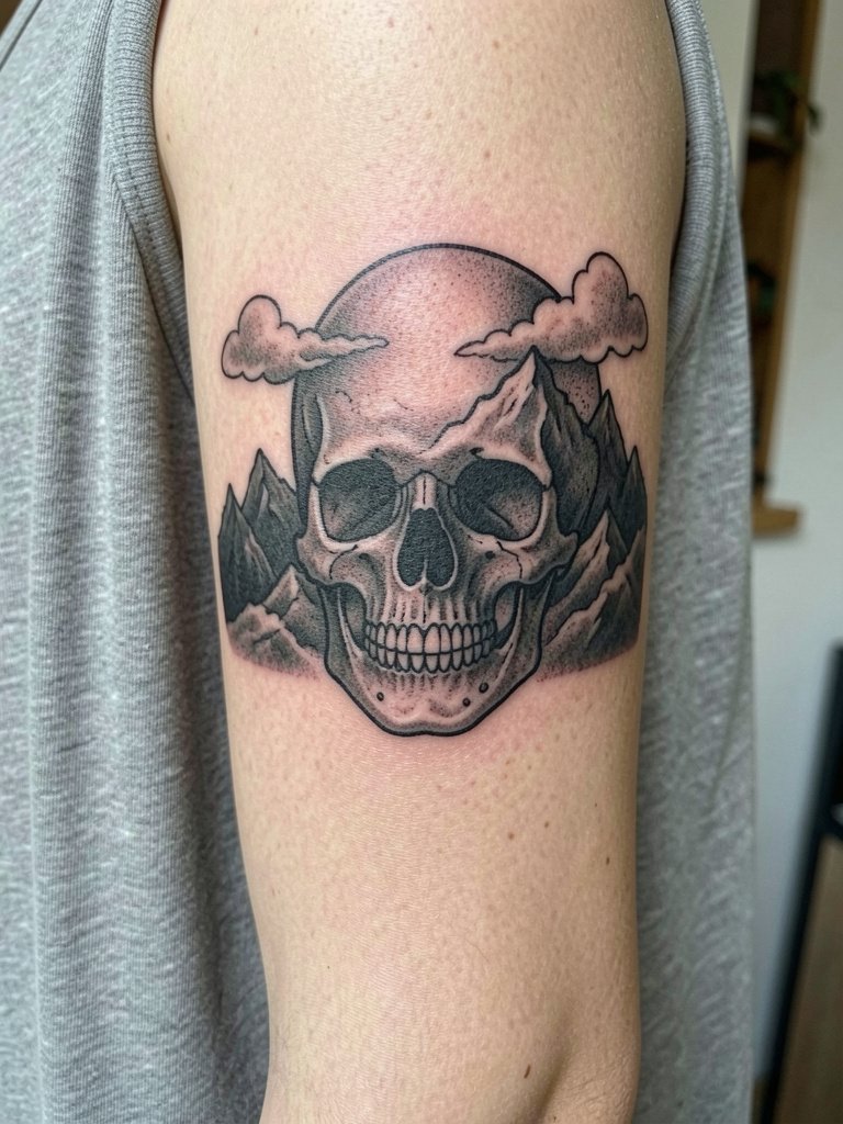
This composition reads like two images fused. Plan the morph point with the artist so the skull transitions into landscape without competing focal points. Common error: making the morph too abrupt, which flattens the effect as it heals. At six months the fusion reads clean, at two years soft grays can blend, and at five years the strong blacks still define the skull. Wear a tank top during the session so shoulder access is unobstructed.
12. Surreal Fabric & Ribbon Sleeve
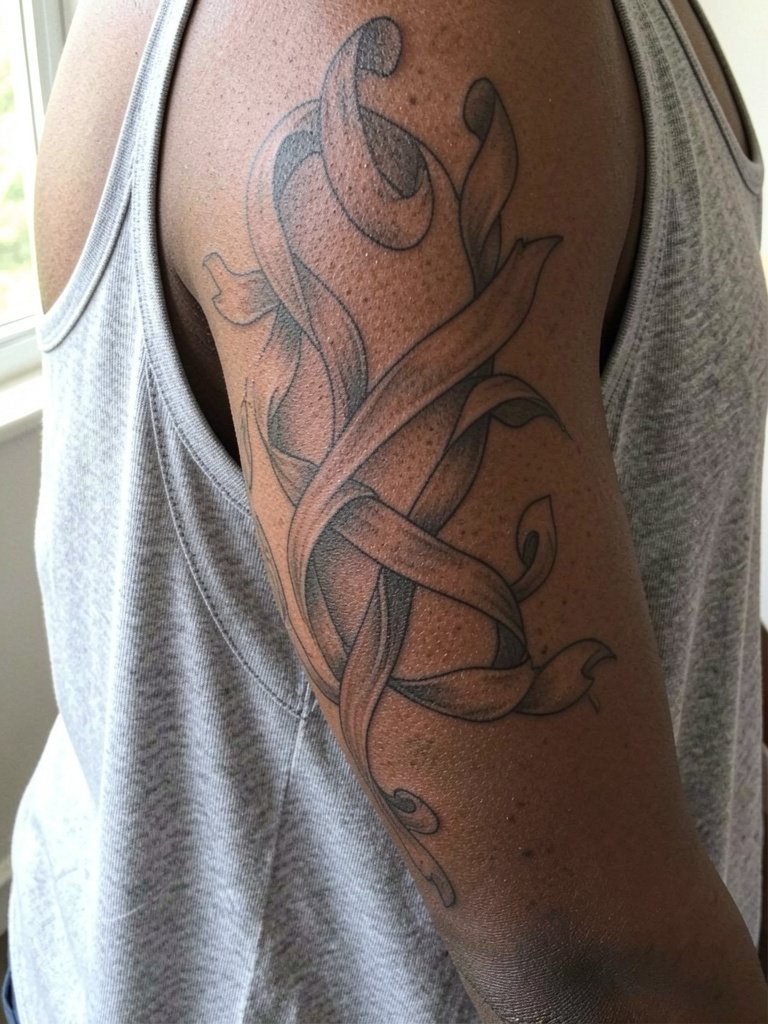
Fabric flow is a smart connector for disjointed symbols. Ask for ribbon widths that wrap muscles so the eye follows the arm. Mistake: making ribbons too narrow, which lose readability as the arm moves and ages. At six months the curves are soft, at two years highlights may need refreshing, at five years the darker troughs keep the three-dimensional feel. For session wear a loose tank top so the artist has unobstructed access to reach around the arm.
13. Surreal Mixed-Blackwork Sleeve
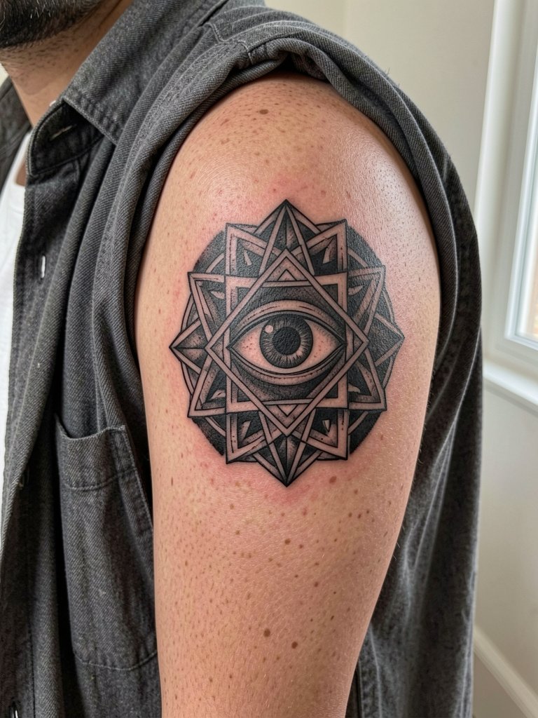
Bold black fills anchor surreal motifs and create modern contrast. Discuss film-like black saturation and edges so the artist knows how heavy to go without risking excessive scabbing. A common error is placing heavy black next to single-needle dots, which can read uneven after healing. At six months the fills look graphic, at two years the black still supports the geometry, and at five years the dot-work detail may need selective touch-ups. For showing this off, rock an open-collar shirt that frames the shoulder work.
14. Surreal Portrait Sleeve (Distorted)
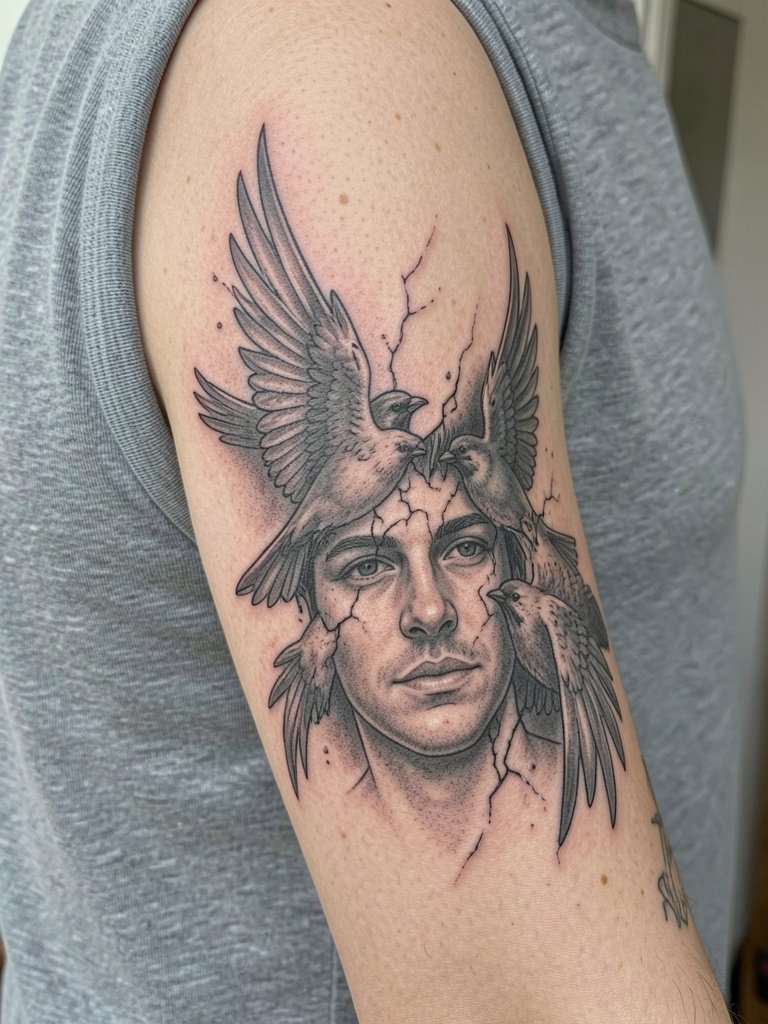
Distorted portraits demand careful scale choices and reference matching. Bring a high-resolution portrait and a second image that demonstrates the exact fracture or melt you want. Mistake: asking for a tiny photoreal face on a curving bicep, which blurs into an unrecognizable shape. At six months the portrait reads haunting, at two years the soft fragments may require a touch-up to retain crisp highlights, at five years the dark contours keep the expression readable. For chair day wear a sleeveless top to give the artist full upper-arm access.
15. Surreal "Dreamlike" Patchwork
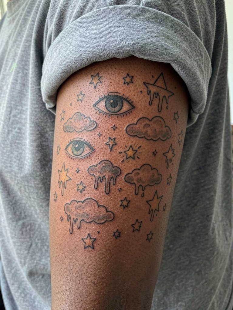
A dream patchwork can be tighter than mixed patchwork because the symbols share a mood. Plan how each small image will read at arm scale and where negative space will separate them. The common mistake is placing symbols too close and then watching them merge over time. At six months the collection looks curated, at two years spacing pays off, at five years the bolder pieces still read distinctly. For showing off pair with solid polos that make the small icons pop.
16. Surreal Fabric Flow Connector
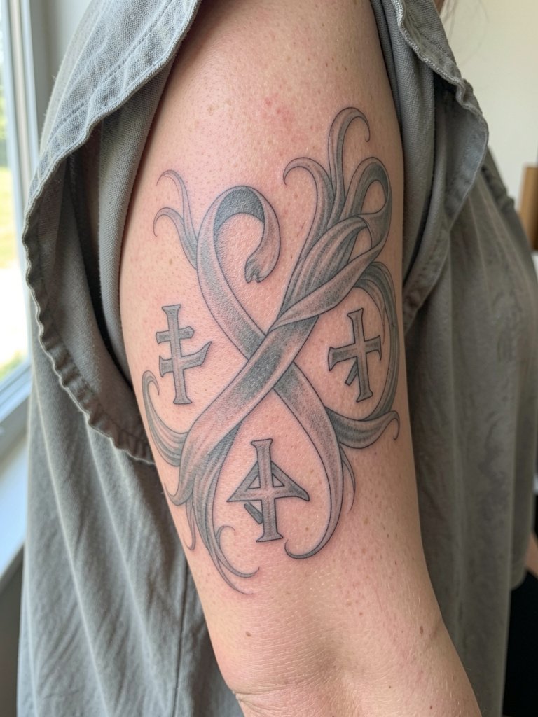
Using fabric or ribbon as a connector stops a sleeve from feeling patchy. Tell the artist exactly where ribbons should cross muscle seams so they never cut a focal face in half. A mistake is letting connectors become too busy; keep them simple and rhythmic. At six months the flow looks soft, at two years the ribbons still guide the eye, and at five years the darker lines maintain continuity. For session comfort wear a flowy top so the inner upper arm is reachable.
17. Value-Range Planned Surreal Sleeve
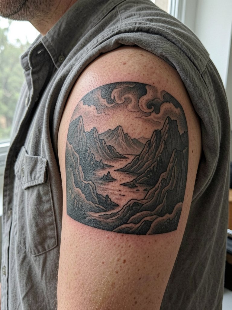
Planning value ranges up front keeps a surreal sleeve readable as it ages. Show the artist where you want the strongest blacks and where to leave open skin so the design breathes. A common error is treating every panel with the same mid tone, which flattens the arm. At six months the planned darks read cinematic, at two years areas with open skin preserve contrast, and at five years the overall composition still reads because of early value planning. For the session wear an open-collar shirt that gives shoulder access.
18. Micro-Panels That Read Across the Arm
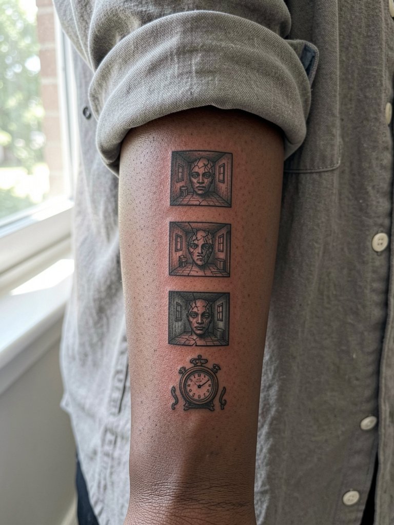
Micro-panels give you a book-like sleeve that unfolds as the arm turns. Ask the artist for mockups showing each panel at actual size so you can confirm legibility. Mistake: making each vignette too intricate for the panel size, which loses detail as lines blur. At six months the vignettes read like tiny illustrations, at two years some details soften, and at five years the stronger contours still guide the narrative. Wear a rolled cuff linen shirt for clean photos.
19. The Minimalist Mountain Range That Ages Well
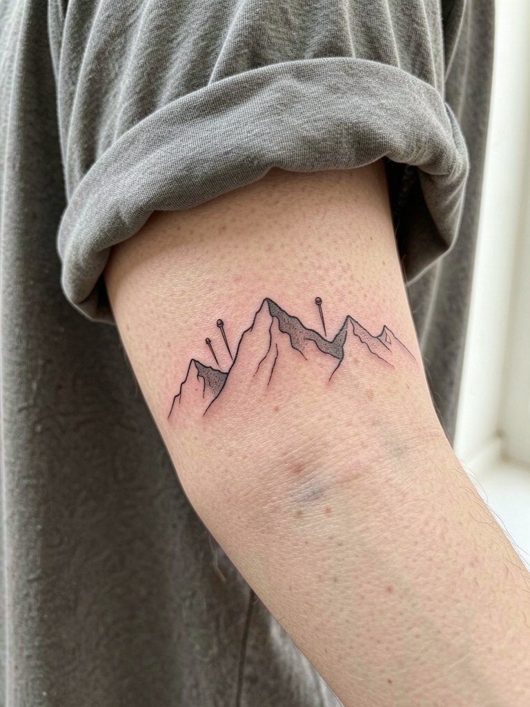
A restrained mountain band keeps surreal hinting without crowding the arm. Have the artist show how negative space will read at three inches and five inches so you avoid lines that look too faint in photos. Common mistake: tracing a tiny wrap that disappears after a year. At six months the peaks are crisp, at two years the thinnest strokes may fade, and at five years the composition still frames the arm if built around open skin. For session wear a loose drawstring linen pant if the lower arm needs rolling to access the wrist area.
Frequently Asked Questions
Q: How much should I budget for a surreal sleeve and what drives price surprises?
A: Expect a multi-session project that depends on detail, color, and size. Smaller patchwork builds let you spread cost over time, while micro-realism and dense blackwork drive longer sessions. The three common drivers of surprise are extra sessions for refinement, touch-ups after healing, and added contrast work when the piece needs more value depth.
Q: Which placements age best for fine-line surreal elements and why do artists disagree?
A: Inner forearm and ribcage surface behavior varies. One group argues fine-line textures are central to the surreal aesthetic and accept some softening as part of the look. The other group insists slightly heavier line weight on high-stretch zones prevents early blur and preserves structure beyond year two. My observation is that planning spacing and value range up front reduces surprises regardless of side taken.
Q: Where can I find artists who actually post healed surreal sleeve photos without naming individuals?
A: Search hashtags like #surrealistattoo and #surrealismsleeve on Instagram and TikTok and use location filters. Tattoodo and similar directories let you search by "dark surrealism" or "fine line surreal sleeve" for portfolio examples. Reddit threads on r/tattoos and r/surrealart also surface healed shots and peer recommendations.
Q: How often will a surreal sleeve need touch-ups?
A: It depends on line weight and saturation. Fine-line pieces commonly need a light touch-up within 1–3 years. Heavier black fills and bold color sections can go longer without work. Plan a realistic touch-up timeline during your initial consult so the artist can show what to expect for your chosen approach.
Q: What should I wear to appointments for different placements?
A: Pick clothing that gives the artist unobstructed access. For inner forearm and wrist work roll cuffs or wear short sleeves. For shoulder and chest pieces wear open-collar or sleeveless items. Try a loose tank top for upper-arm sessions so fabric does not compress fresh ink.