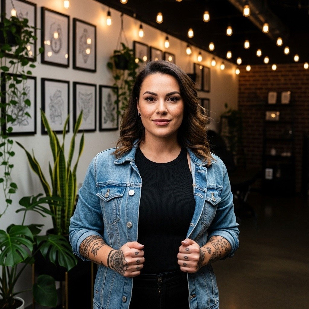
Fine-line script is everywhere on feeds right now, but the pieces that actually read clean after a few years are rarely the ones people save most. Tiny loops blur, red ink needs a size boost, and shop minimums surprise first-timers. If you want a small personal script that still looks intentional at year three, start by choosing the feel you want, then pick line weight and spacing that will survive regular wear and washing.
1. Fine Line Handwriting Script on Inner Forearm
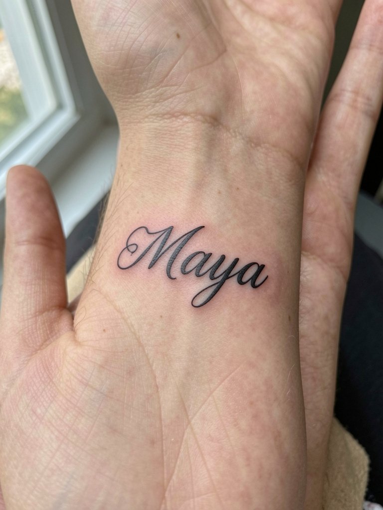
Choose this when you want something that feels like your own handwriting and stays intimate. Go a hair heavier than your favorite pen stroke so the letters do not merge as the skin settles. Common mistakes include asking for ultra-tiny loops that the inner forearm will soften into a blur by year two. Plan the size by printing the script at actual scale and holding it on your arm for a day so you see how it reads from arm's length. For the session wear a loose button-down so the artist can roll the sleeve without rubbing fresh ink. Expect about 30 to 60 minutes and mild discomfort along the muscle belly. Touch-ups are often needed at the two to three year mark for single-needle pieces.
2. Clean Cursive One-Word on Collarbone
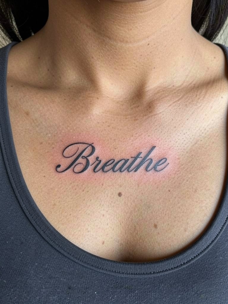
A single empowering word on the collarbone reads delicate without disappearing. Choose medium line weight and slightly wider letter spacing so the script keeps its loops over time. The most common aging issue is placing a dainty single-needle font too close to the clavicle crease. Bring the exact cursive sample at the size you want so the artist can show a stencil in place. For showing it off, pair the placement with thin-strap tops or scoop-necks and a delicate pendant necklace that does not crowd the lettering. Session time is typically under an hour and pain averages moderate because the bone sits under the skin.
3. Bold Thicker Script on Outer Forearm
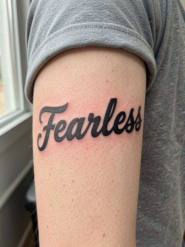
If you want text that stays legible without frequent touch-ups, choose thicker strokes. This style trades daintiness for longevity so letters do not blur into one another as skin ages. A real mistake is asking for capricious flourishes at micro scale. Instead, ask for a 0.8mm or larger visual weight so the script keeps contrast when healed. For casual outfits, bold forearm scripts pair neatly with short-sleeve graphic tees or cropped sweaters that leave the arm visible. Expect one session around 45 to 90 minutes and a touch of vibration during long strokes. Blowout risk is low here if the artist uses steady depth and avoids overworking.
4. Multi-Line Quote Split on Rib Side
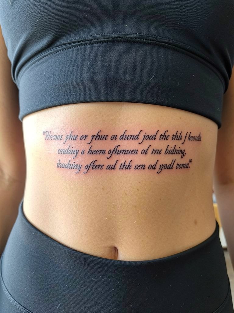
Rib quotes work when line breaks follow the body contour rather than forcing a single long line. Artists and collectors split into two camps on fine-line ribs. One group says fine line on ribs blurs within two years because the skin stretches and daily movement compresses thin strokes. Another group argues that with correct needle depth and slightly wider letter spacing fine line settles well, and they point to three-year healed examples to back that claim. If you pick ribs, plan the line breaks first and bring references at the exact number of characters per line. Pain is high, sessions are often split if the quote is long, and a planned touch-up around year two is realistic for most rib text.
5. Initial + Tiny Number Combo on Inner Upper Arm
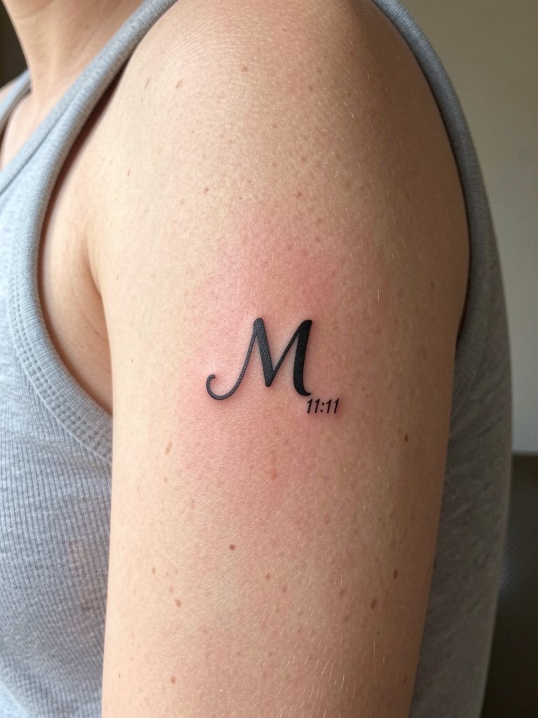
This minimal combo reads private and deliberate when sized for longevity. The trick is keeping the initial bold enough that the tiny number does not disappear. A common error is matching the number stroke exactly to the letter stroke and making both too faint. Instead, ask for the letter to have a touch more saturation than the tiny digits so the contrast stays. During the session wear a loose tank so the artist can access the medial arm without tight sleeves. Session time is short, usually under 45 minutes, and the pain is moderate. Keep in mind micro-elements often need touch-ups sooner, so expect a possible touch-up within two years.
6. Coordinates + One Word on Lateral Hip
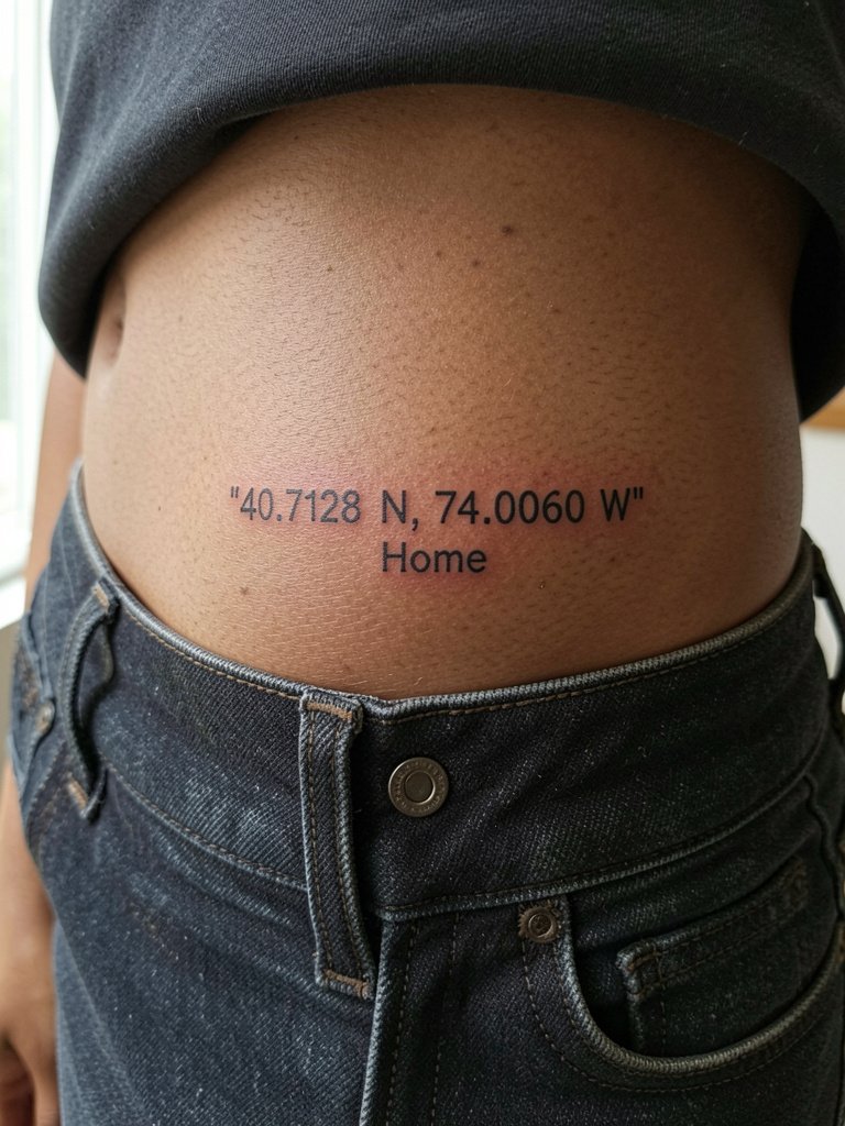
Coordinates paired with a single sentiment keep the design personal without heavy ornament. Wide letter spacing prevents characters from running together as the skin shifts. A common mistake is crowding the coordinates and the word into a tiny square. Instead, let the numbers breathe horizontally and use open interiors in the letters so the digits remain legible. For the appointment wear low-rise jeans or loose shorts so the artist can access the lateral hip without tight waistbands. Expect short sessions but moderate discomfort near bone. This placement is easy to hide under daily clothing and ages quietly if you avoid high friction from waistbands.
Session Day Picks
The inner forearm, collarbone, and hip pieces above each have access needs, so these five items smooth the session and the first week of healing.
-
Stencil transfer paper kit. Useful for artists to preview the exact letter spacing on your skin, which matters for multi-line ribs and coordinates work.
-
Topical numbing cream. Applied as directed before a rib or sternum session takes the edge off without changing line saturation.
-
Thin protective film roll. Keeps low-rise hip and wrist tattoos clean during the first few days of friction from clothing.
-
Fragrance-free body wash. Gentle cleansing avoids irritating fresh script pieces, especially single-needle work on forearms and collarbones.
-
Aquaphor healing ointment. A thin layer for the first two to three days helps single-needle scripts heal without crusting excessively.
7. Red Ink Short Word Script on Wrist
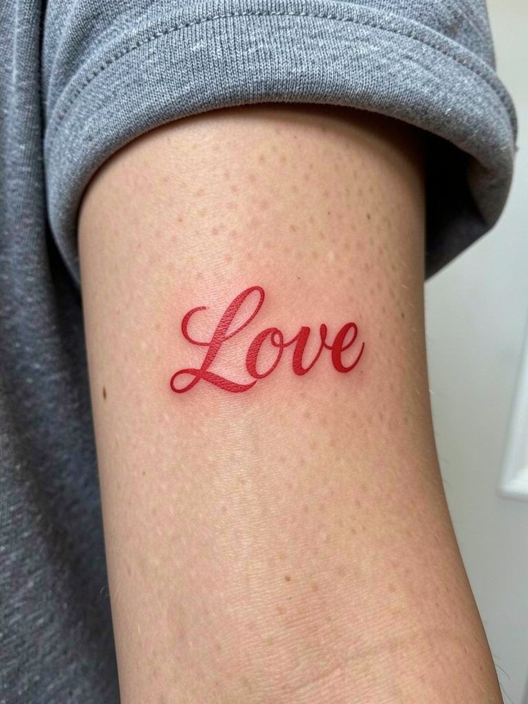
Red ink can be striking, but it needs room to breathe. One camp says red fades faster and looks muddy over time, especially for small script. Another camp points out that short red words done slightly larger with clean lines age just as well, and they emphasize increasing the size by about 10 to 20 percent compared with black ink. If you pick red on the wrist, ask for solid saturation and a modest scale increase so letters do not thin out with wear. For showing it off, balance the piece with a minimalist watch on the opposite wrist. Healing takes typical wrist care, and touch-ups for color tend to be needed earlier than black in many cases.
8. Serif Calligraphy Script on Nape
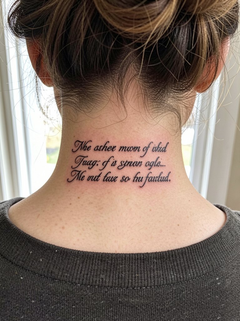
The nape is a great spot for a romantic script that you can hide or reveal. Use flowing serif loops but avoid ultra-tight curls that bite into the hairline and blur. A common mistake is placing the flourish too close to the hairline where regrowth rubs during healing. For session day wear a button-down or easy-up top so you can expose the area without pulling clothing over your head. Pain is low to moderate and the piece typically takes under an hour. Expect minor touch-ups if the linework sits near the hairline where motion and shampooing can affect pigment.
9. Wide Spacing Sans-Serif on Inner Thigh
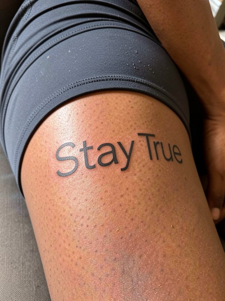
The inner thigh loves open letterforms. Wide letter spacing reduces blur from skin friction and keeps long phrases readable. A real mistake is using ornate cursive in this high-friction area. For comfort during the session wear loose shorts or a skirt that lets the artist roll the fabric without tight seams on the piece. Visibility is private by design, so if you plan to show it, high-waisted skirts and side-slit dresses frame the line beautifully. Expect moderate pain and a slower healing curve because of sweat and friction, meaning you should plan a two-week rest from tight clothing.
10. Custom Mantra Script on Back of Neck
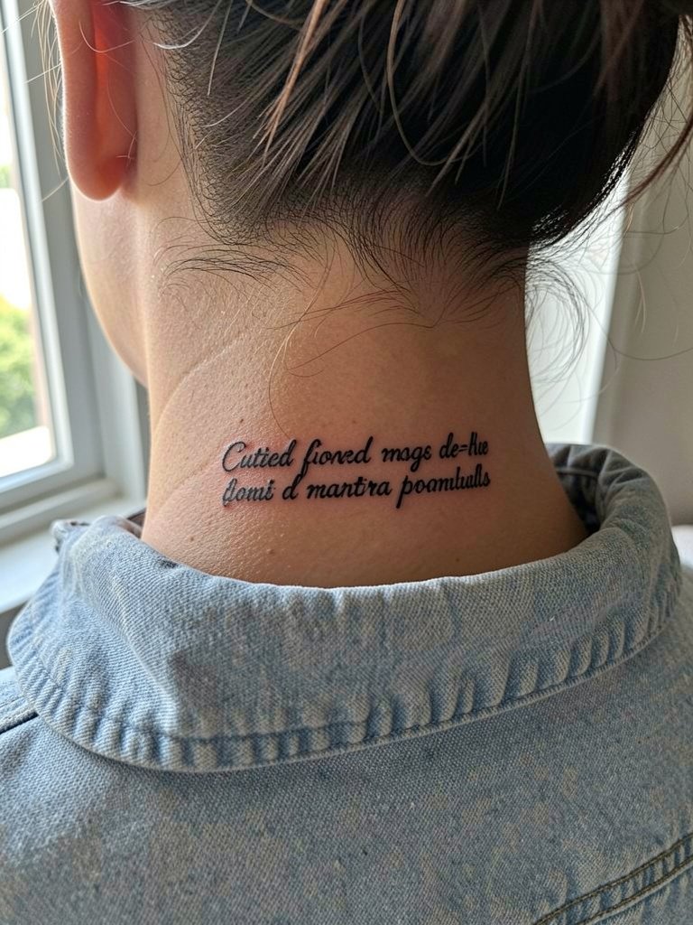
Custom lettering is tempting because it feels unique, but it comes at a premium and offers diminishing returns for very small text. Some people pay the extra cost for a hand-drawn font that truly matches their voice. Others get similar longevity from carefully selected standard fonts with good kerning. If you want a custom script, bring three references and ask the artist to mock the letters at actual size so you can compare readability. Back-of-neck pieces are quick and fairly low pain. Plan for a touch-up if the hairline or collar rubs the ink during the first month.
11. Script Integrated with Floral Elements on Outer Upper Arm
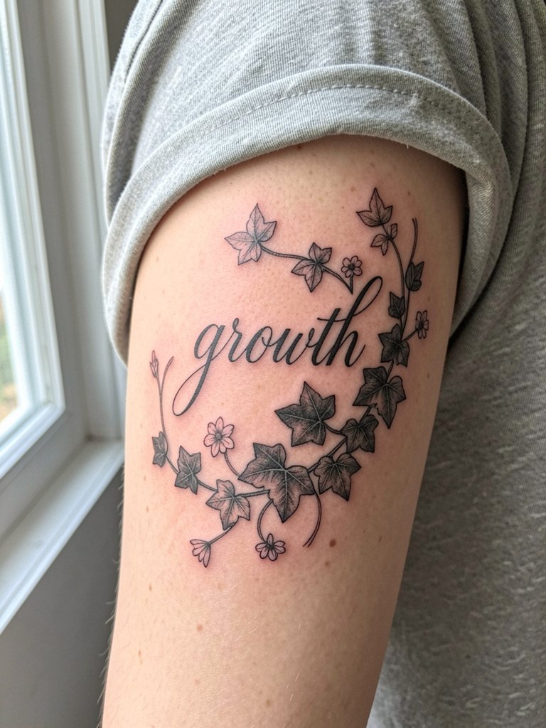
Combining script with floral art softens the text edge and creates an illustrative piece that ages more gracefully than micro script alone. Ask the artist to interlock letters with stems so the text reads as part of the image rather than a caption stuck on later. One common mistake is requesting dense floral fill right against delicate letters, which hides the text as the inks settle. For outfits, this placement pairs well with sleeveless tanks that let the botanical wrap be visible. Sessions for combined work often take longer, so expect one to two hours depending on detail.
12. Tiny Script Behind the Ear (Mastoid Area)
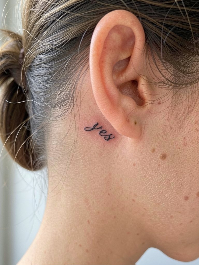
Behind-ear scripts are intimate and repairable if you plan for size. The skin in the mastoid area takes fine detail well but the small surface and frequent hair contact make size decisions critical. A frequent error is asking for text no larger than a thumbnail. Instead, increase scale just enough that each letter holds negative space inside counters. Bring a mirror so you can see the stencil placement before the linework starts. Pain is low and sessions are very short. Keep hair tied away during healing and expect a minor touch-up if shampooing scuffs the edges.
13. Script with Negative Space Inside Letters on Sternum
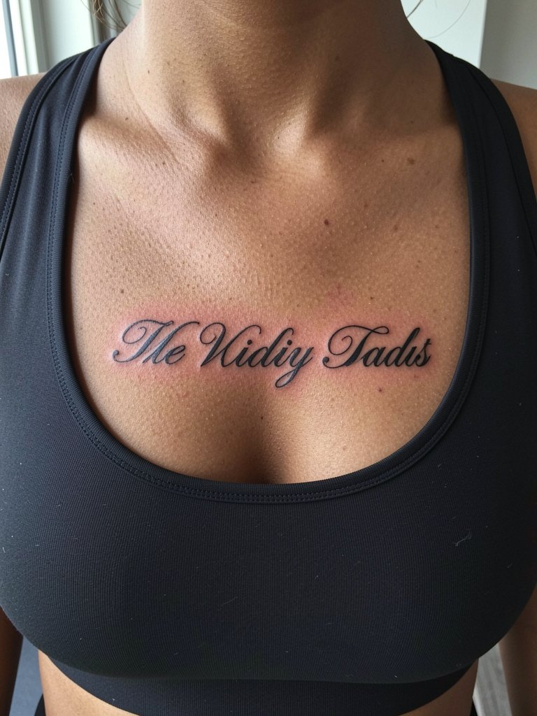
Negative space inside letters is a practical aging hack for sternum and chest scripts. By leaving clean counters the letters avoid filling in as skin stretches. The main mistake is using overly ornate letterforms with tiny enclosed areas that close up. For the session wear a strapless or zip-front top so the artist can access the chest without tugging fabric over the head. Pain ranges from moderate to high depending on proximity to bone. Expect a possible touch-up in two to three years to maintain crisp interiors, especially if the area sees regular pressure from clothing.
14. Bold All-Caps Script on Front Shoulder
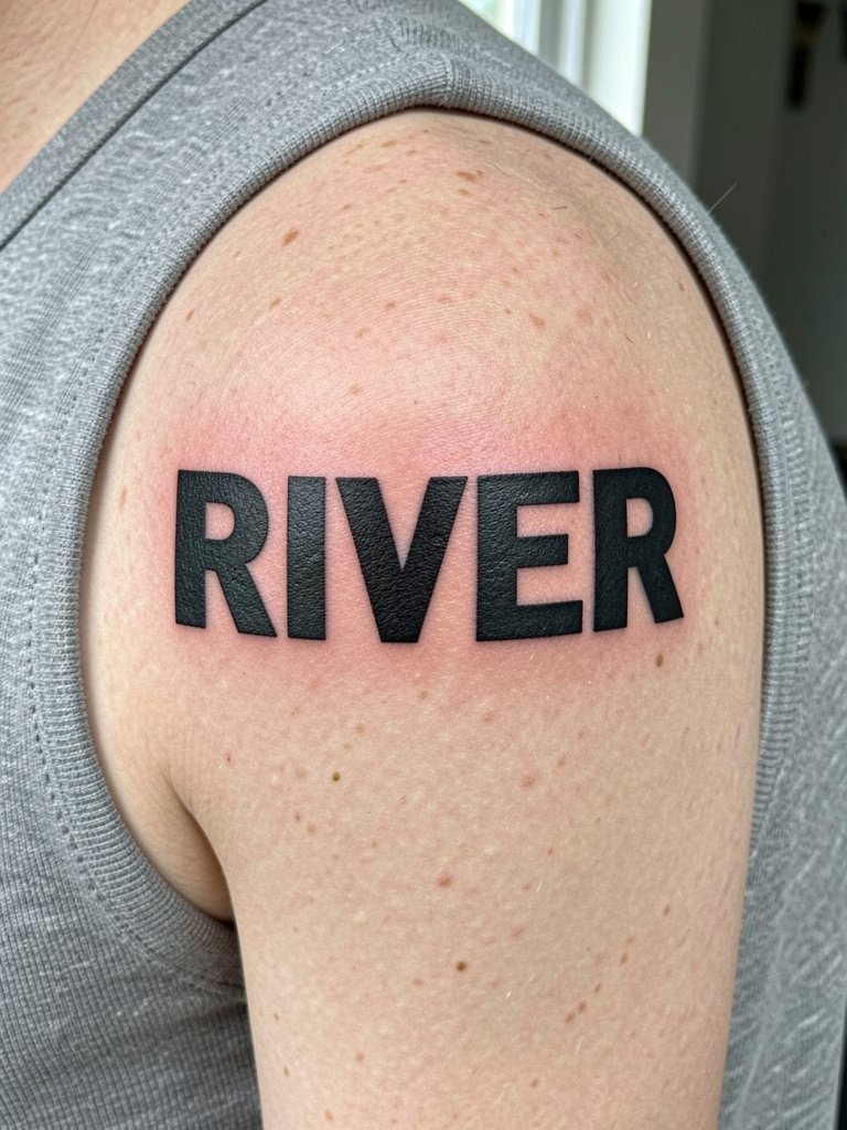
All-caps on the shoulder gives a confident, visible look that reads from a distance. This is a low-blowout placement when lines are kept thick and consistent. A common error is using narrow serif caps that rely on tiny hairlines. For session comfort wear a sleeveless top so the artist has full access without tight fabric. The area heals predictably and touch-ups are rare if the linework is saturated well. This placement shows nicely with off-shoulder dresses and cropped tank tops.
15. Handwriting-Style Script for Inner Upper Arm Nicknames
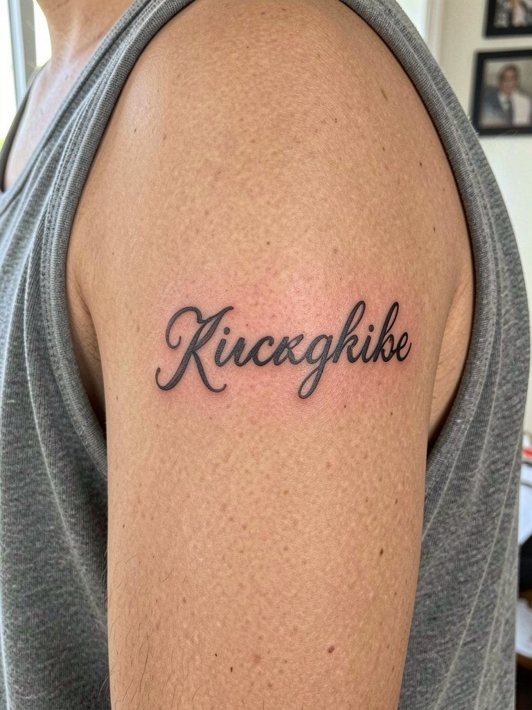
A handwriting-style nickname on the inner upper arm keeps the sentiment private yet tactile. Choose irregular stroke widths to simulate true handwriting, but keep the smallest strokes no finer than the artist recommends for longevity. A typical mistake is copying a tiny signature without scaling it up, which leads to illegibility later. During the appointment wear a loose tank so the medial arm is free. This placement pairs well with rolled-sleeve shirts and a thin chain bracelet set on the opposite wrist when you want to show it off. Expect one touch-up in a couple of years for faded thin strokes.
16. Thin Script Wrap Around Wrist
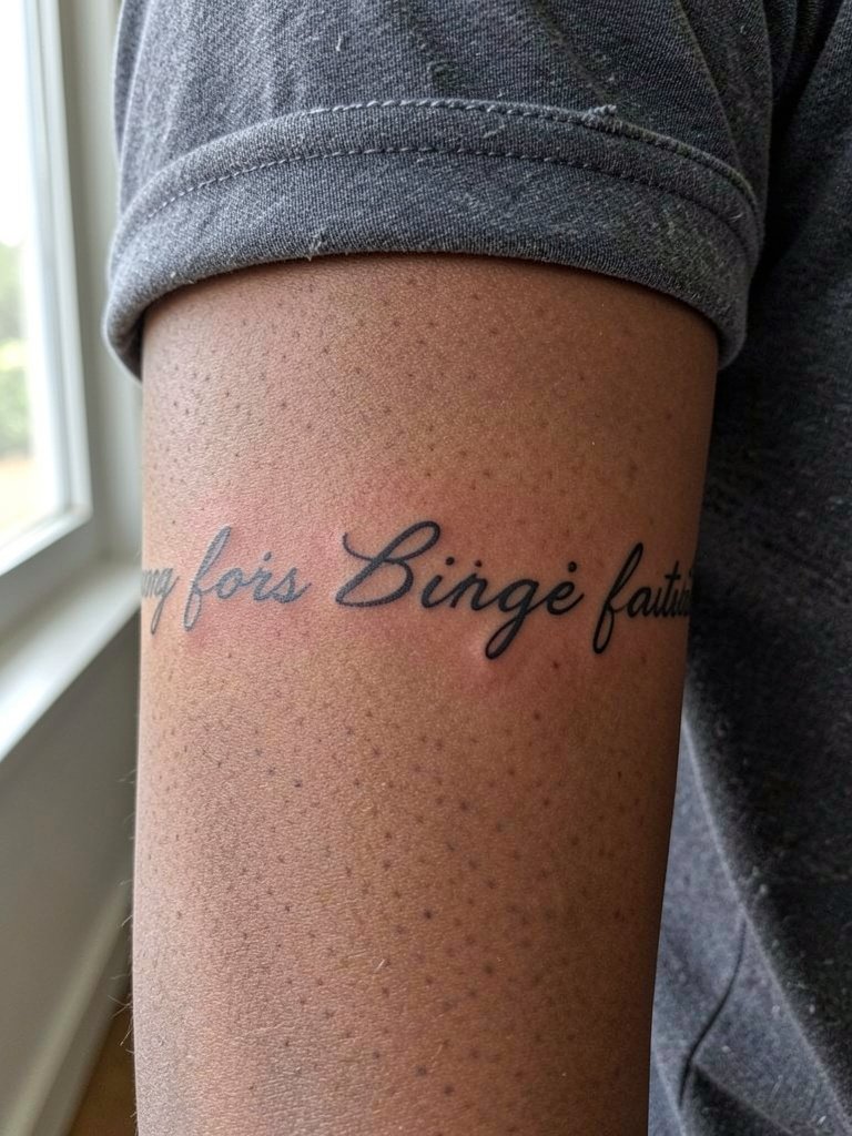
A partial wrap feels like a bracelet and reads as jewelry when executed with even spacing. Keep the curl minimal and the kerning wide so the letters survive wrist movement. People often forget that the wrist sees a lot of hand washing and friction from watches. For the session avoid wearing a watch on that wrist and plan a light bandage for the first day. This piece looks great next to a thin chain bracelet when you want to accent it. Healing is straightforward but expect color fade slightly faster than forearm pieces.
17. Small Serif One-Word on Top of Foot
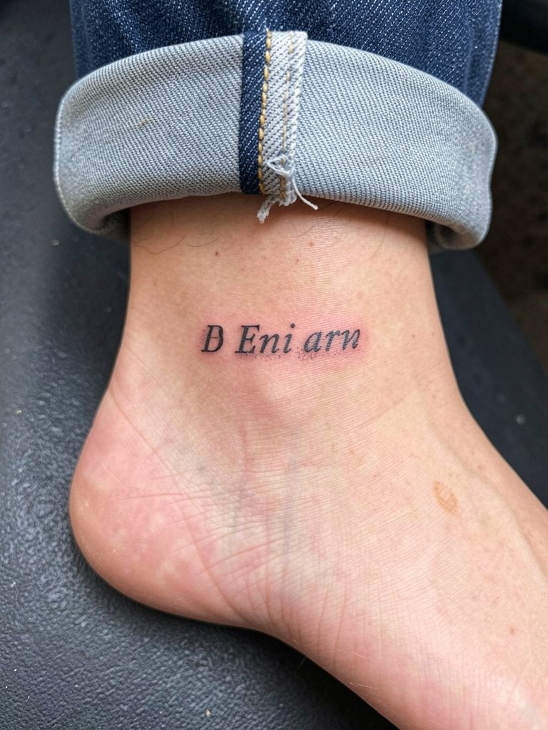
Foot scripts are playful and discreet, but they sit in a high-wear area. Choose small serif caps with room inside letter shapes to avoid smudging. A frequent error is placing micro cursive over tendons where motion blurs thin strokes. Wear shoes that avoid rubbing the top of the foot during the first two weeks and consider sandals while healing. Session time is short and pain is moderate. Touch-ups are common for foot work, so factor that into long-term planning.
Frequently Asked Questions
Q: How much should I budget for a simple script tattoo?
A: Shop minimums in most cities typically range from $100–$150 for tiny work. Custom lettering or larger multi-line scripts usually cost more, often in the $250–$800+ range depending on the artist and complexity. Always plan for a possible touch-up in the first two to three years.
Q: Which placements age best for tiny script and which should I avoid?
A: Open, low-friction areas like the outer forearm and front shoulder generally keep script readable longest. High-movement or high-friction zones such as the ribs, inner wrist, and top of the foot require larger scale and wider kerning to hold up. Expect pieces on the ribcage and feet to need touch-ups sooner than an outer forearm run.
Q: Where can I discover healed examples and local artists without naming anyone directly?
A: Search hashtags like #scripttattoo, #finelinescript, and #handwritingtattoo on Instagram and TikTok then filter by location. Tattoodo and Booksy let you search portfolios by keyword and show healed work. Reddit communities like r/tattoos and r/tattooadvice often share peer photos and local recommendations.
Q: Does red ink really fade faster than black for script?
A: Red tends to shift in tone more noticeably than black over time, so many people choose to increase scale and keep the design simple when using it. Others point out that short, clean red scripts done at a slightly larger size can remain crisp if the artist saturates the color well. Expect more frequent color touch-ups with red than with saturated black.
Q: What are three mistakes to avoid when planning script text?
A: Avoid asking for ultra-tiny loops and flourishes that close up as the skin heals. Do not skip sizing stencils at actual scale on your body. Finally, do not crowd letters together; wide kerning preserves readability as the piece ages.
Q: How often do script tattoos need touch-ups?
A: Small single-needle scripts often benefit from a touch-up at two to three years, while bolder caps and well-spaced sans-serif pieces can go longer before needing attention. Touch-up cadence depends on placement, sun exposure, and how often the area experiences friction.
Q: What should I wear to a session for collarbone, rib, or hip placements?
A: For collarbone and nape pieces wear a scoop-neck or button-down that exposes the area without being pulled over the head. For ribs bring a loose crop or button-up so the artist can access the side comfortably. For lateral hip work choose low-rise jeans or loose shorts that can be rolled without tugging the waistband.