
Script fonts look effortless online, but they hide practical decisions that determine how readable a line will be in two years. Thin single-needle cursive can look delicate at first and blur with daily wear if placed where skin flexes. Choices about spacing, slight bolding of key strokes, and pairing script with small solid anchors make the lettering stay legible over time, and the first example below shows that trade-off in practice.
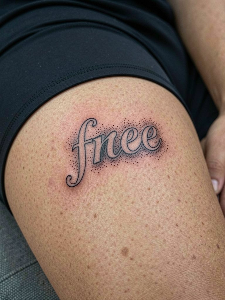
1. Single-Word Cursive on Inner Forearm
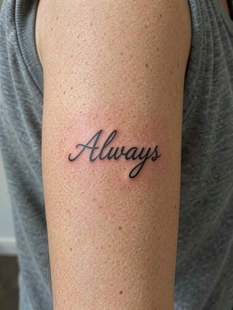
An inner forearm script reads well at daily glance, and I recommend it when you want a readable phrase you can show easily. For this placement, ask for slightly reinforced downstrokes so letters keep contrast as the skin ages. A common mistake is choosing ultra-thin hairline strokes without room for slight spread, which turns letters into a smudge by year three. At six months the lettering will look crisp and slightly raised, at two years the edges soften, and by five years tiny fills may need touch-up to retain sharp counters. Session time for a short one- or two-word piece runs about 30 to 60 minutes depending on size. For showing it off, pair with rolled-sleeve linen shirts in neutral tones so the skin contrast keeps the script legible.
2. Tiny Script Behind the Ear
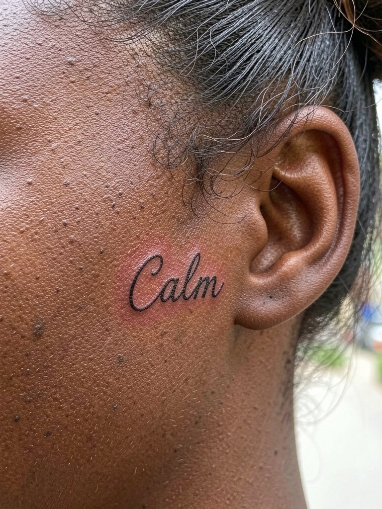
Behind-ear script is discreet and great if you want a tiny reminder that rarely competes with jewelry. This skin is thin and the area heals fast, but the line weight needs to be a touch heavier than your Pinterest reference to prevent blowout over time. A rookie error is requesting a hairline swoop and then expecting long-term crispness. Expect a 20 to 40 minute session with localized tenderness, and plan a touch-up after the first year if you want the thin strokes preserved. For appointments wear your hair up and a wide-neck tee so the stylist or artist can keep hair out of the way.
3. Script with Subtle Flourishes on the Collarbone
Collarbone scripts have a show-off quality without being loud, but the skin there moves with breath and clothing contact. I recommend slightly open letter spacing and modest flourishes rather than dense swashes that age into overlap. A practical consultation point is to bring the exact font sample and ask the artist to map out letter spacing across a three- to five-inch stencil so you can see negative space. At six months the design should flatten and look integrated with skin. At two years very tight flourishes can begin to merge, which is why a subtle stipple shadow can help maintain contrast. For outfits, a wide V-neck blouse frames the script without hiding the clavicle line.
4. Ornamental Script on the Ribcage

Ribcage script splits artists into two camps. One camp argues the constant stretch and compression from breathing and clothing makes ultra-fine lines blur within two years on that skin. The other camp says that with slightly heavier strokes and wider letter spacing the script settles cleanly, and they point to multi-year healed examples to support that. For this placement expect higher pain and a session that can run 60 to 120 minutes. A frequent mistake is insisting on the thinnest available font without allowing the artist to adapt line weight for motion. If you want this area to age well, plan for a one-year touch-up and ask the artist to demonstrate how the stencil shifts while you breathe.
5. Micro Script Along the Finger Side
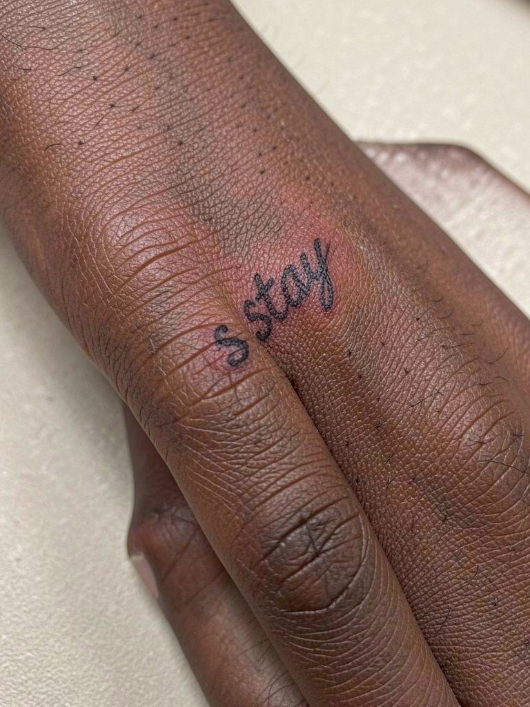
Finger scripts have very specific wear patterns, and most experience shows they fade faster than any other placement. One practical approach is to design the script with slightly bolder terminals and accept annual touch-ups for longevity. Common mistakes include using cursive loops that cross knuckles or creases, because those strokes break up quickly. At six months a finger script looks crisp, at two years the ink will thin noticeably in areas of frequent friction, and by five years it may need a rework. Session time is short but sensitive. For the appointment wear a shirt with sleeves you can roll easily or a loose button-up shirt so the artist has clear access and you stay comfortable.
6. Script Wrapped Around the Ankle

Ankle scripts look delicate when positioned to wrap the bone. Friction from shoes and socks is the main aging factor, so I recommend keeping letters slightly raised without tiny hairlines. A typical mistake is placing the longest part of the script where shoe collars rub; that creates uneven fading. Early healing at two weeks often shows scabbing along the outline, and by six months the ink levels out. Expect a 40 to 80 minute session and plan to avoid tight socks for the first week. For dressing, ankle scripts stand out with low-top canvas sneakers or cropped trousers that show the wrap.
Pre-Session Essentials
The wrist, collarbone, and ankle pieces above all benefit from the same basic session prep, so a few targeted items smooth the appointment and first week.
-
Medical-grade stencil transfer sheets. Helps you and the artist check scale and spacing for small script pieces on the forearm and collarbone before any needle touches skin.
-
Topical numbing cream. Useful for sensitive ribcage or ankle sessions when you want to manage discomfort through a longer sitting.
-
Thin protective film roll. Keeps ankle and wrist scripts safe from friction during the first few days of healing.
-
Fragrance-free gentle body wash. Cleanses the area without stripping ink or irritating delicate linework after a shower.
-
Aquaphor healing ointment. A mainstream ointment that many people use in the initial 48 to 72 hours to maintain moisture over fine-line work.
7. Script with Botanical Accents on the Outer Bicep

Pairing script with small botanical details gives a readable anchor and helps the eye parse the letters as the skin ages. If you want the botanical lines to hold, ask the artist to use a slightly bolder contour for stems while keeping leaves delicate. A frequent error is crowding the words with too many tiny leaves, which can clutter negative space and speed blurring. Expect a 45 to 90 minute session on the bicep with medium tenderness. For wearing choices after healing, this placement looks intentional with rolled-sleeve linen shirts that keep the arm visible without harsh contrast.
8. Mirrored Script on the Nape

Nape scripts catch attention when hair is tied up, and the skin there is fairly stable which helps fine lettering age more gently than fingers or ribs. The main design choice is whether to make each mirrored half identical or let one side breathe more. One mistake I see is placing text too close to the hairline where fading can be uneven due to hair rubbing. Session time is short and the area is sensitive under hair. For appointments wear hair up with simple clips and bring a soft scrunchie set so the artist can keep hair away without creasing the skin.
9. Script in a Curve Over the Wrist

Wrist scripts are visible and tactile, but they face constant friction from watches and bracelets. I recommend mapping the curve so key letters avoid the creases from wrist flexion. People sometimes pick fonts that cross the wrist crease which leads to early fragmentation. At six months the curve will have integrated and feel like part of your hand, at two years expect some softening on the outside edge. Sessions are quick but sensitive and often need a short break. To show the piece, pair it with minimalist metal bracelets that sit below the script rather than across it.
10. Script in Negative Space on the Upper Thigh
Using negative space for script creates contrast and reduces the appearance of thin lines lost to blowout. I often recommend negative-space letters when the thigh is the chosen placement and you want a subtle reading at a glance. A common mistake is making the surrounding stipple too dense, which blurs the letter edges over time. Healing on the inner thigh tends to be forgiving if friction from clothing is minimized for two weeks. For the session wear modest athletic shorts so the artist can expose the area without you feeling exposed.
11. Script Around the Ring Finger

Tiny ring scripts are fashionable but the ring finger is an area of constant washing and contact, which creates a real debate in the community. One group argues ring-finger scripts will almost always blur and require frequent touch-ups because of skin thickness and soap exposure. Another group counters that slight increases in letter weight and avoiding the joint itself let the band last several years before a noticeable fade. The typical session is short and the healing window needs extra care to avoid soaking. If you want a long-lived result, accept the likelihood of a touch-up at the one-year mark and consider spacing the letters slightly wider than a standard font.
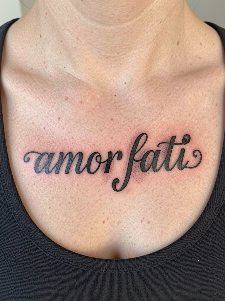
12. Mixed-Language Script at the Sternum
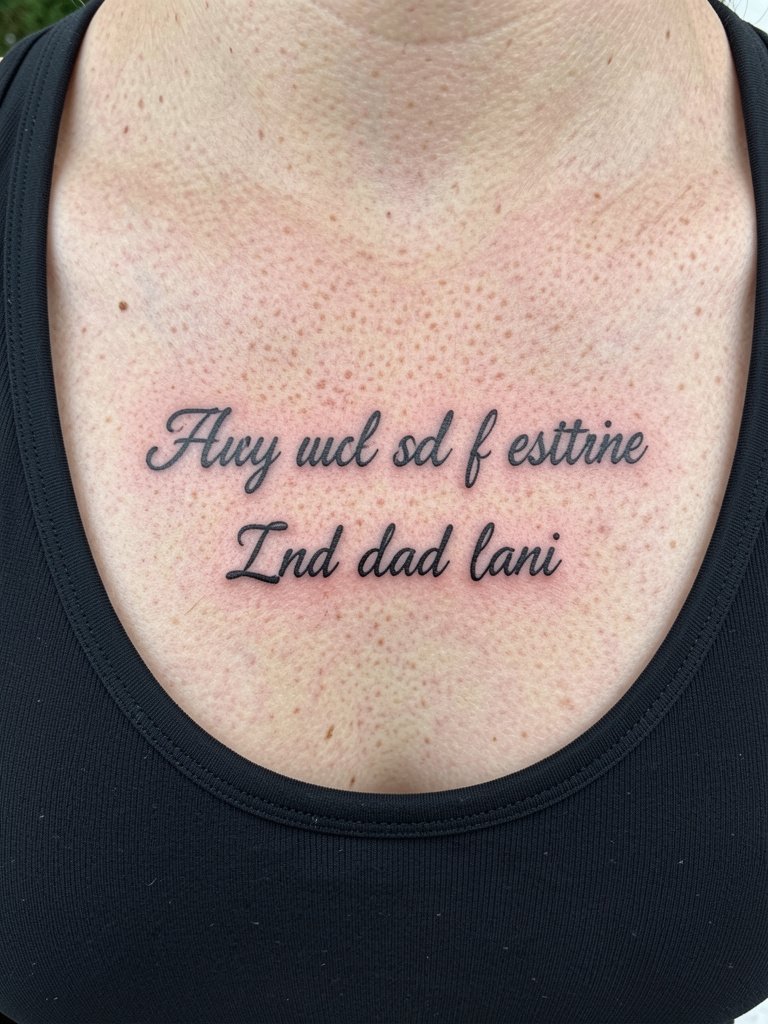
Sternum lettering feels intimate and dramatic, and mixing scripts or languages can add personal meaning. Because breast movement and clothing contact create extra variables, specialized experience is helpful. Many artists will request a release form for sternum work and want to verify your pain tolerance before scheduling. A common aging issue is blurring near the underbust crease if the letters are too compact. Session time ranges from 45 minutes to two hours depending on line complexity. For the visit wear a fitted top that is easy to remove and replace without stretching the area, such as a fitted sports bra.
13. Coordinates in Monospace Script on the Inner Wrist

Coordinates make clean, compact script tattoos and keep the focus on crisp typography rather than flourishes. Because the wrist sees lots of movement and washing, choose a slightly bolder font width for numbers and punctuation. A common mistake is using a decorative script that looks charming in a mockup but loses legibility after healing. Expect a 20 to 45 minute session and plan a single touch-up at about one year if you want sharp numerals long term. For displaying coordinates, stack them with a slim watch or cuff and consider a thin leather watch strap that complements the typography without rubbing the letters.
14. Script Framed by Geometric Lines on the Shoulder Blade
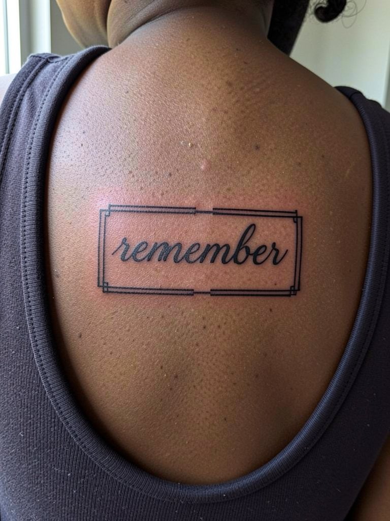
Shoulder blade scripts benefit from the frame because the geometry gives the eye structure as the skin moves. The frame also reduces the temptation to over-stylize the letterforms. A mistake I see is shrinking the lettering to fit an ornate frame which collapses negative space and accelerates blurring. Healing is generally smooth on the scapular area and a single session often suffices. For outfits that highlight this spot, try a scoop-back dress so the framed script is visible in evening wear.
15. Whisper Script in the Armpit Hollow
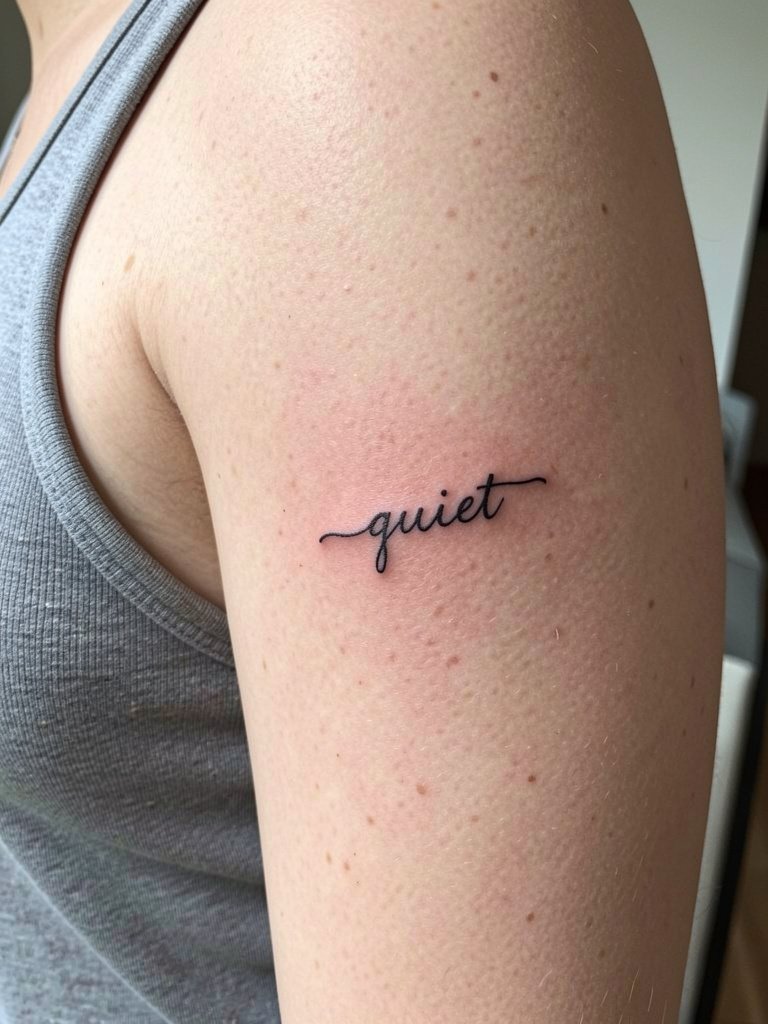
Inner-arm scripts can be pleasantly private and they avoid the armpit crease when planned correctly. For longevity place the letters midway between elbow and armpit and ask the artist to adjust spacing for skin compression. A fairly common error is selecting a font that looks great flat on paper but loses clarity when the arm rests by the side. Expect a 30 to 60 minute session with moderate sensitivity and remember that this area sees less friction than the wrist or fingers. If you want to reveal it occasionally, pair with sleeveless tops and a soft tank dress that shows the inner arm cleanly.
Frequently Asked Questions
Q: Which script fonts hold up best on active areas like hands and wrists?
A: Fonts with modestly reinforced downstrokes and slightly wider letter spacing are the most durable on high-motion areas. Ask the artist to map the letter spacing across the exact placement and avoid tiny flourishes that cross creases.
Q: How should I prep clothing for a collarbone or sternum session?
A: Wear tops that can be removed or replaced without stretching the area, such as a fitted sports bra for sternum or a scoop-neck tank for collarbone work. Choose garments you can put back on without pulling across fresh ink.
Q: Where can I find healed examples and portfolios for script styles without naming artists?
A: Search platform tags and keywords like #ScriptFontTattoo, #FineLineScript, and "healed script tattoo" on social platforms and image sites. Use location filters on social apps and browse portfolio aggregators and forum threads to see healed shots across skin tones.
Q: Do mixed-language scripts require special cultural sensitivity?
A: Yes. If using phrases from another language, verify translation and cultural meaning, and consider consulting a community member or a language specialist for nuance. That respect keeps the work intentional and reduces risk of misinterpretation.
Q: How often do script tattoos need touch-ups by placement?
A: Low-friction sites like the shoulder blade or collarbone often only need a one-time touch-up at one year for most people. High-friction spots such as fingers, ring area, and palms commonly need annual refreshes to maintain crispness.
Q: Can I combine script with other styles like geometric or botanical work?
A: Combining script with geometry or botanical accents can protect readability and add visual anchors, but balance spacing and avoid packing too many tiny elements near letters. If you plan combined work, bring multiple scale references so the artist can translate the composition into a healed-friendly stencil.
