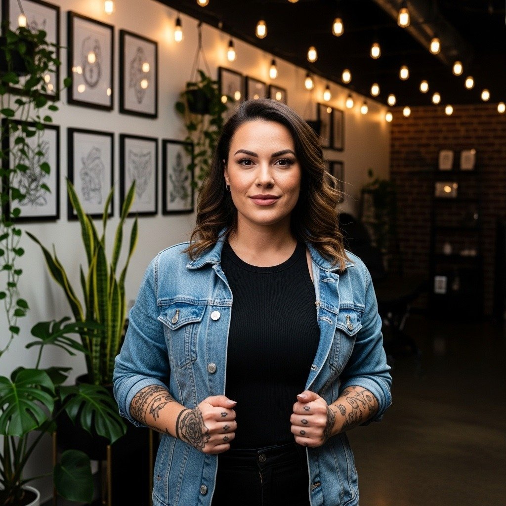
The wispiest single-needle Sanskrit scripts get the most saves on social feeds, yet they are often the first pieces to blur. Choosing letter weight, spacing, and placement matters more than picking the prettiest glyph. Below you will find focused Sanskrit ideas that prioritize legibility, cultural respect, and how the design will actually look after healing.
1. Fine Line Om Symbol on Inner Forearm
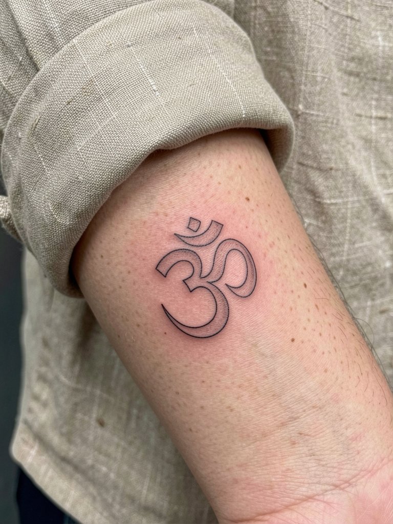
Why it works: Om is compact, so a tidy glyph on the inner forearm reads clearly for daily viewing. I recommend slightly heavier single-needle strokes than the paper reference to reduce early blur. For the session wear, choose a linen button down shirt so sleeves roll easily and you do not tug at the stencil. Common mistake: shrinking the symbol to fit into jewelry space. Keep at least one inch across for long-term clarity. Expect a short, low-pain session of under an hour and a likely minor touch-up within two years if you live in a humid climate.
2. Minimalist “Shanti” Script Along the Side Neck
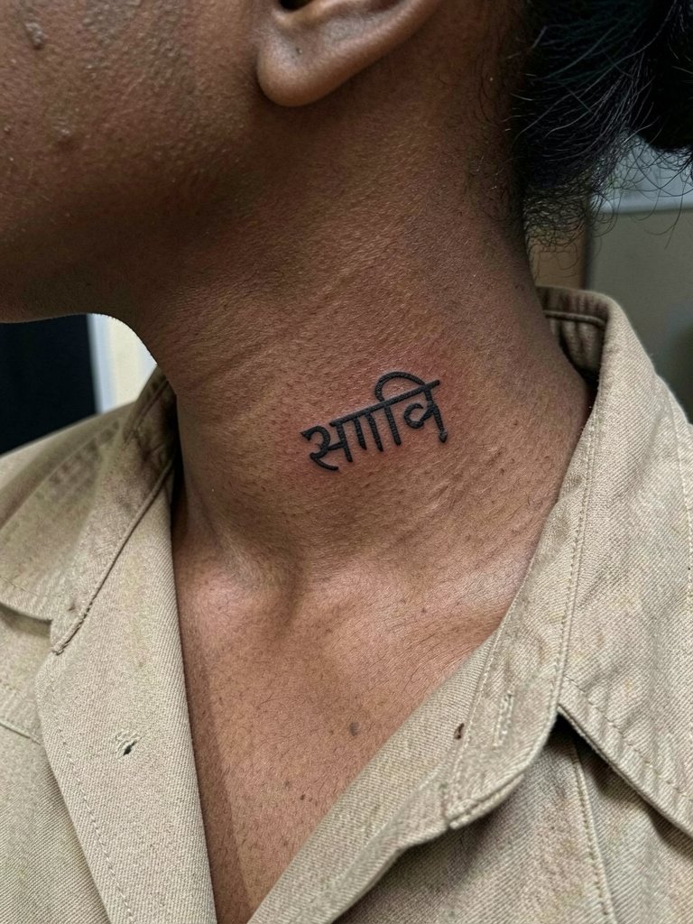
Why it holds up: Side neck skin moves differently than forearm skin, so slightly bolder terminals improve longevity. One group of practitioners insists Sanskrit must be letter-perfect, with classical spellings and strict stroke forms to honor the language. Another group accepts modest stylistic joins to improve legibility on curving skin, as long as the core text stays accurate. If you want both, bring a clear transliteration and ask the artist to show the Devanagari next to a classical reference so you can compare stroke endings. For appointment wear, a wide collar blouse grants easy access and keeps the area comfortable.
3. Fine Line “Aham Brahmasmi” Phrase on Inner Upper Arm
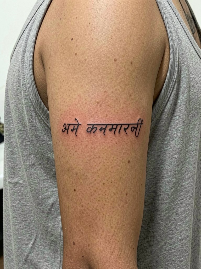
Why collectors choose it: The phrase reads as a gentle band when wrapped across the inner bicep. Plan for a one to one-and-a-half hour session. A frequent error is asking for single-needle at very small scale for a multi-word phrase. Request slightly heavier single-needle weight and extra spacing so characters do not compress over time. For the day of, wear a sleeveless tank neutral to keep the sleeve from rubbing while you sit. Expect a modest touch-up at 12–24 months if you sweat heavily or sun-expose the arm.
4. Ornamental Mandala and Om Combo on Lateral Hip
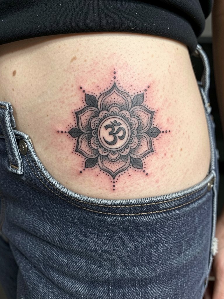
Why this combo lasts: Geometric centers and negative space make the Om read as part of the composition rather than a tiny glyph that could vanish. Cultural note: mandala motifs have spiritual origins in South Asian traditions, so keep the elements respectful and avoid decorative mislabeling. Session feel: two sessions are common for a three to four inch piece because the stipple work takes time. For showing it off, try high waist linen pants or cropped shorts to let the hips breathe without constant fabric friction during healing.
5. Micro-Realism “Tat Tvam Asi” on the Collarbone
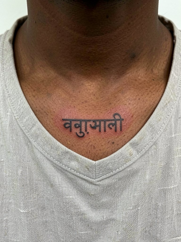
Why this placement is striking: Collarbone skin flexes with breath and posture so micro-realism demands slightly higher saturation than a wrist script. The common mistake is trusting single-needle at very small scale without extra ink. For the session, a crew neck linen shirt or a strapless top makes positioning straightforward. Expect moderate pain where bone lies close to the surface. A touch-up at 18 months is normal if you prefer the characters to stay crisp.
6. Blackwork “Moksha” Bold Word on Inner Forearm
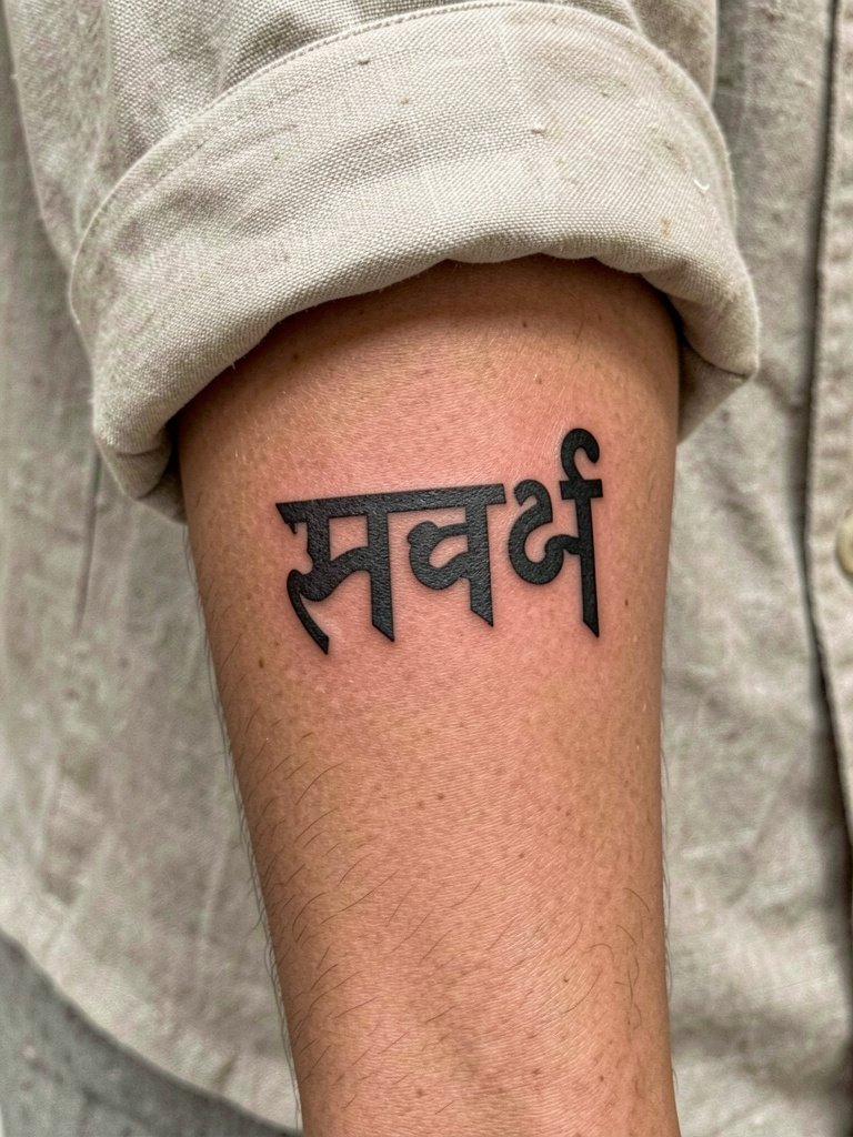
Why choose bold blackwork: A single-word piece gains longevity with saturated fills and thick terminals instead of hairline strokes that disappear first. Session length is short and the pain is low. For day-of comfort, wear a rolled cuff linen shirt so sleeves do not brush the fresh ink. A common error is requesting max-small size for a bold script. Give the letters room and they will keep their shape.
Heal Smart
The next few designs often share the same aftercare concerns as the first six, especially for fine script and rib pieces. Staged healing, minimal friction, and sunscreen after the three-week mark are the top controls people use to keep Devanagari crisp.
- Hustle Butter Deluxe. A balm many fine-line artists prefer because it is thinner than heavy petroleum products and less likely to trap moisture, which helps script settle clean.
- Tattoo Wiz Healing Balm. Lightweight salve favored by artists who work micro-realism and dot work; it keeps lines visible without clogging pores.
- Mad Rabbit Tattoo Salve. Thinner formula options can reduce early ink migration on tiny characters while still supporting moisture balance.
- Saniderm Second Skin. A short sealed window in the first few days protects thin scripts from friction during showers and clothing changes.
- Aquaphor Healing Ointment. Often used for the first 48 hours to lock in moisture for saturated blackwork, though some artists switch to lighter balms afterward.
7. Fine Line “Satyameva Jayate” Along the Inner Upper Arm
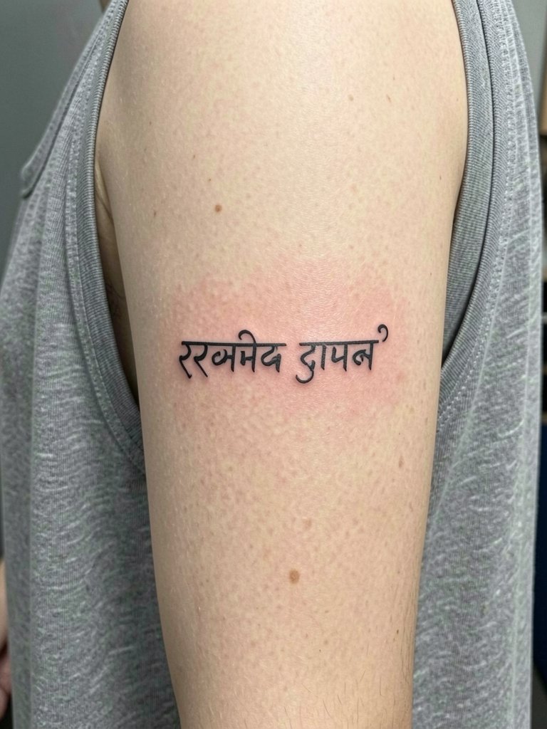
Why this line age checks well: Inner upper arm sees less abrasion than forearm, so fine script with moderate spacing holds better. A common mistake is stacking words too tightly. During the consultation, bring two reference scales so the artist can illustrate how the line reads at two and four inches. For showing it off, a thin gold chain necklace and sleeveless top draw the eye upward. Plan for a one-hour session and a possible touch-up after the first year.
8. Ignorant-Style “Ahimsa Paramo Dharma” on the Ribcage
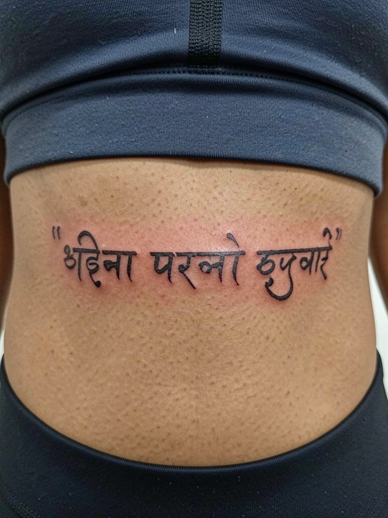
Why the rib debate matters here: Fine line on ribs divides artists into two camps. One camp says the constant stretch and compression from breathing blurs single-needle script in one to two years. The other camp argues that slightly wider spacing and careful needle depth lets fine line settle and remain legible for three-plus years. If you favor the cautionary route, opt for slightly heavier lines and schedule a planned touch-up. Numbing choices and session pacing also affect outcome, so plan for a longer appointment. Sensitive placement note: rib work tends to rank high on pain scales and may require breaks.
9. Neo-Traditional “Om Tat Sat” Over the Sternum
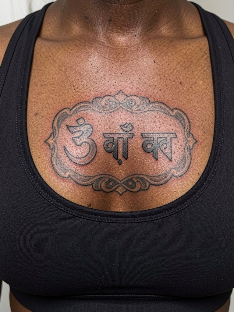
Why this placement reads well: Neo-traditional linework gives the sternum enough contrast to survive movement under clothes. Session note: sternum pieces often take several short sessions to manage healing and client comfort. For show, an off shoulder linen top frames the area without rubbing the healed work. Sensitive placement note: sternum pieces require a practitioner experienced with chest anatomy.
10. Triple “Shanti Shanti Shanti” Fine Script at the Nape
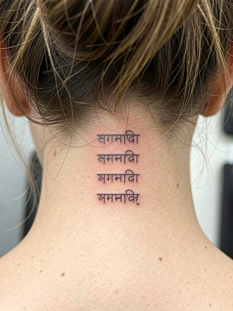
Why repetition works here: Repeating a short mantra creates rhythm and the nape avoids daily friction if hair is kept up. For appointments, wear a top with an open back or bring a button-down. A delicate hairpin or updo will show the healed lines. Touch-ups are uncommon if line weight is preserved at the session.
11. Tiny “Guru” Behind the Ear
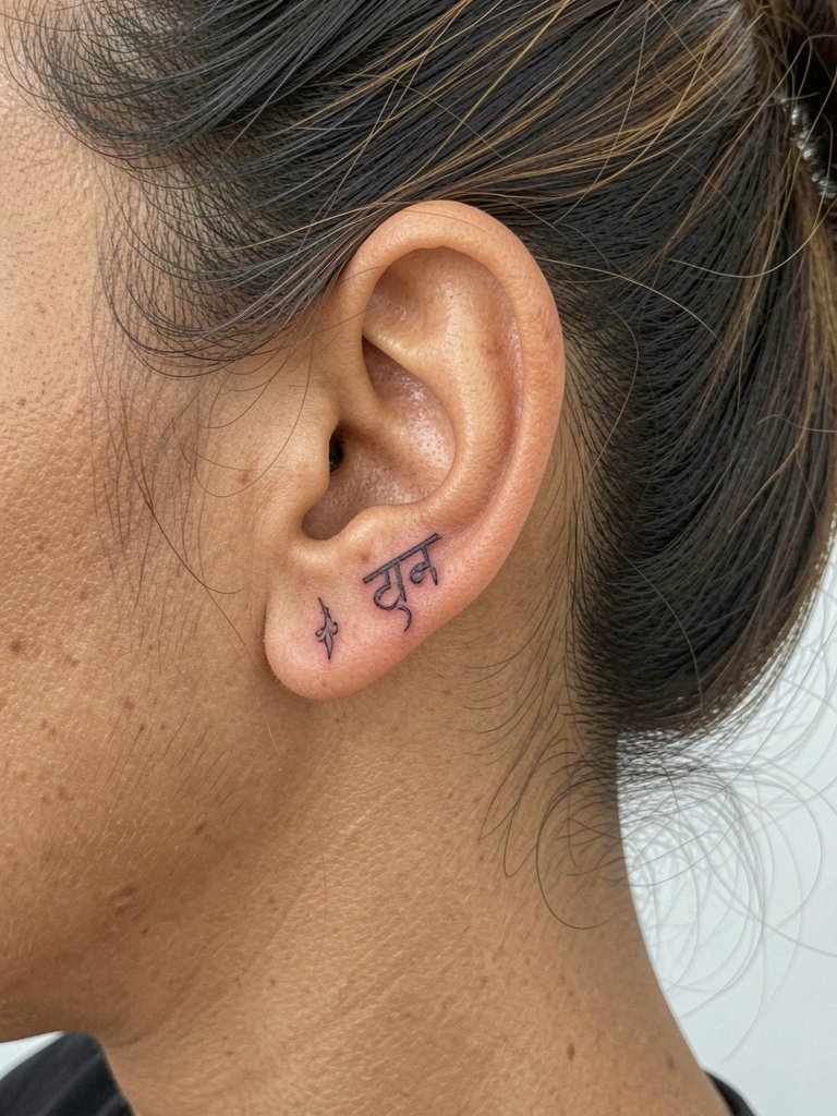
Why small behind-ear scripts hold: Behind-the-ear skin is sheltered, so tiny script can remain clear, provided the artist uses slightly thicker terminals than a paper sample. Session tip: the area is sensitive but quick. Wear hair up on appointment day and bring a delicate hairpin to keep the area exposed during the heal.
12. Vertical Chakra Word Stack Along Upper Spine
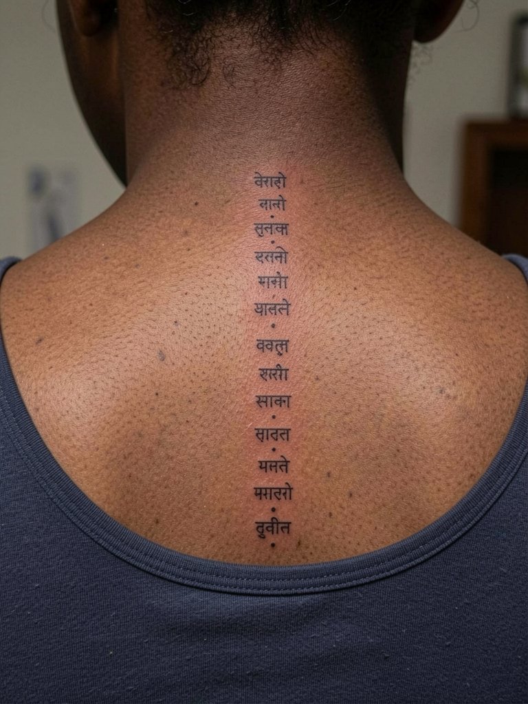
Why vertical stacks work: The spine provides a steady plane for stacked script and makes reading the list easy. A common mistake is compressing the words too tightly. For comfort, book a longer upper-back session to allow time for small breaks and to control ink depth. For outward styling choose shirts with wide necklines so the stack is visible without rubbing the area.
13. Tiny Lotus Seed Syllable at the Ankle
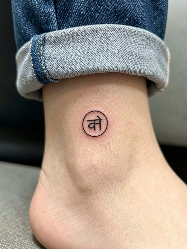
Why ankle glyphs age well: The ankle sees friction but a small high-contrast symbol keeps detail. Session wear: roll jean cuffs or wear cropped pants so the artist can access the area without fabric tugging. For evenings, an open shoe or sandal frames the small mark.
14. Single-Word “Prana” on the Wrist
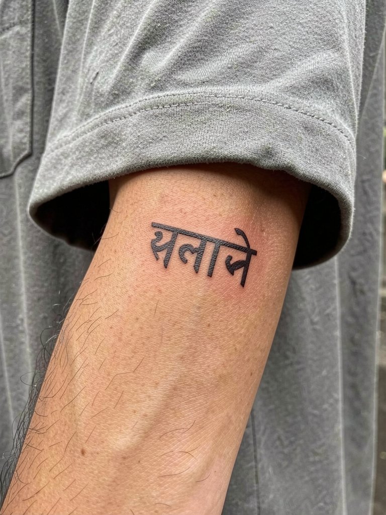
Why the wrist needs small adjustments: Wrists rub against cuffs and objects constantly. Ask for slightly heavier terminals and slightly greater spacing so the counters do not fill in. For the session wear a short-sleeve shirt or roll sleeves up so the area is free. Expect yearly lightening and allow for a touch-up if you use hand creams daily.
15. Wrap Band of “Lokah Samastah” Around Upper Arm
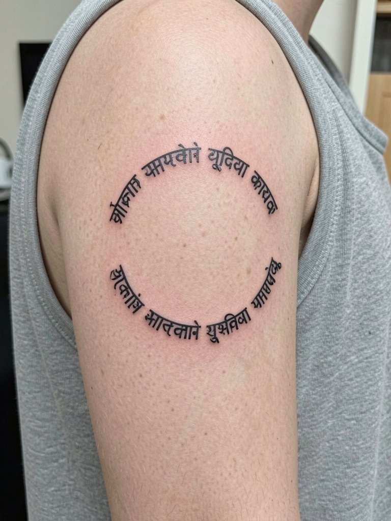
Why a phrase band works: A continuous band avoids awkward word breaks if set correctly. A frequent mistake is shrinking the band to a narrow line that collapses into a thin blur over time. Ask the artist to map the band on the arm before inking so you can see how curvature affects spacing. Session time varies with length. For style, sleeveless tanks display the ring easily.
Frequently Asked Questions
Q: How do I confirm the Devanagari spelling before the needle goes in?
A: Carry a clear transliteration and a printed classical example of the exact phrase. Request that the artist compare the stencil to a standard Devanagari reference and show you the transfer on skin before starting. If you want extra certainty, have a short video call with a native Devanagari reader or a Sanskrit speaker to confirm the characters on the stencil.
Q: Which placements are most likely to need a touch-up and why?
A: Wrists, hands, and ribs tend to need more touch-ups because of constant friction and skin movement. Fine single-needle script on ribs is especially vulnerable to blur from breathing and stretch. Plan for a touch-up window at 12 to 24 months for wrists and 12 to 36 months for ribs if you live in an active or high-sun environment.
Q: Where can I find artists who post healed Sanskrit work and not just fresh photos?
A: Search hashtags like #sanskrittattoo, #finelinetattoo, and #spiritualmantra on Instagram and TikTok and filter by your city. Tattoodo and the Inked App let you search portfolios with keywords such as "fine line Sanskrit Om." Reddit threads in r/tattoos and r/tattooadvice often contain peer-shared healed photos across skin tones.
Q: Should I choose Saniderm or dry healing for a thin script piece?
A: Artists split on this. One approach favors dry healing, arguing it avoids trapping moisture that can cause migration in hairline ink. The other approach prefers a short Saniderm window to prevent scabbing and friction. If you go with second-skin, use it for the first 3 to 5 days then switch to a light balm to reduce chances of migration.
Q: What should I wear to the appointment for a collarbone, sternum, or hip piece?
A: For collarbone or sternum bring a button-down, strapless top, or a crew-neck linen shirt that you can move without tugging the area. For the lateral hip choose loose drawstring or low-rise pants so the artist can roll the waistband without pressure. Example session items: crew neck linen shirt for collarbone sessions and loose drawstring linen pants for hip work.
Q: How do the controversies around decorative tweaks versus exact classical spelling play out?
A: One camp insists on preserving classical orthography and stroke order to respect linguistic integrity. They recommend exact letter reproduction and avoid decorative terminals that change character shapes. The other camp accepts modest stylistic adaptations to improve legibility and aesthetic balance on the body, provided the core word or phrase remains accurate. Both viewpoints are valid. If you care about both, require the artist to show the exact Devanagari stencil next to a classical reference and then demonstrate any artistic terminals on a separate sketch so you can approve.