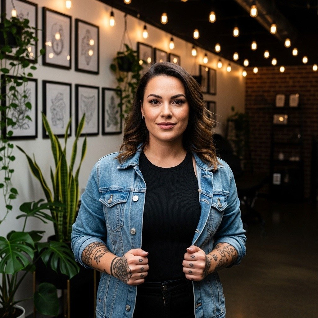
Fine line name tattoos are everywhere on feeds, but the wispiest scripts often lose their crispness faster than people expect. A tiny single-needle name on a finger can look like precise handwriting one month and a grey blur the next, while the same word on the inner forearm can read clean for years. Read these 27 micro lettering approaches with placement and wardrobe tips to help the design age the way you want.
1. Micro-Handwriting Script on Inner Forearm
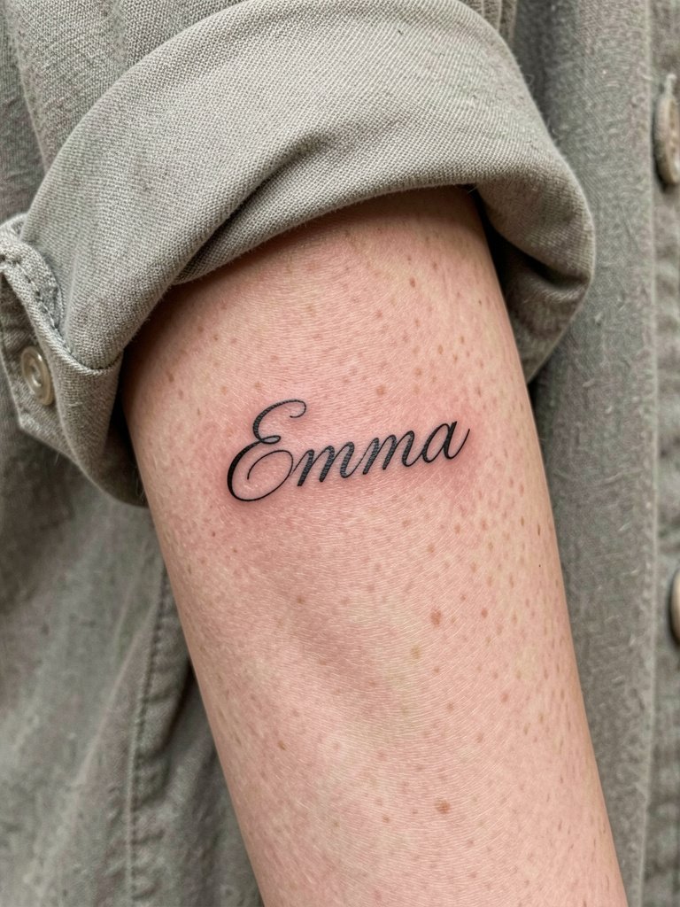
Micro-handwriting on the inner forearm is the classic move for first-timers wanting a personal name that reads like a handwritten note. I recommend bringing a 600 dpi scan of the handwriting and a printed reference so the artist can scale letter spacing accurately. Common mistakes include compressing letters too tightly to fit a short space, which makes the name merge after a year. For session wear, choose a linen button down shirt so sleeves roll cleanly and the artist gets unobstructed access.
2. Snape-Style Whisper Script on Inner Bicep
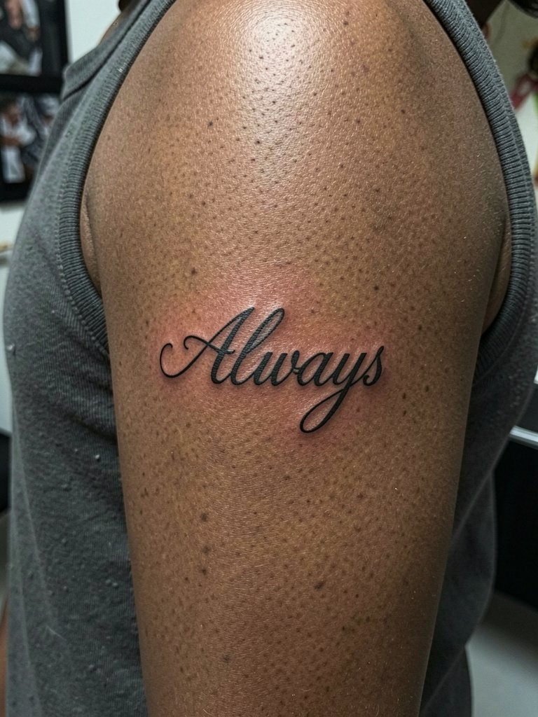
This whisper script reads like an elegant secret when the arm is down and shows gently when you lift your sleeve. The inner bicep is stable skin, but it can be shaded by clothing rub if you wear tight straps. Specify that line weight should be ultra-thin but not paper-thread thin so the letters do not disappear on darker skin. For session day, wear a sleeveless tank top so the artist has full access without fabric compressing the site. Expect low-to-moderate pain because the area has some soft tissue.
3. Botanical Wrapped Name Around the Wrist
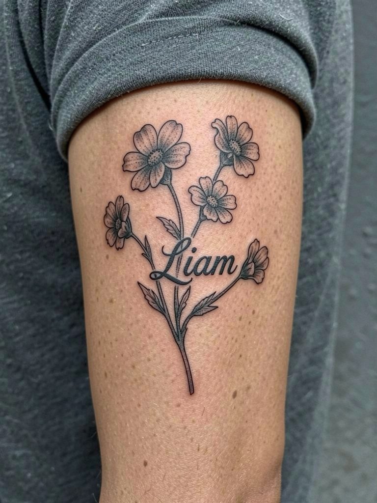
A botanical wrap solves the "plain text is boring" problem by using a stem to frame the name and add breathing room between letters. Wrist skin sees a lot of friction, so keep spacing generous and request soft stipple rather than dense shading. A common error is starting the wrap too tight; the stem should have tiny loops to give the script room as it settles. For outfits, pair this with a thin chain bracelet set on the opposite wrist to balance wrist jewelry without rubbing the fresh ink.
4. Cybersigil Initials Along the Lateral Wrist
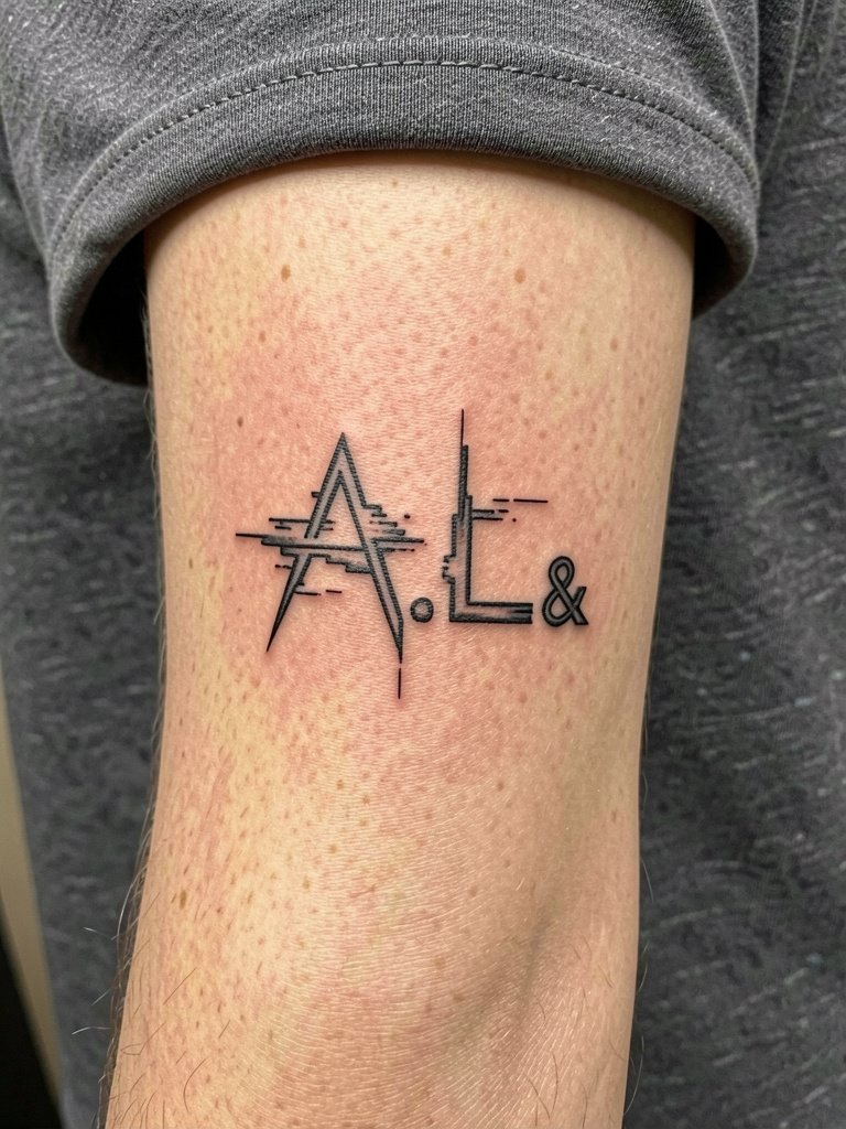
Cybersigil lettering gives a futuristic edge to initials by breaking the strokes into tiny, precise segments. This style needs clean angles and negative space so the "glitch" reads as intentional rather than accidental blur over time. Avoid placing ultra-thin glitches across joint lines where the skin folds. For session wear try a short-sleeve tee that allows wrist access without extra fabric in the way. The lateral wrist can be higher on the pain scale than the forearm but still manageable in a short session.
5. Birth Flower Name on the Collarbone
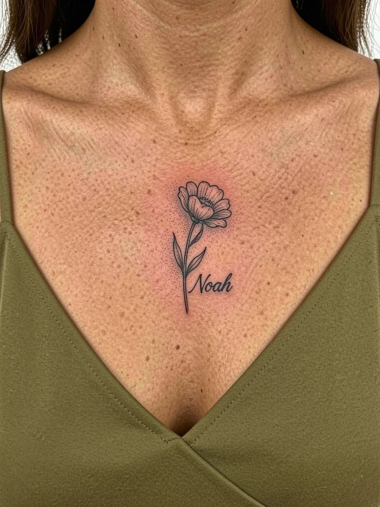
Pairing a name with the person's birth flower gives the script a natural frame and hides the edges that can blur. The collarbone siting photographs well, but the skin is thin so request a slightly firmer line weight to keep letters readable after healing. A common mistake is placing text too close to the clavicle ridge where movement can pull at the ink. For showing off, a slip dress in olive exposes the area elegantly and keeps fabric from rubbing during the first week.
6. Constellation Script Along the Ribcage
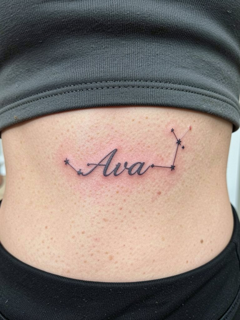
Fine line names on the ribcage look graceful but the skin stretches with movement. Artists split into two camps on this placement. One camp argues that ribs distort and blur thin lines within two years, especially under breathing and weight changes. The other camp says that with slightly wider spacing and careful depth the work holds up, and they point to healed examples for proof. If you choose this spot, wear a two-piece outfit for the appointment and expect higher pain than the forearm.
Session Day Picks
The inner wrist and rib pieces above need different prep. These five items smooth the chair time and the first week across the examples above.
-
Hustle Butter Deluxe (Light Version). A lightweight balm some artists prefer during healing because it moisturizes without a heavy, pore-clogging film on tight single-needle work.
-
Ink Juice Tattoo Aftercare. The no-stick finish reduces the risk of crusts smudging fine line edges in the first few days.
-
Tattoo Recovery Balm UK. A softer finish that prevents over-saturation of thin lines while the skin re-epithelializes.
-
Nilox Matte Finish Balm. Useful for clients who want reduced glare in photos of faint scripts.
-
Aquaphor Healing Ointment. A widely available option for the first 48–72 hours to lock in moisture before switching to a lighter balm.
7. Geometric Circle Name on the Hip
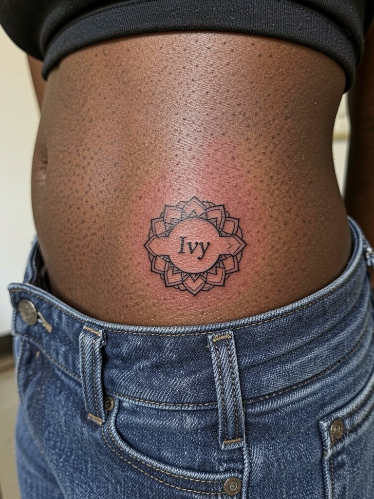
A geometric frame gives a name structure that helps the eye read it from multiple angles on the hip. The lateral hip sees body contour changes with weight shifts so avoid cramming letters near the high-motion edge. For wardrobe, low-rise jeans show the placement cleanly for evenings and editorial looks; try low rise jeans with structured tops. During the session, wear two-piece clothing so the artist can access the site without you getting fully undressed.
8. Micro-Realism Pet Portrait with Name Below
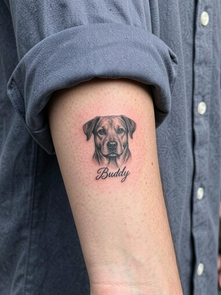
Micro-realism on a small scale is demanding but rewarding when done right. The main risk is packing too much detail into too small an area, which becomes indistinct after healing. Ask for a session mockup at two scales so you can see how the facial detail resolves at 2cm versus 5cm. For showing the piece, minimalist rings on the opposite hand keep focus on the forearm portrait. Expect a longer session and a possible touch-up window at six months.
9. Vertical Spine Name from Nape Down
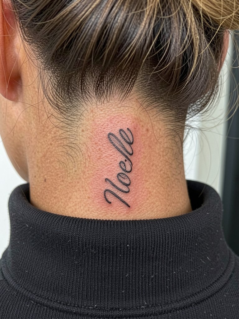
Vertical scripts along the spine use the body line to elongate names. The nape is visible with hair up and pairs well with high collars. Warn your artist that letters must breathe vertically so curves do not touch when the skin flexes. For session day, pull hair up and wear a hair up clip so the artist can work at the base of the skull without obstruction. This placement is more sensitive than the forearm but less than the sternum for most people.
10. Single-Continuous Line Name on the Inner Forearm
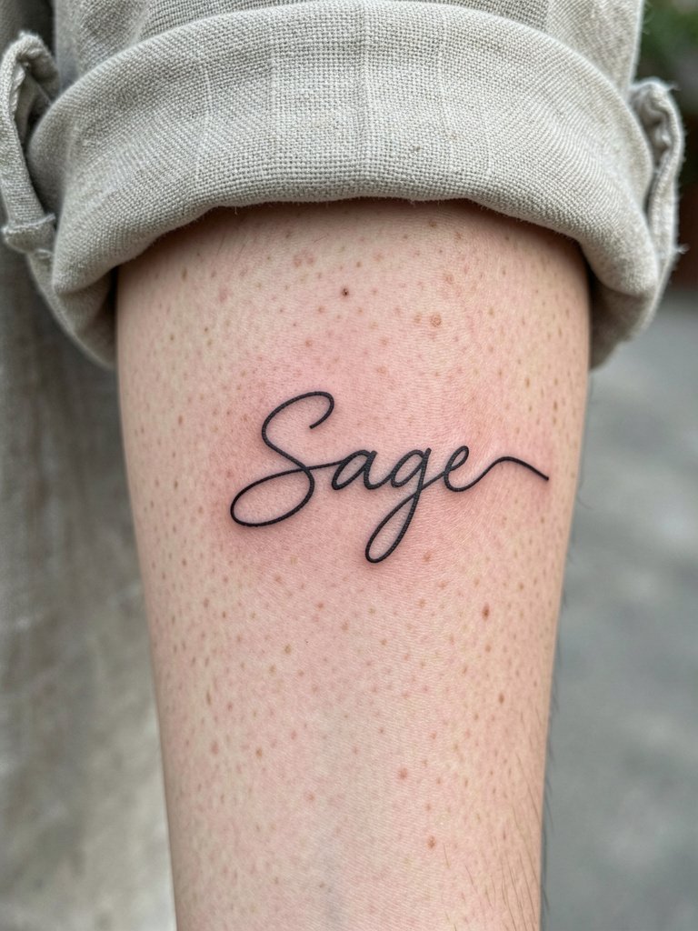
Single-line names read like an artist's sketch and feel modern on the forearm. The design needs intentional negative space so loops do not collapse into one another during healing. A common mistake is forcing too many letters into one tight continuous path. For session wear try a rolled cuff linen shirt so the sleeve keeps out of the way but you still look put together.
11. Butterfly Wing Name on the Wrist
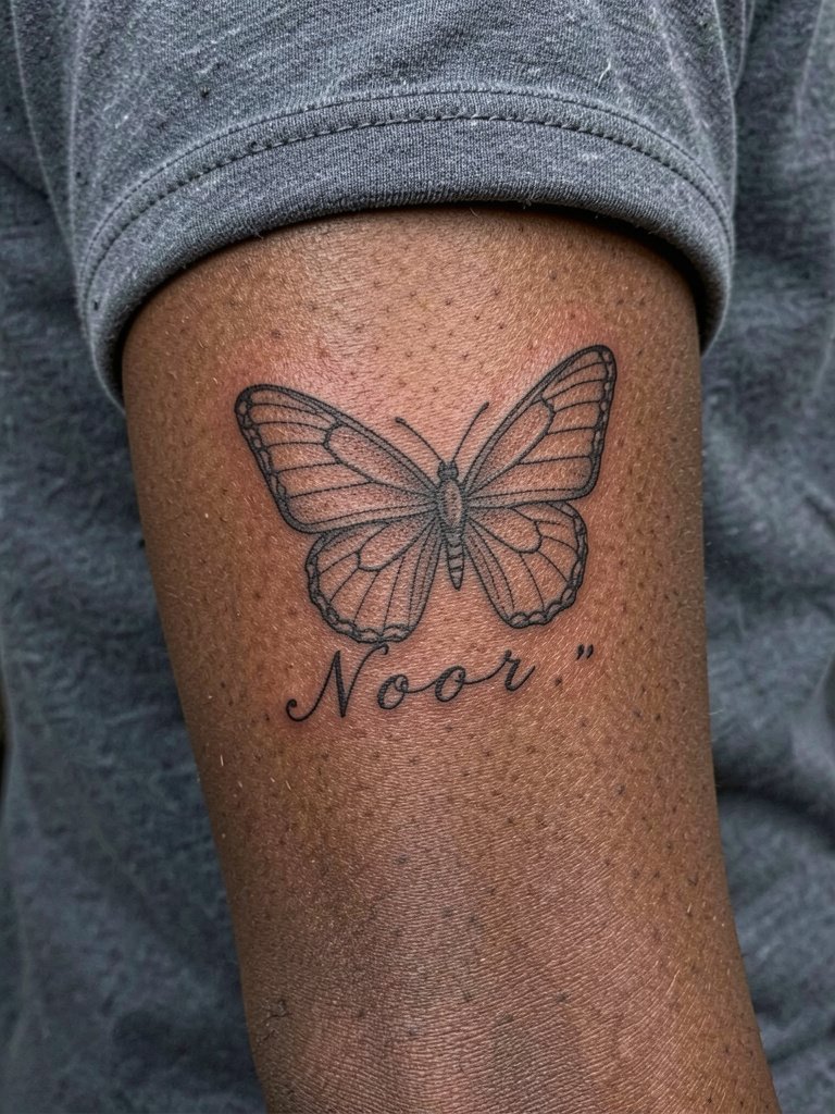
Using wing veins to incorporate a name keeps the text integrated into a motif that still reads as jewelry. The wrist is a high-friction area, which makes fade more likely. For showing off, keep other jewelry minimal and add a thin chain bracelet on the opposite wrist. Plan for a touch-up at 12 months rather than assuming permanence, especially if you wash hands frequently.
12. Ornamental Lace Framed Name on Collarbone
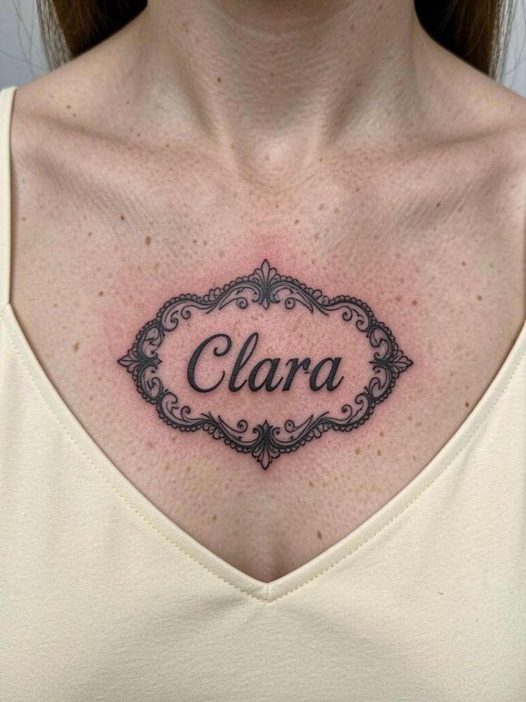
Lace borders read like delicate jewelry on the collarbone and help anchor script so it does not wander into creases. The biggest mistake is making the lace too fine; the pattern needs slightly bolder connecting lines to stay legible after healing. For wardrobe, a dainty pendant necklace on the opposite side balances the visual field without rubbing the fresh piece.
13. Coordinates and Name on Inner Forearm
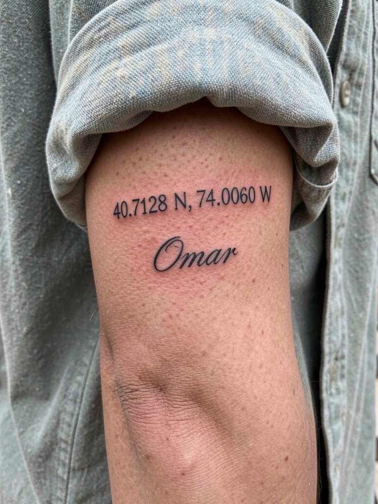
Coordinates paired with a name feel like a tidy memory capsule. Numbers need open, clear spacing so numerals do not blur into a string. Ask for a mock-up that compares monospace numerals to thin serif options so you see which reads best at small scale. For session wear, a loose button-down keeps the forearm accessible without tight cuffs pressing on fresh lines.
14. Minimalist Animal Silhouette with Name on Side of Hand
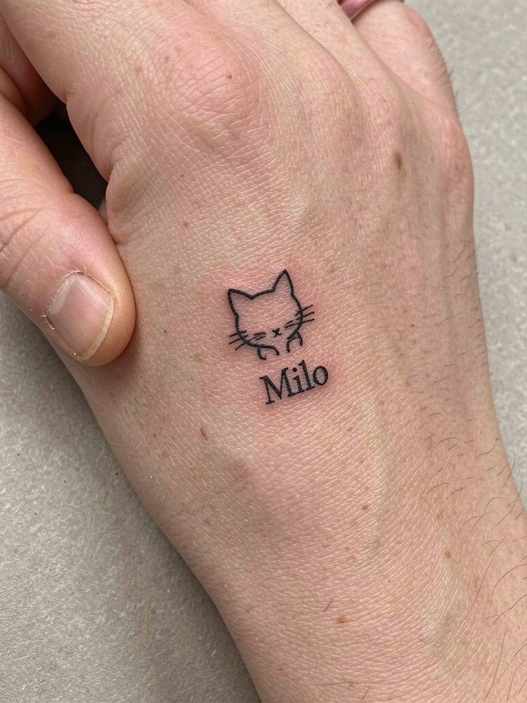
Hands are trend-forward but high maintenance. Artists split into two camps over hand placement. One camp advises never to put tiny names on fingers or hands because skin renewal makes them blur within months. The other camp accepts that some people want the temporary aesthetic and will schedule yearly touch-ups. If you pick the side of the hand, remove all rings during the session and plan for periodic touch-ups rather than treating this as a no-maintenance piece.
15. Sticker-Style Name Patch on the Rib
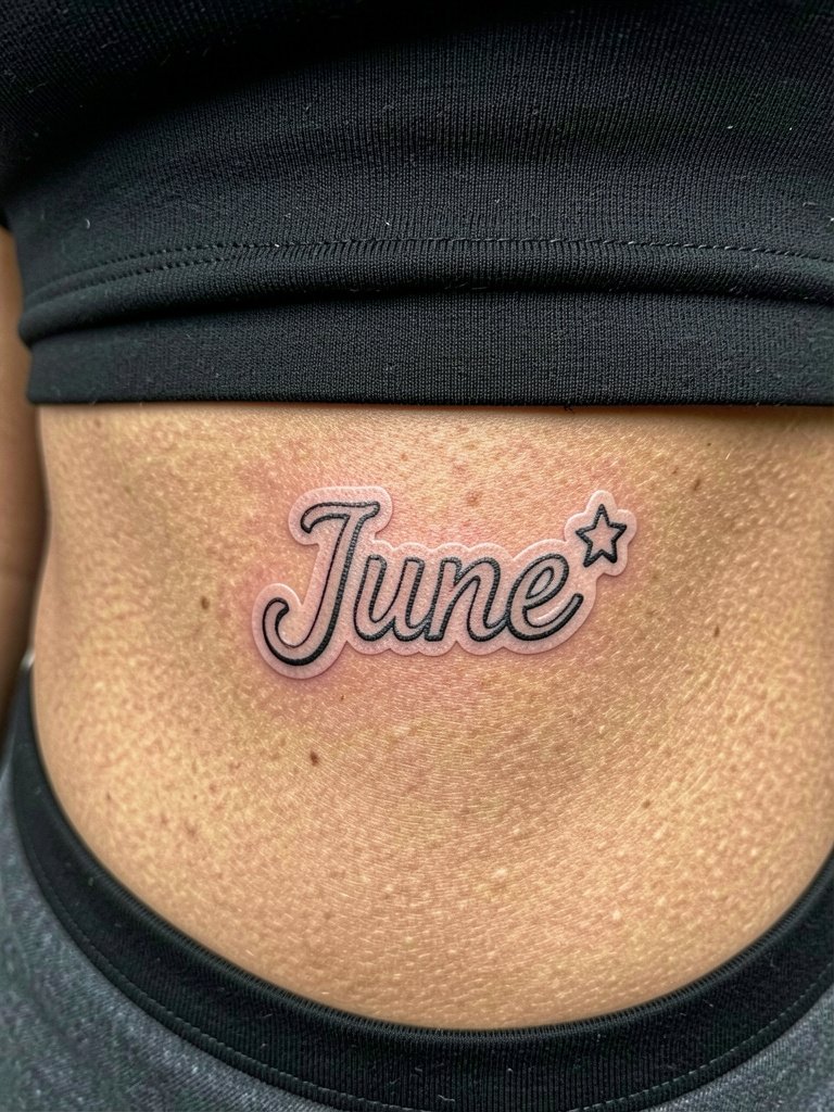
Sticker-style patches lean into a slightly bolder edge so the design reads like a small sticker on skin. On ribs, err toward thicker outline than you might on the forearm. The rub against clothing can be minimized by choosing soft fabrics while the area heals and by avoiding tight waistbands for the first two weeks. For session access, a two-piece outfit is ideal so the artist can work without you removing everything.
16. Single-Line Butterfly with Name Hidden in Vein
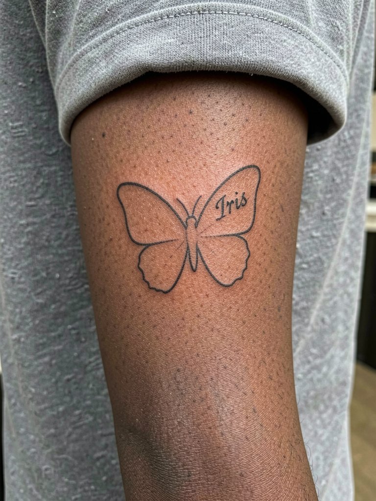
Clever single-line tricks like hiding a name in a wing vein reward a close look and keep the visible form readable from afar. The trick is to make the hidden letters slightly clearer on one reference photo so the artist can maintain those contours during inking. Pair this with airy fabrics and a minimalist watch on the opposite wrist to avoid crowding the design.
17. Micro-Realism Face with Name Underneath on Inner Forearm
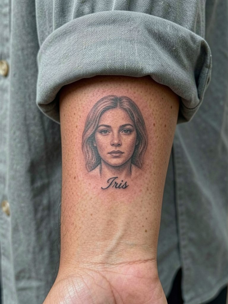
Micro-realistic faces at small scale require planning on how shadows reduce into dots over time. Ask the artist to show you a healed sample with similar tonal range to ensure facial features will remain readable. For showing off, keep the forearm clear and accessorize with a dainty gold stacked bracelet set on the opposite wrist to avoid rubbing the portrait.
18. Script Inside a Geometric Frame on the Hip
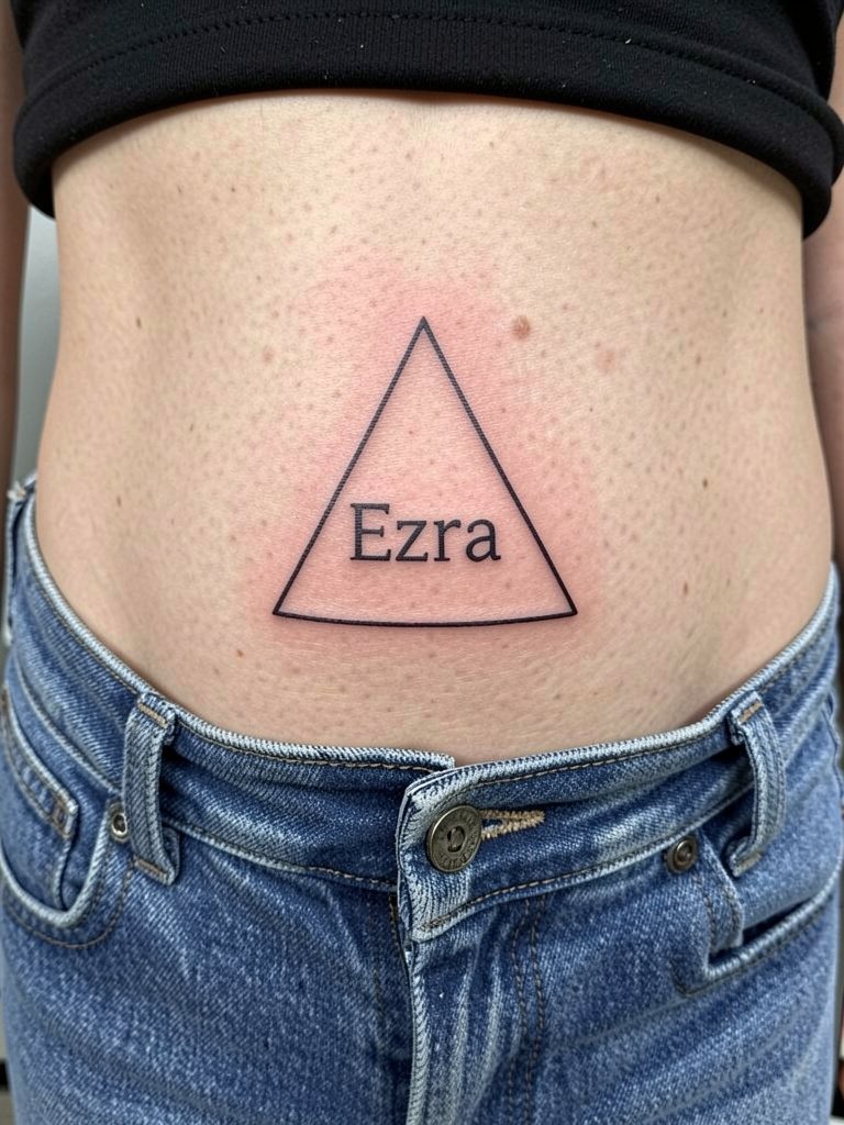
Geometric frames help small scripts read as intentional graphics rather than scribbles. On the hip, ensure the frame sits on the flattest part of the lateral bone so it does not distort with movement. Outfit-wise, wide-leg pants with a cropped top show the placement without rubbing; try wide leg pants. Expect a moderate session length and bring a change of clothes so nothing rubs the fresh ink.
19. Small Birth Date Roman Numerals with Name Under
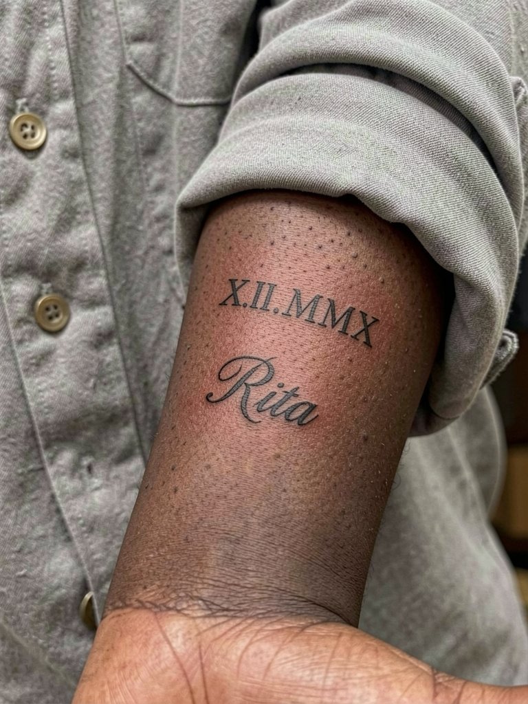
Roman numerals need spacing so the bars and dots do not merge into a single line as the skin heals. Pairing a date with a name gives hierarchy and an anchor for scaling decisions. Bring both a small and a slightly larger mock-up so you can choose the size that preserves numeral clarity. For session wear keep forearm access easy with a loose fit tank top.
20. Tiny Heart-Shaped Name Monogram on the Finger
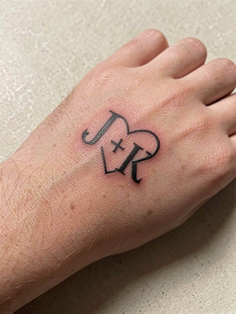
Finger work is fashionable but high maintenance. Expect more frequent touch-ups because the skin renews rapidly and friction from washing wears the ink. If you want a finger monogram, choose slightly bolder lines and accept a maintenance schedule. Remove rings during the session to avoid smudging and plan to protect the area during the first week.
21. Stacked Names on the Collarbone
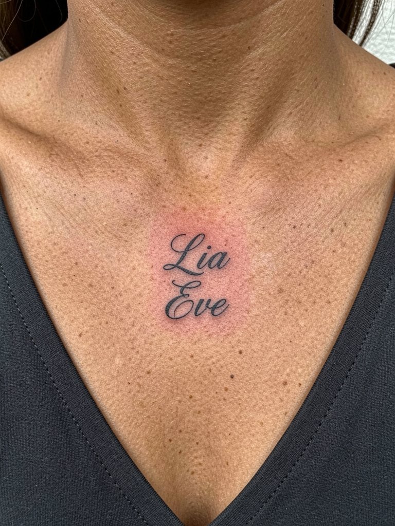
Stacked names look like a layered pendant and make use of symmetry on the chest. Keep vertical spacing so that each name has breathing room; collapsing stacks are a common cause of illegibility after two years. For showing off, try a wide V-neck top that exposes the area without straps rubbing the healing skin.
22. Script Hidden Along the Waistline
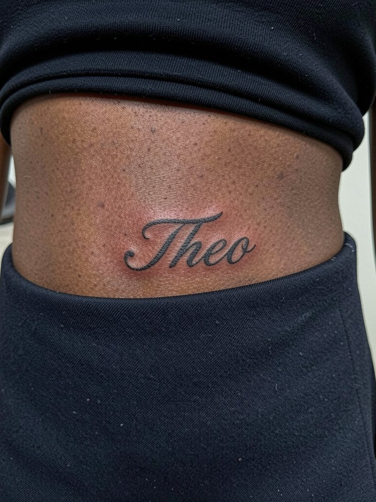
Names tucked along the waistline are easy to hide and therefore good for relationship anxiety. The hip and waist move with body shifts, so choose a short name and gentle curvature to prevent stretching. Low-rise or high-waisted clothing can make the piece a private detail; wear high waisted skirt styles to reveal it selectively.
23. Thin Serif Name Inside a Small Circle on the Ankle
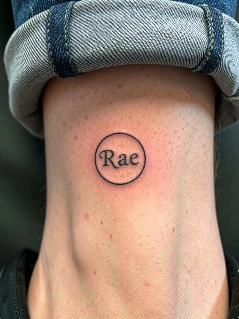
Ankle circles read as little emblems and age well when given room. The ankle can scab if shoes rub, so keep footwear loose and avoid tight socks for two weeks. For footwear pairing, rolled cuff jeans expose the piece; try rolled cuff jeans and low-profile sneakers for an everyday look.
24. Hidden Name on the Inner Thigh
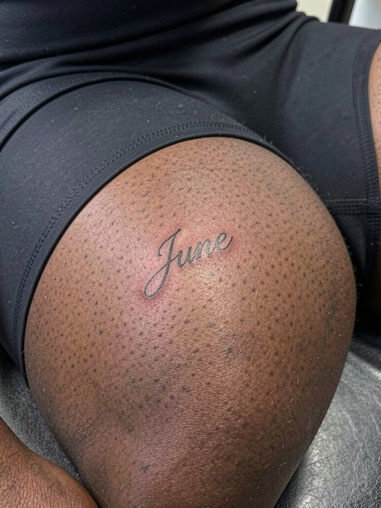
Inner thigh placements are great for private names because they are hidden by most clothing. The area can move with weight fluctuation so avoid long lines and favor short names. For the session wear fitted bike shorts so the artist can expose the site while keeping you comfortable. Healed results vary with friction from walking, so schedule touch-ups if you notice softening after the first year.
25. Micro Script Along the Clavicle Edge
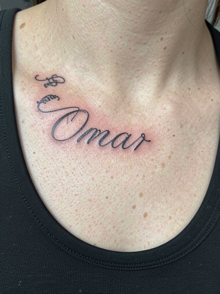
Edge-of-clavicle scripts look like jewelry and photograph well. The main technical point is to avoid placing letters right on the bone ridge where the skin flexes. For showing the tattoo, choose scoop necklines that do not compress the area and use a thin strap top for casual reveals. Expect low pain but sensitive scraping sensations during the session.
26. Fine Line Side Rib Name with Floral Accent
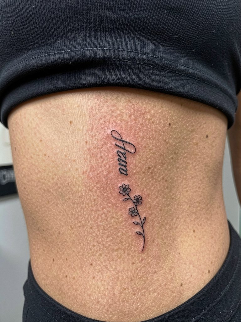
Rib names with decoration look very editorial but controversy exists. One camp says ribs are unstable and thin single-needle script will blur quickly because of skin stretch and breathing. The other camp says that with proper needle depth and slightly wider spacing the lines stay legible and they will cite healed portfolios as evidence. If you choose ribs, request a slightly heavier initial line weight and plan for potential touch-up at the two-year mark.
27. Minimalist Name Along the Side of the Hand
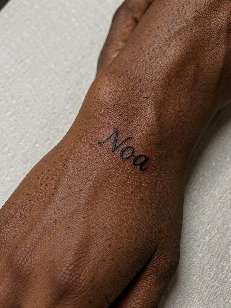
Side-of-hand placement is visible and tactile. Factor in frequent hand washing and rings that could rub the area. If legibility over time matters to you, choose a slightly thicker line or accept scheduled touch-ups. For session prep, have clean hands and remove rings so the artist has unobstructed skin to work on.
Frequently Asked Questions
Q: Where can I find healed examples and artists who specialize in fine line name work without following specific artists?
A: Search hashtags like #finelinetattoo and #microfineline on Instagram with your city added in the location filter. Use Tattoodo or tattoo directories to filter portfolios that show healed images rather than fresh ink. Reddit threads dedicated to fine-line tattoos also collect community-shared healed shots across skin tones.
Q: Should I pick single-needle 1RL or go with 2RL for a name on darker skin?
A: Single-needle 1RL creates the weightless script many people want but may vanish on darker skin tones. One approach is to request a slightly heavier line like 2RL or subtle grey shading under the script so the letters keep contrast in photos and after healing.
Q: How do finger and hand name tattoos age and what realistic timeline should I expect?
A: Hands and fingers are the most likely places to soften into grey within months because of constant washing and abrasion. Plan for regular touch-ups if you love that placement and accept that touch-ups every 6–18 months are common for tiny finger scripts.
Q: What should I wear to the studio for a rib or hip name session?
A: For ribs wear a two-piece outfit so the artist can access side torso skin without you removing everything. For hip pieces try low-rise jeans and a crop top so the waistband sits below the tattoo. A recommended item for session comfort is loose drawstring linen pants if you need breathable coverage while getting lower body inked.
Q: Can custom handwriting be worth the risk compared with refined fonts?
A: There are two viewpoints. One group worries that custom handwriting will look uneven unless the tattooist is a script specialist and prefers refined fonts for predictable legibility. Another group values authenticity and feels a loved one’s actual handwriting brings unique emotional weight that standard fonts cannot match. If you choose handwriting, bring a high-resolution scan and ask to see the artist's healed script samples.
Q: How soon will I know if a fine line name needs a touch-up?
A: Most fine line touch-up needs show up between six months and two years depending on placement. Inner forearm work often lasts longer, while fingers and hands often need correction within the first year.
Q: Is there a reliable way to preview how a name will read at different sizes before booking?
A: Ask for printed mock-ups at several scales on blank skin or use temporary transfers to wear for a day. Seeing the design at 2cm and 5cm on your own skin will reveal how spacing and letterforms behave before the needle ever touches you.