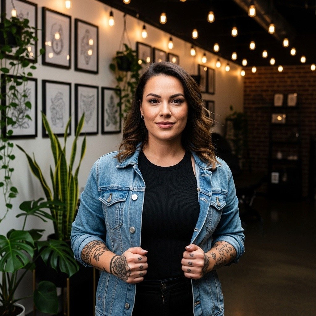
The look people choose for scripture matters more than the exact verse. Tiny single-needle script on fingers reads delicate at first and then blurs, while slightly bolder script on the forearm keeps letter shapes longer. Think about spacing, letter height, and placement first, then the font. Start with a clear idea of how visible you want the verse to be in jeans and short sleeves, and the first design below shows a conservative, long-lasting option.
1. Fine Line Psalm Verse on Inner Forearm
A narrow serif-cursive rendition of a short verse reads elegant on the inner forearm and is easy to cover. I favor a hair heavier line weight than what many Pinterest fonts show because the inner forearm can soften tiny strokes by year three. Plan for a 30 to 60 minute session, expect mild discomfort, and schedule a potential touch-up at year two if you want crisp counters. Bring a reference that shows the letter height at actual scale so the artist can mock up spacing on your arm. This placement pairs well with rolled-up linen shirts for showing the script without crowding, try rolled-up linen shirts to frame the piece.
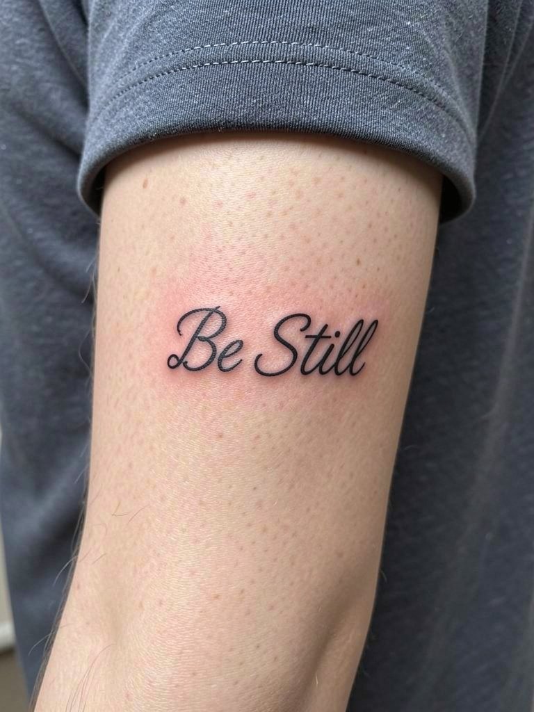
2. Micro Script Wrist Reference
Small script on the wrist looks intimate and carries risk because of hand movement and frequent washing. The mistake I see most is cutting letter height too small so the counters close within a year. Ask for letter heights that remain legible at two inches and request slightly heavier strokes on letters with thin stems. Sessions run quick, often under 45 minutes, and the wrist can feel raw while healing. For showing it off, a slim bracelet or a cuffed short sleeve works best. Try pairing the wrist text with a slim leather cuff bracelet to frame the line.
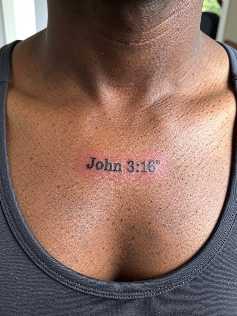
3. Bold Reference on the Collarbone
A short verse citation in small caps stands up on the collarbone because the flat surface keeps edges sharp. This placement tolerates bolder strokes better than single-needle script. Expect one session under an hour and moderate tenderness when leaning forward during the first week. A common aging issue is letters settling into faint blur when placed too low near the neckline, so the artist should center the text on the bony ridge. For evening wear, this placement pairs well with scoop-neck tops or thin chain necklaces. Consider a delicate thin chain necklace to accent the line without obscuring it.
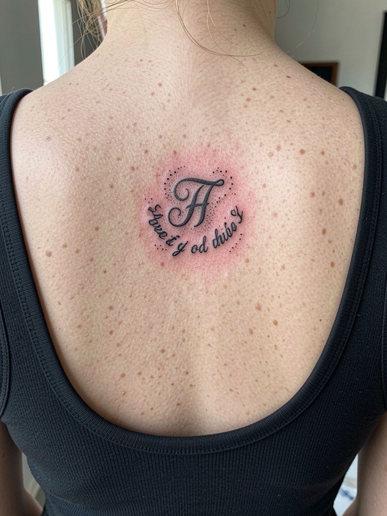
4. Illuminated Initial on Upper Back
An initial styled like an illuminated manuscript makes a compact chest-back focal point for a longer verse that continues beneath clothing. This is a good choice when you want a statement without a full torso piece. The upper back is lower-pain and holds saturation well, so stipple shading and dot work age nicely there. A common mistake is choosing a tiny ornate initial that loses the interior filigree. Plan for a 90 minute session if paired with surrounding script and request healed references for stipple texture at three years. Wear a wide-strap top to the appointment so the artist has clear access and your clothing does not rub the fresh ink.
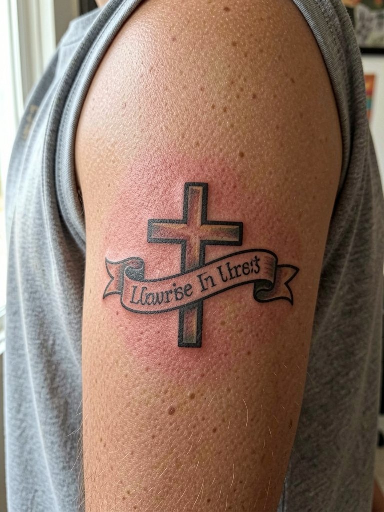
5. Verse Banner on Outer Bicep
A small banded banner with a short verse near the outer bicep reads bold and travels well with sleeves. I recommend this if you want a readable piece that still tucks under shirts. Ask the artist to keep negative space inside the banner so the text does not fill out into one dark block over time. Outer bicep sessions feel moderate in pain and usually complete in one to two hours depending on color. The outer arm resists blowout compared with inner arm locations. Pair the bicep band with short-sleeve shirts or sleeve rolls that expose just enough. Try a casual sleeveless tee to show this placement without overheating it.
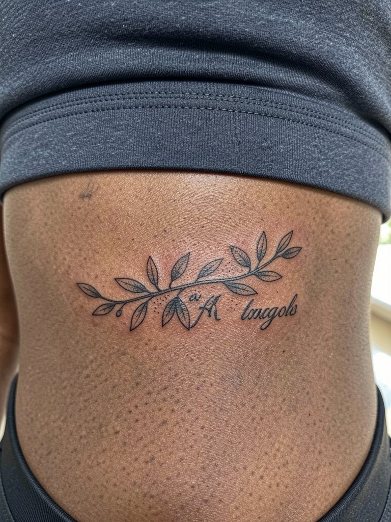
6. Olive Vine Script on the Ribcage
Script wrapped in an olive vine creates a softer canvas on the ribs and suits longer lines that need space to breathe. Be warned, the ribcage is a high-pain area and sessions may be split with breaks. The controversy around fine-line on ribs splits artists into two camps. One camp argues that the skin stretch and movement cause fine lines to blur within two years, especially under the breast crease. The other camp says with slightly wider spacing and precise needle depth, fine line can settle cleanly and show healed photos to support that claim. For the session, wear a fitted sports bra so the artist has access without tugging fabric.
Session Day Picks
These items smooth out the appointment and first week for chest, wrist, and rib placements in ideas 1 through 6.
-
Stencil transfer sheets. Lets you test actual placement and line weight on skin before final inking, especially helpful for verse sizing on the forearm and collarbone.
-
Disposable fingertip bandage rolls. Thin film that protects small wrist and finger script while allowing light breathability during everyday tasks.
-
Cooling gel patches. Apply briefly after the first day of healing to ease swelling in sensitive rib and collarbone areas without poisoning the ink channels.
-
High-thread pillowcase covers. Clean sleeping surfaces reduce friction and keep fresh lines from rubbing on cotton, which is useful for upper back and rib work.
-
Fragrance-free healing ointment. A mainstream, gentle option for the first 48 hours to maintain moisture and reduce scab hardness on fine work.
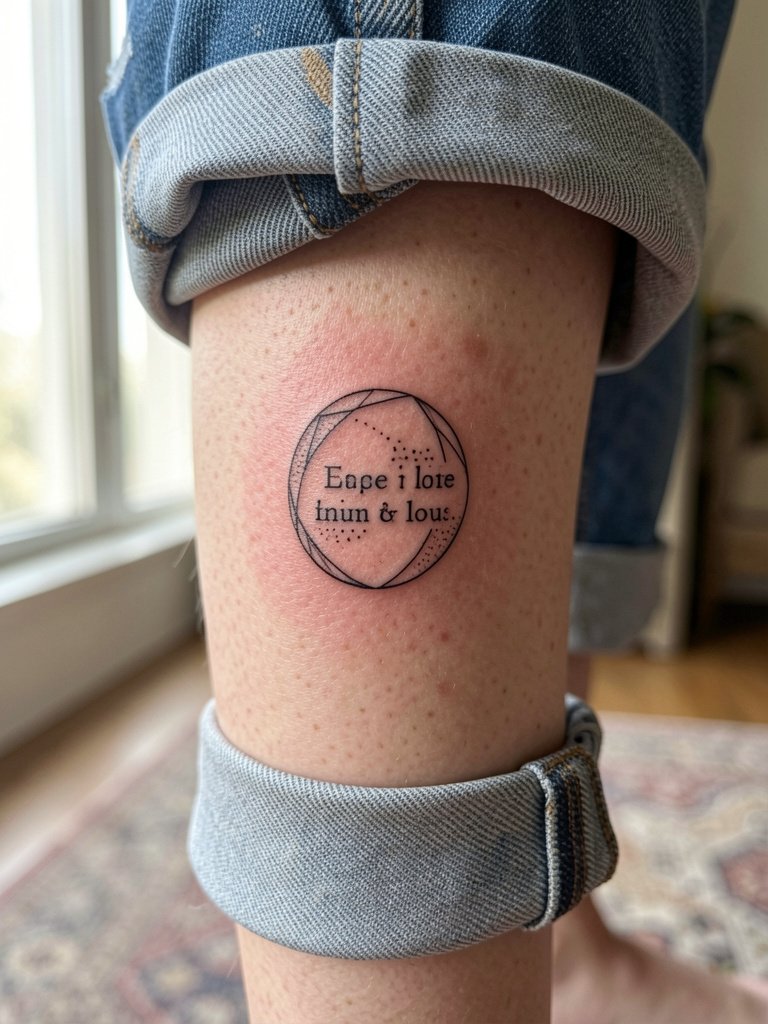
7. Circle Verse on the Calf
A circular verse with dot work gives a quiet, wearable look on the outer calf and resists rubbing from pants. The calf is moderate pain and the muscle holds saturation well, so stippling and dot shading last. Common mistakes include crowding the circle with too many words which forces tiny lettering and causes legibility loss. For sessions, wear loose drawstring linen pants so the artist can roll the leg without pressure on fresh ink. This placement looks great with cropped jeans and mid-calf boots, try cropped denim jeans to balance the exposure.
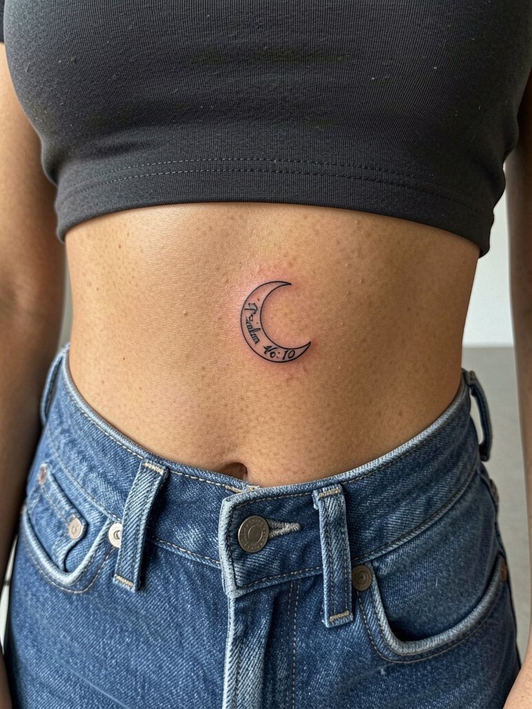
8. Crescent Short Verse by the Waist
Short phrases that hug a curve like a crescent work well on the side torso because the shape complements body contours. The rib and waist area can be sensitive during the first sit so plan for pacing. A visual mistake is overloading the crescent with long sentences which compress the letters. Ask the artist to map the phrase at full scale so letter flow follows the natural curve of the body. This placement pairs quietly with high-waisted jeans and cropped tops. Wear a loose drawstring linen pant to your session to keep pressure off fresh ink while dressing.
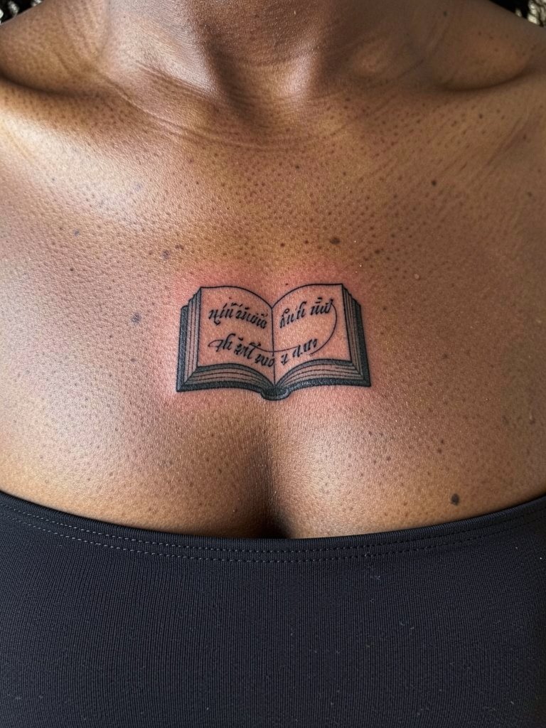
9. Sternum Line in Fine Script
Sternum script reads intimate and suits a short meditative line that sits centered. This area needs a specialized approach because depth control is essential under thinner sternum skin. Pain ranges higher than the forearm and sessions may be interrupted for breaks. A common early-care mistake is placing too many letters across the sternum which causes the middle letters to compress. Discuss spacing and ask for healed photos of similar placements on your artist's portfolio. For appointment comfort, wear a fitted bandeau or sports bra so the artist has clear access without fabric shifts.
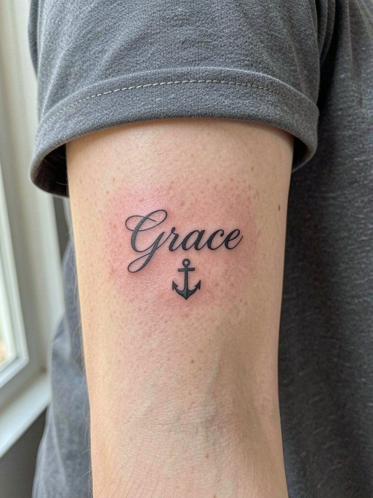
10. Single Word Anchor on the Inner Wrist
One-word scripture tattoos work on the inner wrist when they are designed with open counters and moderate weight. The inner wrist is under constant motion and soap friction so thin strokes vanish faster there than on flatter areas. I recommend slightly bolder single-needle or micro-bold lettering and a scheduled touch-up at year one. Sessions are brief and tend to be sensitive because of the thin skin. For showing off, a slim watch or narrow bracelet complements the word without covering it. Try a slim mesh watch band to keep attention on the text.
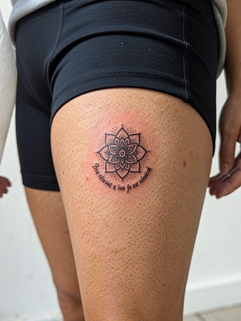
11. Mandala Arc on the Thigh
A mandala accent with a verse underneath works well for private pieces on the inner thigh where size can expand without crowding. The inner thigh can be a tender spot, and sessions may require repositioning. A mistake is compressing ornate mandala detail into a small surface which becomes muddied as it heals. Have the artist show you how the outer rings will look at three inches versus five inches. For appointment comfort, wear modest athletic shorts so the artist can access the area without fabric tugging. This placement peeks nicely under midi skirts, pair with modest athletic shorts for both session wear and styling.
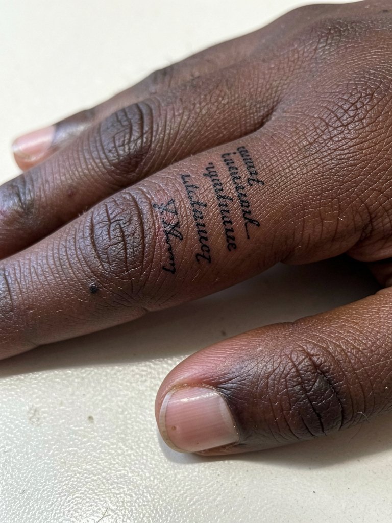
12. Narrow Column Finger Script
Finger scripts are intimate but notoriously high-maintenance because the skin there layers differently and the ink migrates. Two camps argue about finger script longevity. One group says small strokes on fingers fade and blur within a year due to constant hand use and shallow ink placement. The other group points to bold micro-lettering and warns that heavier strokes can scar if done too deep, but when done carefully some healed examples remain legible for multiple years. Expect touch-ups sooner on fingers than on forearms, and plan to refresh at least once in the first 12 to 18 months.
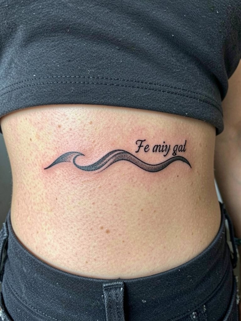
13. Wave Phrase for the Side Ribs
A flowing verse that follows a wave motif fits naturally on the ribs and adds motion to static text. If you want a longer sentence here, space is generous but pain increases with depth across rib cartilage. The visual mistake is forcing a paragraph into a narrow arc which compresses letters. Discuss full-scale placement so the artist can map the path and anticipate how the skin stretches when you breathe. For sessions, bring layered clothing you can remove without dragging fabric across the area. After healing, crop tops and high-waist skirts show the arc attractively.
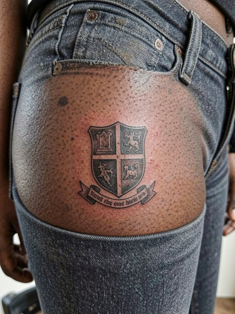
14. Heraldic Mini on the Hip
A small shield with a scripture banner gives a heraldic feel without overt symbolism overload. The hip is forgiving for saturation and the lateral placement keeps the lines stable as you move. Mistakes happen when clients try to pack long text into the shield; keep the verse short or use a reference citation instead. Sessions are low to moderate pain and often finish in one sitting. This placement plays nicely with swimwear and low-rise jeans. For showing it off, pair with low-rise denim or a simple belt that sits below the piece.
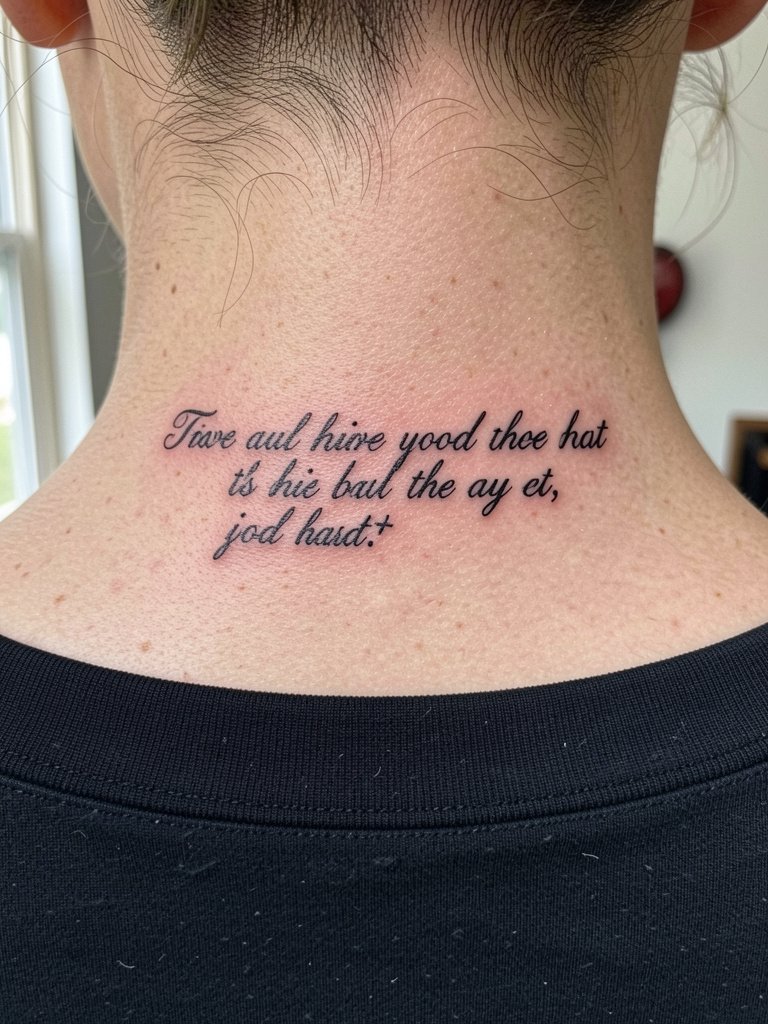
15. Nape Short Script
A short word or two at the nape reads private and elegant and is easy to conceal with hair. The back of the neck can be tender and sometimes requires a steady hand because the skin thickness varies. A common client error is choosing an overly ornate script that merges into a smudge with neck movement. Keep letter spacing open and ask to see healed nape photos in varied hair lengths. For styling, a low bun or short crop frames the nape piece; try a neutral wide-neck top when you want to show it.
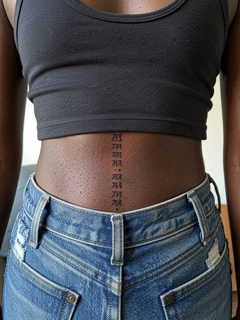
16. Vertical Spine Script
A slim column of text along the lower spine creates a hidden line that looks clean when seated or standing. The lower back tolerates linework well but sits near clothing edges so plan placement carefully relative to waistbands. Pain level is moderate and sessions are often one sitting. Avoid long dense paragraphs which can turn into a darker block as they heal. Ask for a centered stencil and mark the waistline on you so the artist aligns the type with your proportions. After healing, the lower back shows nicely in cropped tops and swimwear.
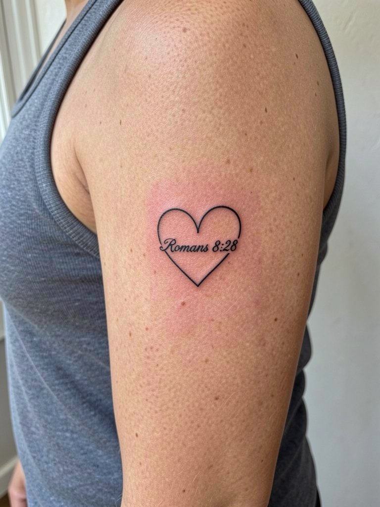
17. Heart Banner on the Inner Bicep
Inner bicep placements are flattering for script that the wearer wants to keep somewhat private. The inner upper arm avoids armpit crease when the arm is relaxed, so the area is stable and ages reasonably well. The most common mistake is placing text too close to the armpit where friction from clothing blurs fine strokes. Request the artist place the design midway between elbow and armpit and preview it with your arm relaxed. Sessions feel moderate and the inner bicep can require longer sitting if shading is added. For showing off, sleeveless tops highlight the inner arm, and you can pair it with a sleeveless denim vest.
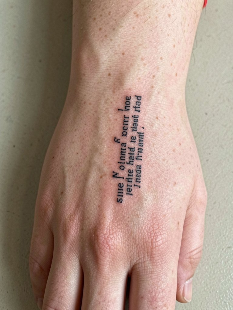
18. Stacked Finger Words
Stacked micro-words on fingers have huge visual impact up close and require acceptance of early fading. Fingers live in a high-wear environment and often need touch-ups within a year. The mistake is asking for dense, ornate lettering; choose open type and allow for future refresh. Sessions are quick but the area is sensitive and sometimes produces heavier scabbing. If you want a long-lasting result, plan on annual touch-ups and be ready for slightly softened edges after each seasonal fade. Minimal rings and neutral nail polish help the tiny column read clearly.
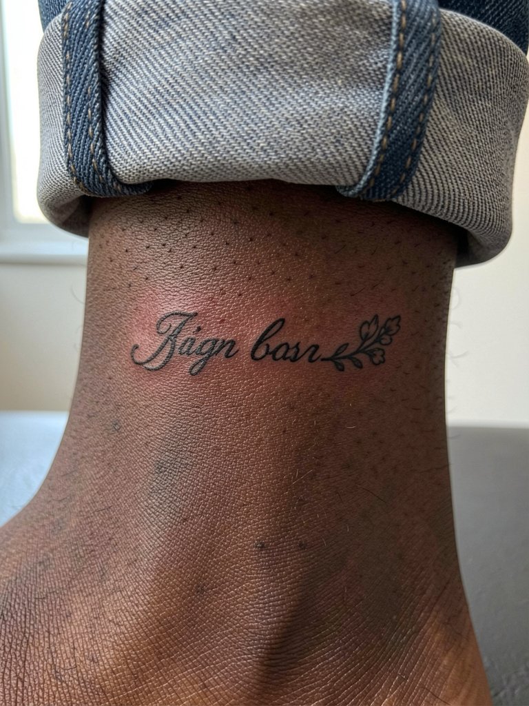
19. Sprig + Script on the Ankle
A short phrase with a small botanical accent suits the ankle's compact canvas and survives well with the right spacing. The ankle experiences friction from socks and shoes, so small filigree can blur faster than bolder counters. Ask for an anchor point above the ankle bone so movement does not distort the baseline. Sessions are low to moderate in pain and usually short. For styling, this placement pairs with rolled jeans or sandals that let the detail peek out. Try strappy flat sandals to show the ankle work without rubbing the site.
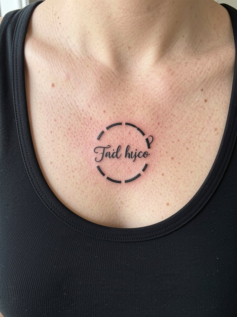
20. Small Chest Roundel
A compact roundel above the heart is intimate and centered, which works well for short doctrinal phrases or single-line citations. The chest area takes a mid-range session time and may be tender if shallow shading is requested. A frequent client error is crowding a paragraph into the roundel which reduces legibility. Plan a mockup at actual scale and view it in a mirror while standing. For showing the piece, scoop-neck tops or thin necklaces present the work without covering the type.
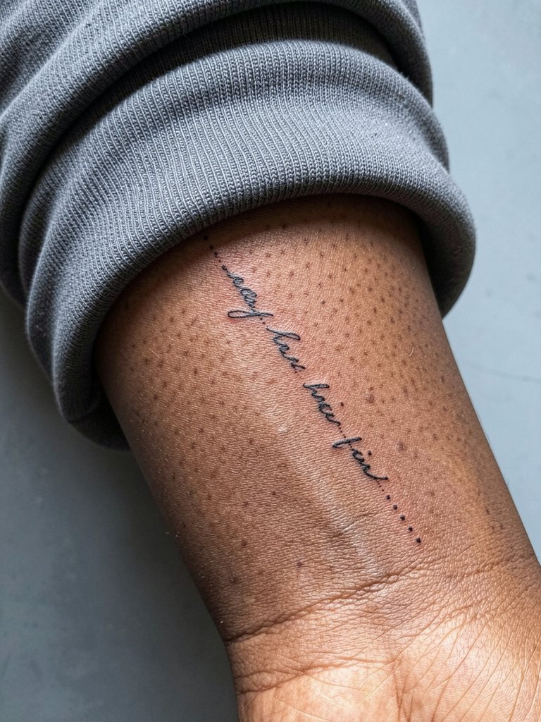
21. Dot-Chain Verse on Forearm
A dotted chain with text is subtle and scans like jewelry when placed near the wrist. It resists quick blur if the dots are spaced and the script letters are given room. The inner forearm near the wrist is vulnerable to soap friction so plan for a light touch-up at year two. The session is short but sensitive. For daily wear, a slim bracelet or watch can sit above the chain without covering it. A slim mesh watch band keeps the area framed and neat.
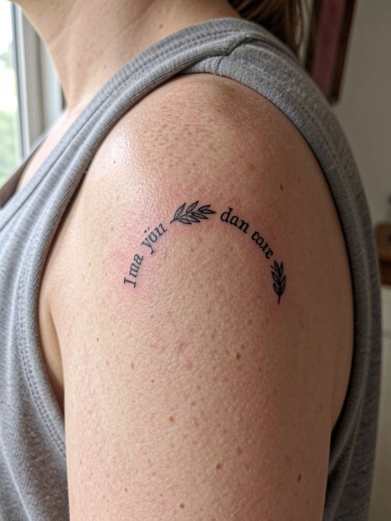
22. Laurel Phrase on the Shoulder
An arcing verse across the outer shoulder reads clean and resists stretch because of the thicker skin there. Shoulder pieces tolerate subtle shading and still hold line clarity. A misstep is crowding in extra ornament that makes the motif too heavy for the area. Sessions are usually pleasant and complete quickly. For casual styling, sleeveless or off-shoulder tops frame the arc. A lightweight off-shoulder blouse complements the curve without rubbing the healed ink.
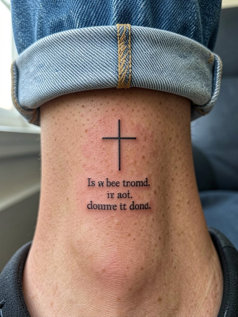
23. Cross + Short Verse at the Ankle
A small cross with a two-word citation above the ankle is understated and durable if the composition leaves breathing room. The ankle is subject to shoe friction so avoid tiny internal filigree. Sessions are quick and the area is fairly low-pain. Plan for a touch-up in the first year if you wear closed shoes daily during the healing window. For display, ankle boots or sandals that expose the bone highlight the piece. Try ankle boots with a low cut to keep the focal point visible without chafing.
Frequently Asked Questions
Q: How do I choose script size so the verse remains legible over time?
A: I recommend asking the artist to print the verse at actual size and tape it to the area so you can live with the scale for a day. Choose letter heights that keep counters open and request slightly heavier stroke weight than a thin calligraphy font. Expect to plan a touch-up at year one or two for very fine work.
Q: Are some placements more controversial among artists for fine-line scripture?
A: Yes. Fine-line work on high-movement zones like the ribs and fingers divides artists into two camps. One camp warns these surfaces blur quickly and avoids single-needle scripts there. The other camp will do the work with slightly wider spacing and a heavier but still delicate line and will show healed examples to support their technique.
Q: Where can I find healed scripture examples and portfolio collections without naming specific artists?
A: Search platform hashtags and keywords that filter for healed work and location, for example try searches like "healed scripture tattoo," "script healed examples," and add your city name to discover local portfolios. Reddit tattoo threads and platform location filters on social video apps are also good for seeing real healed photos across skin tones.
Q: What should I wear to my appointment for a sternum, rib, or inner thigh tattoo?
A: For sternum and rib work, wear a fitted sports bra or bandeau that you can remove or leave in place without shifting the area. For inner thigh or hip placements, wear fitted shorts that expose the mid-thigh while preserving modesty. A loose cover-up or cardigan is useful for after the session so you can dress without rubbing the fresh ink.
Q: How often do scripture tattoos need touch-ups compared with larger pieces?
A: Small, high-wear placements like fingers, wrists, and ankles typically need touch-ups sooner, often within 12 to 18 months. Larger, flatter areas like the forearm, shoulder, and thigh usually hold shape longer and may need a first touch-up around year two. Personal skin type and daily exposure to sun change the timeline.