
A tiny row of numbers can carry the weight of a place without shouting. Pick the right font size, spacing, and placement and the tattoo stays readable for years. Go too thin or tuck those digits into a high-motion spot and the ink will blur. Below are 15 concrete coordinate treatments that balance longevity, look, and how you’ll actually live with the piece.
1. Classic Latitude/Longitude Line on Inner Forearm
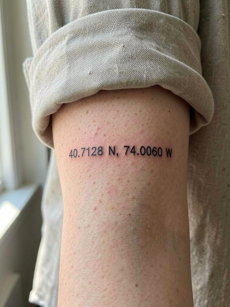
A straight numeric line is the clearest way to show a location. I recommend this when you want a readable piece that sits flat on skin and scales easily. Request slightly heavier lineweight than the thinnest single-needle reference. That extra hair of thickness keeps numbers legible at two and five years healed. Common mistakes are asking for tiny type in high-motion spots or crowding numbers together. For the inner forearm this layout takes 20 to 40 minutes in most shops. The skin here is stable so blowout risk is low, but ask for even spacing between commas and degrees so the digits do not run together after settling. This placement looks great with rolled cuffs and a thin watch on the opposite wrist. linen button down shirt
2. Date-in-the-Middle Collarbone Line
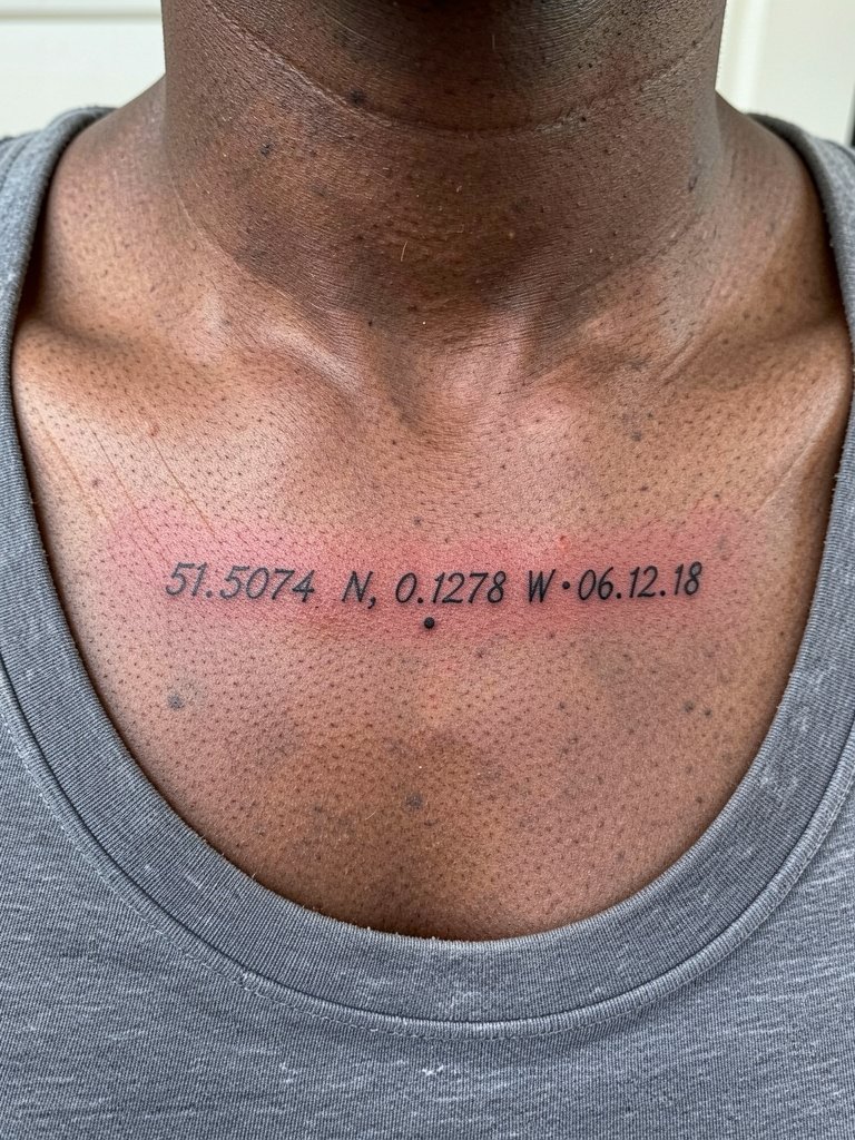
Putting a date between the latitude and longitude turns numbers into an event marker. Choose this if you want the place tied to a moment like a wedding or a birth. Pain here is moderate because the collarbone sits over bone. Expect a short session under an hour for a very small layout. A version that looks thin and beautiful the first day can fade into a faint line at year three if the artist undercuts spacing. Instead request proofed spacing with the stencil at both actual size and 150 percent. For sitting wear a strapless or thin-strap top so the artist can access the area without frayed fabric. Keep the piece black only for best long-term contrast.
3. Coordinates Wrapped Around a Globe, Outer Forearm
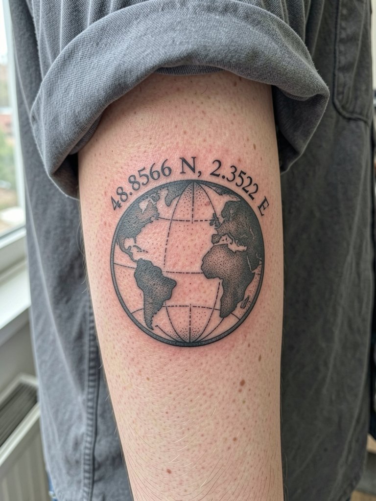
The globe wrap makes the coordinates read like a badge. This is a good option when you want geography visible without pure text. When you consult, bring both the exact digits and a photo of the proposed wrap so the artist can plan curvature. The biggest aging trap is cramming tiny map detail into a one-inch globe. If you want the interior landscape to stay legible, ask for simplified silhouettes and stipple shading rather than tiny hatching. Session time ranges from 45 minutes to two hours depending on detail. This placement pairs well with boxy tees and rolled sleeves. oversized work shirt
4. Crosshair Pinpoint with Coordinates on Upper Arm
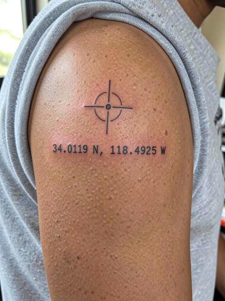
Fine line coordinate proponents argue thin lines keep the look airy and elegant. Another group warns that thin text in mobile areas will blur within a few years, and they prefer bolder, slightly heavier type for longevity. Both positions are common. If you lean toward fine line, make sure spacing is wider than you think. If you accept a modestly heavier hand, expect stronger long-term legibility. Upper arm skin takes ink well and the blowout risk is low. A typical session for a small crosshair and digits is 30 to 60 minutes. Ask for healed photos of similar-sized text from the artist to confirm line weight choices.
5. Fine Line Coordinates with a Tiny Compass on the Ankle
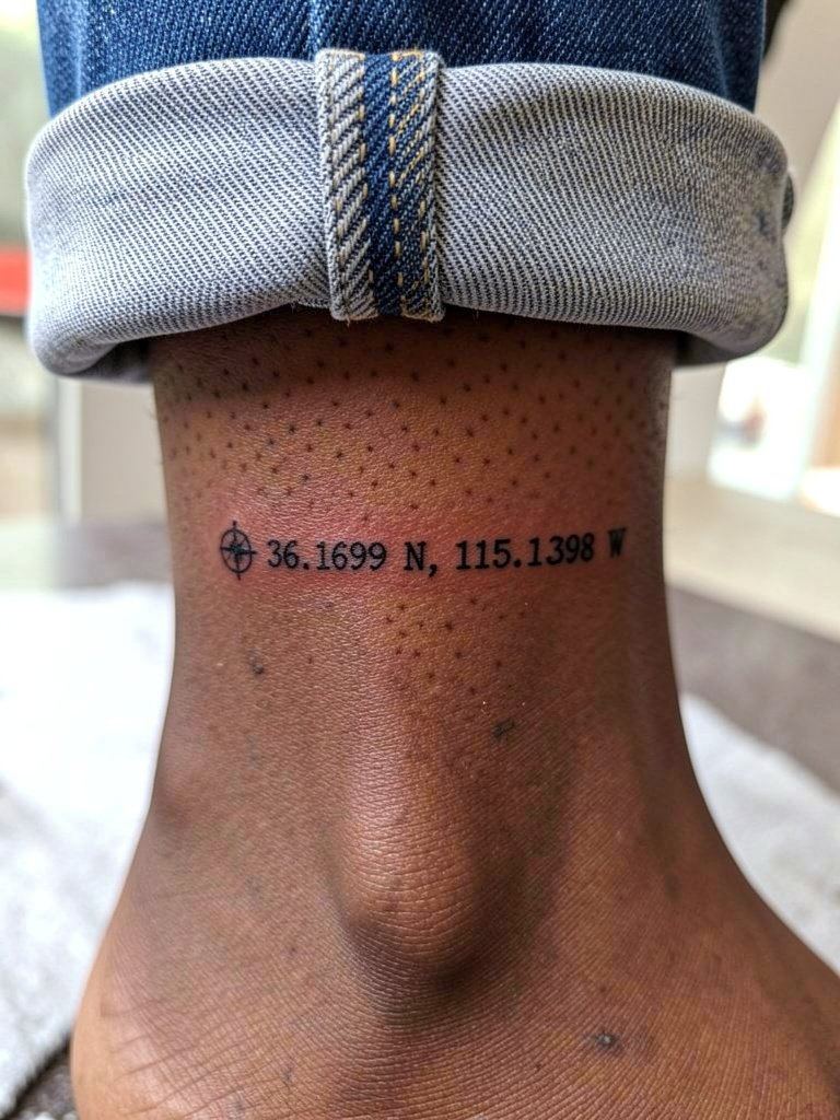
Ankle pieces read small and intimate. Pick a compact compass mark when you want a travel nod without extra words. The ankle endures friction from shoes and socks, so expect the first year to require careful aftercare. For the session wear shorts or pants you can roll above the ankle without tugging. Many people prefer black ink only here to avoid color fading from repeated rubbing. If the numbers are under one inch, request slightly bolder digits than your visual reference so the type does not resolve into a gray line over time. cropped straight jeans
6. Coordinates with Mountain or Wave Landscape on Inner Forearm
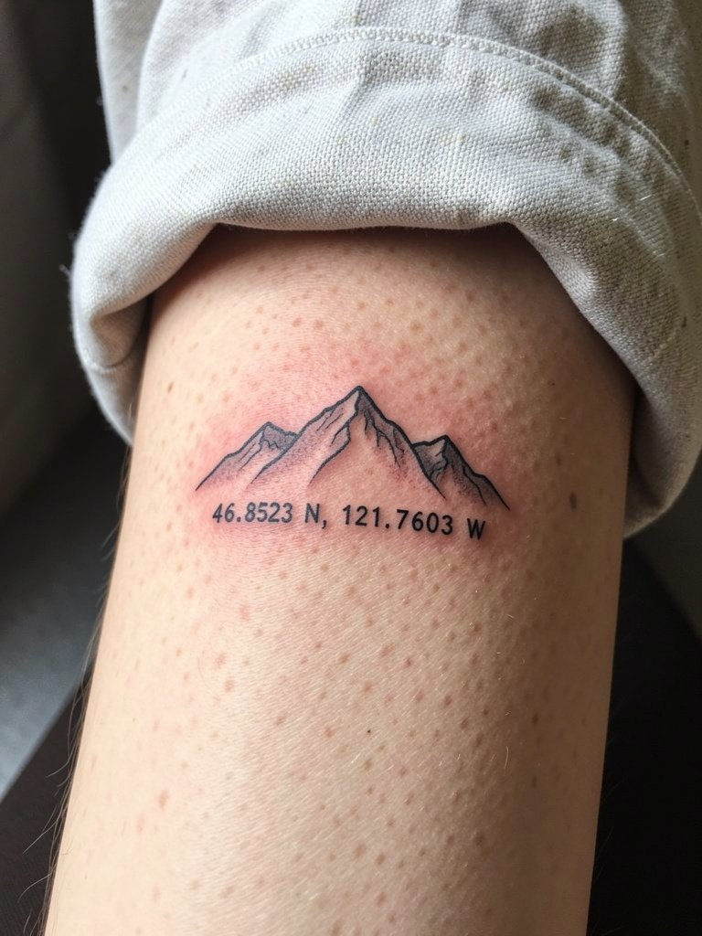
Adding a tiny landscape ties the digits to actual place. I recommend this when the location is known for a feature like a coastline or peak. Tell the artist you want simplified contours, not lots of micro-detail. Too much fine shading inside a small landscape will blur in two to five years. At six months the stipple will look crisp. At two years the most delicate dots start to soften. For the inner forearm this design sits nicely as a medium-length piece and takes about 60 to 90 minutes. For showing it off, roll your sleeves or wear cropped utility jackets so the forearm reads as a single canvas. rolled sleeve shirt
Pre-Session Essentials
The first six ideas include small lines and exposed placements that need careful handling on the appointment day. These picks smooth the sit and the first week.
- Tattoo Goo balm alternative. A lighter balm option some people prefer after the initial thin film stage, useful for small fine-line work that can feel clogged by heavy ointments.
- Bepanthen ointment. Popular in many communities for gentle early-stage moisture, especially when the artist recommends a light touch in the first 48 hours.
- EasyTatt transfer paper kit. Lets you test exact digit spacing and placement on your skin before committing to the final stencil. That preview helps avoid the common tiny-spacing regret.
- Dr. Pickles tattoo balm. A lighter, non-petroleum option mentioned in international forums for small, breathable aftercare during the first days.
- Fragrance-free gentle soap. Cleanses the area without irritation during showers and helps preserve crisp linework while healing.
7. Vertical Coordinate Stack on the Wrist
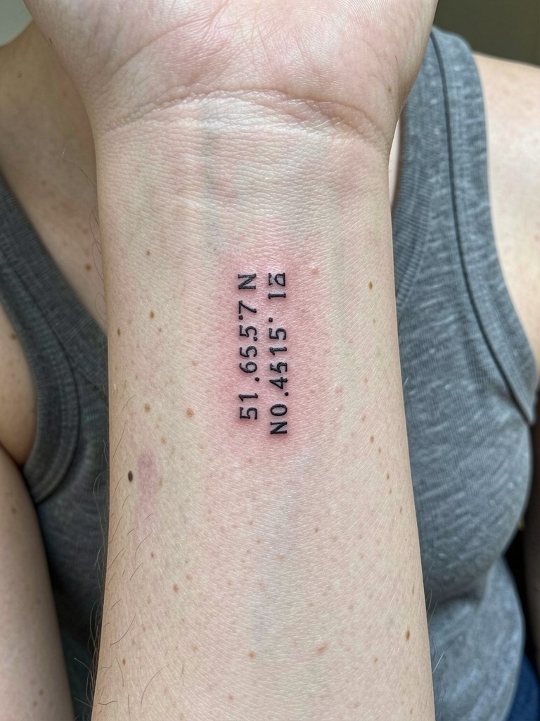
Wrist placement sparks a placement debate. One camp says the wrist is ideal because it is visible and suits micro coordinates. Another camp says the forearm is safer because it gives numbers room to breathe and reduces distortion. Both positions are valid depending on lineweight and your daily wear. Vertical stacks read clean on narrow surfaces and are a go when you want discreet but readable text. The wrist sees a lot of sun and washing, so plan for sunscreen after healing and occasional touch-ups. Typical sessions are under 30 minutes. For showing the tattoo, keep the same wrist free of heavy bracelets and pair the look with a thin chain on the opposite wrist. thin chain bracelet
8. Coordinates with Roman Numeral Date on Inner Upper Arm
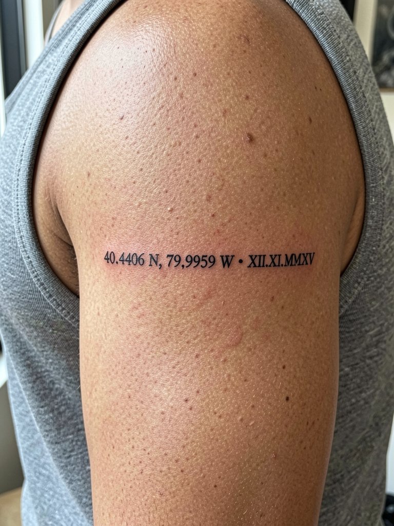
Pairing Roman numerals and coordinates gives the place a time anchor. This area is slightly more protected from daily friction so linework tends to hold well. If you want long-term clarity, request slightly larger numerals and clean spacing between digits and letters. The inner upper arm is lower pain than ribs and provides a smooth canvas for tiny script. Expect a 30 to 60 minute session for small text. A common mistake is asking for script that is too slanted or tightly looped, which can merge when the skin shifts.
9. Tiny Coordinates Under the Collarbone
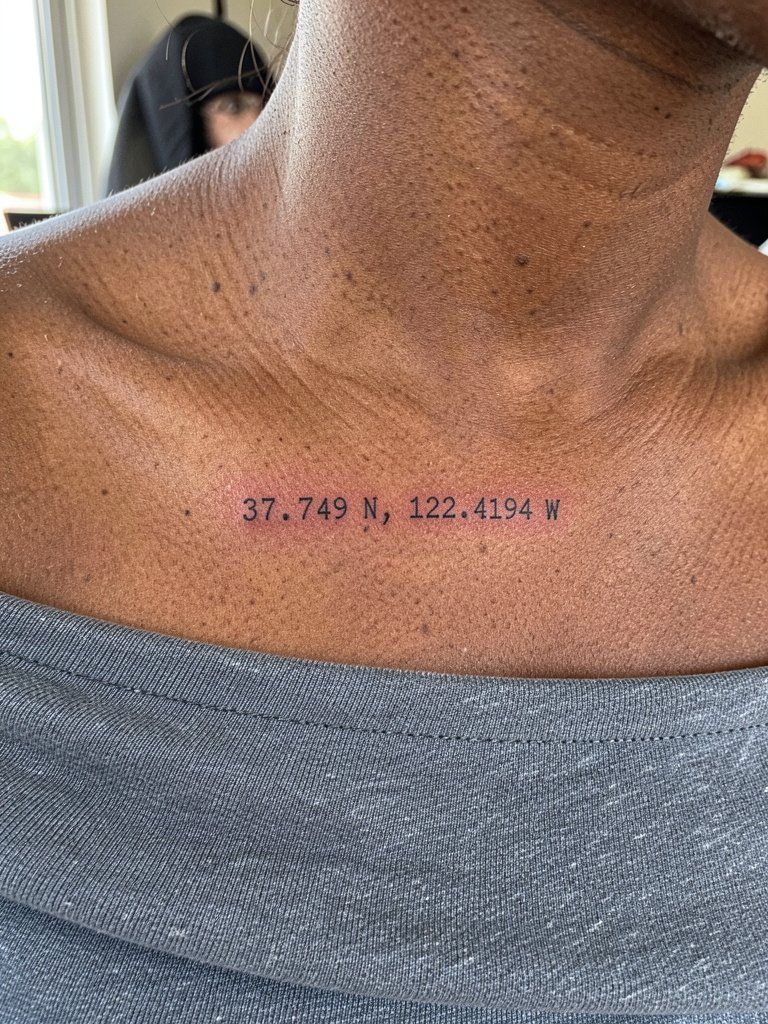
A tucked collarbone line is for people who want discretion with easy reveal. The area sits over bone so expect sharper sensation during the sit. To avoid early softening, choose slightly wider spacing and a font the artist has healed photos for. A standard one-line collarbone piece takes 20 to 40 minutes. Show-up clothing should be strapless or off-shoulder so the artist can work without adjusting fabric. For evening looks, a scoop-neck tee or delicate pendant necklace frames the tiny text without covering it. off shoulder top
10. Coordinates Plus a Heart or Dot Marker on the Ankle
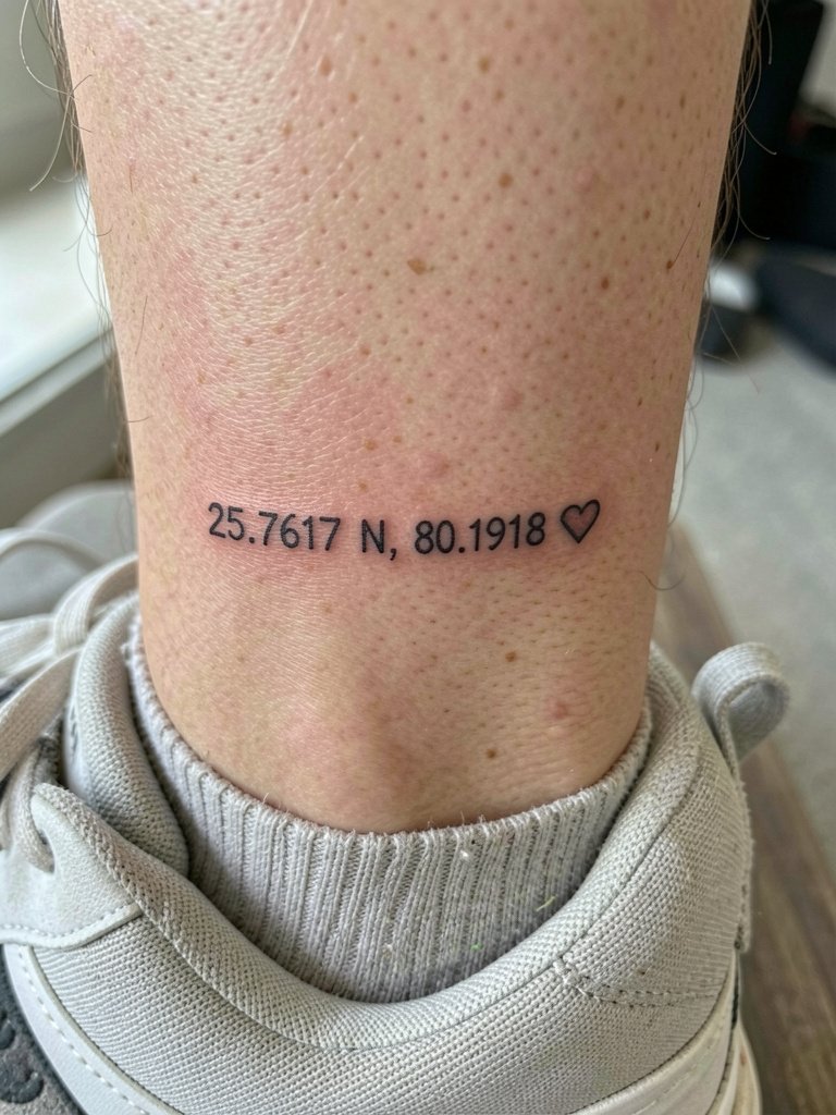
Adding a tiny heart softens numeric geometry when the place carries emotion. For ankles expect extra rubbing from socks and shoes for the first few weeks. Ask the artist about placement relative to the bone so the icon does not migrate visually when you lace shoes. A compact ankle piece takes 20 to 40 minutes. Keep the design strictly black for best retention. For casual wear choose cropped jeans and low sneakers so the ankle shows naturally without rubbing. ankle socks women
11. Micro Coordinates on the Ribcage with Tiny Script
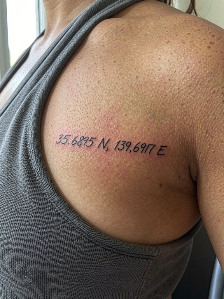
Ribcage pieces are private but demanding. The area is high on pain scales and the skin moves a lot with breathing. One group of artists says fine line here blurs quickly. Another group says careful depth and slightly wider spacing will keep the script readable. Both perspectives are commonly offered. If you choose the ribcage, plan for a session-length tolerance and expect touch-ups after the first year if lines are very thin. Bring a reference that shows healed ribcage text in similar size. The artist may request a break during the session to avoid overworking the skin.
12. Coordinates as Chapter Markers in a Patchwork Sleeve
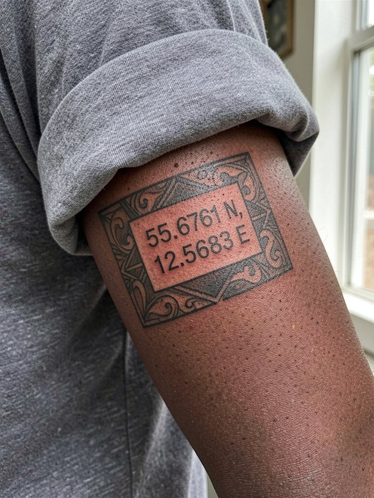
When coordinates are part of a sleeve they act as chapter markers and not eye-catchers. Coordinate size must match adjacent elements so the piece reads as a whole. Bring all your sleeve references and have the artist mock the scale on-site. A common mistake is dropping tiny text into a densely shaded panel; the numbers will disappear. Expect multiple sessions and plan the coordinates where they will not be covered by heavier fill as the sleeve expands. For everyday outfits, oversized shirts and straight jeans complement sleeve visibility. boxy tee
13. Nape Coordinates in Ultra-Thin Script
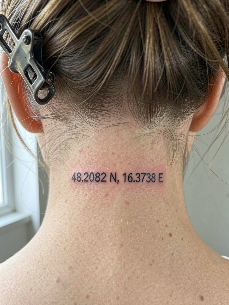
The nape is private and concealable. Tiny script here looks delicate with hair up but is prone to irritation from collars and scarves during healing. Expect a single short session and plan to keep hair clipped for the first two nights to avoid pulling at scabs. For this placement request slightly wider spacing than your initial idea so the letters do not collapse with time. Updos and claw clips are the best ways to show it off. claw clip hair
14. Coordinates with a Memorial Symbol on Inner Forearm
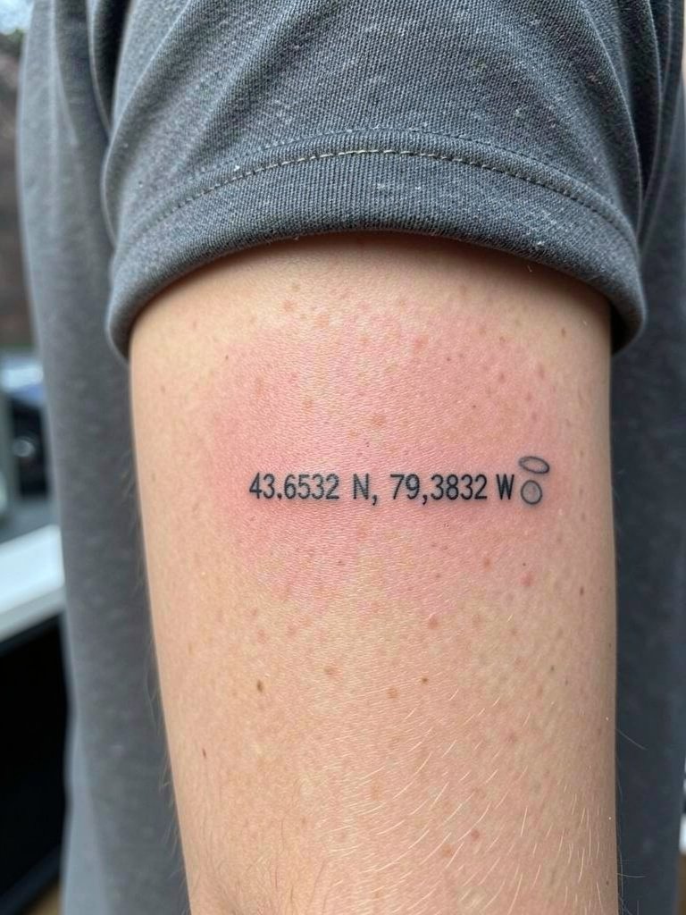
Memorial pairings let you encode loss without a long caption. Choose a small, simple symbol like a halo, tiny star, or bird silhouette to avoid clutter. A frequent error is adding too many micro details around the icon. Ask for clean outlines and a single touch-up window around six to nine months if the icon is faint. Inner forearm heals predictably but sunscreen is important thereafter for long-term contrast. During the sit wear a loose short sleeve or button-down you can roll. Keep the icon black and minimal for best longevity.
15. What3words Alternative on the Wrist
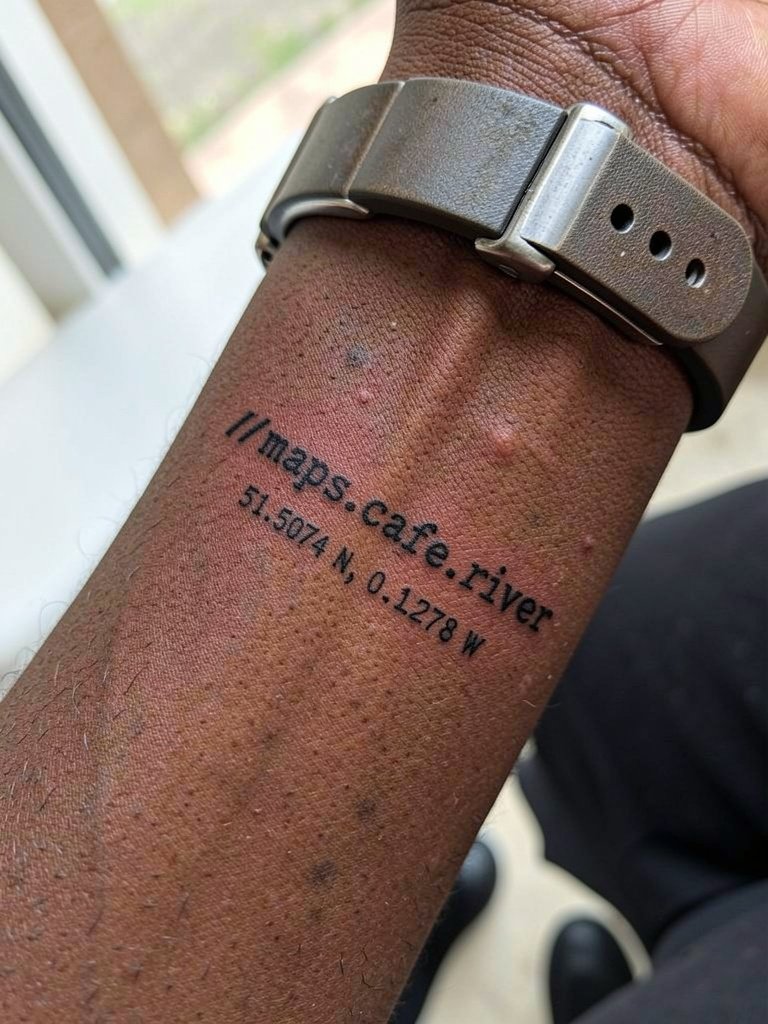
What3words gives a compact, readable alternative to long numeric strings. One group likes it for compactness and precision. Another group prefers latitude/longitude because it is universally recognizable and translates across platforms. Both options have merit. If you pick a what3words stamp, double-check the exact three words and include them in the stencil preview. For wrist text keep font weight slightly higher than the most delicate reference and expect touch-ups sooner than for larger forearm work. Pair this look with a minimalist watch or keep the wrist free of heavy bangles. minimalist watch
Frequently Asked Questions
Q: How do I keep tiny coordinate numbers readable after a few years?
A: Give the numbers room. Request a hair heavier lineweight and wider spacing than the freshest stencil looks like. Be prepared for a touch-up one to three years out if the piece is small and in a high-motion area.
Q: Which placements tend to age best for coordinate tattoos?
A: Stable, low-friction spots like the outer forearm and inner upper arm usually hold crisp linework longest. Wrists, ankles, and ribs are fine but expect more fading from sun and movement and budget time for touch-ups.
Q: How should I find healed portfolio examples and an artist who does tiny text well?
A: Search hashtags like #coordinatestattoo and #finelinetattoo on Instagram and TikTok and filter by location. Look for healed tags and ask the artist to show healed shots in their portfolio rather than only fresh work. Reddit threads in r/tattooadvice are also useful for real-user feedback.
Q: What should I wear to the appointment for a collarbone or ribcage tattoo?
A: Wear a strapless top or a loose sports bra for rib sessions, and choose an off-shoulder or scoop-neck top for collarbone work so the artist has clear access. loose sports bra
Q: Are color accents a bad idea for small coordinate tattoos?
A: Color accents can look nice but they add complexity and fade faster than black. If longevity matters, keep the digits black and use color only as a tiny, simple accent like a single dot or a micro heart.