The light cursive that gets the most saves on social feeds is often the first to blur. Heavier lineweight and generous spacing keep a word legible after years of washing and sun, and placement matters more than most people expect. Below you will find practical cursive script directions, placement notes, session tips, and outfit pairings to bring to a consultation so the lettering still reads in five years.
1. Single-Word Cursive on Inner Wrist
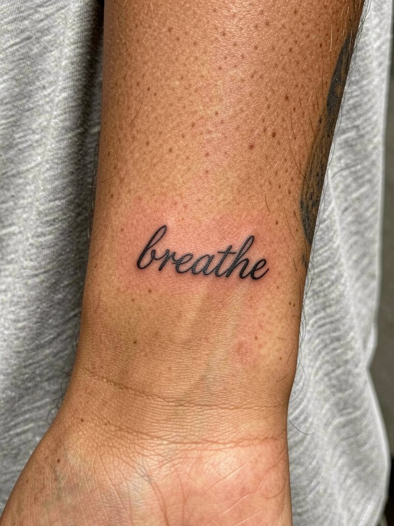
Keep this one two to three inches wide and ask for a slightly heavier lineweight than the Pinterest sample. The inner wrist eats fine detail, so heavier hairlines prevent early blurring and reduce blowout risk. Expect a short session under an hour, low pain, and a first touch-up at around six to nine months if the owner wants crisp counters. For showing it off, pair with a simple bracelet that sits below the script so the word stays visible.
2. Connected Name Script on Side Ribcage
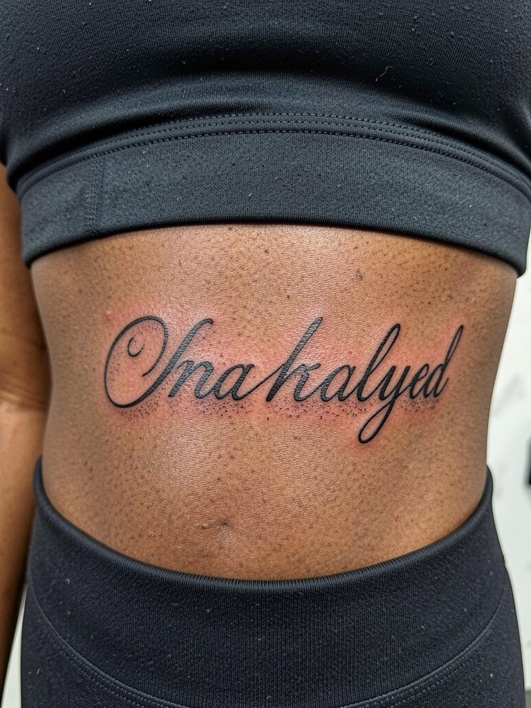
Rib placements show off long, elegant script but come with higher pain and movement during breathing. One common mistake is keeping the letters too tight. Ask for extra letter spacing and a slightly bolder contour so the caps and tails do not merge over time. This placement often requires longer session time and a chance of a touch-up at one year. A fitted cropped top shows the whole line well, so consider pairing with a high-waisted skirt for reveal moments.
3. Minimal Cursive Name Along the Collarbone
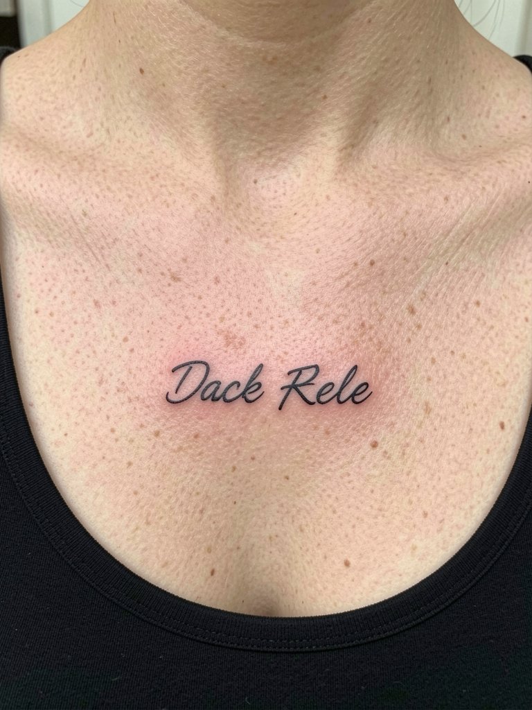
Collarbone script looks delicate when spaced right. The visual trick is to avoid single-needle hairlines and instead ask for a controlled, slightly heavier contour to hold when skin stretches. Pain is moderate. Expect a session under two hours and a likely touch-up window around the nine to twelve month mark. For outfits, this script pairs well with open-collar shirts that frame the clavicle without covering the letters. If the design sits close to ribs, note that artists are split on fine lines there. One camp says ribs blur quickly and small script will merge. The other camp says with proper spacing and depth the lines can remain clear for years.
4. Continuous Phrase Around the Forearm Band
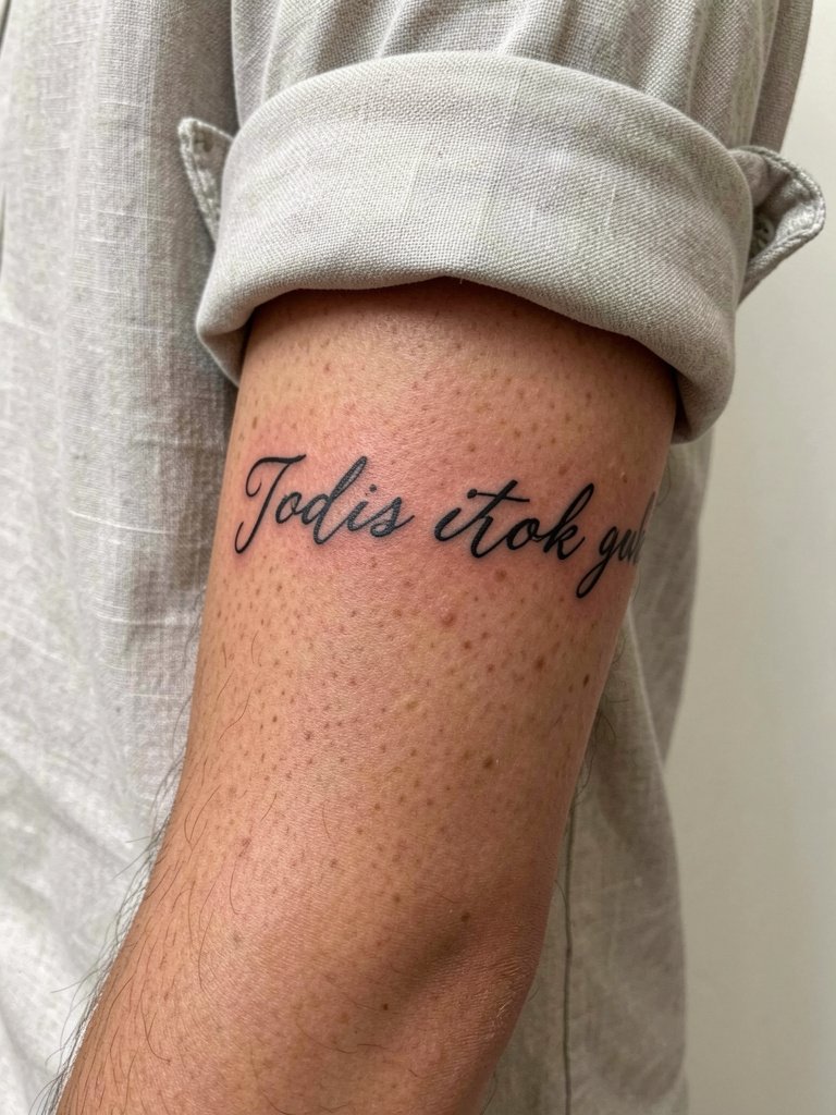
A wrap phrase benefits from spacing and consistent angle of the letters so the text reads as the arm turns. Common mistakes include inconsistent slant and variable lineweight that make the script look jittery after healing. Discuss how the lettering follows the arm's natural curve and request mockups at both three and five inches for scale. This placement is visible, so styling with rolled sleeves helps show the phrase without stretching the skin.
5. Petite Script Behind the Ear
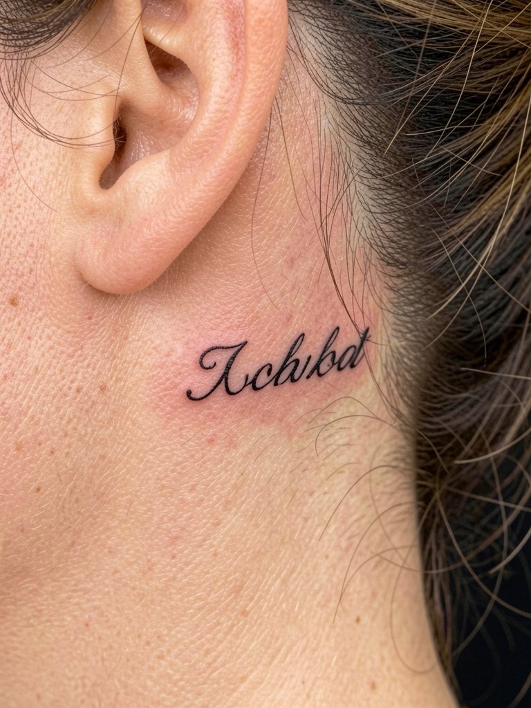
Tiny scripts behind the ear look intimate but risk early fading from sun exposure and hair friction. The trick is to request a slightly heavier contour and avoid single-needle filigree. The session is quick and pain is low. A common mistake is placing the lettering too small to read after six months. For showing it off, short hair or a pinned updo will keep the word visible without daily adjustment. If you want a low-profile accessory, pair with a simple stud earring.
6. Flowing Script Along the Side of the Hand
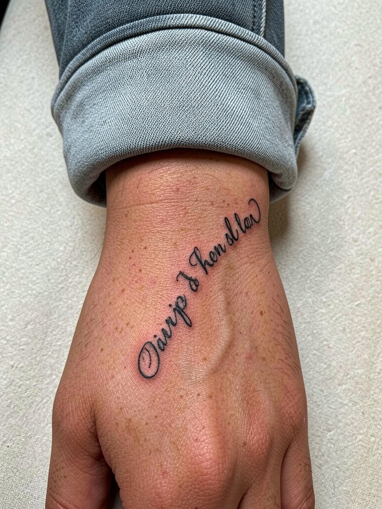
Hand scripts age differently than forearm work because of constant washing and friction. Expect more fading and a higher touch-up rate. A common mistake is asking for ultra-thin letters on the hand. Instead, request a bolder but still elegant line so the counters remain readable after repeated use. Session pain is moderate and healing needs careful protection. For presentation, a delicate ring or thin band ring complements the script without covering it.
Studio Day Picks
These first six pieces include visible areas and delicate linework, so consider a few items that make the session and the first week smoother.
-
Stencil transfer paper kit. Lets you test layout and spacing directly on skin before the first pass, which is key for continuous phrases and wrap scripts above.
-
Topical numbing cream. Apply per instructions about 30 to 45 minutes before a sensitive hand or rib session to get through a shorter sitting without flinching.
-
Thin protective film roll. Keeps fresh hand and wrist work protected from friction and excess washing during the first 24 to 48 hours.
-
Fragrance-free gentle body wash. Cleanses the area during showers without stripping delicate linework or irritating the skin.
-
Aquaphor healing ointment. A trusted mainstream option for the first few days to keep fine script moist without clogging.
7. Scripted Ankle Word with Negative Space
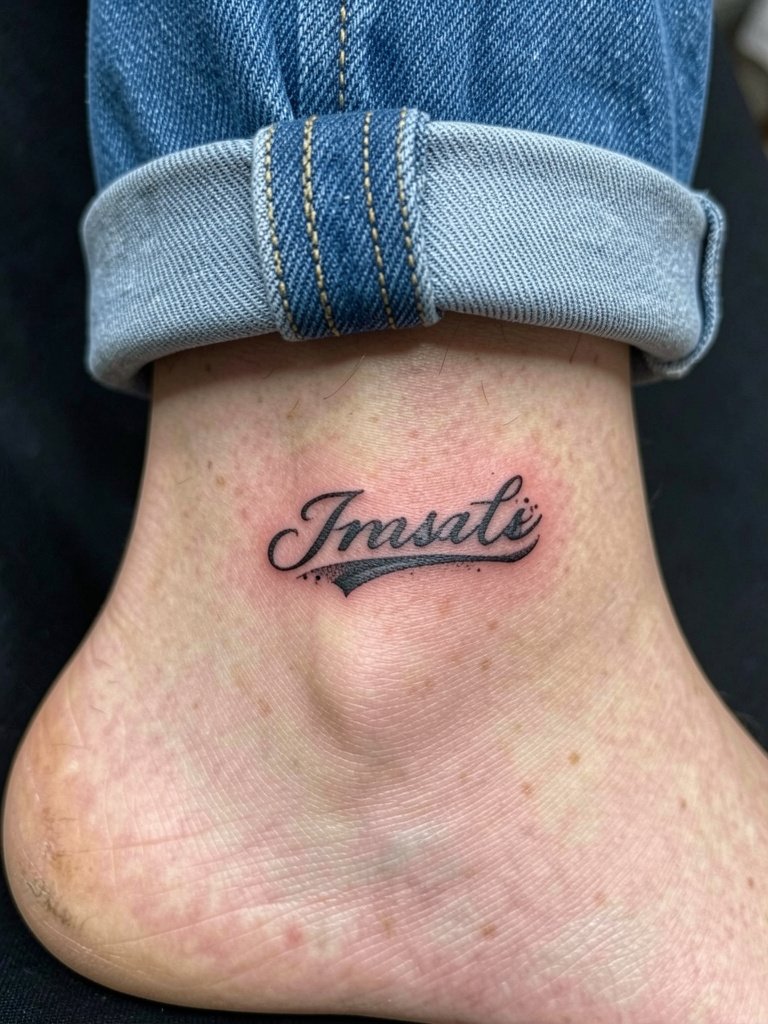
Ankle scripts must account for footwear friction and sneaker rubbing. The leather and socks cause faster wear, so avoid ultra-fine strokes. Recommend a modest contour and ask the artist to place letters slightly above the anklebone where the skin is smoother. Healing takes longer with shoes, so wear ankle-exposing footwear like low-cut sandals during the first week when practical. Pair the piece with ankle bracelets for styled looks.
8. Two-Word Cursive on the Upper Chest Sternum
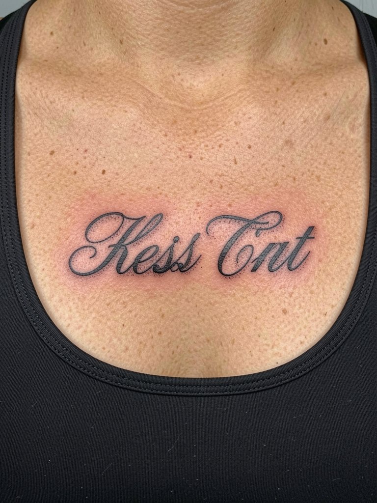
Sternum scripts require careful planning because of chest curvature and movement. The biggest mistake is keeping letter spacing identical to a flat photo reference. Ask for a mockup that maps the phrase across the sternum curve. Pain is higher than forearm work and sessions may pause for breaks. Avoid single-needle filigree in this spot unless the letters are spaced generously. For nights out, open-neck tops or low-cut camisoles will showcase the piece.
9. Scripted Vertical Rib Quote Curving with Body
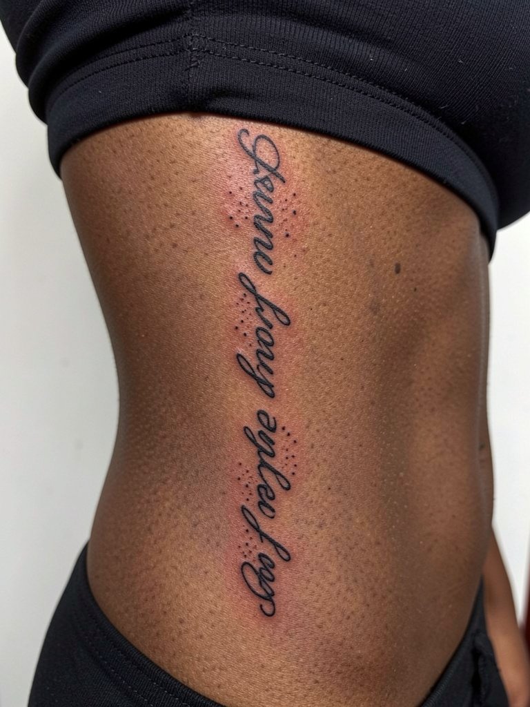
Long rib quotes need breathing room between letters to avoid merging as the skin stretches. One mistake is matching the script size from a flat image without altering the spacing for curves. Talk through ideal length and have the artist place a stretcher stencil so you can see how it sits while breathing. Pain will be significant and multiple short sessions are common. For outfits, side-slit dresses or wrap tops let the quote peek out.
10. Cursive with Tiny Flourishes on the Finger
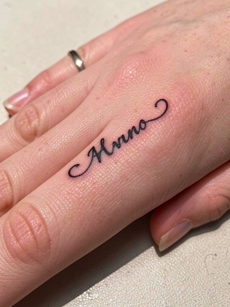
Finger scripts are visible and high maintenance because of constant use and washing. Expect a higher touch-up frequency and some early fading. Use slightly stronger lineweight to compensate. A common mistake is asking for tiny flourishes that fill with time. Session time is short but the healing period is delicate. For styling, a complementary thin band ring draws attention to the letter without covering it.
11. Looping Cursive Over the Shoulder Blade
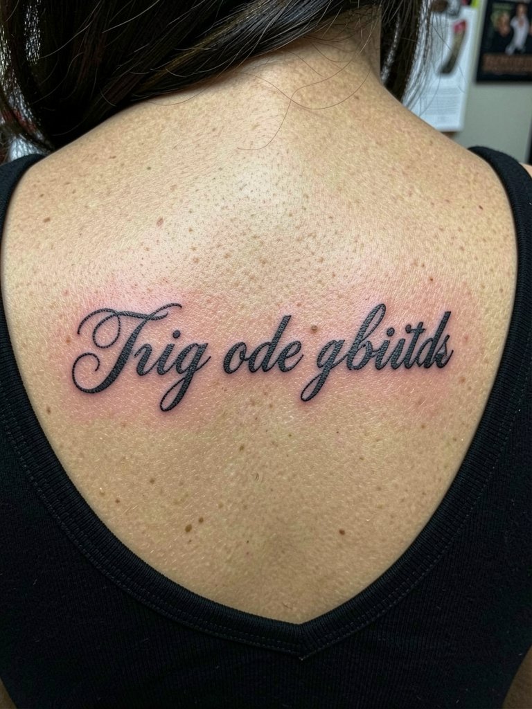
The shoulder blade gives enough flat canvas for flowing letters to breathe. The trick is to map the text so it reads when you look at the back straight on. A frequent error is placing the line too close to the spine or too near the shoulder edge where the fabric rubs more. Sessions can be moderate in length and pain level. Wear a wide-neck top the day of the appointment for easy access.
12. Mirrored Script Along the Collarbone Pairing Two Words
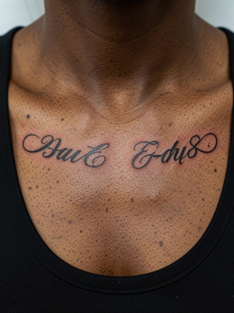
Symmetrical collarbone script demands exact measurements. Bring a reference for scale and request that the artist mark midline balance points on your chest. The design ages well if the letters are bold enough to resist mild stretching. Pain is moderate to low and sessions are usually short. For outfits, scoop or wide-neck tops keep symmetry visible and balanced with a layered necklace.
13. Small Cursive on the Upper Thigh Edge
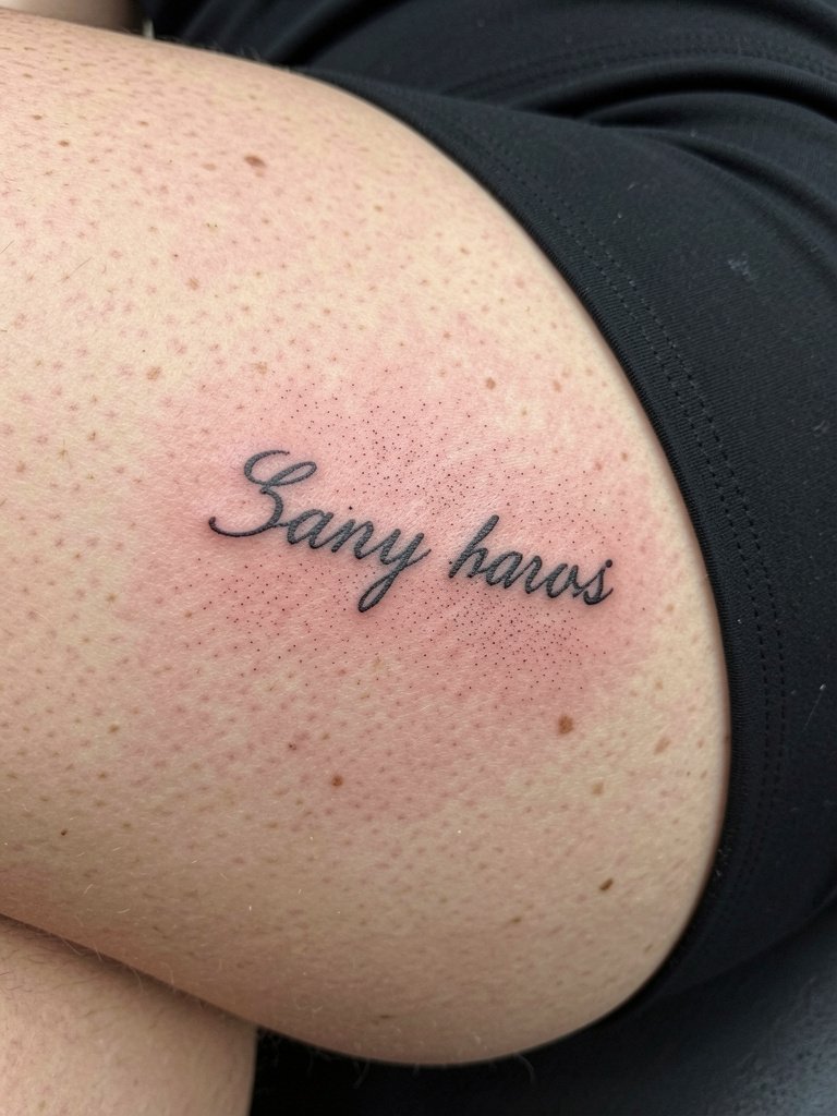
Upper thigh scripts are private and low-friction, so they hold detail well when scaled correctly. The biggest mistake is going too small for the long-term view. Discuss how the letters read at arm's length and ask for a mockup at both actual and reduced sizes. Sessions are low to moderate pain. For showing the piece, a mid-thigh slip dress or shorts work nicely.
14. Single-Line Cursive Across the Side Neck
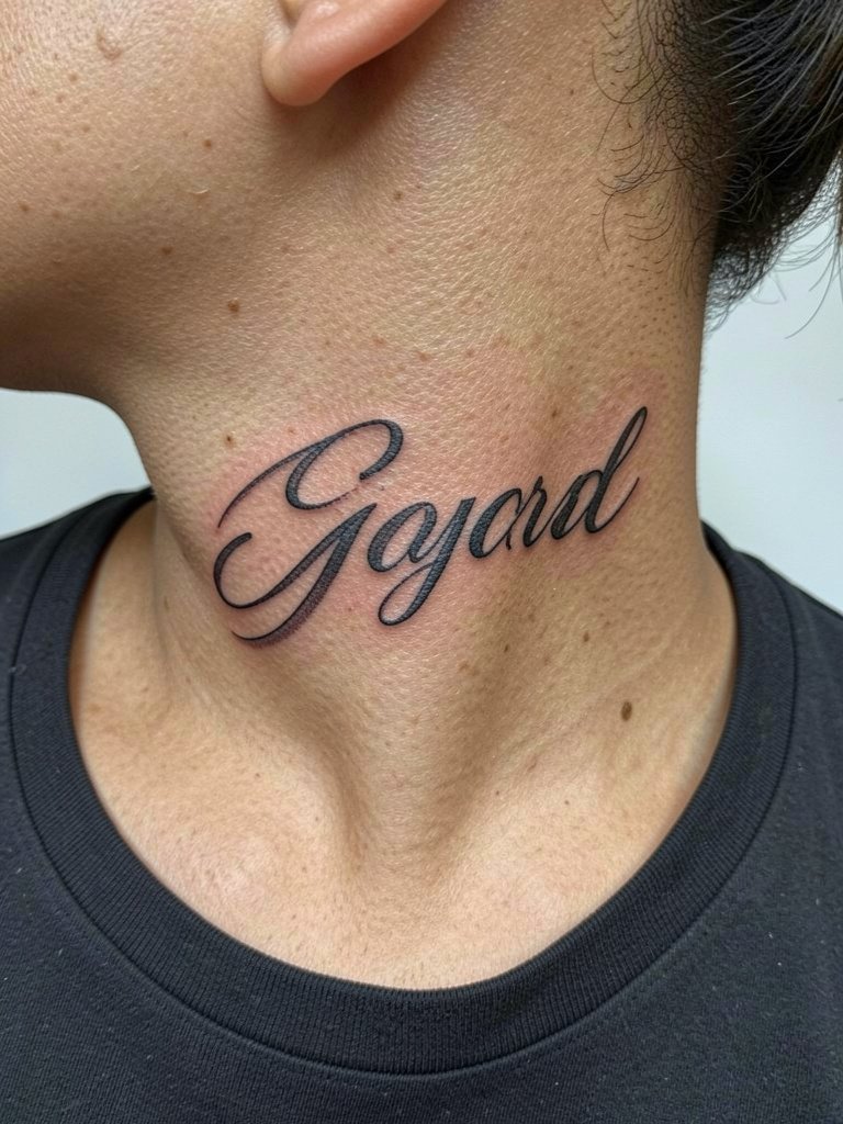
Neck scripts are a visible commitment and require an artist experienced with small bold strokes on thin skin. One mistake is using ultra-fine letters that blur in the first two years. Ask for slightly stronger line weight and a test stencil to check scale. Expect a shorter session but higher visibility, and be ready for occasional touch-ups. For outfits, a wide-neck top frames the script without covering it.
15. Cascading Cursive Along the Side Hip
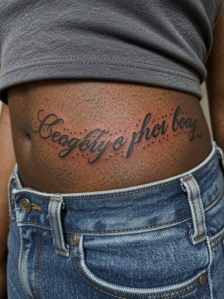
Hip scripts must account for clothing and waistband friction. Place letters slightly above the waistband and choose a lineweight that resists wear from jeans. A common mistake is locating the text too close to the seam where fabric rubs most. Sessions are moderate and the area heals cleanly when clothing is stable. Showing off the script pairs with low-rise jeans or a cropped tee.
16. Half-Moon Script Wrapped Behind the Elbow
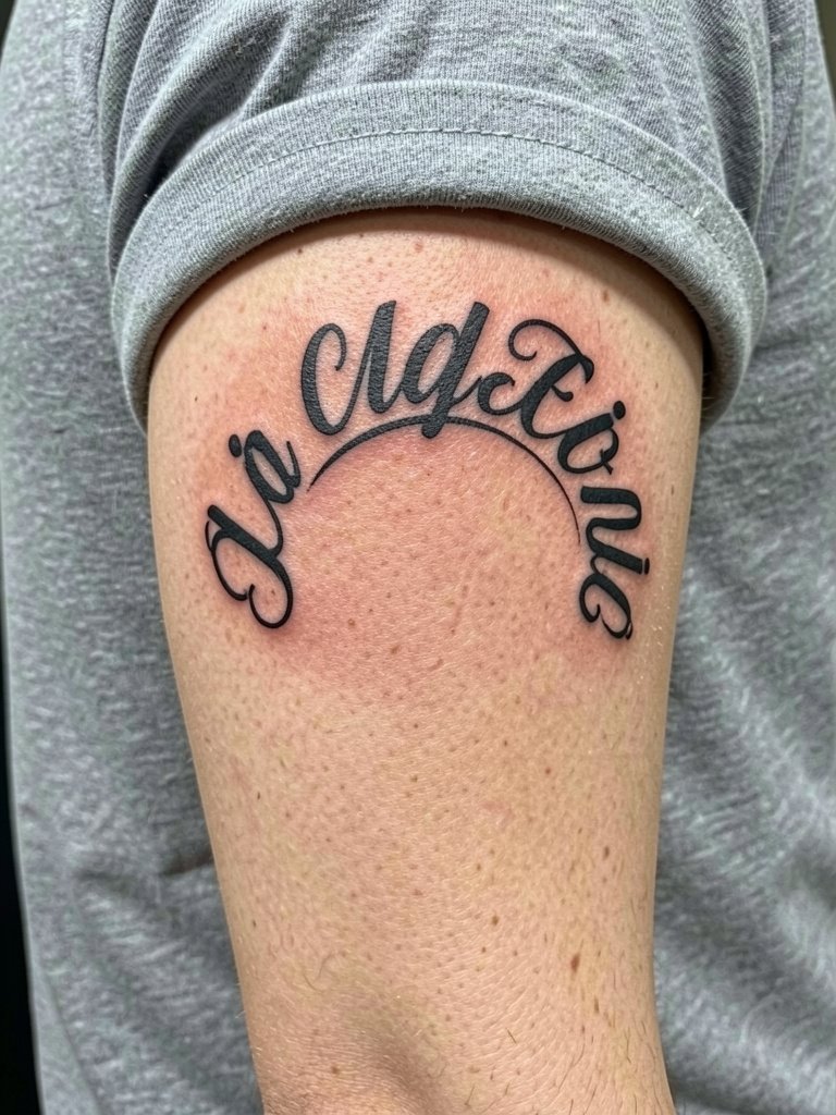
The area behind the elbow moves and stretches, so ask for a more durable line that reads when the arm is bent and straight. A frequent mistake is using single-needle detail that disappears after motion. Expect moderate pain and plan for a potential touch-up. For casual looks, roll sleeves to reveal the curve and add a stackable bracelet that does not sit over the tattoo.
17. Script with Small Illustrative Tail on the Ankle
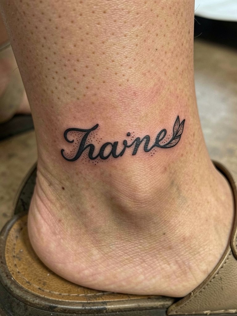
Adding a tiny illustrative flourish gives a script personality but increases the chance of early clogging if too detailed. Request the flourish be simplified and slightly larger than the script stroke to maintain clarity. Ankle areas face shoe friction, so choose placement above the anklebone. Healing takes attention and can benefit from protective bandaging in the first 48 hours. For footwear, low sandals show the detail and pair well with an anklet chain.
18. Thin Script Along the Spine Base
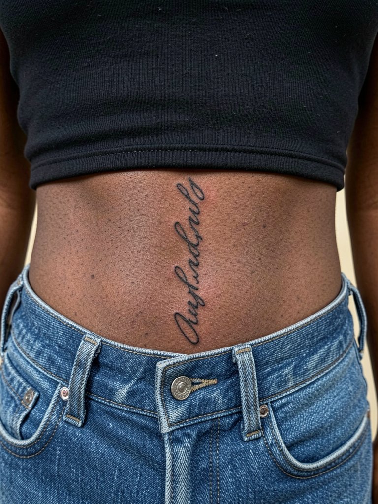
Lower back scripts work well because the skin is relatively flat and low friction if the piece sits above the waistband. A mistake is placing letters too low where clothing rubs constantly. Ask for a slightly stronger contour and for the stencil to be tested in both seated and standing positions. Sessions are moderate. To display the work, midriff-baring tops or low-rise jeans are effective. Try a cropped tank that sits above the script.
19. Cursive Accent on the Thumb Web
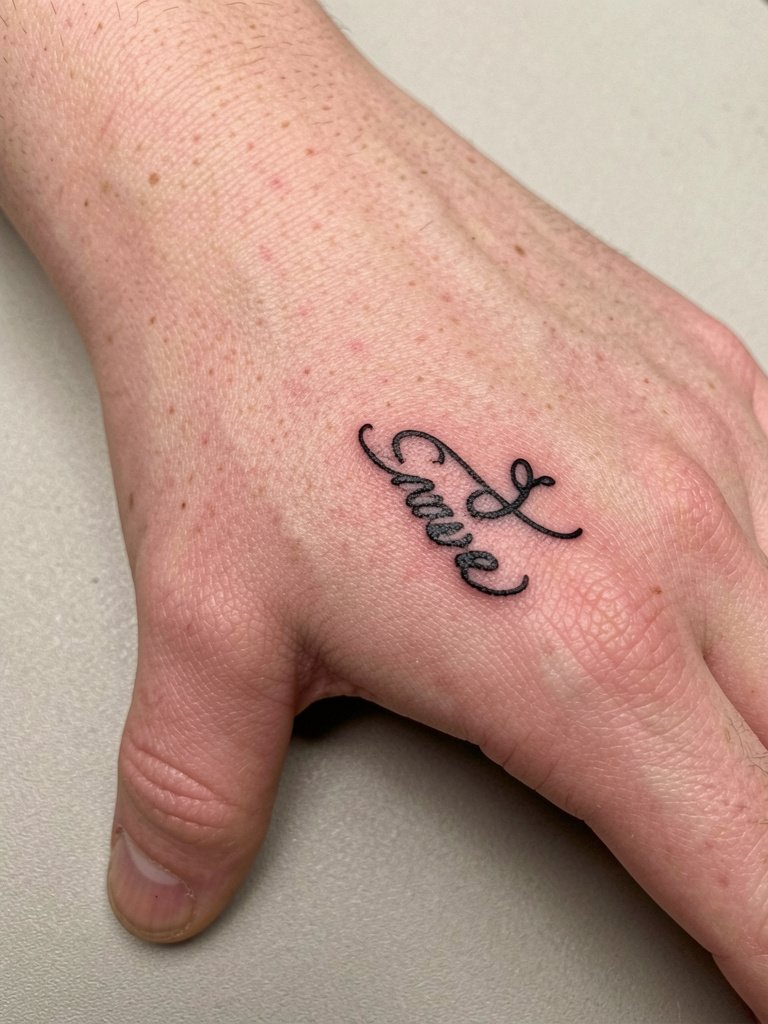
Small thumb web scripts are highly visible and vulnerable to hand washing. Use heavier contour and avoid tiny hairlines that will blur. A common mistake is choosing ornate curls that plug up during healing. Sessions are quick but expect a higher touch-up rate. For low-profile styling, short nails and a matte clear nail polish keep focus on the script.
20. Scripted Crescent Across the Lower Rib
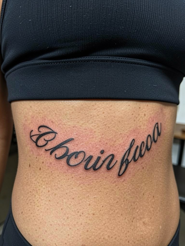
Lower rib pieces are sensual and sensitive. One camp argues that this skin yields blurred lines quickly and warns against single-needle scripts. Another camp insists that with correct needle depth and slightly wider spacing, the text holds up and looks crisp in three-year healed portfolios. Be explicit about spacing and request a stenciled test while breathing to see how the line moves. Sessions may require breaks and numbing options.
21. Single-Word Cursive on the Inner Forearm
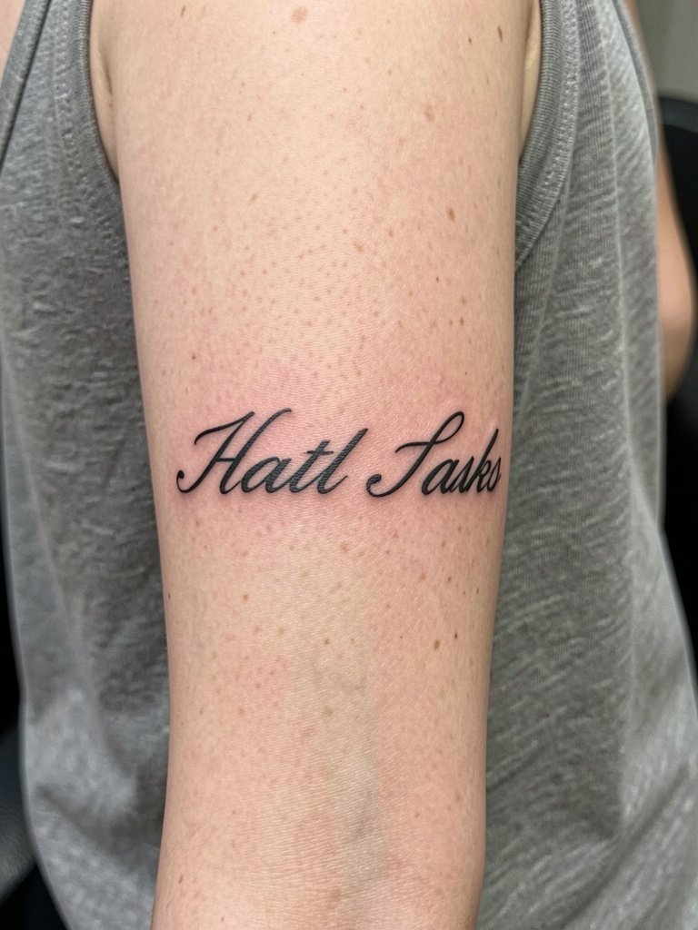
Inner forearm is forgiving for cursive and shows detail well. The mistake is keeping letters too thin in the belief that thinner equals daintier. Ask for a slightly stronger contour so counters remain visible after healing. Pain is mild and session time moderate. For everyday looks, roll sleeves or wear short-sleeve linen shirts to frame the script.
22. Two-Line Cursive on the Mid Back
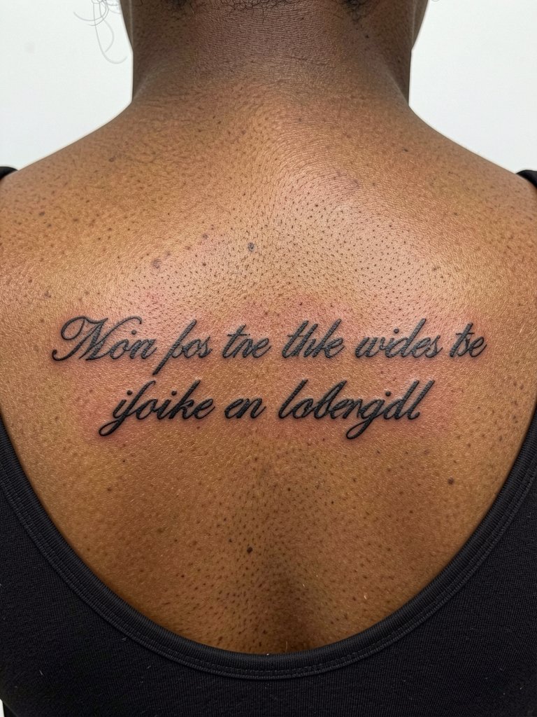
Mid back allows for longer phrases without distortion. Discuss line breaks and baseline alignment so the two lines read as a unit. A common oversight is mismatched slant between lines. Sessions may run longer and touch-ups are usually minimal if spacing is correct. For reveal, off-shoulder tops or backless dresses highlight the script.
23. Scripted Heartbeat Line Integrating a Word on the Wrist
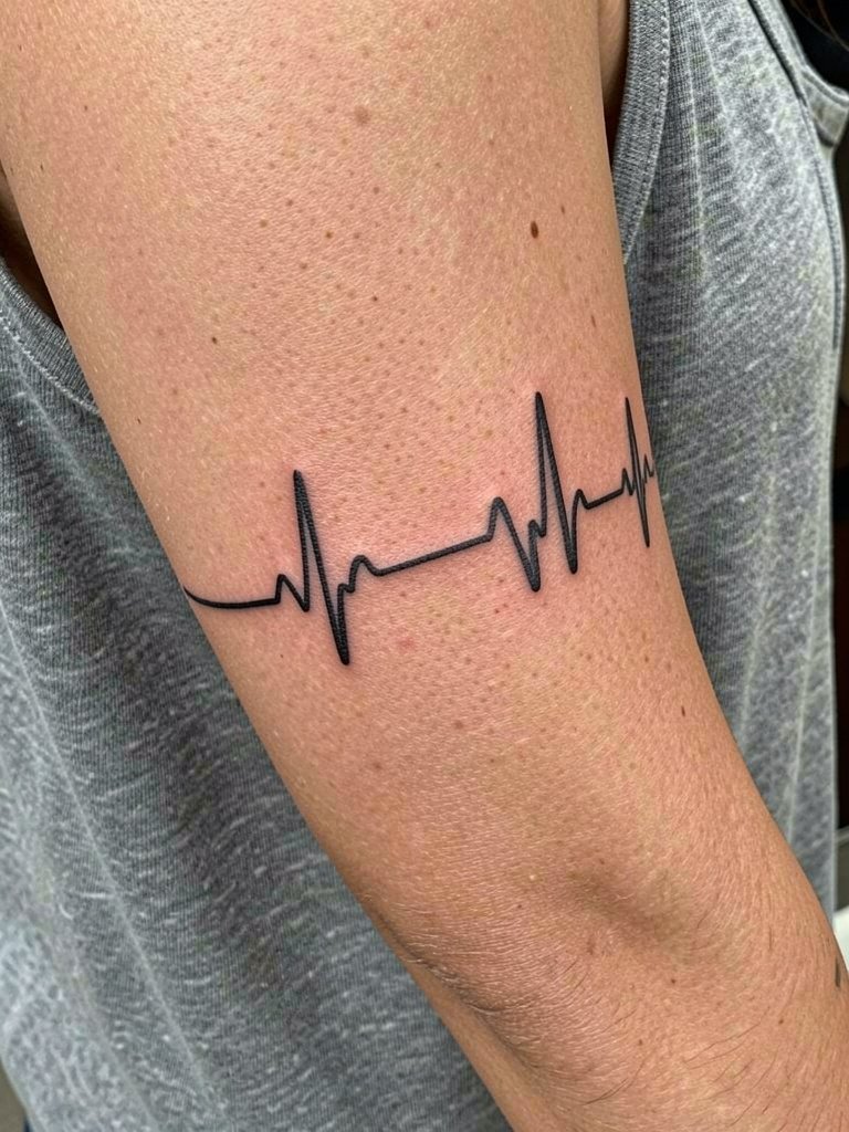
Combining iconography and cursive increases complexity. The risk is that thin connectors between line and letters fade. Ask the artist to thicken connector points and widen letter spacing slightly. Healing is like a wrist script, so expect early touch-up possibilities. For display, delicate watches or bracelets that sit below the design work best. Try a slim leather watch band.
24. Scripty Date in Roman Numerals on the Collarbone
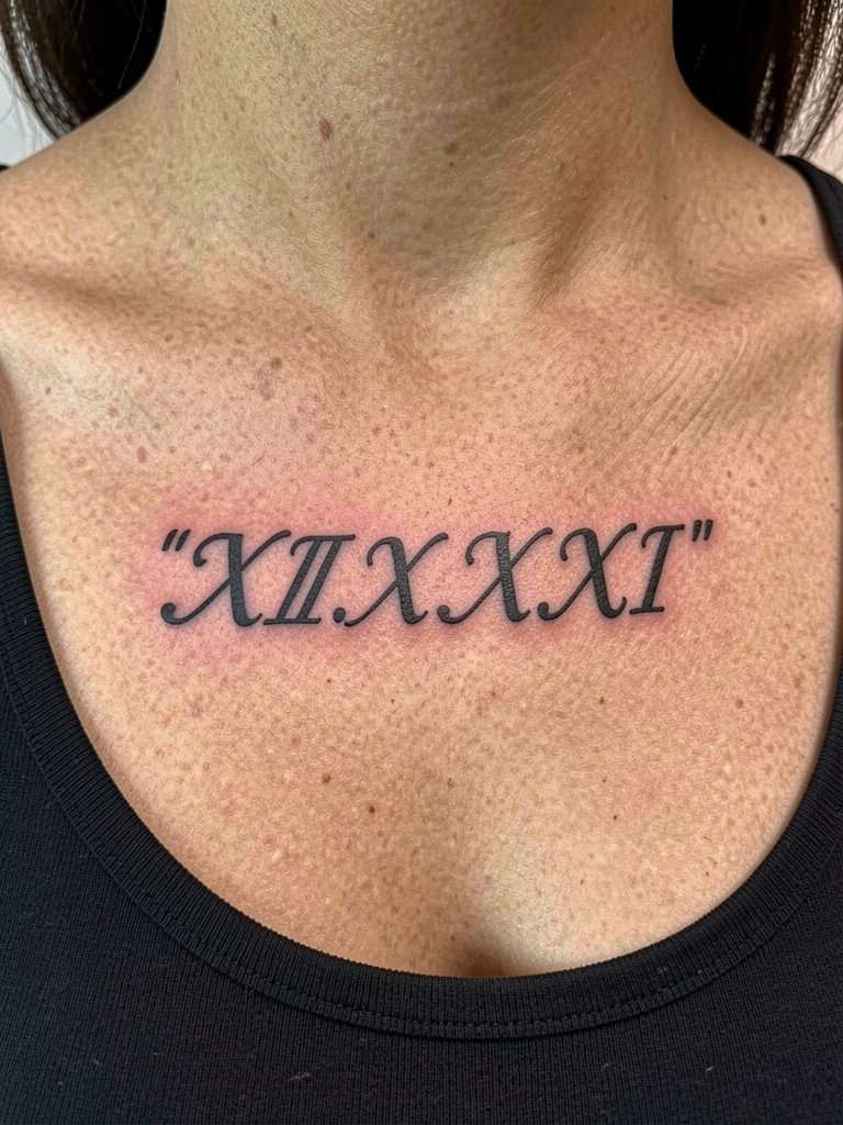
Dates in Roman numerals read well when spaced with strong counters. Small numerals in single-needle can blur, so ask for clear proportions and a slightly heavier contour. The session is short and pain is moderate. For show-off outfits, a delicate chain necklace sits above without obscuring the numerals.
25. Scripted Wave Along the Calf
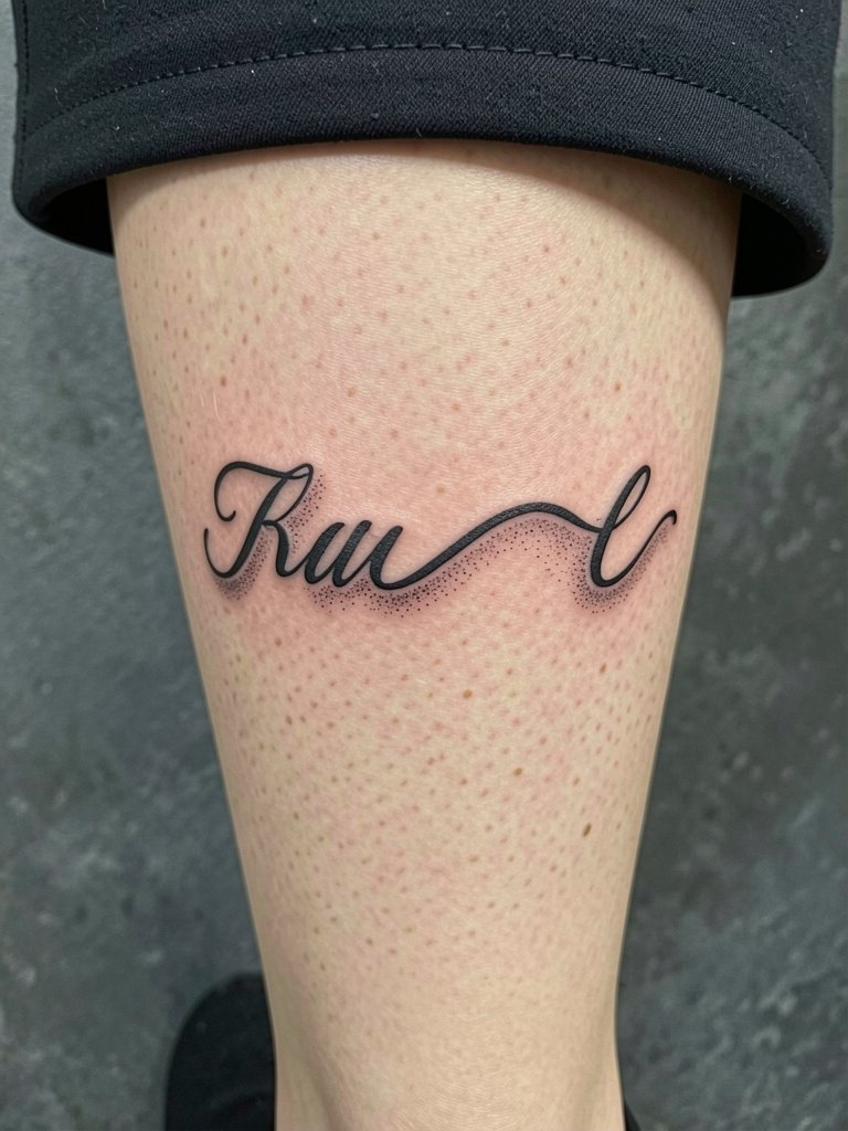
Calf scripts have room to breathe and age reliably if the letters are bold enough to stand up to sun exposure. Avoid single-needle tiny caps that blur under sun and activity. Sessions are moderate and need standard aftercare. For daytime looks, pair with a midi skirt or heeled sandals to show the line.
26. Connected Cursive Around the Ankle Bone
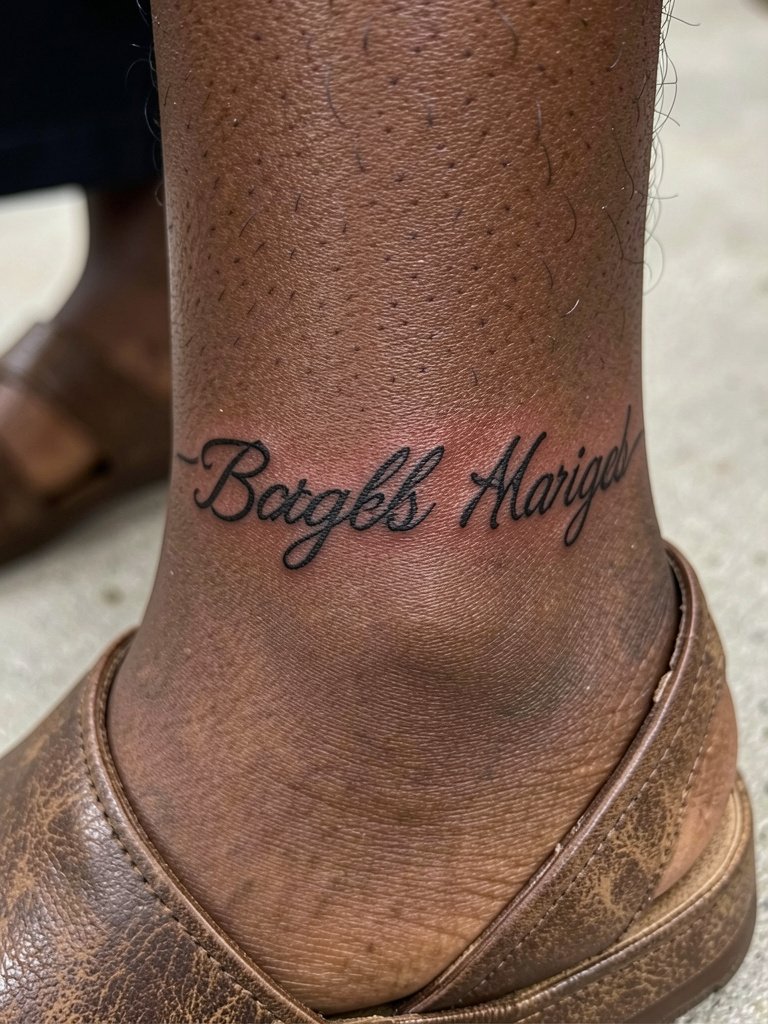
Ankle wraps must consider shoe friction and sock abrasion. Place letters where the skin is smoother and use moderate lineweight. The common mistake is wrapping too tightly which makes letters compress and blur. Healing benefits from minimal rubbing, so choose sandals when practical in the first two weeks. An ankle bracelet complements the wrap without covering it.
27. Fine Script Along the Hairline at the Nape
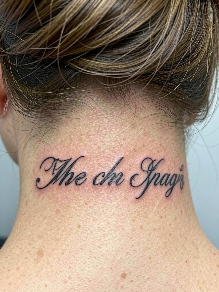
Nape scripts are private and peek out only with certain hairstyles. The hairline area sees friction from collars and shampooing, so reinforce critical strokes and avoid ultra-thin tails. Request a mockup with hair down and hair up to check visibility. Sessions are usually short and healing is straightforward. For styling, an updo and a pair of subtle hair pins let the script show with ease. Consider a minimal hair claw for everyday wear.
Frequently Asked Questions
Q: How fine is too fine for cursive script on wrists and hands?
A: For wrists and hands I recommend slightly stronger contour than what single-needle references show. Thin hairlines on high-friction areas will blur or need an early touch-up. Ask for mockups at both the intended final size and one size larger so you can see how counters and loops will survive daily wear.
Q: How do I find healed examples and portfolios without naming specific artists?
A: Search location-filtered tags on social platforms and look for hashtags that pair keywords like "cursive script healed" with your city name. Explore tattoo community threads for healed progress shots and use portfolio sites to filter by placement and style. Reddit threads often collect year-by-year healed pictures that show how different placements age.
Q: What should I wear to a rib or sternum script session?
A: Wear a fitted cropped top or sports bra that stays in place so the artist has clear access and you do not have to expose or adjust clothing during the session. A fitted sports bra or a seamless bandeau in normal worn state makes the appointment smoother and keeps the stencil aligned.
Q: Will delicate cursive always need touch-ups sooner than bold script?
A: Delicate cursive on low-friction, low-sun areas tends to last longer, but on wrists, hands, and fingers expect more frequent touch-ups. The lifespan depends on placement, lineweight, and aftercare habits. Choosing slightly bolder contours and proper spacing reduces the need for early touch-ups.
Q: Are there ethical concerns with certain script motifs or lettering styles?
A: Yes. When a cursive design borrows from specific cultural lettering or sacred scripts, be explicit about origin and intent. Respectful adaptation and asking whether the phrase holds meaning in its original context prevents misappropriation and shows consideration during the design process.