
Bold clock faces often outlast the ultra-fine wrist stamps that flood feeds. Thicker outlines and deliberate spacing give a clock room to age instead of smudging into an unreadable circle. If you want a clock that still reads at year three, think scale and contrast, not just what looks delicate on a phone. These ideas help you pick a concept and tell your artist exactly how to make it last.
1. Vintage Pocket Watch with Roses
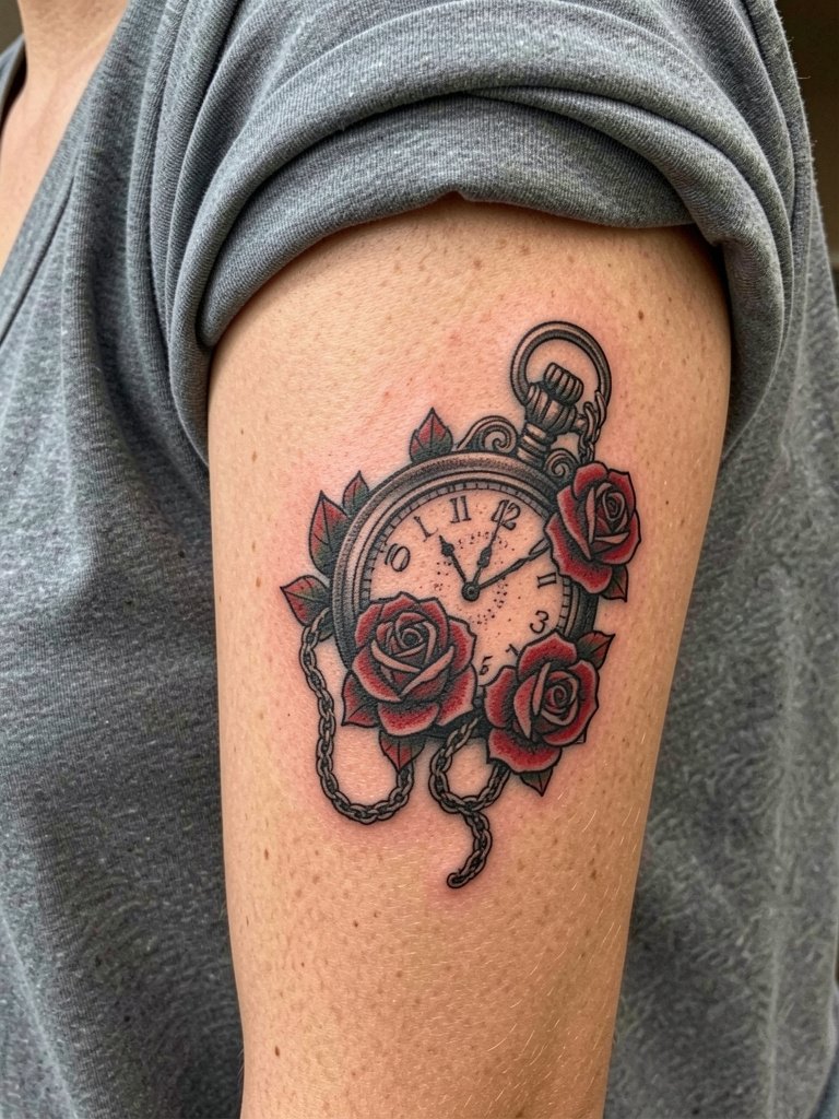
A pocket watch with roses reads like a classic chest or inner arm piece. Recommend this when you want bold outlines and saturated color that will still read at a distance. Ask for thick outline work around the watch bezel and fuller petals on the roses so the shapes do not bleed together over time. The common mistake is asking for tiny filigree and delicate petals, which often soften into a gray mush by year three. For sessions on the inner upper arm expect one to two hours and moderate discomfort. For showing off, pair it with a v neck tee men solid and a layered chain on the opposite side.
2. Minimalist Line Clock Face
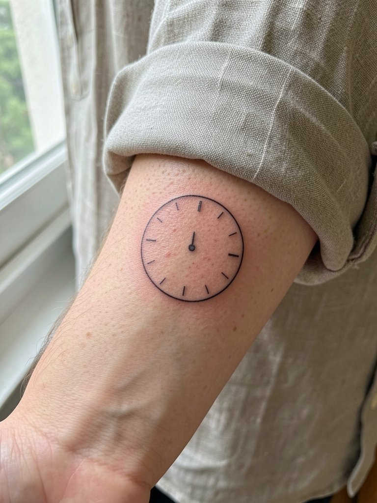
This stripped-back face works well for a first tattoo or someone who wants subtle geometry. One camp says minimal fine-line clocks blur on the forearm within two to three years because daily movement and sun exposure thin the lines. The other camp argues that when the artist uses correct needle depth and slightly wider spacing, the lines can hold for several years, and they will show healed photos to prove it. That controversy affects your choice of scale. If you want it to last, increase the diameter to give the line room to breathe. During the consult bring reference images at two scales so the artist can mock up how the circle reads at inch and three-inch sizes. For outfits, this pairs with rolled-up linen shirts in cream or olive and a linen button down shirt for easy reveal.
3. Realistic Skeleton Clock with Gears
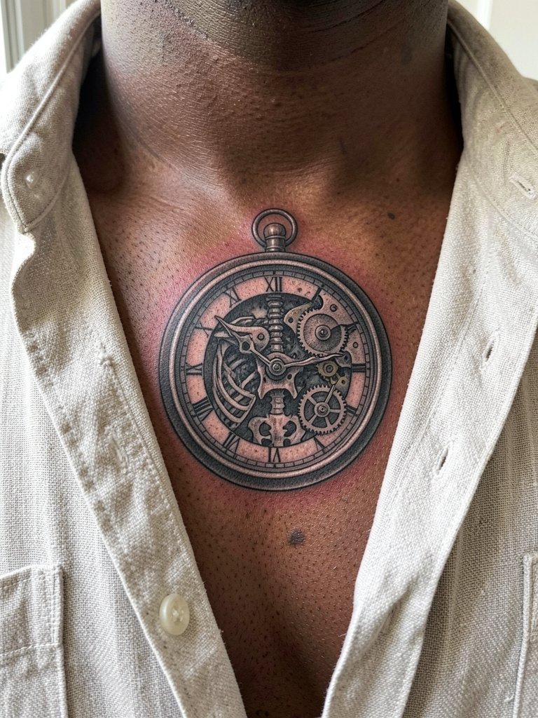
Choose micro-realism here if you love mechanical detail and shadow depth. For chest pieces, the skin is relatively stable but the area can show contrast loss if the shading is too delicate. A typical mistake is asking for micro details in a one-session design with shallow saturation. Tell the artist you want layered shading and multiple sessions to build saturation slowly. Expect 2 to 4 hours per session and moderate to high pain from ribs nearby. For healed appearance, crisp gear teeth become softer at year two unless saturation is strong. Wear an open collar linen shirt to show the piece without full exposure.
4. Distorted Melted Clock, Dali-Inspired
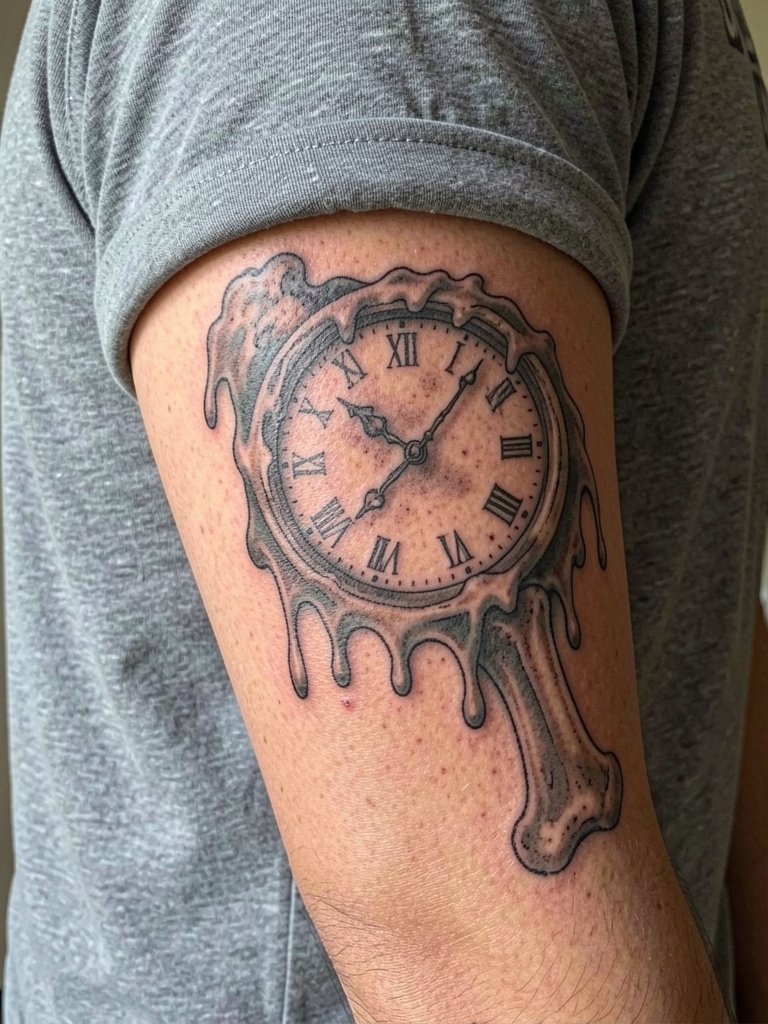
Surreal melted clocks read like small standalone illustrations. They age well when the warped negative space is generous. The mistake people make is cramming too many tiny warped details into a small forearm spot. If you want the distortion to remain readable, increase scale and ask for muted color fills rather than thin watercolor washes. In the chair expect one to two hours and light to moderate pain. Styling tip for afternoons out: pair with a rolled cuff linen shirt so the flowing lines are visible.
5. Alarm Clock with Bell
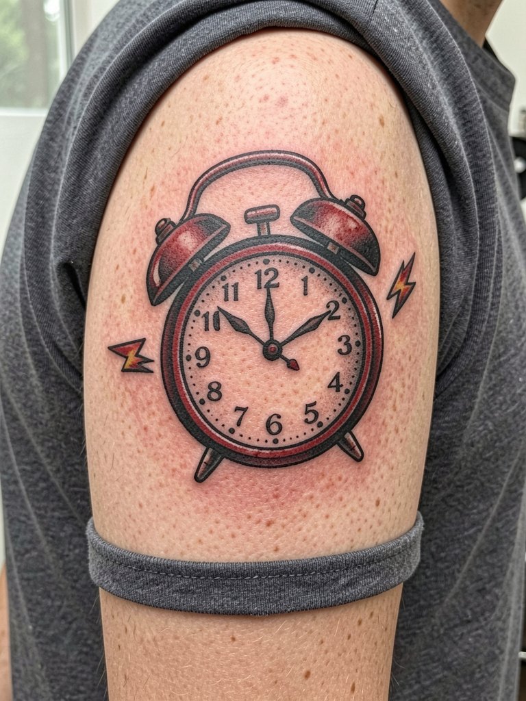
This bold, traditional alarm clock is a good pick if you want clean iconography that lasts. It works best on the outer upper arm where bold flat fills hold up. A common error is requesting tiny bells and thin numerals that fade into a shape. Ask for saturated fills and thicker numerals so the silhouette stays readable for years. Session time is short and pain is low to moderate. For showing it off, wear a short sleeve tee men solid with the sleeve sitting above the piece.
6. Clock Without Hands
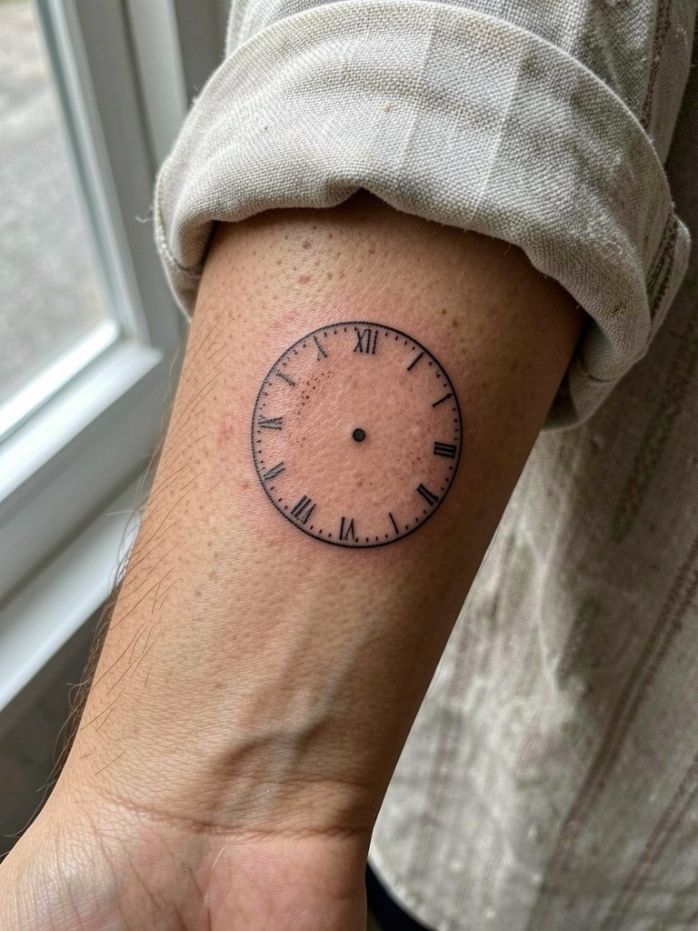
The wordless no-hands clock is a quiet, philosophical option for someone who prefers restraint. It is often requested too small, which makes the rim and numeral hints merge over time. For longevity, ask for slightly thicker rim linework and spaced numerals or dotwork hints rather than thin numerals. Healed appearance at six months will look crisp. At two years fainting typically appears if lines were ultra-fine. This forearm pick shows best with rolled linen sleeves and a dainty gold stacked bracelet set.
Session Day Picks
The inner forearm and wrist pieces above are line-sensitive, so these session and healing tools smooth the first week and reduce the chance of scabbing that eats detail.
- Kobo style Japanese tattoo balm. A thinner, plant-forward balm that users report clogs pores less than thick ointment and keeps fine lines from puckering during healing.
- Australian Tattoo Tonic spray. Light misting to keep the skin hydrated without heavy residue, helpful for delicate inner forearm work.
- +B high-contrast blackwork ink kit. Recommended for bold clock outlines on darker skin tones so the black holds without patchy fading.
- Saniderm second-skin bandage. Used for the first three to five days on visible forearm pieces to reduce friction and scab formation.
- Plant-based tattoo balm, thin formula. A lightweight option to switch to after the first 48 hours if Aquaphor caused milia in the past.
7. Hourglass and Clock Hybrid
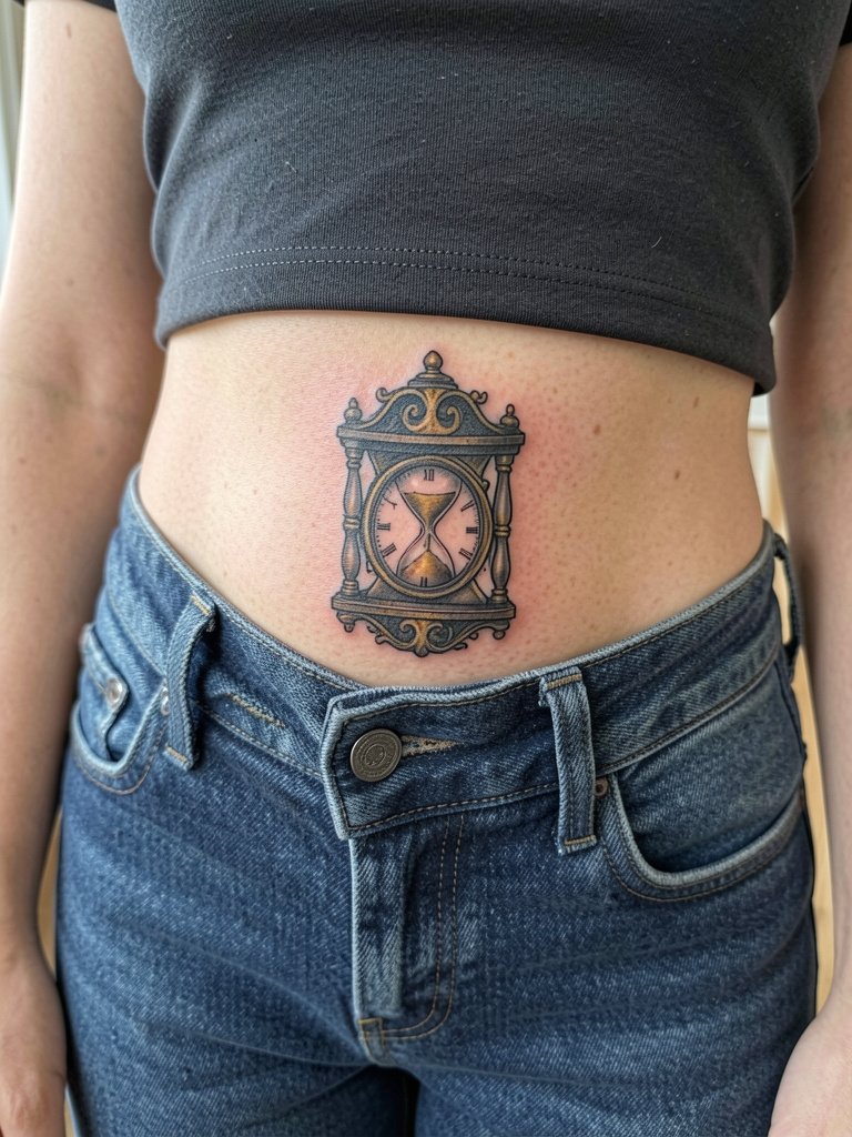
Combining an hourglass with a clock layers ancient and modern time motifs. This placement hides well for private significance. A frequent mistake is demanding tiny filigree that the hip skin does not hold long term. Tell the artist you want a slightly larger case and heavier shading contrast. The session may need two short sittings due to awkward positioning. For wardrobe, low-rise jeans worn normally show the piece above the waistline and pair well with a low rise chinos men look.
8. Geometric Clock with Mandala Frame
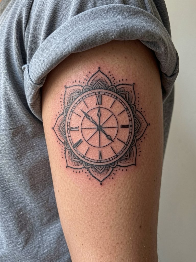
This ornamental clock blends geometry and spirituality. The trick is scale. Intricate mandala rays need breathing room or the dots merge. Ask for dot spacing and confirm the mandala diameter in a stencil preview so the artist can show how the dotwork reads at distance. For a display outfit, a rolled short sleeve tee keeps the inner arm visible without full exposure.
9. Clock Integrated with Skull
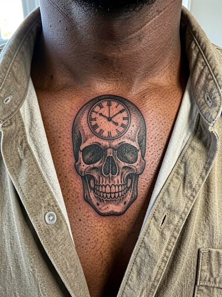
Memento mori themes are visually strong with skulls and clocks. On the chest, bold black shading creates contrast on darker tones. A common misstep is asking for subtle gradient faces that flatten on darker skin. Ask for high-contrast planes and strategic white highlights so details read. Expect two sessions for heavy black saturation. Pair with an open collar linen shirt to reveal the piece casually.
10. Clock and Compass Motif
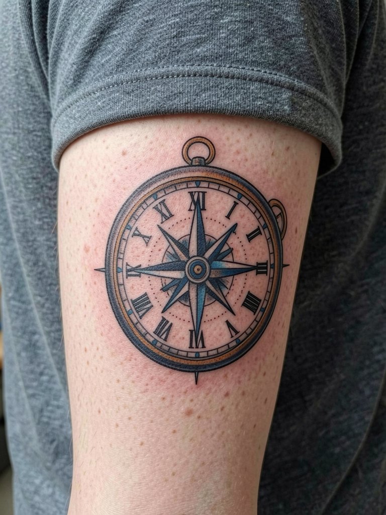
Pairing a clock with a compass creates a life-direction motif. The pitfall is adding too many tiny compass points that become indistinguishable. Tell the artist you want clear primary cardinal points and one accent color on the compass. For longevity pick saturated color rather than thin watercolor. This piece reads well with rolled-up sleeves or a minimalist watch on the opposite wrist.
11. Small Minimalist Clock on the Wrist
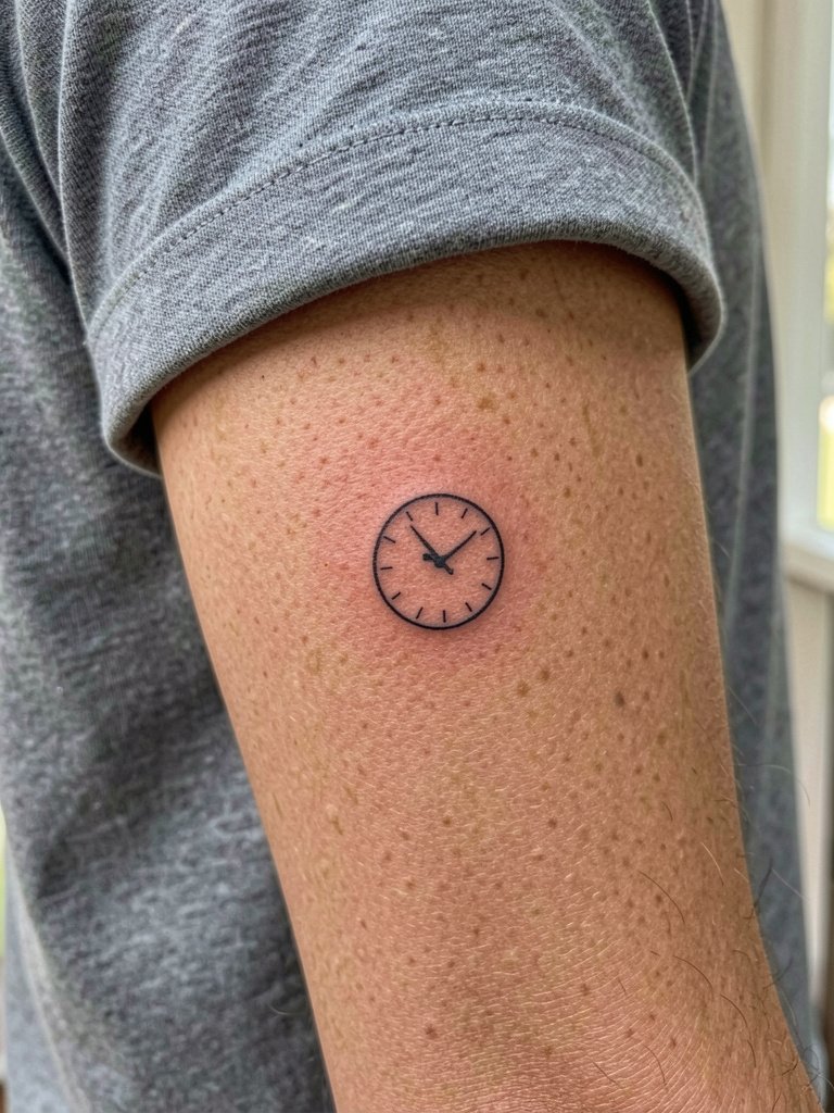
Tiny wrist clocks are a classic first-tattoo choice. The age issue is abrasion and constant hand washing that softens ultra-fine work. If you want a small wrist piece that lasts, bump up the line weight modestly and plan for a touch-up after year one. A frequent mistake is insisting on single-needle detail that the wrist cannot keep. For session wear avoid watches and bracelets on the tattoo wrist. Style with a thin chain bracelet set on the opposite wrist.
12. Clock Tower Silhouette
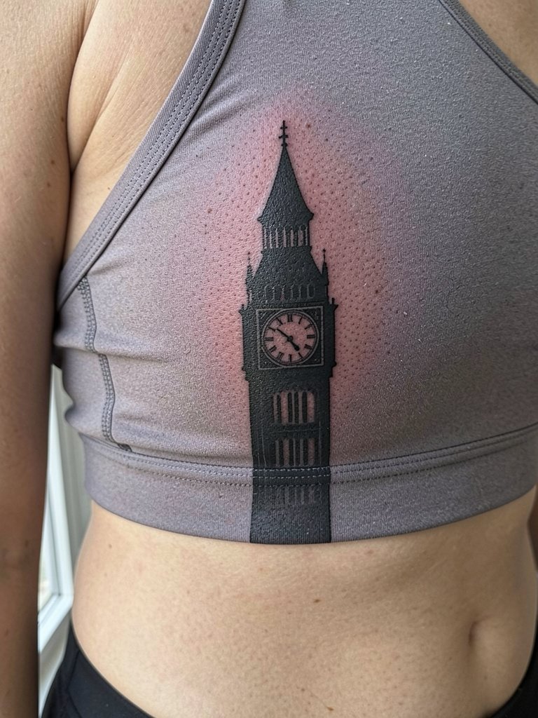
Silhouetted architecture is a low-detail way to put a clock motif on the ribs. Ribs are painful and the skin moves with breath, so size matters. One camp says fine line on ribs blurs quickly because of stretching. The other camp says careful spacing and bold contours can keep linework readable longer. If you prefer a subtle approach, pick a silhouette instead of micro detail to avoid early blurring. The session is high on pain but short on linework time. For the studio day wear a side-opening or loose top that the artist can lift without pressure.
13. Retro Digital Display
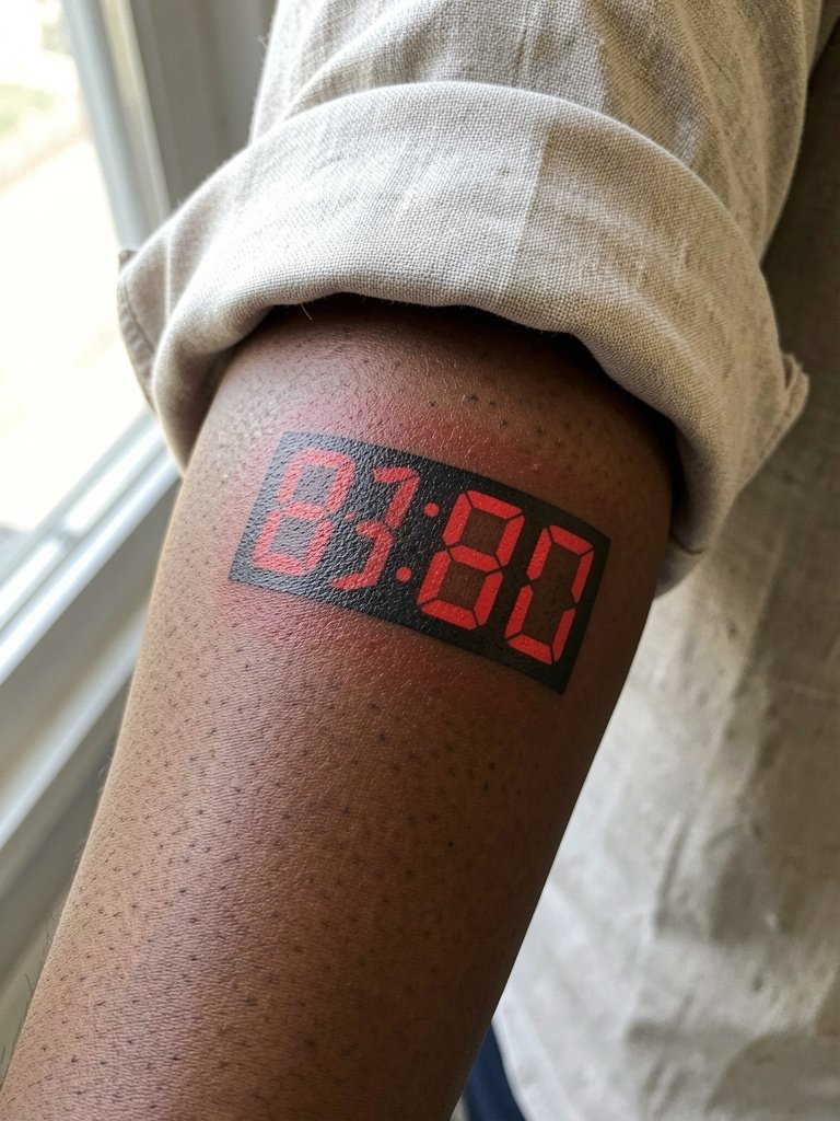
Nostalgic digital displays work when fonts are bold. The main error is using thin pixel lines that wash out. Ask the artist for blocky segments and saturated red fills so numbers remain legible. This style ages like other color work, and modern pigments do better than older formulas. Pair it with casual summer shirts or a minimalist watch on the opposite wrist for a retro touch.
14. Engraved Date Around Rim
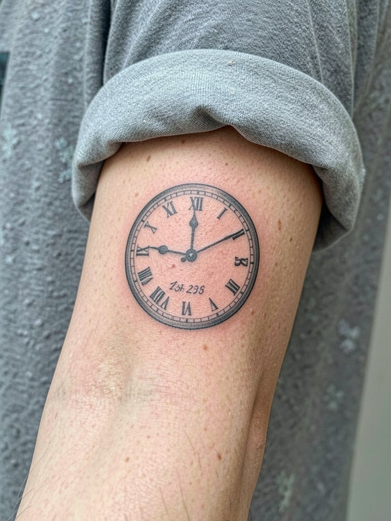
Dates engraved around a clock rim make memorial or milestone work clean and specific. Avoid tiny script that fades. Instead request a serif or small caps engraving style and confirm the exact font size on a stencil. The session is quick and low pain. Bring exact dates in the exact format you want so the artist tattoos the correct numerals. Style with a dainty wrist bracelet set when out.
15. Abstract Watercolor Clock Splash
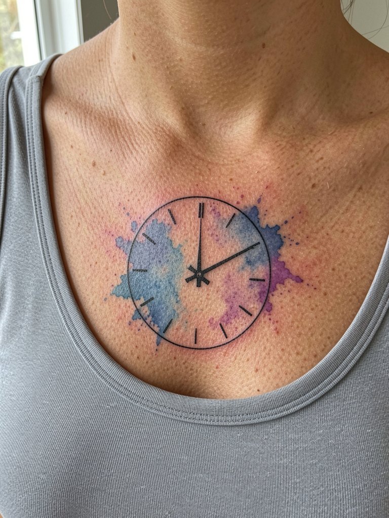
Watercolor clocks read as painterly statements but require acceptance of future fading. If you choose watercolor, ask the artist to anchor the washes with solid black linework so the silhouette remains. The usual mistake is depending entirely on subtle washes for contrast. Expect lighter touch and a softer healed look by year two. For showing the chest splash casually, wear a scoop neck tank.
16. Broken Clock with Shattered Glass
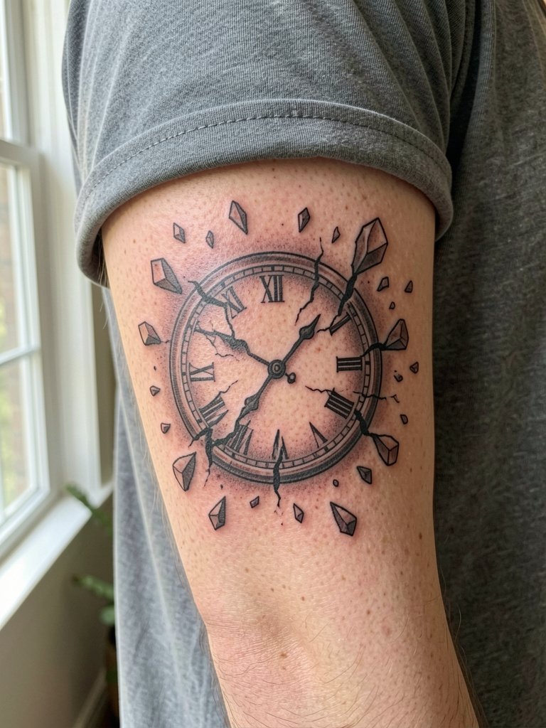
A shattered clock is dramatic and reads well in motion. The risk is tiny shard lines that become indistinct. Ask for broken segments to be bolder and negative space between shards to be clear. This design often looks better slightly larger so the shards have separation. Session feel is short bursts of linework and shading. No accessory links here to keep this placement focused.
17. Pocket Watch Chain Wrapping the Forearm
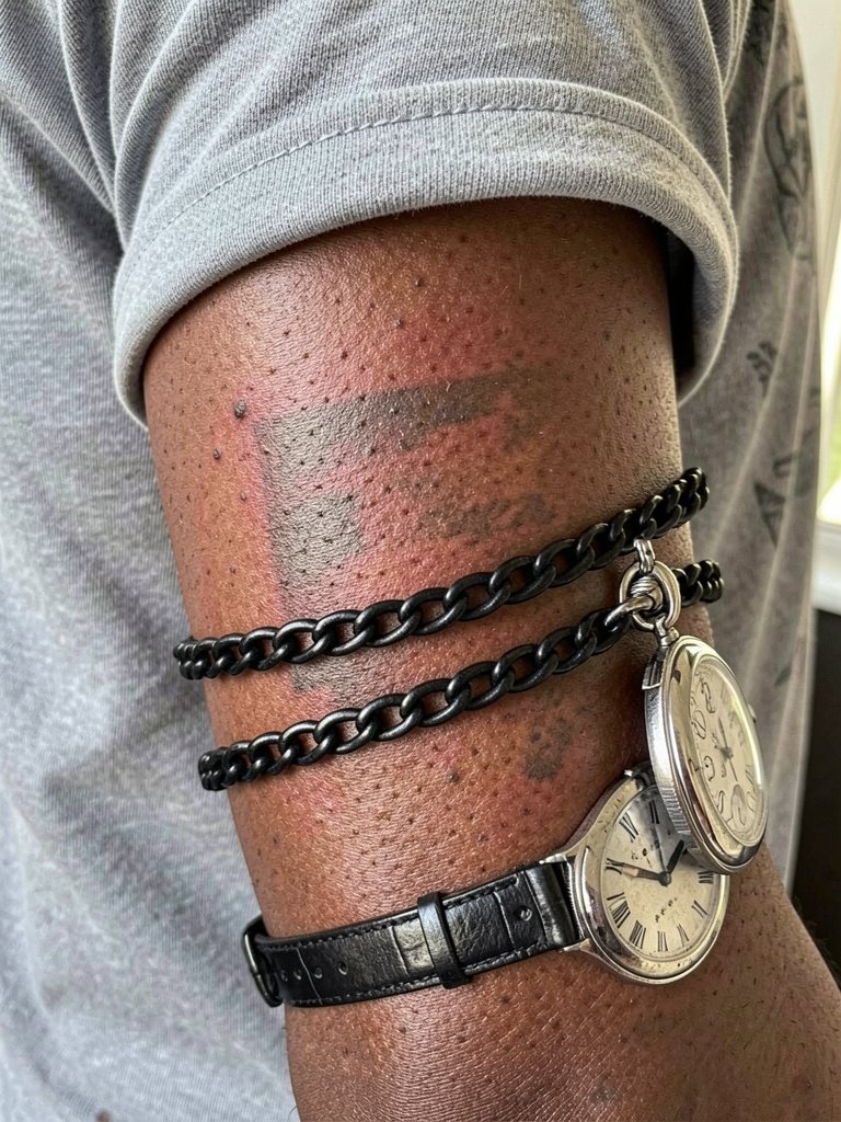
A chain wrap gives movement to a wrist or forearm piece. The mistake is over-detailing tiny chain links that blur with motion. Ask for fewer, larger links with clear negative space between each link. For comfort during the session wear a short-sleeve shirt and plan for one longer session. For display, balance with a minimalist watch on the opposite wrist.
18. Double-Exposure Portrait Inside a Clock
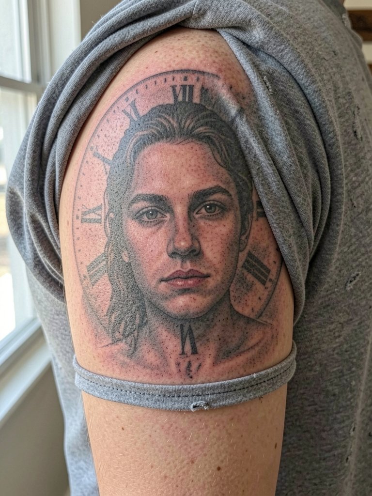
This illustrative approach merges portraiture with a clock dial. It requires a skilled realism artist and staged sessions to layer tones. The common error is compressing too much portrait detail into a small circle. Discuss session breakdown and expect multiple passes for saturation. Avoid tiny facial lines that do not translate at scale.
19. Mechanical Heart and Clockwork
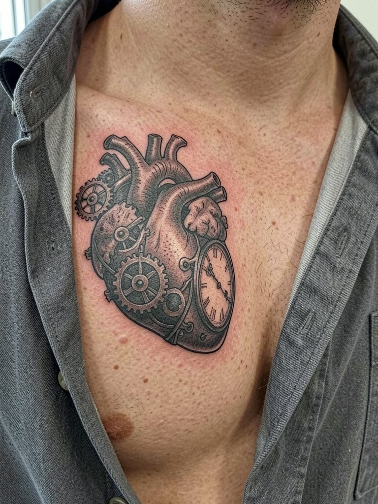
A mechanical heart clocks up as a literal metaphor in chest placement. Because chest skin can be high contrast, ask for metallic highlights and bolder gear teeth to hold over time. Discuss exact placement so it sits naturally over the pectoral muscle. Plan for two sessions and moderate pain. Pair with an open collar linen shirt if you want casual display.
20. Sundial-Style Clock with Shadow Lines
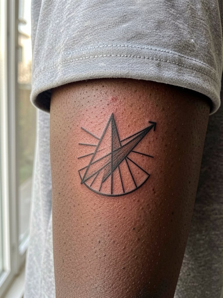
Sundials translate well into linear designs. The pitfall is using ultrafine shadow lines that disappear. Ask for a stronger primary gnomon line and measured spacing between shadow strokes. Heals elegantly and usually requires only one touch-up at year two. No clothing link here to keep the composition clean.
21. Clock as a Map: World Time Dial
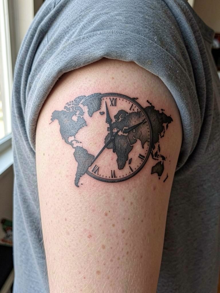
World-time clock dials suit travelers. The detail can get muddy if shrunk too small. Ask the artist to simplify coastlines into bold shapes and confirm the clock hand style. Session time is moderate. For evening wear this piece pairs with an open collar shirt.
22. Tiny Clock Behind the Ear
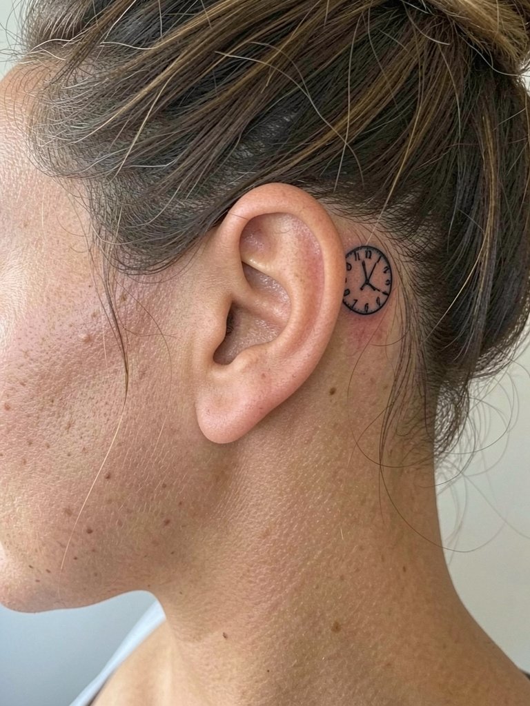
Behind-ear clocks are discreet and intimate. The skin there is thin so line weight matters. Ask for slightly bolder circle lines and limit text or numerals. The session is quick but can be sensitive. For subtle reveal try a hairstyle that naturally lifts like an updo. Wear simple studs or a minimalist pendant necklace on the opposite side for balance.
23. Binary or Barcode Clock
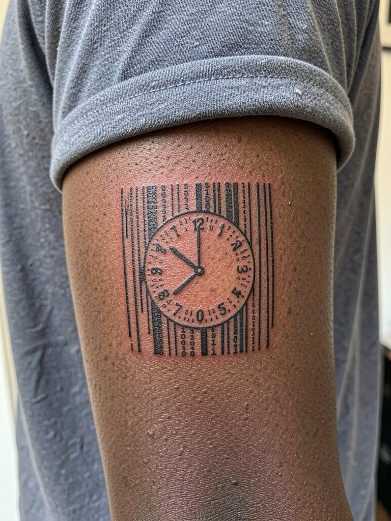
Graphic barcode clocks read modern and abstract. The mistake is making lines too thin or too close together. Confirm minimum bar width with the artist so lines do not merge. These are low-pain and quick sessions. No accessory link here to keep the graphic aesthetic intact.
24. Clock with Laurel Wreath and Roman Numerals
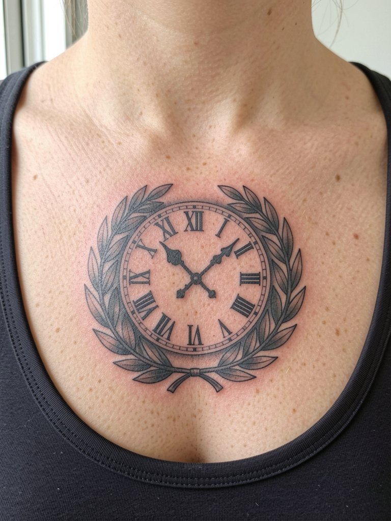
Classical roman numerals and laurel framing look formal and read well when numbers are large. Tiny numerals fade. Ask for strong numeral strokes and clear leaf separation. Expect a moderate session with vector-like linework. Style with an open collar linen shirt for a curated presentation.
25. Constellation Clock
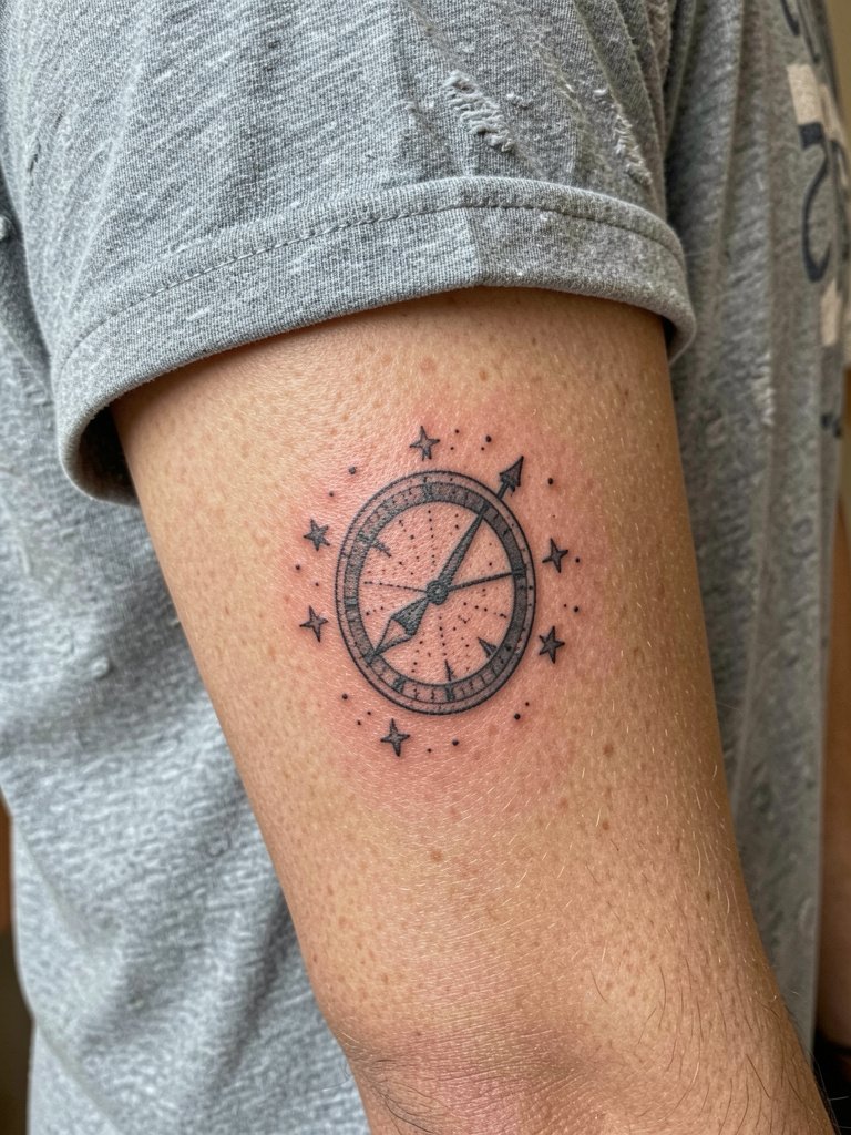
Celestial clock combos are delicate. The biggest mistake is crowding stars close to fine line dials. Instead ask for spaced star points and heavier primary lines for the clock circle. Dot work can hold if dots are generous. Session is short and low pain. No accessory link here to keep the design minimalist.
26. Stopwatch with Racing Flags
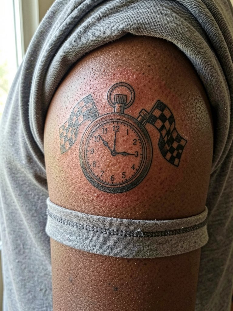
Stopwatches are sporty and read well with bold numerals. Tiny checkered flag details can become a blur if scaled down. Ask the artist for simplified flag blocks and solid numerals to keep the theme crisp. Expect one steady session. For casual display this pairs with a short sleeve tee men solid.
27. Hidden Ribcage Clock Silhouette
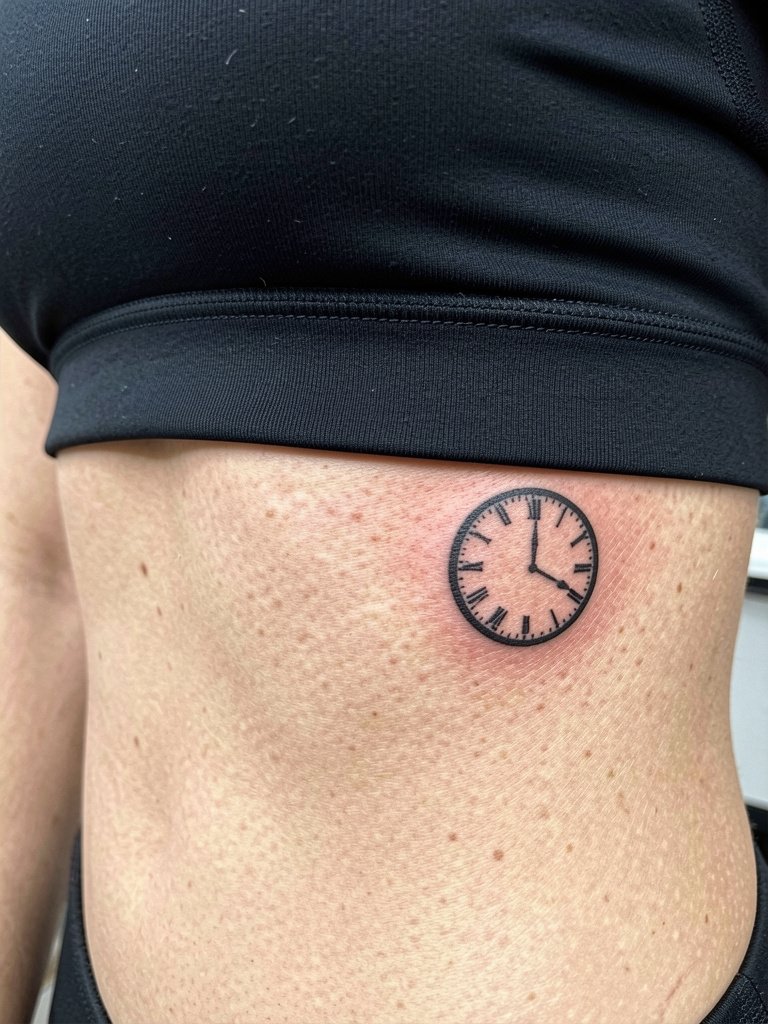
A small ribcage silhouette is a private reminder that stays mostly hidden. Fair warning, ribs are high on common pain charts. One group of artists warns that fine-line ribs blur quickly because skin stretches with breathing and movement. Another group says with strategic spacing and slightly thicker lines the piece can hold up well, and they point to three-year healed photos to back that claim. If you want something low-key choose a solid silhouette rather than fine filigree. Wear a loose top for the session so the artist can access the side without fabric pressure.
Frequently Asked Questions
Q: How do clock tattoos age differently by placement?
A: Smaller fine-line clocks on wrists and fingers tend to blur faster because those areas get sun and friction. Forearms and chests are more stable and keep detail longer when line weight and spacing are increased. Plan for touch-ups on delicate placements every two to three years.
Q: Should I pick black-and-grey or color for a pocket watch and roses?
A: Black-and-grey generally ages more predictably and needs fewer color touch-ups. Color can look striking and last a decade with modern pigments, but it often needs refreshes sooner. If contrast is a worry, choose saturated color accents with bold black outlines to combine both camps.
Q: Where can I find artists who post healed clock portfolios without naming individuals?
A: Search hashtags like #clocktattoo, #clocktattoomen, #finelinetattoo, and #neotraditionalclock on Instagram and TikTok while using location filters. Tattoodo and Booksy let you filter by style keywords such as "minimalist clock" or "black and grey clock" and show portfolios. Reddit communities like r/tattoos and r/tattooadvice often share healed shots across skin tones.
Q: How painful is a ribcage clock and what helps during the session?
A: Ribs rank high on most pain charts. Shorter sittings and good rest before the appointment help. If you plan to use topical numbing, understand the debate. One camp says numbing cream helps first-timers endure ribs and improves session quality. The other camp warns numbing can swell the skin and affect ink placement. If you consider numbing, get a specific plan from the studio about timing and approved products.
Q: What should I wear to a session for an inner forearm or chest clock?
A: For inner forearms wear a loose, short-sleeve or roll-up shirt so the artist can access the palm-up surface. For chest pieces pick a scoop-neck tank or open-collar top that naturally exposes the area. If your piece is near the hip choose low-rise pants that can be lowered slightly without tugging or pressure. A simple outfit choice makes the session smoother and keeps fabric away from the fresh ink.