
Fine line scripture can look like a whisper the day you get it and like a faded shadow a few years later if you choose the wrong place or line weight. Think in terms of placement, line spacing, and the exact text you want on your skin. The list below pairs 23 specific verse ideas with how they age, what to request in the stencil, and simple wardrobe moves that keep the ink visible when you want to show it.
1. Single-Needle Proverbs 3:5-6 on the Inner Forearm
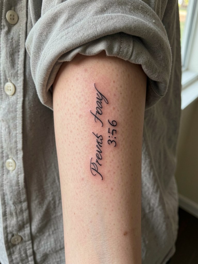
A single-needle Proverbs reference reads intimate and diary-like on the inner forearm. I recommend requesting a slightly heavier single-needle than the reference photo, with letter spacing increased by a hair so the letters do not merge as the ink spreads. People often go too thin and regret it at year two when letters soften into blobs. Expect one quick session and a touch-up around month twelve for most micro-script. To show it off, roll up a linen button-down in cream or olive and wear a dainty gold stacked bracelet set on the opposite wrist so the script stays the star.
2. Flowing Isaiah 40:31 on the Ribs
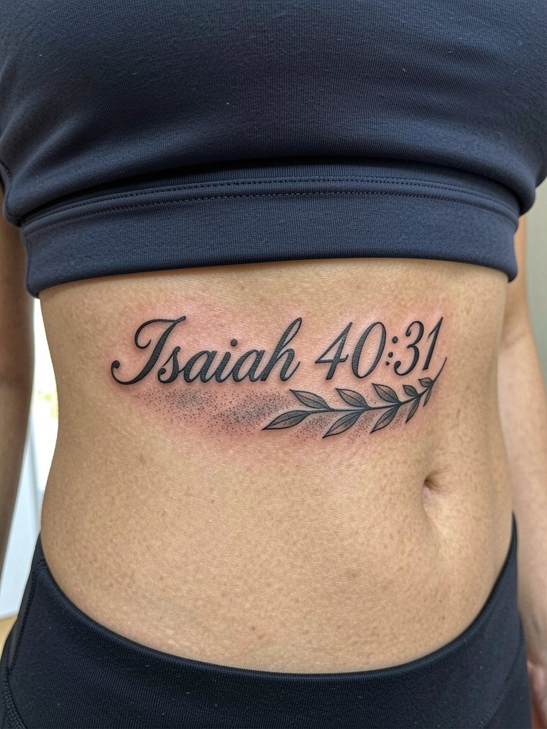
Rib tattoos take patience in the chair and planning for how the text sits while you breathe. Artists split into two camps on fine line ribs. One camp warns that single-needle script on ribs blurs quickly because the skin stretches and compresses when you breathe, making lines merge within two years. The other camp says that with the correct needle depth, slightly wider spacing, and custom hand-lettering it settles fine and shows healed photos to prove it. If you want a long verse here, request flowing kerning that follows the rib curve and bring a loose two-piece outfit for the session, like a removable crop top or a fitted sports bra in normal worn position so the artist has clear access.
3. Bold Gothic Philippians 4:13 on the Wrist
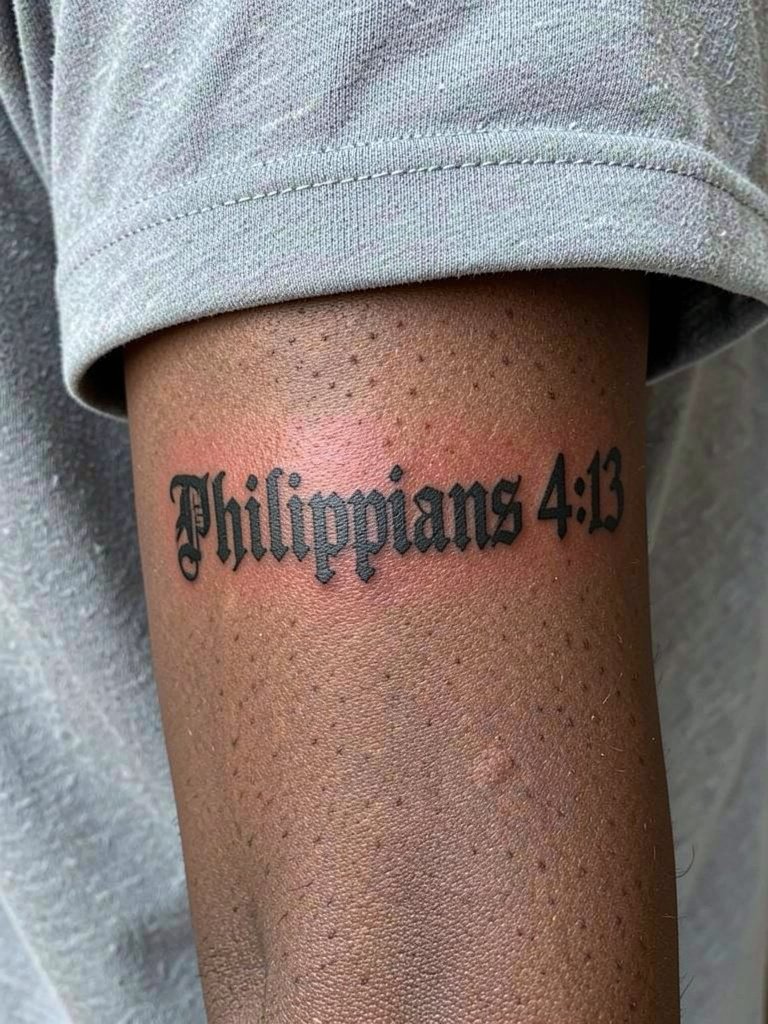
Gothic script gives biblical text heavy presence and it ages into a readable graphic. Recommend thick strokes and internal spacing that keep counters open as the piece heals. The typical mistake is asking for a high-contrast font from a screenshot without checking how small the counters collapse on a wrist. Plan for a single session. For everyday styling, pair the wrist piece with a minimalist watch on the opposite wrist or thin chain bracelets that do not press on the ink while it heals.
4. Minimalist Romans 8:31 on the Outer Forearm
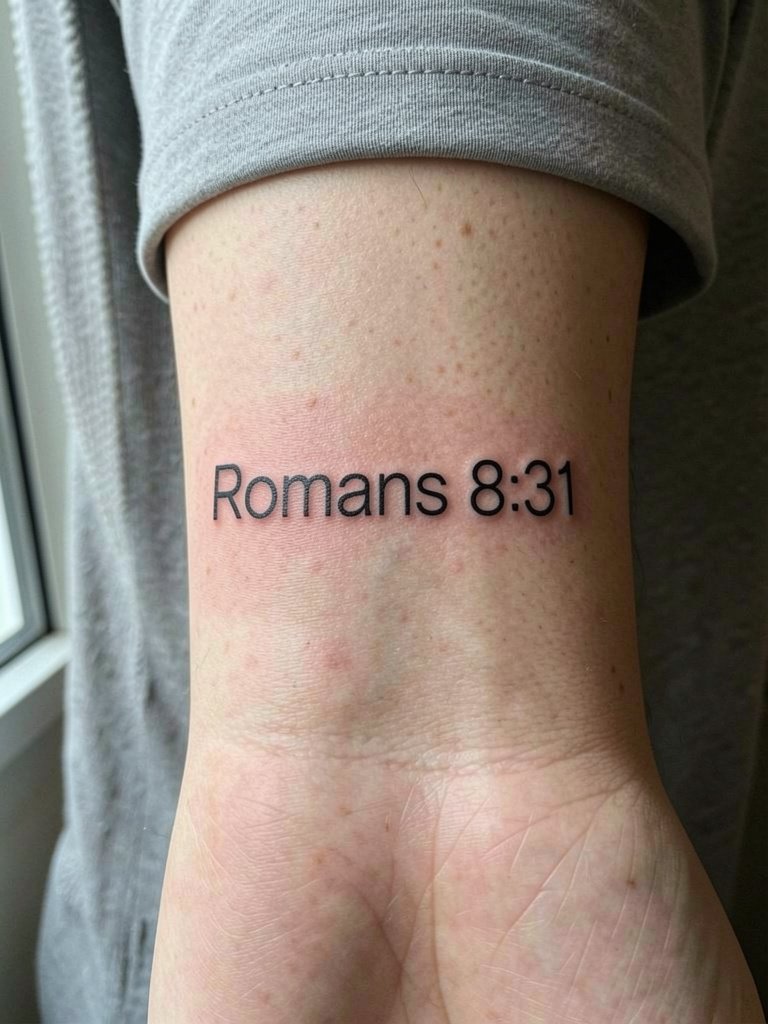
A clean geometric block script feels modern and reads well on the outer forearm. Ask for slightly rounded letter terminals so the type does not crack into patchy bits when the skin moves. A common version that ages poorly uses razor-thin strokes that disappear within months. This placement is low pain and shows well to others, so consider keeping the size around three to five inches to preserve legibility at year two. Expect a single appointment and one small touch-up if letters thin out.
5. Ornamental Floral Proverbs 31:25 Along the Collarbone
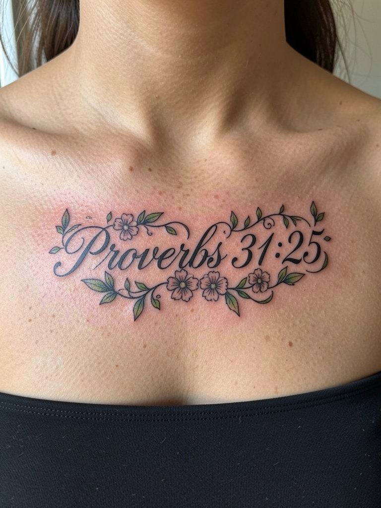
Combining script with thin-line botanicals softens long verses across the collarbone. Tell the artist in the consultation to layout the vines so they frame the text rather than overrun the counters. The frequent error is cramped florals that steal negative space from letters and age into a muddle. This site loves strapless or off-the-shoulder tops for display. For evenings out try a layered pendant necklace that sits below the tattoo to give the eye a natural frame.
6. Vertical John 16:33 Down the Spine
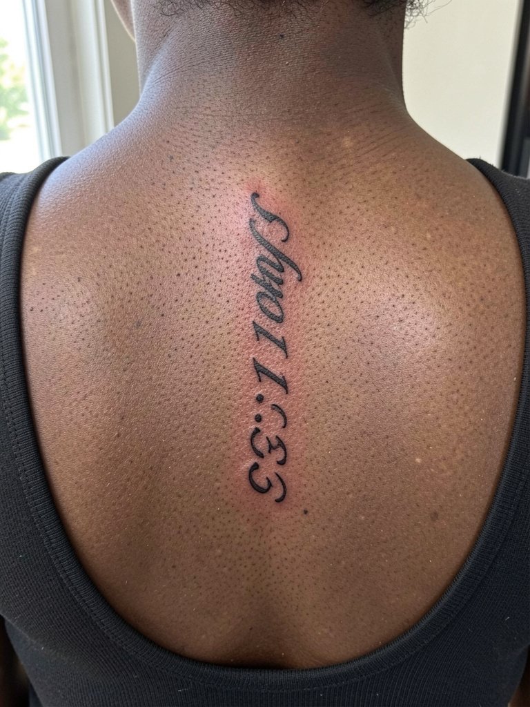
A spine line reads like a column of text that elongates the back. For long passages use narrow letterforms and plan for two sessions when the run hits six inches or more. The main mistake is using a dense block font that looks cramped on curved areas of the back. For showing off, low-back dresses or a long pendant necklace that hangs parallel to the spine complements the vertical layout without covering the ink.
Heal Smart
The first six ideas include wrist, ribs, collarbone, and spine placements that all have different friction and clothing risks, so a few practical items make the first week smoother.
- Gold Filler tattoo balm. An indie balm many people mention for fine line work, it feels thin on skin and helps prevent scabbing that can pull at tiny letters.
- Saniderm medical-grade film. Use it for long vertical pieces or high-friction locations to protect fresh lines during the first 48 hours.
- Dr. Bronner's unscented castile soap. Gentle cleansing during final healing keeps ink from clogging pores without fragrance irritation.
- Hustle Butter deluxe balm. Good for the initial moisturize phase on heavier blackwork so shading does not crack.
- Aquaphor healing ointment. A thin layer for the first 48 hours helps keep micro-script from drying into thick scabs that can pull pigment.
7. Classic Cursive John 3:16 on the Inner Wrist
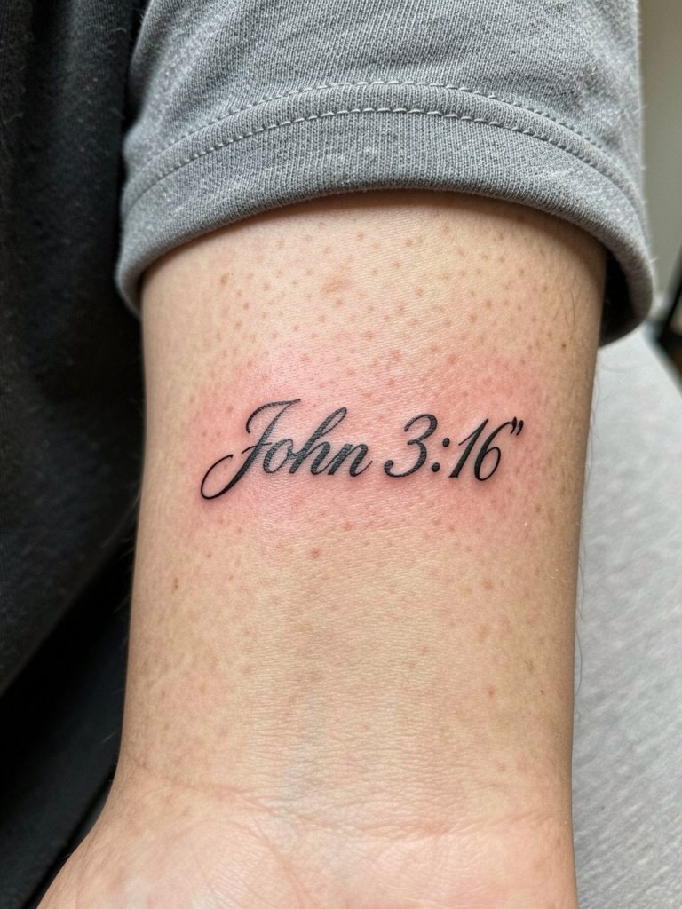
Fine line cursive at the wrist can feel like a private reminder and it is easy to show. Artists split on wrist fine line longevity. One group says wrists are high-friction areas and single-needle cursive will blur into unreadable grey within one to two years. The other group says that with slightly heavier single-needle depth, more spacing, and hand-lettered forms, wrists can remain legible for several years. For this placement ask the artist to add modest kerning and a hair more weight than the sample. Wear the piece with thin bracelets on the opposite wrist so the new ink avoids constant rubbing. Consider a thin chain bracelet set for styling.
8. Dainty Below-Ear Isaiah 41:10 in Micro Script
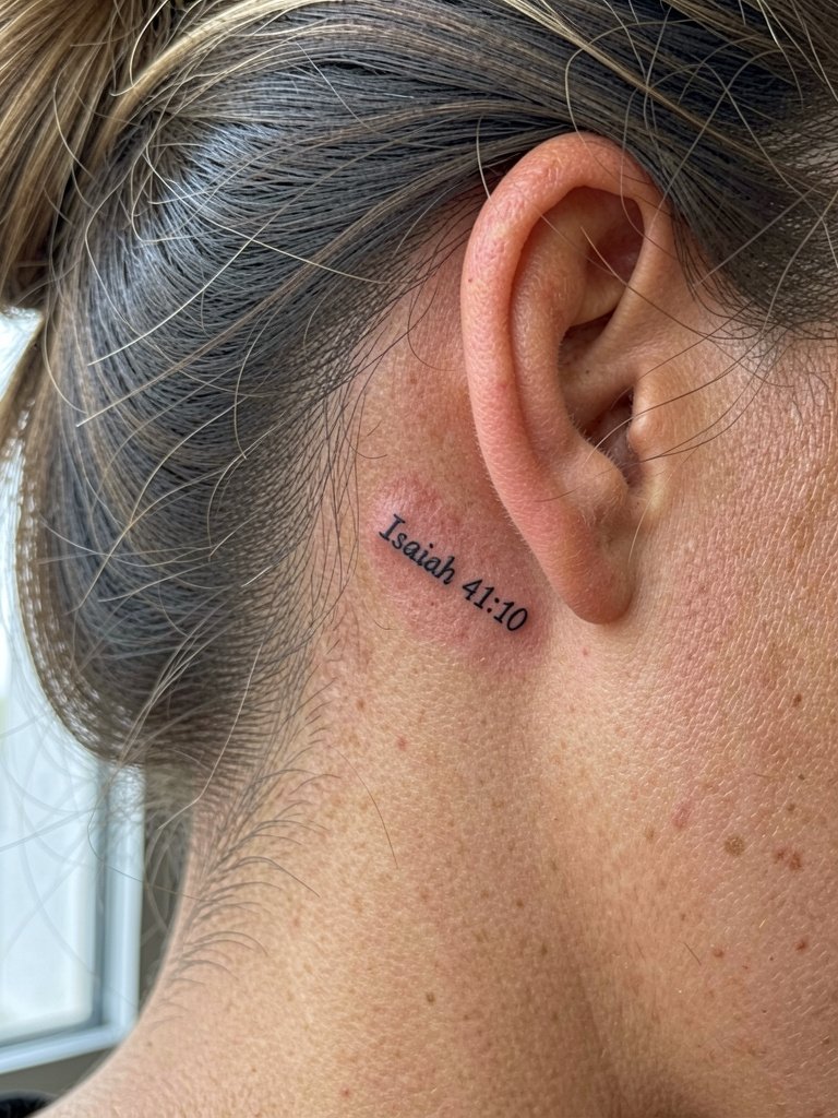
Tiny scripture behind the ear works if you accept frequent fading as part of the trade. The usual mistake is making the type too small to survive normal sun exposure and hair brushing. If you want it to last, ask for a single-needle script bumped up slightly in size and avoid added color. To show it off, style hair into a ponytail or bun and add a gold ear cuff on the opposite ear to balance a minimal aesthetic.
9. Neo-Traditional Corinthians 13:4 on the Upper Thigh
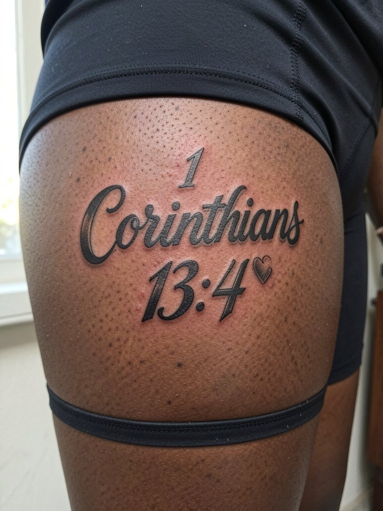
Upper-thigh placements allow heavier outlines and illustrative flourishes without visible daily friction. For a neo-traditional verse layout pick bold outlines and avoid tiny script inside dense shading. The common mistake is packing a long passage into a small oval so the counters vanish after healing. Session comfort is usually higher here than ribs. Wear loose bottoms or a two-piece on session day so the artist can access the area without fabric pressure.
10. Minimal "Peace" from John 16:33 on the Inner Bicep
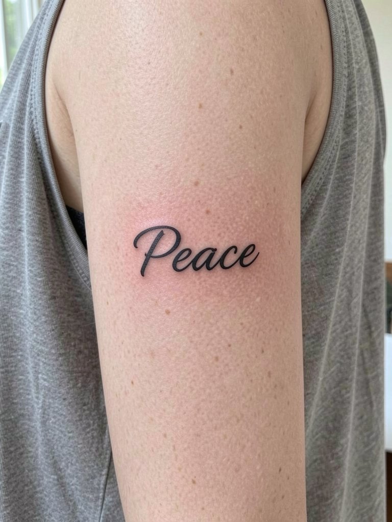
A single-word inner bicep patch reads private and is easy for a first tattoo. The inner arm tends to keep ink stable if the line weight is a hair stronger than a typical micro script. Tell the artist you want letter spacing that allows a one-millimeter gap at minimum so blowout risk is reduced. For outfit pairing, sleeveless tops in neutral tones highlight the inner bicep. Try a loose tank top on session day so sleeves do not rub the fresh ink.
11. Handwritten Proverbs 3:5-6 as Inner Thigh Script
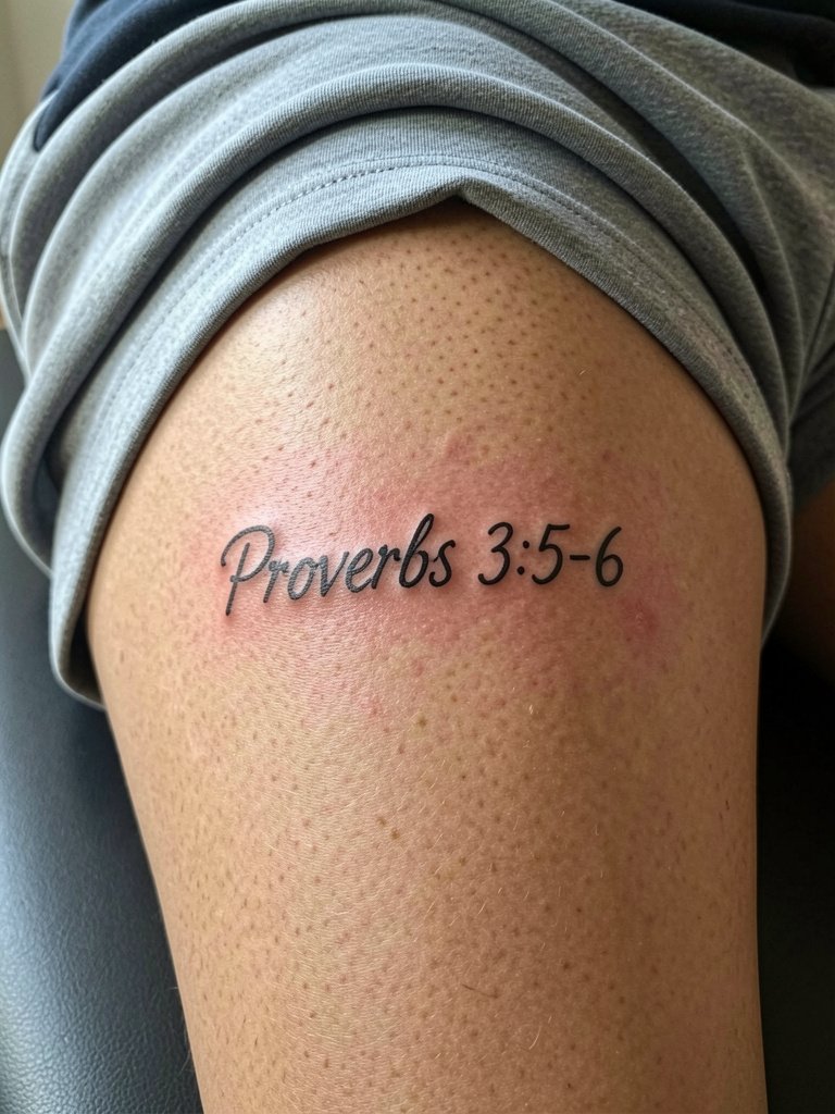
Inner-thigh script can feel intensely private but it stretches with movement. A common misstep is placing long lines on the inner thigh without testing how the letters move when walking. Ask for a mock layout on the seated pose so you can see the text when the leg is relaxed. Session comfort varies and some people request topical numbing for longer pieces. Leave space for a touch-up after the initial healing because friction from clothing can lighten thin strokes.
12. Blackwork St. John 3:16 Across the Sternum
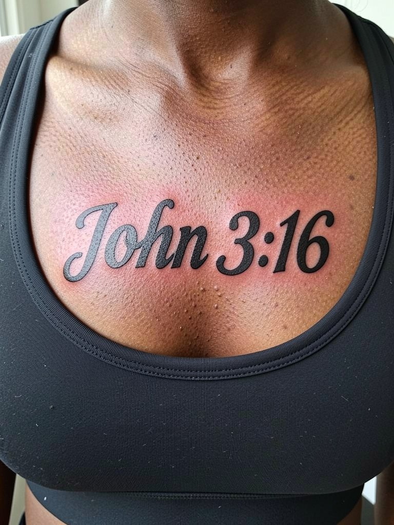
Sternum pieces demand boldness to read across that anatomy. Thin script here often looks like a smear within a year. If you prefer a long passage, pick heavier blackwork and limit small serif details. The session can be intense because of proximity to ribs and breast tissue. Wear a removable top or a sports bra you can easily open to provide access while avoiding tight pressure on the fresh ink.
13. Watercolor Accent Isaiah 40:31 on the Lower Back
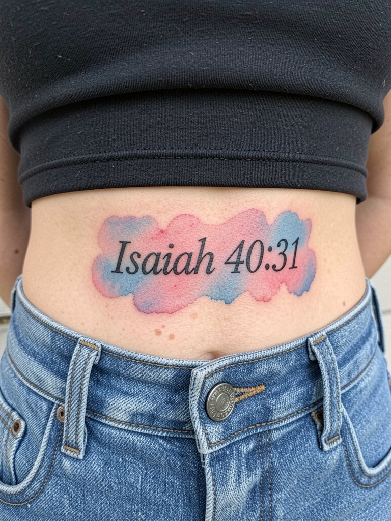
Watercolor adds an emotive softness but it brings trade-offs in longevity. One camp says watercolor behind scripture is a poor choice because pigments fade unevenly and the washes can leave the letters looking like a blur. The opposing camp values the aesthetic depth the color provides and points to newer pigments and careful placement that maintain the effect longer. If you pick watercolor, ask the artist to lock the lettering in pure black and keep the color washes as background only. For showing a lower-back piece, low-back dresses and open-back tops work well with a low back dress for evenings.
14. Gothic Romanesque Romans 8:31 on the Shoulder
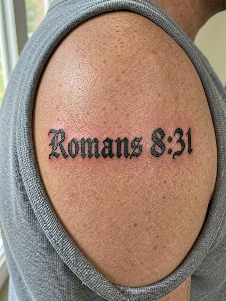
Medieval-style lettering gives weight without needing large real estate. On the shoulder the biggest error is compressing ornamentation so shading fills in tiny counters. Request bold outlines and open interior shapes. Pain is low here and touch-ups are typically cosmetic at year one when the sun has mellowed edges. For casual wear, sleeveless tops and layered necklaces frame shoulder pieces. Try a sleeveless top neutral for day looks.
15. Micro-Realism "Strength" Finger Script
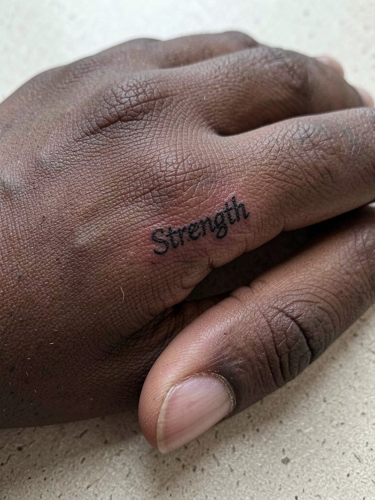
Finger script can be striking at first and soft within a year. The finger eats single-needle work quickly due to constant washing and friction. For a finger word select a slightly bolder micro font and anticipate an annual touch-up. A common mistake is expecting a full two-decade life span from a micro line on the finger. Keep the word short and accept that maintenance is part of the plan.
16. Script in the Original Language on the Nape
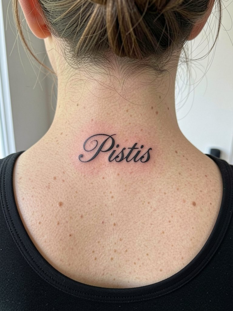
Tattooing script in an original biblical language rewards exactness. Bring a clear printed reference of the precise phrase in the original alphabet and request the artist stencil both the original and a transliteration so you can verify letter forms. The nape is a guarded placement that often looks great with hair up. A simple pendant necklace or a bun complements this spot. For session comfort, short appointments and breaks help when the artist is working close to the hairline.
17. Verse Plus Micro Symbol on the Wrist Edge
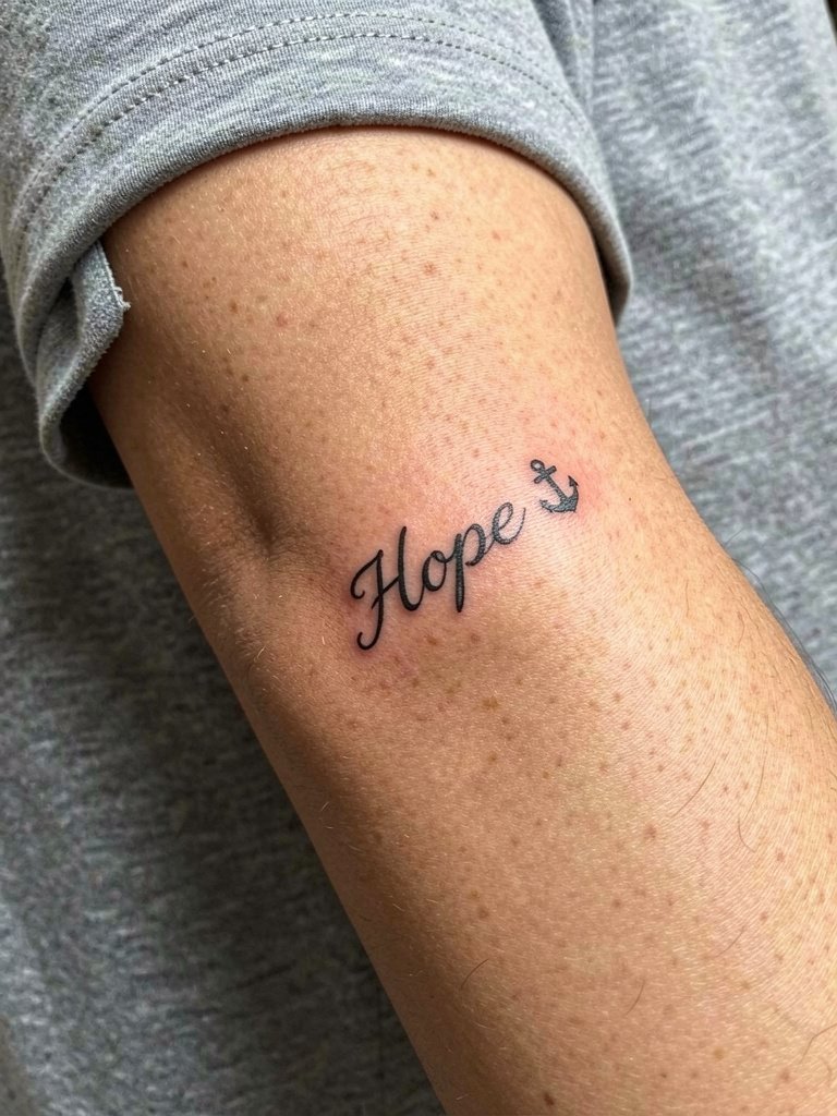
Pairing a single word with a micro-symbol gives visual shorthand for a longer verse. The wrist edge faces friction from bracelets and watches. To keep both elements legible, ask for the anchor to be simplified to a solid silhouette and set the word at least one-quarter inch away. A common error is cramming icon and text so they blur together. This layout shows well with stacked bracelets on the opposite wrist rather than heavy pieces on the tattooed side.
18. Minimalist Single-Word on the Inner Upper Arm
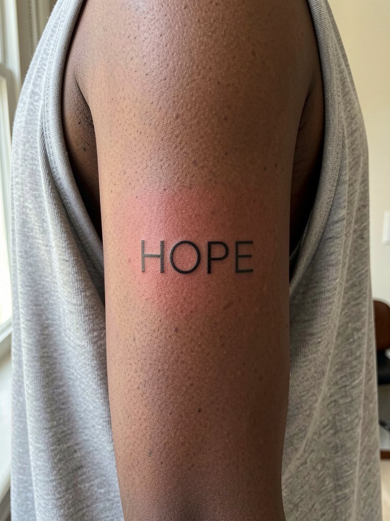
A bold, short word reads clearly on the inner upper arm. The inner arm tolerates slightly heavier strokes without blowout. If you want the piece to remain crisp, pick clean letterforms with open counters. Plan for one session and no color here. Wear a loose tank top on appointment day so nothing rubs the fresh ink.
19. Minimalist Lower-Case Collarbone Snippet
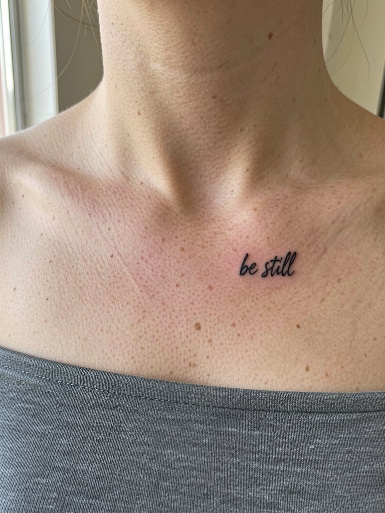
Small lowercase snippets under the clavicle feel intimate and readable when you lean forward. The typical mistake is using ultra-tiny letters that vanish in photos. Ask for hand-lettered forms that maintain character at three inches across. Show-off pairings include strapless tops. Try a strapless top for events where you want the script visible without necklace interference.
20. Vertical Forearm Passage in Serif Script
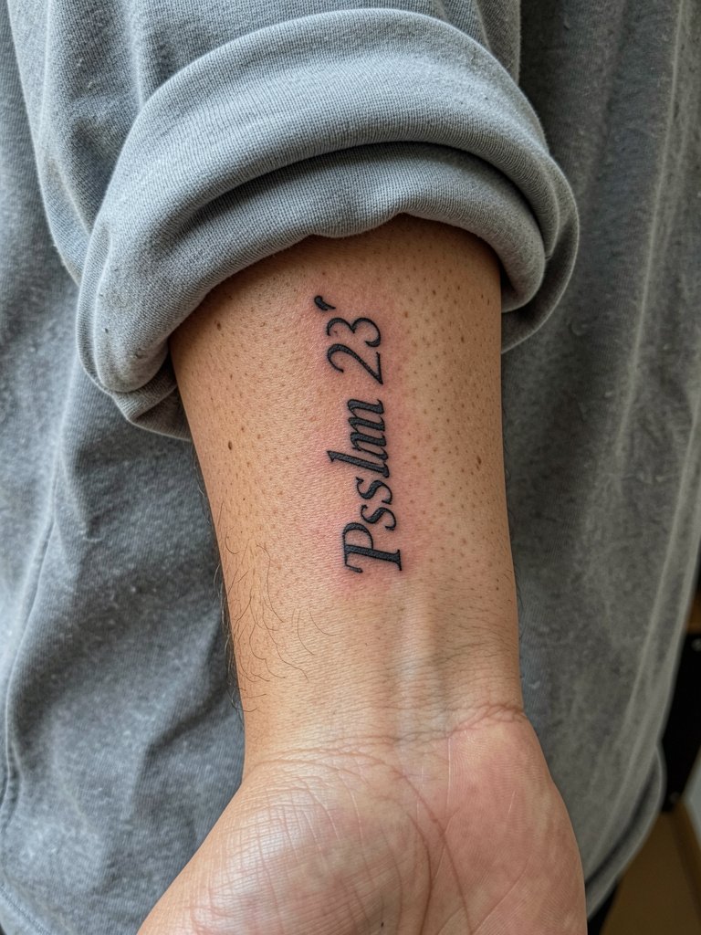
Vertical columns suit longer passages without taking the torso. To avoid letters compressing on the forearm curve, ask for a slightly narrower serif and increased line-height so each line breathes. A common failure is typing a block scripture into a small width so the words stack into unreadable blocks. Vertical forearm pieces are easy to check in a mirror during the consultation so bring the printed layout.
21. Tiny Anchor and Verse Coordinates on the Hip
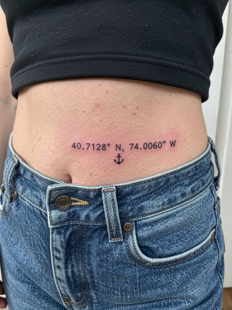
Hip tattoos pair nicely with low-rise clothing and feel discreet when you want them to be. The usual mistake is placing coordinates too close to the waistband where friction from jeans fades ink. Ask for the exact coordinate text to be stenciled and check size so the numbers remain legible at a glance. Session wear should be low-rise bottoms you can easily pull down a hair while staying covered.
22. Sternum Quote in Bold Script for Chest Balance
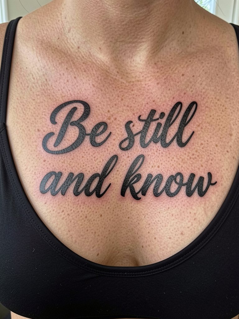
Large script across the sternum benefits from bolder strokes and open counters. The main complaint with sternum script is too many tiny flourishes that disappear when the skin moves. If the piece is mainly personal, choose bold black letters and skip tiny details. Wear a bralette with thin straps or a top you can easily remove for access on session day.
23. Micro-Symbol and Short Verse on the Ankle
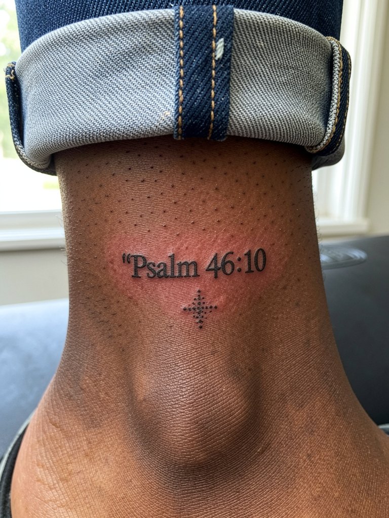
Ankle motifs are excellent for small, symbolic scripture placements. The ankle faces friction from shoes and socks during early healing. Avoid ultra-fine hairline strokes and pick a compact layout that keeps counters open. On session day wear jeans cuffed above the ankle so the artist can work without fabric pressing on fresh ink. For styling, ankle pieces peek nicely beneath skirts with rolled cuffs.
Frequently Asked Questions
Q: How do I pick between fine line and bold black for a Bible verse?
A: Think about longevity and skin tone first. Bold black gives contrast on melanin-rich skin and holds up longer in high-friction spots. Fine line reads intimate on low-friction forearms and ribs when the artist uses slightly more spacing and a heavier single-needle depth. If unsure, request a hand-lettered sample at scale so you can see how the lines breathe at the size you want.
Q: What should I bring to my consultation to avoid typos or wrong language forms?
A: Bring both the exact verse text and the verse reference in the original alphabet if you plan to use it. Ask the artist to stencil both the original script and a transliteration. Bring two printed references at different scales so you can compare how the type reads at three inches and five inches. Double-check the stencil on your skin before the needle starts.
Q: Where can I find healed examples and local lettering specialists without naming artists directly?
A: Search hashtags like #bibleversetattoo and #scriptureink on Instagram and TikTok and then filter by location to see studios nearby. Tattoodo and Booksy let you search portfolios with keywords such as "fine line scripture" or "blackletter bible verse" and show healed photos. Reddit communities for tattoos surface peer recommendations and healed examples across skin tones.
Q: How long until a script tattoo needs a touch-up?
A: Most script benefits from a small touch-up around twelve months, especially micro-script in friction zones. Inner forearm and shoulder pieces often need less frequent work. Fingers, wrists, and ankles commonly need refreshes sooner because of washing and clothing contact.
Q: What should I wear on session day for ribs, sternum, and collarbone placements?
A: For ribs wear a two-piece or a fitted cropped top that can be lifted without tugging your waistband. For sternum pick a sports bra or a top that can be opened so fabric does not press on the fresh ink. For collarbone bring a strapless or wide-neck top that exposes the area naturally. Choose clothing you can remove or adjust without rubbing the new tattoo.
Q: Do watercolor accents ruin the clarity of a verse?
A: Watercolor can soften the background mood but it increases the risk of uneven fading around the letters. If you want color, keep the lettering in saturated black and ask the artist to keep pigment washes faint and behind the type so the script stays readable as color diminishes.
Q: Can script on dark skin look good in photos?
A: Yes, with the right approach. Choose saturated black and slightly larger letter proportions so the contrast reads well in photos. Thin grey or pale inks tend to fade into bruising tones on darker skin, so avoid muted greys for script.