
White ink can look like a private mark on the wrist, barely there until light hits it. It asks for patience because the pigment needs extra passes to sit and it will change over time. Read these 11 wrist ideas, with what each actually feels like in the chair, how it ages, and a few wardrobe notes so the piece flatters your day-to-day look.
1. Minimalist Single-Line Heart on Inner Wrist
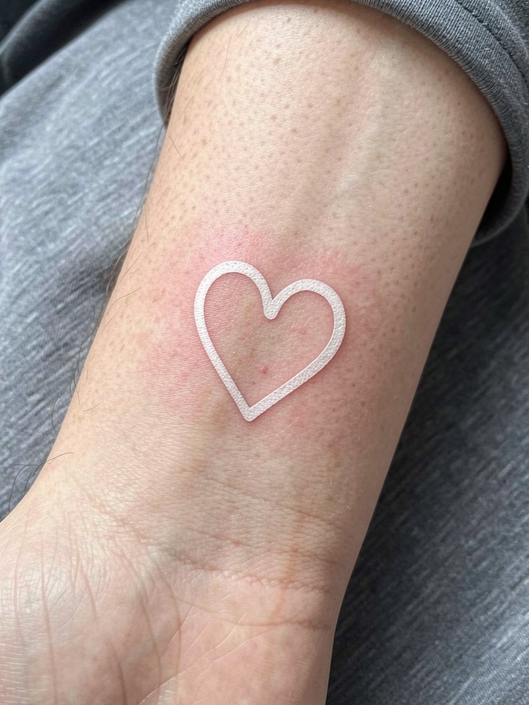
A single-line heart is the quintessential white-wrist request because it reads intimate and clean when fresh. Expect the artist to pass the needle multiple times for saturation and to plan touch-ups around month six if you want it to stay visible. The common mistake is going too thin; that shrinks the window before a blowout or fade makes it vanish. If you like a soft jewelry look, pair it with a rolled cuff linen shirt for neutral frames and wear a dainty bracelet on the opposite wrist so the tattoo stays unobscured. In the chair you will feel repeated, sharp passes where the pigment needs to sit. Ask for slightly heavier single-needle linework than your reference image so the heart survives two years without turning into an indistinct smudge.
2. Tiny White Infinity Symbol, Radial Inner Wrist
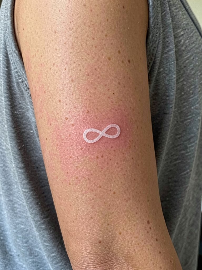
Infinity lines need absolute clarity to convey the symbol as it fades. I normally recommend a hair-thicker single-needle weight than clients expect so the loops keep their shape after one or two years. The touch-up timeline here is realistic: most people see a first touch-up at six to twelve months. The usual error is requesting micro scale without a healed reference; show your artist a one-inch mockup so they can advise on minimum legibility. Expect higher sensitivity on the radial wrist because the skin is thin and bony. For showing it off, pair with a dainty gold stacked bracelet set. The bracelet on the opposite wrist balances the look and keeps the tattoo wrist unobstructed.
3. Delicate White Moon Phase Set, Vertical Arc
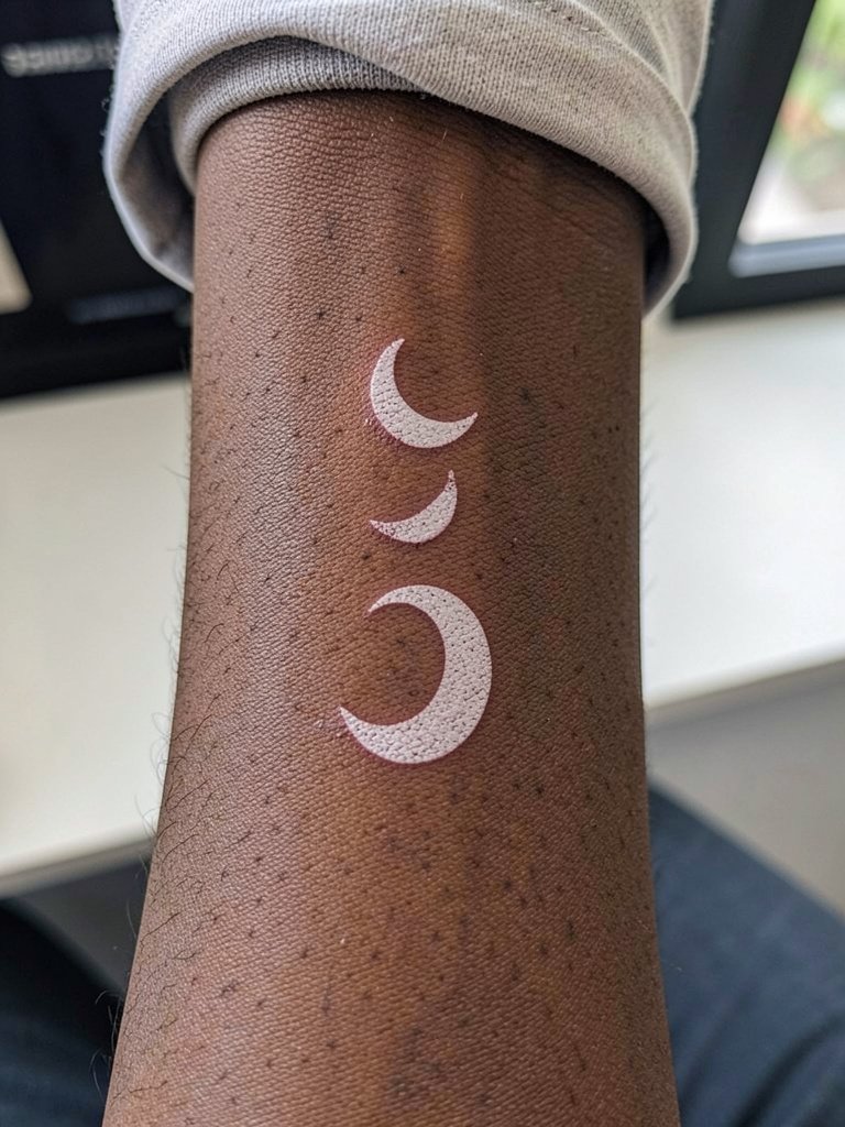
Moon phases read beautifully in white but they also highlight the white-ink debate. One camp says white ink is a bad choice because it fades quickly and can yellow or disappear on many skin tones. The other camp argues the soft fade is the intended look and that properly saturated white phases age into a subtle glow. If you have medium to dark skin, plan a candid conversation about alternatives like fine-line black outline with white highlights so the motif keeps contrast. Ask for healed examples on similar skin tones. The session will require multiple passes for each crescent. For evenings out, a rolled cuff linen shirt in cream or olive keeps the wrist visible and complements the soft white finish.
4. Micro Floral Sprig on Radial Inner Wrist
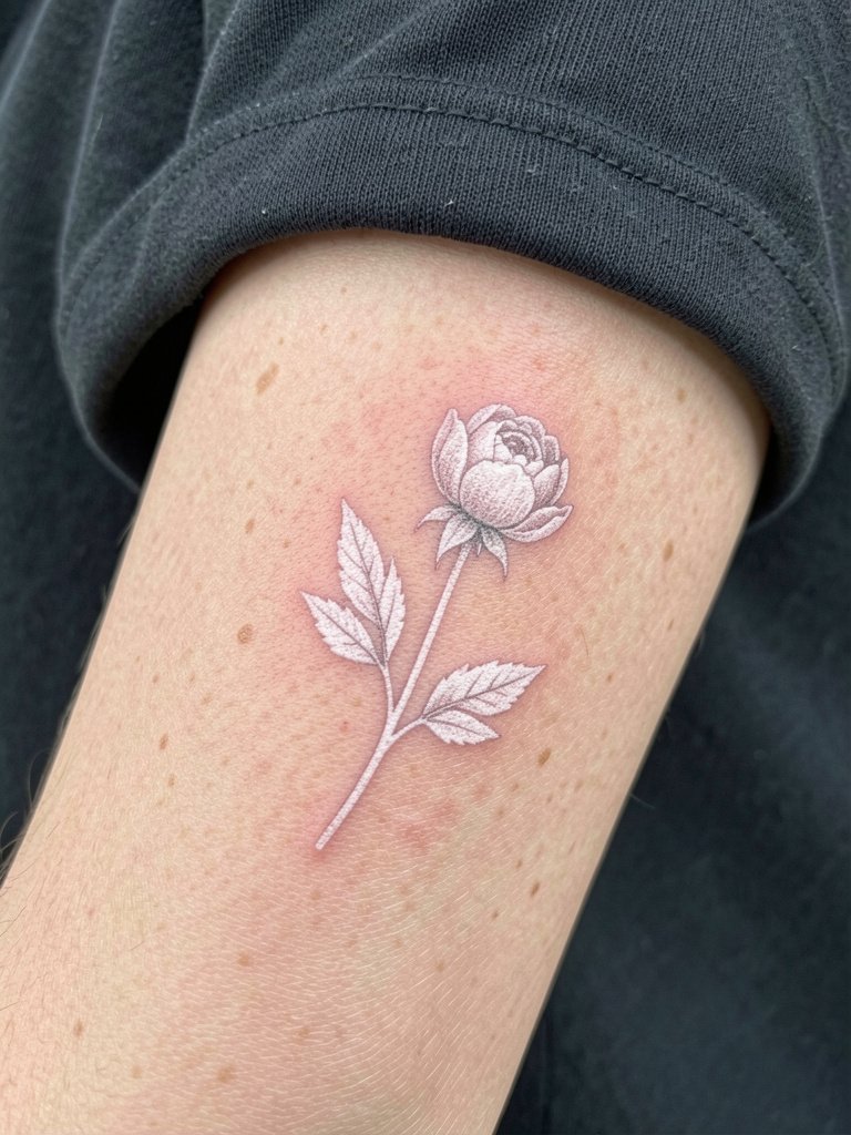
Botanical pieces age by losing contrast in petal detail if the spacing is too tight. My go-to suggestion is to simplify petals into negative-space shapes and keep leaf veins minimal. The session feels like focused work with repeated passes on tiny areas, so you will be sore at the base of the palm after. A real mistake is asking for micro stipple shading that turns into mottled blur after a year. If you want to dress it up, the sprig pairs well with a dainty gold stacked bracelet set on the opposite wrist and a neutral linen top to keep attention on the skin detail. Schedule a touch-up at six months to refresh any lost highlights.
5. White Ink Script Name or Date, Central Inner Wrist
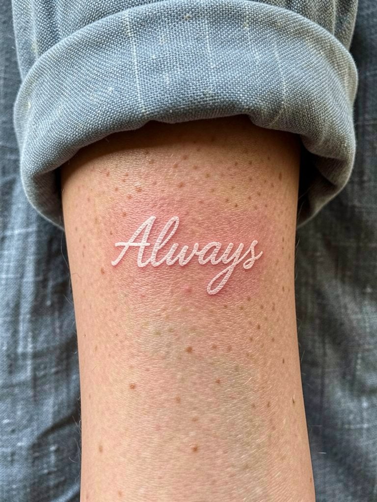
Script in white demands full saturation and honest expectations about longevity. The common error is choosing ultra-fine cursive. If your text is a name or date, bring the exact word or numerals in the font you want and ask the artist to show a one-inch stencil. For this placement, the touch-up schedule is usually six to twelve months. Script here feels tender in the chair because the wrist has little cushioning, and heavy saturation means extra passes. For outfits, a dainty gold stacked bracelet set on the opposite wrist and cream linen sleeves frame the script without covering it. Tell the artist you want slightly wider counters in the letters so loops remain readable as the ink softens.
6. Geometric Dot Cluster, Radial Edge
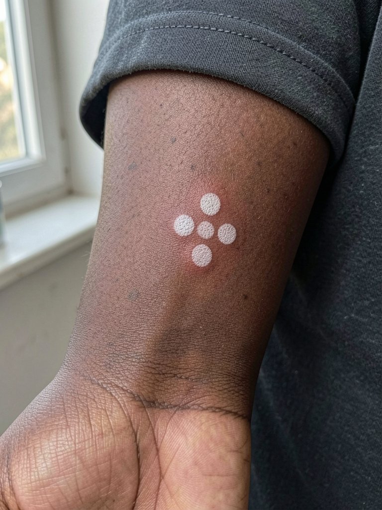
Dot clusters are deceptively simple but rely entirely on saturation and spacing to avoid becoming a smudge. The mistake I see most is placing dots too close for the wrist's anatomy. Tell your artist you want exact spacing in millimeters so they can map the healed negative space. For darker skin tones the dots may read as pale spots rather than crisp white, so discuss alternatives like a tiny black outline or gold ink accent. The session is quick but involves repeated passes to get each dot even. Common touch-up timing is lighter than for script, often around nine to twelve months. If you want to show it without drawing attention, keep wristwear minimal and pair with an opposite-hand watch or bracelet.
Before You Book
The small wrist pieces above respond differently to sun, friction, and daily hand use, so a handful of practical items smooth the session and the first week.
- White ink-specific balm. Formulated to avoid yellowing, this kind of balm can shorten the window where white ink oxidizes during early healing.
- UV-block wrist sleeve. A thin sleeve blocks sunlight during the crucial first months and reduces the chance of early yellowing for wrist pieces.
- Tinted moisturizer for temporary touch-up. Useful between touch-ups if the white has softened and you want a subtle boost for a special event.
- Fragrance-free gentle body wash. Cleansers without perfumes are kinder to freshly tattooed wrists and cut irritation risk.
- SPF 50+ sunscreen. Daily high-SPF protection is one of the simplest ways to slow white ink from shifting color over the months.
7. White Ink Butterfly, Ulnar Wrist Accent
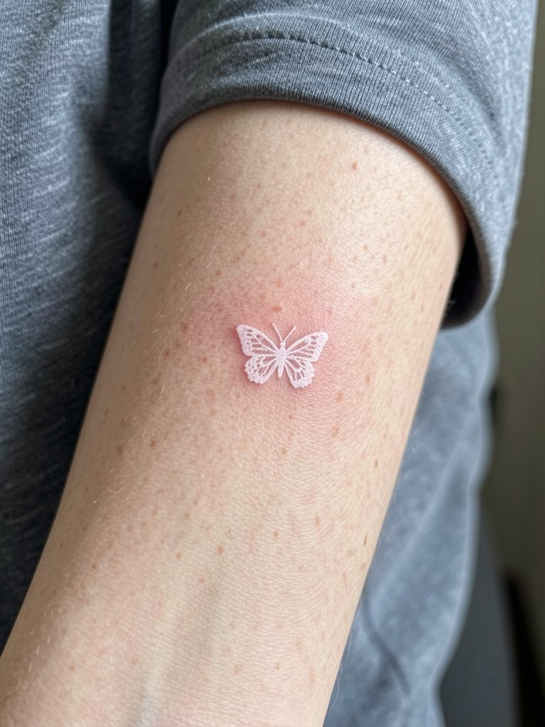
A tiny butterfly reads like a faint mark when healed, which is the appeal. The most common error is asking for detailed wing veins at micro scale. Instead, simplify the silhouette and reserve subtle stipple shading only where the skin can hold it. The session involves focused saturation on the wing edges, and people report a sharper sting where the wing tips sit over bone. Expect to plan a touch-up at six to nine months. For showing the piece, pair it with a linen button down shirt with sleeves rolled so the wrist sits naturally exposed and the soft white reads against neutrals. If you have darker skin, discuss whether a faint black outline or gold accent will help the motif age more predictably.
8. Minimalist White Star, Radial Side
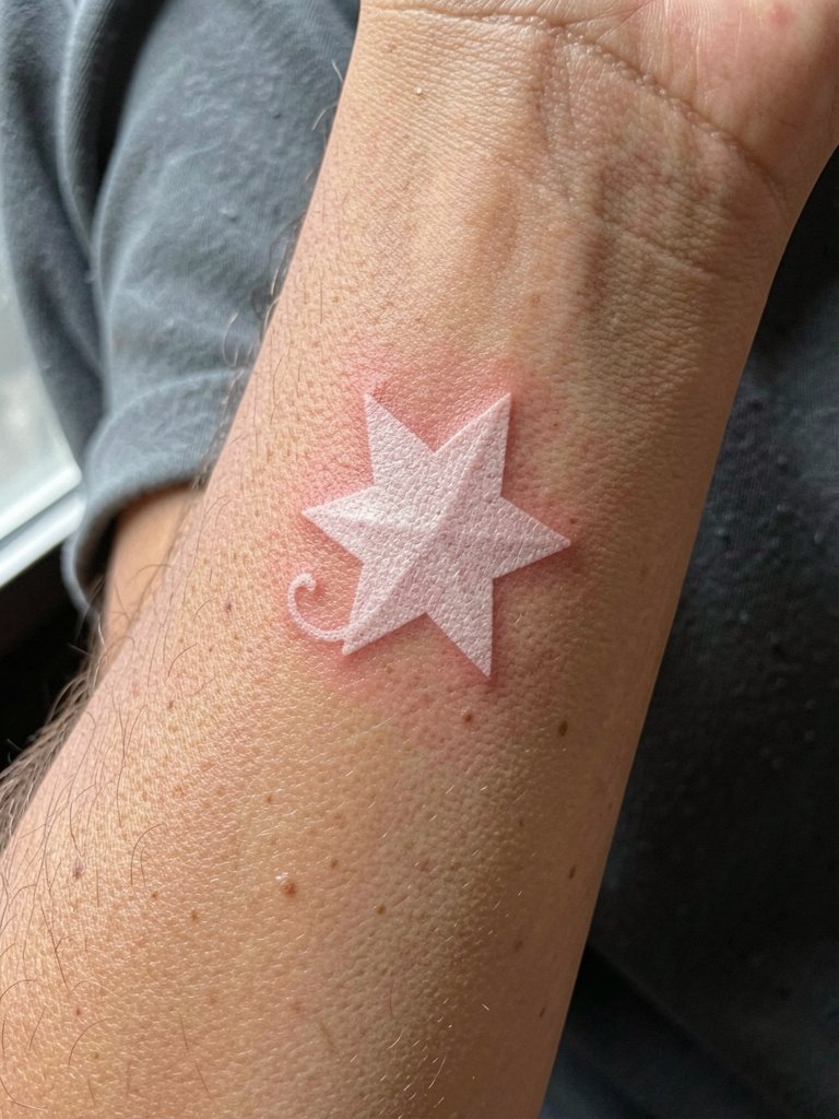
Stars are forgiving if scaled correctly. The mistake is making the points too sharp and tiny, which can blur into a round blob over time. I advise a slightly larger point radius and a one-year touch-up plan for white highlights. The wrist stings more than the forearm so bring breathing techniques and consider a short break halfway through the session if needed. If you want to make it pop without heavy ink, ask for a faint micro black anchor behind the star so contrast remains as the white fades. For styling, a rolled cuff linen shirt or a thin gold chain bracelet on the opposite wrist frames the piece without covering it.
9. White Ink Vine Twig, Along the Wrist Bone
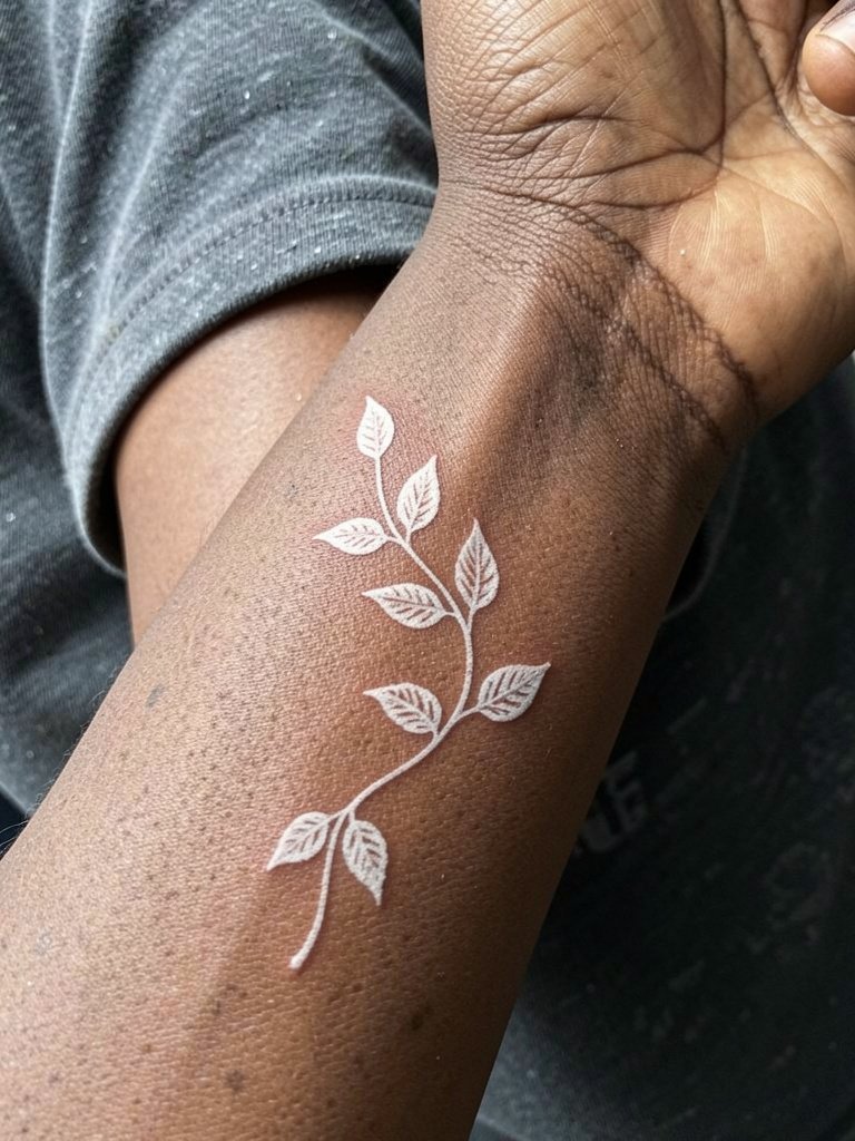
A vine that follows the wrist curve can look organic for years if you leave breathing room between leaves. The common mistake is trying to cram too many tiny leaves into a short span. That detail will blur with motion and daily friction. Ask for slightly wider spacing and plan a light touch-up at the one-year mark. The session feels like a long, precise pass along a bony ridge so expect soreness where the vine meets the bone. For outfits, a cropped linen sleeve or rolled cuff keeps the curve visible while thin opposite-hand bracelets add balance. On melanated skin, discuss a paired gold ink accent to maintain definition as white softens.
10. Abstract White Curve, Central Inner Wrist
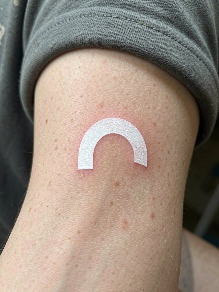
Abstract curves are a strong option if you want low-representation marks that age into soft contours. The main mistake is copying a thick reference without adjusting for wrist curvature, which forces distortion as the skin moves. Tell the artist you want a mockup with your wrist flat and lightly flexed so they can test how the curve reads in motion. The procedure is quick but requires careful saturation on the arc ends to avoid premature softness. For display, neutral linen sleeves and a simple thin bracelet across the opposite hand keep the wrist minimal and modern. Touch-ups at six to twelve months are typical depending on exposure.
11. White Ink Arrow, Radial Directional Mark
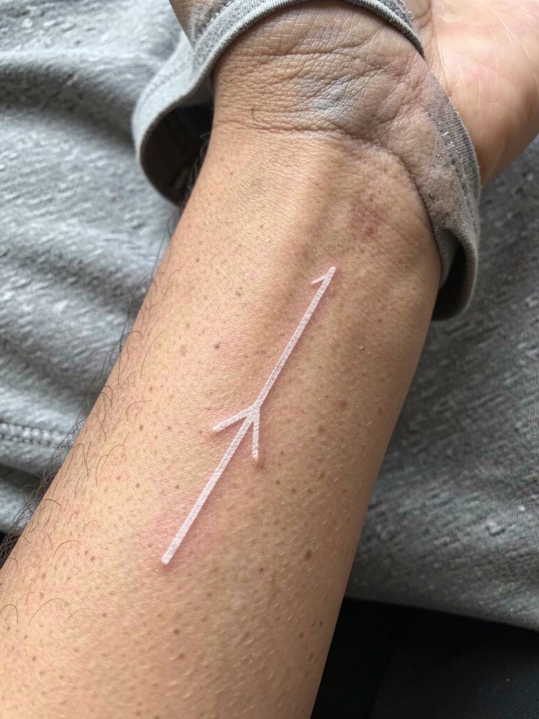
Arrows are graphic and read well when the shaft and head keep proportion. The frequent error is compressing the arrow into too small a space where the head loses shape. I recommend asking for straight-line spacing checks during the stencil step so the final has room to breathe. The wrist is sensitive, and saturation for white will require extra passes along the shaft. Plan a touch-up at nine to twelve months if you want the directional mark to keep crisp edges. For outfits, an opposite-hand watch or a slim cuff looks intentional and avoids covering the arrow. If you want a subtle boost, ask for a faint gold accent behind the arrow tip to preserve contrast as white softens.
Frequently Asked Questions
Q: Will white ink on the wrist disappear faster than on the inner arm?
A: In my experience, yes. The wrist sees more sun and friction from clothing and wrist motion, and white pigment needs heavier saturation to hold. Plan for an early touch-up around six to twelve months and daily sunscreen once healed to slow color shift.
Q: Can white ink work on darker skin tones without turning yellow or invisible?
A: Artists and clients split into two camps on this. One group says white ink often oxidizes or becomes a pale stain on darker skin, making it a risky choice. The other group says careful saturation, contrast strategies, or tiny gold accents can make the design read as a glow rather than vanish. If you have darker skin, request healed portfolio examples on similar tones and consider a paired black outline or gold ink where appropriate.
Q: How painful is a white ink wrist tattoo compared with black ink?
A: White ink usually involves repeated passes for saturation, so the wrist session can feel sharper and longer than a comparable black fine-line piece. Bring breathing techniques, consider a short break halfway through, and discuss topical numbing with your artist because each case differs.
Q: What should I wear to the session and to show off a white wrist tattoo?
A: For the session wear short sleeves or a sleeveless top so the artist has clear access to the wrist. To show the tattoo, neutrals like cream or olive linen sleeves and opposite-hand dainty jewelry keep focus on the wrist without covering it. If you want shopping ideas, search the linen and bracelet keywords many artists recommend when styling wrist work.
Q: Where can I find healed white ink wrist portfolios and artists who specialize in this work?
A: Search hashtags like #whiteinktattoo, #whitetattoo, and #ghosttattoo on Instagram and TikTok while filtering by your city. Use portfolio platforms that let you search keywords like "white ink wrist" or "fine line white ink" and look for healed photos rather than fresh shots. Reddit threads on r/tattoos and r/tattooadvice often share peer recommendations and healed results across skin tones. Booksy and Tattoodo can also filter studios by specialty when you need a local search.
Q: Do I need special aftercare for white ink compared with other tattoos?
A: Keep the healing routine simple and avoid heavy ointments that can trap moisture and alter the pigment. A fragrance-free cleanser and a thin layer of a white-ink-friendly balm in the first week help, and daily SPF once healed is the most important long-term step to keep white tones from shifting.
Q: How often should I plan touch-ups for wrist white ink?
A: Expect the first touch-up between six and twelve months. After that, many people need a minor refresh every one to three years depending on sun exposure and how much the piece interacts with clothing and hand use.