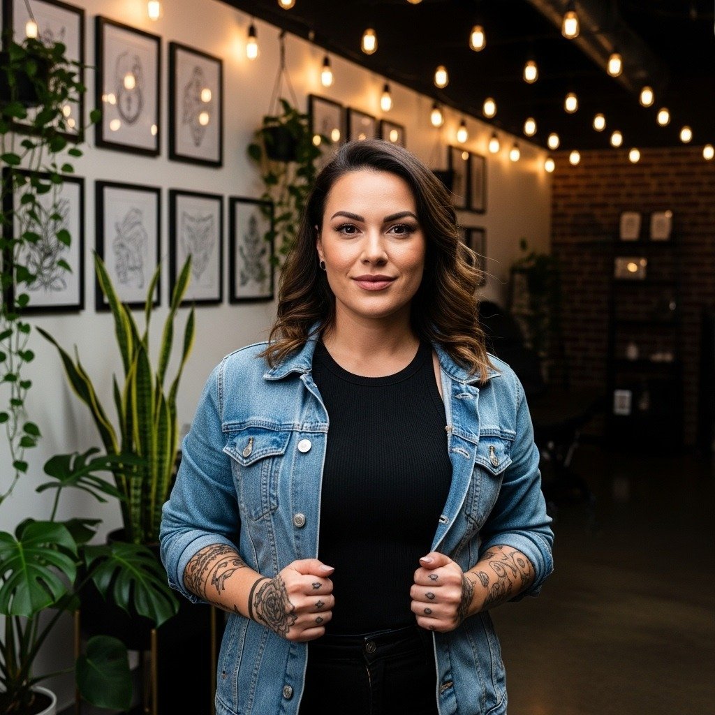
A lot of forearm script posts on social feeds look incredible the day they are fresh and taut. In practice the versions that still read crisp after two years are the ones planned with spacing, a slightly heavier single-needle line, and sizing bumped up by about 20 percent. The examples below skip generic fonts and show specific script choices, what to ask for in consultation, and how each one is likely to look at six months, two years, and five years healed.
1. Fine Line Single-Needle Handwriting Script
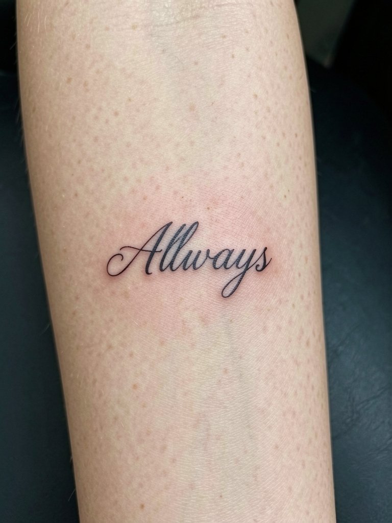
This is the diary-style script people ask for when they want their own handwriting translated into ink. Recommend a 20 percent size increase over what they imagine and slightly wider kerning so loops do not merge. Tell the artist you want single-needle feel but with a hair more weight through descenders so the letters read at two years. A common mistake is asking for ultra-tiny loops under two inches; those usually blur by year two. For the session wear a loose button-down so the artist can roll the sleeve without cuff pressure. Pain is low to moderate, one short session, and expect a touch-up within 12–24 months for the finest strokes.
2. Curved Wraparound Script Band
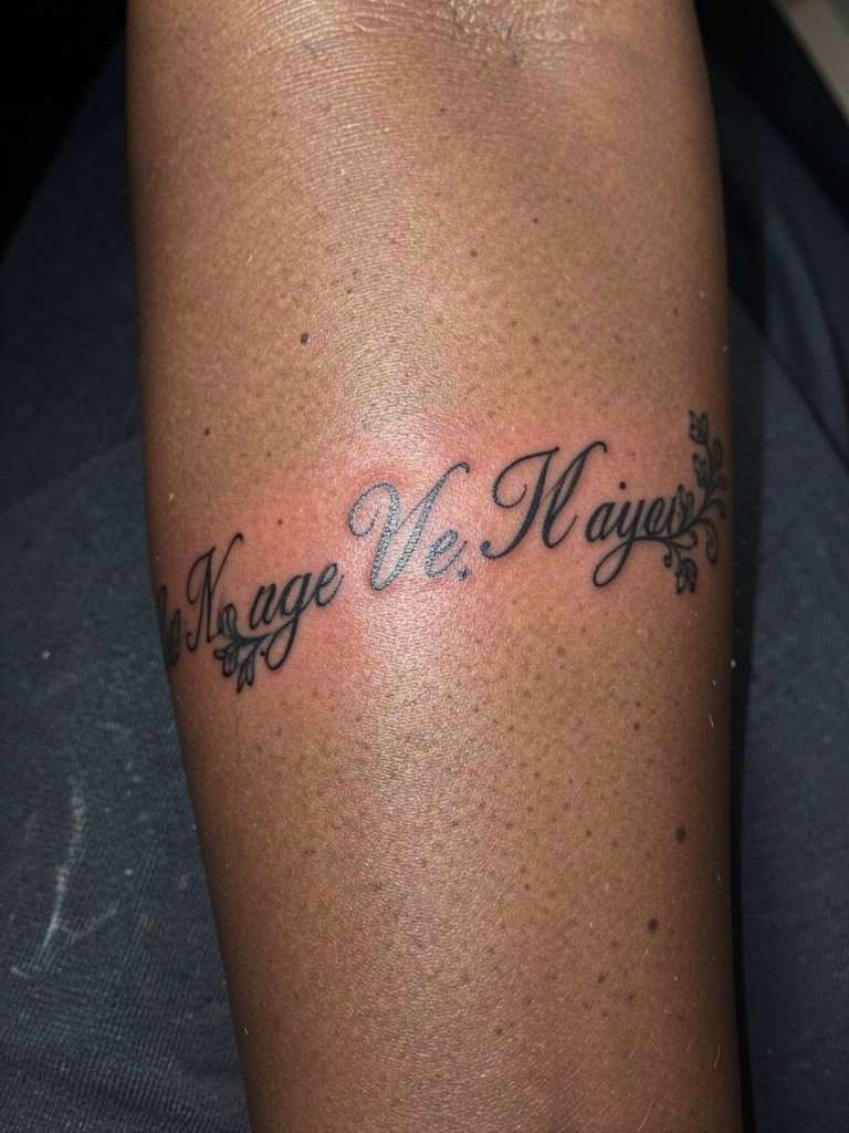
Pick this when you have a longer sentence that should move with the arm. Discuss the degree of curvature with the artist and bring a mock-up that shows the phrase at the exact arc you want. One camp argues fine curve work blurs where skin creases most, and the other camp says careful spacing prevents that. Name both positions in the consultation so the artist can recommend spacing. If you plan to show it off, pair it with a rolled-cuff linen button down and a dainty gold stacked bracelet set so the textiles frame the script without competing.
3. Bold Chicano Lettering Single Word
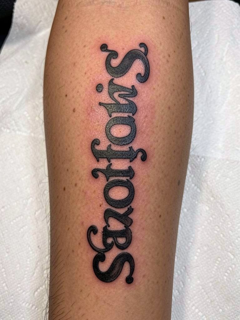
Choose this when you want instant presence that survives movement and photos. It ages differently than fine line pieces because saturation and weight hold up better on the outer forearm. One camp prefers inner forearm for script readability while the other camp argues bold blackwork on the outer forearm reads for strangers. Name both camps during booking so you and your artist align on visibility versus flat aging. Wear a solid black short-sleeve tee to show contrast and finish the look with a chunky silver ring set. Session time is typically one medium block and pain is moderate.
4. Micro Sans-Serif Stacked Phrases
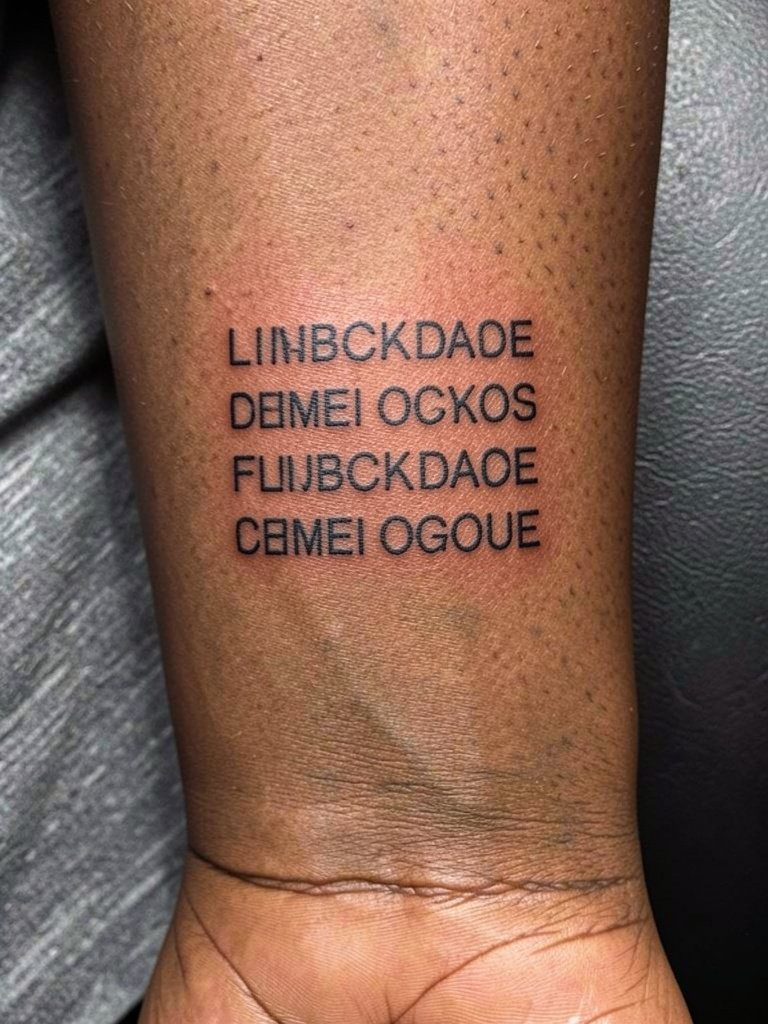
Modern, label-like stacks read like a discreet printed patch on skin. The trick is wide kerning and a small increase in size so each line keeps negative space. Tell your artist you want uniform spacing across lines and ask for a paper mock-up at life-size so you can check kerning. Tiny versions under two inches usually bloom; this stacked approach avoids that by giving each letter room. For show-offs, a crisp white button-down with rolled cuffs and a minimalist watch complements the clean geometry. Expect a one-session appointment and a possible touch-up at one year.
5. Cursive Calligraphy with Floral Accents
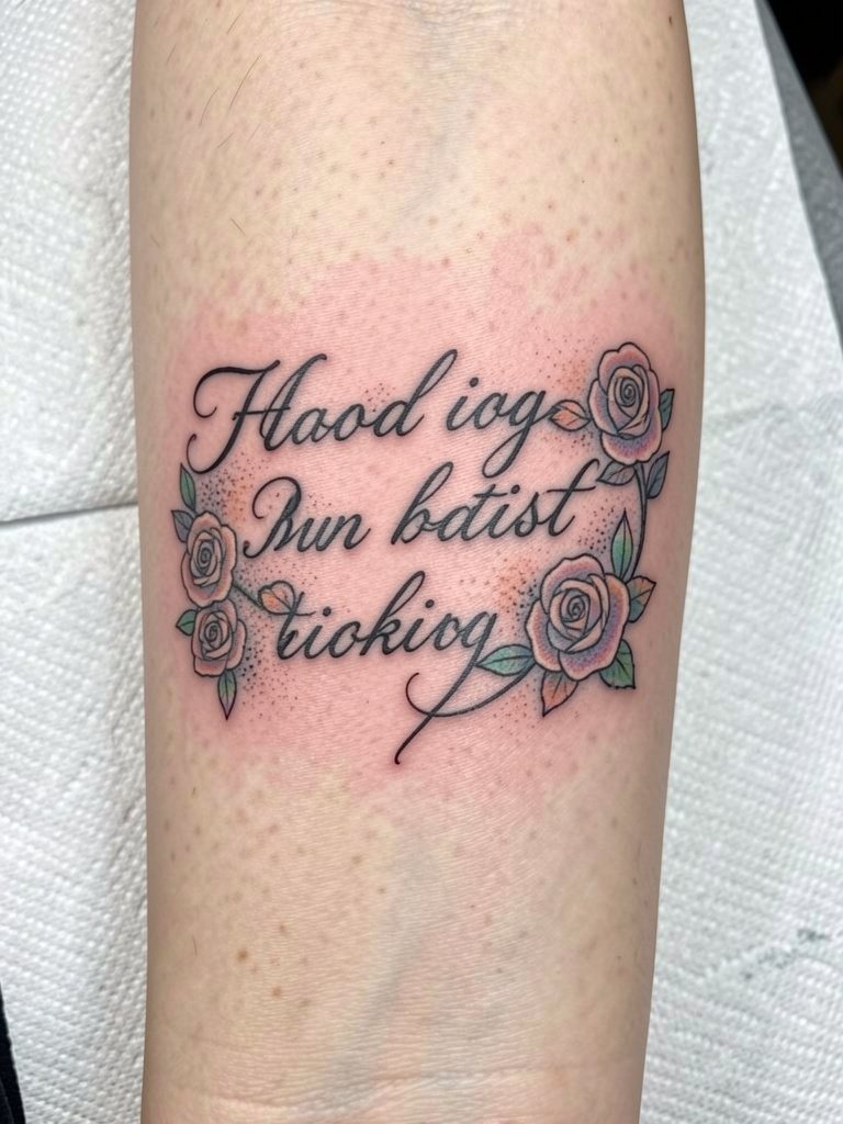
Use floral accents when you want to soften script without losing legibility. Tell the artist which letters should carry flowers so the petals sit in negative space rather than filling counters. A common mistake is tucking blooms into tiny spaces, which looks crowded at year two. The floral version will need slightly more session time and a delicate touch during healing. For outfits, soft pastel blouses and a delicate pearl necklace echo the palette and keep the focus on the intertwined composition. Expect a touch-up after 12–18 months where pastel tones fade first.
6. Typewriter Font Mantra
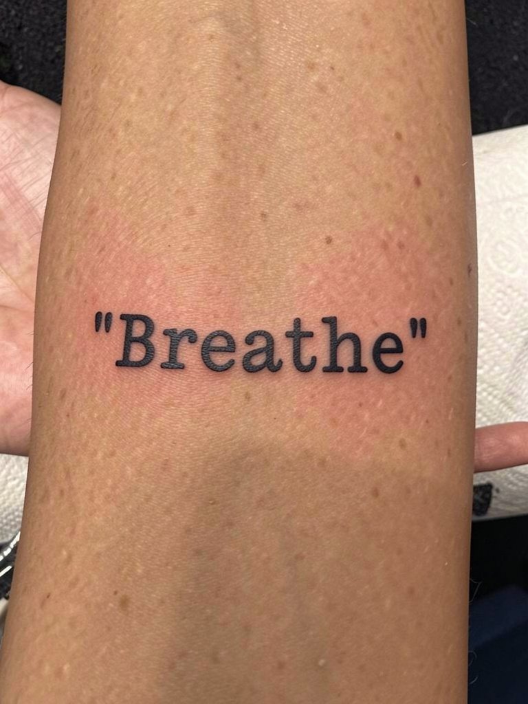
Typewriter or monospace feels like a printed label and it ages predictably because the strokes are evenly spaced. Ask for uniform letter spacing at life-size and request a stencil transfer that sits on your arm for a full minute so you can check scale. The common error is shrinking it to novelty size; that invites blur. For session comfort choose a loose short-sleeve tee so the artist can access the whole palm-up surface without cuff pressure. Pair the finished piece with a white button down when you want a clean, editorial display.
Pre-Session Essentials
The six inner-forearm examples above range from single-needle lines to heavy blackwork, so a few practical items make the session and early healing smoother.
-
Japanese Sumi tattoo ink search. Artists often prefer deep, UV-resistant pigment for script that should stay bold, which helps the handwriting and blackletter pieces described above.
-
CBD tattoo cream search. Reported to reduce inflammation during the first 48 hours for people who swell easily from needlework, useful for tightly packed cursive or stacked phrases.
-
Hustle Butter Deluxe search. A thinner artist-favored balm that can avoid clogging single-needle channels during the healing window for fine-line scripts.
-
Specialty tattoo balm search. Use after initial thin ointment days to keep pastel accents and delicate florals vibrant without heavy residue.
-
Aquaphor healing ointment search. A common thin-layer option for the first few days that many people use with fine-line work to lock moisture without excess clogging.
7. Blackletter Gothic Name Script
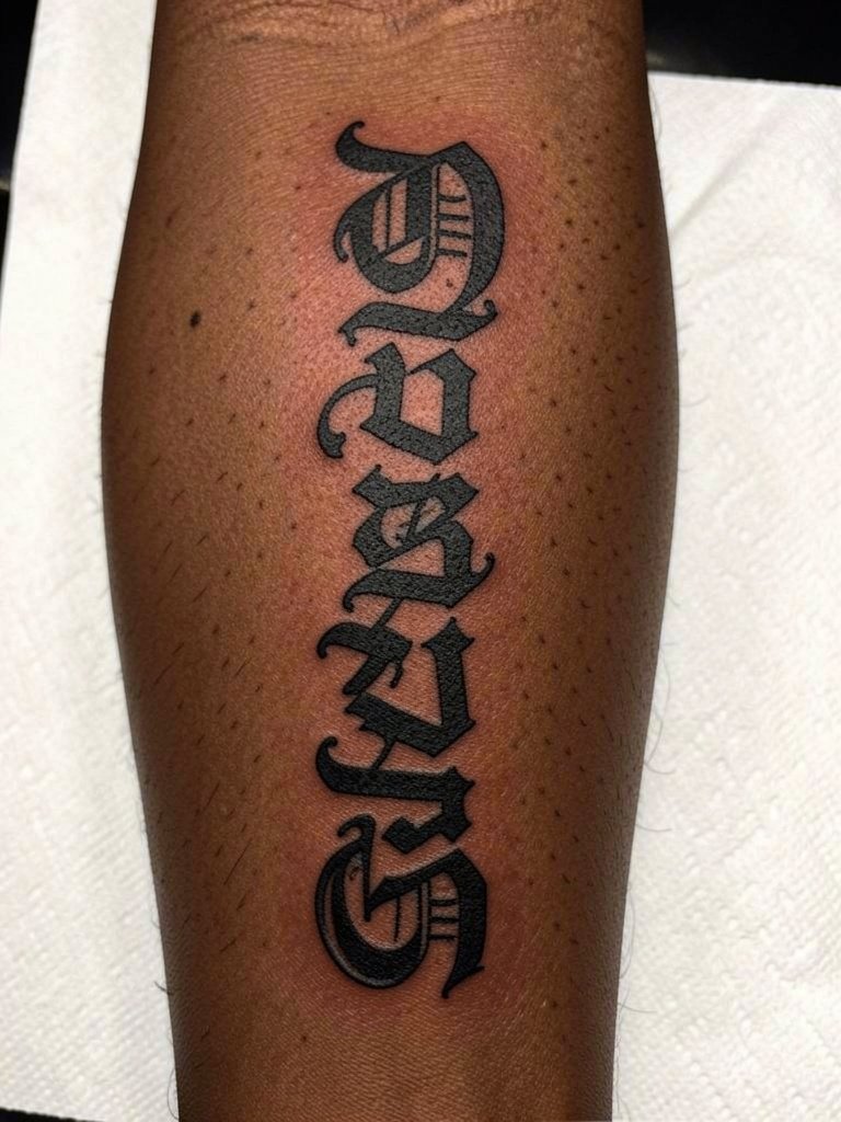
Blackletter gives serious weight to a short name or phrase. Ask the artist to show you the negative space inside the letters at life-size because counters that are too narrow will fill over time. A common mistake is choosing too many flourishes; they tend to close up at year three. This style is forgiving on the outer forearm for bold versions but holds fine on the inner forearm when letters are spaced. For a street-ready outfit wear a solid black tee and a chunky silver ring set to echo the heavy contrast. Expect moderate session pain and one to two hours of focused linework.
8. Product Sans Affirmation Block
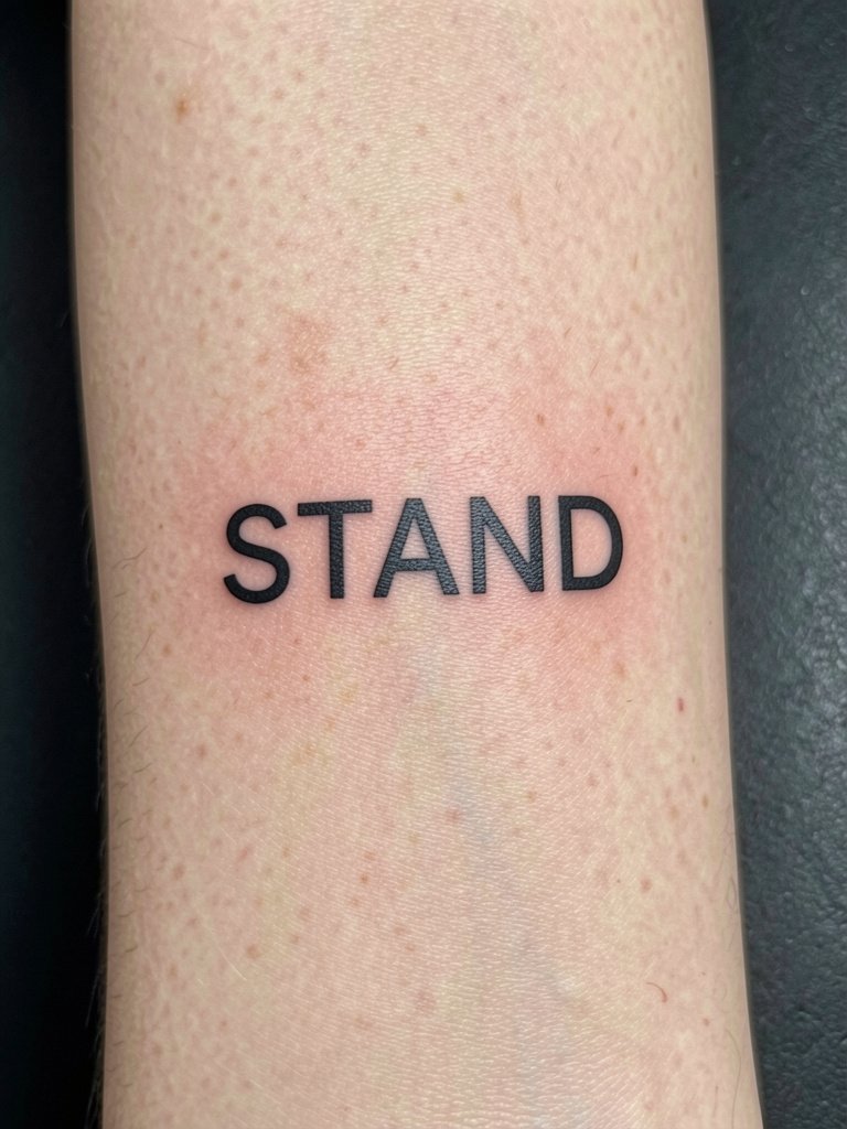
This minimalist block style reads like a label and stays readable when letters are spaced generously. Tell the artist you want uppercase spacing at two to three inches across so the counters breathe. The typical error is compressing it into a novelty size that ages into a blur. For showcasing, a rolled-cuff linen shirt in cream or sand keeps attention on the block letters. Add a minimalist watch to balance the clean aesthetic. One short session and low pain make this a beginner-friendly option.
9. Script with Celestial Sun and Moon Motifs
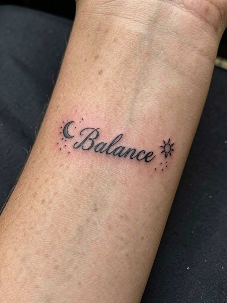
Combine a short word with small celestial icons when you want visual anchors to the text. Specify exact placement of icons relative to the letters so they do not crowd counters as the piece heals. A common error is adding heavy shading to tiny moons, which can merge into the script at two years. For a soft contrast, wear cropped tops or open-sleeve shirts that show the inner forearm and pair with a delicate bracelet. Expect a short session with light stipple shading and a touch-up if the tiny icons soften.
10. Script with Rose or Lotus Accents
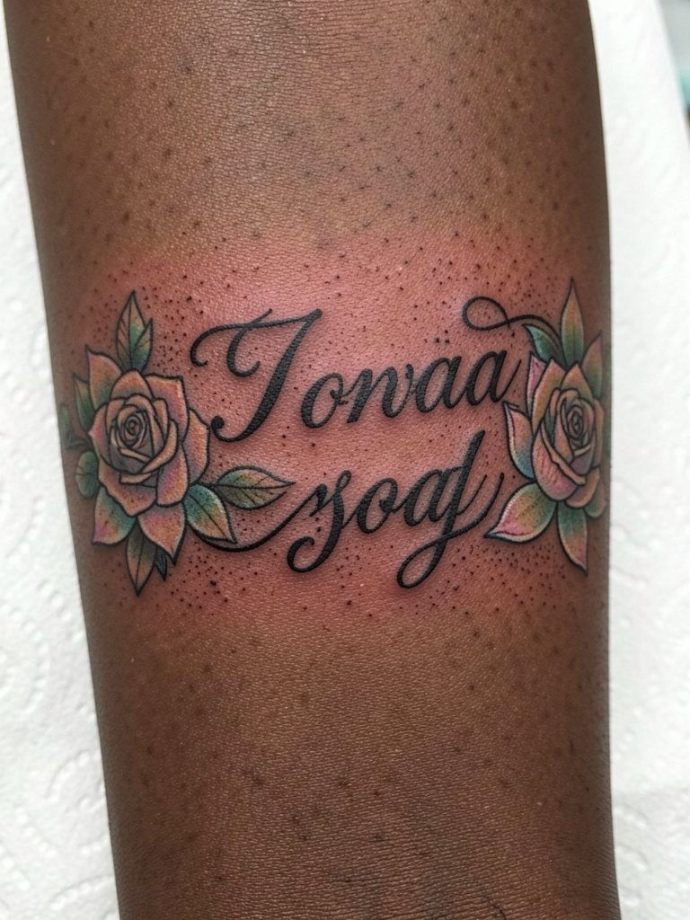
Floral accents visually anchor script and can protect tiny counters by occupying planned negative space instead of invading letterforms. Ask the artist to map blooms over a life-size stencil so you can see which letters will carry petals. The mistake to avoid is asking for florals inside closed counters, which look muddied as the ink settles. For evenings out, a soft pastel blouse and a delicate pearl necklace complement the palette. Healing time is standard and pastels will usually need refreshing before black line touch-ups.
11. Script with Compass Motif
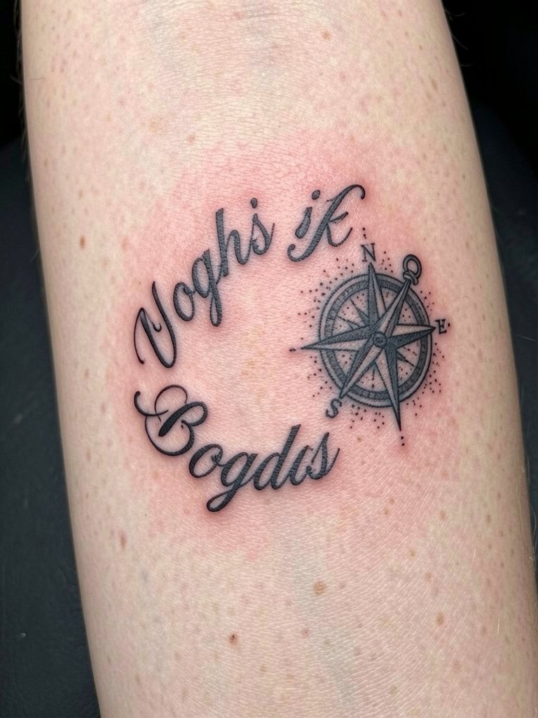
A compass pairs well with a short directional phrase for a travel or guidance theme. Discuss how much of the compass you want shaded versus left open to preserve clarity at five years. Overly detailed compass faces will lose their crispness at small sizes, so request a simplified icon with bolder cardinal points. For session ease, choose a loose short-sleeve or sleeveless top so the artist can rotate the arm without fabric interference. This design is moderate in session length and usually stable with one-year touch-ups for fine points.
12. Script with Geometric Pattern Background
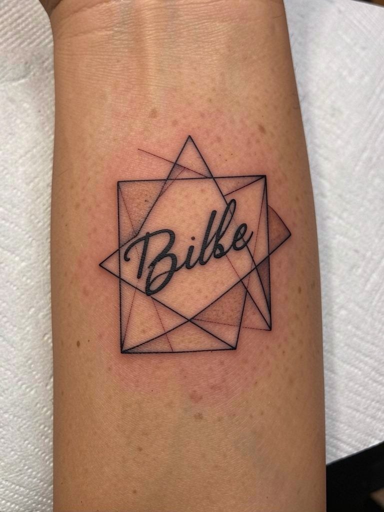
Framing text with geometry gives a modern edge but requires precise spacing so the background lines do not encroach on letter counters. Tell the artist to keep at least 2 mm of clear skin between script strokes and geometry lines on the stencil. A frequent mistake is making the frame too tight, which causes visual crowding after healing. For a neat pairing, wear a crisp white button-down and a minimalist watch so the linear elements align with your wardrobe. Expect a single session with careful stencil placement.
13. Large Block Letter Statement Word
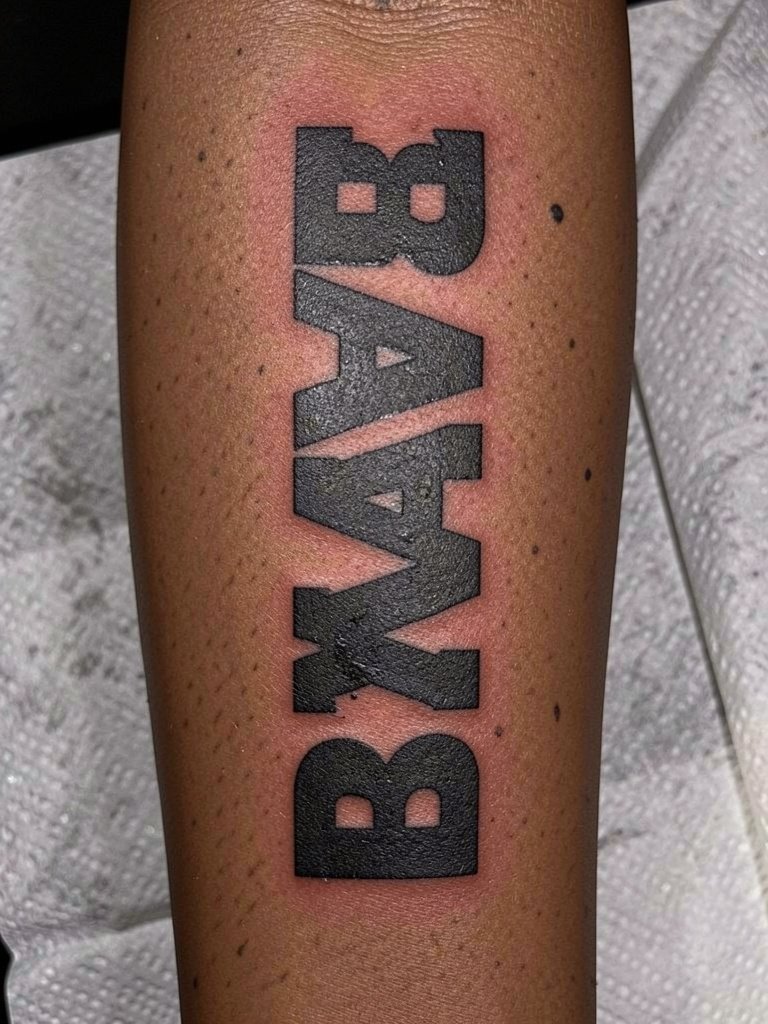
Go big with a single strong word when you want clear legibility from a distance. The main planning item is vertical spacing so letters never crowd the elbow crease or wrist. Ask the artist to show you a full-size stencil taped on during the consult to check how it bends when you flex. A common error is stacking heavy shading into thin letters, which invites early softening. For a look that matches the boldness, keep outfits simple and use a solid black short-sleeve tee. One strong session and minimal touch-up needs make this a durable pick.
14. Stacked Book Page Quote Script
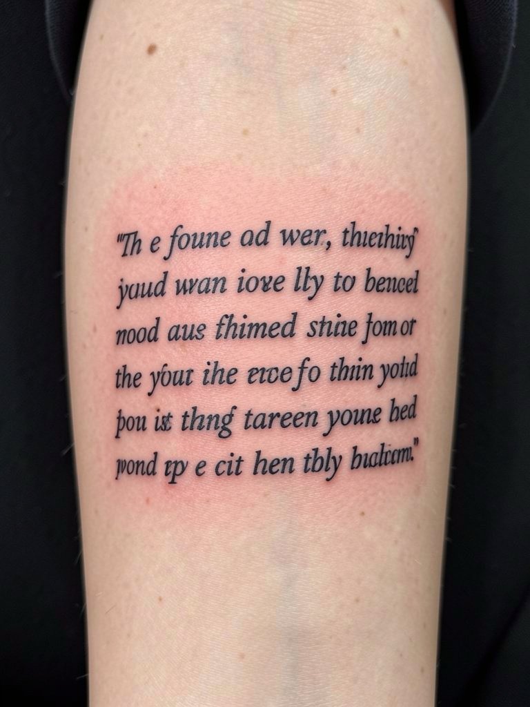
Use stacking to fit longer quotes and keep line length consistent for the "mini page" effect. Ask the artist to justify line ends during layout so no line becomes noticeably longer than the rest when the arm is relaxed. The error to avoid is squeezing too many words into narrow lines; that forces tight kerning and speeds blurring. For the appointment wear a short-sleeve button-down so the artist can work across the span without tugging at cuffs. Expect a longer session and plan for a touch-up at one to two years for any micro letter fading.
15. Micro Script on Adjacent Inner Bicep
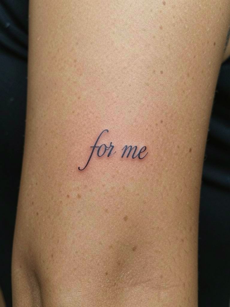
This tiny "for me" style works as a companion to forearm script but requires flat, smooth skin. For inner bicep placement specify the exact midpoint between elbow crease and armpit and confirm the arm will be relaxed during the stencil check. The typical mistake is treating inner bicep like outer arm; skin texture differs and ultra-thin loops can soften faster. For the session wear a sleeveless or tank top so the artist can access the area without raising the arm. Pain is slightly higher than the forearm and you may need a small touch-up within a year.
16. Handwritten Single-Word Signature
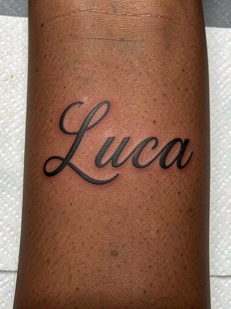
Replicating a true signature needs a life-size transfer and an agreement on line weight. Bring the original sample and request line weight calibration so the downstrokes read stronger by year two. A frequent mistake is copying a tiny signature exactly; that often becomes unreadable. For styling, a rolled-cuff linen shirt keeps the signature visible and paired accessories minimal. One session, low to moderate pain, and plan a touch-up at 12–18 months if tiny loops soften.
17. Script with Celestial Dot Work Border
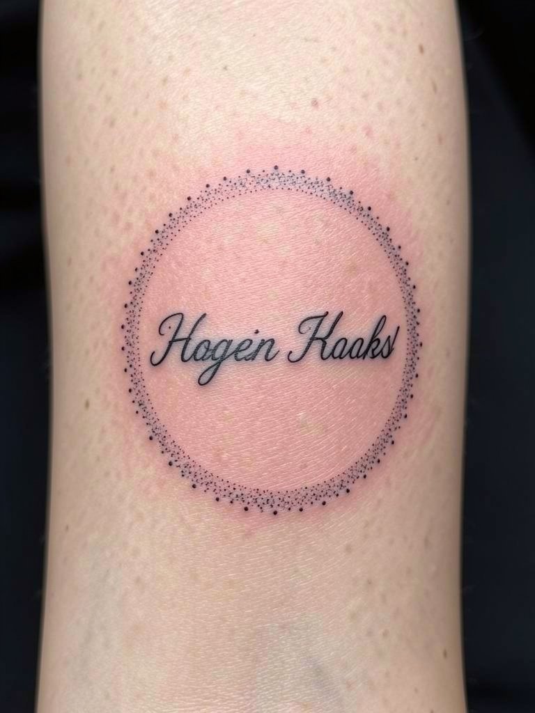
Dot-work halos frame script elegantly but need spacing rules to avoid the dots invading letter counters. During consultation request at least 3 mm between the outermost letter and the first row of dots. The mistake is tight dot halos that create a vignette of blur at year three. Session wise dot work increases time, so expect an extra thirty to sixty minutes. Wear a loose button-down to keep fabric from brushing the fresh dots during the first few days. Touch-ups often refresh the halo sooner than the text.
18. Minimal Lowercase Whisper Script
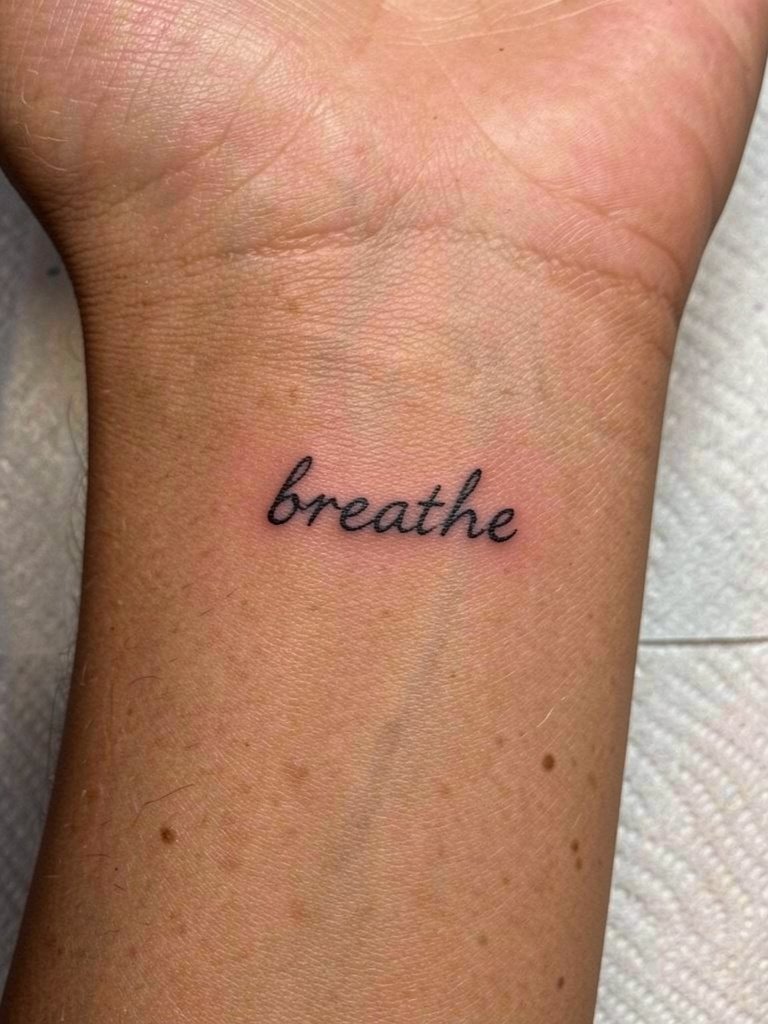
A whisper script relies on spacing more than flourish. Increase overall size and request slightly heavier downstrokes so lowercase loops have presence at two years. Artists split on whether tiny lowercase holds up on forearms; one camp warns tiny loops blur quickly and the other points to healed single-needle examples where careful depth helped. State both positions when booking and ask the artist to simulate a healed-width test on paper. For the session choose a loose tank top so sleeves do not rub the area. Healing is quick and light touch-ups are common.
19. Script with Negative Space Lettering
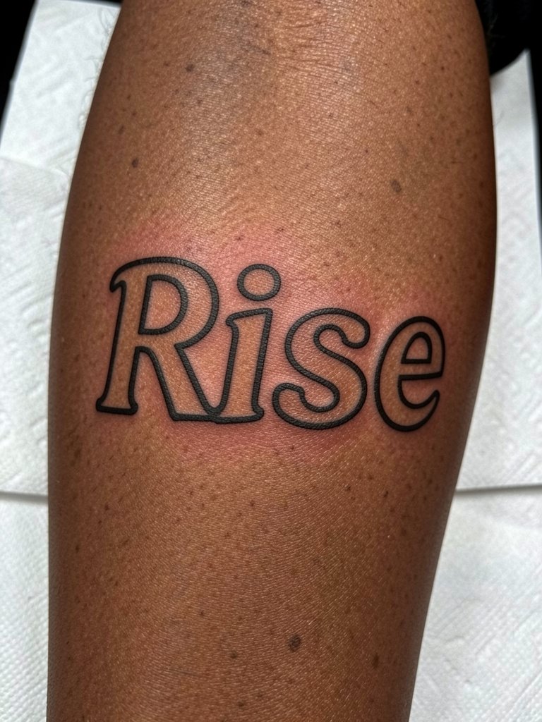
Negative space inside letters preserves readability as pigments spread. Ask the artist to leave at least 20 percent of each letter as open skin and to mock up the size at life-size. The common mistake is relying solely on thin strokes that can disappear; outlines with negative space age more predictably. For daytime looks wear rolled cuffs and a neutral top so the open counters stand out. Session time is moderate and you may need an outline touch-up earlier than a filled script.
20. Script Paired with Small Realism Accent
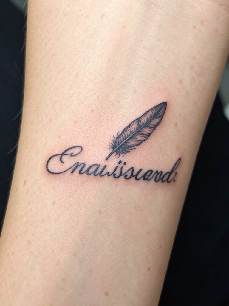
A small realism accent such as a feather or tiny leaf catches the eye and breaks monotony. Discuss the scale of the accent relative to the letters so it reads as an accent and not a competing element. The mistake is over-detailing the mini-realism at sizes that blur. For show-off outfits try a sleeveless top and a simple bracelet that keeps attention on the realistic detail. Sessions run longer because of shading, and realistic accents often need a color or shade refresh earlier than line-only text.
21. Vertical Script Column
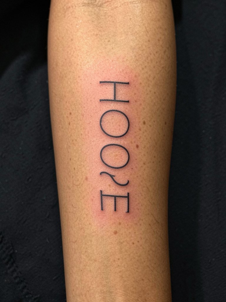
Vertical columns suit names or single words when you want to use forearm length. Confirm vertical letter height so the wrist and elbow do not distort the top and bottom letters. A common mistake is overcompressing the vertical spacing, which speeds visual crowding. Session discomfort is low and the piece will likely need only a minor touch-up for any tiny serifs. Pair with short sleeves or rolled cuffs when showing off. Bring a reference at booking so the artist can scale the column before the stencil stage.
22. Script with Metallic Accent Ink
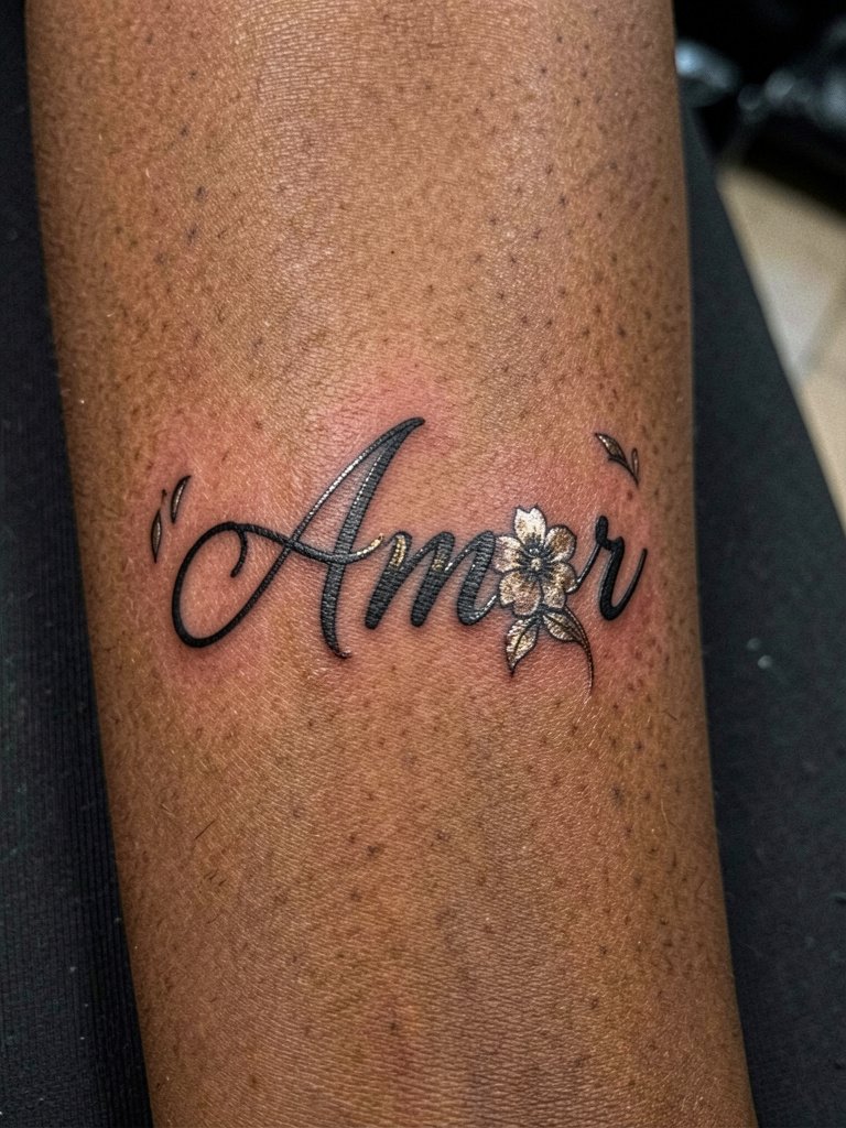
Metallic accent ink can boost contrast on darker skin tones but requires experienced pigment choice. Tell the artist you want selective metallic highlights only in accessory motifs, not inside the core letters. Some artists avoid metallics for long-term stability while others report great results when used sparingly. Name both viewpoints in your consult and request a healed photo reference from the artist. For display, soft pastels or a blush blouse draw attention to the metallic shimmer and you can wear a pastel ruffle blouse to echo the tones. Session time is slightly longer and metallic accents may need refreshes sooner.
23. Script with Compass Rose Overlay
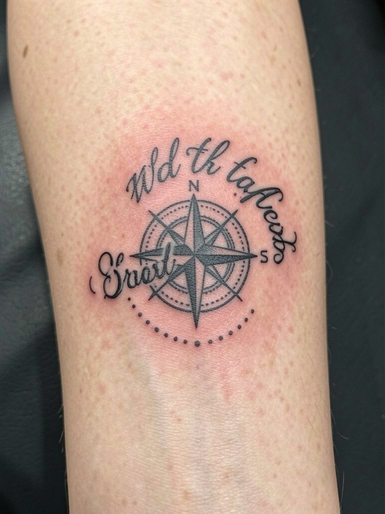
Overlaying script onto a small emblem gives narrative weight but needs planning on which element sits visually on top. Ask the artist to show layered mock-ups so you can decide whether lettering overlays the compass or hugs it. A common error is placing the script too low so it reads separately from the emblem. For an everyday look match the piece with a casual tee and a minimalist watch to keep the compass readable. Sessions are medium length with dot shading increasing time.
24. Geometric Script Frame
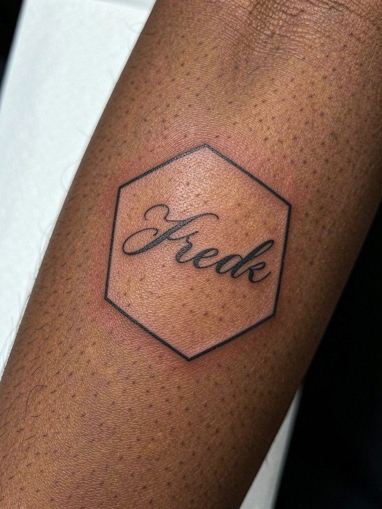
A geometric frame adds structure but needs clearance between script and frame. Ask for at least 3–4 mm of breathing room so the frame does not compress into letter counters over time. The mistake to avoid is a tiny frame that then makes the letters look crowded at year three. For styling, a crisp button-down or an open-back dress that exposes forearm during evening events highlights the framed text and a rolled cuff linen shirt search pairs well. Expect a single session with meticulous stencil placement.
25. Script with Subtle Shadowing
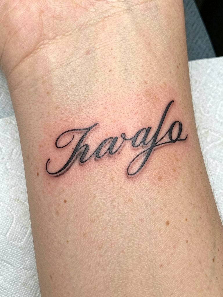
Adding a thin shadow increases legibility and creates a lifted effect but must be subtle to avoid mushiness. Specify the offset distance for the shadow so it remains a crisp graphic element rather than blended shading. A common error is heavy shadowing close to thin script which blurs into a grey mass. Session time is moderate and shadow lines may require a touch-up before the main script needs one. For outfits, neutral palettes like cream or olive linen let the subtle shading read clearly. Wear a loose top during the session to avoid cuff pressure.
26. Script with Rose Tuck and Open Counters
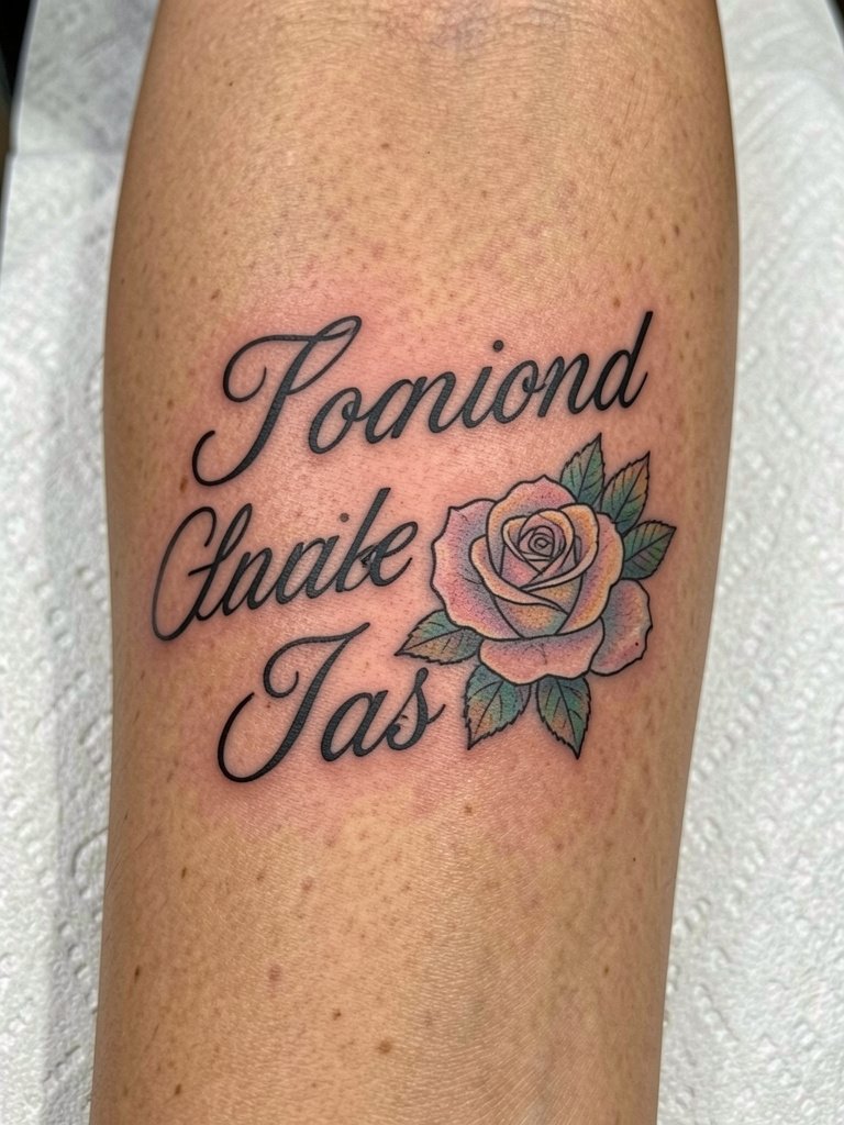
Tucking a rose into an intentionally open counter preserves legibility as the piece ages. Ask your artist to leave extra negative space around the rose and to size the bloom so it reads at two years. The common mistake is crowding the letter with petals that later merge with letter strokes. For showing off, soft blouses and delicate jewelry frame the floral accent and a delicate pearl necklace pairs well. Sessions are slightly longer due to color work and pastels often need a color refresh before the black line.
27. Minimal Monoline Script Wrap
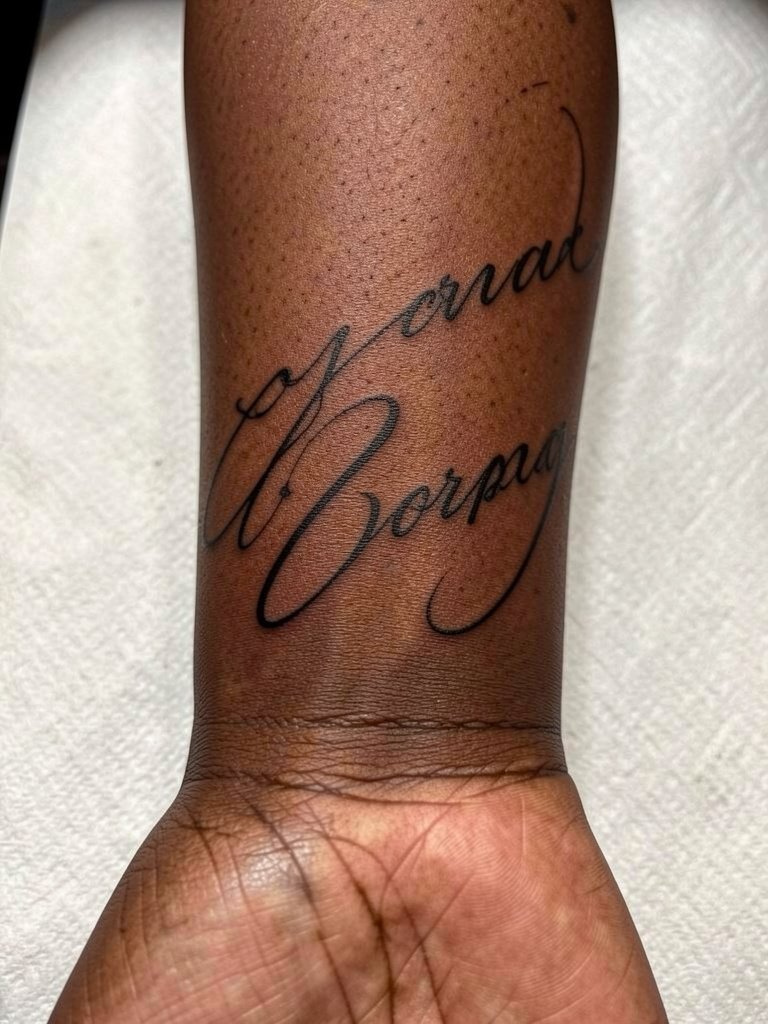
A monoline wrap captures arm movement while keeping a single consistent weight. Ask the artist to test the wrap at life-size and to show how the phrase reads when you flex; the inner forearm handles gentle wrap well. The typical error is making the wrap too tight around the wrist where bending distorts letters. For styling, short sleeves or rolled cuffs highlight the gentle curve and a dainty gold stacked bracelet set on the opposite wrist balances the look. Expect one session and a minor touch-up if the wrap crosses a high-movement spot.
Frequently Asked Questions
Q: How big should I make script on the inner forearm so it ages well?
A: Aim to go about 20 percent larger than you think you need. Wider kerning and slightly increased letter height give ink room to settle, which reduces the chance of tiny loops closing up by year two. Ask for a life-size stencil during your consult and compare it on your arm before deciding.
Q: Does fine-line single-needle actually blur faster than bold script?
A: Artists are split into two camps on this. One camp says ultra-thin fine-line loops blur within two years on forearms because daily movement compresses the ink. The other camp points to healed examples from single-needle specialists showing fine line can hold for years when depth and spacing are correct. Bring both concerns to your artist and request a spacing plan so you get the best of both approaches.
Q: Where can I find healed portfolio examples and local artists without naming specific shops?
A: Search hashtags like #scripttattoo, #finelinetattoo, and #handwritingtattoo on Instagram and TikTok, then filter by location. Use directory sites that let you search by keywords such as "single needle script" or "Chicano lettering" and review healed portfolio images. Reddit threads in r/tattoos and r/tattooadvice also surface peer recommendations and healed shots across skin tones.
Q: How should I dress for a forearm script appointment?
A: Wear something with short sleeves or a loose button-down that can roll without tight cuffs. If the piece wraps toward the wrist, avoid fitted long sleeves that will press on the fresh ink. For show-off styling after healing, linen shirts with rolled cuffs or crisp white button-downs keep the inner forearm visible and complement linework.
Q: What about script visibility on darker skin tones?
A: High-contrast choices work best. Talk to your artist about bold black outlines and selective use of pastel or metallic highlights to enhance readability in photos. Some artists favor more saturation and slightly heavier downstrokes for darker skin so the script reads clearly across lighting conditions.
Q: How soon will I need a touch-up for fine script on the forearm?
A: Expect surface healing in two to three weeks and plan on a realistic touch-up window between 12 and 24 months for most fine-line pieces. Heavier blackwork often goes longer before needing a refresh. If the design contains color accents or metallic highlights those often require check-ins sooner than the primary black lines.