
The right Sanskrit word in the right style can feel like a private talisman and also a bold design choice that reads from across a room. Tiny single-needle scripts often look crisp on day one and soft by year three, so spacing and stroke weight matter more than trendiness. Think about placement, cultural context, and how the letters will age when the skin stretches. The first example below shows a simple approach to keep small script legible for years.
1. Single-Word Fine Line on the Inner Wrist
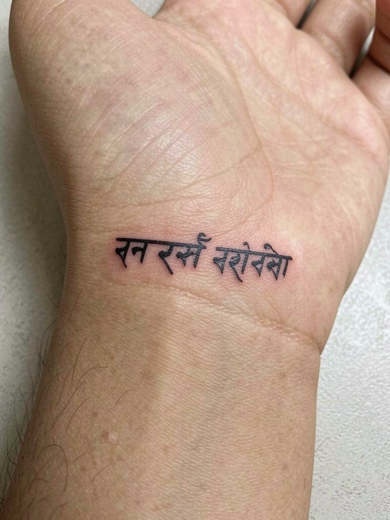
Fine single-word Sanskrit scripts on the inner wrist look very refined but they demand room to breathe. Ask for slightly heavier stroke weight than the reference image so the characters do not merge at year two. A common mistake is requesting ultra-thin letters when the wrist tissue is textured. Expect a short session under an hour for a single word and a likely small touch-up after six to twelve months to keep counters crisp. For showing it off, pair with a delicate cuff bracelet that sits above the design so the script remains visible.
2. Stacked Mantra on the Ribcage
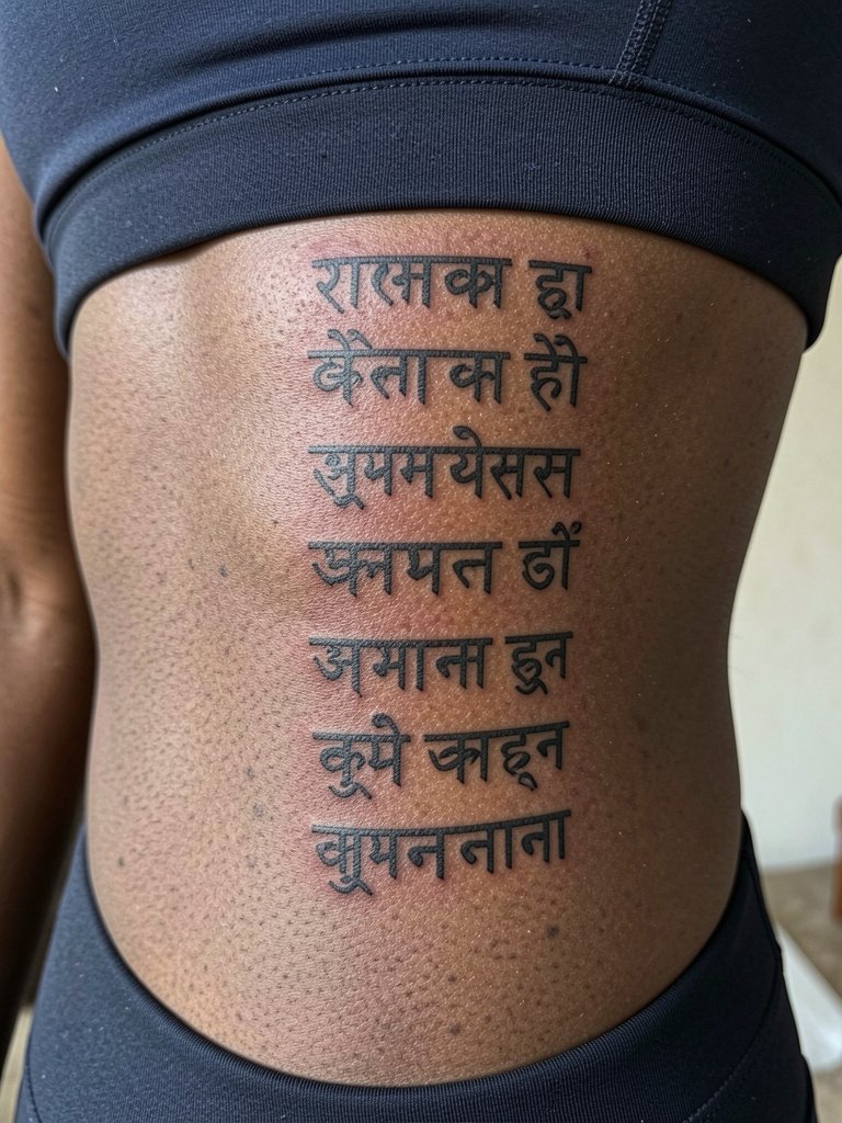
Ribcage pieces look dramatic but they are a higher pain zone and the skin stretches with movement. Plan for longer sessions divided into two parts if you want full saturation. Discuss spacing and vertical alignment precisely so the letters stay legible as the torso shifts. The typical mistake is packing too many lines into a small rib area. Expect two to three months of softness in the healed edges and a potential touch-up at one year for deeper saturation. For session comfort, wear a fitted cropped top so the artist can access the area without you adjusting clothing.
3. Sanskrit Dot-Work Mandala Accent on the Shoulder Blade
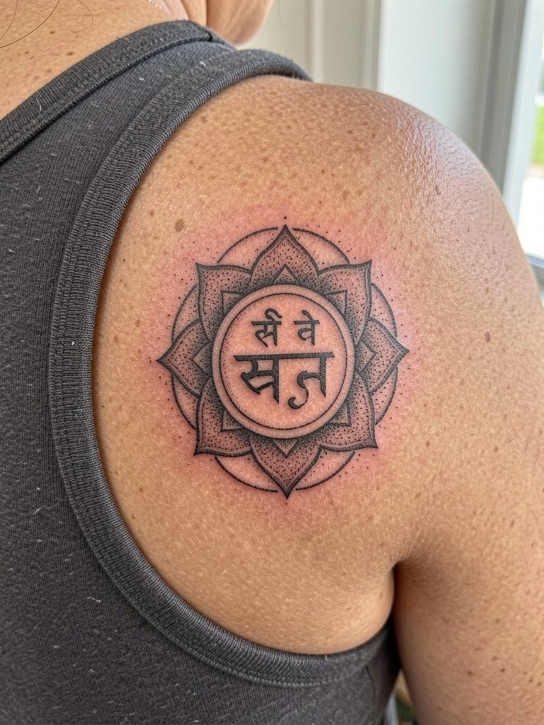
A mandala that centers a short Sanskrit line reads like a symbol and also holds cultural meaning. Respect the origin by asking what the phrase means and whether it is appropriate to wear. When done with tight stipple shading the design remains clear at six months and still reads at five years if spacing is preserved. A common error is attempting extremely fine inner lettering inside the mandala core. If you plan to show this off, a scoop-back top frames the shoulder blade without covering the art.
4. Collarbone Phrase in Bold Letterforms
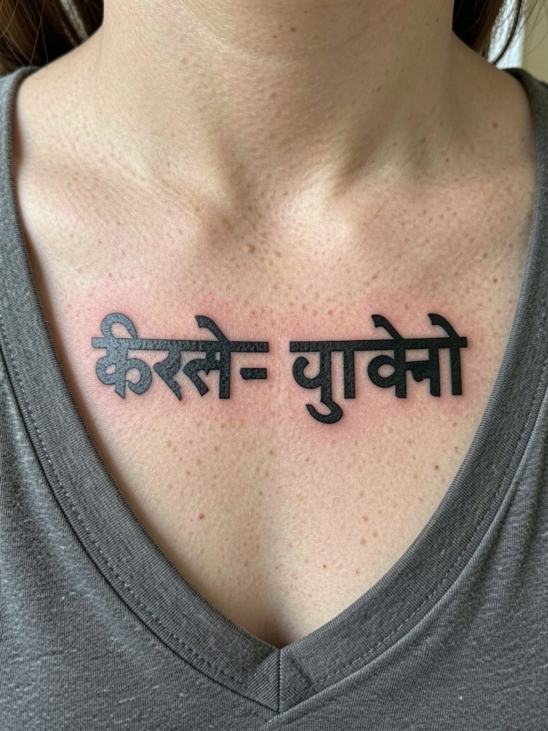
Collarbone lettering splits artists into two camps. One camp argues bold, wider letterforms hold up best because the area sees constant light stretch and friction. The other camp prefers delicate script and says with impeccable depth control it can settle finely. If you favor longevity, choose slightly heavier strokes and request preview stencils to check spacing across the clavicle. For sessions, wear a shirt with a natural neckline so you avoid shifting fabric while the artist works. A common aging issue is shallow lines that fade unevenly across the collarbone ridge.
5. Throat-Side Single Character with Negative Space
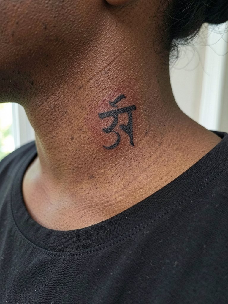
Side neck placements are visually striking but require a specialized approach. Expect a sharper pain level and a longer healing window because the skin is thin. Discuss exactly how large the character should be and insist on slightly larger counters than you think you need. A frequent mistake is shrinking the glyph too much to make it "delicate." For showing it off, a wide-neck blouse frames the area without hiding the design. Note that neck pieces sometimes need a touch-up after the first year to keep edges crisp.
6. Inner Bicep Script Band
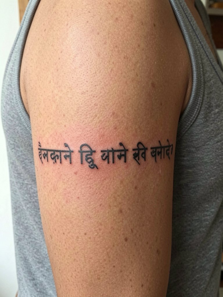
Inner bicep scripts look private and read well when the characters get subtle spacing. Ask for a mock stencil while seated so you can flex and see how the band moves. The inner arm has moderate blowout risk if the artist goes too deep or uses excessively thin lines. Expect the session to be moderate in pain and to take between 45 and 90 minutes depending on length. For the appointment, wear a loose tank top so the artist can roll the sleeve without tugging at the fabric.
Pre-Session Essentials
The small scripts and chest work above heal differently, so a few targeted items make the chair day smoother and the first week less fussy.
-
Professional stencil transfer paper kit. Lets you see exactly how line weight and spacing land on skin, which matters for wrist and inner bicep words.
-
Fast-acting topical numbing gel. Can soften the initial sting for ribcage and sternum sessions when used per the product directions.
-
Medical-grade thin protective film roll. Useful for finger and ankle pieces that face friction in the first week.
-
Fragrance-free gentle body wash. Cleans the area during showers without stripping too much moisture from fine line work.
-
Aquaphor healing ointment. A mainstream option for initial barrier care during the first few days that many clients find helps prevent excessive scabbing.
7. Minimalist Ring of Text Around the Calf
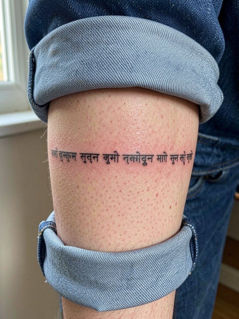
A calf band lets a short phrase wrap the leg and read from many angles. Discuss exact curvature and how the letters will sit when you stand and when you point your toes. The biggest misstep is tight letter spacing that collapses when muscles flex. Expect a one to two hour session and a possible touch-up at the one-year mark for saturation. For evenings out, this area pairs with rolled hem jeans that let the band peek through.
8. Micro-Scale Sanskrit Dot Script Behind the Ear
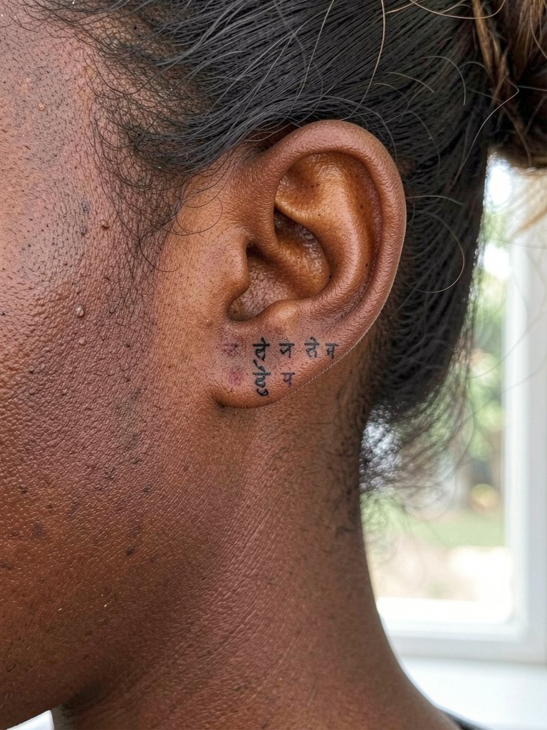
Behind-the-ear scripts are discreet and intimate, but they need a steady hand and precise spacing. This placement can blur faster if the artist goes too shallow. Plan for a short session under 30 minutes and keep styling minimal the first week. A common mistake is trying to cram a long phrase into the small mastoid area. Because this is near the hairline, schedule the session with hair tied back and consider a simple earring to draw attention once healed.
9. Sanskrit Verse Along the Spine
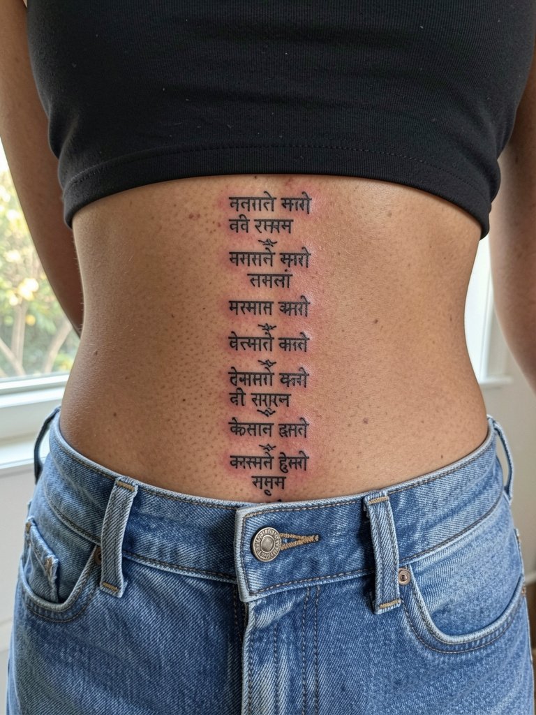
Spine text reads elegantly but it calls for steady alignment and larger counters. The skin along the spine can shift with posture so request preview stencils while standing and lying down. Sessions here are longer and often split over two appointments. A wrong move is compressing lines too tightly to save session time. For nighttime and low-back show-off outfits, a cropped tank keeps the area visible without fuss.
10. Sacred Syllable Over the Sternum
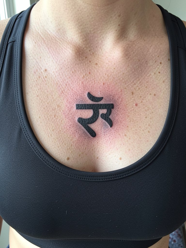
Sternum syllables carry spiritual weight and they also raise a cultural debate. One camp says wearing sacred script without context is cultural appropriation and urges study and permission. The other camp believes careful study and respectful use can be a form of appreciation and meaningful expression. If the symbol has religious significance, explain why it matters to you and get guidance on correct phrasing and transliteration. Sternum work is higher pain and the area needs a practitioner familiar with chest contouring. For session wear, a fitted sports bra keeps the area accessible while preserving modesty.
11. Miniature Geometric Sanskrit on the Finger
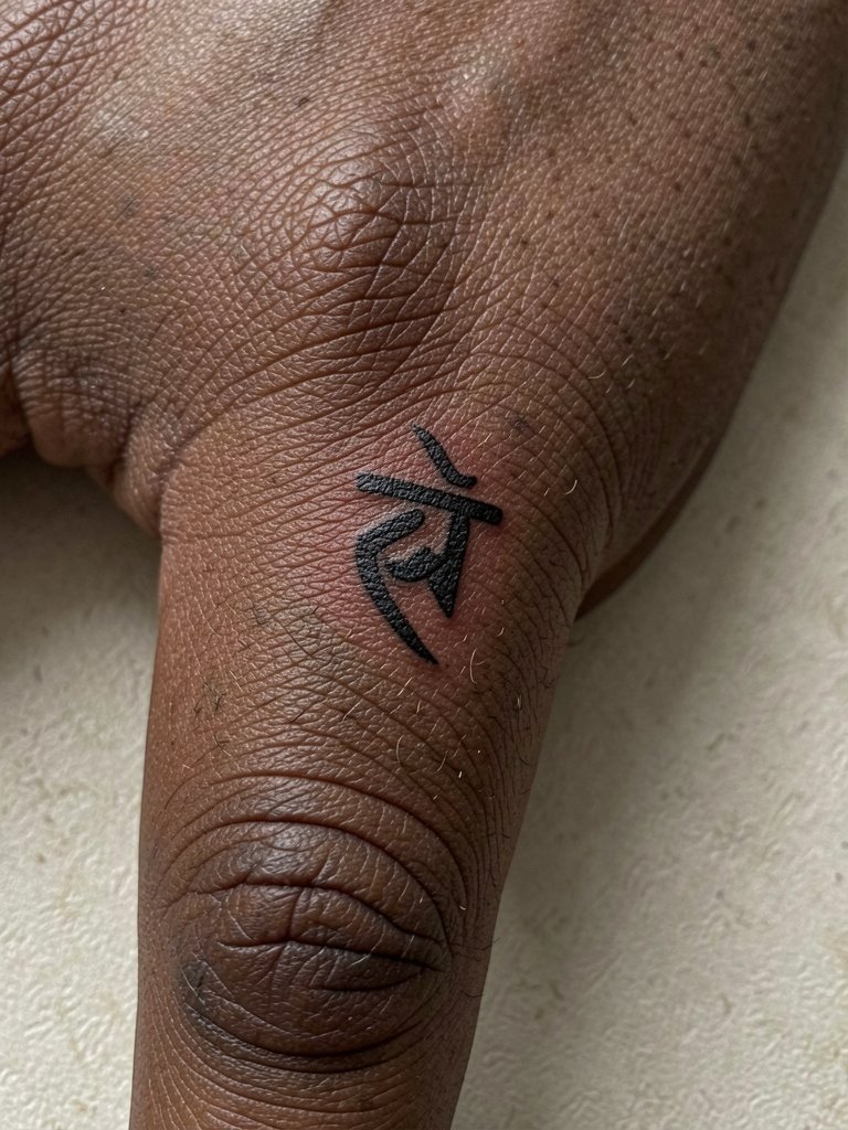
Finger tattoos are high-fade pieces that live in a harsh environment. For Sanskrit glyphs on fingers, ask for heavier line weight and simpler forms to reduce early blurring. The typical mistake is treating finger skin like the forearm. Plan on more frequent touch-ups and expect some fade within a year. Sessions are short but can sting because bone is close to the surface. For show-off pairing, thin stacking rings keep the design visible and elegant.
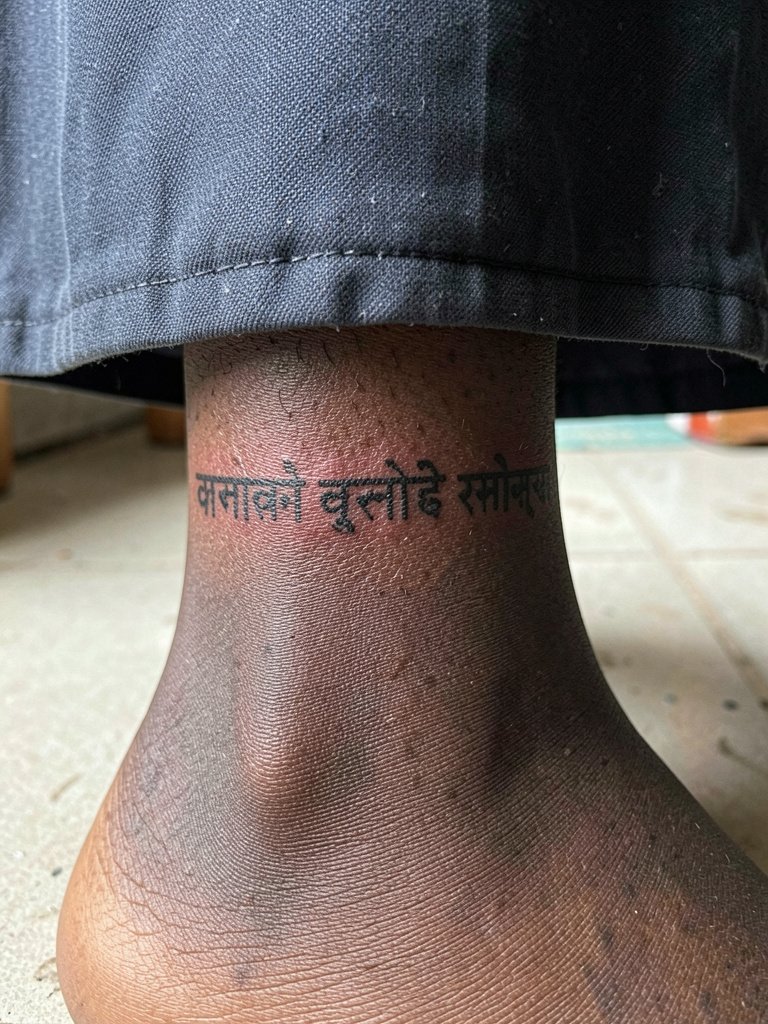
12. Sanskrit Script Wrapped Around the Ankle
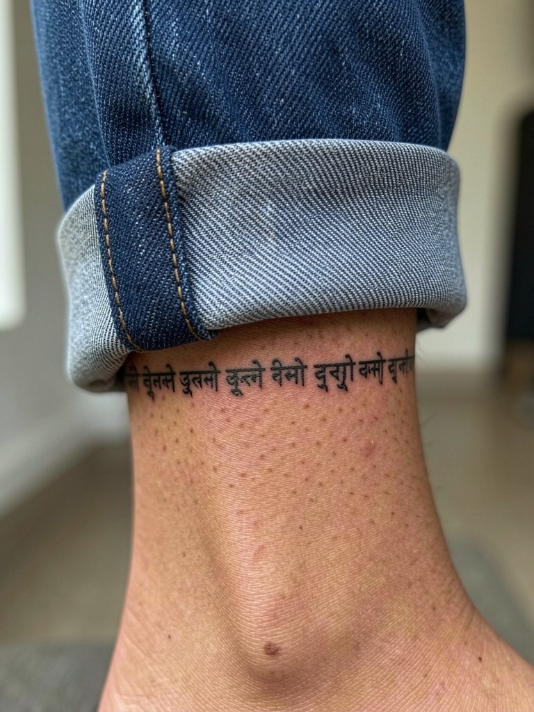
Ankle scripts take regular friction from socks and shoes so choose clear, compact characters and ask for a protective aftercare plan. Expect small scabbing and possible ink loss around the edges during the first week. A common mistake is a fragile script that disappears under daily wear. For footwear that complements the cuff text, a pair of low-profile sandals or rolled hem jeans shows the band without rubbing it aggressively.
13. Inner Thigh Couplet with Floral Frame
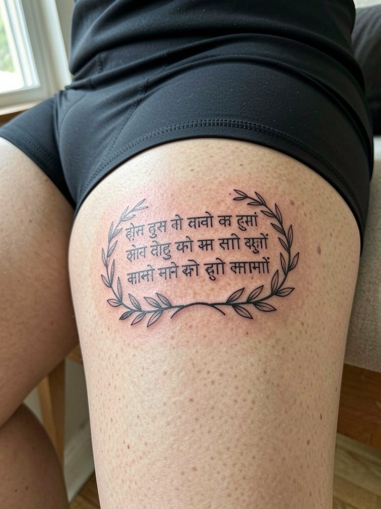
Inner thigh couplets are intimate and age well if you allow space around each character. Expect higher sensitivity and plan the session with breaks. The wrong approach is trying to cram dense script into a narrow strip near the groin. Inner thigh pieces can be easily hidden or revealed, which is why many choose subtle botanical framing. For the appointment wear fitted shorts so the artist can access the area without moving fabric.
14. Forearm Vertical Column in Stipple Shading
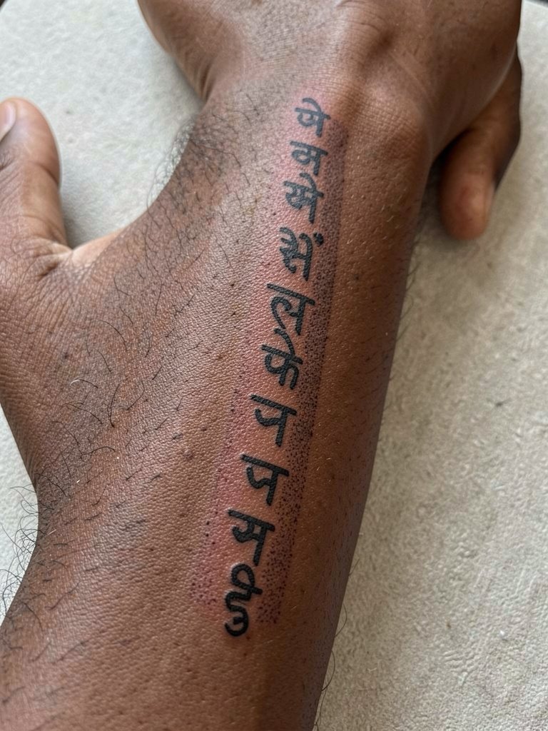
A vertical forearm column reads well and is relatively low-risk for blowout when the strokes are solid. Discuss exact character spacing and request a standing and seated stencil preview so you see the reading line. The common error is line weight that is too thin for the forearm's texture. Expect a comfortable session lasting an hour to an hour and a half and a likely touch-up at one year. For show-off outfits, roll sleeves to reveal the column and pair with a linen button-up.
15. Upper Arm Shield with Short Sanskrit Line
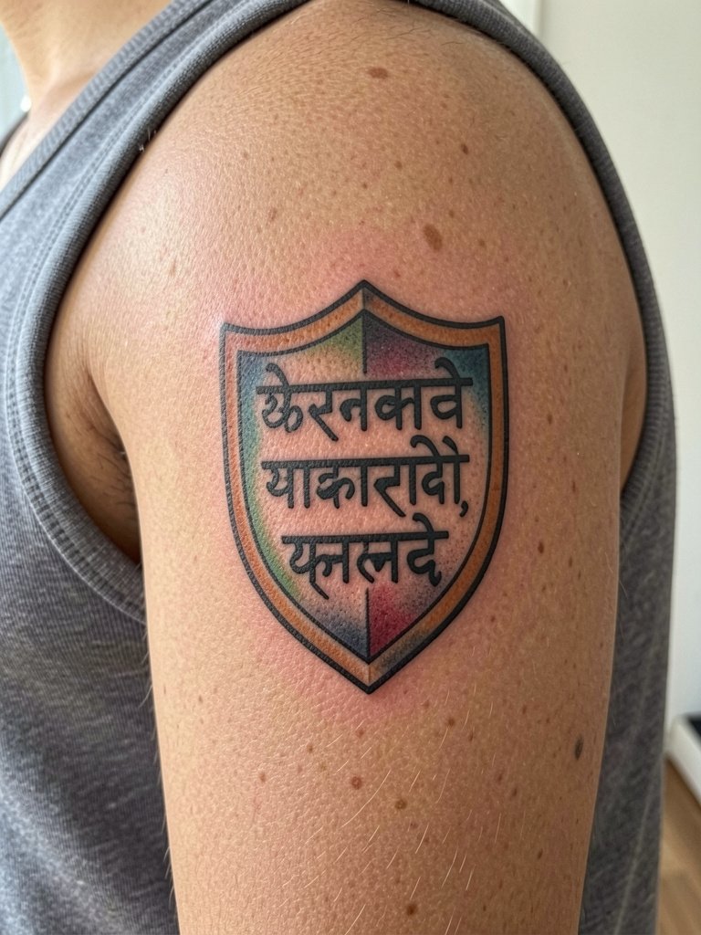
A shield motif frames a short script and gives the lettering context that translates well into bold work. Choose solid outlines and color blocks so the phrase remains legible even if some fading occurs. A typical mistake is choosing tiny script inside heavy color fields without enough contrast. Sessions for shield pieces are moderate and may require a second pass for color saturation. Pair this with a sleeveless top to show the artwork when desired.
16. Sanskrit Circle Medallion on the Nape
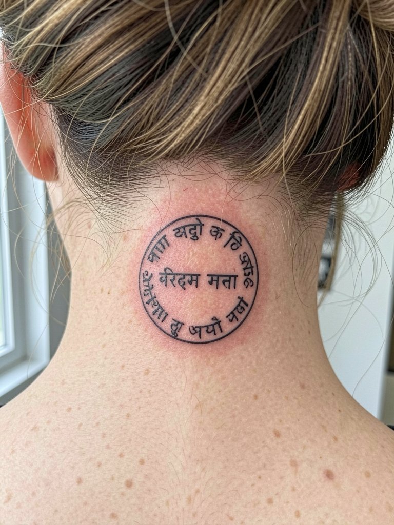
Nape medallions are a tasteful way to carry script without high visibility. The nape is a tricky area for symmetry so ask the artist to mark the midline and double-check with head position changes. Expect a moderate pain level and plan for a neat updo when you show it off. A common problem is off-center placement due to posture differences, so test positions while sitting and standing.
17. Sanskrit Phrase Along the Stern of the Foot
Foot scripts see heavy wear from shoes and washing so choose bold shapes and expect early fading. Sessions are short but often painful because of the thin tissue over bone. The mistake many make is choosing super-fine characters for an area that needs resilient letterforms. Plan for a touch-up once the swelling and initial loss settle. For summer footwear, simple sandals keep the instep visible without pressing on the new ink.
18. Sanskrit Script Integrated into a Lotus Outline on the Thigh
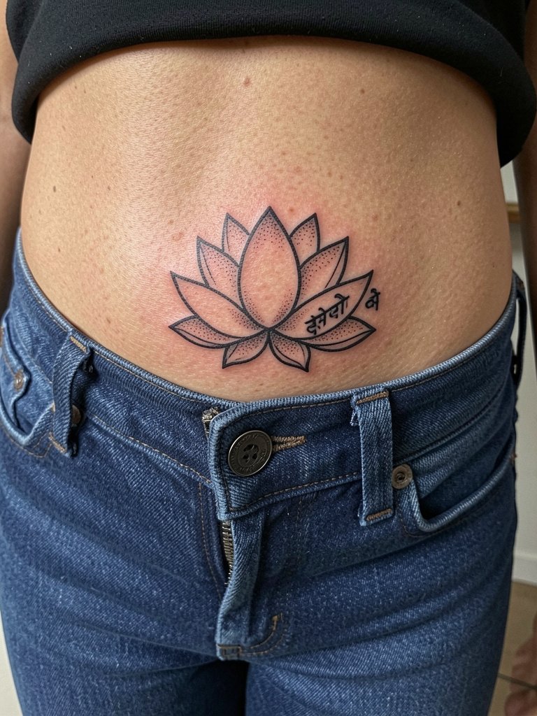
Lotus frames soften script and add a graphic anchor that aids legibility. If the phrase has spiritual significance, mention that in the consultation and consider correct transliteration. The thigh holds ink well so aging is usually gentle when the lines are spaced. Sessions can run longer for larger floral frames. For evenings out, low-rise jeans that reveal the petal edge complement the piece and prevent fabric rubbing during early healing.
19. Sanskrit Couplet Across the Outer Rib Panel
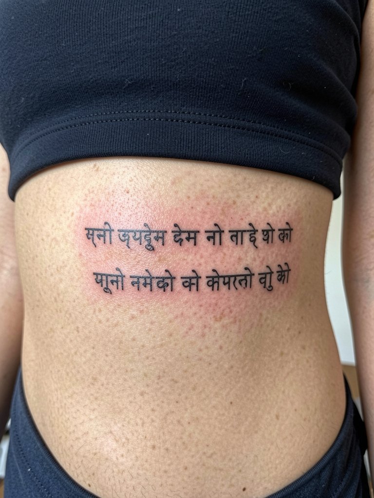
Outer rib couplets need attention to how lines flow with the body. Ask the artist to map letters along the rib curvature so each glyph sits naturally. A common error is forcing straight lines across a curved surface, which makes the script look distorted when you move. Expect higher pain and schedule the appointment with rest breaks. For session comfort, wear a cropped top that stays put.
20. Sanskrit Micro-Block on the Back of the Hand
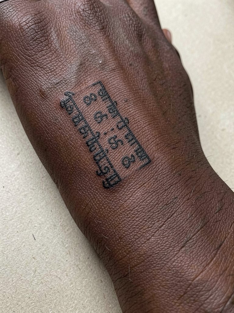
Hand pieces are high-maintenance and prone to fading from washing. For back-of-hand text, request compact glyphs with robust line weight and expect touch-ups every one to two years. The session feels sharp because of limited cushioning in the area. The wrong approach is selecting very thin letters that disappear under daily use. For accessories, a simple bracelet worn near the wrist helps draw attention without rubbing the block.
21. Small Sanskrit Seal on the Hip
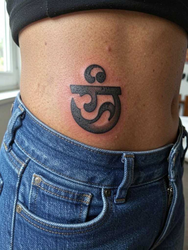
Hip seals are subtle and can be easily hidden or revealed. Discuss exact placement relative to your waistband because small shifts in clothing can alter visibility. A common mistake is placing the seal too close to the waistline where it will rub. Healing is usually straightforward but avoid tight waistbands while the area seals. For outfits, low-rise jeans reveal the seal without pressure.
22. Circular Sanskrit Inscription on the Upper Shoulder
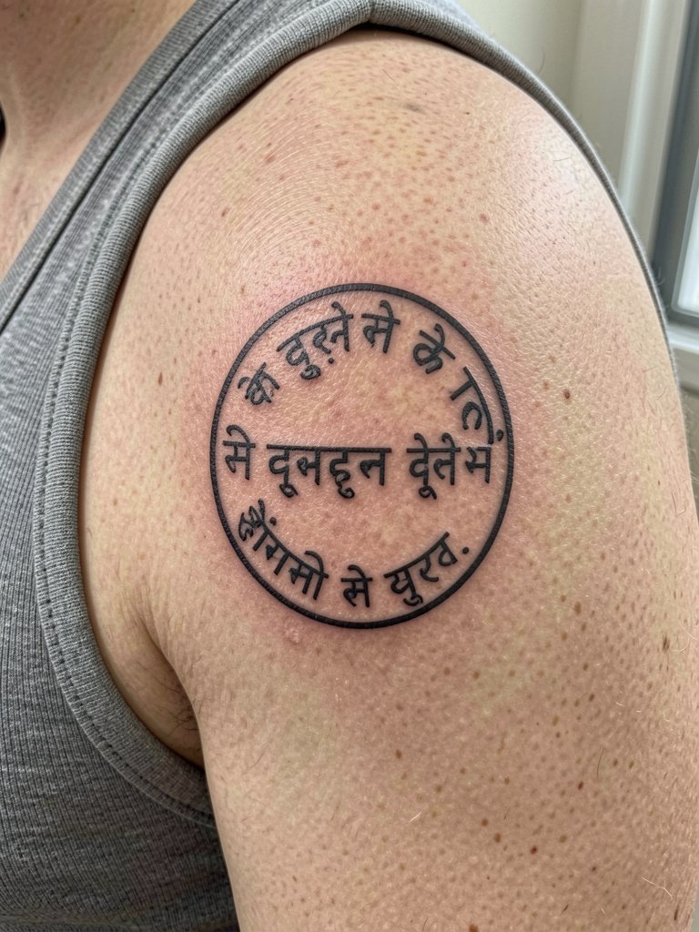
Shoulder inscriptions are forgiving and age well because of thicker skin and lower friction. Ask for preview stencils while your arm is relaxed and slightly raised so the artist can check how the circle reads in motion. A misstep is uneven spacing around the circumference that becomes obvious when you wear sleeveless clothing. Sessions are moderate and healing is quick. A loose linen tank shows the design without constricting it.
23. Sanskrit Phrase Paired with a Small Conch Motif on the Chest
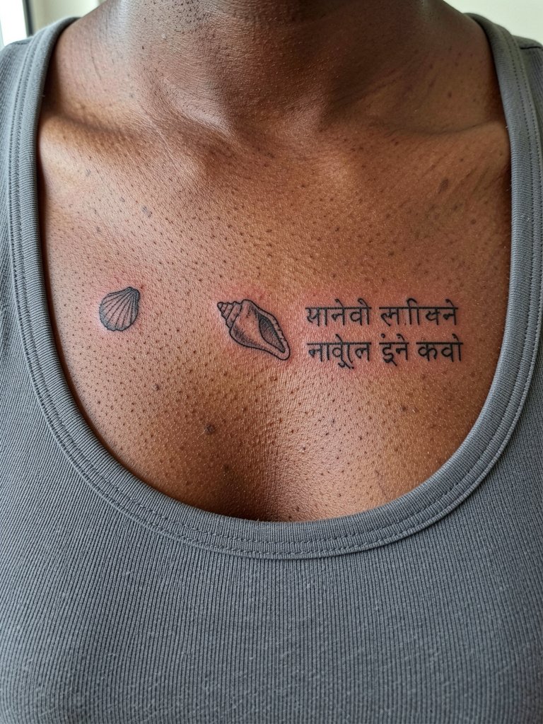
Pairing an emblem like a conch with a short scripture line anchors the text and creates visual balance. Be explicit about the relative scale so the symbol does not overpower or swallow the phrase. Chest placements can blur if the lines are too close to the areola or the collarbone ridges. Expect a moderate session and plan to wear a scoop-neck top for the appointment. For cultural imagery, state the phrase clearly and confirm correct transliteration so the meaning is preserved.
Frequently Asked Questions
Q: How do Sanskrit letterforms age compared with English script on similar placements?
A: Sanskrit characters often have compact shapes that need slightly more spacing than simple Latin letters to stay legible as skin shifts. In my experience, heavier strokes and generous counters keep glyphs readable at two and five years. Plan on a touch-up at the one-year mark for most fine-line scripts.
Q: Will a tiny Sanskrit tattoo on my hand or fingers hold up?
A: Hands and fingers fade faster because of constant washing and friction. For these areas choose bold, simplified glyphs and accept that periodic touch-ups are common. If longevity is essential, consider the forearm or upper arm instead.
Q: How should I handle cultural concerns about wearing Sanskrit?
A: Two perspectives circulate widely. One perspective sees wearing sacred script without context as inappropriate and urges caution and learning. The other perspective allows respectful use when you have studied the meaning and use correct transliteration. If your chosen phrase has spiritual significance, explain why it matters to you and confirm precise wording before the stencil is applied.
Q: Where can I find portfolios and healed examples without naming specific artists?
A: Search platform tags and keywords for healed examples and location filters. Look on photo-driven platforms with keywords like "Sanskrit healed tattoo" plus your city name to find local portfolios. Tattoo-focused forums and healed galleries often show time-lapse shots that reveal aging across skin tones.
Q: What should I wear to the appointment for a sternum or ribcage Sanskrit piece?
A: For sternum and ribcage work wear a fitted sports bra or a cropped top so the artist can access the area without you adjusting fabric. A fitted sports bra keeps things modest and steady while the artist works.
Q: How painful are chest and rib placements compared with inner arm scripts?
A: Chest and ribs are generally higher on the pain scale than the inner arm. The inner arm is moderate and can be sensitive but usually tolerable for most people. Pain tolerance varies, so plan breaks and discuss comfort options for longer rib sessions.