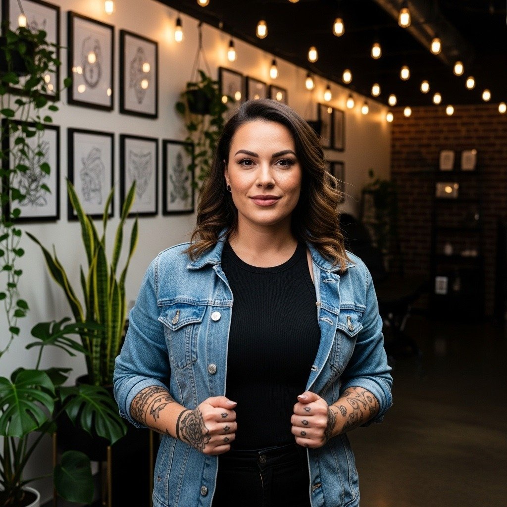
A small, bold Hanzi can outlast a wispy fine-line piece that looks great on video. Many people assume single-needle characters are always the most elegant choice. In reality, stroke weight, placement, and spacing determine whether a character reads clean at year three or softens into a blur. Below you will find specific Chinese-style motifs, placement notes, and practical styling tips that help the ink age well.
1. Vertical Two-Character Calligraphy on the Spine
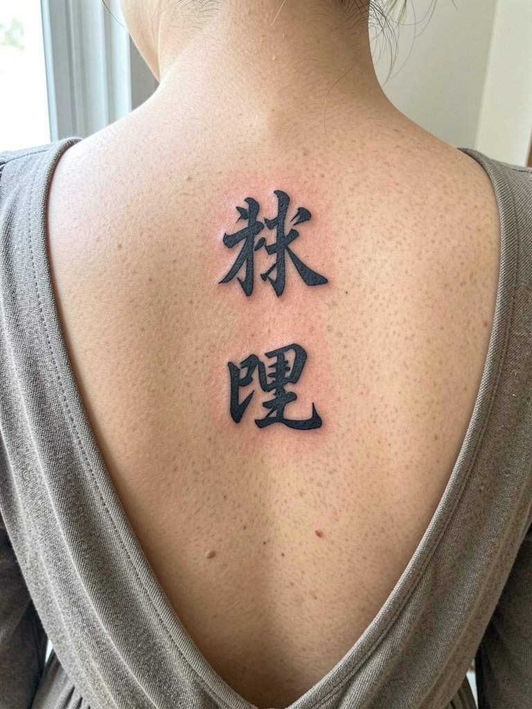
A vertical two-character stack reads with a classic scroll energy when placed along the spine. The spine is high pain for many, but the result follows the body's natural axis and gives the characters room to breathe, which helps legibility at year three and five. For the session, bring a loose open-back top so the artist can access the full length without straps digging into fresh skin. Show a reference that demonstrates stroke weight and spacing and be explicit about preserving generous spacing between strokes to avoid future softening. For evenings out, this placement pairs well with open-back midi dresses in cream or olive to keep the vertical line the focal point.
2. Single Minimalist Character on the Inner Wrist
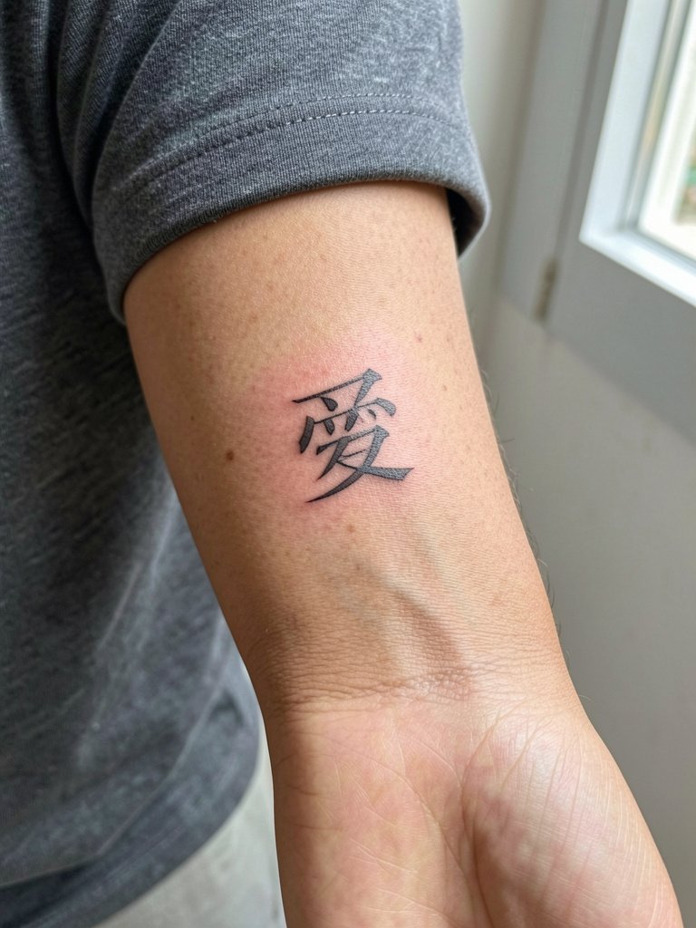
A single Hanzi on the inner wrist is a classic first-tattoo choice because it wears like jewelry and reads up close. The wrist sees constant motion, so single-needle work can fade or blur faster than bolder strokes. If you want fine line, ask for slightly heavier starts and stops in the stroke terminals rather than wafer-thin lines. For the appointment wear a short sleeve or sleeveless top and avoid bracelets on that wrist until the area is healed. To frame a tiny character day to day, try a thin chain bracelet set on the opposite wrist so the tattoo stays visually balanced.
3. Chinese Dragon with Ink-Splash Background on the Outer Forearm
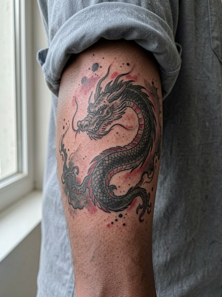
Dragons are about motion and scale on the forearm. The common pitfall is making the splash background too diffuse and low contrast, which fades into a gray haze on darker tones. Artists split on watercolor versus black-and-gray for dragons. One camp says watercolor splash ink looks vibrant immediately but blurs and fades at the edges after a year. The other camp argues carefully layered washes and strong black anchors keep the composition legible long term. If you prefer longevity, request stronger black anchors around the head and spine then soft washes for motion. The forearm is forgiving for touch-ups if you want to preserve color.
4. Fenghuang Phoenix in Ink-Wash Style on the Side Ribs
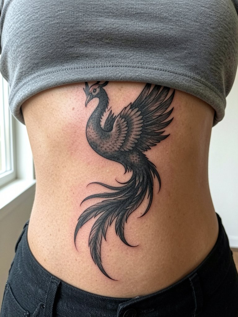
Rib pieces are high on the pain chart and they reward commitment. Ink-wash phoenixes need space so feathers read with soft gradients instead of a blur. A common mistake is compressing too many feather details into a narrow vertical strip. During consultation, specify overall sweep and where you want darker contrast so the artist can stage values. Wear a loose two-piece outfit for the session so the top can be removed without stretching the midriff. For showing off the healed design, a high waist crop top in a neutral tone keeps the rib area visible without competing details.
5. Lotus Flower with Calligraphy Border on the Collarbone
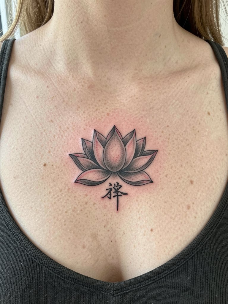
A collarbone lotus pairs floral form with compact text. The area moves with respiration so thin script can scatter if placed right on the bone edge. Ask your artist to mock up how the character sits relative to the clavicle curve and to leave a buffer from the bone where shading meets skin. Pain for collarbone work is moderate. For visibility pick tops with an open collar so the line sits in a clean negative space.
6. Peony Cluster with the Character 富 on the Lateral Hip
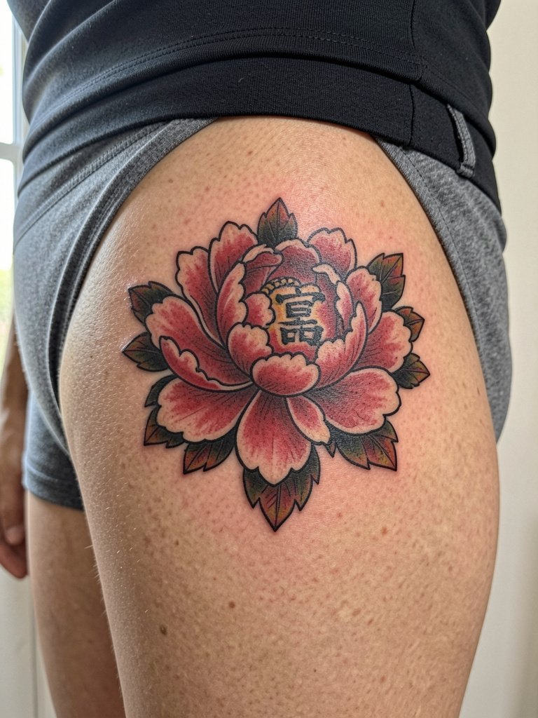
Peonies demand scale to show petal depth. The lateral hip handles lush color because the skin there takes saturation well. Session wear should be loose shorts or a skirt so the artist can access the side without pressure on the area after you leave. For styling, pair the peony with high-waisted skirts that reveal the hip line and let the floral cluster read as an editorial detail.
Session Day Picks
These picks help the small character and mid-size floral ideas above survive the first week and look their best at the two-week mark.
- Japanese aftercare balm (Tsuya-style). A less greasy balm option that keeps ink-wash styles breathing without the heavy occlusion that can blur fine details.
- Matte black ink replacement option. Matte black maintains contrast on darker tones and helps calligraphy stand out in photos.
- Chinese calligraphy reference book. Bring printed characters to your consultation so the artist can match stroke rhythm and historical forms.
- Thick-stroke calligraphy needle assortment. For bold Hanzi on high-motion areas a heavier grouping preserves crisp terminals during healing.
- Matte finish balm (Hustle Butter Deluxe). A common go-to for the first week that balances moisture with breathability for bold blackwork and color pieces.
7. Chinese Knot Mandala on the Sternum
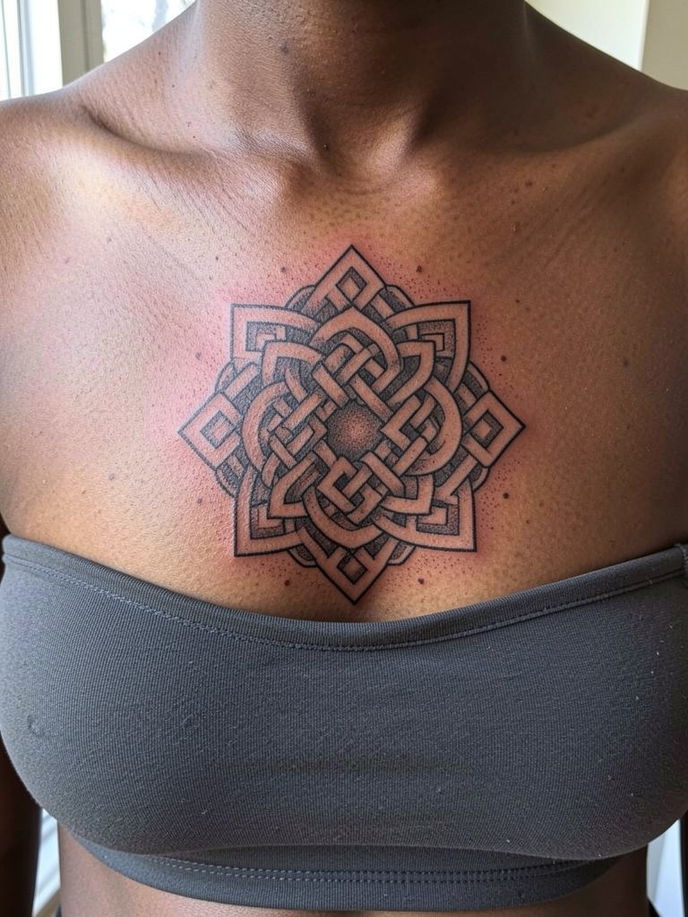
Sternum work reads as a central geometric anchor when scaled properly. Pain tends to be high for sternum pieces and healing can be complicated by bra straps. Wear a fitted sports bra or bandeau to the appointment so the artist can work with minimal friction on fresh ink. Because of the location, pick an artist who has clear healed photos of sternum geometry so the lines will remain crisp rather than wobble over time. Respect the cultural origin of knot motifs and mention that you want a traditional symmetrical approach rather than a generic mandala mash-up.
8. Cranes in Flight with 寿 on the Outer Forearm
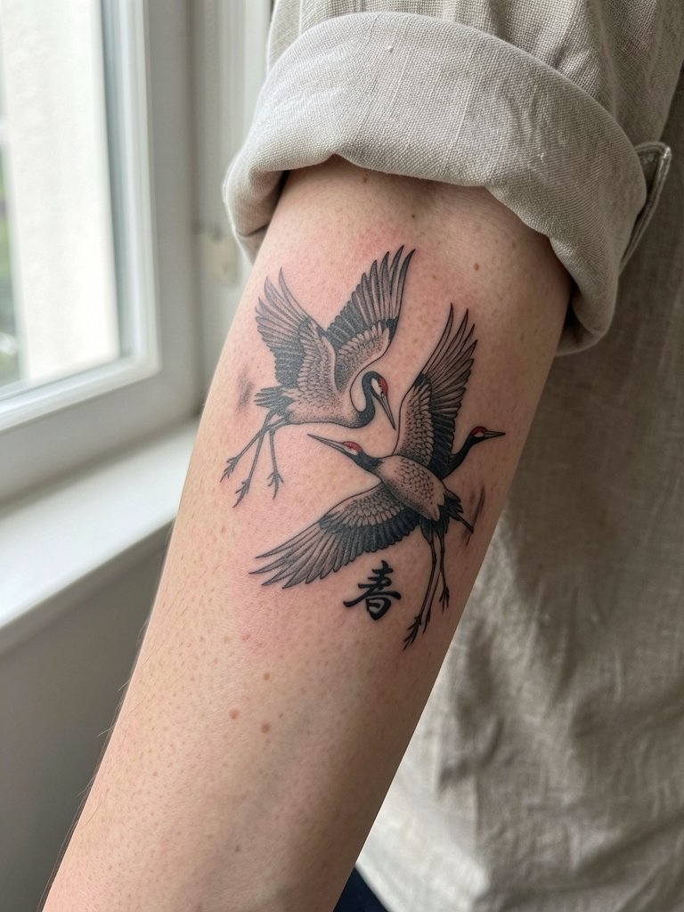
Cranes need breathing room to convey the wingspan. On forearms the risk is packing too many feathers into a narrow band. Ask for vertical or diagonal movement that follows the arm line. Outer forearm pieces pair well with rolled-up sleeves in linen to show the composition naturally. If you like the look, try a rolled up sleeve shirt that frames the forearm without hiding it.
9. Laughing Buddha with 喜 on the Side of the Hand
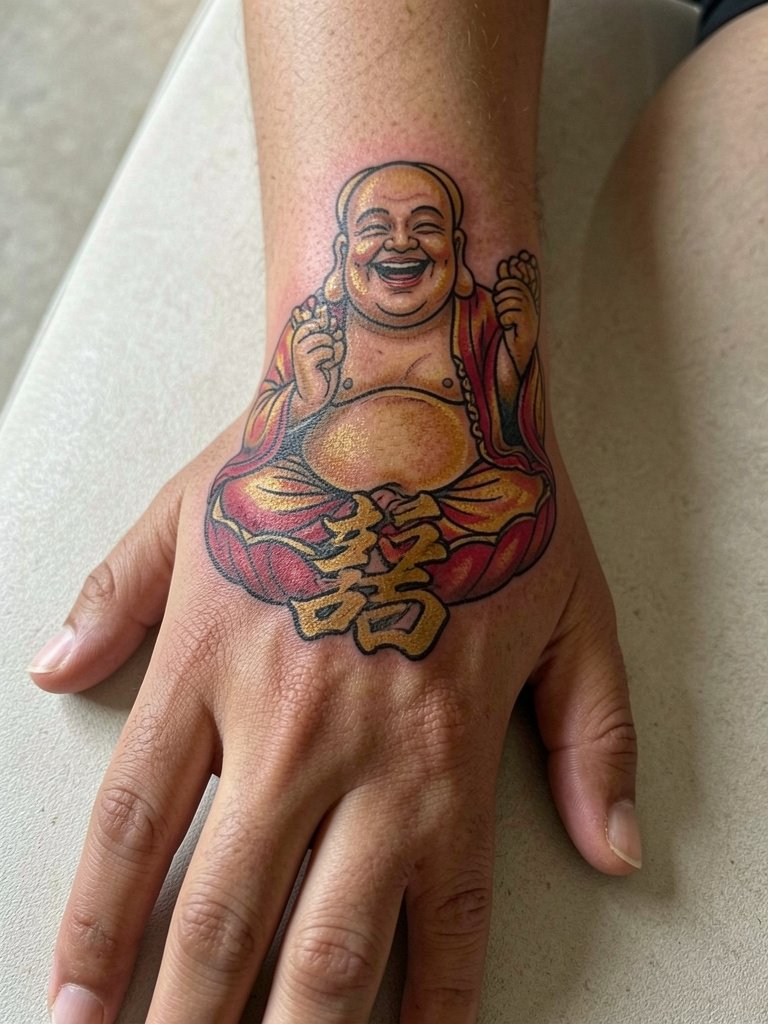
Hand tattoos are visibly rewarding and also high-maintenance. The skin on the hand takes heavy wear from washing and friction so expect faster fading and likely touch-ups. Pick bold outlines and strong color anchors rather than tiny filigree. A professional who regularly does hand work is a must because placement precision prevents early blowout. Also note that hand tattoos can stand out socially and at work, so think through long-term visibility before committing.
10. Vertical Spine Phrase in Three to Five Characters
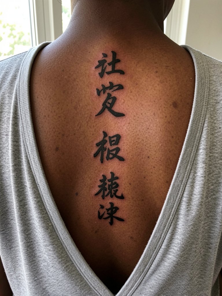
Spine phrases have dramatic visual weight because they travel with posture and movement. The biggest error is compressing characters so they collide when you bend. During the consult bring scaled-up stencils that show vertical spacing and rhythm. Touch-ups are easier on the spine than on high-motion soft tissue, but plan for a touch-up window around year two if you want crisp terminals.
11. Horizontal Collarbone Phrase in Modern Calligraphy
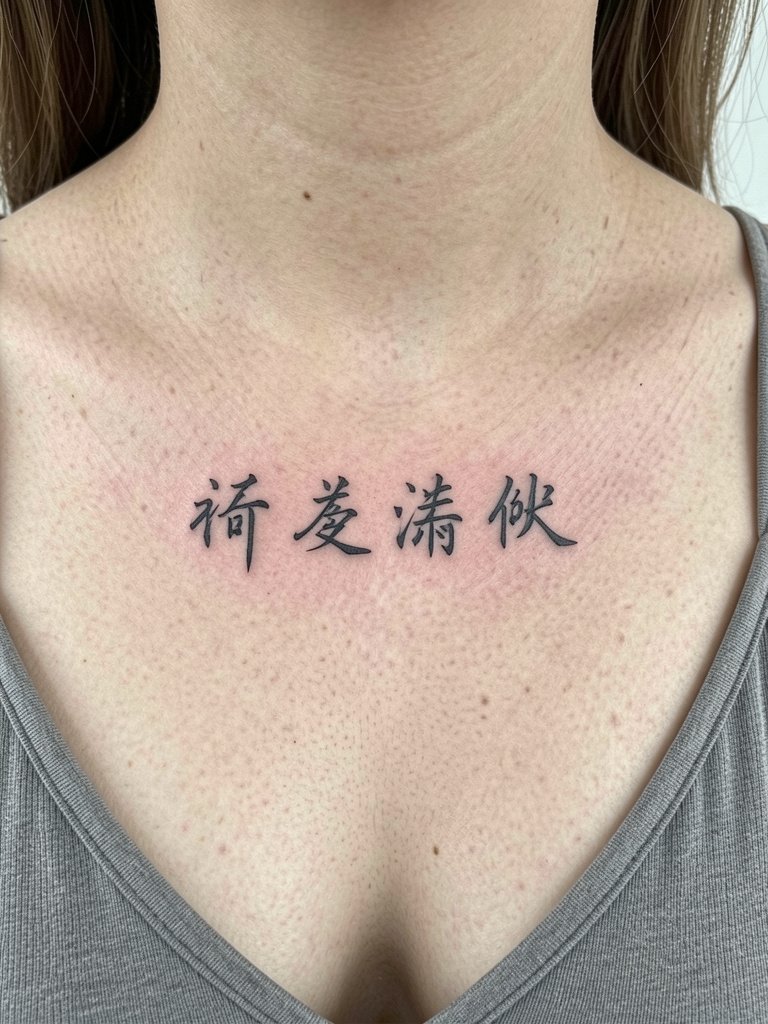
Horizontal collarbone phrases are contemporary and work with shoulder lines. Artists debate whether vertical is the only authentic direction or if horizontal is a practical modern choice. One camp says vertical is truer to traditional writing and provides an elegant spine-like read. The other camp points out that horizontal flows better on curved chest areas and can feel more wearable for everyday clothing. If you choose horizontal, ask for a slight increase to stroke weight so the letters keep their edges over time. For evenings, a strappy top in cream or sand frames the horizontal line cleanly.
12. Zodiac Animal Portrait in Brush Style on the Upper Arm
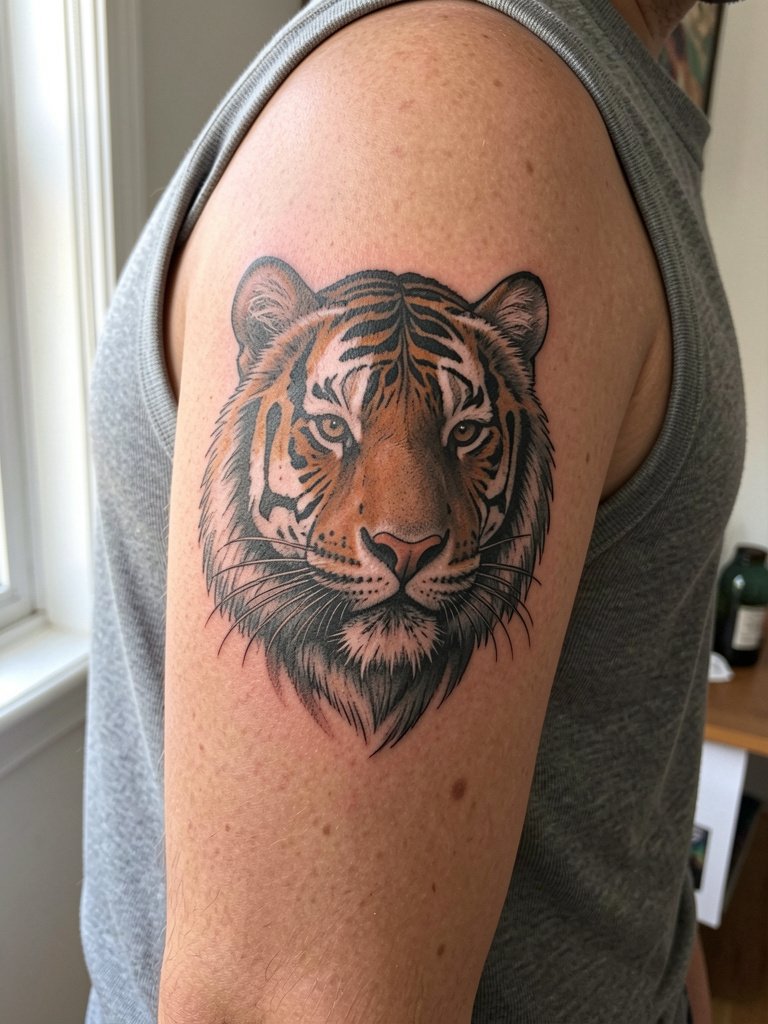
Zodiac animals are highly personal and can be tailored by pose or expression to reflect traits like courage or curiosity. The medial upper arm reads well for portraiture because the surface is flat and touch-ups are straightforward. Keep the composition bold so the animal remains legible at arm distance. Sleeveless tops are ideal both for the session and for showing postoperative photos.
13. Watercolor Landscape of Mountains and River on the Upper Back
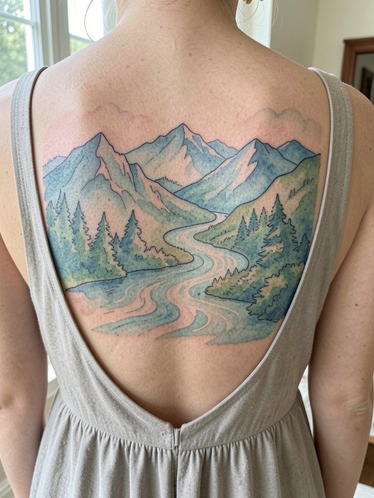
Watercolor landscapes are cinematic but they age differently than black-and-gray washes. One camp argues watercolor fades quickly and loses edge definition unless reinforced by black anchors. The opposing camp says the soft washes are valid and beautiful if you accept periodic color refreshes. If you want the watercolor look, plan on a multi-session approach that starts with a strong grayscale underpainting to preserve depth. For show-off looks, a backless dress in deep tones lets the washes read like a painted panel across the upper back.
14. Minimalist Script on the Inner Wrist
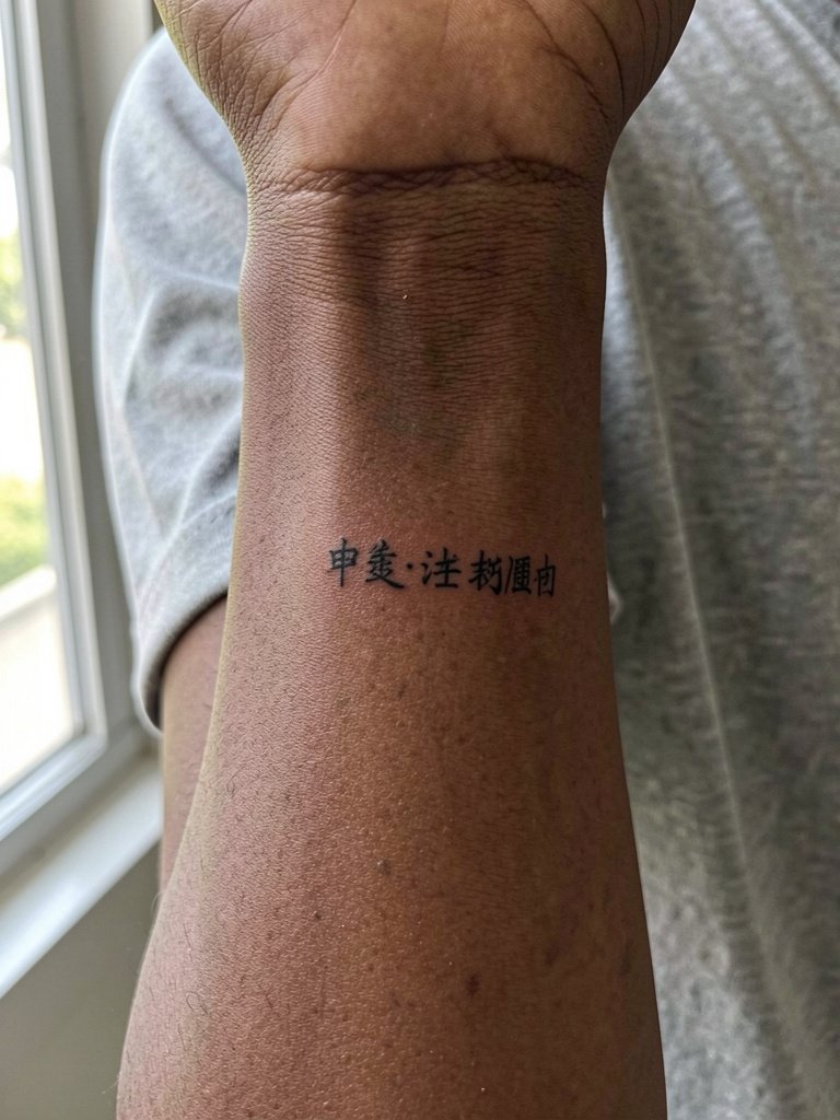
Minimalist scripts read as a whisper on the wrist. The common mistake is sizing too small. At this scale, plan for yearly touch-ups if you want the lines to stay crisp, especially on high-motion wrists. Bring two reference sizes to your consult so the artist can demonstrate how the character looks at three versus five millimeters of stroke width.
15. Ink-Wash Bird with 自由 on the Inner Upper Arm
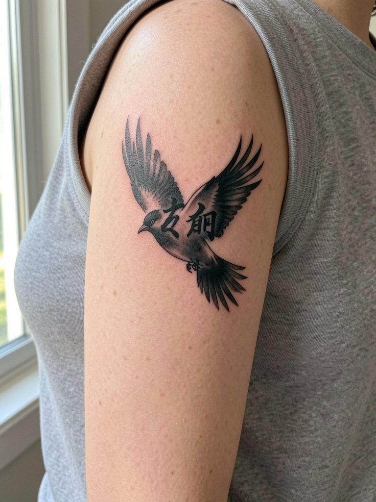
Inner upper arm placements are protected from sun and show subtle detail well. The skin here holds stipple shading and soft washes. For the appointment choose a sleeveless top so the artist can roll the arm without tugging fabric across fresh work. To emphasize the bird's ethereal quality wear tank tops in neutral tones that let the negative space around the bird become part of the composition. Try a sleeveless top in cream for casual reveals.
16. Fine-Line Hanzi on Dark Skin, Carefully Spaced
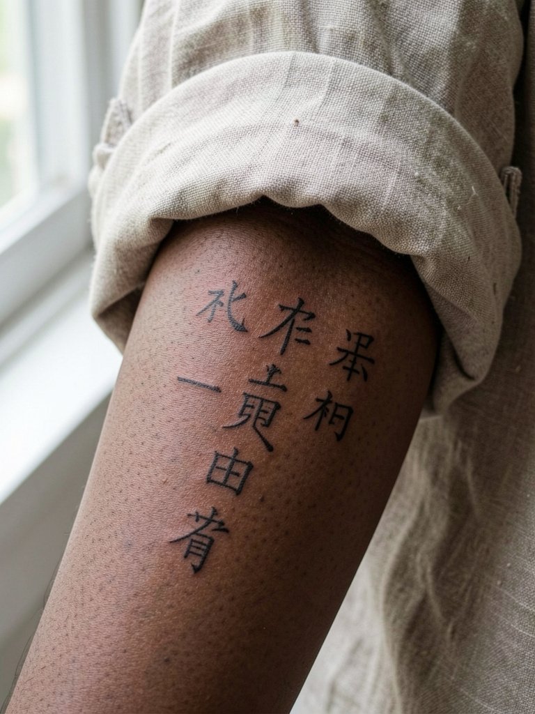
Fine-line Hanzi on darker skin needs careful planning to keep contrast. Some artists insist fine line blurs within one to two years because thin strokes spread under the skin, especially in high-motion areas. Other artists maintain that with proper needle depth and slightly wider spacing fine-line work can look sharp for three years or longer. The best approach is to request slightly heavier terminals and confirm healed examples on similar skin tones. Expect a touch-up down the line if you want the piece to stay as crisp as the fresh photo.
17. Tiny Character Behind the Ear
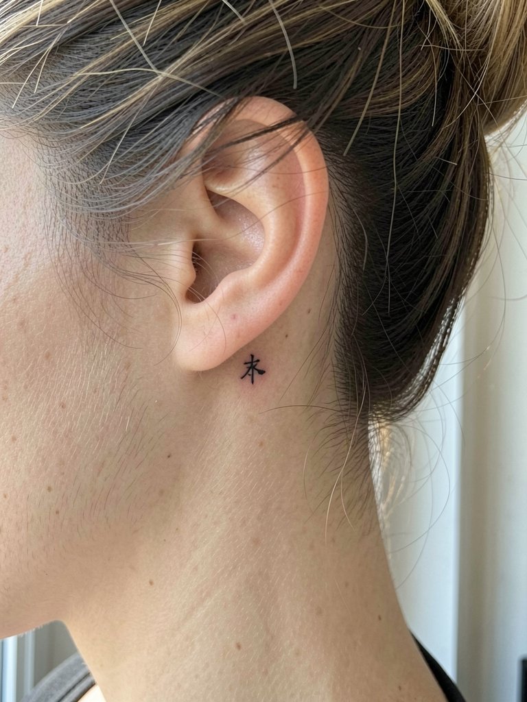
Behind-the-ear pieces are intimate and require precise placement because the surface is small. If you plan to reveal it, style hair in an updo to showcase the spot. For the appointment pull hair back and wear a shirt that won't rub the nape. To accessorize, a small ear cuff on the opposite ear adds balance and keeps the look editorial. Consider a gold ear cuff set that complements the tiny character.
18. Full-Back Brush-Style Dragon for Collectors
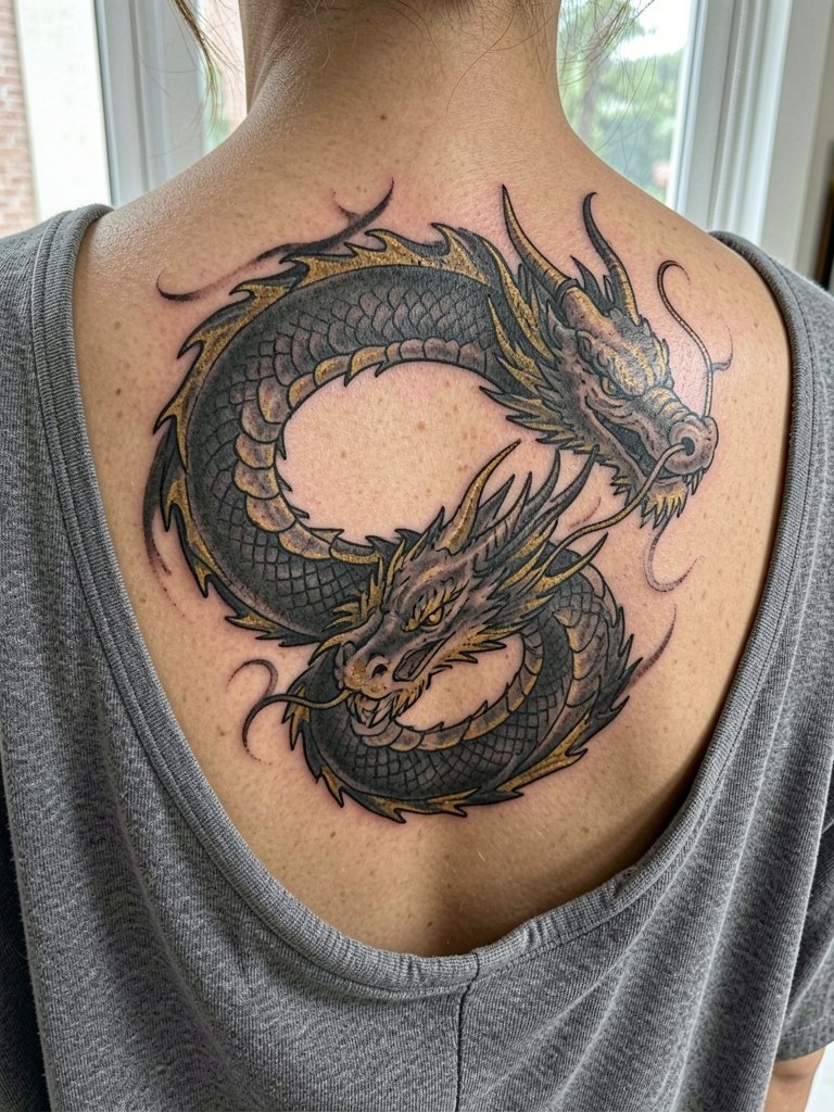
Full-back dragons are for collectors who can commit to multi-session builds. The large canvas lets calligraphic strokes breathe so the dragon keeps its structure over decades. Expect several sessions and planned touch-ups to maintain color intensity. For aftercare logistics plan loose tops for the first week so straps do not rub the area while it seals.
19. Seal-Style Square Hanzi on the Ankle
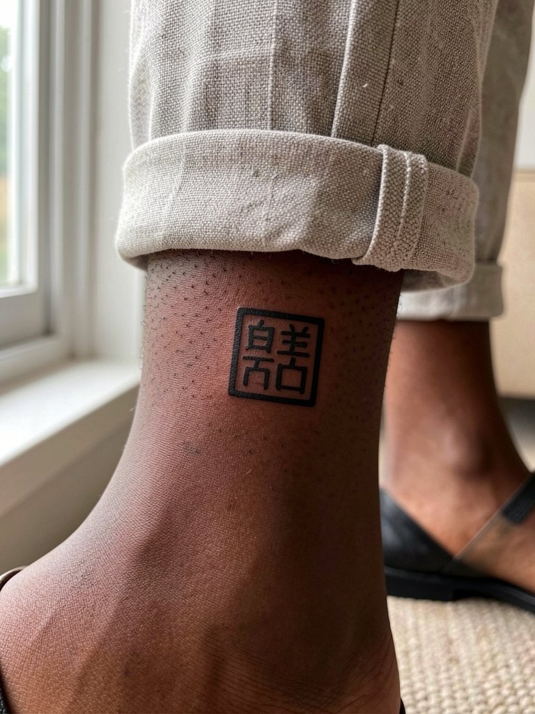
Seal-style stamps read graphic and compact on ankles. The ankle sees friction from shoes and socks, so bold square forms hold up better than thin frames. For the session wear cropped pants or open-toe sandals so the artist can reach the ankle without fabric pressure. Keep the stamp centered on the lateral bone for best visual balance.
Frequently Asked Questions
Q: How do I verify a Chinese character so it does not read incorrectly?
A: Bring a printed character from a trusted reference and show the artist the exact glyph you want. Ask a native speaker to confirm the meaning and tone before the stencil goes on skin. Also bring a calligraphy-style reference that shows stroke order and weight so the artist can match rhythm and avoid a misread glyph.
Q: Where can I find artists who specialize in Hanzi or ink-wash styles without naming anyone?
A: Search hashtags like #chinesetattoo, #hanzi, #chinacalligraphy, and #finelinehanzi on Instagram and TikTok and filter by your city. Tattoodo and the Inked App let you search portfolios by keywords such as "vertical Chinese calligraphy" or "ink-wash dragon." Reddit communities like r/tattoos and r/tattooadvice are useful for healed examples and peer recommendations.
Q: Will a fine-line character fade faster than a bold stroke on the ribs?
A: Fine-line on ribs has mixed reports. One group of artists says the thin strokes blur within one to two years because the skin there stretches and moves a lot. The other group responds that with slightly heavier terminals and wider spacing the fine-line approach can hold well and they will show healed photos as proof. If longevity matters most, opt for heavier starts and stops and plan a touch-up in the second year.
Q: How should I dress to my tattoo session for a rib, hip, or collarbone piece?
A: For ribs pick a two-piece outfit like a crop top and loose pants so you can remove only the top. For lateral hip wear low-rise shorts or skirt with an elastic waist. For collarbone choose a strapless or open-collar top. Wearing these items in their normal fit helps the artist work and limits pressure on fresh ink while you leave the studio. If you want, pack a spare loose shirt to wear home.
Q: Do watercolor washes work on darker skin tones?
A: Watercolor washes tend to lose contrast on darker tones because they rely on subtle color shifts. Many artists recommend anchoring washes with strong black elements or choosing bolder color saturation. If you love the watercolor aesthetic, ask for test patches in healed examples on similar skin tones and schedule a planned color refresh if needed.
Q: What is a realistic touch-up timeline for fine-line Hanzi versus bold calligraphy?
A: Fine-line pieces often need a light touch-up within one to two years, especially on high-motion areas. Bold calligraphy usually maintains clarity longer and may only need a refresher at three to five years depending on sun exposure and skin changes. Plan touch-ups into your timeline if you want the piece to look as crisp as the day it healed.