Bold, single characters done without breathing room often blur into a smudge after a few years. A clean Chinese character tattoo that lasts starts with correct spacing, intentional line weight, and a style matched to the skin and placement. These 27 designs focus on how each character reads now and how it will look after healing, with practical notes on session time, pain, touch-ups, and wardrobe that helps show the work off.
1. Single Character '愛' on Inner Forearm
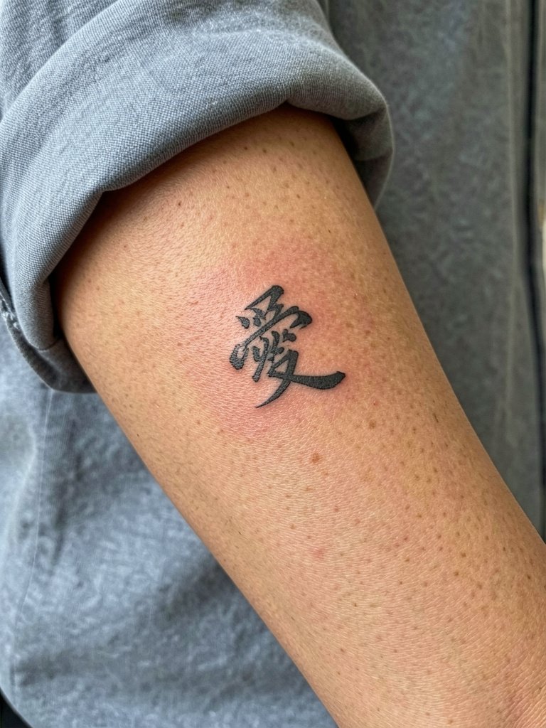
A single-needle brush script of '愛' reads intimate on the inner forearm and fits a two-hour session. Recommend slightly heavier single-needle line weight than the Pinterest reference so the strokes survive the first two years. A common mistake is asking for hairline strokes without spacing, which the inner forearm will eat and blur. Expect softening at two years and a likely light touch-up at three to five years. For showing it off, roll a shirt cuff and pair with a linen button cuff shirt that leaves the forearm visible.
2. Bold Seal-Style '勇' on Upper Arm
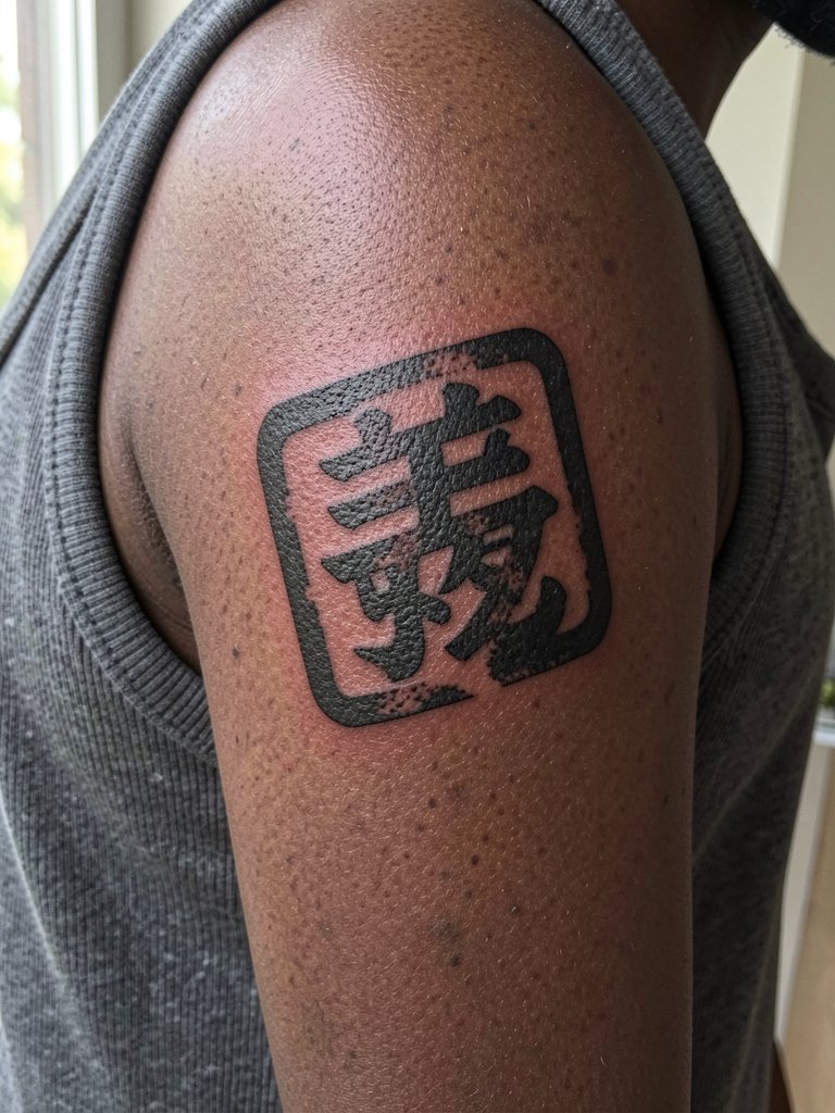
A bold seal-stamp '勇' fits the outer upper arm because thick outlines read across distance. Choose saturated blackwork and tight negative-space for longevity. The session runs about one to two hours with low blowout risk here because of thicker lines. Avoid asking for distressed tiny texturing that will disappear. If you want a seal effect, bring a high-res photo of carved-stone seals so the artist can match spacing rather than guessing. Pair this placement with sleeveless tees that let the block character read from across a room.
3. Vertical Phrase '夢想' Along the Ribcage
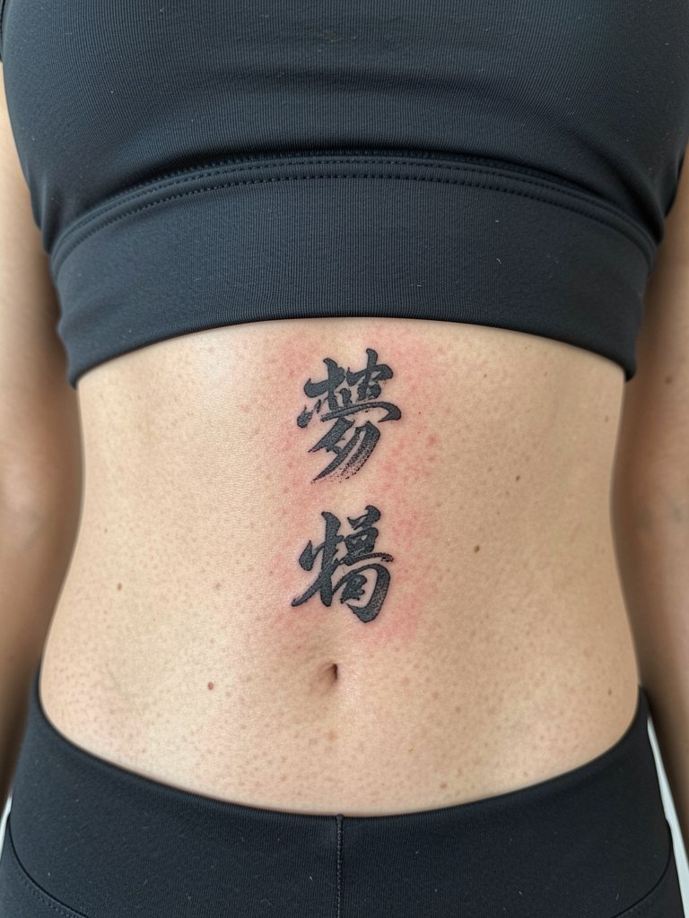
Vertical phrases across the ribs read dramatically but require planning for stretch and friction. One camp argues ribs stretch and blur thin strokes fast. Another camp says slightly bolder brushstrokes and deliberate spacing will keep characters legible for years. Expect higher pain and a session that might need two passes because of breathing and rib movement. Bring references that show character spacing at the final intended height so the artist can scale the strokes for healing. For the appointment wear a fitted cropped top so the area is exposed without fabric shifting.
4. Small '和' Behind the Ear
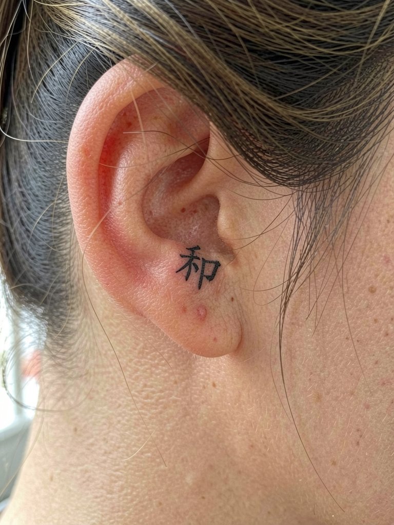
Behind-the-ear characters are a session of thirty to forty minutes with high sensitivity but low motion. The biggest mistake is asking for micro-hairline strokes. A slightly heavier hairline and a touch of stipple shading around the base will help retention. Artists split on visible text longevity here. One camp warns the area moves with hair growth and fades unevenly. The other camp says proper depth with a slightly bolder exit keeps the glyph legible. If you plan to show this off, a simple stud earring and a silk hair scarf for updos frame the area without covering it.
5. Stacked Names in Small Script on Inner Wrist
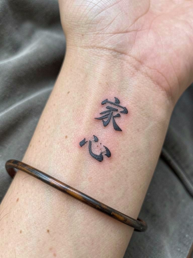
Inner wrist stacked characters are charming but require spacing and slightly increased line weight to survive heavy washing and friction. The common mistake is packing too many tiny details near tendons and expecting them to stay crisp. Expect the first six months to show crisp contrast, then gradual softening at two years requiring a touch-up. The session is short but the area drinks ink, so discuss stroke spacing and where the tendon will distort the glyph when the wrist bends. For outfits, choose bracelets that sit below the tattoo, or show it with delicate chain bracelets worn lower on the wrist.
6. Brush-Stroke '力' on the Calf
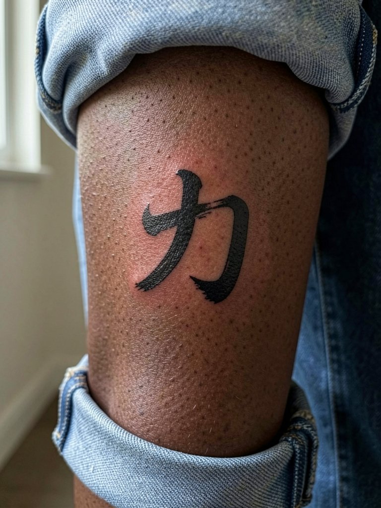
Calf placements give enough canvas for expressive brush strokes and lower blowout risk. The session is comfortable and often completes in a single hour. The main mistake is asking for ultra-dry stipple instead of full saturation, which loses presence on darker skin. Specify how bold you want the strokes so the artist can adjust saturation and linework. For summer looks, pair with ankle-length skirts or cuffed jeans so the character remains visible.
Pre-Session Essentials
These first six placements range from wrists to ribs, so a few small items smooth the chair day and the first week.
-
Stencil transfer paper kit. Lets you preview exact character placement on skin before inking, which is essential for vertical and stacked designs above.
-
Topical numbing cream. Applied 30 to 45 minutes before a sensitive rib or sternum session takes the edge off without affecting linework.
-
Thin protective film roll. Useful for wrist and finger placements to reduce early friction from handwashing.
-
Fragrance-free gentle body wash. Cleanses healing areas without stripping ink or irritating fine-line strokes.
-
Aquaphor healing ointment. A mainstream option for short-term moisture control during the first few days after saturated blackwork or fine script.
7. Mini '心' on the Side of the Finger
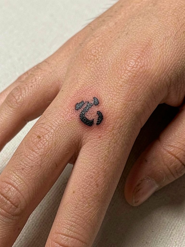
Finger characters are high maintenance because of constant washing and skin turnover. A thicker, block-style '心' holds better than hairline kanji. Expect touch-ups in the first year. The session is quick but painful for most people because the skin is thin. Avoid tiny ornamental strokes that vanish. For showing it off while minimizing rubbing, wear thin gold stacking rings on adjacent fingers rather than tight bands over the tattoo.
8. White Ink '平' on the Collarbone
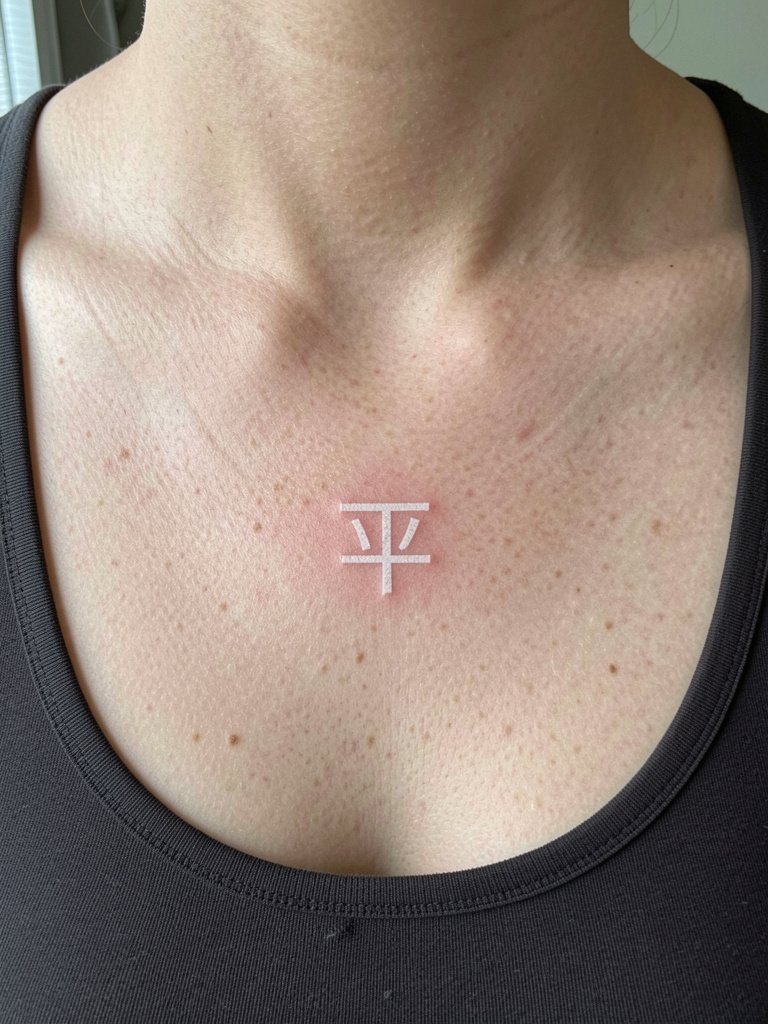
White ink characters can be subtle and very visible on the collarbone in the first year, but they often fade faster than black. The work needs more saturation and possibly a tiny shadow in soft grey to keep legibility. A common mistake is treating white ink like a wash. Expect periodic touch-ups and plan for a one-hour session. For outfits that reveal and flatter the faint contrast choose open-back blouses that frame the collarbone without rubbing the area.
9. Block '真實' Across the Shoulder Blade
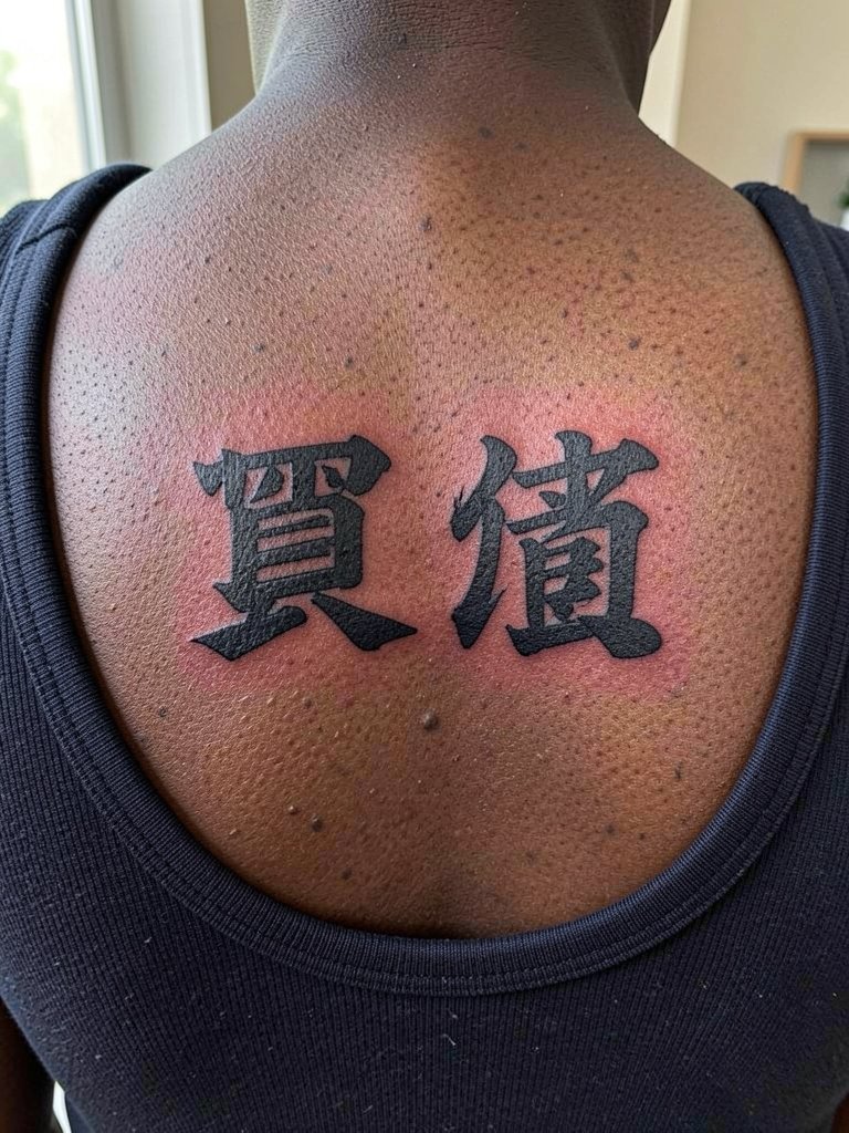
Shoulder blade placements have low friction and are good for larger, bolder characters. The canvas lets an artist add texture and play with brush edges. Sessions can be one to two hours depending on scale. Common mistakes include making strokes too fine for the skin there, which softens over time. Bring photos showing scale across a similar shoulder so the characters do not end up too small. Show the piece off in summer with a cropped tank that keeps the back exposed.
10. Vertical '永遠' Down the Spine
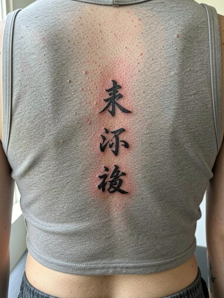
Spine work reads strong when centered and spaced carefully. The main challenge is movement and curvature, which changes how each stroke sits. Tell the artist which vertebra you want the top character to align with so the line flows with your posture. Pain ranges from moderate to high in the midline, and session time can stretch to multiple hours. For visibility, low-back crop tops work well; try a cropped rib-knit top to frame the vertical script.
11. Minimal '誠' on the Outer Ankle
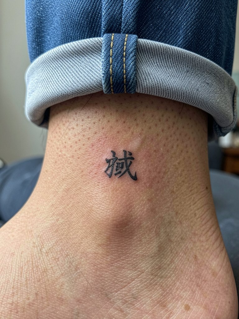
Ankle placements face rubbing from socks and shoes, so choose slightly bolder strokes. The typical mistake is ultra-thin linework that dissolves with footwear friction. Session time is short but be ready for a touch-up at one year. For demonstrating the glyph during warmer months, cuff pants or wear low shoes with minimalist leather sandals that keep the ankle visible.
12. Circular Seal '平安' on the Shoulder Cap
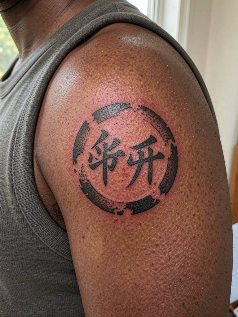
A round seal fits the shoulder cap because the curvature supports the circular layout. The consultation should cover how large the interior counters need to be so the characters do not bleed together after healing. Expect a one-hour session for a medium-sized seal and low blowout risk. For outfits that highlight the circle, choose sleeveless cuts or a tank dress that keeps the shoulder open.
13. Tiny Script '忍' on the Inner Bicep
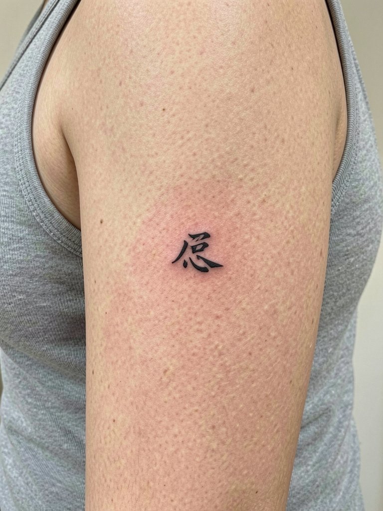
Inner bicep calligraphy is intimate and often hidden. The main mistake is hairline stroke requests without accounting for the skin's tendency to blur. Choose slightly heavier single-needle strokes and discuss how the glyph will look with the arm relaxed versus raised. Pain is moderate. For the session wear a sleeveless shirt so the artist has unobstructed access without the arm being raised.
14. Negative-Space '友' on the Rib Flank
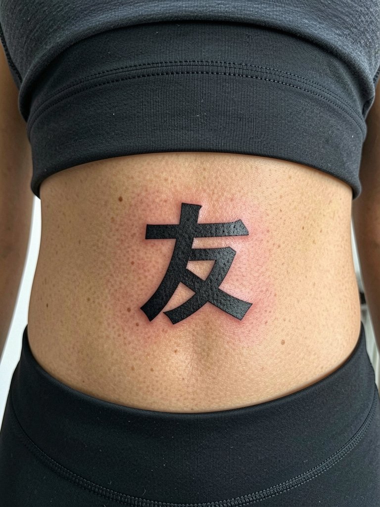
Negative-space characters on the ribs look striking but require a lot of saturation in the surrounding black so the letter remains crisp. One camp worries about the heavy black aging into uneven texture over years. The other camp says if the black is deep and layered it remains consistent and the negative letter pops. Expect multiple passes and a longer session. For breath control during the session practice slow diaphragmatic breathing and wear a fitted top so the artist can work without fabric moving.
15. Tiny '學' on the Side Neck
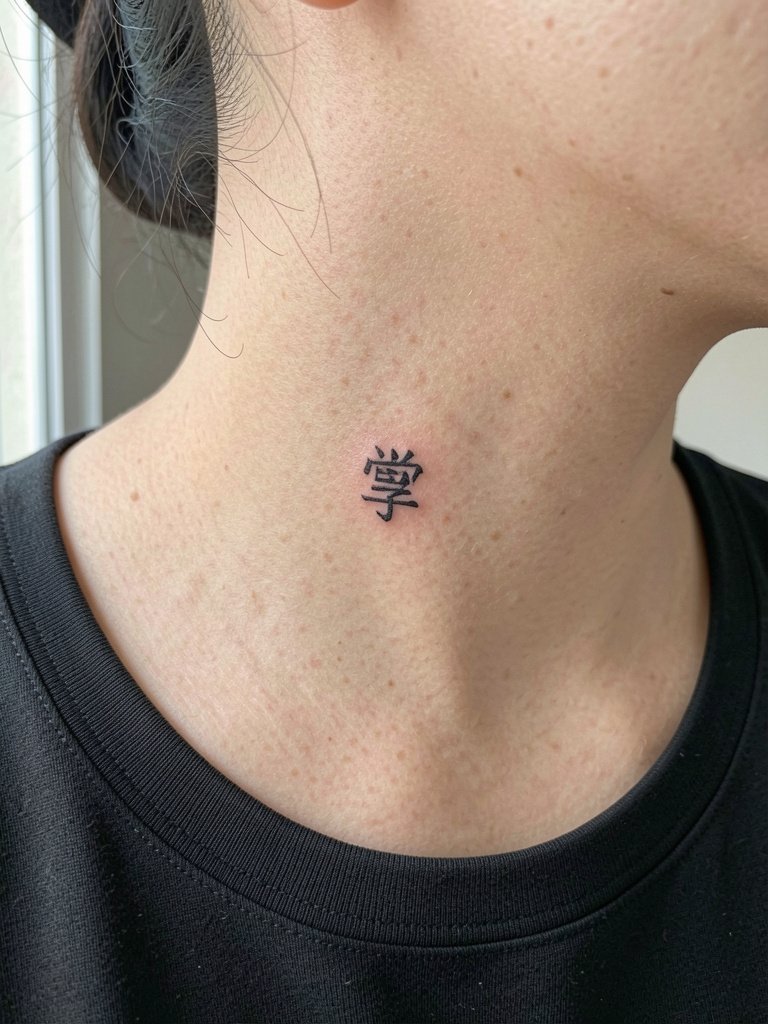
Side-neck characters are visible and need to be bold enough to stay legible as skin moves. The common mistake is choosing an ultra-fine ornamental script that fades into the hairline. Sessions are quick but more painful than outer arm work. For wardrobe that keeps the character on display, try a wide-neck blouse that naturally reveals the lateral neck without tugging at the skin.
16. Scripted Phrase '光 旅' on the Upper Thigh
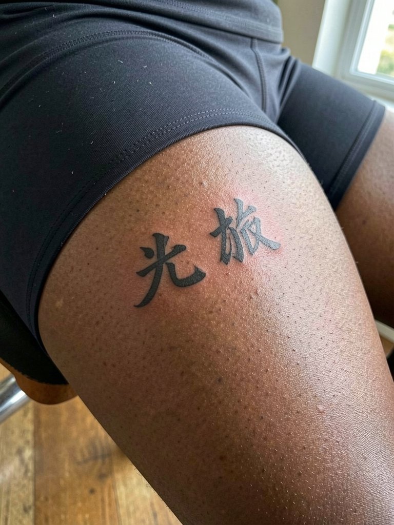
Upper-thigh placements provide privacy and longevity because of lower sun exposure. The mistake is using too-fine script that wrinkles with skin movement. Expect a one-hour session and modest pain. For showing the piece in summer, wear modest fit bike shorts or mid-thigh skirts so the characters are visible without being exposed to friction.
17. Minimal '恩' on the Wrist Side
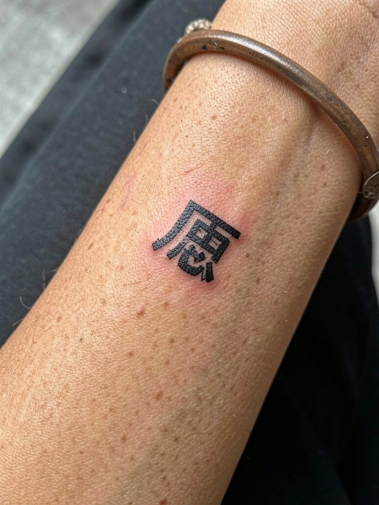
Outer wrist placements balance visibility and survivability. Opt for a slightly bolder stroke than the inner wrist to survive hands and sunlight. The main mistake is packing tiny serifs into a small glyph. Session time is short with mild to moderate pain. For accessories that show off the glyph, pick bracelets that sit below the mark instead of over it. A minimal leather cuff worn lower brings attention without covering the tattoo.
18. Curved '旅' on the Hip
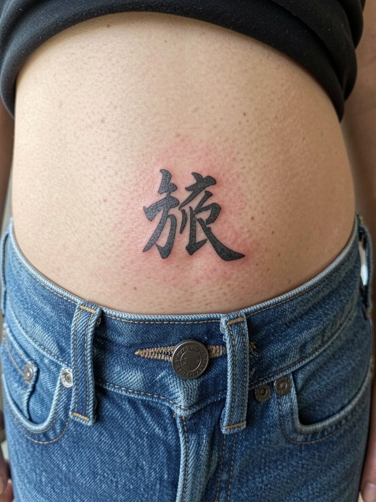
Hip characters are subject to friction from waistbands and movement. The mistake is placing characters under tight waistlines where repeated contact causes early fading. Keep a small buffer between the tattoo and the waistband. Session is moderate and usually short. For outfits that show it without rubbing, wear low-rise jeans or choose a high-cut bikini bottom with the waistband sitting below the piece.
19. Bold '成功' on the Outer Thigh
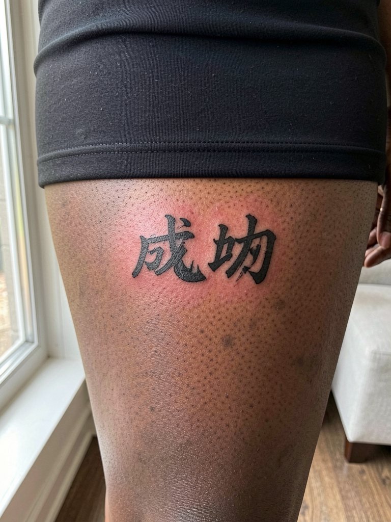
Outer thigh work gives room for expressive brush characters with low blowout risk. The main mistake is cramming too many flourishes into a block of text that will stretch with movement. Plan for an hour-long session and discuss how the characters will look while seated. For clothing that frames the piece pick skirts that end above the tattoo and complement the scale with A-line skirts.
20. Small '光' on the Back of the Hand
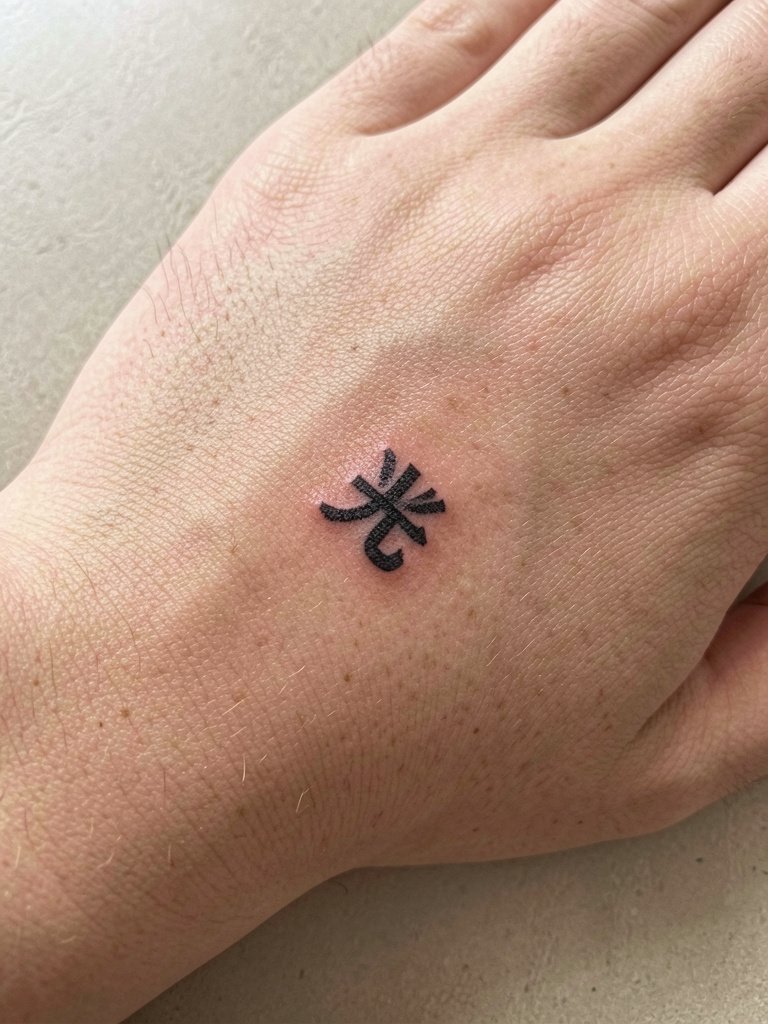
Hand tattoos fade fastest because of frequent washing and friction. If you want a hand character, choose bold, simple strokes and accept touch-ups will be frequent. The session is quick and painful, and the skin there heals differently than interior placements. Avoid ornate strokes that will break up with finger movement. For minimal interference, opt for gloves or patches while healing and show the piece with simple cuff bracelets that do not rest on the area.
21. Long Calligraphic '希望' Along the Forearm
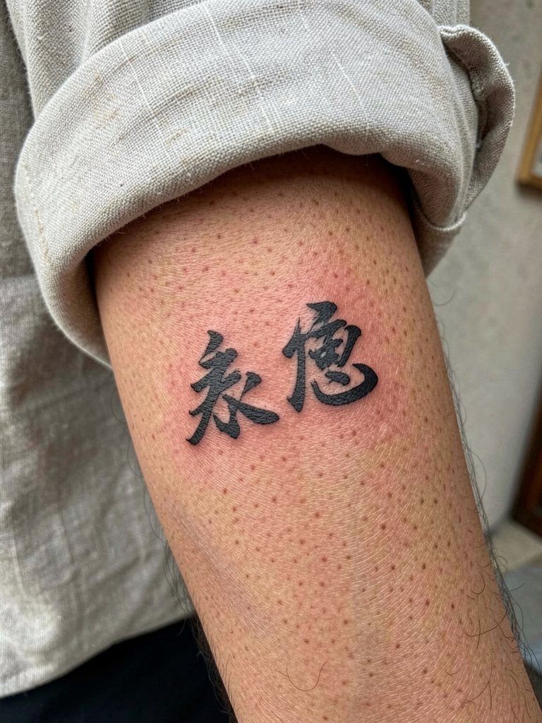
Forearm calligraphy is a reliable placement for multi-character phrases if strokes are spaced to account for forearm curvature. The common error is squeezing characters too close, which makes them illegible when the arm rotates. Plan for one long session and ask the artist to show a mockup at actual scale so you can see how it curves. For casual outfits that highlight the phrase choose rolled-up linen shirts that leave the forearm exposed.
22. Tiny '光' Under the Heel of the Foot
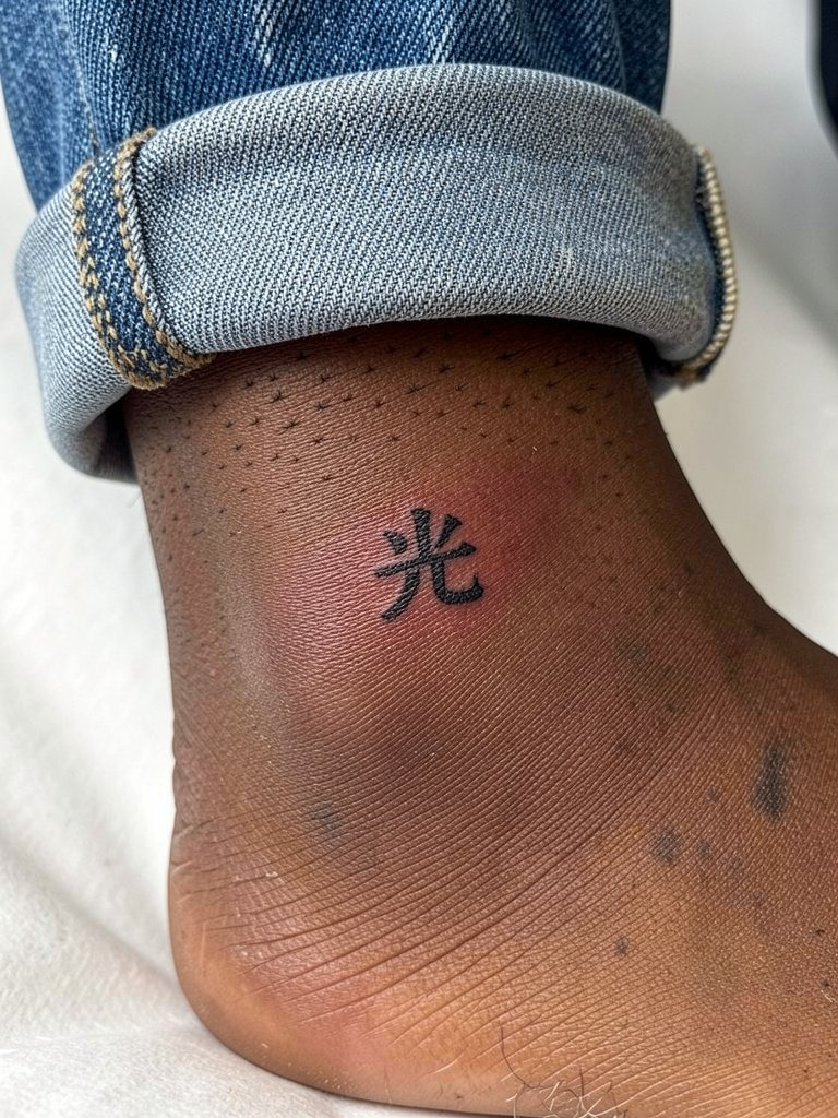
Foot placements face heavy wear and sun exposure. The common mistake is fine script that blurs under shoe friction. Expect a series of touch-ups and a slow healing window due to shoe pressure. For session comfort choose shoes that allow the area to stay dry and uncovered while healing. Show it off in summer with minimal slip-on sandals that keep the top of the foot visible.
23. Horizontal '誠' on the Inner Wrist
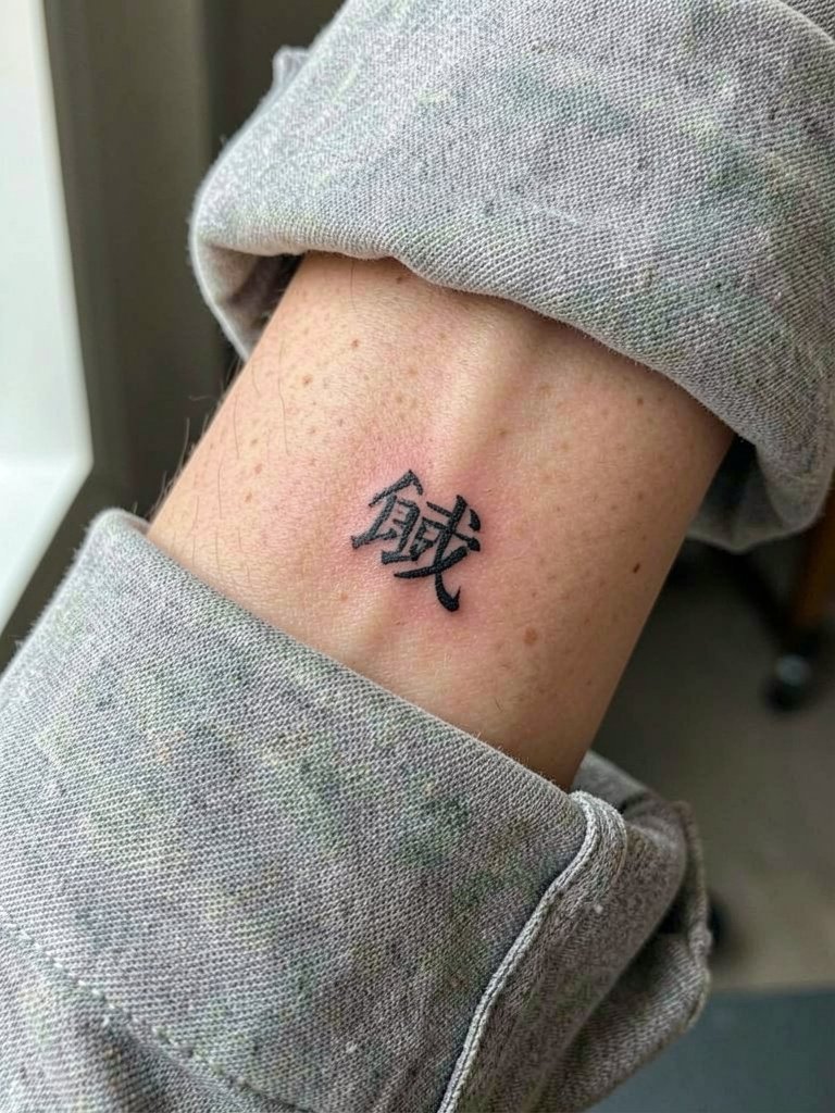
Inner wrist horizontal characters are delicate and visible. Increase line weight slightly over reference images so the glyph does not fade with frequent washing. The standard mistake is relying on hairline script for highly visible spots. The session is quick and moderately uncomfortable. Pair with a thin leather strap watch worn lower on the wrist so the tattoo remains unobstructed.
24. Framed '長寿' on the Lower Back
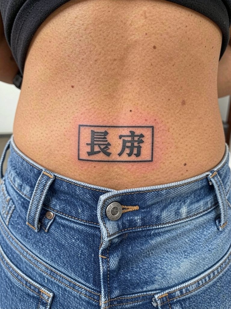
Lower-back framed characters are protected from sun but must avoid the waistband line. The primary mistake is positioning the bottom character so it sits under the waistband and rubs. Sessions usually complete in one hour. For outfits that reveal the piece choose cropped tops with high-waisted bottoms or a cropped tank that keeps the lower back visible.
25. Vertical '平' Along the Side Rib
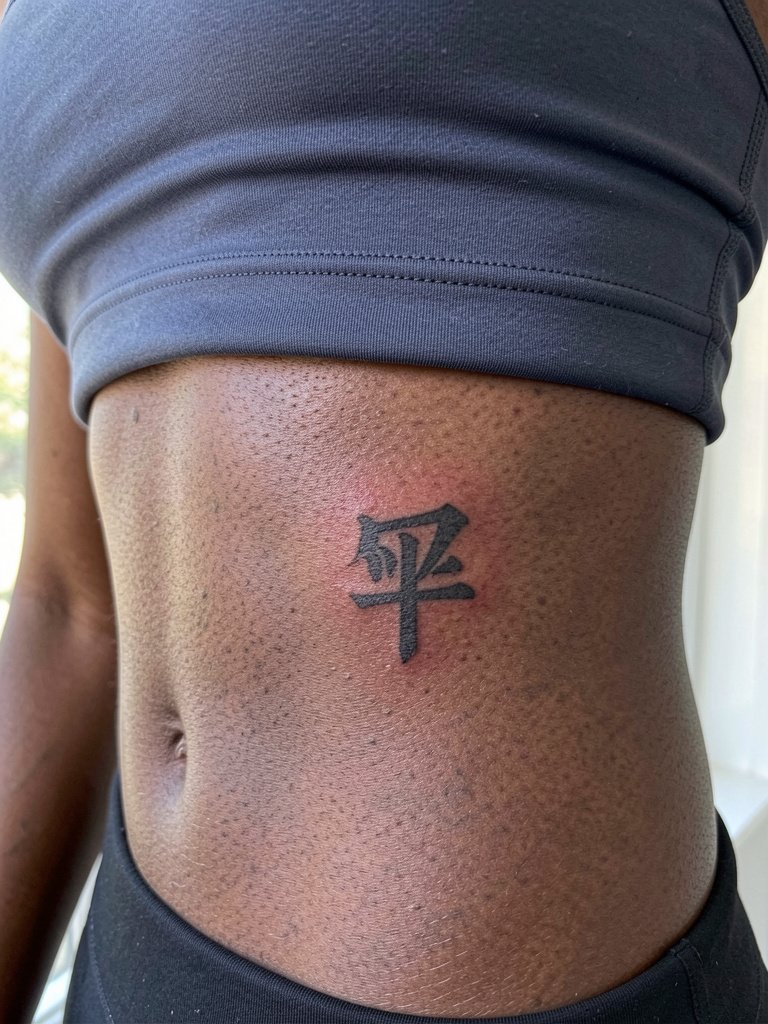
Side-rib characters need spacing that accounts for breathing and torso curvature. The mistake is using ultra-fine strokes that disappear with movement. Pain can be high and session time depends on complexity. Discuss how the glyph reads when you are standing and when you are bent over so sizing is correct. For healing avoid tight waistbands and choose loose underwear for the first two weeks.
26. Bold '夢' Across the Sternum
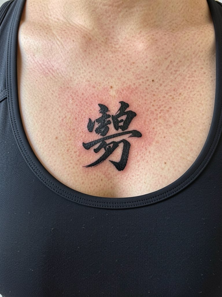
Sternum characters sit in a sensitive zone with variable skin tension. One camp warns about fine-line work there because of the interplay with breast tissue and movement. The other camp will do heavier line weight and spacing to compensate. Sessions can be uncomfortable and may need breaks. Discuss exact vertical placement relative to the bra line so the artist can avoid areas that get constant friction during healing. For revealing outfits choose a fitted bandeau or a supportive sports bra during the early healing phase.
27. Tiny '慈' on the Nape
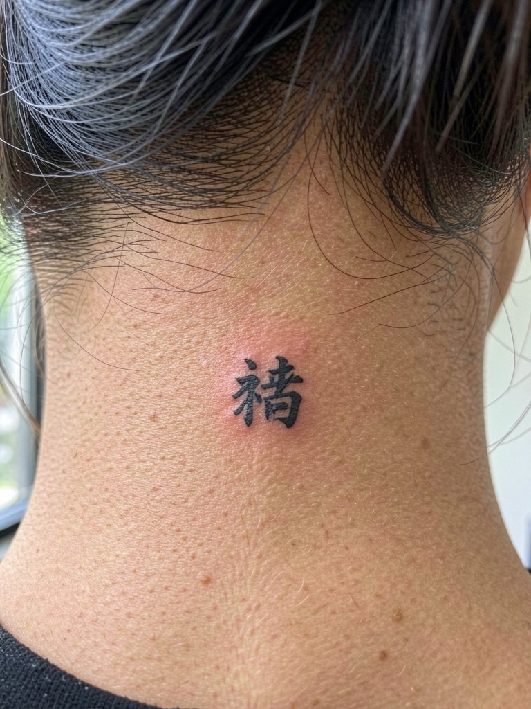
Nape characters are low on daily friction and age well, but they need clear placement relative to the hairline. The frequent mistake is letting the top of the glyph sit under the hairline where fading is uneven. The session is short and moderately sensitive. For display style choose hair-ups that expose the nape and pair with a lightweight scrunchie for casual updos.
Frequently Asked Questions
Q: How can I make sure a Chinese character is translated accurately before tattooing?
A: Verify meaning with at least two native readers and show the exact character glyph you plan to use. Bring a printed mockup and ask the artist to write the glyph at the tattoo scale so you can see stroke order and spacing. This reduces the risk of a mistranslation or a stylistic form that changes intended meaning.
Q: Is cultural appropriation a reason not to get a Chinese character tattoo?
A: People split into two camps on this. One group says using Chinese characters without cultural context can be appropriation and disrespectful, especially when the characters are chosen for aesthetics without understanding their history. The other group argues personal expression and cross-cultural appreciation are valid when the wearer approaches the symbol with research, permission when appropriate, and respect for its origin. Consider why the character matters to you and make a clear plan for respectful use.
Q: Which placements age best for single-character tattoos?
A: Thick, low-friction zones like the shoulder blade, outer thigh, and calf hold saturated black characters best over time. High-friction or high-movement zones such as the hands, fingers, and ankles need bolder strokes and realistic expectations for touch-ups. Expect a maintenance plan when choosing visible and high-wear placements.
Q: How do I find healed examples and portfolios without naming artists?
A: Search platform tags and location filters on social video and photo apps for healed examples using phrases like #ChineseCharacterInk and #HealedCalligraphy, and filter by city or studio tags to see local portfolios. Tattoo community subreddits and healed-photo threads are useful for comparing how different characters look over time on varied skin tones.
Q: What should I wear to the appointment for sensitive placements like ribs or sternum?
A: Choose fitted but removable garments that expose only the area the artist needs. For ribs and sternum wear a fitted sports bra or bandeau that sits in its normal position so the artist avoids constant fabric shifting. A fitted sports bra makes both access and modesty simple while keeping the tattoo area stable.