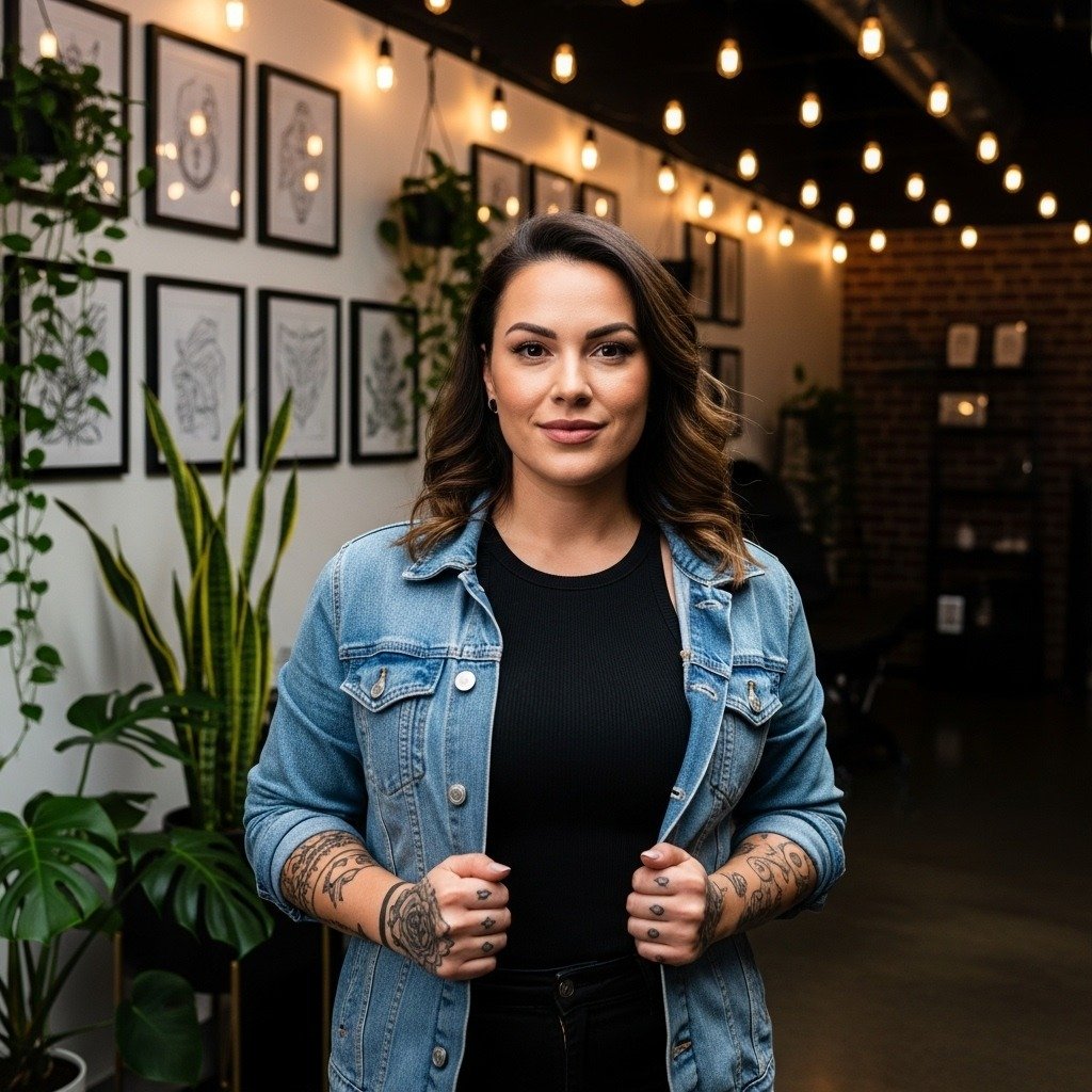
Sanskrit script often reads like sculpture on skin, but the pieces that stay crisp are not always the daintiest. Heavier single-needle work can blur quickly on softer skin, and cramped lettering will fill in even with flawless linework. Think about scale, spacing, and placement first so the syllables remain legible for years, and pick a style that suits how you move and dress.
1. Tiny Devanagari "ॐ" on the Inner Forearm
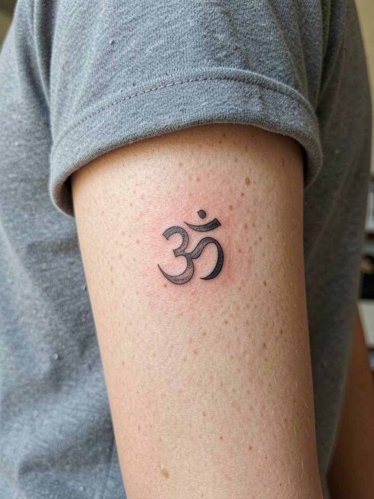
A palm-up inner-forearm "ॐ" reads clearly when scaled to three to five centimeters. I recommend a hair heavier lineweight than the thinnest single needle, because the inner forearm's texture softens detail over time. Bring a printed close-up of the exact Devanagari character so the artist matches the stroke terminals and the proportion between the loop and shoulder. The most common mistake is squeezing the symbol too small. At six months the linework looks crisp, at two years it softens a little, and a light touch-up around year three keeps the counterforms open. For showing it off, roll sleeves to a cropped cuff and pair with a delicate gold chain bracelet that frames the piece.
2. Small Lotus with Sanskrit Transliteration on the Collarbone
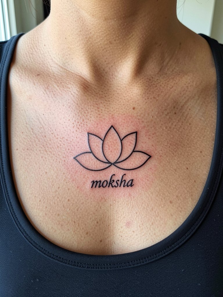
A small lotus below the collarbone works well as an elegant Sanskrit pairing when the transliteration is kept to one word. I prefer slightly bolder contour lines on this spot because the collarbone shifts with posture and tight single-needle script can fragment. Tell the artist the exact Roman-script spelling you want and ask them to sketch the letter spacing at three different scales. Collarbone pieces can feel tender during the session, expect short breaks and three to four hours for a crisp layout. For evenings out pair the piece with a scoop-neck silk blouse to expose the area without tugging at fresh skin. Be mindful of the lotus origin and acknowledge its cultural background when choosing motifs.
3. Geometric Yantra Between the Shoulder Blades
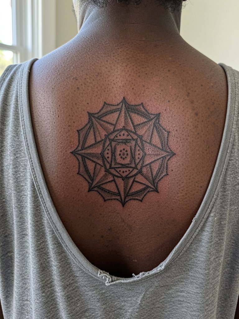
A symmetrical yantra centered between the shoulder blades survives well because the skin there is stable and not often rubbed. I suggest stipple shading for inner fills and bold radial lines for long-term legibility. Ask the artist to map the central point to your spine so the geometry reads even when you move. A common mistake is relying on ultra-thin spokes that blur into the fill after a year. Sessions for this area feel moderate in pain and usually take two to three hours for clean linework. For the appointment wear a loose tank top so the artist has clear access without fabric tugging. Respect the yantra's spiritual origin when adapting its elements.
4. Devanagari Mantra Band Around the Wrist
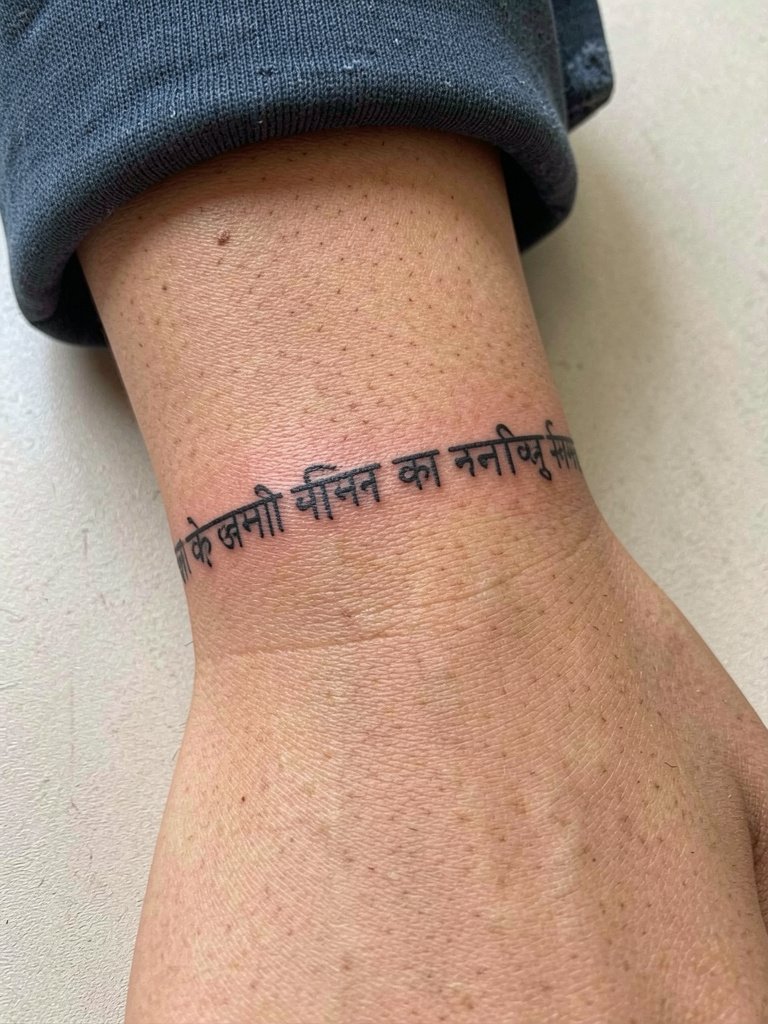
A wrist band in Devanagari is a visible choice that needs breathing room between characters. I often ask clients to increase kerning slightly so each glyph keeps its counters open. Wrist skin gets constant washing and friction, so expect the strokes to soften faster than on the forearm. The usual lifecycle is crisp at three months, softer at two years, then a touch-up keeps the script readable. Avoid wrapping the text too tight around the wrist or the ends will collide. For showing it off layer thin bracelets and a minimalist leather wrap that sits beside the band without covering the letters.
5. Tiny Mandala Behind the Ear
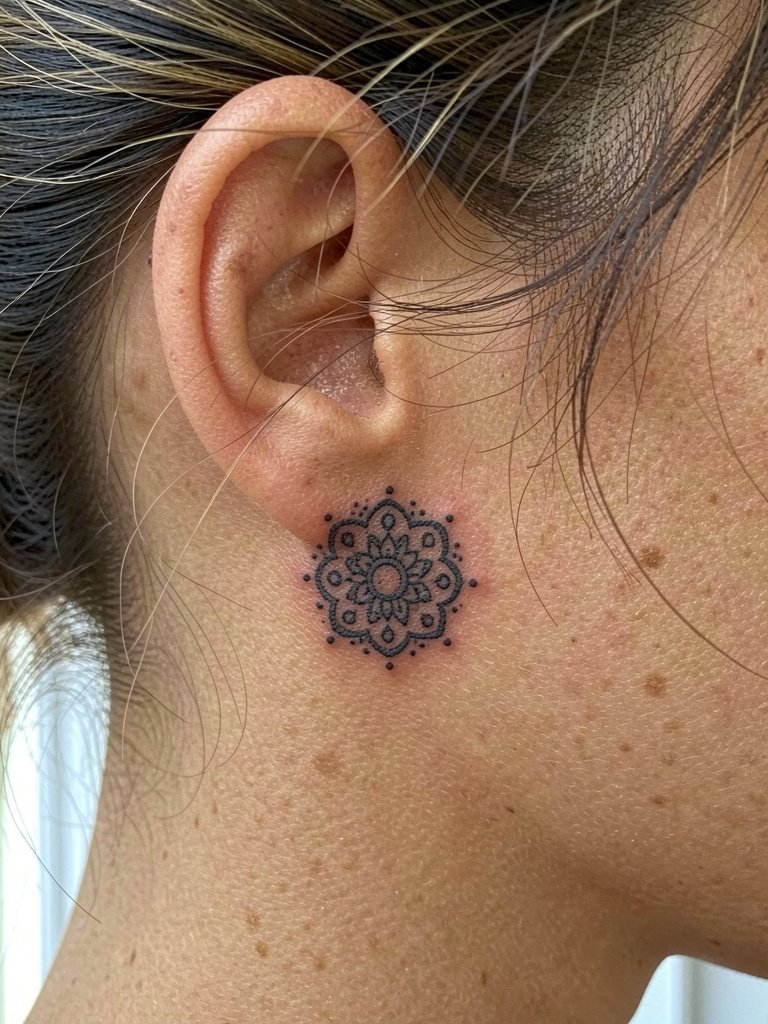
Behind-ear pieces are best kept simple because the canvas is small and mobility of surrounding tissue can blur fine detail. I recommend stipple shading in place of fine fill so the piece retains texture as it heals. Note that this placement requires an artist comfortable with tight zones and small needles. Sessions are short, often under an hour, but the skin there is tender. If visibility matters plan hair-ups confidently and pick discrete clips that reveal the area. A neat option is pairing it with decorative hairpins like metallic claw clips. Because of the placement seek an artist experienced with ear-adjacent work.
6. Vertical Chakra Column with Seed Syllables Down the Spine
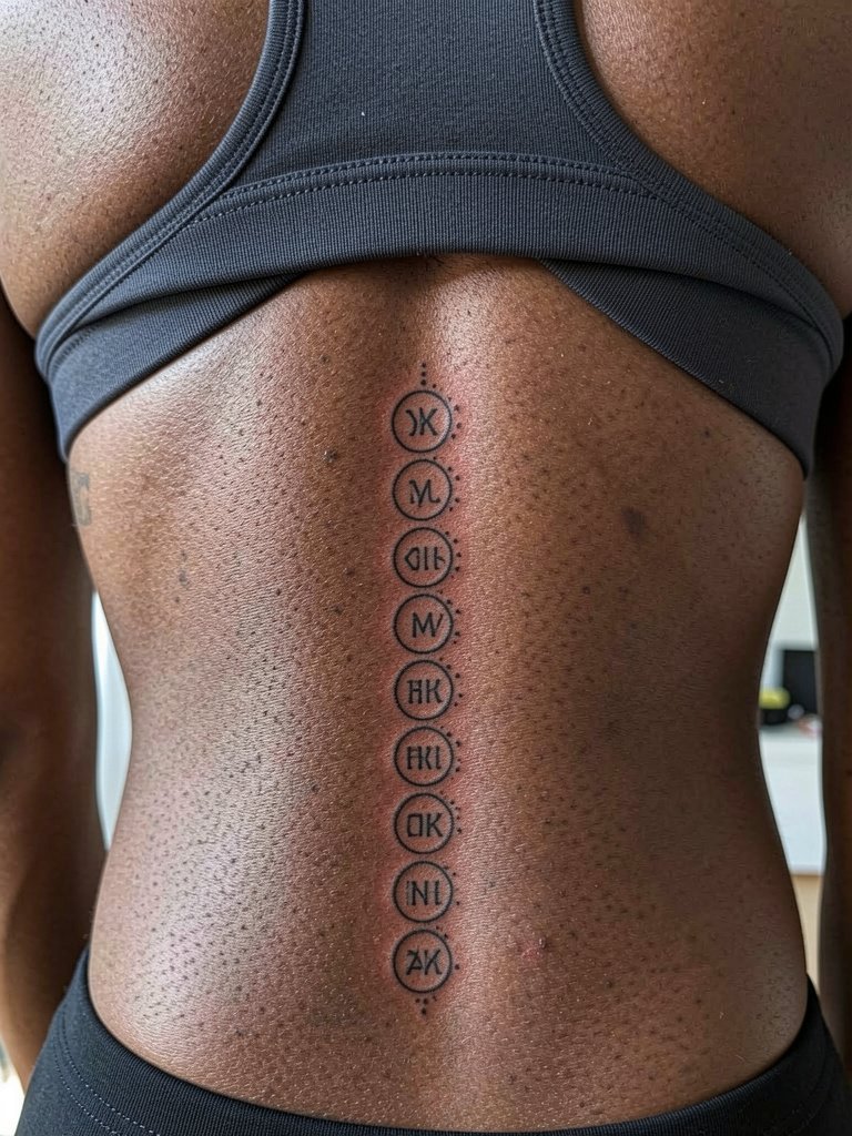
A spine column of seed syllables reads as a single vertical piece when spacing is even. I advise slightly larger circles around each syllable so the tiny letters do not merge into the adjacent dots over time. The rib adjacent movement can stretch the central panels, so plan for slightly wider separation there. Sessions can be split into two to three appointments depending on length and the client's pain threshold. Expect a six to eight month window before you see the settled contrast and a possible touch-up after a year. Respect the spiritual origins of chakra symbols when choosing which syllables to include.
7. Ankle Protection Sigil in Bold Blackwork
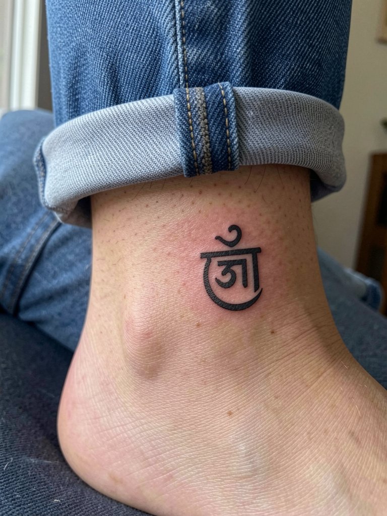
An ankle sigil benefits from bold linework because the area takes friction from socks and shoes. I favor solid black fills and thicker outlines rather than hairline strokes. Tell the artist to leave narrow margins between the sigil and the ankle bone so the edges do not blur into the natural creases. The session can be brief but the skin there swells easily during healing, so wear loose footwear for the first week. For styling, exposed ankles look sharp with cropped jeans or cuffed denim so the sigil sits above the hem. Avoid placing highly intricate text so close to the bone.
8. Long Flowing Mantra Along the Ribcage
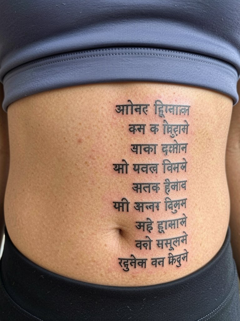
Ribcage mantras are visually beautiful but they spark debate in the tattoo community. One camp argues that fine-line scripts on the ribs blur and lose legibility within two years because the skin stretches with breathing and weight change. The other camp says that with slightly wider spacing and proper needle depth the same scripts can settle and hold for years, and they point to healed portfolios as evidence. Because of this split I recommend broader letter spacing and slightly heavier strokes for ribs. Sessions can be quite painful and sweaty. Plan for two sessions if the mantra extends across multiple ribs. Because it is a private area think carefully about how public you want the phrase to be, and honor the cultural origin of the text.
9. Side Neck Seed Syllable in Devanagari
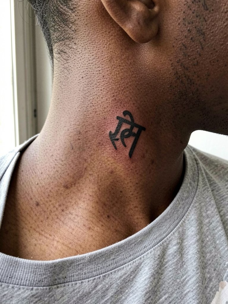
Neck placements need precise depth control because the skin is thin and movement is frequent. I recommend a compact syllable no larger than two to three centimeters and a slightly robust outline so the counters do not close up. For the session wear a wide-neck top that sits naturally so the artist can access the area without fabric tugging. A single-syllable neck piece reads best with minimal surrounding detail. Healing here is slower and touch-ups may be needed around year two. Note that neck tattoos are highly visible and require a professional who has healed examples on similar placements.
10. Bold Blackwork Calf Mantra
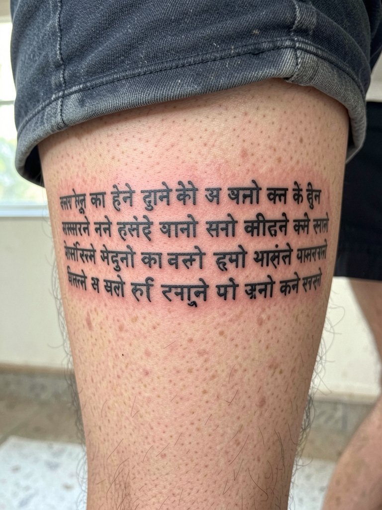
Calf pieces are sturdy and show saturation well over time, so bold blackwork is an excellent choice for longer phrases. I advise heavier strokes and solid fills rather than fragile script if you plan to keep the phrase legible without frequent touch-ups. Discuss the curvature of the calf with the artist and request a paper mockup wrapped naturally so the phrase does not twist when you stand. Sessions can be comfortable for most people and usually complete in one sitting depending on length. For showing it off pick ankle boots or shorts and a casual denim short that ends above the design.
11. Sternum Yantra Under the Breast
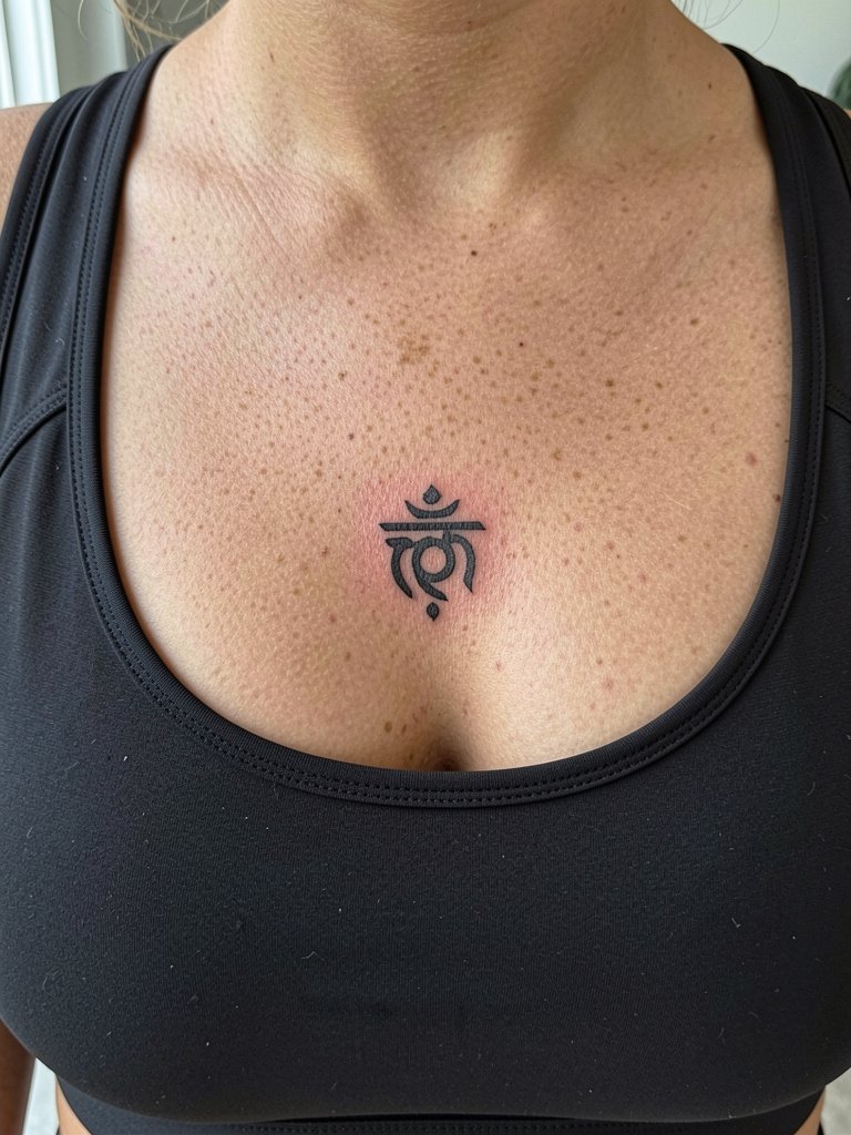
Sternum yantras require an artist experienced with central chest anatomy because the skin under the breast moves and can be sensitive during healing. Keep the design compact and ask the artist to mark the piece with the exact vertical placement so it does not drift toward the breast crease. Sessions are often painful and some artists prefer to book a single longer appointment. This placement calls for specialized aftercare and an artist who has healed sternum examples. Also acknowledge and respect the religious origin of yantras when choosing elements. For the session wear a fitted sports bra so the artist can access the sternum without fabric tugging.
12. Micro Devanagari Character on the Side of a Finger
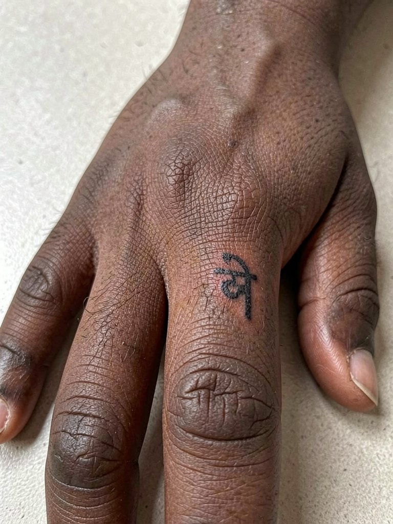
Finger tattoos fade and blur faster than most placements because of frequent washing and thin skin. For a side-of-finger character choose bold strokes and accept that annual touch-ups are likely. I tell clients to expect a gentle five to ten minute session per finger for placement and mapping and then another short pass for saturation. A common mistake is asking for micro curly terminals that disappear quickly. For accessories consider thin stacking rings that sit below the tattoo line. A set of minimal stacking rings pairs nicely and highlights the character without covering it.
13. Thigh-Length Sanskrit Line with Floral Border
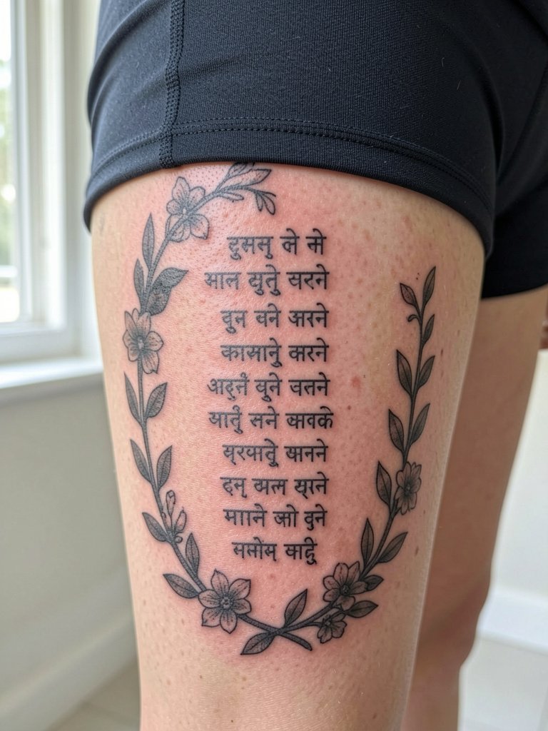
The outer thigh is forgiving for long Sanskrit lines because it provides wide, low-friction canvas real estate. I advise keeping the line height consistent and surrounding it with light floral shading so the phrase reads like a column. Ask to see mockups with the phrase at three different lengths to decide the scale that complements your leg. Sessions here can run longer but are usually well tolerated. The design ages predictably, with the border holding up longer than micro-script. For summer looks pair the piece with midi skirts or flowy dresses and a linen midi skirt that frames the artwork.
14. Seed Syllable Behind the Knee
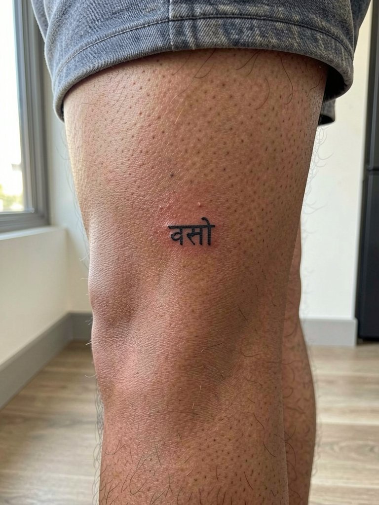
The area behind the knee flexes constantly and can distort tight lettering, so I prefer compact seed syllables with surrounding negative space. Communicate to your artist that you want a design that reads while the leg is straight and while it is bent, and ask for a mockup showing both poses. The session tends to be moderately uncomfortable because the skin is thin and sensitive. Keep expectations realistic: this location often needs a touch-up after the first year. For warm-weather shoes choose low-cut sandals that do not rub the area while it heals.
15. Shoulder-Mounted Circular Mandala with Tiny Script Ring
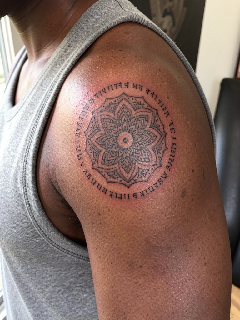
Upper-shoulder mandalas pair well with a thin band of script because the shoulder provides a stable, low-friction canvas. I suggest the tiny script ring be set slightly larger than you think so the letters do not compress when the shoulder moves. The most common error is packing too many words into the ring. Sessions are comfortable for most clients and usually finish in a single three- to four-hour slot for medium-sized mandalas. For showing the piece off wear sleeveless tops and fitted tank tops that reveal the shoulder without rubbing. Respect mandala origins and avoid mixing sacred geometry with unrelated cultural symbols.
Session Essentials
These five items help smooth early sessions and first-week healing for wrists, ankles, and fine-line scripts in the ideas above.
-
Stencil transfer paper kit. Lets you preview the linework and placement on skin before the first pass, which is especially helpful for the wrist band and forearm script examples above.
-
Topical numbing cream. Applied about forty-five minutes before and re-applied at breaks reduces session discomfort for ribcage or sternum work without impacting line quality.
-
Thin protective film roll. Keeps ankle and finger tattoos protected from friction during the first week when washing and daily movement are highest.
-
Fragrance-free gentle body wash. Cleanses healing areas without irritating delicate linework on forearms and neck.
-
Aquaphor healing ointment. A thin layer in the first couple of days helps retain moisture for fine-line pieces without clogging the needle channels.
Frequently Asked Questions
Q: How do I choose the right size for a Sanskrit script so it stays legible over time?
A: Think larger than the Instagram reference. I recommend mapping the phrase at your intended placement at three different scales and viewing each at arm's length. The rule of thumb is to widen spacing and slightly increase stroke weight for skin that moves or rubs often, such as ribs, fingers, and wrists.
Q: Are there cultural concerns with wearing Sanskrit phrases as tattoos?
A: Yes, two views coexist. Some people treat Sanskrit tattoos as respectful homage when the phrase is accurate and they credit the source. Others see non-native use as cultural appropriation, especially when sacred phrases are used casually. Be deliberate, learn the phrase's meaning, and avoid decorative truncation that strips the context.
Q: Where can I find portfolios and healed examples of Sanskrit work without naming specific artists?
A: Search tags and keywords on visual platforms with location filters to find nearby portfolios. Try searches like #SanskritTattoo, #DevanagariTattoo, and #HealedTattooShots while using city filters on Instagram and TikTok. Also browse tattoo community forums and portfolio sites that let you filter by script and healed photos to see how different placements age.
Q: How often should I budget for touch-ups on fine-lettering Sanskrit tattoos?
A: Expect a touch-up within one to three years for high-friction spots like fingers and wrists. More stable locations such as the upper shoulder or calf usually hold for longer and may only need a touch-up at the three- to five-year mark. Plan touch-ups into your long-term maintenance rather than assuming a one-and-done outcome.
Q: What should I wear to the appointment for a sternum or ribcage tattoo?
A: Wear clothing that gives the artist unobstructed access without adjusting garments during the session. For ribs and sternum a fitted sports bra or cropped athletic top works well. If you need aftercare-friendly options for post-session comfort consider soft, breathable pieces like a fitted sports bra.
Q: Do some artists refuse to do certain Sanskrit phrases or placements?
A: Yes, some artists decline work they feel is culturally sensitive or beyond their healed portfolio. Others avoid placements they know will age poorly for a client's skin type. If an artist hesitates, take that as a prompt to ask detailed questions about how they would adapt the design rather than pushing the original concept unchanged.