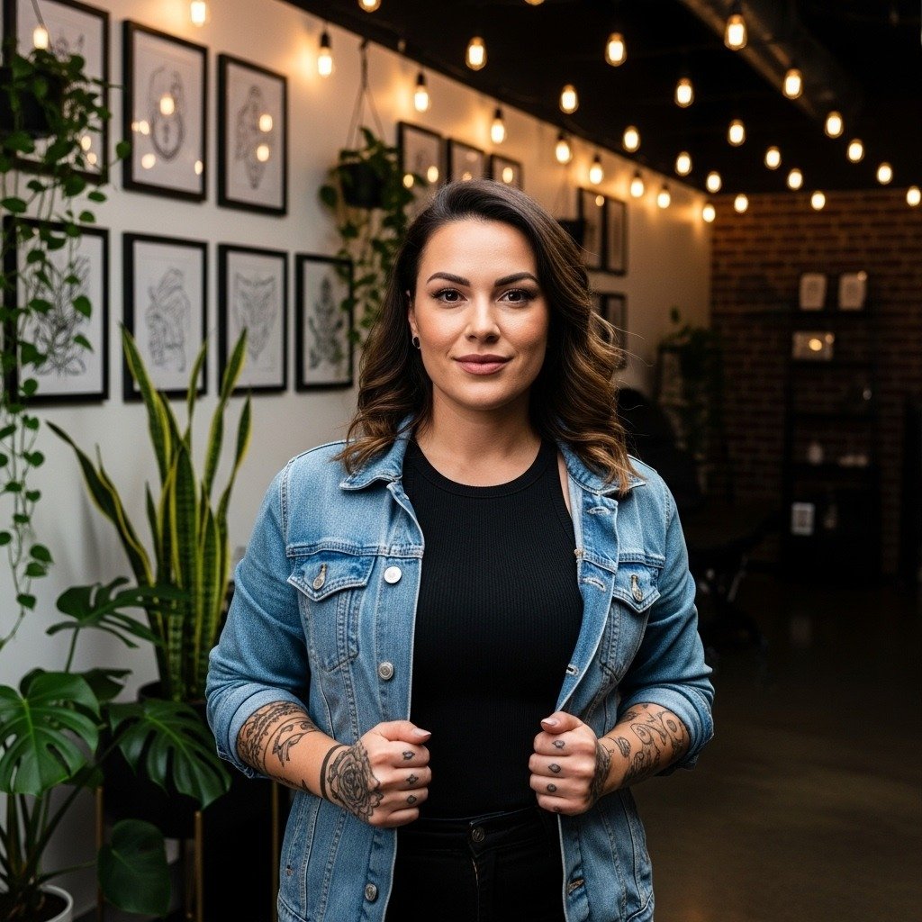
Someone I know spent six months saving references and still felt shaky at the consultation. The real question was not the image, it was how a sleeve would sit on moving skin and what would age well over five years. These 15 sleeve ideas focus on meaning and on practical choices that keep detail readable as the ink heals and the years pass.
1. Fine-Line Botanical Sleeve on Inner Forearm
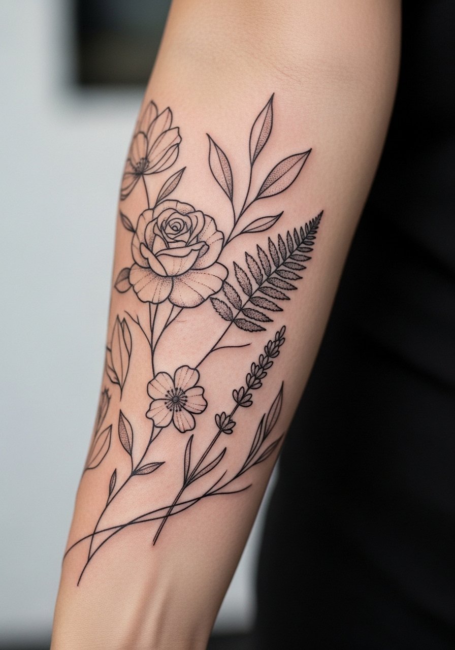
Someone I know first saw this style on a gardener's forearm and booked the same idea. Fine-line botanicals read like handwriting across the arm. Tell your artist you want slightly heavier contour lines where the design meets muscle so tiny details do not blur into a gray patch as the skin moves. Fair warning, the inner forearm is lower pain but the thin lines need room. A common mistake is shrinking motifs to fit the whole arm. Keep key elements larger and let filler leaves breathe. Expect a touch-up around year two to restore faint leaf veins. This suits someone who wants personal symbolism without heavy saturation.
2. Watercolor Celestial Sleeve with Soft Washes
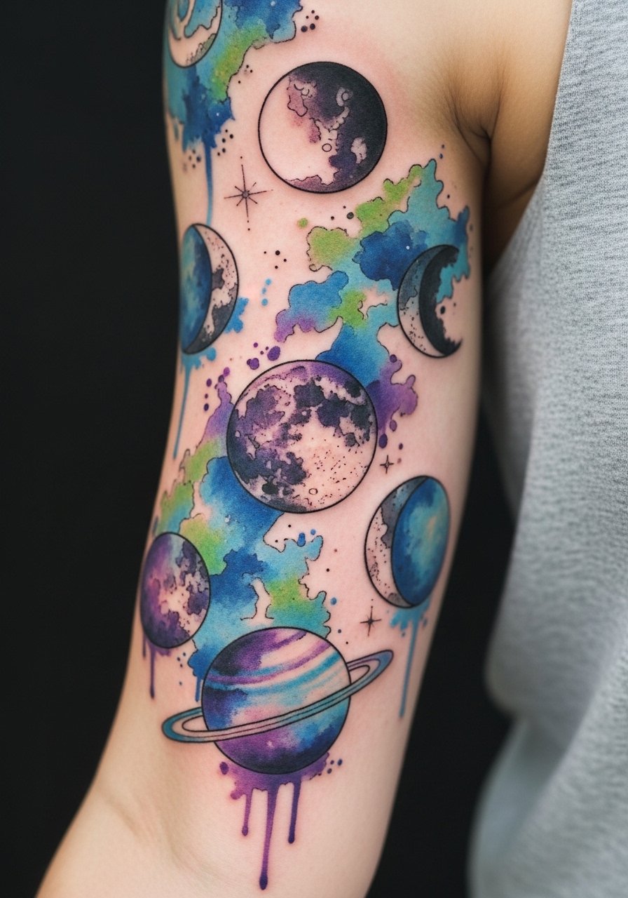
Most watercolor sleeves from five years ago look washed out now when artists overloaded the skin with color too close to the surface. This version places saturated elements behind thinner washes so the darker stars anchor the piece. During consultation ask for layering that prioritizes saturation near outlines rather than across the whole wash. Outer biceps feel like a four out of ten on the pain scale. Blowout risk rises when washes are applied too densely. If you want longevity, plan a two-stage session and expect lighter touch-ups at year three. Use constellations to map personal dates or life chapters.
3. Geometric Mandala Wrap That Follows Muscle Flow
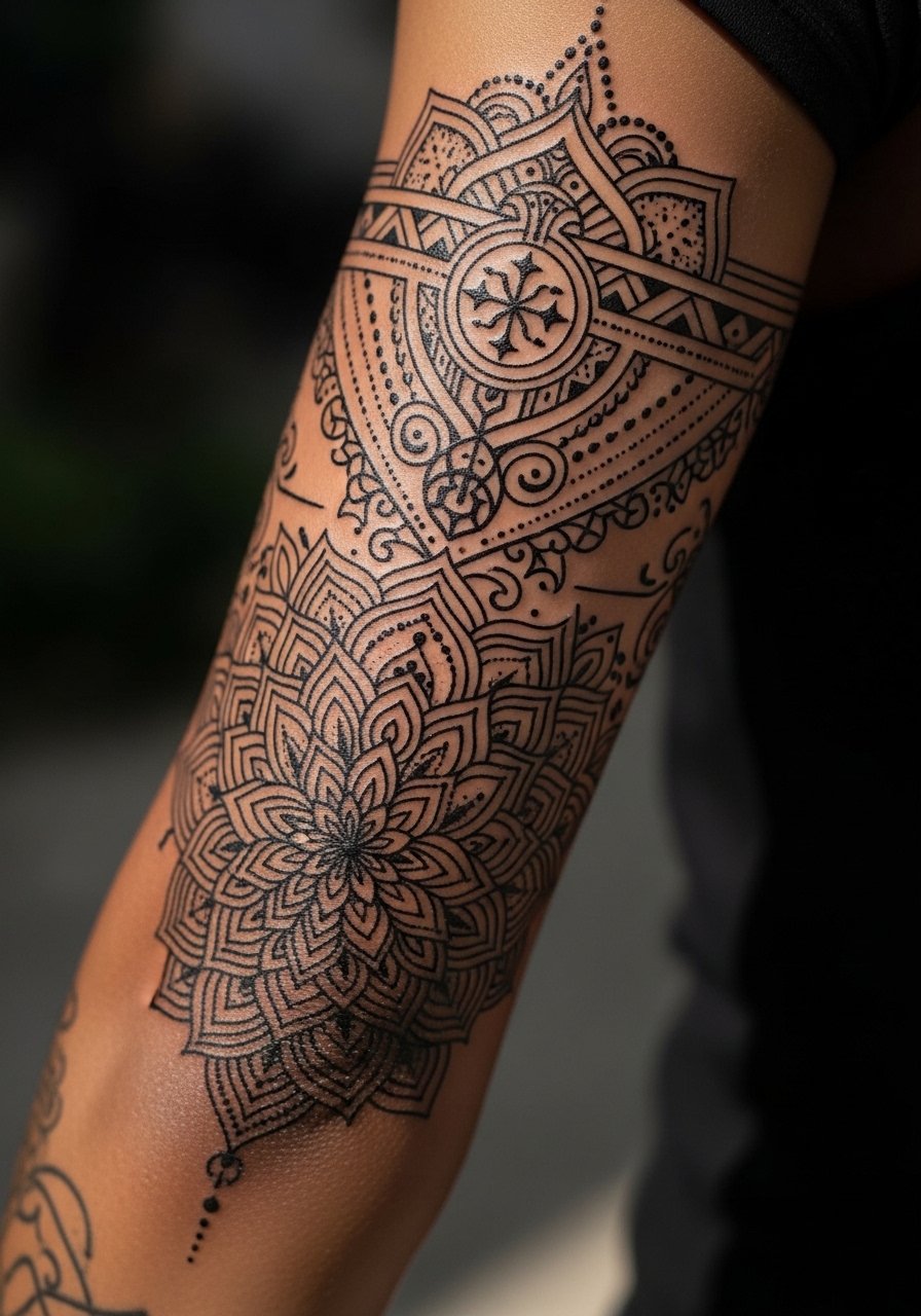
The biggest mistake with geometric sleeves is forcing a perfect circle across curved anatomy. This mandala follows muscle flow so the pattern keeps symmetry in photos and in movement. Tell your artist you want reference photos of similar placements and ask how they will map the piece with temporary stencils. The elbow area is high on discomfort and needs careful staging. Some artists argue for tighter line spacing for detail. Others warn that overly tight geometry will blur on softer tissue. Name both camps when you ask for a plan. Expect touch-ups along the most mobile seams at year two to three.
4. Blackwork Nature Sleeve with Bold Silhouettes
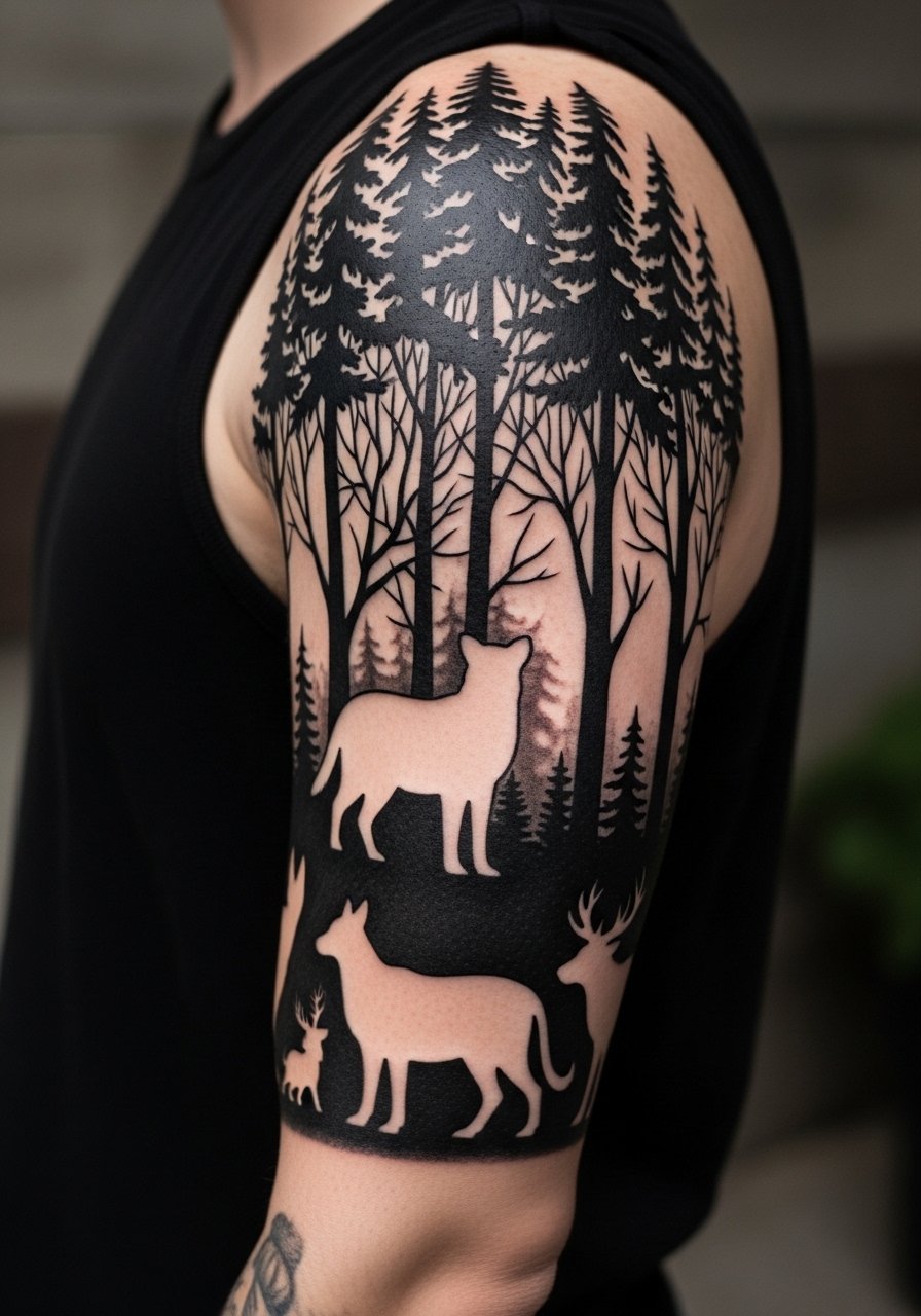
There is something about bold black silhouettes that reads from across a room and ages predictably. This blackwork approach uses heavy saturation for long-term contrast. Tell your artist you want solid fills with clean negative-space breaks so the piece does not turn muddy. Sessions will be longer but fewer, because saturation requires concentrated runs. On darker skin tones, solid black holds very well, but plan for slower sessions to manage swelling. A common mistake is adding tiny internal details inside large black fields. Those details vanish. Keep the silhouette clean and add texture via edge shapes if you want nuance.
5. Irezumi-Inspired Sleeve Respecting Cultural Roots
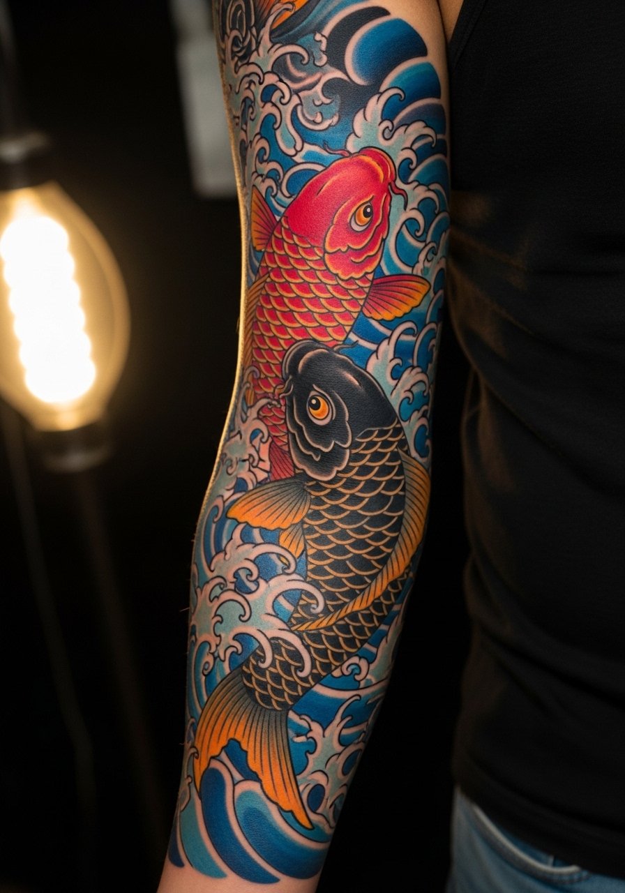
This tradition traces to Japanese craftsmanship, so many people choose motifs with personal tweaks rather than direct replicas. One sentence note on origin respect. When you book, say you want elements inspired by the tradition and ask how the artist plans to avoid iconography that carries sacred meaning. Expect multiple long sessions because the style uses layered saturation and bold outlines. Artists split on strict adherence. One camp prefers faithful motifs with full backgrounds. The other suggests adapting symbolism to your life. Be explicit about which approach you prefer and bring placement references. Touch-ups are typical at year three for color refresh.
6. Micro-Realism Memorial Sleeve with Portrait Panels
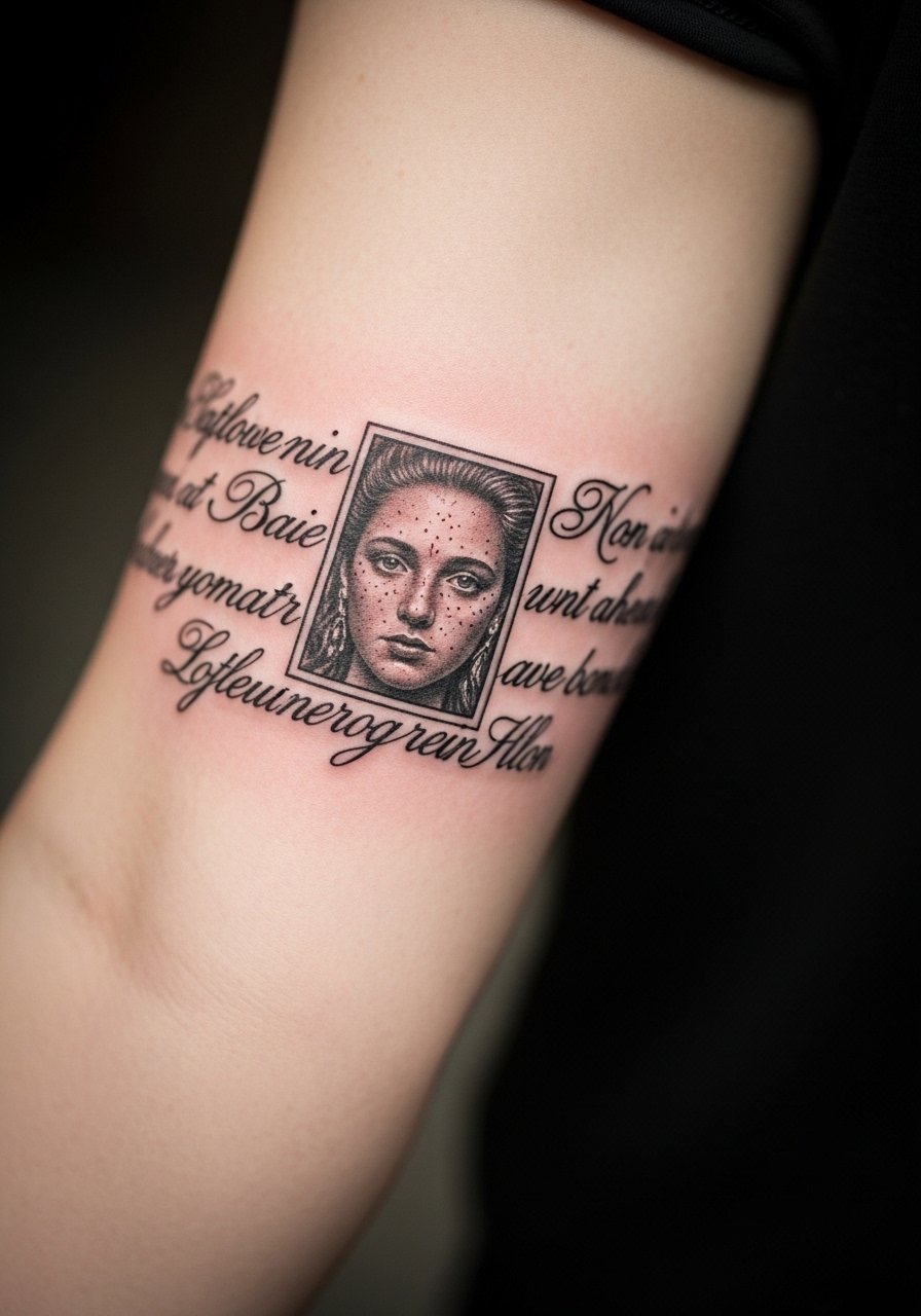
If you want a sleeve that reads as a living photo album, micro-realism portraits anchor panels with softer backgrounds between them. In consultation specify which features must be recognizably accurate so the artist focuses contrast there. The inner arm and ribcage can distort portraits, so I recommend chest or upper arm placements. Portrait sessions are intense and detail-oriented. A mistake is requesting multiple tiny portraits jammed together. Let each portrait breathe and use neutral filler to separate emotional anchors. Expect a touch-up within two years for hairline details and fine highlights.
7. Lace and Filigree Sleeve for a Feminine, Structured Look
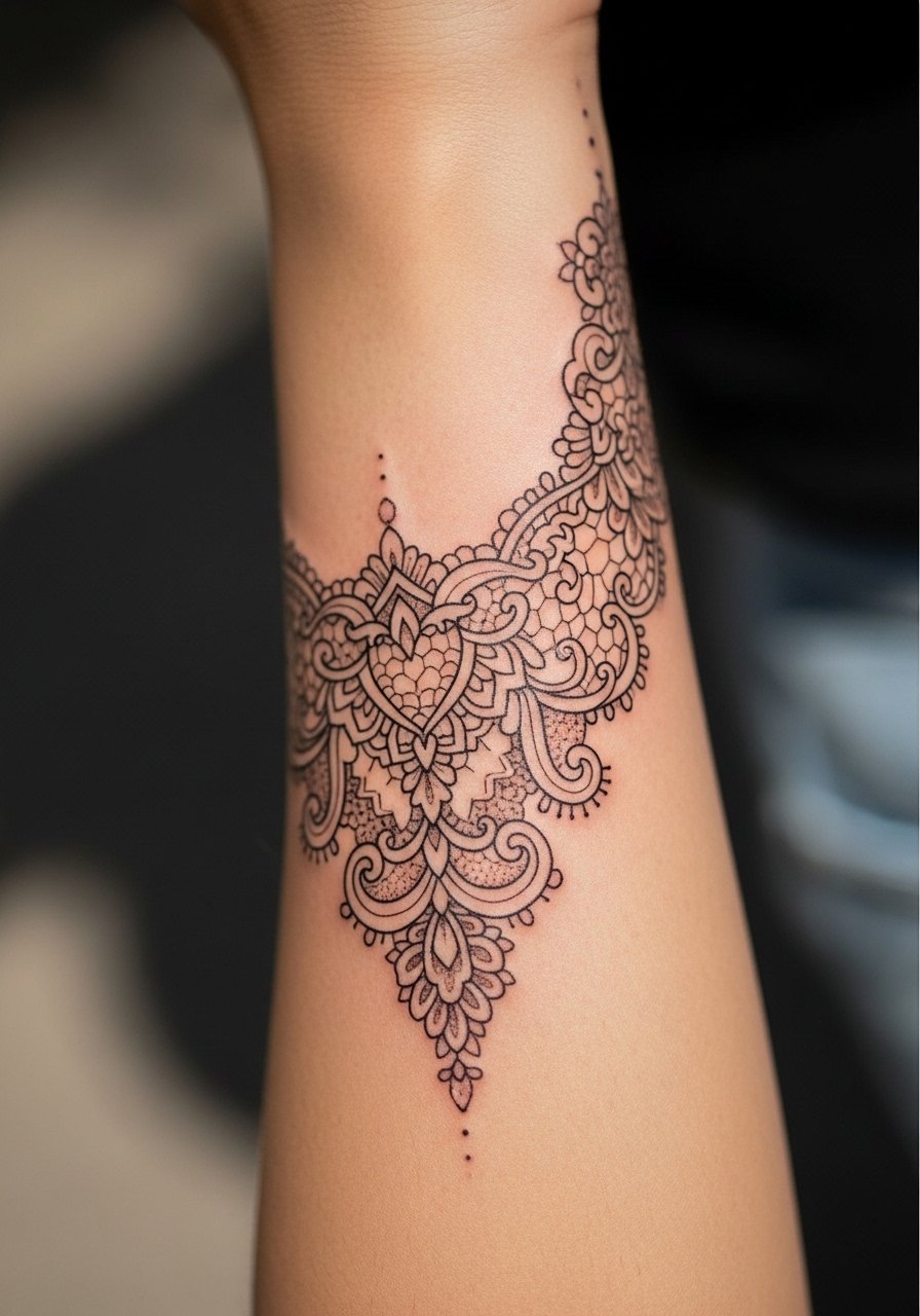
When done right, lace work reads like fabric on skin and keeps meaning through heirloom motifs such as family crests woven into the pattern. Tell your artist which parts you want dense and which parts you want airy. The wrist and hand areas carry higher blowout risk and are more visible to employers. One sentence note about professional considerations. A frequent error is over-detailing the wrist with lines that will blur. Let filigree breathe and expect lighter touch-ups along the most exposed bands after a couple of years.
8. Phoenix Sleeve Symbolizing Renewal with Bold Color
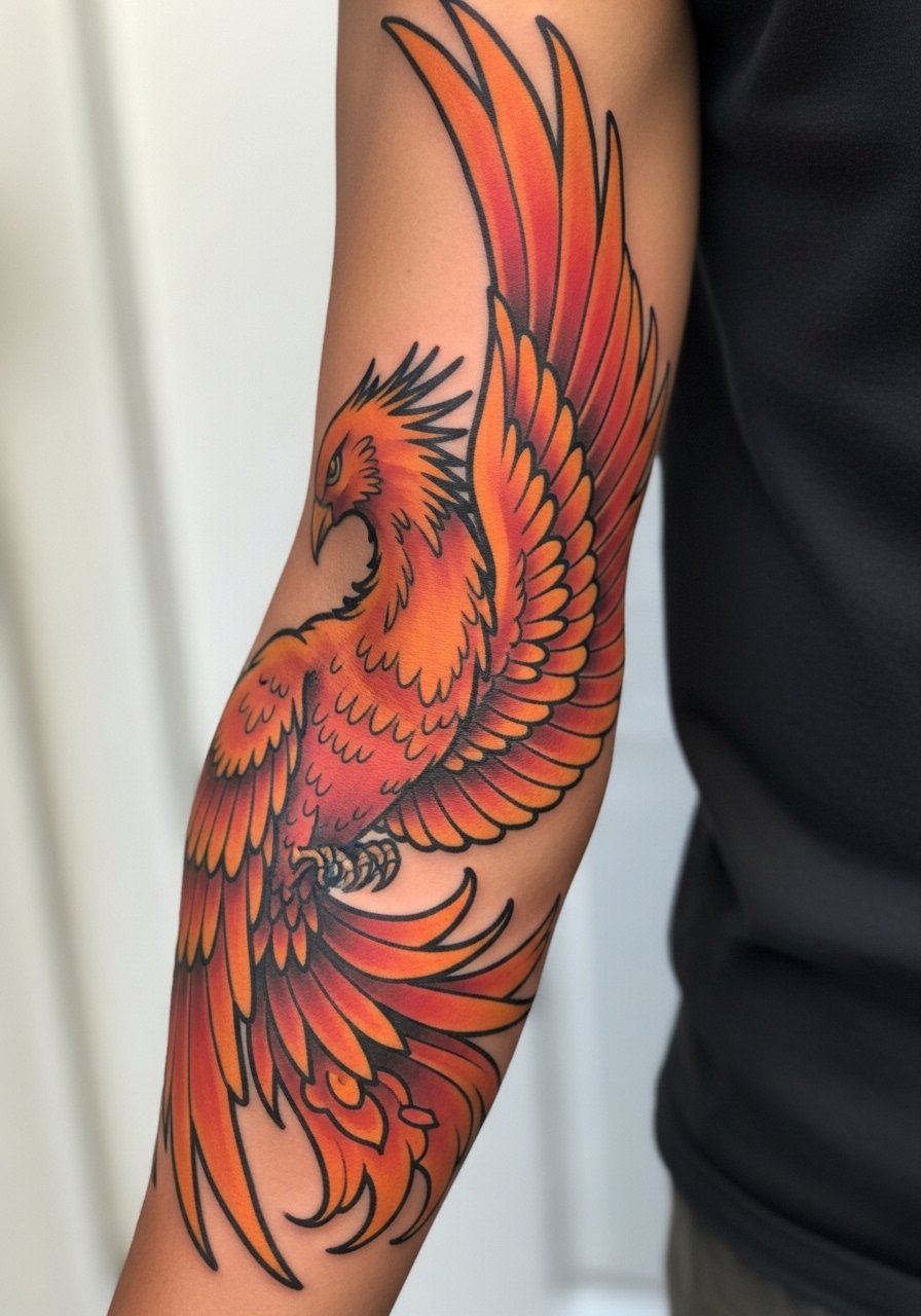
There is a practical reason phoenix designs stay popular. They give room for dramatic composition while carrying personal stories of change. When you consult, bring the life event you want the bird to represent so the artist can place the flames around existing scars or tattoos for narrative flow. Color fades predictably on high-sun areas. Plan sessions in winter to avoid heavy sun exposure during healing. A common mistake is choosing tiny feather detail that becomes indistinct. Make wing forms larger and expect a color refresh at year three to restore vibrancy.
9. Starmap and Coordinates Sleeve That Maps Life Moments
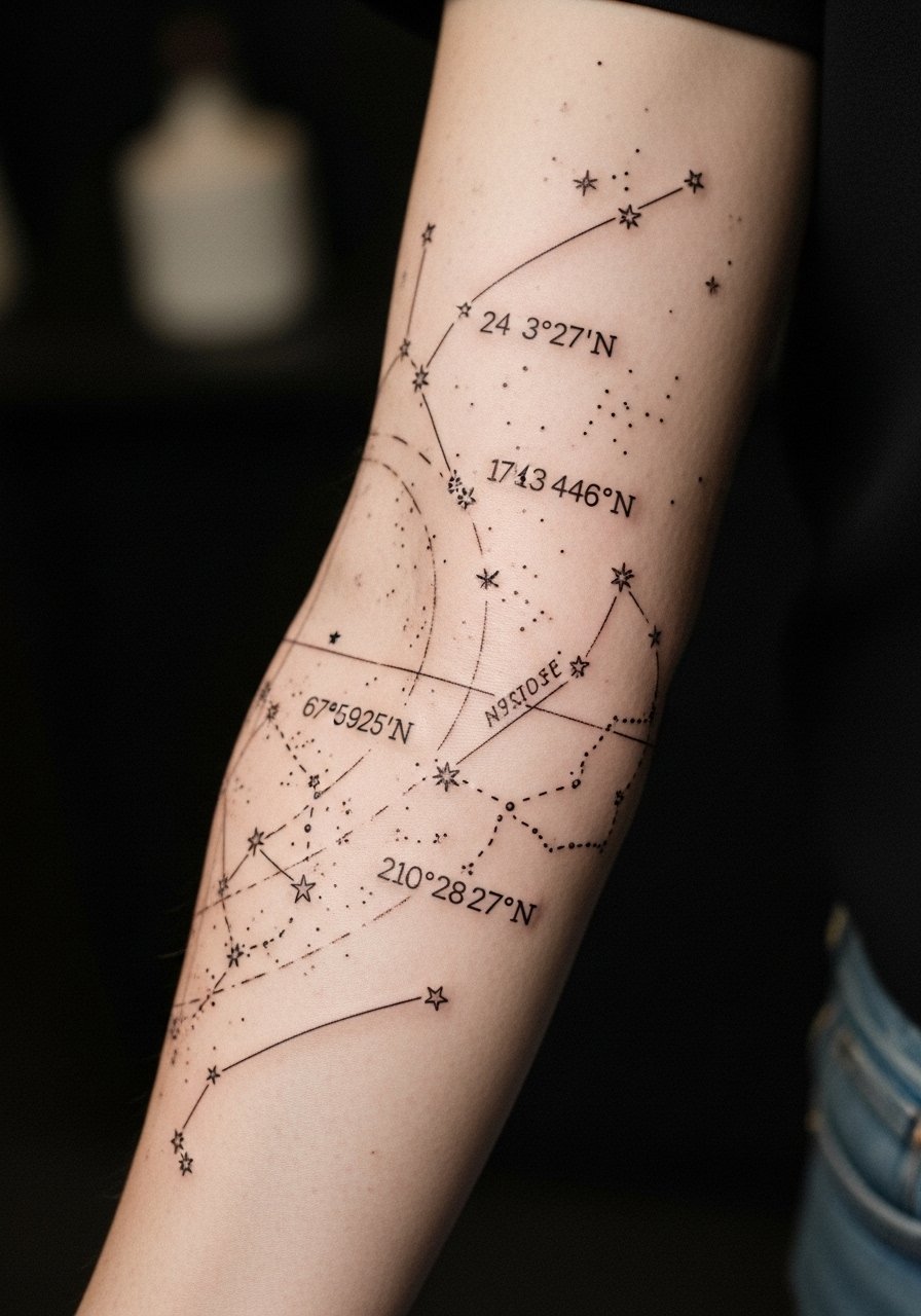
Coordinates and star charts make sleeves feel like a private map. When including text specify exact formatting. For example, list coordinates as "41.4025 N, 2.1743 W" so the lettering generator renders clean characters. The inner bicep is lower pain but watches movement. A common mistake is using tiny script with close letter spacing. Use slightly larger type to stay legible after two years. If you want the sleeve to double as a discreet personal ledger, place coordinates along bones or natural seams for longevity. Touch-ups for thin script usually come at year two.
10. Mythological Creatures Sleeve Blending Symbols
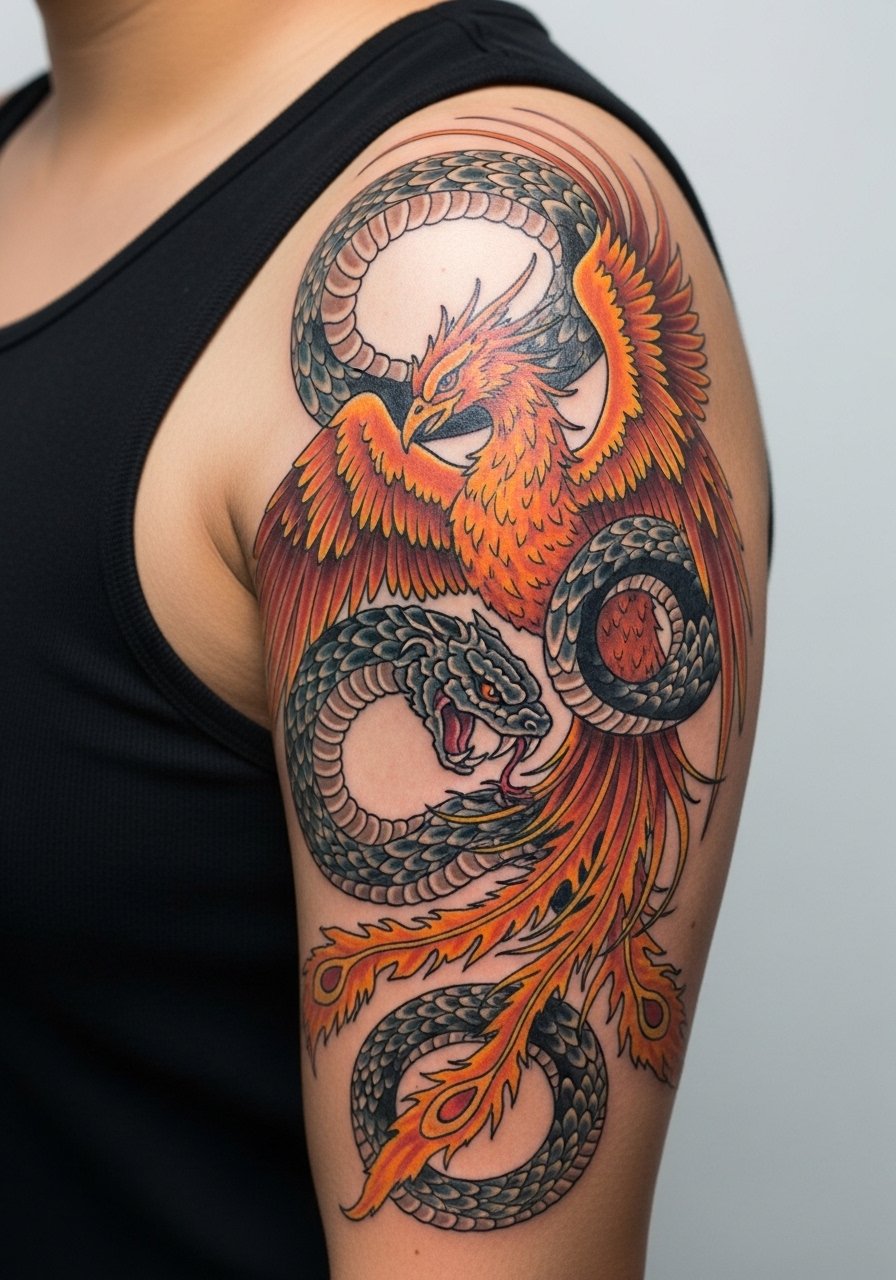
A sleeve that mixes mythic animals can tell a life story in scenes. Start the consultation by explaining which traits you want each creature to represent so the artist crafts interaction rather than random placement. Shoulder and upper arm sessions can handle larger compositions in two or three sittings. A typical error is asking for too many creatures without negative space. Let focal pieces dominate and use subtle fillers like clouds or foliage to separate narratives. Expect heavier saturation near outlines to keep icons readable at five years.
11. Botanical Sleeve with Insects and Pollinators
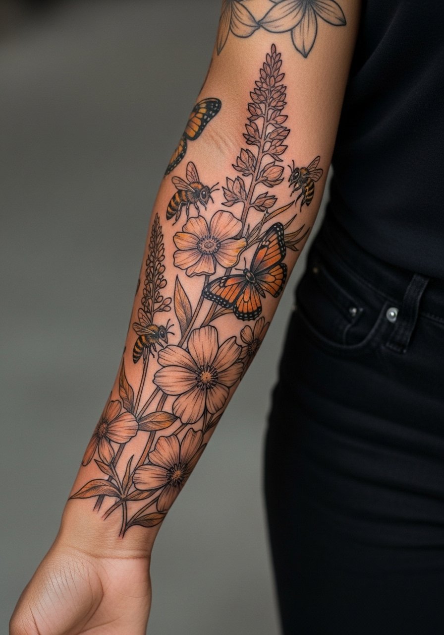
I recommend this when your meaning ties to growth or community. Ask the artist to scale pollinators slightly larger than life for detail retention. Forearms are friendly for photographing your sleeve but beware that busy stems can blur if they are too thin. One practical tip is to let the insects carry most of the contrast. A frequent mistake is drawing tiny wing veins that disappear. Plan on a touch-up timeline of two to three years for fine line highlights and antennae. If you want realism, bring clear reference photos that show wing texture.
12. Compass, Map, and Travel Sleeve with Mixed Media Look
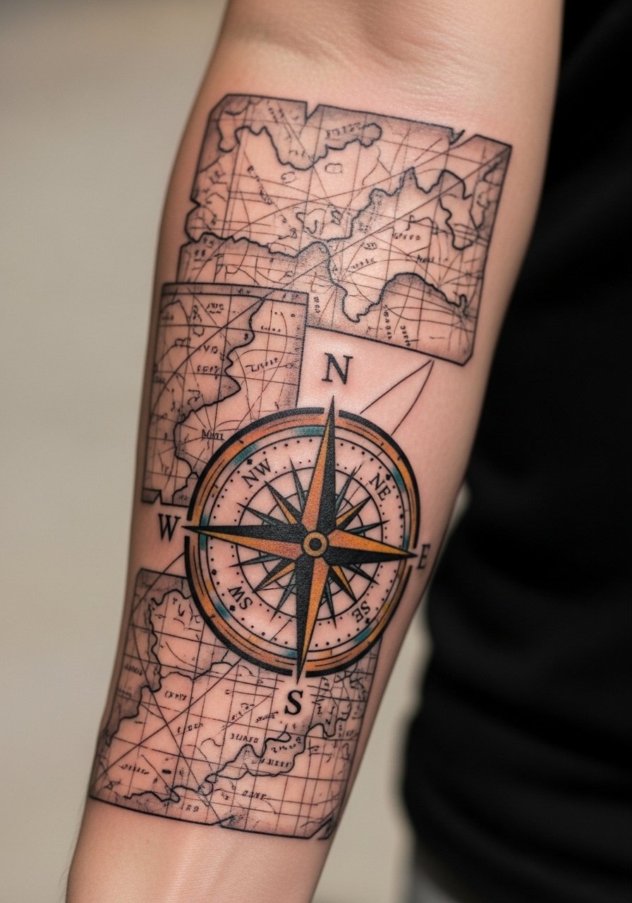
The visual pull of travel sleeves is in layered storytelling. Use the map panels for dates and places. During consultation say whether the map should read aged or modern so the artist chooses color temperature and edge treatment. Outer forearms take sun so maps will fade faster there than on inner arms. A common mistake is overloading a sleeve with small icons that compete. Reserve three to five travel markers and use negative space between them. Expect a color and line refresh around year three depending on sun exposure.
13. Abstract Watercolor with Dot Work Transitions
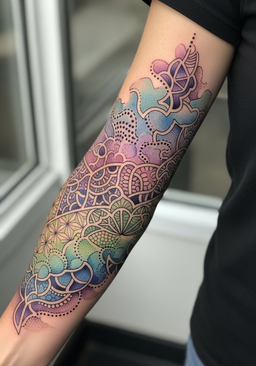
Some artists lean hard into blended washes. The version that ages best anchors washes with dot work edges so areas do not migrate. Tell your artist you want stipple-defined borders between color fields. The elbow sits on a joint and can distort washes, so expect the most fading there. A mistake is relying solely on watered ink without any dark anchors. Add small dark elements to preserve depth over time. Touch-ups for watercolor styles are more common and might be needed at year two for color balance.
14. Animal Totem Sleeve Featuring a Wolf and Stag
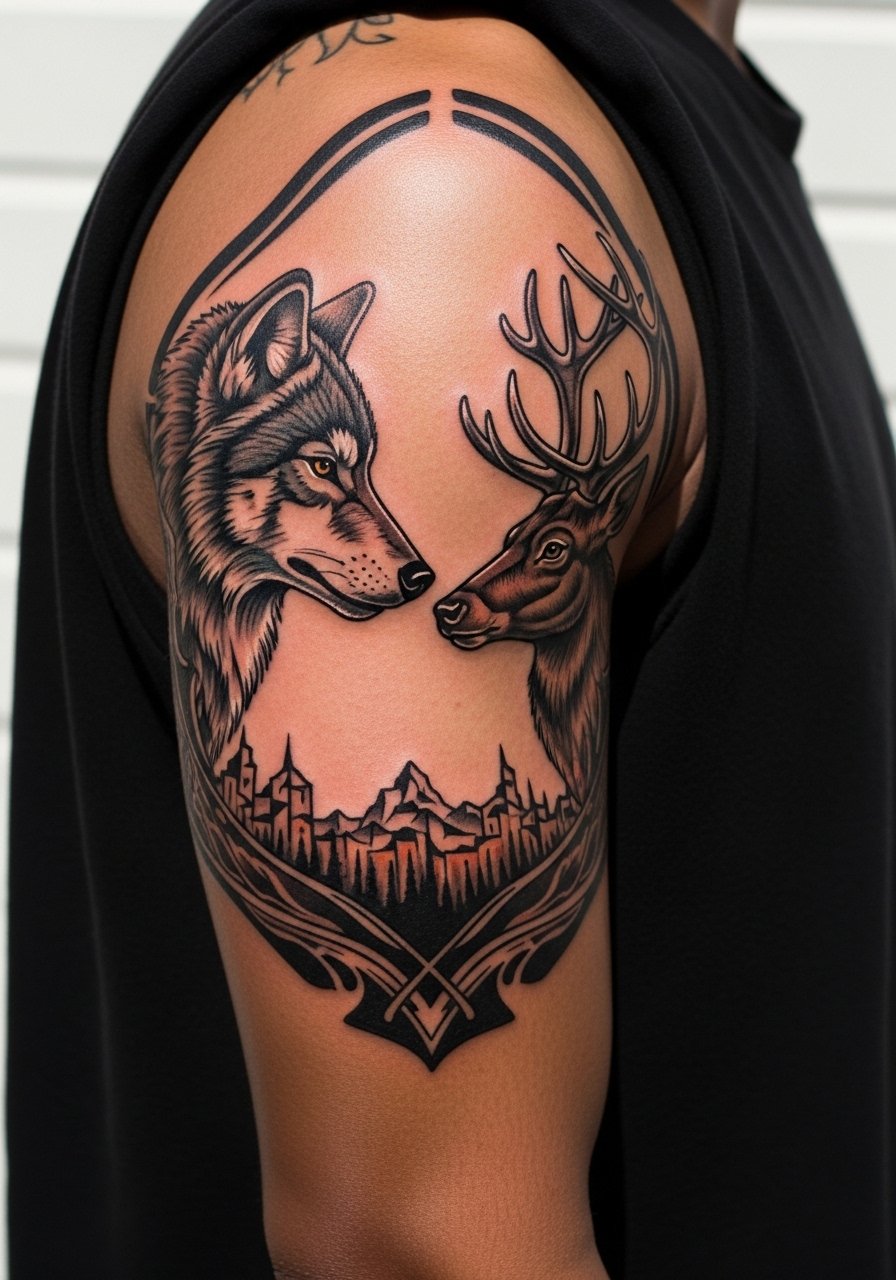
If your sleeve is about kinship or strength, choose animals whose interactions tell the story. During consultation specify which animal takes visual precedence and whether you want realism or stylized forms. Shoulders handle larger animals well and create a dramatic silhouette. A common error is packing both animals at identical scales which flattens the composition. Vary scale intentionally and use negative space for separation. Expect touch-ups where fur highlights catch the light most, typically at year two to three.
15. Transformational Cover-Up Sleeve That Reframes Old Ink
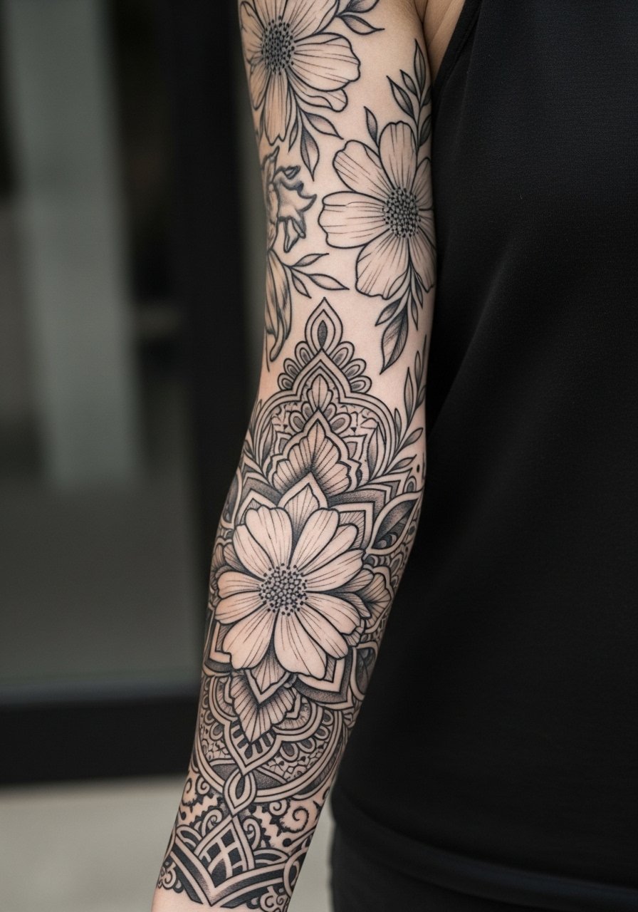
Cover-up sleeves require different planning. When you sit down with your artist, bring photos of existing ink under daylight and explain which parts are non-negotiable to hide. Tell them if there are scarred areas so they can recommend saturation or patterning that masks texture. One mistake is asking for a delicate style over old, dark fills without accepting that heavier blackwork will likely be needed. Sessions tend to be longer and staged to test how the cover settles. Expect multiple touch-ups as new layers knit into old ink.
Tattoo Prep and Aftercare Essentials
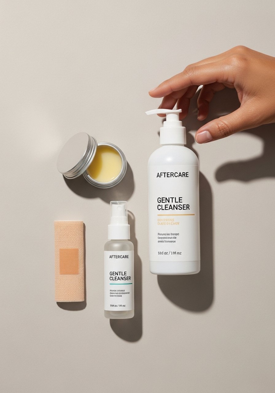
Before the needle and after it heals are both important. Here is a compact shopping list organized by when to use each item and why it matters. I include several lesser-known products and one mainstream option for broad availability. When shopping search the exact phrase in parentheses to find options that match your needs.
Fragrance-free gentle foaming cleanser (gentle+foaming+tattoo+cleanser). Use for the first few days to remove residue without stripping the skin. Gentle foams rinse clean and reduce the need to rub.
Lightweight fragrance-free balm for daily moisturizing (lightweight+fragrance-free+tattoo+balm). Apply sparingly to avoid clogging pores. Good for keeping lines supple during the first month.
Medical-grade second skin bandage, single-use sheets (medical-grade+second+skin+bandage). Useful for overnight protection during heavy sweating or in hot climates. Follow your artist on timing for how long to use.
Breathable tattoo aftercare ointment from a lesser-known indie brand (tattoo+aftercare+balm+indie). These thinner formulations absorb faster and reduce surface shine while keeping skin hydrated.
Fragrance-free mineral sunscreen for long-term protection (fragrance-free+mineral+sunscreen). Use once skin is fully healed to protect saturation and linework from UV breakdown.
Soft, breathable compression sleeve for sleep or travel (soft+breathable+compression+sleeve). Keeps new work covered during flights or hours of sitting.
Silicone scar smoothing sheets or strips, small size (silicone+scar+sheets+small). If you have scar tissue under new ink, these can help even texture after healing.
Alcohol-free cleansing wipes for spot cleaning while out (alcohol-free+cleansing+wipes). Handy for brief cleanup after workouts in the first week.
Aquaphor healing ointment for targeted dry spots (Aquaphor+healing+ointment). Use this mainstream option sparingly on stubborn dryness only if your artist approves.
Every tattoo is different. Always follow your artist's specific aftercare instructions. Consult a dermatologist if you have skin concerns or unusual healing issues.
Frequently Asked Questions
Q: Will fine-line botanical details blur together if I get a full sleeve?
A: It depends on scale and placement. Fine lines need space between motifs and slightly heavier contouring at key edges to hold up. Ask your artist to scale the smallest leaves to at least three to four millimeters of clear linework so they stay distinguishable after a couple of years.
Q: Do watercolor-style sleeves need different aftercare than blackwork pieces?
A: The basic steps are the same, but watercolor sleeves often need gentler drying and more frequent, light moisturizing to stop scabbing from pulling pigment. I recommend avoiding heavy ointments that can trap moisture and flatten washes unless your artist asks for it.
Q: Why do geometric mandalas fade faster on some people and not others?
A: The skin type and where the mandala sits both matter. Softer tissue such as the inner bicep or areas with frequent friction will soften the edges faster. Also, tiny line spacing invited to create detail may blur. Ask your artist to test line spacing with a small flash area if you are worried.
Q: How should I find an artist for a culturally rooted sleeve without causing offense?
A: Use discovery pathways like tattoo convention lineups, credible shop directories, and community forums to find artists who show respectful adaptations in their portfolios. Bring clear conversation points about which elements are symbolic and which you want adapted. Artists who have experience with cultural work will offer respectful variations.
Q: For a cover-up sleeve, how many sessions should I expect and what should I prepare?
A: Cover-ups are staged based on how dark the existing ink is and how much texture exists. Expect multiple sessions spaced months apart so layers settle. Prepare by bringing high-quality photos of the current ink and by accepting that stronger blackfill or larger motifs are often necessary for a successful transformation.