
Someone I know spent months narrowing down coordinates before they realized the real question was which style would still read clearly after a year. From what I have seen in five shops across Brooklyn, fine line and blackwork both have fans and skeptics. Read on for 25 coordinate tattoo ideas that show how to balance readability, placement, and touch-up expectations so you know what to ask your artist at booking.
1. Fine-Line Latitude/Longitude on Inner Forearm

Someone I know first saw this style on a friend and booked the same placement because the numbers sit so neatly with the arm's flow. Tell your artist you want true fine line but deeper needle depth than a flash piece so the numerals do not fade into a blur too fast. Expect low pain and a single short session. A common mistake is asking for tiny digits without spacing, which leads to unreadable healed work. At six months the lines look crisp, and with reasonable sun care many hold well for two years. Plan for a touch-up around year two to keep the numerals sharp.
2. Minimalist Coordinates with Date Separator on Wrist
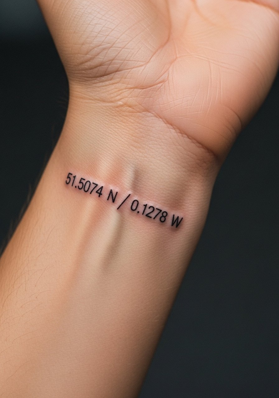
Fair warning: the wrist moves and rubs against sleeves, so I recommend slightly thicker lineweight than social media examples. When you consult, ask for a tiny increase in character size and a little spacing between numbers and separator. The pain level is low but expect a quick sting as the artist works close to bone. Many people who go too small regret it after one year because the digits soften. If you want easier cover-up later, keep the font straightforward rather than ornate. A touch-up at year one is common for wrist pieces.
3. Globe-Wrapped Coordinates on Shoulder Blade

When a design wraps coordinates around a globe, the trick is giving the numbers room inside the shape so they remain readable from a distance. In consultation, show map references and ask for slight negative space around each numeral. Shoulder blade skin is stable so aging is kinder than ankles. Expect medium pain during placement and one to two sessions for shading. Avoid heavy watercolor fills in the numbers themselves because saturation there can muddy the digits after healing. Plan on a touch-up at year two if the client wants the globe contrast fresh.
4. Neo-Traditional Coordinates with Compass Rose on Chest

When you add a compass, the artwork gains illustrative weight so the numerals do not need to be oversized. Tell your artist to anchor the coordinates beneath the compass and keep color saturation concentrated in the compass petals. Chest placement can be more painful than arm work but it supports larger layouts. One mistake I see is asking for tonal color washes over fine digits, which accelerates blurring. Two sessions are typical when color is involved, and expect a touch-up to refresh saturation at year three if you get lots of sun exposure.
5. Blackwork Solid Coordinates Block on Ribcage
Fair warning: the ribcage ranks high on most pain scales, but solid blackwork helps the numerals hold on darker skin tones. Ask your artist for high-contrast negative-number treatment so the digits remain legible inside a black block. Artists split on whether fine line holds up on ribs. One camp says thin lines blur faster there due to skin flex, and the other says correct depth and spacing make fine line settle fine. Name where your sympathies lie during booking. Expect one longer session and a likely touch-up at year two if the edge of the block softens.
6. Watercolor Coordinates Fading into Map Lines on Inner Bicep

Most watercolor tattoos from several years ago faded into indistinct color, so this approach keeps the numbers pure black and places color around them rather than through them. Tell your artist you want the coordinates in black with soft color echoes beyond the numerals. Inner bicep is forgiving for healing but expect moderate pain during longer shading passes. A common mistake is asking for pastel color over tiny digits. If you want the wash to stay vibrant, expect a color refresh sooner than for black ink.
7. Micro-Realism Coordinates on Side Finger

Finger tattoos face the most friction so I recommend a bold micro approach rather than ultra-thin script. Ask your artist for slightly heavier linework and expect the piece to need a touch-up within a year. Pain is sharp but brief. People often request fingertip-scale numbers and then return disappointed because healed digits fade unevenly. If you still want a discreet finger mark, plan for annual touch-ups and skip intricate shading near the joints. Hand tattoos can affect some professional situations so think through visibility before booking.
8. Ornamental Coordinates in Mandala Frame at Ankle
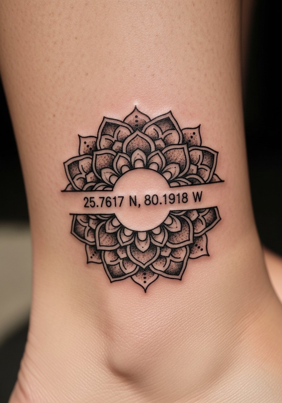
This idea elevates the numbers into a decorative piece while keeping them readable. When you sit down with your artist, bring mandala references and specify that the numerals remain negative space in the center. Ankles can stretch with weight changes so ask the artist to mock placement with movement before inking. The common mistake is crowding the mandala too tightly around the digits, which kills legibility. Expect two sessions for detailed stipple shading and a touch-up at year two if lines soften.
9. Traditional Bold Line Coordinates with Anchor on Inner Arm
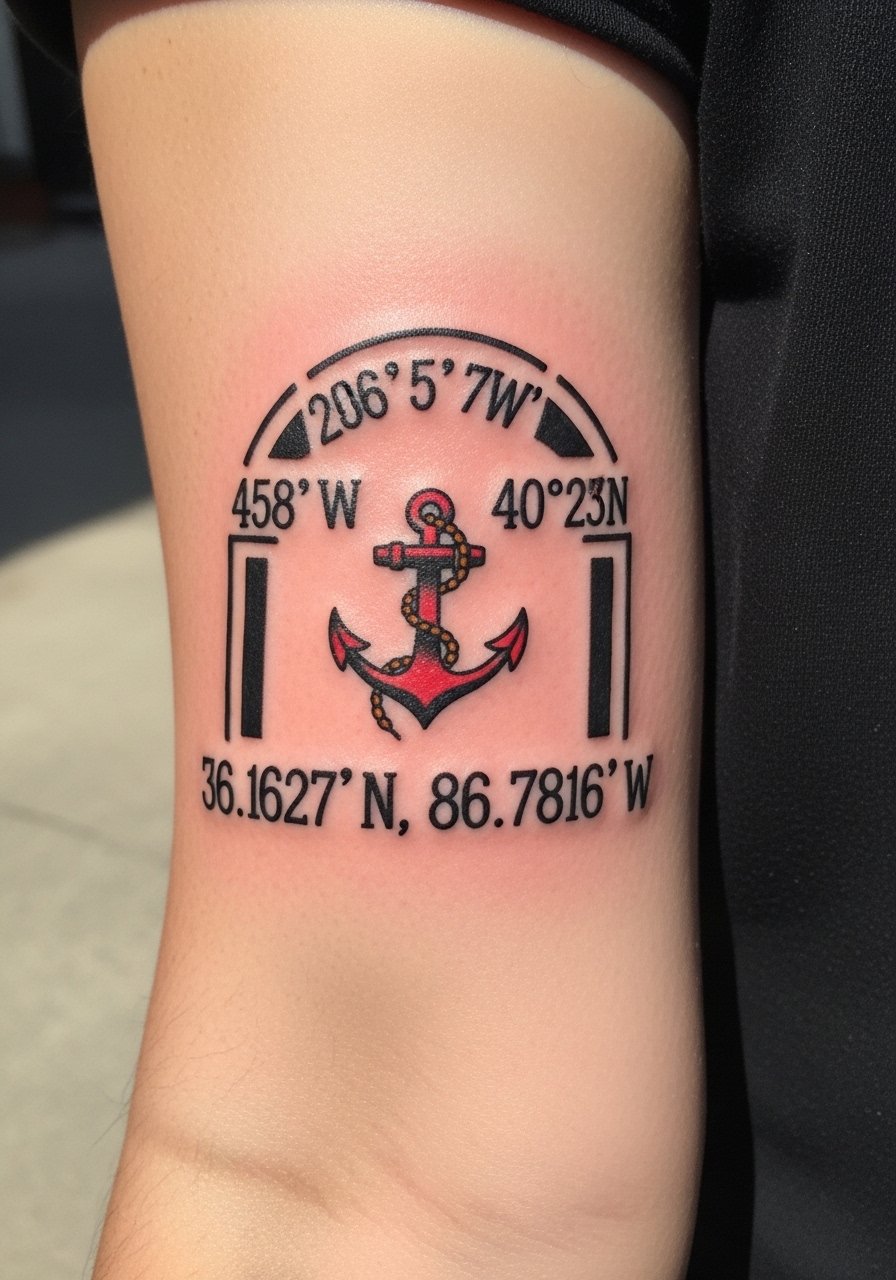
There's something about bold outlines that reads from across a room so consider this if you want a visible statement. Tell the artist you want classic linework with saturated color limited to the anchor so the numerals remain black. Inner arm tolerates this well and pain is moderate. A mistake is choosing tiny numerals with heavy color that competes with readability. One session usually covers this, and color touch-ups happen sooner than black ink if you sunbathe a lot.
10. Ignorant-Style Thick-Script Coordinates on Collarbone

The ignorant style gives a raw, hand-drawn energy that reads like a personal flash. When you consult, bring samples of the handwriting vibe you want and tell the artist to keep the numbers chunky so they age like traditional linework. Collarbone placement is bony so expect sharper stings during tattooing. A common error is asking for illegible hand-lettering. If you want career flexibility, consider placement slightly lower on the chest. One short session covers most collarbone scripts.
11. Dual Coordinates Side-by-Side for Matching Wrist Sets

Matching sets for couples or siblings look best when both pieces are identical in weight and spacing. In the consultation, request mirrored stencils and confirm both artists use the same font size. The mistake I see is small discrepancies in lineweight between two practitioners. Wrist movement reduces longevity so thicker digits help. For peace of mind, book the same artist or ask for stencils to cross-check. Touch-ups in year one are common for wrist pairs.
12. Coordinates Arched Over Spine with Split Latitude/Longitude
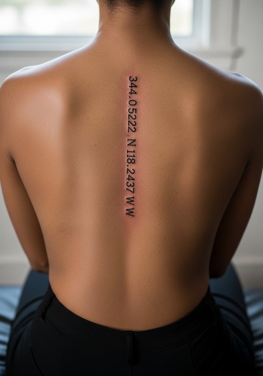
Spine work creates a vertical flow that plays nicely with milestone dates and locations. When you book, ask the artist to align the split so each half centers on either side of the vertebrae. Some artists debate fine line on the spine due to movement. One camp says thin scripts blur faster, and the other claims careful depth and spacing make them last. Pain is higher on the spine but the composition advantage can be worth it. Expect one to two sessions and a touch-up after healing if the halves shift.
13. Geometric Crosshair Pinpoint on Upper Arm
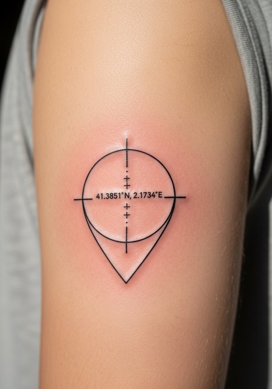
The crosshair motif frames coordinates like a map pin so the digits stay the focal point. Tell your artist you want precise spacing and ask for a healed mockup in stencil form to check legibility. Upper arm skin is stable and tolerates crisp lines well. A common mistake is over-designing the frame so the numbers lose priority. One session usually does the work and most people only need a touch-up after a couple years to refine edges.
14. Subtle Dot-Work Coordinates Along Rib Line
If you want subtlety, dot work can add texture without overpowering digits. Ask for numerals with slightly heavier dots forming the numbers so stippling does not swallow the characters. The ribs hurt more than the arm, and sessions may stop and restart if pain spikes. A common error is requesting very tiny stipple numerals, which can fade into a smudge on healing. Plan for a touch-up at year two to restore crispness.
15. Scripted Coordinates in Cursive Under Clavicle

Some clients prefer a softer script for a discreet look. When you show references, specify that only the style borrows cursive flow and that numerals remain easily read. Clavicle placement is visible and can snag on clothing while healing so follow aftercare closely. The mistake is choosing an overly ornate script that loses numeric clarity. Expect moderate pain during the session and plan for a touch-up if strokes soften with time.
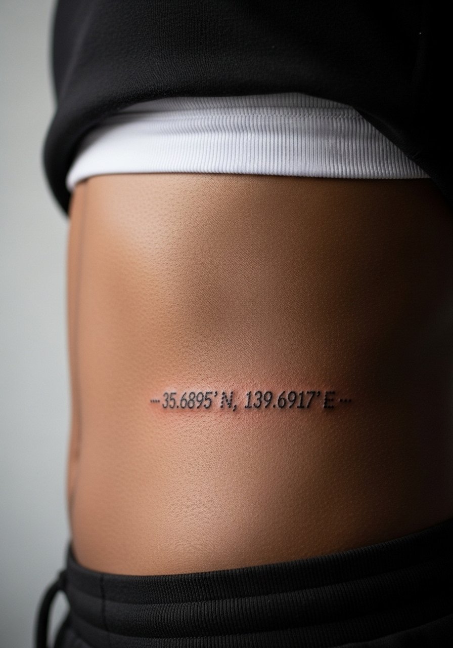
16. Tiny Coordinates Inside a Minimalist Circle on Ankle

Ankle placements are romantic but they experience shoe friction and occasional swelling. Ask for slightly larger numerals than your initial impulse. People who go too tiny regret it because digits blur or migrate with footwear wear. The session feels quick but expect to baby the area during healing. If you want long-term legibility, plan for a refresh in year one or two depending on wear.
17. Coordinates Incorporated into a Minimal Mountain Range on Forearm
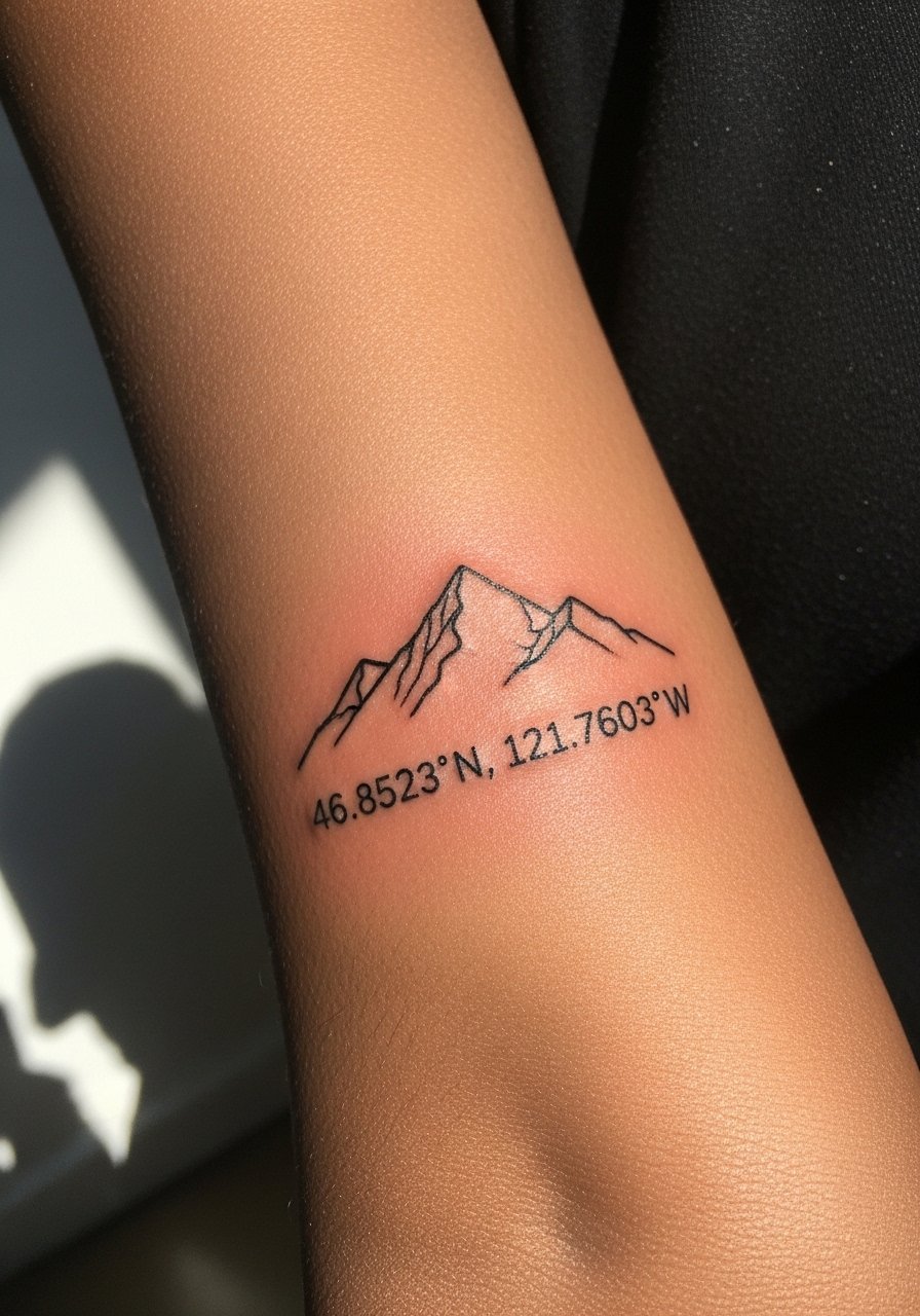
Visual motifs like a mountain silhouette offer context so the numbers do not need to shout. In consultation, specify that the range should be single-line so it does not compete with the numerals. Forearm placements heal well and handle detail. A frequent mistake is layering too much shading behind numbers. That causes the digits to look muddy after a couple years. One session usually suffices and touch-ups can be timed with any color refresh if present.
18. Coordinates with Roman Numeral Date Divider on Wrist

Splitting a coordinate set with a Roman numeral date gives timeline context without extra imagery. Tell the artist to keep the Roman numerals small but spaced so they do not crowd the coordinates. Wrist friction remains a downside so thicker strokes are better than ultra-fine ones. People sometimes ask for tiny Roman numerals that become unreadable. Expect a short session and a touch-up within the first two years.
19. Global Grid Coordinates Across Upper Back
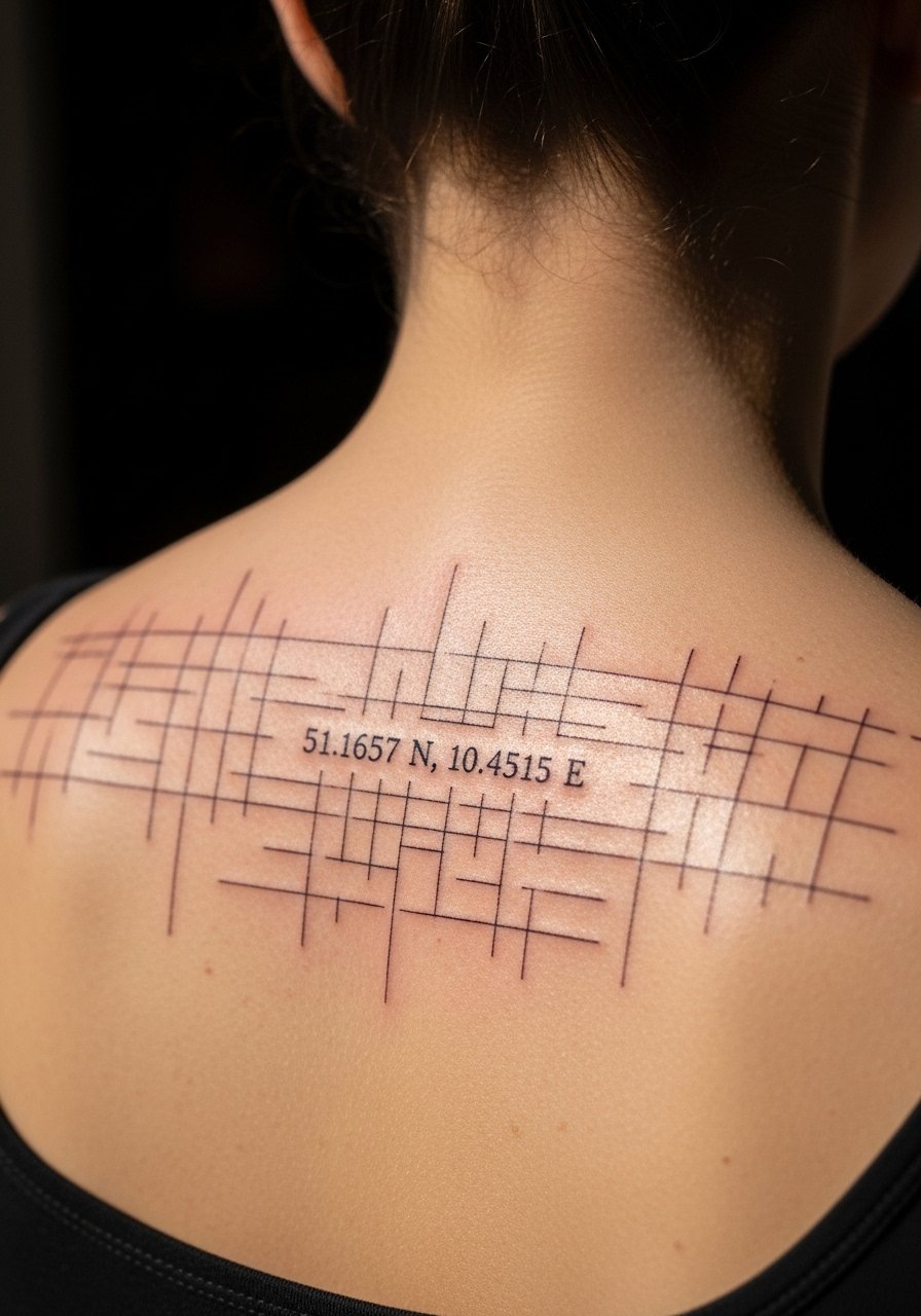
A grid composition can feel architectural and suits larger back canvases. In the booking, ask for mapping lines that do not intersect numerals directly. Upper back skin is stable and ages well for linework. A mistake is cramming too many grid lines into a small area which overwhelms the numbers. This design often needs two sessions and a follow-up to sharpen lines if any blowout appears.
20. Coordinates Pinned by a Tiny Arrow on Biceps

When a small arrow points to coordinates, it adds direction without stealing the show. Ask your artist to keep the arrow delicate and the numerals slightly bolder than the line mockups you bring. Biceps tolerate detail well and the session is generally low to moderate in discomfort. A common misstep is asking for needle-thin arrows and ultra-tiny numbers. Both end up fading unevenly. Expect a touch-up at year two if you want the arrow crisp.
21. Split Coordinates Across Two Ribs for Storytelling

Splitting a set across both ribs can tell a two-part story. When you plan, make sure both sides have matching lineweight and spacing so they read as a pair. Ribs are higher on the pain scale and healing needs patience. Artists disagree about fine line on ribs for the same reasons I noted earlier. One side will not age differently if the stencil and depth match. A touch-up is usually expected at year two for symmetry.
22. Coordinates Hidden Inside a Floral Stem on Wrist

Hiding numbers inside a stem gives a secretive feel that still allows readability up close. Tell your artist to carve negative space within the stem specifically for the numerals. The wrist placement still favors slightly heavier digits. A mistake is placing numerals inside highly shaded petals which hide them after healing. One session covers a clean stem and the hidden numerals, and expect a small touch-up if details soften.
23. Coordinates with Stippled Halo on Thigh

Thighs offer a roomy canvas so you can play with halo effects that complement the numbers. Ask for stipple density that stops short of the digits so they remain legible. Pain is low to moderate and sessions can be longer. The common error is over-saturating stipple into the numbers. Schedule a touch-up within two to three years if the halo softens and the contrast needs a refresh.
24. Coordinates in Blackwork Bar on Thigh Side

Blackwork bars are bold and resist fading visually, which helps numerals remain readable long term. When consulting, specify negative-number technique and confirm the artist is comfortable with saturated fills. Thigh skin handles saturation well and the session is usually a single sitting. A common mistake is poor edge control on fills that leads to soft borders. Expect minimal touch-ups if the fill was executed cleanly.
25. Globe with Intersecting Lines Pinpointing a Port on Back of Neck
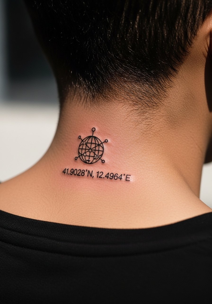
Neck placements require a specialized hand and portfolio review because the skin and visibility are unique. Tell the artist you want a compact globe with clear intersection lines that do not cross the digits. Pain is higher and some studios require advanced bookings for neck work. A mistake is asking for too much tiny detail in such a small area, which compromises legibility. If you go forward, expect a touch-up as the neck sees more sun and movement than the torso.
Tattoo Prep and Aftercare Essentials
When your appointment is set, plan logistics and a small kit so healing starts well. Pre-appointment, hydrate and wear loose clothing that gives your artist access. For long sessions bring a snack and plan transport that lets you sit comfortably afterward. Aftercare varies by artist, but gentle cleansing, a light occlusive for the first few days, and sun avoidance during the first month are consistent suggestions across studios and conventions I have been to.
Shopping list
Fragrance-free gentle foaming cleanser. Use it for the first week to remove excess plasma without stripping the ink. It helps reduce scabbing and irritation during active healing.
Lightweight fragrance-free balm. Apply thin layers after cleansing to keep the area moist without clogging pores. Good for dry climates or winter healing.
Medical-grade second skin bandage, 6-inch roll. Useful for covering high-friction areas like hands or ankles in the first 24 hours. It protects against rubbing and contaminants.
Gentle microfibre travel towel. Use a clean towel for gentle patting during aftercare so you do not drag lint across the healing tattoo.
Breathable cotton clothing for sleep. Tight fabrics rub and increase scabbing. Loose cotton reduces irritation and speeds comfortable healing.
Alcohol-free antiseptic spray. Good for instant cleanups if you catch a scab at risk of catching debris, but use sparingly and only if recommended by your artist.
Aquaphor Healing Ointment. A single mainstream option that many artists recognize for the first few days when heavy occlusion is needed. Use thinly.
Medical-grade silicone scar sheet, small pack. After the tattoo has closed, silicone sheets can help even skin texture and minimize raised areas for larger pieces.
Every tattoo is different. Always follow your artist's specific aftercare instructions. Consult a dermatologist if you have skin concerns or unusual healing issues.
Frequently Asked Questions
Q: Will fine line coordinates on the inner forearm blur faster than bold numerals?
A: It depends on depth and spacing. From what I have seen, fine line can blur sooner if the digits are too small or packed close together. Ask your artist for slightly increased spacing and a hair more depth than a delicate script. That approach keeps the look of fine line while improving longevity.
Q: Why do finger coordinates often need touch-ups within a year?
A: Fingers experience constant friction from washing and handling objects, which erodes shallow ink. If you want a finger coordinate, request bolder numerals and expect an annual touch-up. Some people choose blackwork instead of fine line for fingers for exactly this reason.
Q: Are watercolor-style coordinates harder to care for than traditional black ink?
A: Color can fade faster than black under UV exposure so you will need to protect the area from sun. If the watercolor sits around the black numerals rather than on them, the numbers remain clearer. Plan on a color refresh sooner than you would for pure black if you want it vibrant long term.
Q: How should I approach choosing an artist for neck or face adjacent coordinates?
A: Look for artists with a portfolio of healed neck pieces and ask to see healed photos, not just fresh work. Discovery pathways like location-based hashtags, tattoo directories, and convention listings help find experienced hands. If the studio requires advanced bookings or a consult, that is a reasonable gate for these placements.
Q: What is a realistic touch-up schedule for a ribcage coordinate that uses blackwork fill?
A: Blackwork holds up well, but edges can soften with time. Expect a potential touch-up at about year two to sharpen borders if you want the block to read crisply. Sun protection and avoiding excessive weight fluctuation help the piece age better.
Q: If I want coordinates that might need future cover-up, what is the best way to design them now?
A: Keep shapes and negative space in mind so a future piece can incorporate the numerals. Avoid tiny ornate fonts and excessive color right over the digits. When you consult, mention possible future changes and request placement and spacing that allow larger elements to overlap cleanly if needed.
