
The single-word Sanskrit tattoo trend looks effortless online, but it often hides a decision point that matters more than the font. Small letters can read crisp in the studio and then soften with wear, while slightly bolder strokes can preserve clarity for years. This list focuses on short Sanskrit words and compact phrases chosen for readability, placement fit, and styling options that keep the script legible as it ages.
1. Asha, Hope in Fine Script on the Inner Wrist

Asha is compact and reads well on the wrist so long as the letters have breathing room. If you like wrist placement, pick slightly wider spacing and a modest line weight so the letters do not blur into one another after healing. This placement feels low on the pain chart, but friction from bracelets and sleeve cuffs speeds fading. For session wear, bring a short sleeve tee that can be rolled up without tight cuffs. Pair the finished piece with a thin chain bracelet set when you want the script to peek out without being hidden.
2. Prem, Love in Classic Script on the Side Forearm

Prem works as a short, readable word that looks balanced across the side of the forearm. The common mistake is requesting ultra-thin single-needle letters that look fragile on the first day and then blur. For a forearm band that stays crisp, increase line weight and keep negative space around each glyph. Show-off pairing includes rolled sleeves or an overshirt that frames the forearm. For a clean reveal at events, try a lightweight overshirt that you can push above the elbow.
3. Shakti, Power on the Inner Forearm with Subtle Flourish
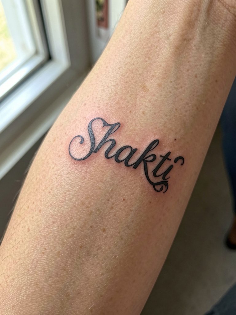
Shakti reads as a strong one-word statement when the lettering balances clarity with a modest ornamental flourish. Inner-forearm skin moves a lot, so spacing is the real design decision here, not decoration. Ask for a small mockup at two sizes to see how the ornament shrinks at shorter lengths. If you plan to show it, layer with a watch on the opposite wrist or stack bracelets to direct attention. A rolled linen shirt looks great with this placement, so consider a linen button down for healed show-off moments.
4. Aham Brahmasmi, Short Phrase Along the Outer Upper Arm
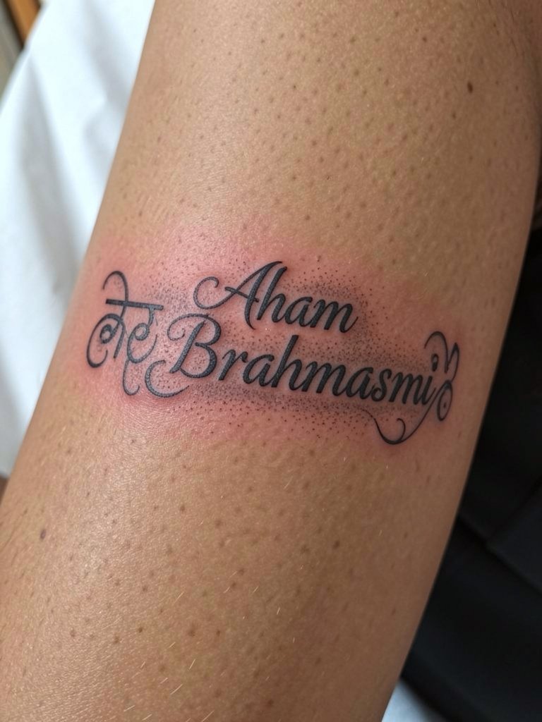
A short phrase like this gains presence when given room. Outer upper arm handles medium-length script well because there is flat linear real estate. A common error is compressing a phrase into a tiny band. Instead, design with slightly larger characters so each glyph holds its shape as the skin settles. Capable session wear is a loose short sleeve that lets the artist access the bicep without a tight seam. For showing it off, a cap sleeve top frames the arm cleanly.
5. Tat Tvam Asi, Balanced Script on the Ribcage Side
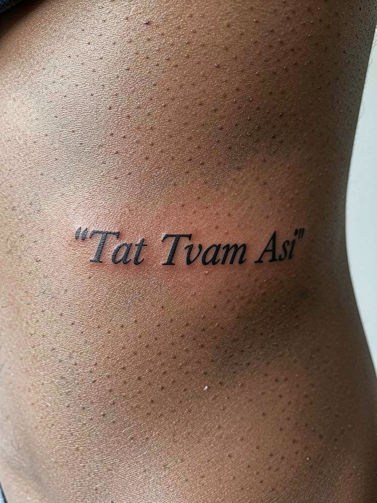
Ribcage placement gives more room for phrases but it faces higher movement and friction while sleeping or wearing snug bras. Some artists argue that fine line here softens too quickly, and they prefer a stronger line weight for long-term legibility. Others maintain that with expert depth and spacing, delicate letterforms can settle without merging. Name both positions when you pick a style because the trade-off is real and visible well before year five. For the appointment, a soft sports bra or a front-opening bra makes access simple and avoids fabric pressure during healing.
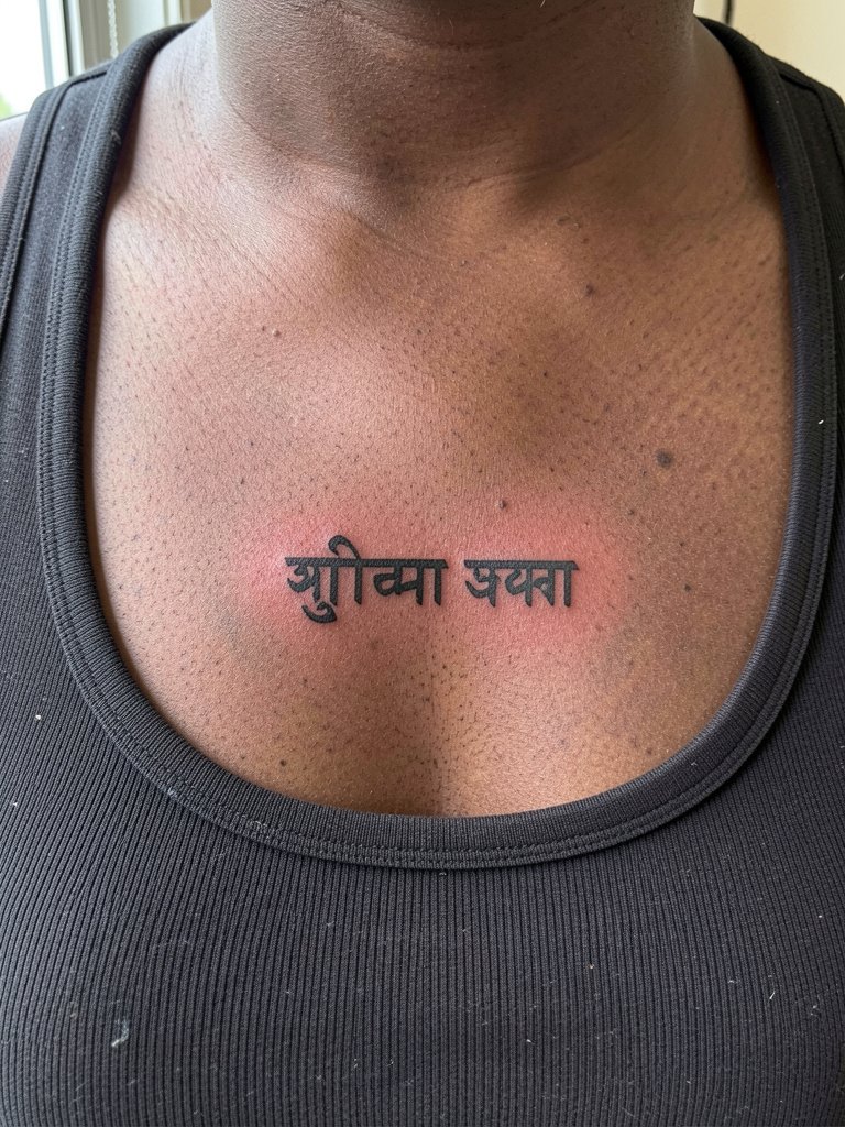
6. Krishna Sadā Sahayate, Devotional Phrase Under the Collarbone

A devotional phrase across the clavicle area reads well with a small symbolic accent like a flute line or feather. The key is spacing so the letters do not get squeezed by the natural curve of the chest. Session wear that opens at the front, such as a button-down, avoids overhandling the area. For styling, a layered necklace set sits above the script and guides the eye to the tattoo during casual outfits.
Session Day Essentials
The wrist and forearm pieces above have different access and healing needs than chest and ribs. These five items help during the session and through the first week.
-
Bepanthen Tattoo Aftercare. A lighter healing balm option that many people prefer for the first delicate phase when a thick occlusive feels too heavy.
-
Butterluxe-style tattoo butter. A middle-ground emollient for the later healing window when you want something between balm and lotion.
-
Tattoo Goo. A long-running choice for ongoing soothing during early scab and peel.
-
H2Ocean Saline Spray. Use for gentle cleaning in shops and during the initial rinse stages.
-
Saniderm-style second skin strips. Clear protective film that helps avoid friction and keeps fresh linework from catching on clothing during the first 48 to 72 hours.
7. Vertical Sanskrit Band, Spine-Adjacent Text

Vertical script along the spine gives an elegant line that follows the body. The trade-off here is movement during sitting and sleeping, which can blur ultra-thin lettering. If you want a vertical band, choose slightly increased spacing and a modest weight for each letter. Session wear should be a zip-up hoodie you can remove without scraping the back, not a tight pullover. For show-off looks, backless tops or racerback dresses work well once healed.
8. Red Accent Single Word on the Wrist
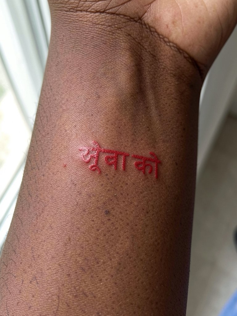
Red ink can be striking as an accent, but it ages differently across skin tones. One camp values red for visual distinction and cultural resonance. Another camp points out that red can fade unevenly and sometimes soften faster than black. If you prefer red, plan for a slightly larger scale and discuss pigment choices with your studio. For session clothes, avoid anything whose cuff rubs the wrist. A slim watch on the opposite wrist keeps attention balanced for photos.
9. Name in Sanskrit Script on the Side of the Neck
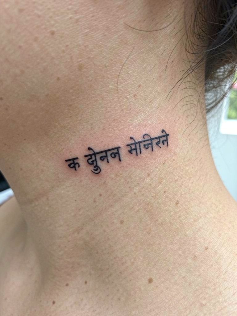
Names in Sanskrit script are personal and compact. The neck is visible and moves often, so pick a slightly bolder line than you might for a wrist. Behind-the-ear and side-neck tattoos require careful artist experience for consistent line depth. Keep hair styled to show or hide the piece. A wide-neck top or pendant layered above the collarbone pairs well for staged reveals, so try a square neck top after healing.
10. Warrior-Themed Sanskrit Word on the Outer Forearm

Masculine-framed Sanskrit words work well on the outer forearm where the composition can read at a glance. The outer forearm tolerates slightly heavier weight that keeps characters distinct. Avoid super-tiny script that the eye loses at a distance. For outfits, a structured sleeve tee or minimalist ring set keeps the focus on the forearm. A minimalist ring set complements the aesthetic.
11. Lotus-Accented Phrase Across the Sternum

Sternum placements offer a centered canvas for a phrase plus motif, but they are intimate and sensitive. Choose a composition with space between the motif and the lettering so lines do not merge as the skin moves. For the session, wear a front-opening bra or button-down so the artist can work without fabric rubbing. After healing, deep V or square-neck tops highlight the piece, so consider a deep v neck top for occasional reveal.
12. Om Symbol Paired with One-Word Script on the Shoulder

Pairing Om with a word helps the script feel intentional and anchored. Shoulder skin stays relatively stable, which means finer detail can hold longer than on high-movement spots. Wear a sleeveless or wide-neck top for session access and for healed styling. Tank tops or sleeveless tees pair naturally, so try a sleeveless tank top when you want to display the shoulder.
13. Thin Vertical Mantra Down the Spine

A spine line is dramatic and sleek when laid out with consistent spacing. The risk is that ultra-thin lettering can spread over time, so choose spacing that gives each glyph a margin. Backless tops, racerbacks, and open-back dresses highlight the vertical composition. Pick a backless top for event wear once healed.
14. Sanskrit Poem Fragment on the Inner Forearm
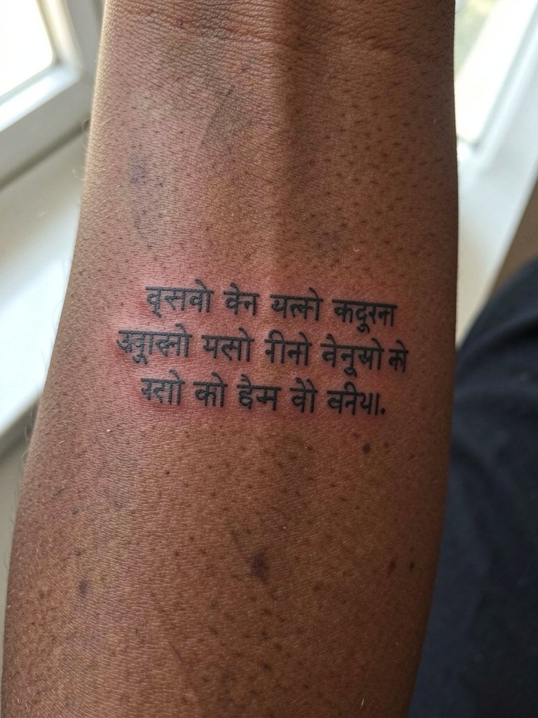
Poetic fragments add literary rhythm but need careful line breaks that respect script flow. Inner forearm reads well for short couplets that run with the arm. A common mistake is cramming too many characters into a narrow band. For session comfort, wear a loose short sleeve that rolls up easily. Rolled linen shirts work well for showcasing this placement, so consider a rolled sleeve linen shirt for casual reveals.
15. Story-Based Phrase with Small Motif on the Upper Arm

When text ties to a mythic figure or story strand, keep the symbol minimal and the lettering clear. Upper arm area handles a slightly larger composition and gives room for graceful spacing. For showing off this piece, cap-sleeve tees and rolled shirts are natural fits. A muscle tee frames medium upper-arm compositions for casual days.
16. Sanskrit Single-Word on the Ankle

Ankle tattoos take rubbing from socks and shoes, which accelerates fading. Choose slightly larger letters than you imagine and avoid ultra-thin single-needle strokes. For session clothing, roll your jeans cuff or wear shorts so the artist can reach the area without fabric pressure. A soft ankle bracelet style shoe will draw attention to the ankle once healed, but protect the tattoo from straps or socks while it seals.
17. Sanskrit Dot-Work Phrase with Lotus Accent on the Rib Side
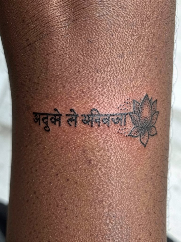
Dot-work gives texture without heavy fill, but tiny dots demand distance between letters. On the rib cage, the key is layout that avoids compressing the dots into a blur. For sessions, wear loose sportswear that does not press tight across the side. As a show-off option, side-slit dresses reveal the piece selectively when you want to display it.
18. Short Sanskrit Verse Along the Side Torso

Longer fragments need linear space and a calmer canvas, which side torso provides. The mistake is cramming too many characters into a short horizontal span. Plan the phrase to run naturally with the ribs and give the letters room. Session wear should be a soft crop top and easy-waist pants so nothing presses the side during healing. For occasional display, a wrap top is a tasteful pairing.
19. Single Sanskrit Word on the Calf

Calf placement gives visible canvas and tolerates bolder weight that reads in motion. The skin there is forgiving, so a confident line weight retains character longer than ultra-fine script. For session ease, wear shorts or loose pants that pull off without rubbing. When healed, pair the calf piece with mid-calf boots or skirts to reveal it deliberately.
20. Sanskrit Word Ring Around a Finger

Finger script ages faster because of constant wash and abrasion. If you want a finger ring, choose slightly larger lettering and accept a higher likelihood of touch-ups. The most common mistake is opting for hairline script that disappears within months. Keep jewelry minimal on that finger while healing. For staged looks after healing, minimalist rings on adjacent fingers balance the script.
21. Sanskrit Couple-Word on the Collarbone Arc

Collarbone script can be very visible and photographs well. Keep enough negative space so letters do not crowd the bone contour. A square-neck or off-shoulder top flatters this area. Layered delicate chains work with the arc, so consider a layered necklace set when you want the piece to be part of an outfit.
22. Sanskrit Word with Small Mandala Accent on the Shoulder Blade
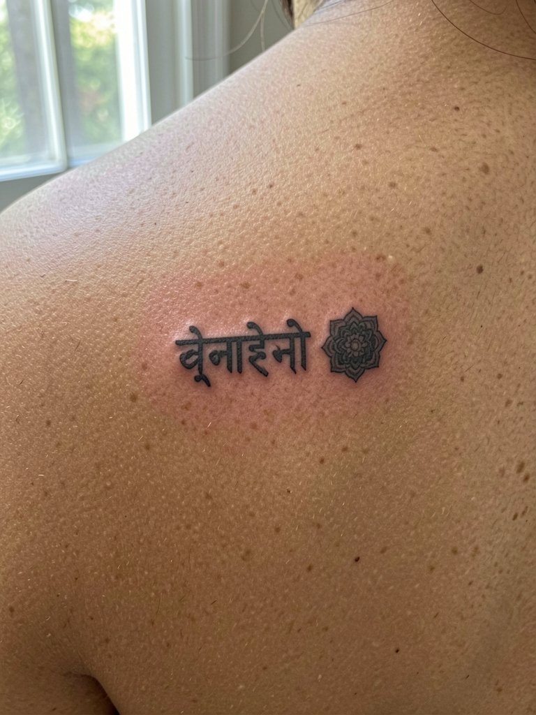
Shoulder blade placements allow small complementary motifs that make the script feel complete. The area heals steadily and handles fine detail better than wrists or fingers. For session wear, pick a top that removes easily without dragging across the back. A wide neck tee works well for showing the area.
23. Sanskrit Single Word Near the Sternum Center
A centered sternum word is intimate and looks deliberate when the lettering is clear and not crowded. Pick boldness over brittle fineness for long-term reading. For the session, a front-opening bra or button shirt makes access less awkward. When healed, V-neck and layered bodies frame the piece nicely.
Frequently Asked Questions
Q: How can I verify that a Sanskrit word is spelled and transliterated correctly before booking?
A: Ask for a transliteration image and run it by at least one native speaker or a university-level Sanskrit reader. If you cannot find that, post the proposed glyphs in a language or academic forum that includes Sanskrit readers and request a quick spelling check. Bring the confirmed lettering to your appointment so the stencil reflects verified characters.
Q: Does fine line or heavier script hold up better for Sanskrit lettering over several years?
A: Artists split into two camps. One group prefers fine line for the modern look and will use it on low-movement skin where a short word can stay crisp. The other group favors slightly stronger line weight because ultra-thin letters can soften and blur as the skin ages. Both positions have merit, so pick based on placement and how long you want the text to remain readable before a touch-up.
Q: Is red ink a good choice for a small Sanskrit word?
A: Red can be a striking accent, and some people choose it for cultural resonance or visual difference. Others recommend black because red can fade differently across skin tones and sometimes require more frequent refresh work. If you choose red, increase scale a touch and discuss pigment options and aftercare timing with the shop.
Q: Where can I find artists or portfolios that handle Sanskrit script well?
A: Search hashtags like #sanskrittattoo, #scripttattoo, and #fineletteringtattoo on Instagram and TikTok while using your city filter to find local portfolios. Tattoodo and booking platforms let you search keywords like "Sanskrit script" and view healed photos. Reddit threads in r/tattoos and r/tattooadvice can help you sanity-check artists and spot healed examples in different skin tones.
Q: How should I dress for a tattoo session by placement?
A: For wrists and forearms wear short sleeves or a sleeveless top you can roll easily. For chest or sternum choose a front-opening bra or button-down. For ribs and side torso wear a loose crop top or sports bra that does not press the area. Bring clothing that the artist can access without tight seams rubbing the fresh ink.
Q: Will a short Sanskrit phrase need touch-ups more often than a single word?
A: Longer phrases often need less frequent touch-ups per character because spacing can be more generous, but the total area increases potential fading. Small single words can demand touch-ups sooner if the letters are tiny or placed in high-friction zones. Plan realistic maintenance and factor a touch-up into your expectation for delicate placements.
Q: Any advice on pairing clothing with visible Sanskrit placements for everyday wear?
A: Match placement to garments that naturally reveal the area. Wrists pair with thin chain bracelets and rolled sleeves. Collarbone pieces pair with square or scoop neck tops. Forearm and upper-arm script go well with short sleeves or sleeveless styles. Use simple accessories like layered necklaces or minimalist rings to direct attention to the script without overwhelming it.
