
Someone I know spent eight months saving designs before booking. The real problem was not picking a pretty rose. It was picking a style that keeps meaning as the years pass, looks good on movement, and plays fair with touch-ups. I pulled notes from conversations in five shops across Brooklyn and dozens of portfolios to find bold rose ideas that show through the first fade and still tell a story later.
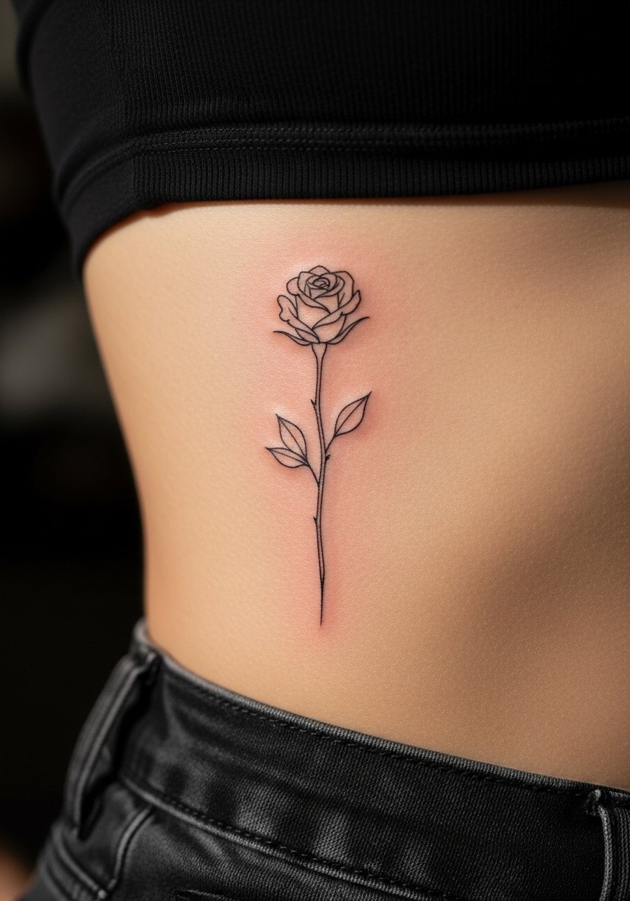
1. Fine line single rose on inner forearm

Someone I know first saw this on a friend and booked for the same calm placement. Expect a low to moderate pain level and one quick session under two hours if kept small. Ask your artist to keep line spacing slightly wider than usual so the petals do not merge as they fade. A common mistake is requesting pencil-thin lines with no backup weight. Fine line on the forearm ages better than on the ribcage because the skin is stable. Plan a touch-up at year two to refresh thin contours.
2. Neo-traditional rose with bold outlines on the shoulder cap

There is something about bold outlines and saturated color that reads from across a room. Pain is mild on the shoulder and sessions run one to two hours depending on size. During your consult, bring photos showing your preferred outline weight and color palette. The design that ages poorly is the same palette but with weak outlines. Strong linework protects color saturation over time. This style suits anyone who wants a visible statement that holds up to sun exposure better than watercolor.
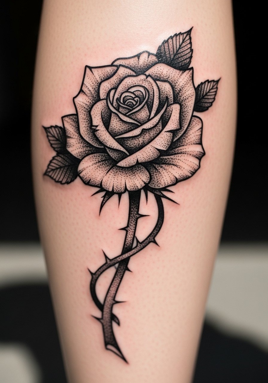
3. Blackwork rose sleeve panel with stipple shading

Visual impact leads here, but note that full blackwork needs time. Sessions are long and may be split into multiple appointments. Tell your artist you want areas of negative space to breathe so the rose reads when the arm moves. Stipple shading offers texture without heavy saturation in every area which makes future touch-ups easier. Blowout risk increases when lines are too small and packed. Expect a touch-up around year three for saturation top-ups in heavily worked areas.
4. Watercolor rose with bold anchor lines on the ribcage

Fair warning: the ribcage is on the higher end of the pain scale. The session will be longer and stopping points are common. Two camps argue about watercolor on ribs. One camp says loose color bleeds on stretch-prone skin and fades to a bruise. The other camp says anchoring with black linework preserves the art because the lines hold pigment. If you like watercolor, ask for anchor lines around petals and plan for touch-ups at year two or three.
5. Micro-realism rose behind the ear

This placement is discreet and quick but sharp. Sessions are short, often under one hour. The biggest mistake is asking for too much detail in a too-small area. Ask your artist for slightly bolder micro strokes so detail does not blur. Blowout risk is low behind the ear, but fine dots can fuse over time. This is best for someone who wants a private piece that reads close up and can be covered by hair when needed.
6. Traditional red rose on the upper thigh
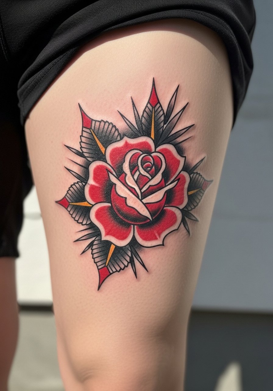
Thigh tattoos have forgiving skin which helps saturation last. Expect moderate pain and a session of one to three hours based on size. When consulting, show vintage American traditional references to lock in the right petal shapes and color stops. A common aging issue is going too small, which makes petals merge. Larger, solid fills and clean outlines age more predictably on the thigh. This placement suits those who want a bold, private piece that can peek out seasonally.
7. Minimalist single-stem rose along the rib line
Pain on the ribs is higher and sessions can be stopped and resumed. The usual mistake is requesting extremely thin continuous lines without slight variation. Ask for micro-weights in certain areas so the stem does not disappear in a year. Fine line on ribs splits artists into two camps. One group warns that stretch and movement blur thin lines quickly. The other group maintains that with intentional depth and spacing, lines can settle well. Decide with your artist based on their portfolio.
8. Black and gray rose near the collarbone

Collarbone placement reads as elegant but sits over a bony area so expect sharp sensations during the session. Plan for a session under two hours for a medium-sized piece. Ask your artist to balance contrast so highlights remain visible on lighter skin. Overworking the area leads to loss of subtle midtones. This style is great for someone who wants a visible statement that layers well with necklaces and tops without overwhelming the chest.
9. Rose and dagger chest piece with bold saturation

The chest has a wide flat canvas that handles bold work. Pain varies across the sternum. If you choose this motif, request a clear focal point so the dagger and rose do not compete. A common mistake is cramming too many small elements into a chest design. Expect a multi-session process and plan touch-ups where thin lines meet heavy saturation. For sternum work, consider an experienced artist who handles intimate placements professionally.
10. Geometric rose with dot work on the forearm

When you sit down for this, bring clear references showing the exact dot density you want. Forearm skin is stable so dot work and geometry hold up well. The mistake I see often is asking for geometry too tight to the rose. Give each element breathing room. Sessions can be medium length depending on dot density. The result works for someone who likes structure and botanical forms together. Plan for a light touch-up at year three for any softened dots.
11. Single red rose on the wrist with shadowing

Wrist tattoos still affect some hiring scenarios so think about work implications before committing. The wrist is a higher wear area because of movement and washing. Ask for slightly bolder shadowing rather than ultra-fine lines to preserve form. Sessions are short but expect color to soften faster here. A common mistake is choosing a highly detailed petal composition too small for the wrist. Plan touch-ups at year one or two to keep the red vibrant.
12. Rose bouquet on upper back with negative space

Upper back gives room for composition and layering which helps the rose stay meaningful as you add pieces. Pain is mild to moderate and sessions may be broken across sittings. Tell your artist you want intentional negative space to prevent a flat block of color later. Overloading every inch with ink makes future expansion harder. This placement suits someone who plans a back piece or half-sleeve and wants the rose to anchor the composition.
13. Micro color rose on ankle

Ankles are bony and can sting more than softer areas. Sessions are usually short. The trap is requesting too much color intensity in a tiny footprint. Ask for slightly simplified petal shapes and place saturation where it matters most. Foot and ankle ink often needs touch-ups earlier because of friction from clothing and shoes. This option is for someone who wants a tiny flash piece that still reads as color rather than a speck.
14. Sleeve of roses with whip shading and color gradients

If you want sleeve impact, know this will be a major commitment across several sessions. Whip shading creates motion inside petals which ages with a soft, fabric-like quality. During consultation, prioritize a map that spaces each rose so blowout risk lowers. The mistake is letting roses sit too close with identical tones. Vary saturation and negative space to keep the sleeve legible for years. Expect regular touch-ups to maintain gradients.
15. Single black rose on the index finger

Finger tattoos demand honesty. They fade faster and often need more touch-ups. Sessions are short but may feel sharp. The most common error is asking for a shaded petal composition that cannot live in that space. Go for simplified silhouette or solid black shapes that read clearly as they blur. If you work in an industry sensitive to visible ink, consider placement alternatives. Plan a touch-up at year one or two.
16. Rose and butterfly micro-realism on the shoulder blade

Shoulder blade skin takes detail well and the area is forgiving on healing. Sessions are medium length. Tell your artist you want contrast between the rose and butterfly so one element does not disappear. A common mistake is tiny wings with no contrast. Micro-realism benefits from slightly stronger midtones to preserve the illusion as pigment settles. This is great for someone who likes paired symbolism and a piece that can be covered by clothing.
17. Stipple shaded black rose on the calf
Calf placements take shading well and travel nicely when you want to show or hide. Pain is moderate and session lengths vary. Request deliberate stipple density to create depth without heavy saturation. The wrong move is packing dots so tightly they read as a solid wash later. Stipple ages gracefully because it leaves skin breathing room. Plan for a touch-up where the highest contrast areas have softened.
18. Rose cluster behind the ear and along the hairline
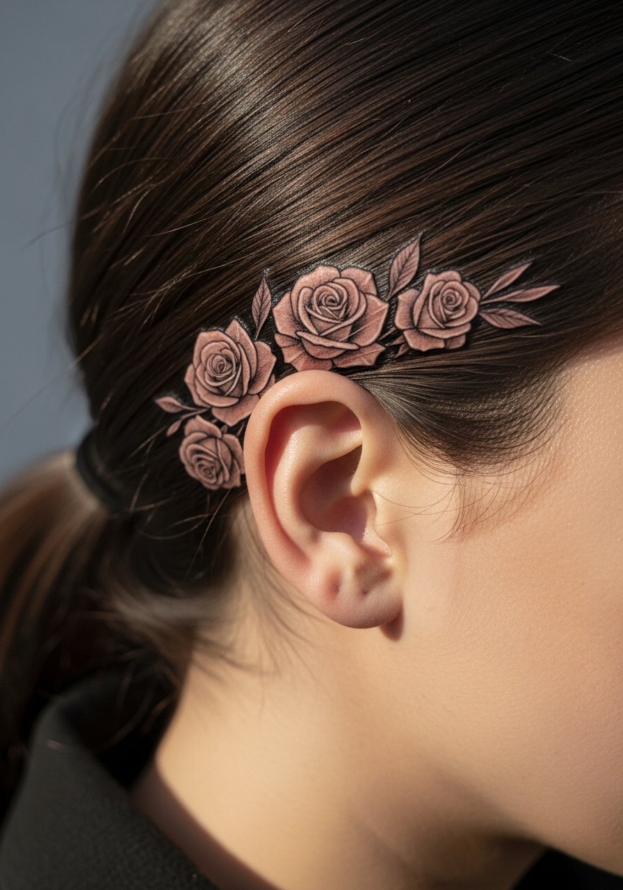
This is a discreet placement that hides or reveals with hair. Sessions are short though the area may be tender. The consultation tip is to mark the final hairline so the piece does not disappear into hair growth patterns. A common mistake is ignoring hair movement which can obscure detail. This option suits someone who wants private symbolism with occasional visibility. No heavy saturation here so the cluster can last without frequent touch-ups.
19. White ink-accented rose on the sternum

Sternum work is intimate and may be more painful. White ink behaves differently across skin tones and may fade to a sheen. Ask your artist how they use white for highlights and whether they recommend layered sessions. One camp praises white accents for pop. Another camp warns that white can yellow or vanish quicker. If you choose white accents, expect an earlier touch-up cycle and a professional who treats sternum work regularly.
20. Rose and script on the rib side with a specific date
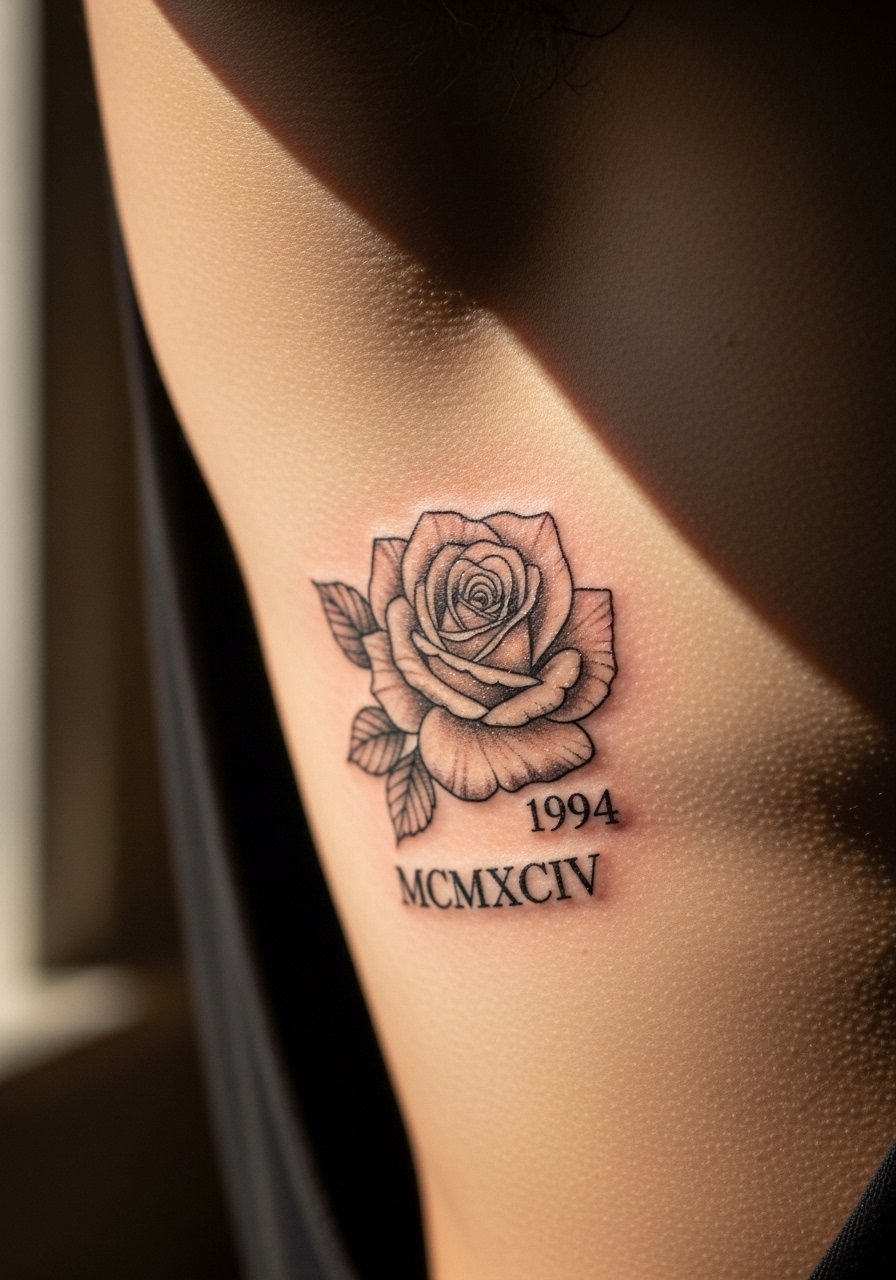
Rib side allows integration of text and imagery with elegant curves. Pain is high and sessions may be split. When including text, specify exact format so the final lettering is correct. The year here uses Roman numerals that read XII.XCIV and should be placed with enough spacing to avoid blur. People often pick fonts that are too fine for ribs. Ask for slightly bolder serifs and expect a touch-up to keep clarity.
21. Neo-Japanese rose sleeve element with bold black fills

If you like cultural roots, know the style has a lineage that many respect. Include a line that acknowledges origin during your consult without copying sacred or traditional iconography. Bold black fills here protect against early fading and make color layers pop later. Sessions may be long. The mistake is mixing incompatible stylistic elements that fight for attention. Plan your sleeve map and discuss future expansion pathways in detail.
22. Single long-stem rose wrapping the rib to hip

This placement follows body curves and breathes with movement so the image feels alive. Pain varies and sessions are long. Tell your artist you want flow that works with clothing cuts and with body changes. A common error is ignoring how the stem will sit when you bend. For anyone who anticipates weight or shape changes, request a layout that keeps the focal bloom in a stable area.
23. Geometric mandala rose at the sternum center
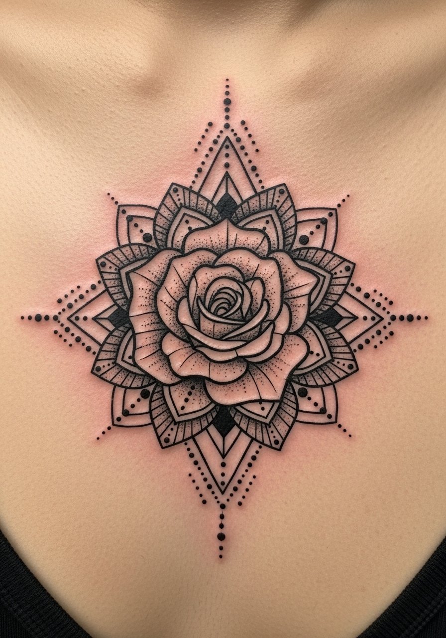
Mandala geometry demands exact spacing or the piece will look off. Sternum center is sensitive and requires professional skill. During consult, ask the artist to show mapped guides before starting. The downside is that symmetry injuries and stretch can unbalance tiny geometry. Expect touch-ups that refine alignment and small line weights that keep the pattern readable over time.
24. Cover-up using a bold black rose

Cover-ups are a different discussion from fresh pieces. The goal here is to hide existing ink with solid saturation and smart negative space. A common mistake is choosing a delicate design for heavy old ink. Tell your artist which areas of the old tattoo you want masked so they can plan heavy fills and shadow placement. Sessions depend on the darkness you cover. Expect multiple sittings for full concealment and later touch-ups to refine edges.
25. Small compass rose hybrid on the ankle with coordinates

This mixes symbolism with a location that anchors meaning. The ankle sees friction so keep lettering bold enough to stay legible. Specify the exact coordinates text so the final piece reads correctly. Sessions are short but consider the wearing surface. The common error is tiny type that becomes illegible. This suits someone who values travel, place, or memory tied to a rose motif.
Tattoo Prep and Aftercare Essentials

- Fragrance-free lightweight balm. Use sparingly after the initial healing phase to avoid clogged pores. Apply a thin layer when the tattoo feels tight or dry.
- Medical-grade second skin bandage, single roll size. Useful for the first 24 to 48 hours if your artist recommends occlusion. It reduces friction and keeps fluid contained.
- Gentle foaming cleanser, fragrance-free. Clean with lukewarm water twice a day to remove surface debris. Avoid scrubbing.
- Breathable healing ointment from a lesser-known brand. A light occlusive that absorbs quickly and reduces shine is ideal while the tattoo forms a scab.
- Soft, lint-free dressing pads. Useful for blotting and gentle cleaning after showers.
- Fragrance-free daily moisturizer for long-term care. Once healed, moisturizing protects saturation and skin elasticity.
- Travel-size antiseptic wipes, sensitive-skin formula. Handy when you cannot rinse in a sink during the first 48 hours.
- Saniderm transparent healing film pack. This is the mainstream choice I see used often in studios. Follow your artist's guidance if they recommend an occlusive.
Every tattoo is different. Always follow your artist's specific aftercare instructions. Consult a dermatologist if you have skin concerns or unusual healing issues.
Frequently Asked Questions
Q: Will fine line roses blur faster than traditional bold roses on my forearm?
A: From what I've seen, fine line tends to soften sooner because the lines are thinner. On a stable area like the forearm it can hold for two years before obvious blur if the line weight was planned well. Ask your artist to add slight backing weight and to map spacing during the consult. Plan on a touch-up in the second or third year if you want crisp edges.
Q: Do watercolor-style roses need different aftercare than a traditional saturated rose?
A: The basics are the same but watercolor pieces often rely on softer washes and less heavy outlines. Keep them out of direct sun more aggressively in the first year and be gentle when applying moisturizers. If your artist used open washes, expect earlier touch-ups for color that loses vibrancy from sun and friction.
Q: How should I find an artist who handles rib or sternum roses well without naming anyone?
A: Use discovery pathways like local studio directories, convention vendor lists, and hashtags that combine your city with the technique, for example cityname+fine+line or cityname+blackwork. Look for portfolios showing healed photos on comparable placements. Ask studios about recent healed images and whether they offer staged touch-ups for sensitive areas.
Q: If I want a cover-up, can a single bold rose always hide old work?
A: Not always. Coverage depends on how dark and stubborn the old ink is. Bold black roses can conceal many colors but may require multi-session layering and careful planning. During a consult, have the artist assess the old piece in natural light and map where heavy fill is needed.
Q: What's a realistic touch-up timeline for blackwork versus color roses?
A: Blackwork usually holds longer before needing a refresh because pigment tends to remain visible even as lines soften. Expect potential touch-ups at year three or later. Color pieces, especially reds and pastels, often benefit from a bump at year one to three depending on sun exposure and placement.
Q: Are there placement choices I should avoid if I want a rose to age well?
A: High-motion and high-friction areas like fingers, knuckles, and the tops of hands age faster. Ribs and sternum can blur if lines are too thin. If you want longevity, choose areas with stable skin or ask the artist to adapt line weight and spacing for movement.
Q: Can I get small text or coordinates near a rose and expect it to stay legible?
A: Yes if you pick an appropriate font size and weight. Tiny serif or monospace numbers need clear spacing to remain readable. Discuss exact text with the artist and ask for mapped placement to avoid blurring with skin movement or nearby shading.
