
Someone I know spent six months saving screenshots and still could not pick a quote tattoo, because the real problem was knowing which scripts actually age well on different skin. I spent time in five shops across Brooklyn and saw the same handful of styles hold up. Below are bold phrasing and placements that balance clear linework, realistic touch-up expectations, and the mood each quote carries.
1. Fine line "Still I Rise" on the collarbone

Someone I know first saw this on a friend and booked it because the collarbone makes short scripts read like jewelry. Fair warning, collarbone is a medium pain placement and the skin there moves a lot during sleep. Tell your artist you want a slightly heavier line weight than the feather-thin samples, because ultra-fine scripts can soften into faint hairlines by year three. Expect one short session and a possible touch-up at 1–3 years for clarity. The most common mistake is squeezing too many words into a two-inch span, which invites blowout and illegibility. Best for people who want a subtle visible statement that still photographs well.
2. Cursive "Dare to be different" with a dandelion on the inner wrist

When you sit down with your artist for a wrist piece, bring a dandelion reference that shows both seed head and a single flying seed. The inner wrist is highly visible and tends to blur faster because of frequent friction. Pain is low to medium and the session is quick. Ask for slightly looser spacing between letters so each word keeps its negative space as the ink migrates. People who try to fit decorative flourishes into a tiny wrist script end up with a smudged look within two years. This pairing reads as botanical minimalism and works well if you want a small daily reminder on the surface of the skin.
3. Neo-traditional "I refuse to sink" with an anchor on the outer forearm

Visual impact matters when the quote is intended as resilience armor. There's something about bold outlines and solid saturation that reads from a distance, so this style suits outer forearm placements where the muscle offers a broad canvas. Expect medium pain and a one- to two-hour session. In consultation, say you want strong linework around the anchor and slightly softer script to avoid competing focal points. A common aging mistake is using thin script inside heavy shapes, which speeds up legibility loss. Touch-ups at year two or three keep the contrast crisp. This design suits someone who wants a visible mantra paired with classic nautical symbolism.
4. Elegant italics "Love is the beauty of the soul" along the ribcage
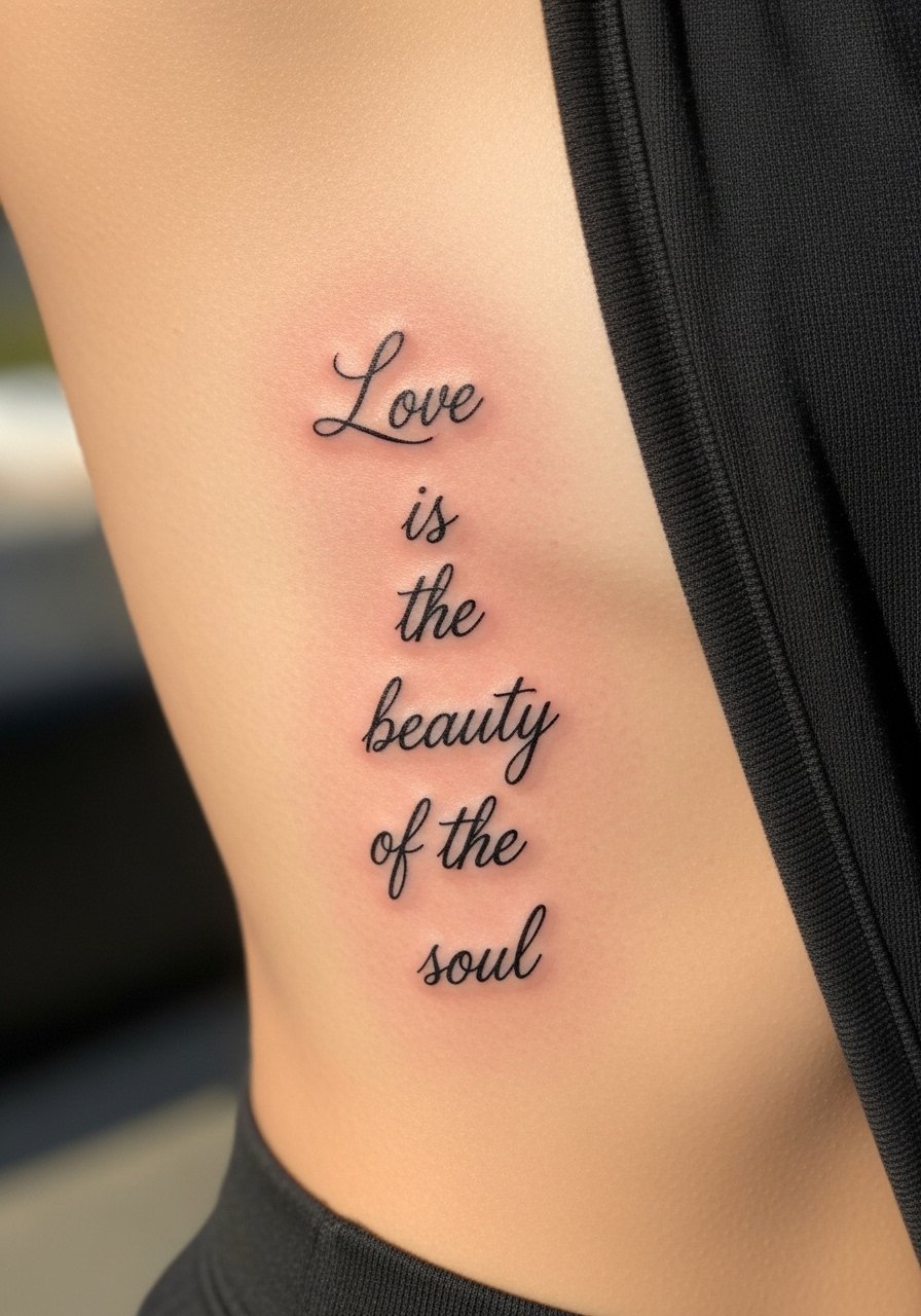
Fair warning, the ribcage is a seven out of ten on most pain scales, but the vertical flow of italics maps beautifully to that curve. Artists split on whether super-fine italics hold up on ribs. One camp says the constant stretch with breathing blurs thin strokes within two years. The other camp says proper needle depth and slightly wider spacing keeps the script legible. Ask where your artist stands and request a mock-up showing how the line thickness adapts to movement. Expect a longer session and a realistic touch-up window around year two. This placement is for someone who is okay with a higher pain trade-off for a private, intimate statement.
5. Watercolor "Be the change" on the shoulder blade
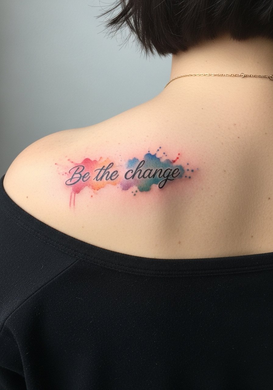
There's a debate about watercolor and longevity because pigments can fade faster than solid black. From what I've seen, keeping the script in black while using color as a soft background splash preserves legibility longer. The shoulder blade gives space for a medium-sized composition and is mild on pain with a one- to two-session timeline if color layering is involved. Tell your artist you want black script with watercolor accents that do not cross the lettering. A mistake is wrapping saturated color tightly around thin letters, which invites early fading and a muddy look. This approach works well for someone who wants painterly energy without sacrificing readable text.
6. Blackwork "Turn your wounds into wisdom" on the inner thigh
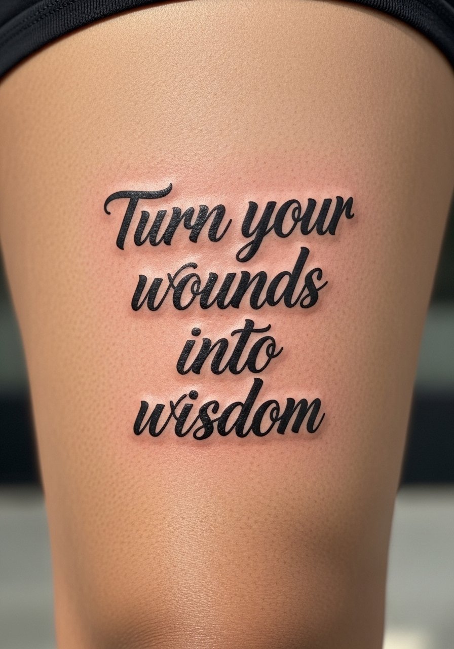
The inner thigh is a personal, higher-pain spot that heals protected by clothing, so saturation tends to hold well there. Expect a single session with moderate discomfort during longer sittings. Blackwork scripts with solid fill age better than delicate lines in this area, because the thicker ink resists fading and blurring. A common error is trying to force ornate lettering into a curved thigh panel, which leads to uneven line weight as the skin shifts. Plan for a touch-up at year three if you exercise frequently or change body composition. This placement is ideal for a quote tied to recovery, resilience, or privacy.
7. Micro-realism "Dream as if you'll live forever" with an hourglass on the ankle

Most ankle micro-realism pieces are tiny and precise, so the trick is giving the text room to breathe. The ankle is a low to medium pain spot and sessions are brief. Ask your artist for slightly increased letter spacing and a simplified hourglass silhouette to prevent early loss of detail. The number one mistake is cramming a long sentence into an ankle-length strip, which often looks like smudged gray at year two. Expect touch-ups sooner than on thicker-skinned areas. This design is for someone who wants a discreet, poetic reminder that pairs with a small motif.
8. Ornamental "Strength" framed by a mandala down the spine

Mandala work traces to Buddhist and South Asian traditions, so consider small adaptations rather than direct replicas out of respect for origin. The spine offers a dramatic vertical read but is a higher-pain area near the vertebrae. Stipple shading and tight linework around a single word give meditative focus and age well if spacing is generous. Artists divide on how tight to place mandala elements near the spine. One group favors dense geometry for contrast. The other prefers airy spacing to avoid crowding during healing. Ask your artist which approach they use and why. Expect two sessions and a likely touch-up window at year three.
9. Ignorant-style "Still I Rise" with abstract waves on the calf

There is a raw confidence to ignorant style because thick, unapologetic linework resists blur. The calf is excellent for this approach since muscle provides stability and visibility. Pain is moderate and sessions are usually single but depend on size. Tell your artist you want intentionally uneven edges and confident fills so the piece keeps its rough charm as it ages. A real mistake is asking for over-detailed flourishes inside thick script, which defeats the aesthetic. Touch-ups are straightforward; keep an eye on saturation along the muscle curve where friction from clothing can shave contrast over time.
10. Traditional banner "Be yourself" on the inner bicep

There's a timeless readability to Americana banners, and the inner bicep is a forgiving canvas that keeps color saturation strong. Expect medium pain when the needle approaches the underside of the arm, and a single session for a compact banner. In consultation, ask for classic solid outlines and color blocking that will age with strong contrast. The usual error is over-ornamenting the banner with tiny detail, which becomes cluttered as lines soften. A touch-up at year three refreshes color and keeps edges crisp. This option suits someone who likes iconic visuals alongside a short, direct motto.
11. Fine line "Peace begins with a smile" with a lotus on the side of a finger

Finger placements are tiny and high-traffic, so expect faster fading and a shorter touch-up timeline. Hand and finger tattoos still affect hiring in some industries, so think about career visibility before committing. This side-finger script works if you keep the phrase very short and the lotus minimal. The number one mistake is asking for full sentences across multiple fingers, which crowds and blurs. Pain is sharp but brief, and touch-ups are often needed every 1–2 years. If you want a daily positivity cue that reads when you gesture, this discreet finger location delivers in micro doses.
12. Neo-traditional "The flower that blooms in adversity" starting an inner forearm sleeve

There's real visual drama when a long quote becomes the spine of a sleeve start, and the inner forearm keeps text readable in most poses. Expect a multi-session plan with medium discomfort during longer sitting blocks. Tell your artist you want the script to flow between floral elements, not be swallowed by them, because dense composition can hide the words as the sleeve grows. A common mistake is treating the quote as an afterthought, which makes it disappear once more elements are added. Plan on scheduled touch-ups as color settles, and keep future integration in mind during the consultation.
Tattoo Prep and Aftercare Essentials
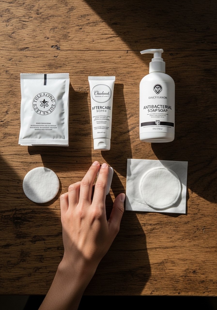
Prepare like you are caring for a precision instrument. I tell people to arrive well-rested, hydrated, and with a clean skin patch where you plan to sit. Aftercare is about gentle cleansing, barrier protection, and sun avoidance. Below is a compact shopping list that covers pre-appointment prep, immediate healing, and long-term maintenance. I relied on product searches and community favorites, and I keep only one mainstream product in this list for broad availability.
Fragrance-free gentle foaming cleanser. Use for the first week to remove ointment without stripping the skin barrier. Gentle foams rinse easily and reduce rubbing.
Lightweight fragrance-free balm. Apply a thin layer during the initial moist healing phase. Avoid heavy greases that trap sweat.
Medical-grade second skin bandage, 4×6 inches. Good for large areas or overnight protection when you need a sterile barrier.
Silicone scar sheets, small pack. Useful long term for smoothing raised lines after full healing.
Gentle mineral sunscreen SPF 30, fragrance-free. Essential for protecting healed ink from UV fade.
Hypoallergenic soap bar, unscented. For shower days when you need a no-fuss cleanser.
Microfiber towel, lint-free small towel. Use for gentle patting only, not rubbing.
Saniderm transparent wound dressing. If you like occlusive coverings, this is a popular single mainstream option. Use only if your artist recommends it.
Every tattoo is different. Always follow your artist's specific aftercare instructions. Consult a dermatologist if you have skin concerns or unusual healing issues.
Frequently Asked Questions
Q: Will fine line scripts on the collarbone blur faster than the same script on the forearm?
A: Yes, from what I've seen fine line on collarbone can lose crispness sooner because the skin there is thinner and stretches with movement. Forearms are more forgiving and usually hold linework longer. Ask your artist for slightly bolder lines on collarbone pieces if you want longer-lasting definition.
Q: Do watercolor-style quotes need different aftercare than traditional black scripts?
A: They do not require a completely different routine, but watercolor pieces often use diluted pigments that sit more superficially. That means strict sun avoidance and consistent moisturizing help preserve color. The fragrance-free balm linked above works well during the early phases for both styles.
Q: If I start a forearm sleeve with a quote, how should I plan future elements so the words stay legible?
A: Plan the quote as a compositional spine. Tell your artist you want negative space reserved around letters and that motifs should lead into, not over, the script. Discuss future sessions up front so scale and flow remain consistent as the sleeve develops.
Q: How often do finger scripts need touch-ups compared with an inner thigh piece?
A: Fingers typically need touch-ups every 1–2 years because of constant washing and friction. Inner thigh pieces tend to hold saturation longer and often go three or more years before a touch-up, assuming stable body weight and minimal abrasive contact.
Q: Are mandala-framed words culturally sensitive to tattoo, and how should I approach that respectfully?
A: Mandala patterns originate in religious and cultural practices, so many people choose to alter motifs or combine personal symbolism instead of copying sacred imagery exactly. A short conversation with your artist about origin and intent usually leads to respectful adaptation.
Q: What should I say during a consultation if I want a quote to age well?
A: Ask the artist about recommended line weight and spacing for your placement, request healed photos of similar work on comparable skin tones, and discuss a realistic touch-up timeline. I have found asking for healed examples of the exact script size clears up expectations quickly.
