
Someone I know spent eight months scrolling tattoo feeds before realizing the real problem was not the designs. It was picking a style that would hold up on her skin, fit her day job, and still feel like her five years from now. I visited five shops across Brooklyn and talked to artists who specialize in fine line and small script. What follows is a mix of name tattoo ideas for women that balance how they look fresh with how they heal, where to place them, and what to say at your consult.
1. Minimalist script "Ava" on the collarbone

Someone I know first saw this style on a friend and booked the same placement the next week. The collarbone reads elegant while still letting you hide it under a blouse. Tell your artist you want 2 to 3 millimeter stroke width and slightly increased letter spacing so the script does not blur into itself over time. Fair warning, the collarbone can sting more than a forearm, but sessions are short, usually under an hour. A common mistake is asking for ultra-tiny letters. If the script is too small it will lose crispness in one to three years, and then you will be looking at a touch-up. For a cleaner long-term look, keep the size around two to three inches and stick to black ink for strong linework.
2. Watercolor splash "Maya" with floral accents on the forearm

Most watercolor pieces need more saturation than they appear in photos. I learned that from watching a forearm session where the artist layered color instead of relying on a single wash. When you consult, ask how much saturation they plan to use and whether they will outline the name lightly to protect the edges. Expect one to two sessions and moderate pain on the forearm. Watercolor can look soft at six months and then shift by year two, so plan for a color refresh if you want the original pop five years out. A common mistake is asking for a wash so thin it behaves like a bruise while it heals. Tell your artist you want vibrant placement but gentle edges.
3. Geometric patterned name frame "Nora" on the inner wrist

The biggest mistake with geometric frames is going too small. Linework needs breathing room. Ask for a reference photo that shows the exact frame scale you like and request that the artist maps the piece to your wrist circumference during the consult. Inner wrist skin is thin so blowout risk is higher. Expect a single focused session of under two hours. Over time the geometry holds better when lines are spaced at least two to three millimeters apart. If the frame is cramped, the straight edges will blur into a shaded block by year three. This style suits someone who wants structure paired with a name.
4. Handwritten-style name "Sofia 03.14.1994" along the ribcage

Fair warning, the ribcage rates high on most pain scales but the outcome can be quiet and intimate. Artists split on fine line on ribs. One camp argues the skin stretch blurs thin lines within two years. The other camp says that with correct needle depth and slightly bolder linework, the script can settle cleanly. Ask where your artist stands and request a mockup with slightly increased stroke weight if they lean conservative. A common error is asking for live-exact handwriting at micro scale. If your handwriting is shaky, ask the artist to smooth the rhythm so it reads well healed. Expect a one-session piece with possible touch-up at year two.
5. Celtic knotwork encircling the name "Ciara" on the shoulder

When you want a sense of continuity, knotwork can anchor a name without overwhelming it. Tell the artist you want negative space between knot loops so the pattern keeps definition as it ages. Shoulder placement is forgiving for blowout but the design often needs two sessions when the knotwork is dense. A common mistake is asking for ultra-small interlacing that becomes a muddied texture after healing. This version keeps the name readable by placing it inside a clean loop and leaving buffer space around letters. If the knot has cultural meaning, acknowledge its Celtic origins and consider a subtle variation rather than an exact replication.
6. Fine line name "Olive" with lavender botanical on the ankle
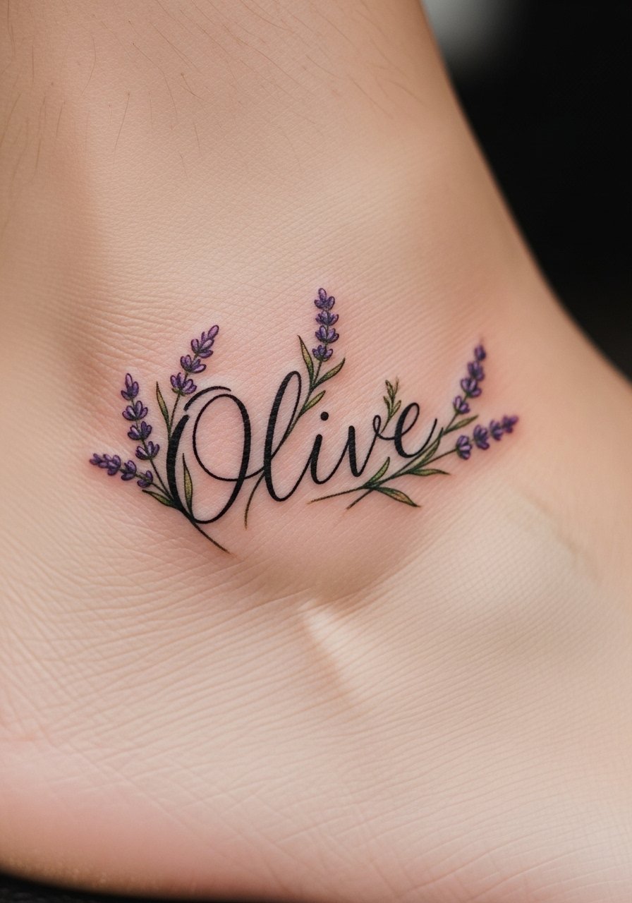
When I saw this on someone who gardens, it read like a low-key signature. The ankle is sensitive but small botanical partners give the name context. Ask your artist for stipple shading rather than solid fill on the lavender so it ages with softness. A common mistake is placing heavy shading on the ankle which can obscure the name in two years. This piece usually needs one short session. Expect touch-up possibly at year three, especially if you expose the area to sun regularly. For longevity, keep the script steady and let the lavender act as framing, not fill.
7. Silhouette portrait outline with integrated name "Amelia" on the thigh
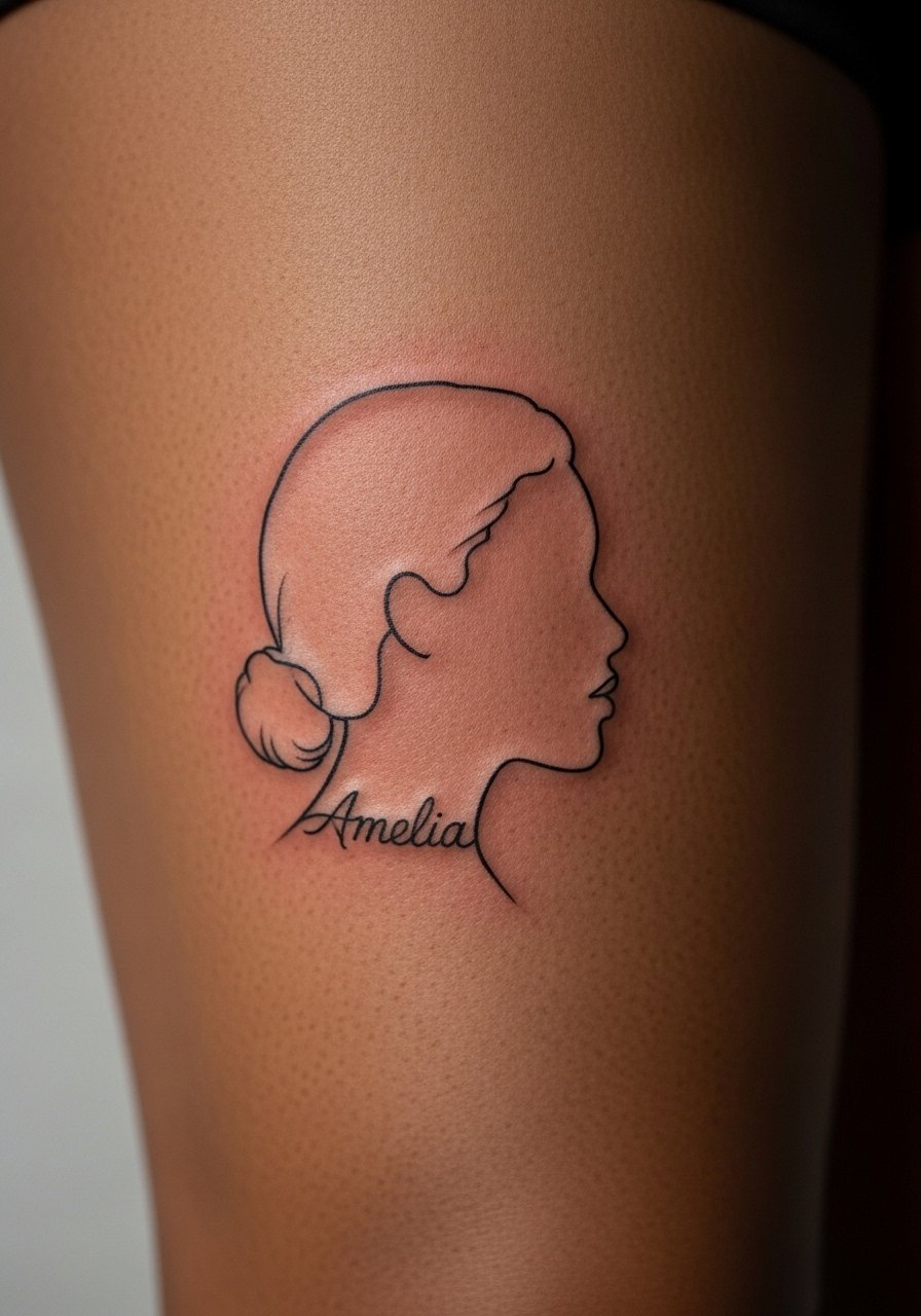
There is real sentiment to merging a tiny portrait silhouette with a name. Thigh skin takes ink well but can be prone to slight stretching with weight changes. In your consult, show reference silhouettes and specify that you want the name woven into the base line rather than sitting on top. A common error is insisting on too much facial detail at small scale. Micro-realism needs space, so keep the portrait simple. Sessions range from one to two hours. Expect the silhouette to age predictably, and plan for a touch-up at year three if you want crisp edges. This design reads like a quiet tribute that stays personal.
8. Morse code for "Eve" on the finger
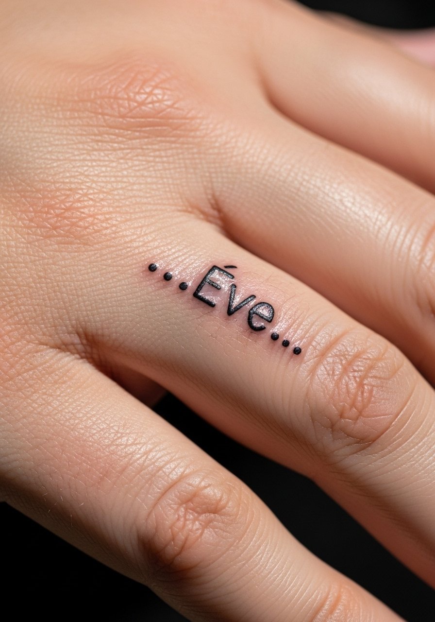
Morse keeps the name private in plain sight. Supporters like the secrecy, while others say the unreadable pattern reduces daily recognition. If you choose Morse, tell your artist you want evenly spaced dots slightly larger than you think necessary, because finger skin moves and small dots can fade quickly. Finger placements have high touch and wash exposure so expect faster fading and touch-ups every one to two years. A common mistake is requesting ultra-tiny dots; that yields rapid dot loss. If you want more longevity, place the code on the side of the finger rather than the pad.
9. Binary code "01001101 01101001 01100001" behind the ear for the name MIA
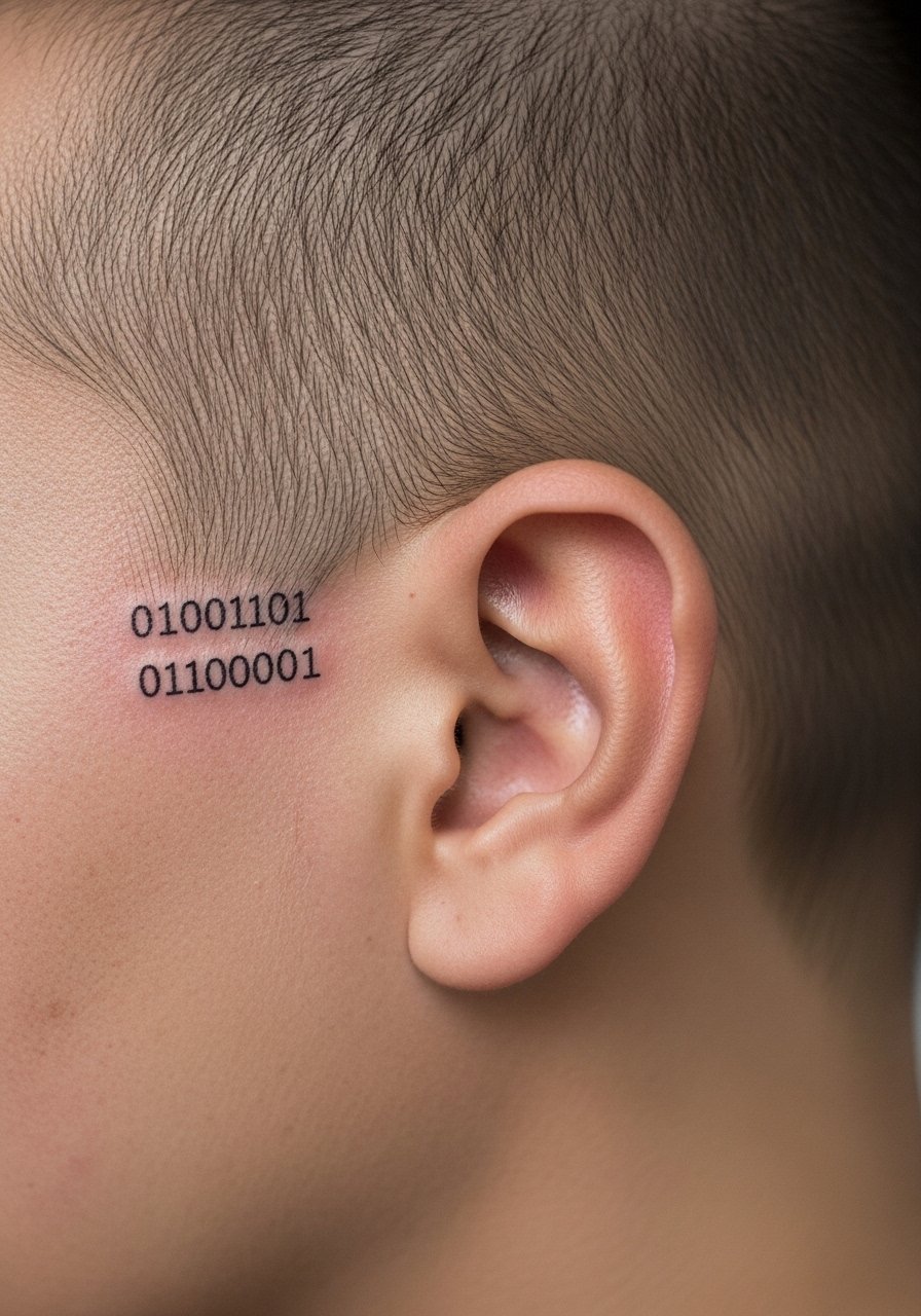
Binary appeals to tech-minded folks who want a ciphered name. Fans love the mystery, while critics say most people never decode it so the everyday meaning is lost. Ask your artist to use a monospace type and to keep the numbers legible with even spacing. Behind-the-ear skin is thin so pain is brief but distinct. Common mistakes include running the sequence too long for the placement, which forces smaller digits and faster blur. Expect a single short session and a possible touch-up at year two if the digits soften. This is a quiet statement piece that rewards close inspection.
10. White ink scripted name "Zoe" on the forearm

White ink is often pitched as a low-commitment test. Proponents say it fades gently for easy cover-up. Critics point out that on melanin-rich skin it can become near invisible too quickly. If you are curious, ask your artist about placement and whether they will mix a faint gray shadow to keep readability for longer. Forearm placement exposes the piece to sun so plan for a fade timeline. A common mistake is expecting white ink to behave like black. It does not. Expect the need for touch-ups if you want the original brightness preserved. Decide based on your skin tone and how visible you want the name to be.
11. Blacklight-reactive name "Luna" on the lower back
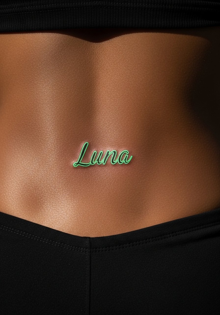
Blacklight ink is the ultimate private message that appears under UV. People who prefer secrecy love it, while others worry about long-term pigment stability. Ask whether the studio tests UV ink under blacklight before you leave. Lower back is a friendly canvas and sessions are usually short. A frequent mistake is assuming UV ink behaves exactly like regular ink. It can fade in sunlight differently and may require color-safe touch-ups. If you expect the piece to be a lifelong secret, discuss the ink brand and touch-up plans with the artist during the consult.
12. Initials "K.B." with a tiny rabbit for wrist charm
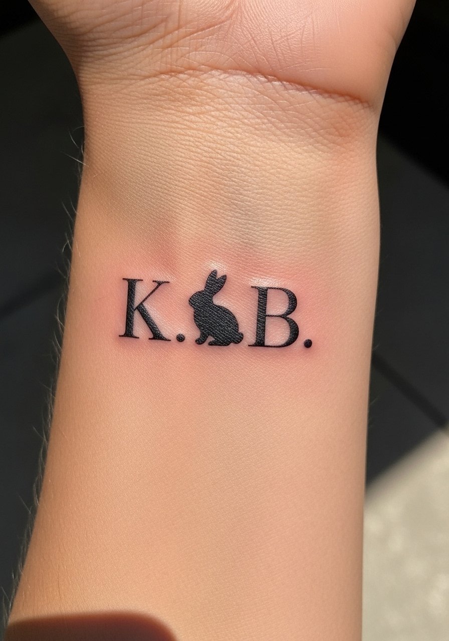
Playful initials paired with an animal can make the name feel lived in. Fans appreciate the creativity, while others warn about accidental humor risk with certain initials. When you bring this idea, bring a few animal sketches and be explicit about scale and expression so the rabbit does not look cartoonish. Wrist placement shows easily and sessions are quick. A common mistake is letting the icon crowd the initials, which reduces legibility after healing. Keep the animal small and the initials clean, and plan for a touch-up at year two if lines soften.
13. Roman numerals "VI.XXV.MCMXCII" below a name on the nape
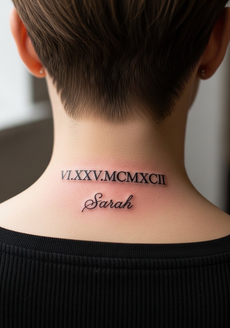
Roman numerals add formality without shouting. Nape placement is easy to conceal and the linear layout suits the spine flow. Ask for slightly increased letter spacing in roman numerals so the strokes stay separate over time. A common mistake is compressing numerals into a tiny band which can become unreadable. Sessions are short and pain moderate. Expect the numerals to soften by year three on some skin types. For longevity, choose a clear serif or thin monospace and leave breathing room between characters.
14. Single-initial "A" monogram with filigree behind the ear

A monogram behind the ear reads elegant and discreet. The area is small so ask for a simplified filigree that reads at scale rather than intricate loops. Artists sometimes over-detail small filigree which looks busy after healing. This placement has brief sharp pain but heals quickly. Expect a single short session. If your initial will be visible in professional settings, note its placement before booking. For cultural patterns in the filigree, acknowledge origins and consider a personalized twist rather than direct copy.
15. Script loop with heartbeat and the name "Maya" over the sternum
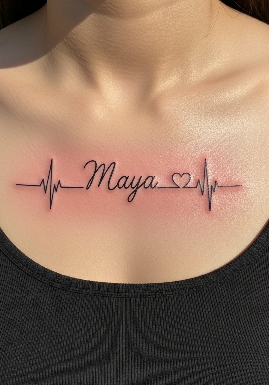
Sternum work has a strong emotional feel but pain is higher and sessions can be patchy. If you choose this, look for an artist experienced with chest pieces because skin tension changes a lot. A frequent error is asking for continuous micro line without accounting for stretch. Ask for slightly reinforced linework through the loops and request a mockup in your natural posture. Expect one to two sessions and a possible touch-up at year two if lines soften. For career-sensitive folks, remember this placement is easy to conceal.
16. Stipple botanical frame with the name "Ivy" on the ankle

Dot work can give a delicate texture that ages with softness. Tell the artist you want stipple rather than soft solid shading so the frame keeps its airy feel. Ankle bone placements can be painful and are prone to abrasion from shoes. A common mistake is over-saturating the frame which masks the name by year two. Sessions are short but precise. Expect touch-up at year three if dots migrate. This style fits someone who wants an understated botanical around a name without dense fill.
17. Block serif name "Sera" as a finger band
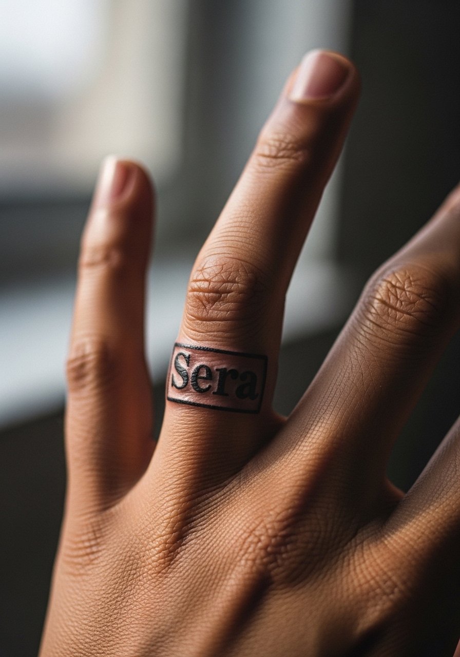
Finger bands look modern but they demand maintenance. I've seen crisp bands fade unevenly within a year when daily hand work wears them down. Ask for slightly taller letterforms so the serif keeps shape as ink softens. Fingers need regular touch-ups. A common mistake is picking ultra-heavy black that spreads into a solid band after healing. If you need longevity, place the band on the proximal phalanx instead of the joint area. Consider the piece a living design that will need refreshes.
18. Micro-realism tiny portrait with name "Grace" on the inner bicep

Micro-realism can be very sentimental but it requires scale discipline. The inner bicep is softer and accepts detail well. Tell the artist you want minimal facial features and clear negative space around the name to preserve legibility. A mistake is cramming too many facial details into a two-inch area which reads muddy after healing. Sessions can take an hour. Expect a touch-up at year two if contrast fades. This placement is forgiving and keeps the tribute private unless you show it.
19. Geometric framed name "Nadia" optimized for darker skin tones on the inner wrist

For darker skin tones, strong contrast and slightly bolder linework improve legibility over time. When you consult, mention skin tone so the artist can plan saturation and spacing. A common error is copying a super-fine design that reads well on light skin but loses definition elsewhere. Inner wrist is exposed to sun, so expect faded edges if you skip SPF. Sessions are quick and touch-ups are possible at year two. This variation keeps structure while respecting how saturation behaves on richer tones.
20. Stacked sibling names "Ella & June" on the ribcage

Most people underestimate ribcage pain but love the hidden reveal. If you are getting sibling names stacked, check spacing in a standing and lying-down mockup so the letters do not compress awkwardly. A common mistake is stacking without considering torso movement, which can distort lines over time. Expect one focused session and a possible touch-up at year two. This placement keeps the bond private and offers a larger canvas for small script. Decide beforehand whether you want an ampersand or a simple line between the names.
Tattoo Prep and Aftercare Essentials
Fragrance-free gentle foaming cleanser. Use for the first week to keep the area clean without stripping ink. Gentle foaming cleansers rinse residue better than bar soaps and cut down the risk of irritation.
Medical-grade second skin bandage, 6-inch roll. Useful for the first 24 to 48 hours on areas that rub against clothing. It reduces scabbing and lets you shower with less worry.
Lightweight fragrance-free balm. Apply sparingly after the initial scab phase to keep the skin from drying out. Fragrance-free options cut down on contact dermatitis risk.
Breathable tattoo aftercare ointment (small jar). Choose a non-greasy formula you can reapply during the first two weeks. Lightweight ointments can prevent excess scabbing while still letting the skin breathe.
SPF 50 mineral sunscreen stick. Long-term color and line retention depend on protecting healed ink from UV. A stick is handy for small areas like the wrist and collarbone.
Aquaphor Healing Ointment. Use this as your single mainstream reference for initial heavy moisture if your artist recommends it. Apply thinly and only for the first few days if chosen.
Silicone scar sheet strips for touch-up scar smoothing. Use later in healing if raised scarring appears. Silicone helps flatten early hypertrophic response.
Soft cotton recovery clothing, high collar or loose waistbands. Protect fresh ink from friction and keep fabric away from the tattoo while it seals.
Every tattoo is different. Always follow your artist's specific aftercare instructions. Consult a dermatologist if you have skin concerns or unusual healing issues.
Frequently Asked Questions
Q: Will a minimalist name on the collarbone blur faster than one on the forearm?
A: It depends on size and line spacing. Collarbone skin is thinner and moves differently, so very fine letters risk blurring sooner. Ask for slightly more letter spacing and a modest stroke width. Forearm placements tolerate finer work better and often need fewer touch-ups.
Q: Do watercolor name tattoos need different aftercare than black script names?
A: From what I've seen, watercolor pieces rely on layered pigments so avoiding heavy scrubbing and sun exposure matters more. Use a gentle cleanser and a lightweight balm during the first two weeks. Long-term, strict SPF helps maintain color saturation.
Q: How visible will Morse or binary name tattoos feel socially?
A: Coded names feel private because most people do not decode them. That privacy is the point for many clients. Keep in mind fingers and neck placements are more public physically and may require more frequent touch-ups.
Q: Are white ink names recommended for darker skin tones?
A: Artists are split on this. Some recommend white ink as a fading option for low commitment. Others caution that it can become nearly invisible on melanin-rich skin. Ask your artist to show healed examples on similar skin tones and discuss using a subtle gray base for longevity.
Q: How often will finger and hand name tattoos need touch-ups?
A: Expect maintenance more often than for torso or thigh work. Fingers and hands are high-friction and exposed to washing. Plan for touch-ups around once every one to two years if you want crisp lines.
Q: If I want a UV-reactive name, what should I ask an artist at consult?
A: Ask whether they test the UV ink under blacklight before you leave and what touch-up schedule they recommend. Also ask about sun exposure effects on that specific ink. If they cannot show healed UV examples, consider another artist or placement.
