
The sleeves that still read bold after five years are often the ones built around clear anchors and smart negative space, not a hundred tiny symbols jammed together. Expect a multi-session investment, commonly in the low thousands for a full arm, and plan pacing so you do not burn out halfway through. Below are focused ideas that show how composition, linework depth, and wardrobe choices keep large pieces looking intentional rather than cobbled together.
1. Black-and-Grey Skull and Graveyard Sleeve

A skull-and-graveyard sleeve works when you let the big shapes do the reading from a distance and keep the micro details for close inspection. For a sleeve like this plan 4 to 8 sessions that alternate anchor pieces and background filler so the artist can pace saturation across the arm. A common mistake is filling every square inch with tiny tombstones. Leave bands of negative space and a wide midtone mist so the skulls do not vanish into each other by year two. On session day wear a loose short-sleeve tee you can push up, and when you want to show the sleeve pair it with a solid crew neck tee in black or charcoal that keeps the focus on linework and contrast.
2. Japanese Dragon Sleeve, Outer Arm Flow

This composition is all about movement along the arm and how the dragon scales tuck into the negative space. Artists and clients often debate color choices for Japanese work. One camp argues black and grey keeps saturation consistent across several sessions and ages more predictably. The other camp says vivid color is worth the extra touch-ups because it gives the piece identity, especially with traditional palette cues. For the sleeve plan request larger scale color blocks rather than dozens of tiny highlights so the inks keep their visual weight as the skin ages. Respect the cultural origins by asking how classic Irezumi motifs will be adapted without copying ritual imagery.
3. Celtic Knotwork with Compass Anchors
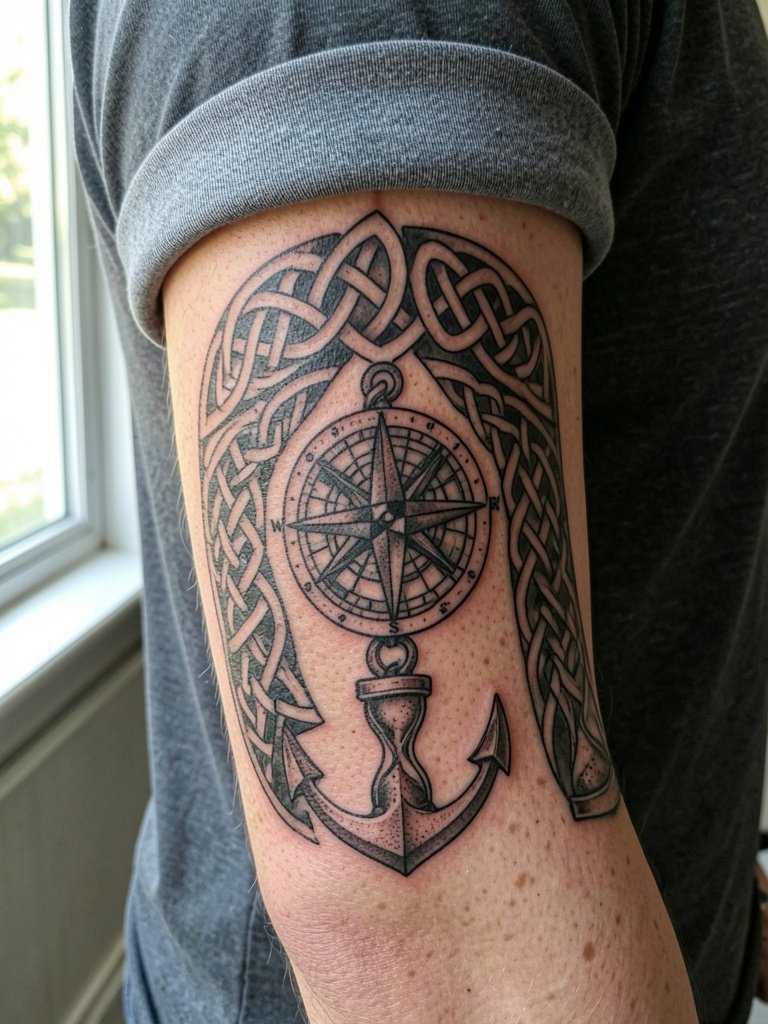
Celtic knot sleeves need breathing room. High line density without large anchors creates visual mud after healing. When you want an emblem that reads at a glance, pick a compass or hourglass as an anchor and let the knotwork transition into stipple shading. The inner-flow panels are where blowout is most likely, so ask for slightly thicker linework in the smallest knot runs so the pattern holds at year five. For wardrobe, this sleeve pairs with workwear overshirts or fitted tees in navy or faded gray. If you plan to build over time, map the main knots in the first sessions so future pieces fit the weave.
4. Yggdrasil and Norse Mythology Sleeve
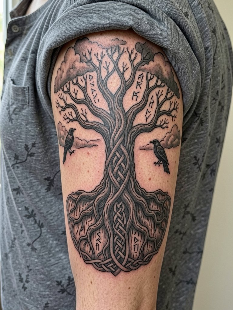
A Norse tree sleeve reads as a single narrative when the branches and roots are the compositional spine. Avoid putting too many tiny runes crammed together. A common version that ages poorly is one with narrow twig-like roots and dense background stippling that turns into muddiness. Instead ask for bold root anchors that taper into finer texture at the edges, so the silhouette stays legible at five years. Be explicit about which myth elements you want and why, and mention cultural sensitivity so the imagery is respectful rather than decorative.
5. Lion Portrait Sleeve with Realism Shading

Portraits demand measured contrast and planned gaze placement so the face reads regardless of arm contours. Expect a three to seven session rhythm depending on how much surrounding mane you want. A mistake is compressing fine whisker lines too close to shadow areas. Discuss eye highlight placement and ask the artist to draw a muscle-mapped mockup so the lion's face does not distort when the bicep flexes. For showing the piece, a rolled-sleeve henley or fitted tank keeps the portrait visible without competing prints.
6. Wolf and Forest Narrative Sleeve

Forests are perfect for depth because overlapping tree lines create natural layers without extra detailing. The session feel here alternates block shading for background trees and concentrated stipple for the wolf fur. A common healing problem is evenly dark backgrounds that swallow the subject. Keep one tonal band of midspace between wolf and background so the face stays crisp at two and five years healed. For an everyday look try a workwear overshirt in black or navy to contrast the organic imagery when you want to show it off.
Heal Smart
The first six sleeves above include both heavy blackwork and areas of fine detail that heal differently. These picks make chair day and the first week easier and protect detail in riskier zones like inner arms and wrists.
- Bepanthen Tattoo Ointment. A gentler-feeling early-healing ointment used by some people who find petroleum-heavy balms too greasy on large areas.
- Aveeno Fragrance-Free Lotion. Light, non-irritating daily moisturizer once the initial weeping stage is over and you need to keep a full sleeve hydrated without clogging.
- CeraVe Healing Ointment. A fragrance-free option that can replace heavier balms for people prone to clogged pores during long healing windows.
- Lightweight Tattoo Balm. Use thin layers on large sleeves so the skin can breathe and the ink does not appear slick while scabbing.
- Saniderm Second Skin. Protective film that guards fresh sleeve work from friction in the first 24 to 72 hours, especially useful when the sleeve rubs shirt seams.
7. Phoenix Sleeve with Motion and Color

Phoenix designs are about sweep and rhythm rather than micro detail. If you want color, plan saturation as large swaths rather than tiny gradients so touch-ups remain minimal. Color supporters say the energy and identity of a phoenix rely on strong pigments. Color skeptics point out it will need periodic touch-ups and more sun protection over time. Both views are valid, so pick which trade-off matters more and request saturated fields that read at arm scale. For session wear bring a loose shirt or a rolled sleeve henley so the artist can work shoulder to forearm without fabric interference.
8. Ornamental Mandala and Geometric Sleeve

Geometric sleeves hinge on scale. The biggest mistake is shrinking mandalas down so the small shapes merge with time. Fine-line advocates say modern single-needle geometry can hold up if spaced correctly. The bold-line camp warns that thicker anchors age more predictably and read from a distance. Both camps are right depending on placement and skin texture, so ask for measured spacing maps and slightly heavier anchor rings where the arm curves. For display pair this sleeve with plain fitted tees in neutral tones so the symmetry is the visual focus.
9. Ocean Wave and Koi Composition

Koi and wave sleeves are modular by design, which helps when you want to build over time. The water fills are where cohesion happens, so prioritize flow lines that reconvene at the elbow or forearm. Over-saturating tiny scales is a common mistake. For the session wear a loose short-sleeve tee that can be rolled without stretching the fabric across the shoulder. Expect color to fade faster on sunny forearms, and plan touch-ups accordingly.
10. Patchwork Sleeve Built Over Years

Patchwork sleeves are the collector route and they bring their own planning needs. One camp values the flexibility of building over years and choosing motifs as life changes. The other camp prefers a fully planned sleeve because a predesigned composition controls negative space and flow from the start. Both approaches work but they require different conversations. If you go patchwork, secure at least three anchor placements early and reserve wide bands for future filler so the arm does not end up visually fragmented. Wear a loose button-down that can be opened or pushed up for shoulder and upper arm sessions.
11. Traditional American Eagle or Panther Sleeve
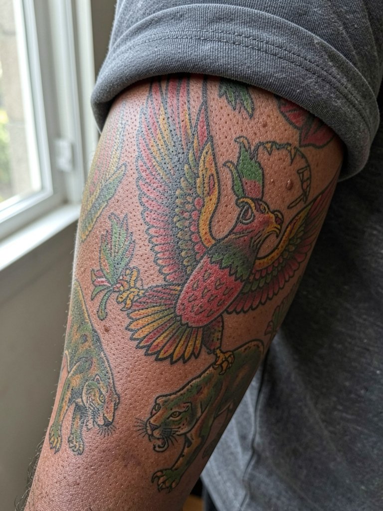
Traditional American flash ages well because of bold anchors and limited palette. The session feel is often energetic and fast because the artist works block color and thick outlines. A common error is asking for tiny modern details inside a traditional anchor. Keep the motifs large and the color blocks clean so the piece reads from a distance. For showing off choose a plain fitted tee in a muted shade so the bold outlines pop.
12. Space Sleeve with Planets and Galaxies

Space sleeves solve the negative-space challenge by using circular forms and soft gradients to tie the arm together. A bad version floods the arm with tiny white-star specs that fade into patchy light areas. Ask for stacked planet anchors and broader nebula paddings so the sleeve keeps structure at distance. Session time alternates detailed planet work and larger blending passes, which is easier to schedule over four to eight sessions. When you want to show the sleeve, solid neutral tees let the color pops read clearly.
13. Gothic Cathedral or Cemetery Architectural Sleeve

Architectural sleeves need strong anchors like columns and window arches to hold the composition. The problematic version uses tiny brickwork everywhere which becomes visual noise. Instead, request broad planes for the main structures and detailed texture only in focal points. Pain is often higher across ribs and inner arm connectors when you wrap features into those spots. For display layer with a lightweight overshirt or open shirt that frames the upper arm without competing patterns.
14. Filigree and Playing-Card Neo-Traditional Sleeve

Decorative filigree gives a sleeve an upscale look if the ornaments are scaled for the arm. Tiny, lace-like filigree is a trap on textured or mobile skin. Instead ask for filigree that reads as frames around larger card portraits so the whole arm reads from a distance. The session feel alternates portrait passes and ornamental lining. For showing the sleeve keep the shirt simple and avoid bracelets on the tattooed wrist so the finishing elements remain visible.
15. Filmed-Inspired or Space for Torso-Spill Sleeves
If you plan to spill a sleeve into the torso, plan the junction early so the negative space lines up. A typical mistake is finishing the arm and then trying to force a chest or rib scene that does not match the arm's tonal rhythm. Mark the connecting anchors in session two or three so future torso work snaps into place. Note that ribs require different pain pacing and may need topical numbing applied before long sittings. For session comfort wear a loose button-down that opens fully so the artist can access the side torso without fabric friction.
Frequently Asked Questions
Q: How much should I budget for a full sleeve and how are costs usually spread across sessions?
A: Expect a full sleeve commonly to fall between about $1,500 and $5,000 depending on coverage, color, and artist rates. Most people break this into deposits and multiple sessions, often booking three to ten sessions over months. Factor in a modest tip per session and a small touch-up later on.
Q: Will black and grey hold up better than color for a sleeve?
A: Black and grey typically ages more predictably, especially for high-contrast anchors, because color can fade unevenly and needs more sun protection and occasional touch-ups. Color fans argue the added energy and theme clarity is worth future maintenance, so choose based on whether you prefer lower upkeep or a more vibrant original look.
Q: I want to build a sleeve over years. How do I avoid it looking random?
A: Start by placing three to five anchor pieces and reserve contiguous filler bands for background work. Ask the artist to map transitions and show you how negative space will tie motifs together. That planning keeps a patchwork approach from becoming a sticker book.
Q: How do I find artists who show healed sleeves rather than only fresh photos?
A: Search healed-work tags on Reddit and filter Instagram or TikTok portfolios by location, then look for studio portfolio pages that explicitly label healed photos. Try keywords combining style and placement like "black and grey realism sleeve healed" and check convention guest lists for artists who do multi-session pieces.
Q: What should I wear to a full-sleeve session and how should I show the tattoo afterward?
A: For session comfort wear easily pushed-up items like a loose short-sleeve tee or a button-down you can open, depending on placement. To showcase the healed sleeve, pick simple wardrobe pieces such as a rolled sleeve henley or a fitted tank so patterns or prints do not compete with the ink.
