
Someone I know spent months saving screenshots before they understood the real problem. The issue was picking a design that would age with their life and not blur into a fuzzy patch. I spent time in five shops across Brooklyn and talked with an artist who specializes in fine line. Below are 25 clock tattoo ideas with clear notes on placement, healing, and what to tell your artist so the piece still looks deliberate years from now.
1. Fine line clock with cherry blossoms on inner forearm
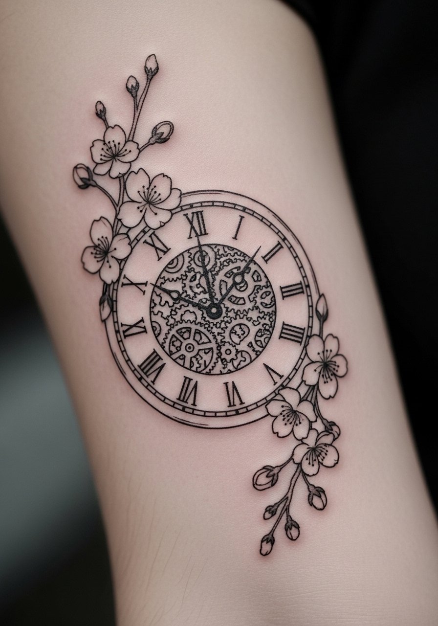
Someone I know first saw this on a friend’s forearm and booked the same artist. Fine line plus small floral accents reads delicate up close, and the inner forearm is forgiving for linework. Expect a one to two hour session and moderate pain. Tell your artist to keep spacing between numerals and blossom stems so the petals do not merge as it heals. A common mistake is asking for micro detail under 1 inch. That size risks early blurring and a touch-up at year two. On this placement, light sun protection helps saturation hold.
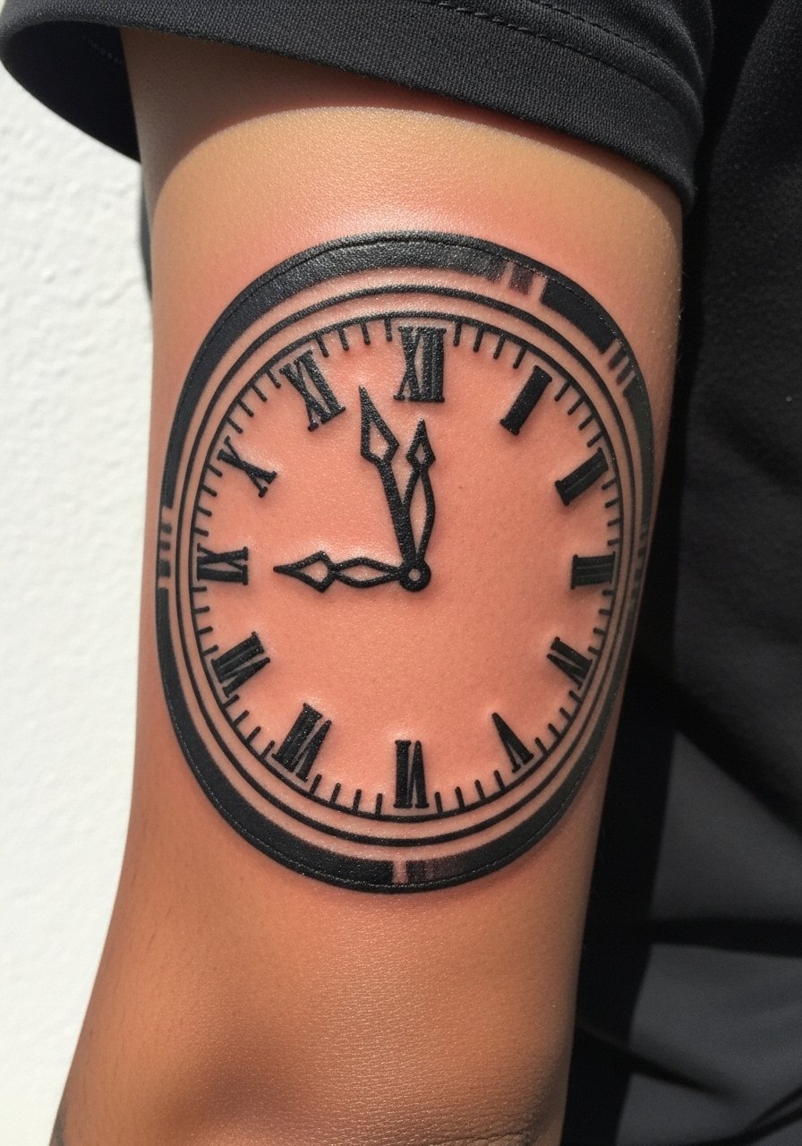
2. Minimalist Roman numeral clock on the wrist
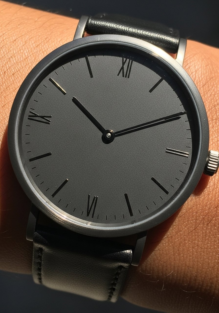
Fair warning: the outer wrist sees a lot of movement so thin lines can soften faster than on fleshier spots. This style is best for someone who wants a subtle daily reminder rather than a bold statement. Ask for slightly bolder line weight than your reference so the numerals read at six months. Expect a 30 to 60 minute session and sharp but brief pain. The biggest mistake is pushing for micro-sized numerals. Give each mark room and plan a touch-up in the third year if needed.
3. Watercolor clock with melting hands on collarbone
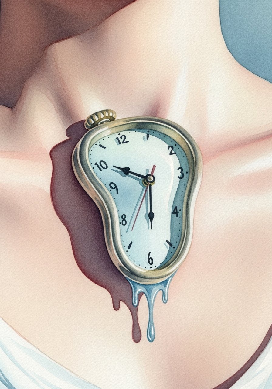
Most watercolor from a half decade ago looks like color bleed now. This version holds because the clock outline stays crisp while the color sits outside the linework. Collarbone placement is visible and sensitive. The session runs around two hours for a three-inch piece. Tell your artist you want color gradients that stop short of the metal rim so saturation does not lose shape. Healing here can feel tender for a week. Expect a color check at six to twelve months depending on exposure.
4. Blackwork geometric clock on ribcage
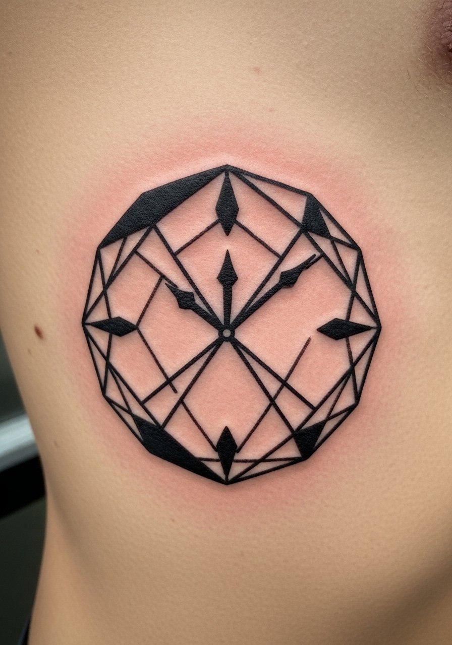
Fair warning: the ribcage rates high on pain scales but rewards with dramatic contrast. Artists split on whether solid blackwork on ribs always holds. One camp says heavy saturation seals well and resists fading. The other camp warns about natural stretching and recommends spacing to avoid blowout. Ask where the artist stands and bring examples that show clear negative space. Expect two to three sessions. If you want bold geometry that ages predictably, plan for dense saturation with crisp margins.
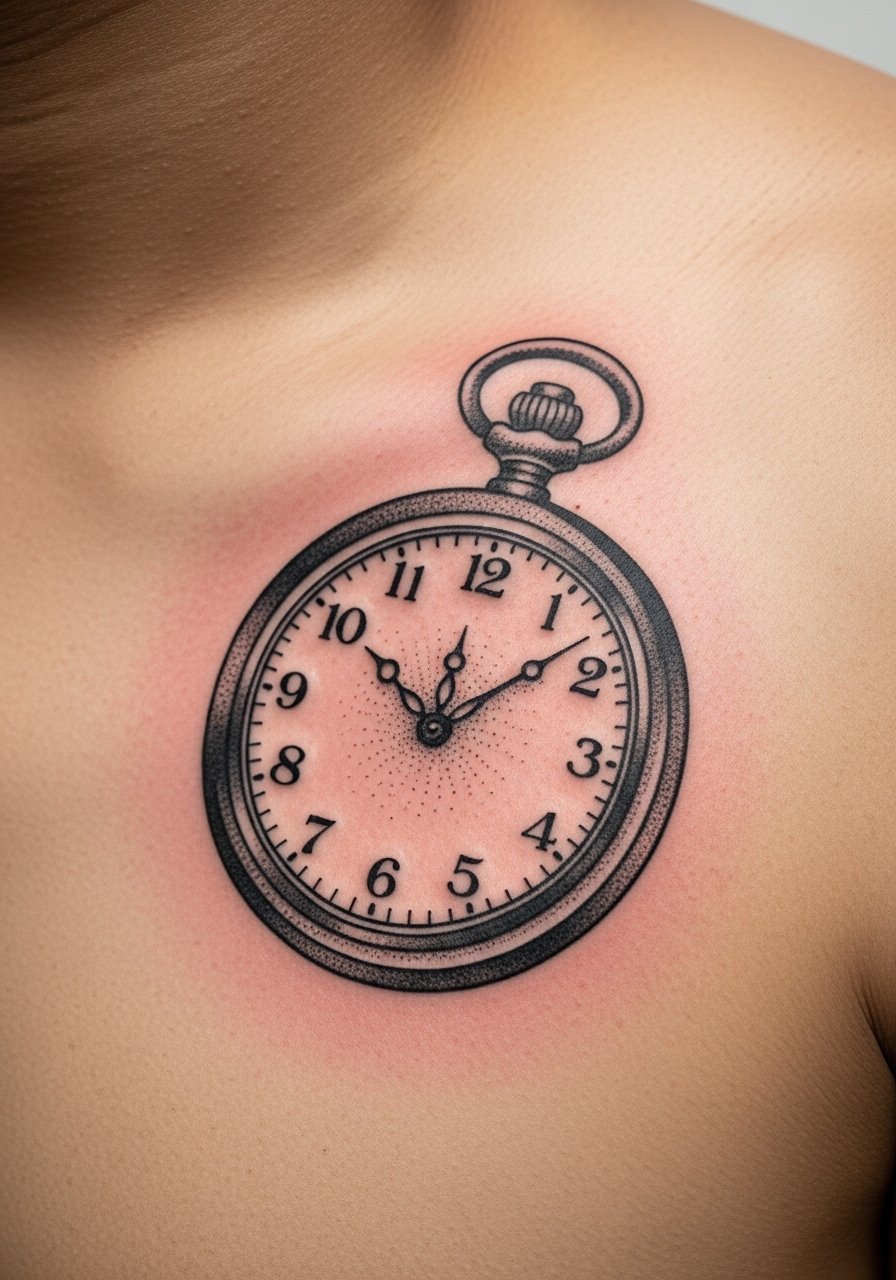
5. Neo-traditional pocket watch with roses on thigh
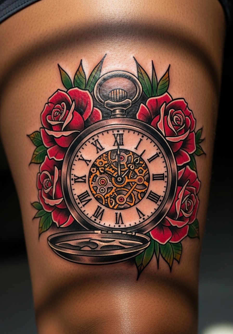
There is something about vintage pocket watch motifs paired with roses that reads like a personal heirloom. Thigh placement is forgiving for linework and color saturation. Sessions tend to be longer and might be broken into two visits for a 5-inch piece. During the consultation ask for strong outlines around the watch face and layered shading inside the roses to retain depth as the ink settles. The common mistake is over-detailing the chain links too small. Keep the chain slightly thicker so it remains visible at two years.
6. Micro-realism antique clock face on ankle
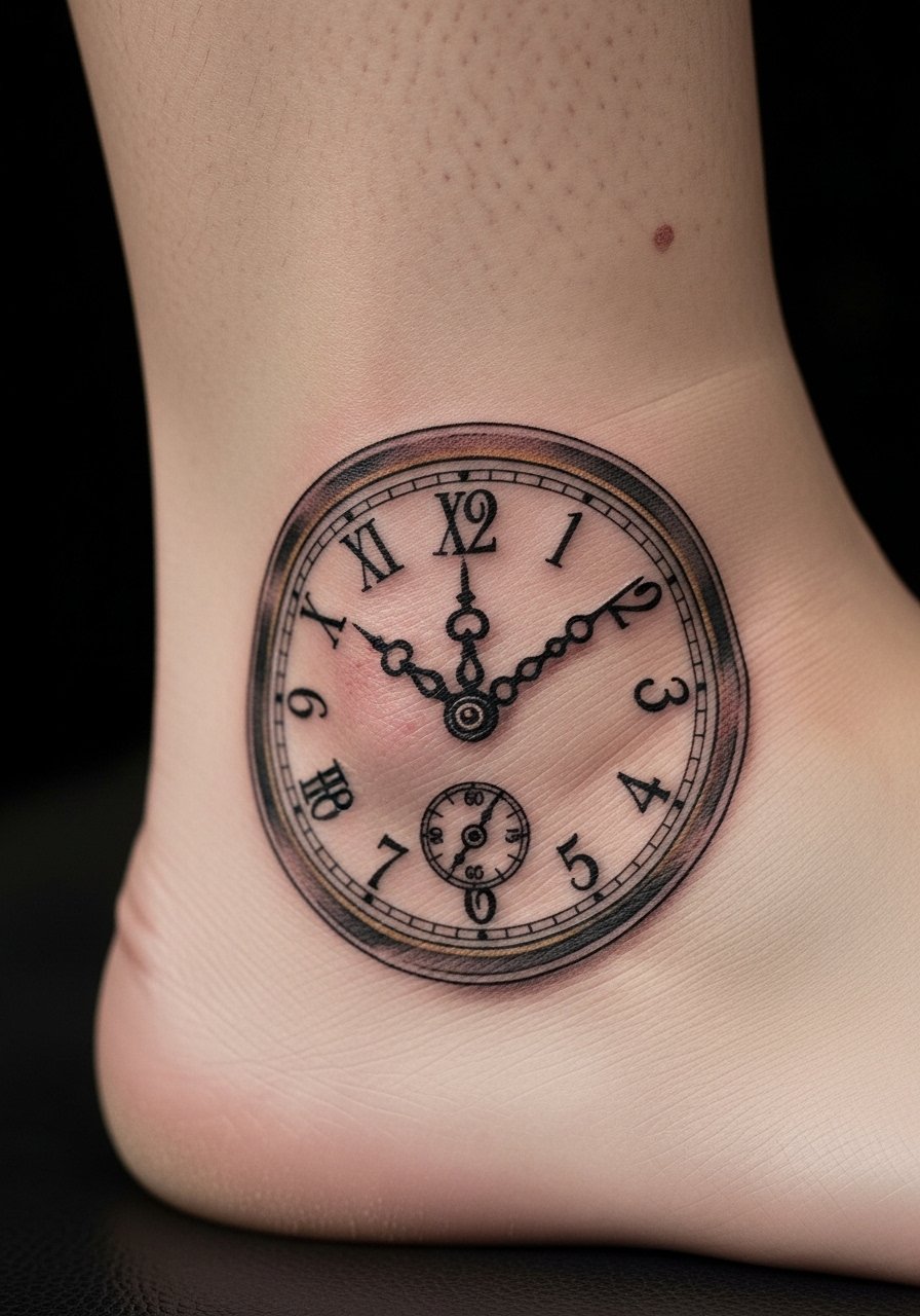
When you pick micro-realism for the ankle, expect a two-session plan for the best result. The ankle has thinner skin near bone so pain is sharper and lines can diffuse if the artist packs too much in one pass. Tell your artist you prefer crisp shadows and conservative contrast rather than tiny cross-hatching. A typical mistake is cramming hairline ticks into a small diameter. At six months the piece should show solid contrast, and at three to five years a light touch-up may be needed to restore fine highlights.
7. Ornamental clock mandala on shoulder blade
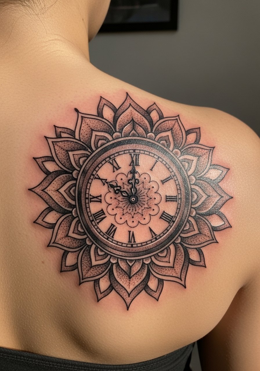
The shoulder blade is ideal for circular symmetry because it lies flat and moves little. If you want an ornamental mandala, ask for stipple shading and deliberate negative space to avoid the cake effect as it heals. Sessions are usually two hours for a four-inch piece. A mistake people make is insisting on ultra-fine dot work packed too closely. Keep dot spacing consistent so stipple reads at a distance. This placement ages predictably when you use regular sun protection and schedule a touch-up if any lines soften after two years.
8. Ignorant style broken clock with vines on forearm
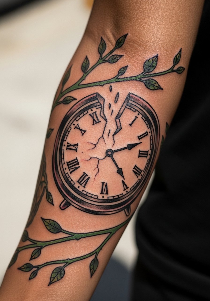
The ignorant style embraces imperfection with thick lines and playful composition. Forearms are forgiving for bolder strokes and show well day to day. Pain is moderate and sessions are usually one to two hours. When you book this, tell your artist you want intentional irregularities not accidental gaps. The most common error is asking for shaky lines that were actually poor stencil placement. This style holds well because of saturated linework. Expect minimal touch-ups if the outlines are dense and the vines have clear negative space.
9. Traditional clock tower silhouette on calf
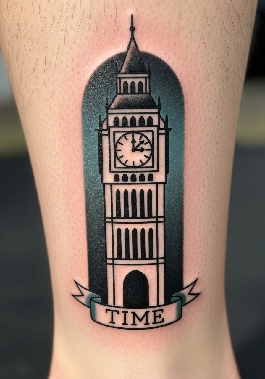
There is a visual impact to a vertical silhouette on the calf that reads from across a room. The lower leg handles bold traditional work well and the thicker lines resist fading. Sessions often run around two hours for a vertical six-inch piece. Tell your artist you want the tower silhouette to have a clear skyline edge to avoid a muddy border later. A mistake is asking for tiny ornamental windows that disappear. Healed, the silhouette keeps its presence, and touch-ups are rare if spacing and edge thickness are correct.
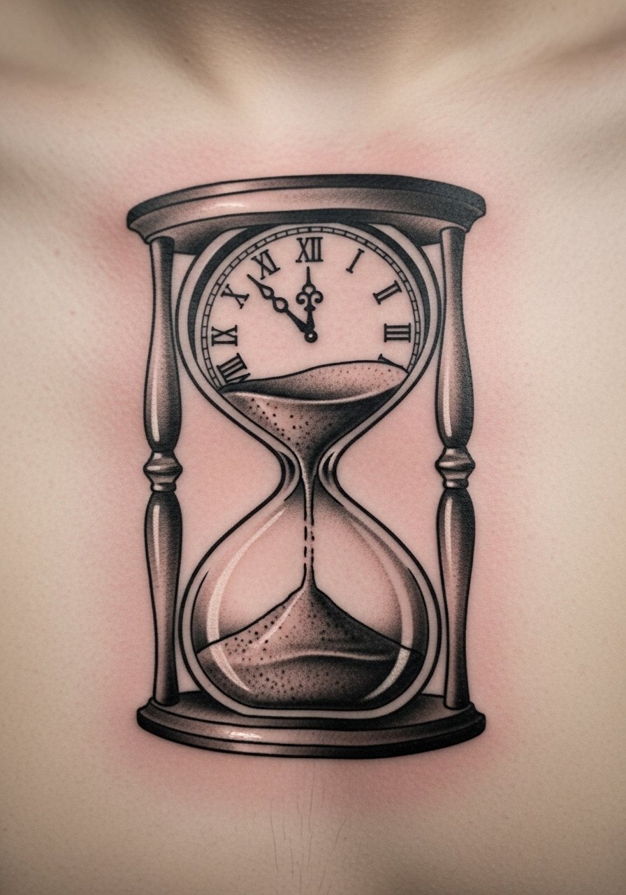
10. Fine line hourglass clock hybrid on finger
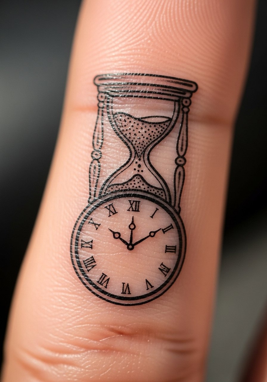
Finger tattoos are notorious for fast fading because the skin regenerates quickly. Expect short session time but a higher likelihood of needing touch-ups. This hybrid reads clever and compact but the biggest mistake is asking for complex numerals on a 0.5 inch canvas. Ask for simplified marks and slightly heavier linework than in references. Pain is brief but sharp. Plan for a touch-up within the first year and keep in mind hand exposure to water and friction speeds fading.
11. Black and gray clock with script quote on bicep
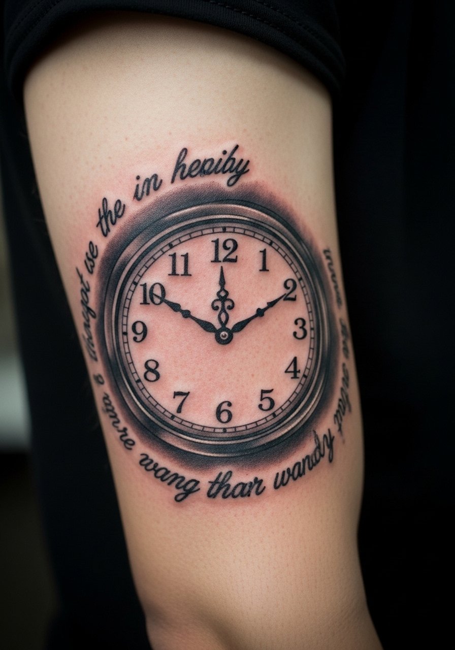
When a clock pairs with script for a memorial piece, the inner bicep protects both lettering and shading from sun. Sessions usually span two visits for ideal grayscale depth. Tell your artist the exact script text you want and the font size in millimeters so the letters do not close up as the ink settles. A common error is choosing overly ornate script too small to remain legible. Healed, the black and gray keeps its tonal gradation, and a touch-up can restore contrast if the quote softens.
12. Patchwork clock elements with stars on ribs
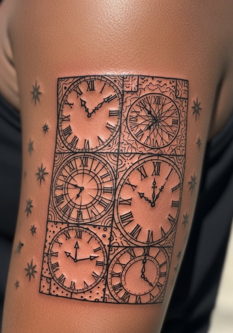
Fair warning: the ribs are sensitive and breathing makes the stencil shift while working. Patchwork approaches let you build a story over multiple sessions. If you go for modular pieces, tell your artist you want consistent line weight across sessions so the composition reads seamless. A common mistake is mixing line weights without a plan. Expect four or more short sessions. Artists debate fine line on ribs. One side argues the skin stretches and blurs lines. The other side says careful spacing and depth keep the lines. Ask where they stand before booking.
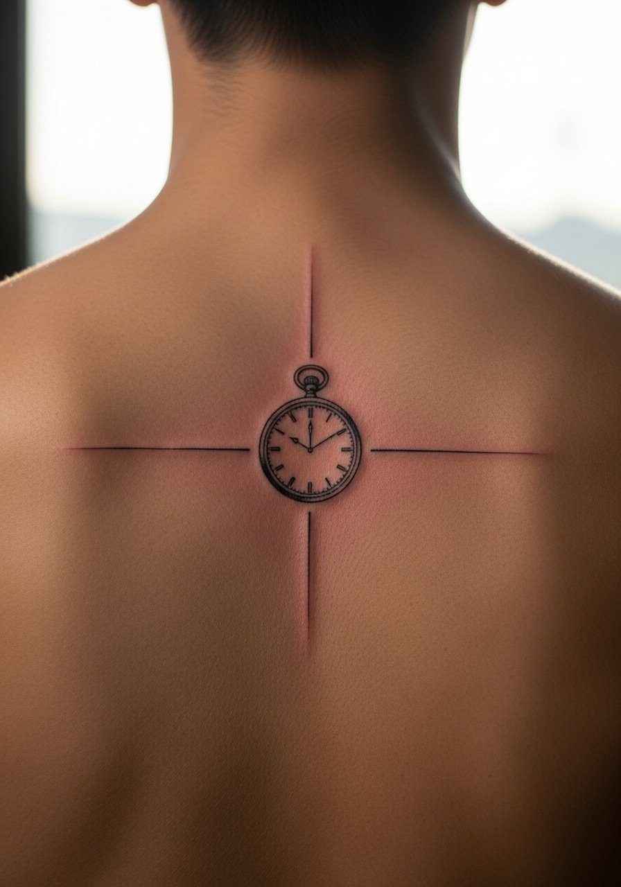
13. Compass-clock hybrid behind the ear
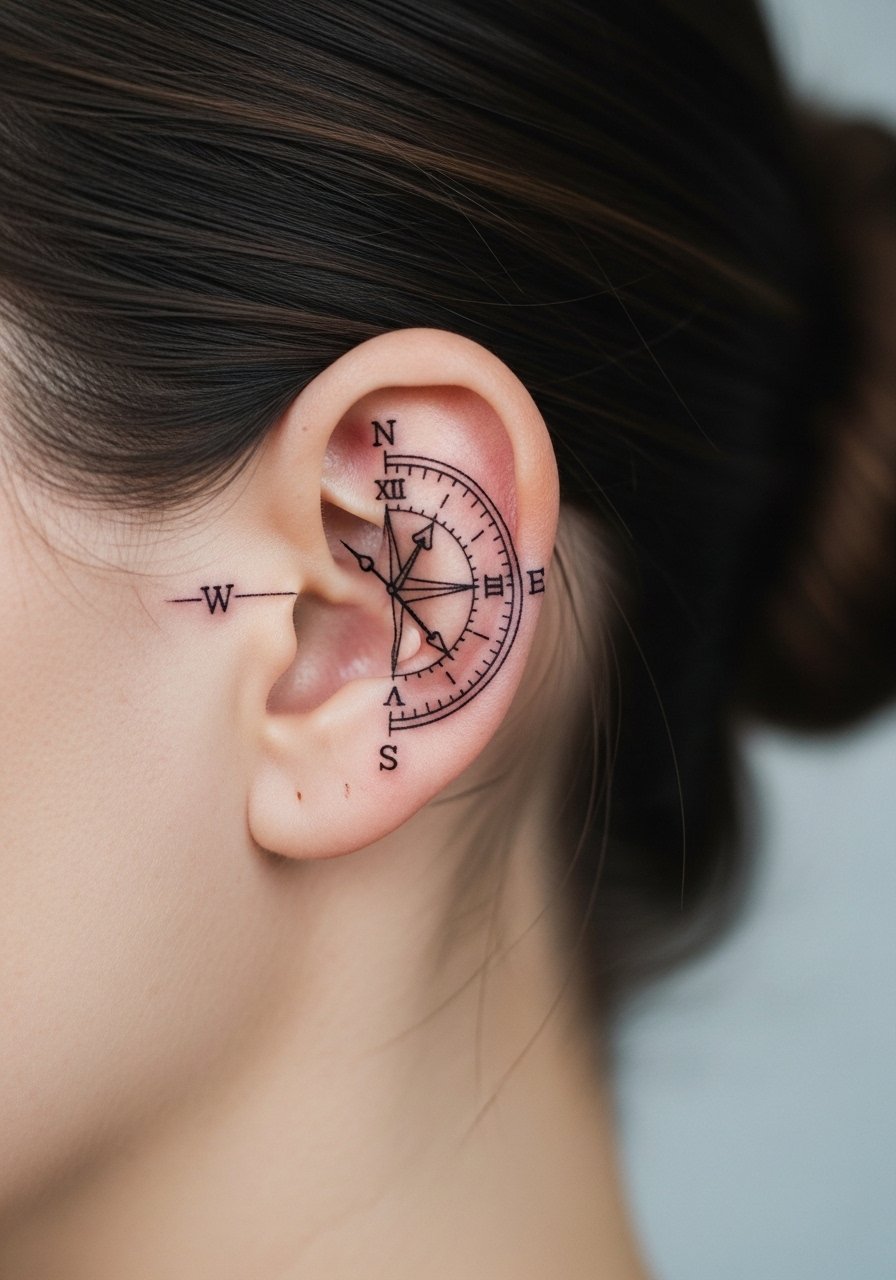
Sensitive placement note: behind-ear tattoos require an artist experienced with short, precise passes. This spot is subtle and best for people who want a private symbol with occasional visibility. Sessions are brief but the area is tender. Tell your artist you want simplified pointers and avoid tiny numerals. The typical error is over-detailing a space no larger than one inch. Healed, this will age similarly to other surface-level small pieces and may blur if lines are too fine.
14. Stipple-shaded pocket watch on upper chest
Chest pieces benefit from dot work because stipple shading creates texture without heavy lines. Sensitive placement note: upper chest near sternum should be done by someone used to working over bone and curved areas. Sessions are often split for comfort. Tell your artist you want rhythmic dot spacing and a few solid anchors so the watch face reads clearly at a distance. The common mistake is uneven stippling density. Healed stipple softens slightly but keeps its pattern when done with measured spacing.
15. Geometric gear clock on inner arm
When gears meet clock faces, the design can either read mechanical or cluttered. Inner arm placement keeps detail visible and protected. Sessions run one to two hours depending on size. During consultation request negative space between cogs and ask the artist to avoid hairline joins that risk merging. A common mistake is over-layering tiny teeth. After healing the geometry keeps its crispness if spacing and saturation are controlled.
16. Watercolor crescent clock on collarbone sash
Visual impact lead: the collarbone sash is flattering for curved, flowing watercolor. The risk with watercolor is color migration when placed too close to a line. Tell your artist you want the black rim distinct and the color wash to sit outside it. Sessions usually take two sittings. A mistake is relying on color alone for form. Pair color with a subtle outline so the shape endures as pigment fades.
17. Minimal pocket clock between shoulder blades
Pain warning lead: the mid-back can be less painful because of thicker flesh, but proximity to spine varies. This placement is great for someone who wants a private piece visible in certain clothes. Keep the design around two to three inches so numerals remain legible. The usual mistake is shrinking pocket-watch hands to unreadable length. Ask for simplified hands and clear contrast. Healed, the piece holds well with occasional sun protection.
18. Broken clock mosaic on upper thigh
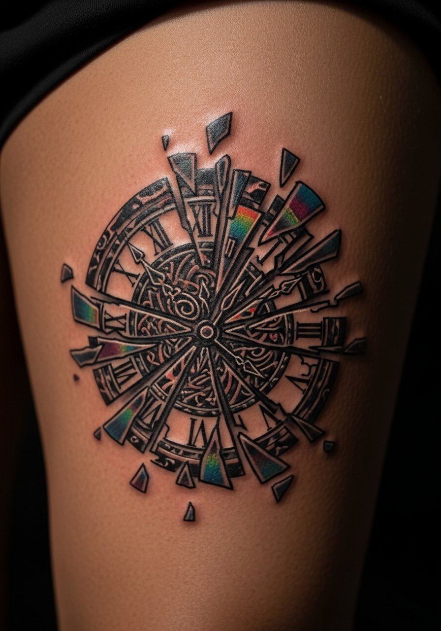
Mistake lead: a common error with fragmented designs is placing too many tiny shards that blend into one blotch at distance. Thighs tolerate larger compositions and color saturation. Sessions run longer for a 5-inch mosaic and may be split. Tell your artist you want distinct shard borders and varied saturation so the mosaic retains depth as it heals. On this placement, touch-ups are rare if outlines and contrasts are bold.
19. Hourglass-clock hybrid on sternum
Sensitive placement note: sternum work requires an artist experienced with breathing and pressure over bone. Pain is higher here for many people. This hybrid reads intimate and symbolic. Expect a longer session and possibly a second visit for shading. Tell your artist you want the hourglass boundaries solid enough to prevent dot blurring. The biggest mistake is packing too many micro details near the center. Healed, the piece keeps form if contrast was established early.
20. Linework sun-and-clock on upper arm
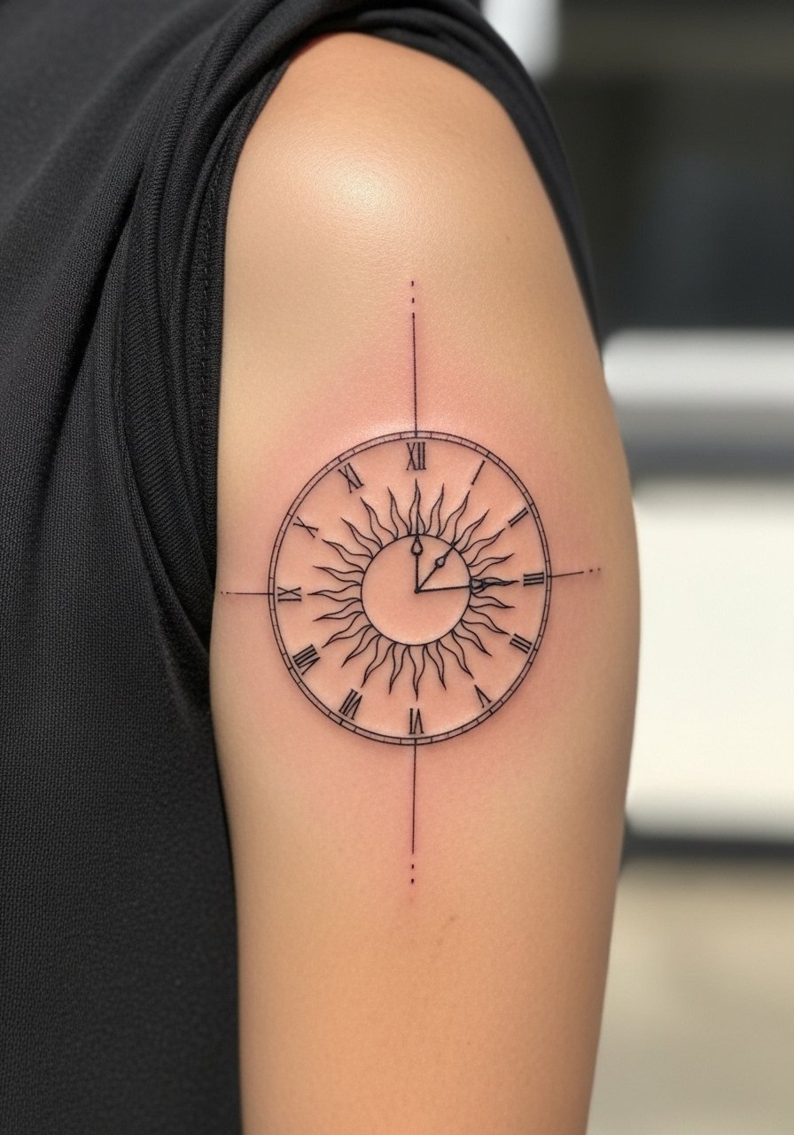
Consultation lead: when you sit down for a sun-clock, bring reference photos that show line weight you like. The outer arm handles movement and is less prone to blowout. Tell your artist you want sun rays with breathing room to avoid merging. Sessions are usually one to two hours. A typical mistake is using continuous rays too thin. Slightly thicker rays hold longer and the overall silhouette keeps meaning as it ages.
21. Dot work moon-clock on rib arc
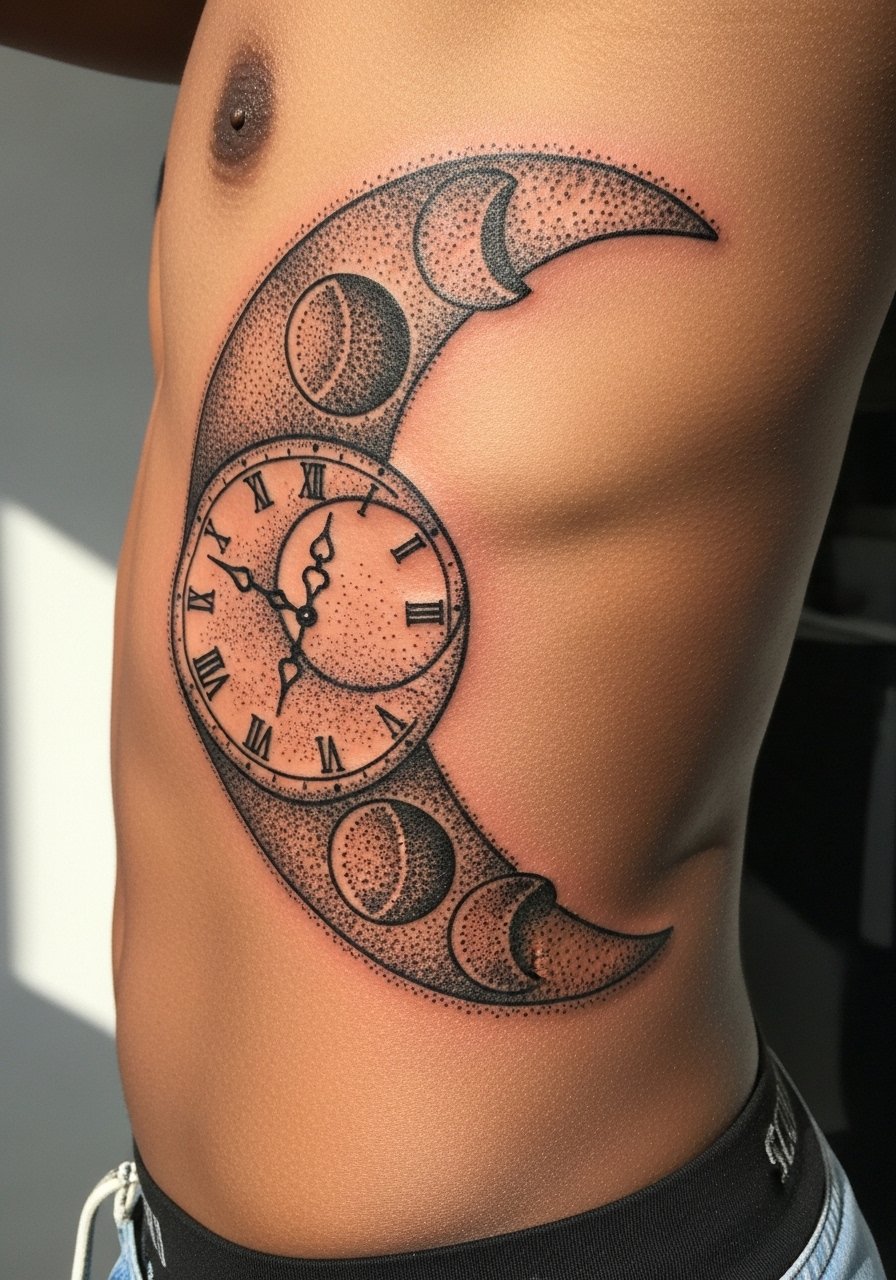
Aging and healing lead: dot work on the ribs can be spectacular but needs intentional spacing. One error is packing dots into gradients that later fill in. Tell your artist you prefer moderate dot density and clear phase markers. Sessions are usually split to limit discomfort. Artists disagree about very fine stippling on ribs. One group warns of early softening. Another group says conservative dot spacing keeps the pattern intact. Clarify technique before booking.
22. Pocket watch with floral filigree on lower back
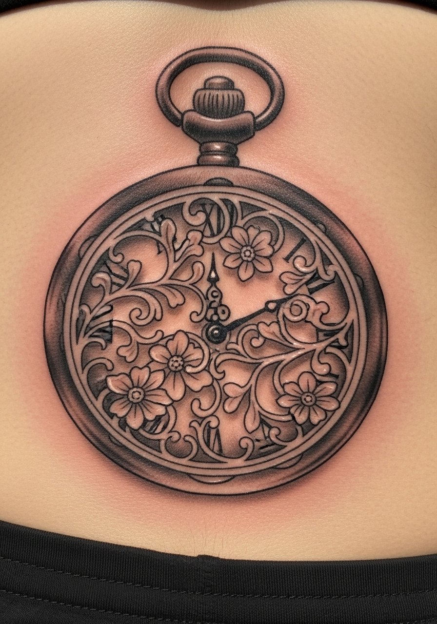
Visual impact lead: lower back allows for horizontal compositions that tuck beneath clothing. If you want filigree, ask for defined anchor points so the filigree does not look like a wash later. Sessions can be longer for wider pieces. A mistake is over-ornamenting the edges with hairline flourishes. Keep some negative space for the filigree to breathe and for the watch face to remain the focal point as it heals.
23. Small Roman numerals wrapped around a finger
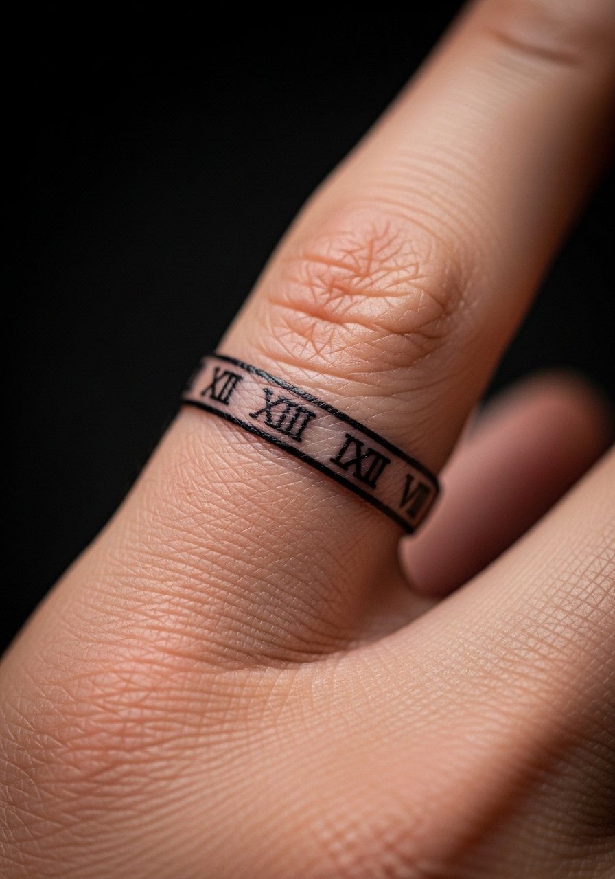
Fair warning: finger bands are high maintenance. The skin there regenerates rapidly and the band often needs re-inking. If you want numerals, pick a size that keeps each character at least a few millimeters tall. Sessions are short and pain is brief. The common mistake is tiny ornate numerals. Expect a touch-up at year one. If you want lower maintenance, consider moving the band slightly away from the joint.
24. Clock face with compass points on the forearm crease
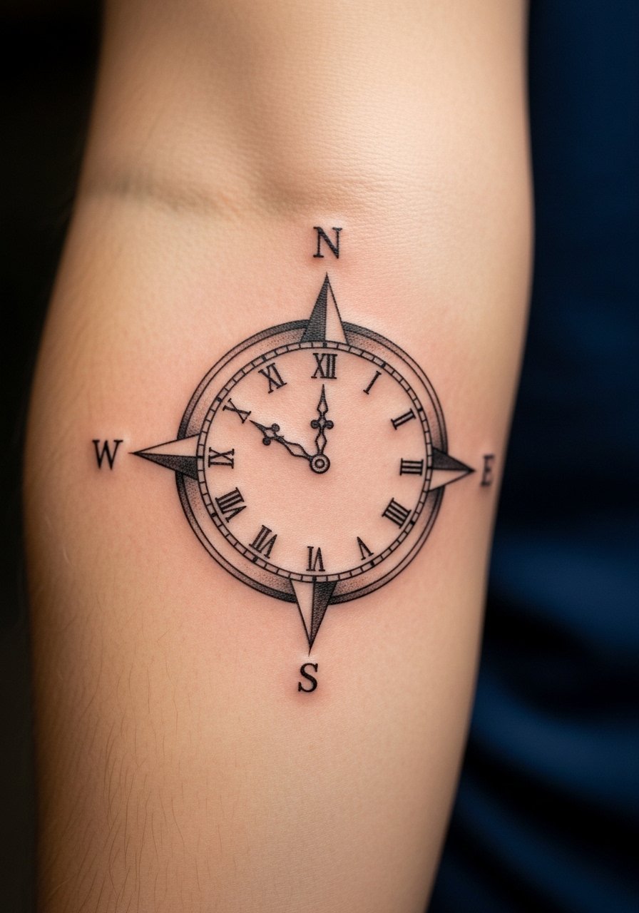
Visual impact lead: aligning compass points with the forearm crease creates dynamic movement when you rotate the arm. The crease can cause minor distortion while moving, so ask for slightly bolder markers at cardinal points to keep legibility. Sessions are about one to two hours. A common error is making inner ticks too fine. After healing, bold cardinal markers retain presence and minor ticks may soften but the design keeps direction.
25. Patch-style flash clock sleeve element for building over time
Consultation lead: patchwork is ideal if you plan to build a sleeve gradually. Make each clock element coherent in scale and line weight so future additions match. Sessions for single patches vary but expect to book multiple short visits. A common mistake is mixing flash styles with conflicting line weights. Before walking in, gather a few flash pieces that share boldness and let the artist adapt them into a cohesive sleeve. This approach lets your story evolve without ending up visually disjointed.
Tattoo Prep and Aftercare Essentials
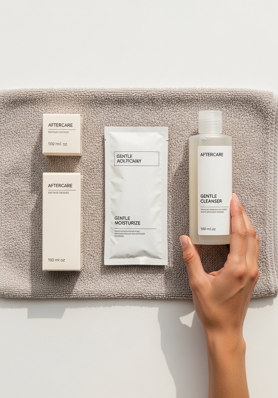
Below are practical items to have before and after your appointment. I include a mix of lesser-known items and one mainstream option that many artists still recommend. Pick what fits your skin sensitivity and follow your artist’s specific instructions.
Lightweight fragrance-free balm for daily hydration. Use sparingly after the first scabbing stage to keep skin supple without clogging pores.
Medical-grade second skin bandage, 6-inch roll. Ideal for the first 24 to 48 hours on areas that rub clothing.
PH-balanced gentle foaming cleanser. Use to clean gently twice a day during the early healing phase.
Tattoo-specific silicone scar sheet for smoothing raised areas. Helpful if your skin tends to hypertrophy.
Antibacterial saline wound spray for gentle cleansing. Use only in the first few days if your artist approves.
Ultra-light breathable gauze pads, assorted sizes. Good to have for sensitive placements.
Aquaphor Healing Ointment search page. This is the mainstream option I include. Use it sparingly if your artist recommends it, because some prefer thinner balms.
Long-sleeve sun shirt or UPF clothing for tattoo protection. UV protection during the first year preserves saturation.
Every tattoo is different. Always follow your artist's specific aftercare instructions. Consult a dermatologist if you have skin concerns or unusual healing issues.
Frequently Asked Questions
Q: Will fine line clock tattoos blur faster on the ribs than on the forearm?
A: It depends on your skin and the artist’s technique. From my experience, ribs can blur sooner if lines are packed too tightly because of stretch. The forearm usually keeps fine line clearer. Ask your artist about spacing and expect a touch-up timeline of one to three years for fine line work.
Q: Do watercolor clock styles need different aftercare than black and gray pieces?
A: Yes. Watercolor relies on color saturation outside outlines, so keep pigment-covered areas out of the sun and use gentler moisturizers. Black and gray can be a bit more forgiving but still need consistent sun protection. Follow your artist’s timeline for when to stop occlusive balms.
Q: How often should I plan touch-ups for micro-realism clock faces on ankles?
A: In my observation, ankles often need a touch-up within two to four years. That timeline shortens if you wear shoes that rub the area or if you get heavy sun exposure. Schedule a check at six to twelve months to see how shading settled.
Q: Are there placement choices to avoid if I want a clock tattoo that stays crisp?
A: Avoid very thin-skinned or high-friction areas if you want long-term crispness. Fingers, sides of hands, and the joint-heavy zones often require more maintenance. Choose fleshier areas or places with less daily abrasion for detailed work.
Q: How do I find artists who post the right kind of healed photos and not just fresh work?
A: Use style-specific hashtags and tattoo directories to filter for healed photos. I also look for portfolios that include time-stamped healed shots. Searching for location tags like a city plus the style helps find walk-ins or appointment artists who share long-term results.
Q: Will oversized blackwork clocks on ribs risk blowout more than geometric linework?
A: Heavy blackwork can actually resist blowout when the artist packs ink properly. Very fine geometric lines near heavy saturation carry a higher risk if placed too close. Discuss edge thickness and spacing with your artist to balance saturation and clarity.
