
Someone I know spent months narrowing down lyric choices, only to get a script that blurred into a shaded smudge after a year. Font, placement, and needle spacing matter as much as the line from the song. Below are twelve One Direction lyrics tattoo ideas built to read well at one month, one year, and five years healed, with notes on what to tell your artist and what to avoid.
1. Fine Line Script "Live While We're Young" on the Ribcage
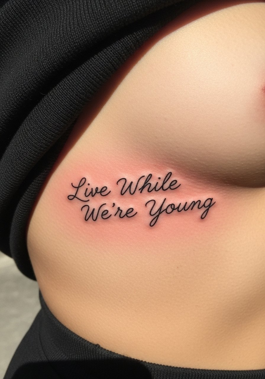
Fair warning: the ribcage is a high pain placement, and fine line there tests an artist's depth control. Fine line on ribs divides artists into two camps. One camp says the stretch of skin and breathing blurs delicate lines within two years. The other camp says with slightly bolder spacing and precise depth the script will settle cleanly. Tell your artist you want open letter spacing and a shallow but consistent needle depth. Expect a two hour session and a possible touch-up at year two. Common mistake is tiny lettering too close together. For a lyric that matters, aim for readable scale so the words stay legible as the skin shifts.
2. Minimalist Wave with "Little Things" on the Inner Wrist
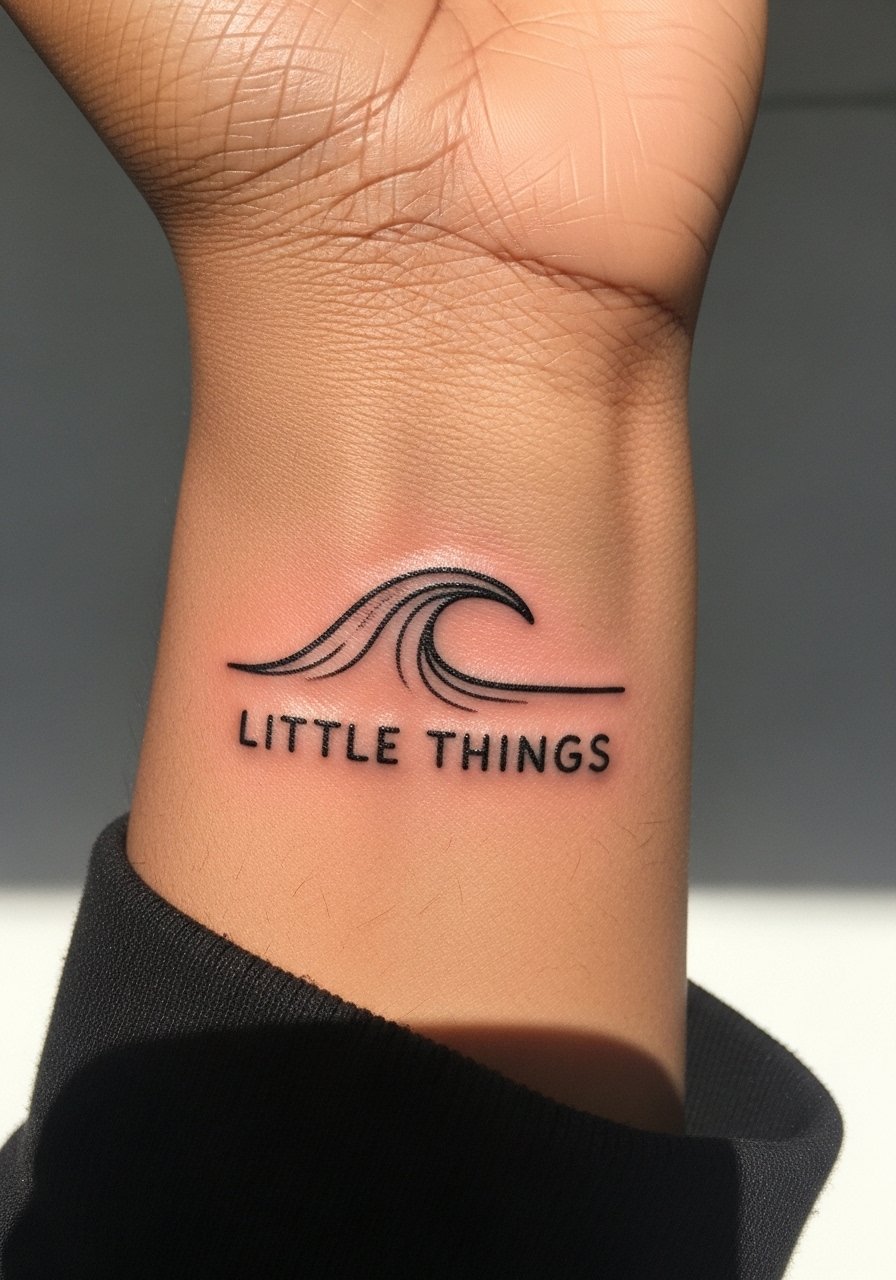
Someone I know picked the inner wrist because they wanted a private cue they could glance at. The wrist feels like two out of ten on most pain scales but it is exposed, so plan for fading from sun and friction. Tell your artist you want slightly thicker linework than a typical micro script to avoid early blur. Session time is short, often under an hour. The common mistake is using ultra-tiny cursive. That looks fragile at six months. For a wave paired with the lyric, keep the wave simple so the text remains the focal point. Hand and wrist placements sometimes affect job perceptions, so think through visibility before committing.
3. Typewriter Block "Night Changes" on the Collarbone

There is a certain drama to a collarbone lyric that sits right at the neckline. The collarbone can be a three to five on pain charts depending on build. Typewriter font ages better than thin script there because the strokes have room to keep their shape. Bring reference photos showing exact kerning and letter weight. Expect a single brief session and a touch-up discussion for year two. A typical error is requesting hairline fonts that disappear into sun exposure and clothing friction. If you plan on wearing low necklines, the placement reads like a deliberate statement without being loud.
4. Blackwork Banner "Story of My Life" on the Upper Arm

There is visual impact in bold black banners that read from across a room. Upper arm placement is forgiving on healing and lower blowout risk. Ask for solid outlines with even saturation and a slight gap between letters so the phrase keeps contrast as it heals. Session time varies from one to two hours depending on banner thickness. People often ask for dense shading that ages patchy. Instead choose clean fill and clear negative space around the letters. If you like bold presence, this style holds up by keeping high contrast and predictable touch-up needs.
5. Whisper Script "Steal My Girl" Behind the Ear
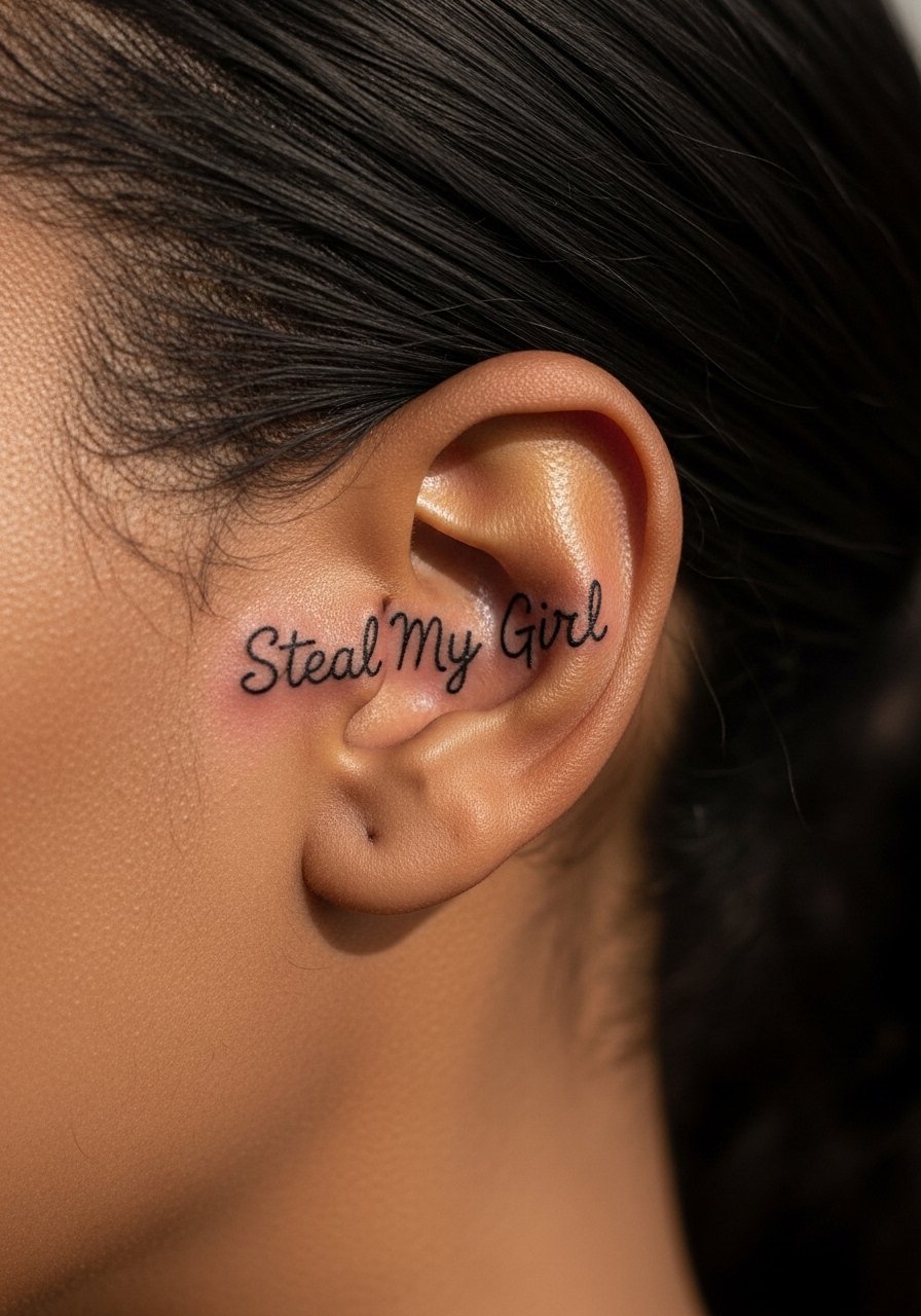
Tiny behind-the-ear lyrics read like secrets you only catch on tilt. That area is sensitive during the session and can need a shorter appointment split across sittings. Ask for slightly stronger line weight than a true micro script so the letters do not bleed into one another. Expect a touch-up at year one more often than on thicker placements. A common mistake is placing words too low where hair will obscure the script and make healing messy. If you want a concealed nod to a song, keep the script short and the spacing deliberate.
6. Stipple-Shaded Portrait Accent with "You & I" on the Rib Side
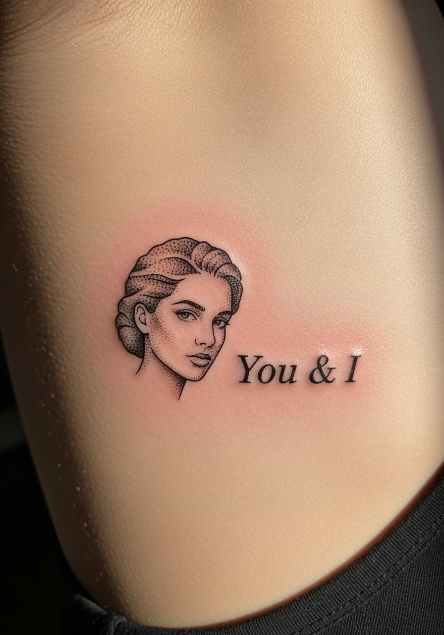
Most watercolor and stipple approaches on the rib can age unpredictably, but stipple shading keeps contrast without large saturated fills. Tell your artist you want dot work that avoids heavy washes. The session often takes two to three hours and feels intense because of breathing motion. A common mistake is pairing stipple with tiny cursive that fights for attention. Instead keep the phrase short and let stipple provide texture. Blowout risk is moderate on the rib, so leave spacing around letters to prevent ink migration.
7. Bold Serif "Best Song Ever" on the Calf
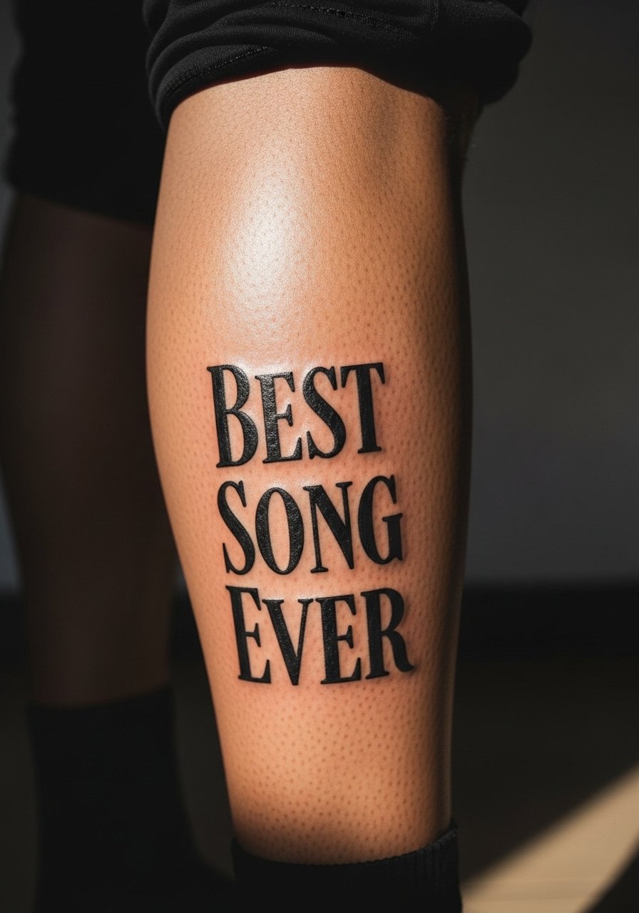
There is longevity in serif lettering on thicker skin. Calf placements are less prone to blowout and heal with steady saturation. Tell your artist you want crisp serifs and consistent spacing so the text reads at a distance. Expect a single session under two hours and a likely touch-up discussion at two to three years if you wear shorts frequently. A mistake many make is choosing ornate display fonts that compress on curved anatomy. Serifs help anchor the text visually as muscles move and the skin ages.
8. Script Ribbon "You & I" on the Inner Bicep

The inner bicep is a comfortable spot that hides the ink easily while still being intimate. Pain is usually moderate. For ribbon scripts, tell your artist you want the ribbon to follow the natural curve of the muscle so the words do not twist when you flex. Sessions are medium length, often under two hours. People sometimes put too much detail into the ribbon edges which blurs with motion. Keep the ribbon simple and the linework confident. Expect less sun fading here, but consider a touch-up if you change weight significantly.
9. Dot Work Heart Accent with "No Control" on the Ankle
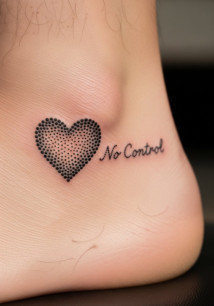
Ankle placements can sting and need careful aftercare because shoes rub. Dot work heart accents pair well with short lyrics and low line density. Tell your artist to plan for a single focused session and to avoid heavy black around the bone where skin stretches. A common error is overpacking black ink next to fine script which then becomes muddy after healing. Blowout risk is moderate near bony areas. If you plan to wear socks often, expect extra fading and a potential touch-up timeline at year two.
10. Geometric Frame "Little Black Dress" on the Upper Back
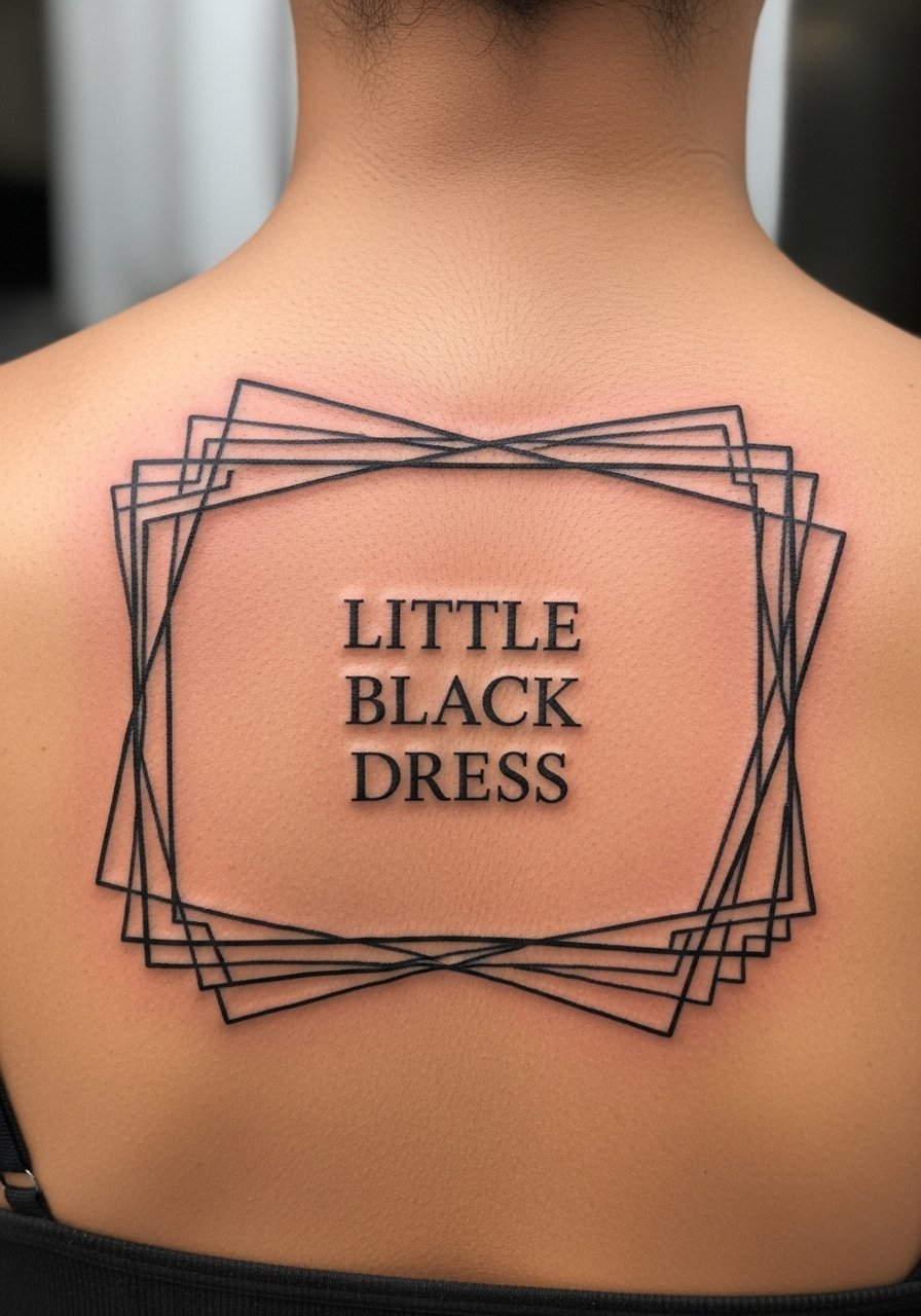
Geometric framing adds structure to lyrics and helps them age with clarity. Upper back placement is low pain and wears clothing friction well. Ask your artist for measured spacing and a mock-up that sits well with natural shoulder lines. Sessions may last one to two hours depending on frame detail. The mistake to avoid is oversized negative space that makes the lettering feel lost. Geometric borders stabilize the text and reduce edge blur over time. For large frames think about future expansion so linework stays consistent.
11. Script Banner "Kiss You" on the Sternum

Sternum placements are sensitive and polarizing professionally. Artists split on nail depth in this area, and it affects line longevity. Tell your artist you want clear spacing and to show healed examples on similar skin types. Expect a session that feels intense and may require upper body repositioning. Typical mistakes include cramming long phrases where curvature will distort letters. If you choose sternum, book with an artist experienced in chest work. A quick note on career implications, chest visibility can still be dress-controlled but factor in comfort with the placement.
12. Type-Set Coordinates "41.4025 N, 2.1743 W" with "Story of My Life" Accent on the Inner Forearm
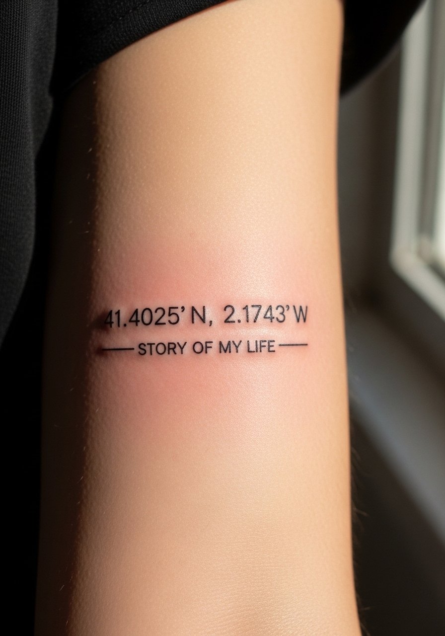
Coordinates give a lyric context and make the piece feel personal without long sentences. The inner forearm heals predictably and reads well at scale. Tell your artist you want crisp monospace numerals with even spacing so the numbers stay legible as skin moves. Session time is usually short. Common mistake is choosing a tiny font that becomes unreadable after six months. This hybrid approach keeps the lyric meaningful and the design clean for long-term wear.
Tattoo Prep and Aftercare Essentials
A short prep note. Book a consultation and bring reference images showing exact font, spacing, and size on the body. I have talked to artists in five shops across Brooklyn who insisted that clients bring scale references on skin rather than photo crops. Ask about their touch-up policy and whether they recommend occlusive bandaging for the first 24 to 48 hours.
Healing and maintenance shopping list
Healing essentials
Fragrance-free moisturizing balm for tattoos. Lightweight balms that avoid fragrances help with itch control and seal in moisture during the first week. Use sparingly and reapply only when the skin feels dry.
Gentle foaming tattoo cleanser, pH balanced. A mild, fragrance-free cleanser keeps the area clean without stripping natural oils. Clean twice a day with lukewarm water.
Medical-grade second skin bandage, 6-inch roll. Use for artist-recommended occlusion when you need protection from clothing and friction during the first night.
Pre-appointment prep
Non-scented antibacterial liquid soap. Wash the area gently before your session to reduce surface bacteria.
Lightweight travel moisturizer for dry skin. Keep skin hydrated in the days before your appointment but do not over-apply on the day of the tattoo.
Long-term maintenance
Lightweight mineral SPF 50 sunscreen, broad spectrum. Sunscreen preserves saturation on healed tattoos when you are outside. Apply daily on exposed pieces.
Saniderm transparent occlusive bandage, single use sheets. This is the one mainstream occlusive option many artists recommend for first-day protection. If you choose it, follow your artist's timing exactly and watch for irritation.
Every tattoo is different. Always follow your artist's specific aftercare instructions. Consult a dermatologist if you have skin concerns or unusual healing issues.
Frequently Asked Questions
Q: Will fine line script like "Live While We're Young" blur faster on the ribcage than bold lettering?
A: Fine line scripts tend to show softening sooner on areas that move a lot. The difference comes down to letter spacing and how deep the artist places ink. Ask for slightly larger spacing and a confident line weight. A touch-up at year two is common for delicate ribs.
Q: Do behind-the-ear lyrics need special aftercare compared with forearm pieces?
A: Behind-the-ear tattoos have more exposure to hair oils and sweat so gentle cleansing and avoiding heavy hair products speeds healing. Forearms get more sun and friction so sunscreen after healing and occasional touch-ups keep text crisp. Use a fragrance-free cleanser from the shopping list during the first two weeks.
Q: How do I tell my artist exactly what kerning and scale I want for a typewriter style "Night Changes"?
A: Bring a printed mock-up shown on your anatomy or ask the artist to stencil the exact size on skin before inking. Say you want visible gaps between letters and a reference for how it reads at arm distance. If they show healed photos of similar placements that helps you decide.
Q: Are stipple and watercolor lyrics risky for long-term legibility?
A: Watercolor approaches often lose detail faster because they rely on soft washes. Stipple holds contrast better by using dot work that keeps form. If you want a lyric to remain readable, pair stipple texture with clear, slightly bolder lettering.
Q: How long should I expect before scheduling a touch-up for calf or upper arm banner work?
A: For bold serif or banner pieces on thicker skin, touch-ups commonly happen between two and five years depending on sun exposure and skin changes. Many artists plan a one to two year check-in for color saturation and line crispness.
Q: If I am debating Saniderm versus air-dry aftercare, what are the practical pros and cons?
A: One camp prefers Saniderm for protection from bacteria and quicker showering. The other camp favors short open-air periods to let the scab form and fall naturally. Both approaches work when done correctly. Ask your artist which method they use and why, and follow their timing to reduce risk of irritation.
