
I spent months pinning lyric tattoos and sitting in shop chairs before I realized the hard part was less about a perfect line of text and more about choosing a style that tells the story for years to come. I wanted phrases that age into quiet statements, not blotchy regrets. These 24 lyric tattoo ideas are the ones I kept returning to, the ones artists I follow keep recommending in 2026, and the versions that actually look good healed.
This list focuses on lyric tattoos done in fine line, typewriter script, and small micro-realism. I picked placements that work for lovers of subtle text and for people who want storytelling pieces that read at a glance. From what I’ve seen, minimal scripts and small integrated lyrics are trending and last longer on skin that sees sun.
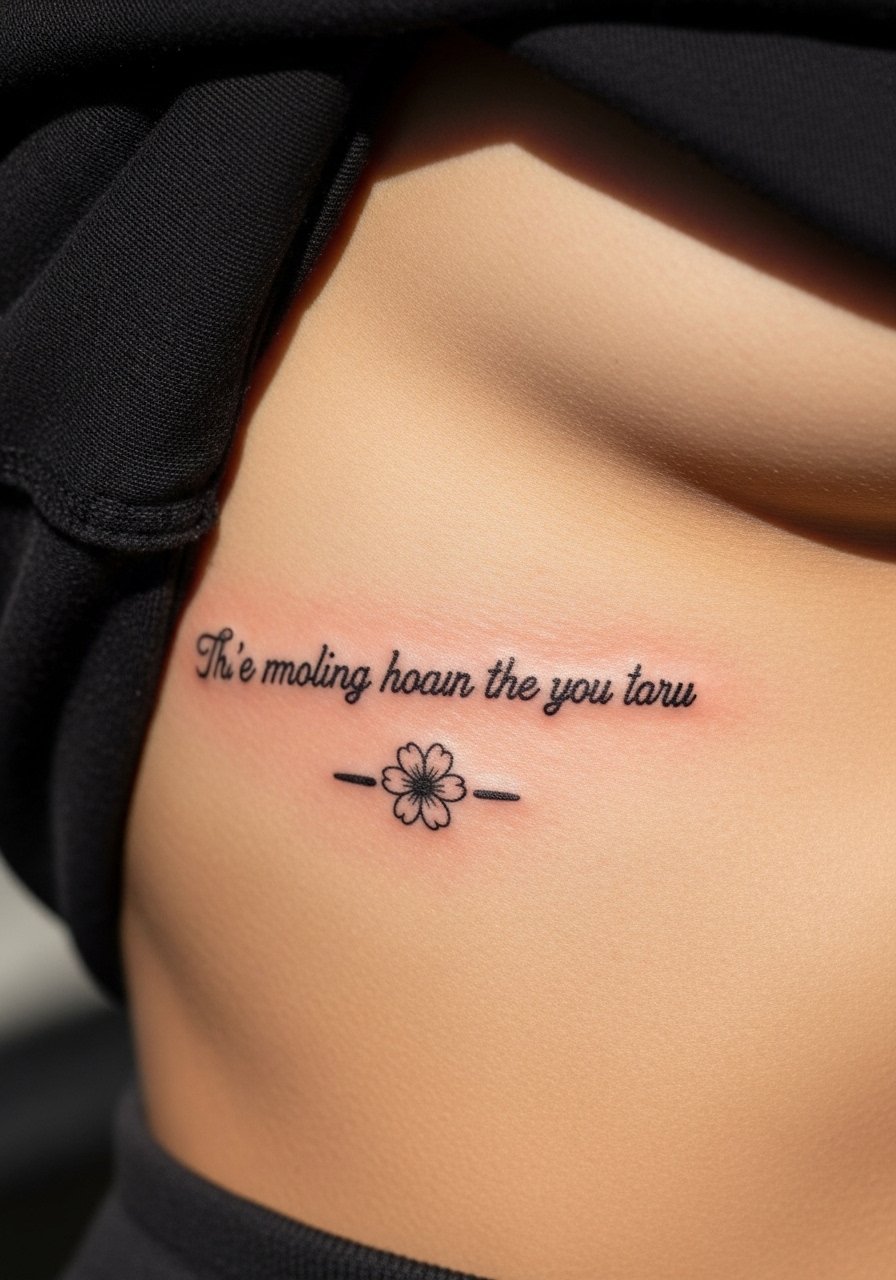
1. Fine Line Script on Inner Forearm
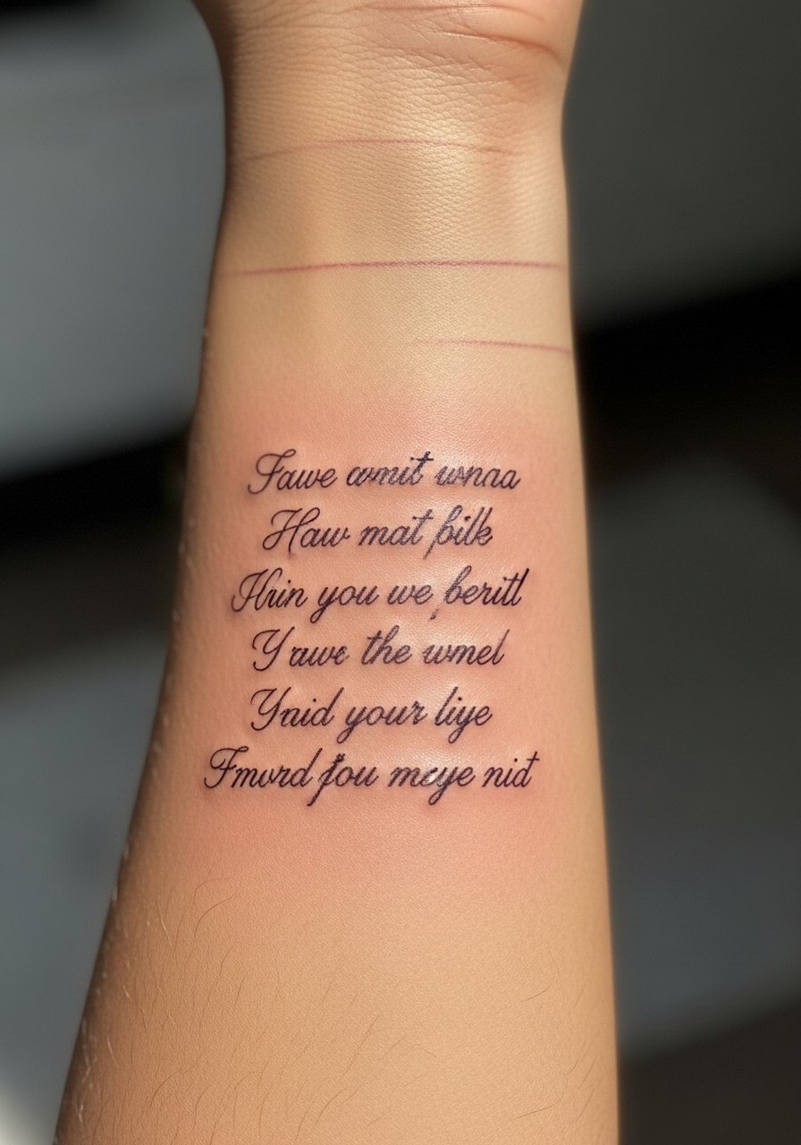
I first saw this on a friend who had a two-line lyric spiraling with a tiny wave. The inner forearm is forgiving for text. Pain is mild, about a 3 to 4 for me. Tell your artist you want ultra-fine hairlines, but ask them to thicken key letters slightly. Many people ask for the thinnest possible lines and then complain at year two that letters bled together. Expect one to two small sessions. Healed look at six months will show lines soften. At two years some thin strokes will blur, so plan spacing. A common mistake is letting script drop below 6 point legibility. Ask for photographed stencil on your arm during consult. If you plan sleeve integration later, show those references.
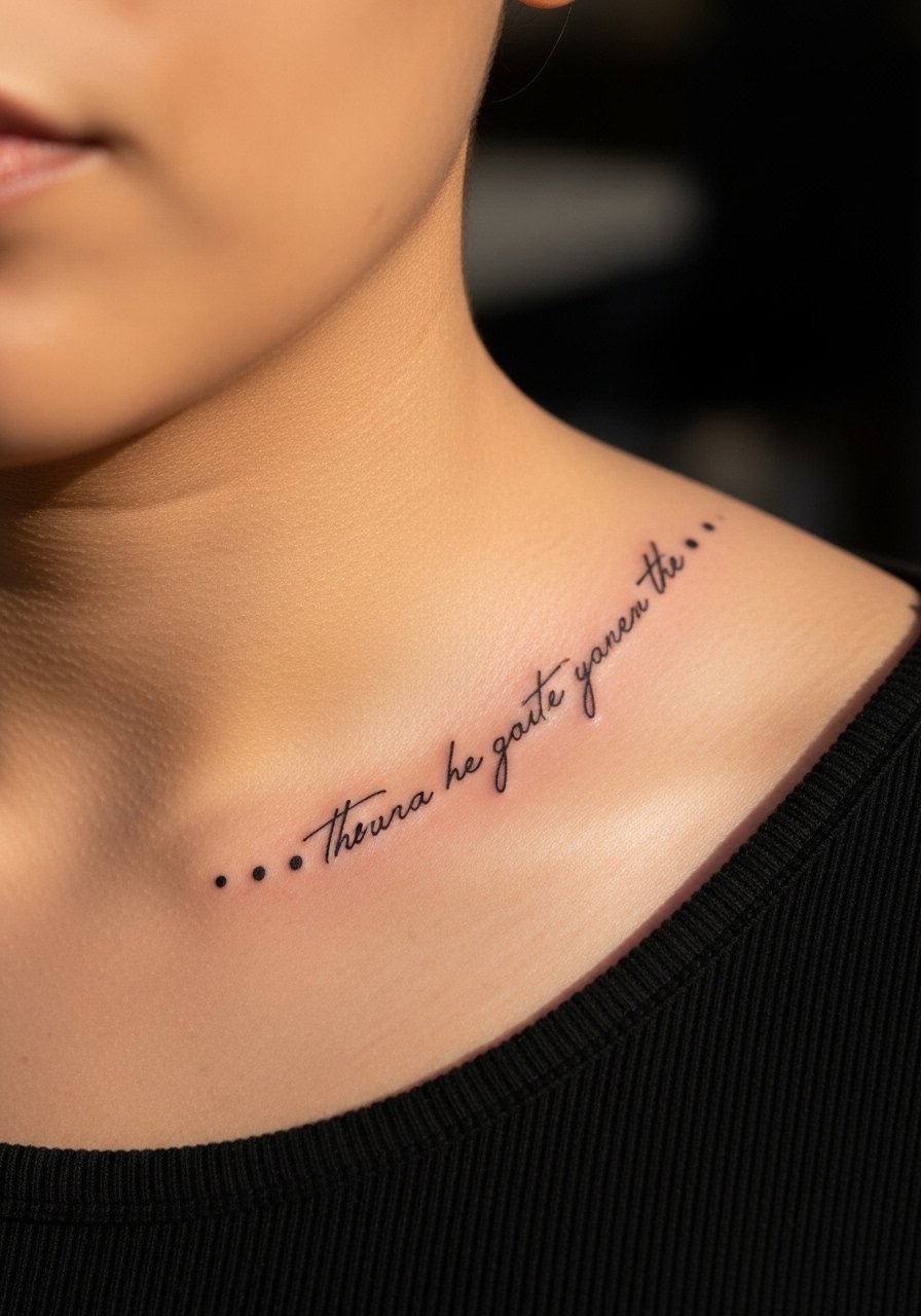
2. Typewriter Font Along Collarbone
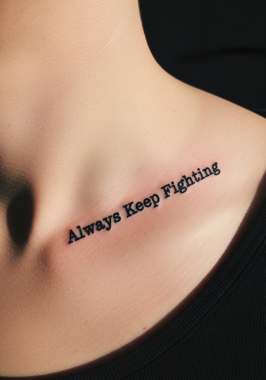
The collarbone has instant intimacy. I remember seeing a short, jagged lyric in typewriter font that read like a journal entry. Expect higher pain when the needle hits bone, closer to a 6 out of 10. Sessions are quick, often a single 20 to 45 minute pass. Ask your artist to letterspace deliberately. A frequent error is choosing a font that is too narrow. Healed at six months the letters will fill in slightly. At two years darker typeweight holds better than thin typewriter strokes. If you want a weathered typewriter look, ask the artist to dot a few imperfect edges in the stencil so it reads well as it ages.
3. Minimalist Single-Word Behind Ear
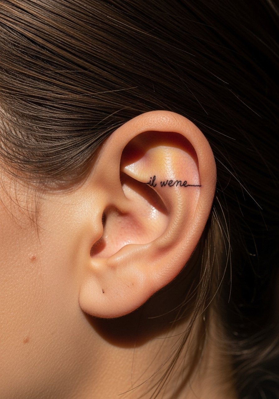
I picked this placement after overhearing a podcaster say they kept a single word there to ground them. Behind the ear is discreet and personal but painful in short bursts, maybe a 5. Sessions take about 15 to 30 minutes. For this spot, ask for single-line lettering about 6 mm high so it remains readable. Many pick ultra-tiny letters and then struggle with legibility after six months. If you want it to last, choose slightly bolder strokes or place it on the fleshy spot behind the ear instead of right on the mastoid bone. In my experience, healed edges will soften but maintain clarity if initial line weight is balanced.
4. Micro-Realism Portrait With Lyric on Upper Arm
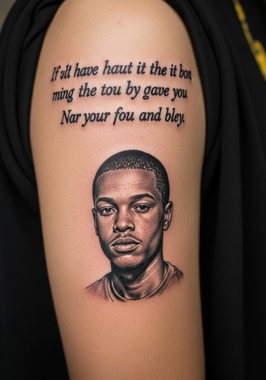
I save this one for a lyric tied to a person or memory. The upper arm gives room without causing too much pain. Expect a two-hour session when portrait detail is included. Tell your artist you want the lyric to sit as negative space above the portrait. Artists I’ve talked to say micro-realism needs slightly larger letters than minimalist pieces. A common mistake is trying to squeeze long phrases into the same patch as the portrait. Healed at six months the grayscale holds well, but fine script next to gray wash will blur if letters are too thin. Ask for reference portraits and a stencil test at life size during consult.
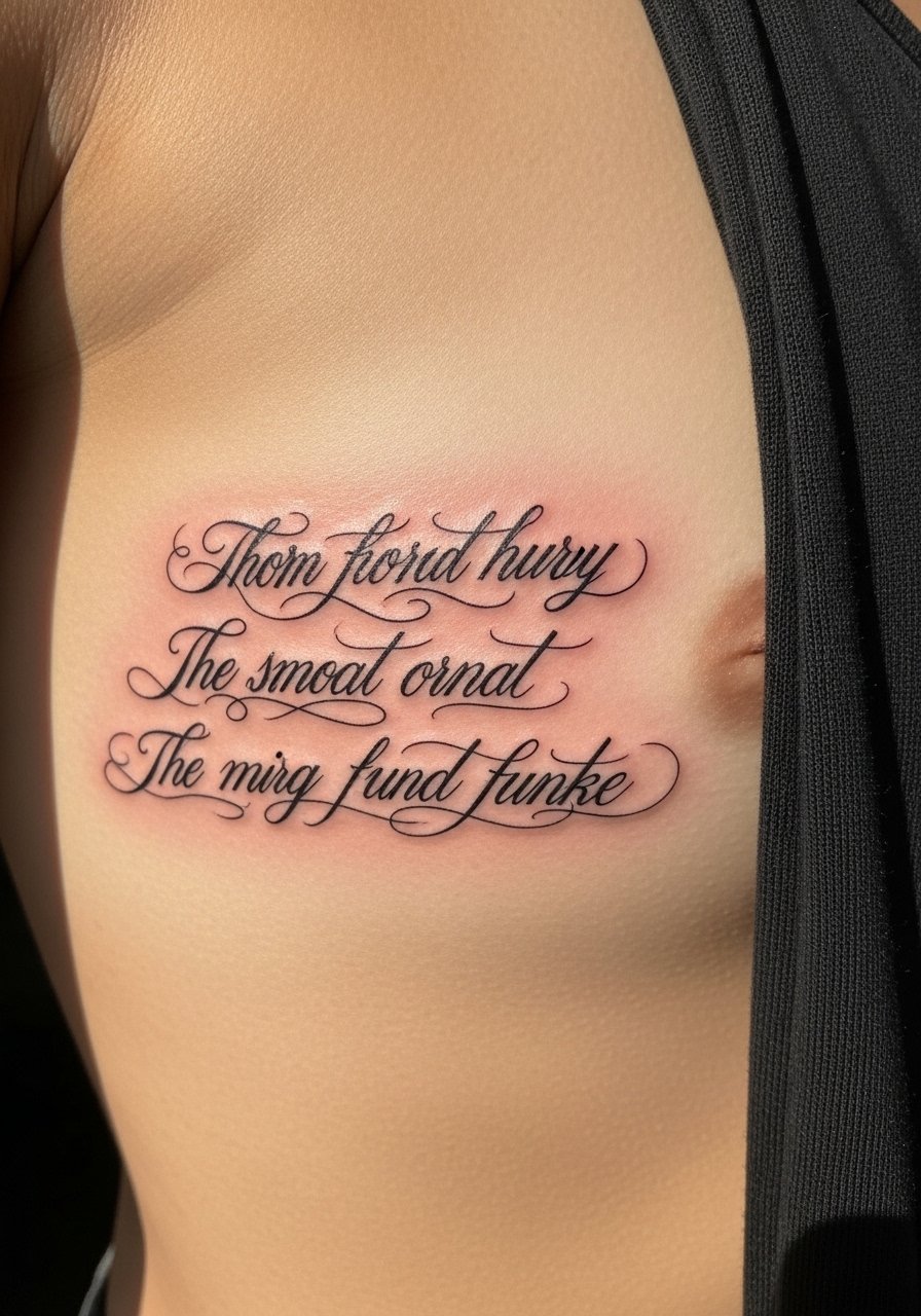
5. Traditional Banner With Bold Script on Chest
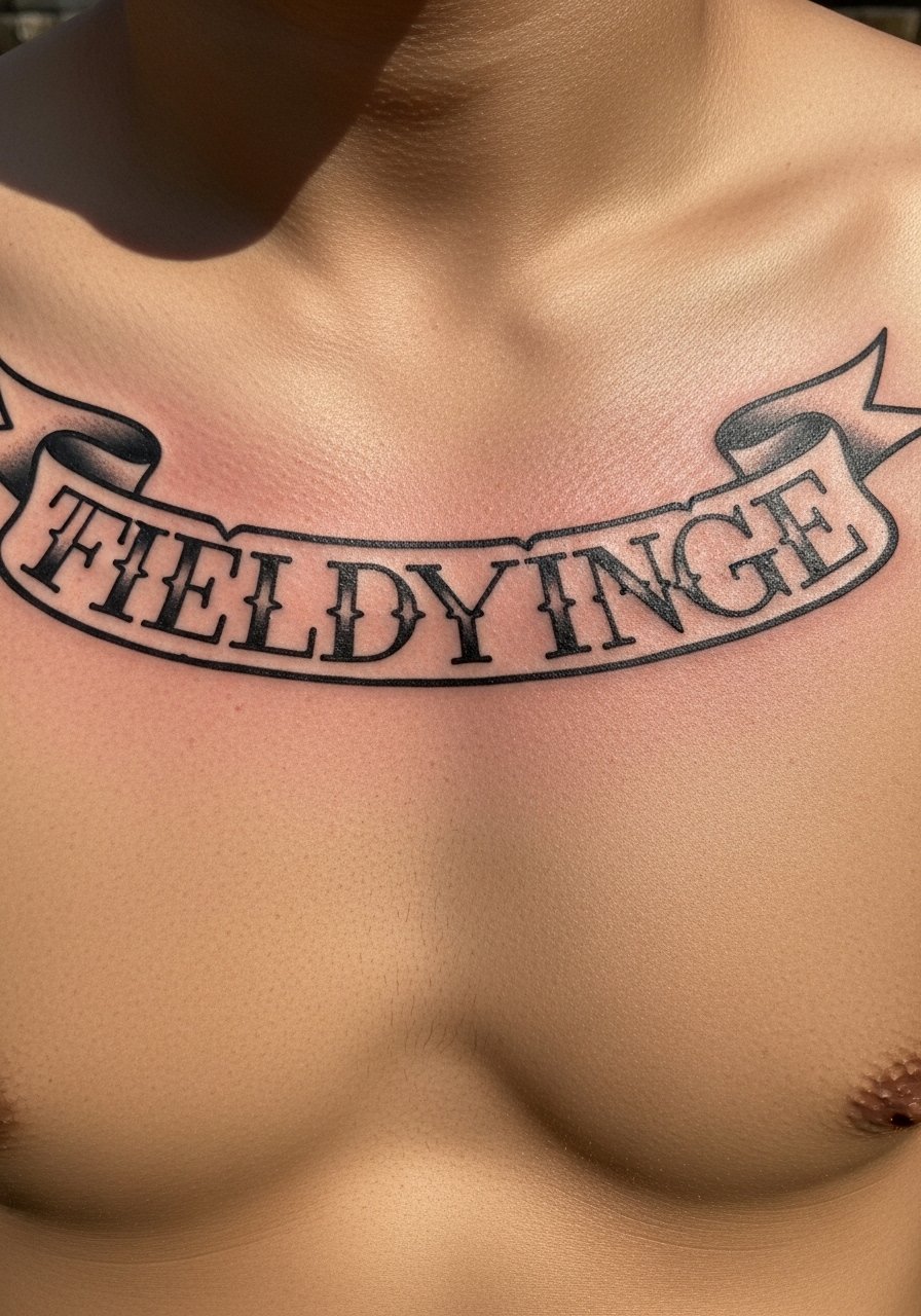
There is an old-school warmth to script inside a banner. I saw a chest banner with a short chorus line that read during hugs. The chest is medium pain, a steady 4 or 5. Bold outlines in a traditional style help lyrics stay legible for years. If you want longevity, ask for clean, confident outlines and leave room for bold fill. Mistake I see often is choosing script that sits too close to ornate shading, which competes as it heals. At two years the black outline keeps the phrase readable even if fills fade. For a chest piece, plan session timing around shirts that won't rub the fresh ink.
6. Watercolor Background With Script on Ribcage
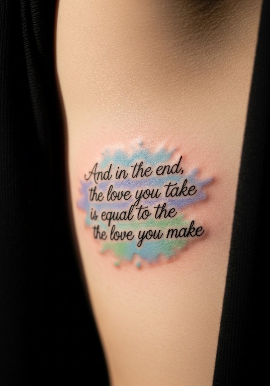
Fair warning, ribs hurt. For me it was an 8 on the pain scale. But a lyric floating over watercolor looks like a lyric memory. Ask your artist for pigment placement that keeps the script in darker black above the wash. A common error is oversaturating watercolor near letters. Healed at six months, watercolor will soften and may be patchy if not layered correctly. From what I’ve gathered, a two-session approach, one for the script, one for the wash, makes the most sense. Tell your artist you want the script prioritized for longevity, and do light touch-ups once healed.
7. Single-Line Lyrics Wrapped Around Wrist
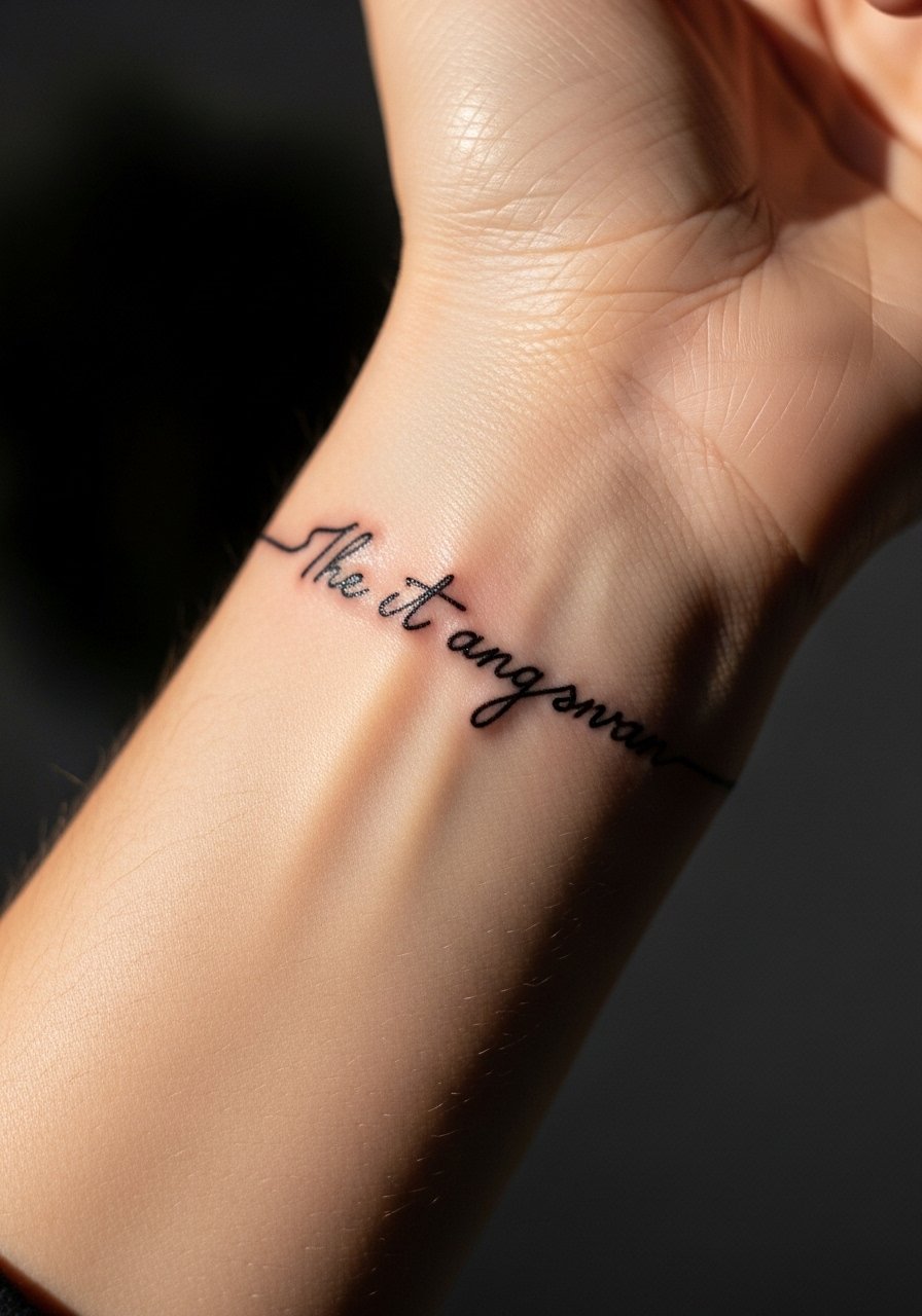
I used this idea for a repeating hook that reads as I turn my wrist. Wrapping the wrist is excellent for short lines only. Pain is medium, about a 4 to 5. Keep lettering tall and slightly spaced. The biggest mistake is trying to fit long phrases around this narrow band. Healed, wrist tattoos are constantly exposed and fade faster, especially on the inner wrist. From my experience, use a slightly darker initial shade and plan on touch-up at year one. During consult, ask the artist to wrap the stencil on your wrist so you can read it while moving. This prevents awkward breaks in words.
8. Micro Script Along Side of Finger
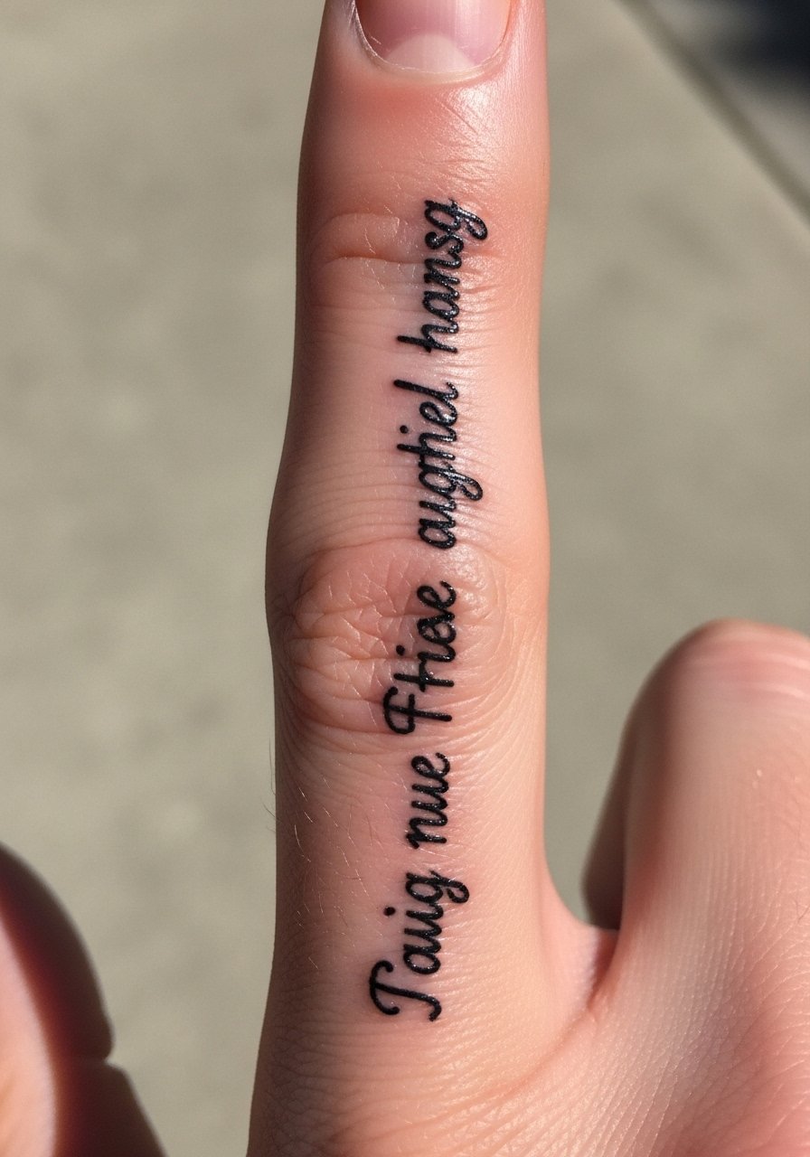
I first tried this on a friend who wanted a secret lyric she could hide with a ring. Fingers are notorious for fading. Pain is sharp and brief, usually a 6. Expect rapid wear; the skin here regenerates often. Ask for bolder letterforms or choose a symbol-replacement if you want longevity. A common mistake is demanding ultra-fine cursive. From what I’ve seen, these blur within a year unless you accept frequent touch-ups. If you still want it, plan a touch-up session at six months and ask your artist to use denser spacing so letters survive skin movement.
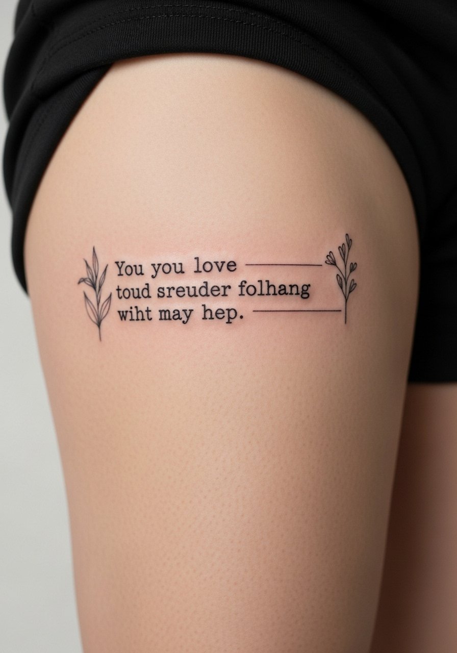
9. Script Integrated Into Floral Sleeve on Upper Arm
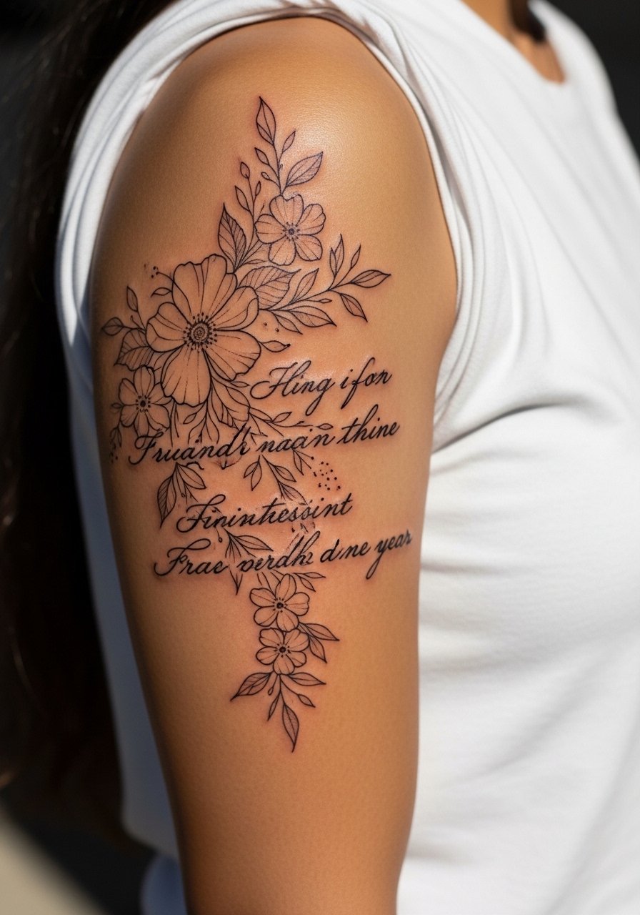
I love text tucked between petals. The upper arm sleeve gives room to blend lyrics as negative space. Pain is low to medium, often a 3. This approach works when the lyric becomes part of a larger narrative. Tell your artist you want the words to breathe, not be overwhelmed by flowers. A common error is over-detailing the florals around text, which makes reading the lyric hard once healed. In my experience, space and contrast matter more than tiny flourishes. Healed at one year, negative-space words tend to age better than thin overlaid script.
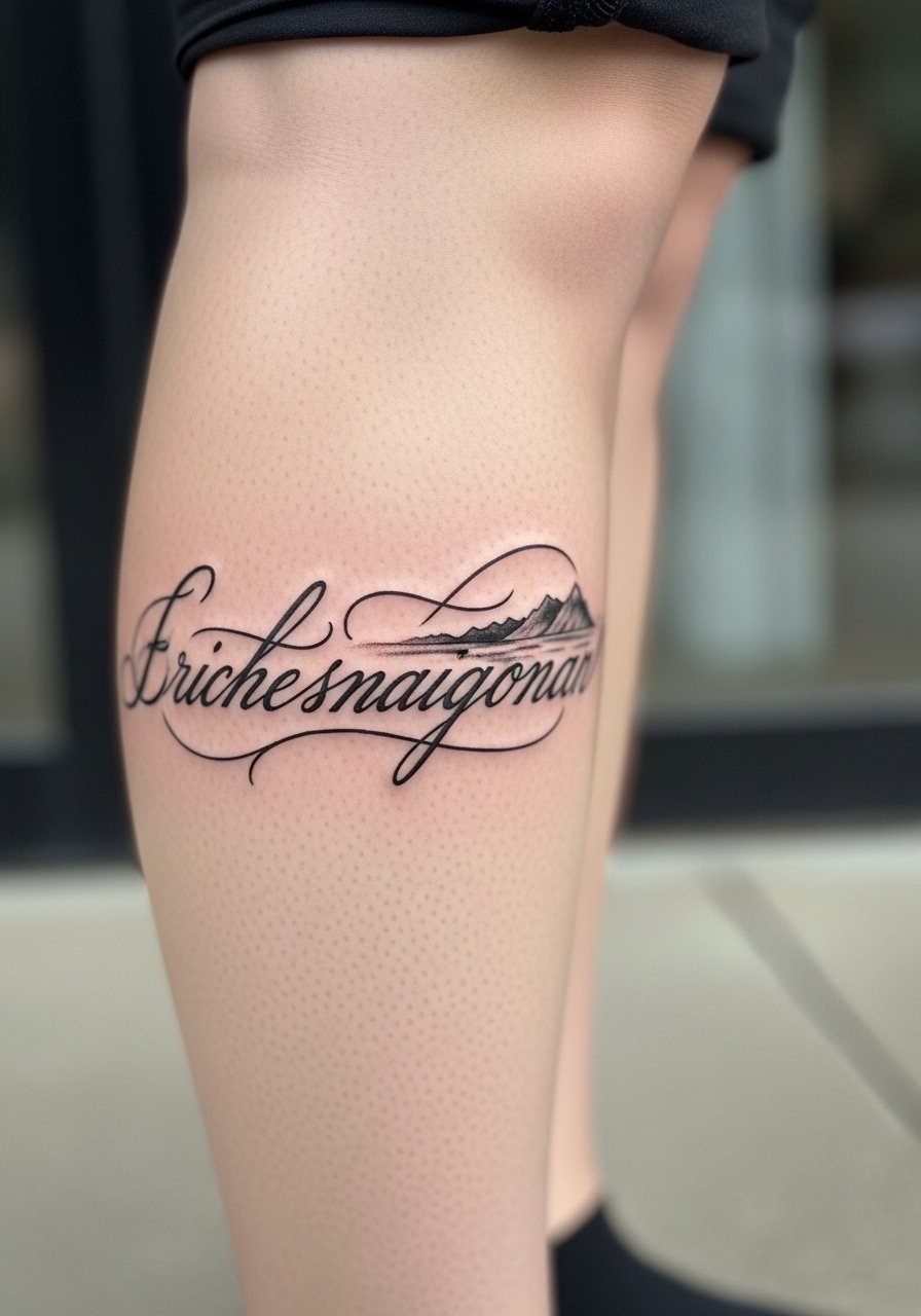
10. Blackwork Block Letters on Forearm
There is a presence to chunky block type. I saw a forearm line of a chorus done in heavy black and it read across a room. Forearm pain is mild. Block letters age well because they resist blurring into illegibility. If you want something that lasts, choose a heavier weight. The mistake is picking too many thin details inside each letter. Healed, black fill keeps the phrase readable for years. Tell your artist you want crisp negative edges and avoid tiny serifs. Session time varies by size, but one solid pass often does it.
11. Hidden Lyric In Scallop Rib Tattoo
I liked this after seeing a lyric tucked into scalloped shading near the ribs. Pain is high here, often a 7 or 8. The payoff is intimacy. Ask your artist to carve the lyric into negative space and avoid heavy fills that swallow letters. The mistake I notice is overcomplicating the background, which eats contrast. Healed at six months the letters will sit quietly inside the shading if the artist kept the ink density for the text higher. Expect a longer session when pairing decorative fills with script.
12. Delicate Script With Dotwork Around Ankle
I picked an ankle lyric for a travel quote. The ankle area can sting, about a 5. Dotwork borders help the script read as a framed note. The common error is placing too long a phrase on a small ankle panel. Healed, thin script on ankle will soften fast because shoes and socks rub. If you love ankle placement, request slightly darker lines or a small border to protect edges. Sessions are short but expect touch-up opportunities after six months.
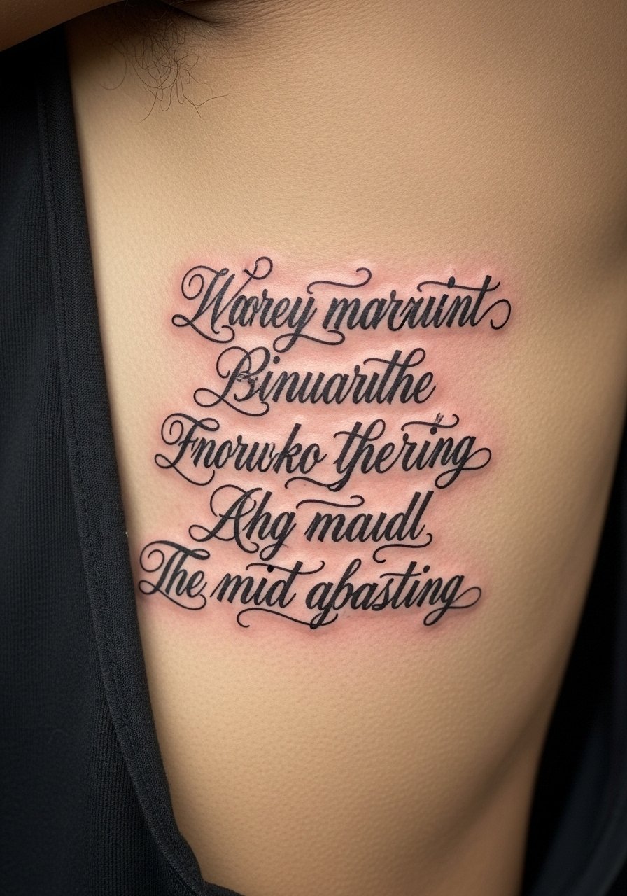
13. Calligraphy Script On Ribcage With Light Shading
I learned calligraphy scripts look dramatic on ribs when done with breathing room. Pain is high. The style works if your lyric has emotional rhythm. Ask your artist for controlled thick-thin strokes with no hairline extremes. A mistake is using a calligraphy font that relies on micro hairlines. After six months those will fade into blobs. From what I've gathered, calligraphy ages best when line weight is planned for future blur. Schedule shading separately to reduce swelling and keep script crisp.
14. Small Quote Inside Bicep With Tiny Stars
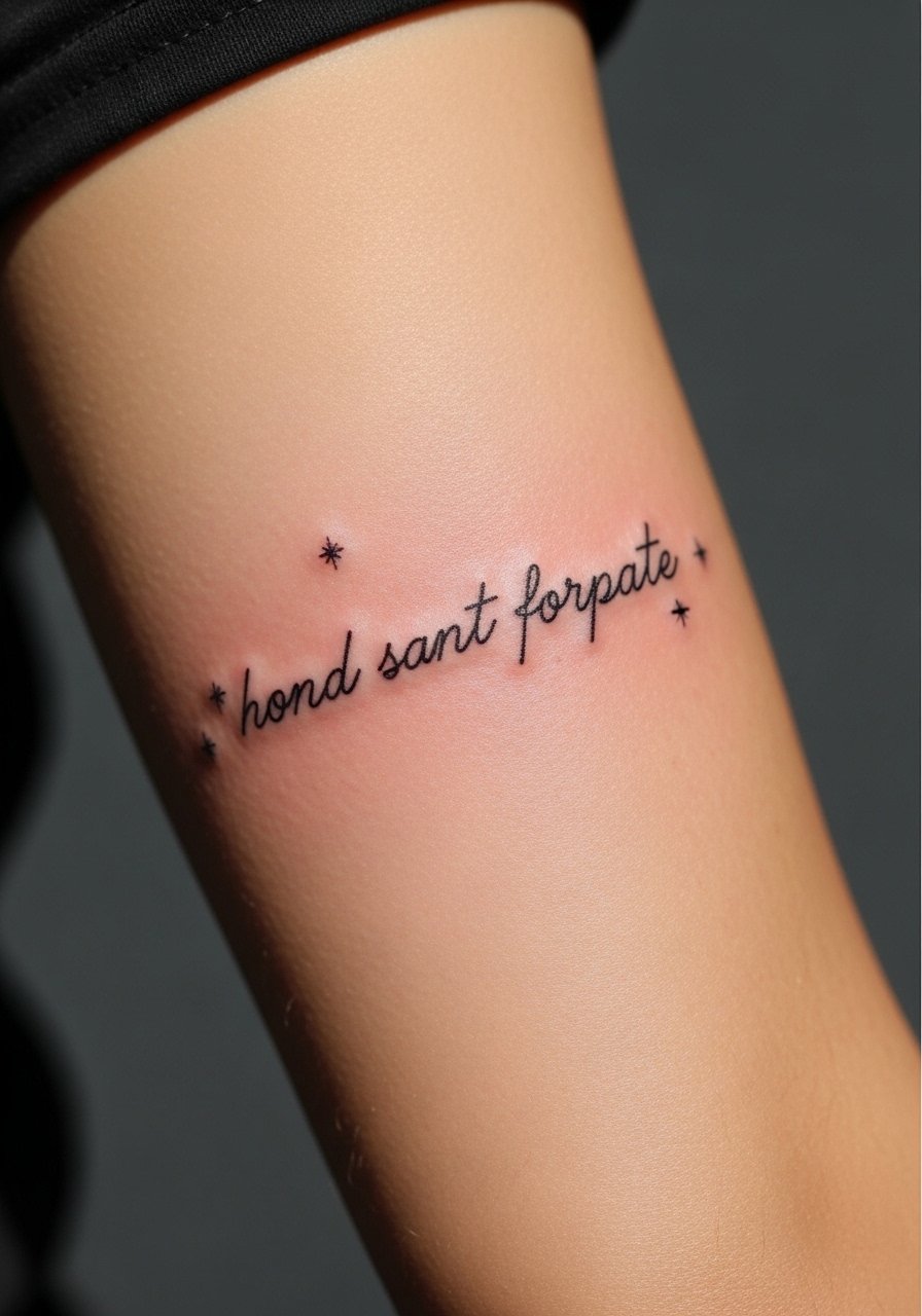
I put a short lyric there to hide during work meetings. Inner bicep pain is medium, about a 4. The space is great for privacy. Tiny stars add personality and can mask minor aging. The usual mistake is choosing a long sentence for a spot that moves a lot. Healed at six months, inner bicep ink holds well if you avoid super tiny type. Ask for slightly larger spacing and ask to see the stencil with your arm flexed in consult.
15. Script Around Nape With Micro-Flowers
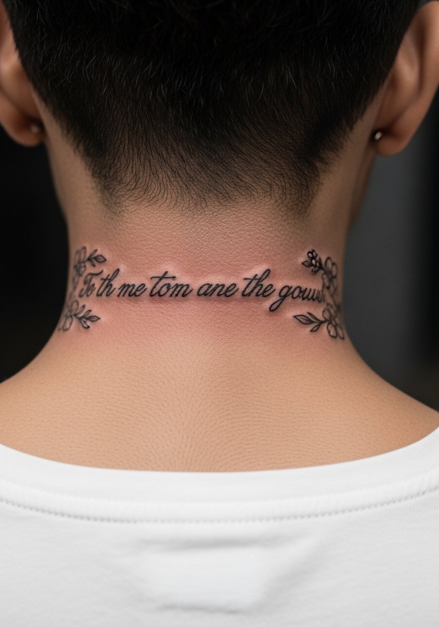
I noticed people using the nape to hide lyrics under hair. The nape is sensitive, pain around a 5. Micro-flowers soften the look and can disguise small touch-ups. The big error is placing long cursive that wraps into hairline; that makes healing messy. Healed after one year, nape tattoos that get covered often stay darker because of less sun exposure. When you consult, show hairstyle photos so the artist can plan visibility.
16. Single-Line Lyric Along Sternum in Serif Script
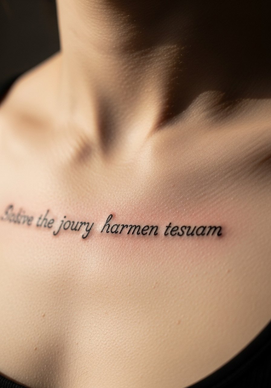
When I saw a sternum lyric it felt like wearing a secret amulet. Sternum pain is a steady 6. Serif scripts add a classic touch and serif weight helps letters survive. The mistake is choosing delicate serifs that blur. From my experience, a chest lyric needs substantial letter shapes. Healed looks at one year often retain serif definition if the artist used enough contrast. Ask your artist about session breaks if you feel faint, this spot is intense.
17. Tiny Script On Rib Side With Negative Space Flower
I picked this after seeing a lyric that curved around a negative space blossom. Pain is high along the rib, but the curve flatters words. Many people cram long sentences here, which looks crowded when healed. From what I've seen, two short lines or one compact phrase works best. Healed at six months, the negative space keeps the words readable. For consult, bring body position photos so the artist can place the curve correctly.
18. Typewriter Lyric On Thigh With Fine Illustrations
I chose thigh placement for a longer lyric. Thighs are lower pain, often a 2 or 3. Typewriter font scaled up reads beautifully on this canvas. A frequent mistake is mixing too many illustration details with small text. If you want companions, keep them minimal and away from the letters. Healed, thigh tattoos often hold well because of less sun exposure. Ask your artist for a full-size stencil laid on your thigh while standing so you can check how the lyric sits with clothing.
19. Script Across Shoulder Blade With Bird Accent
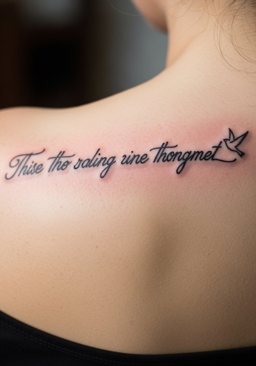
I found a lyric there that looked like a sentence taking flight when the shoulder moved. Shoulder blade pain is moderate. This placement is forgiving for longer phrases. The common mistake is putting too many decorative elements near the text. From experience, keep accents like a bird small and separate so the words remain the focus. Healed at one year, shoulder blade ink tolerates sun better if you use sunscreen. During consult, ask the artist to test the spacing with your shoulder in motion.
20. Script Inside Elbow Crease With Protective Dotwork
This one stung for me during the session. The crease is a tricky spot, pain around a 5 or 6. The elbow crease moves a lot, so plan for thicker letters and dotwork to protect edges. A mistake I often see is choosing thin cursive that disappears when you bend your arm. Healed, inner elbow tattoos soften faster because of movement. Ask your artist to overline slightly to compensate for future blur and plan a touch-up at six to nine months.
21. Thin Script Along Collar Of Shoulder With Small Circles
I liked this placement for a lyric that needs to peek out over a tank top. Shoulder collar area pain is mild. Tiny circular accents help anchor the phrase. The mistake is picking ultra-thin strokes that fade when exposed to sun and clothing. From what I've gathered, keep letters modestly bold. Healed at one year, this area fares well with sunscreen and occasional balm. During consult, have the artist map the phrase to clothing lines so it shows when you want it to.
22. Continuous Script Around Calf With Landscape Accent
I chose a wrap around calf lyric after planning a travel-themed piece. Calves are moderate pain and take longer sessions if the wrap is large. The visual effect is cinematic when the phrase encircles the leg. A common mistake is inconsistent spacing that looks off when you stand. Healed at a year, calf tattoos often hold deep saturation. Ask to see the full circle stencil and walk around in front of a mirror during consult so you can check flow.
23. Block Script On Side Rib With Subtle Shading
I once watched a session for a chorus line in block letters on the side rib. Pain is high, but block scripts here read clearly on photographs. Mistakes happen when shading encroaches on letter edges. Healed at six months, solid blocks resist blur. From my experience, a staggered line break can make the text more dynamic. During consult, discuss how the lines fall with breathing so the phrase does not distort when you inhale.
24. Fine Line Script Curving Over Knee Cap
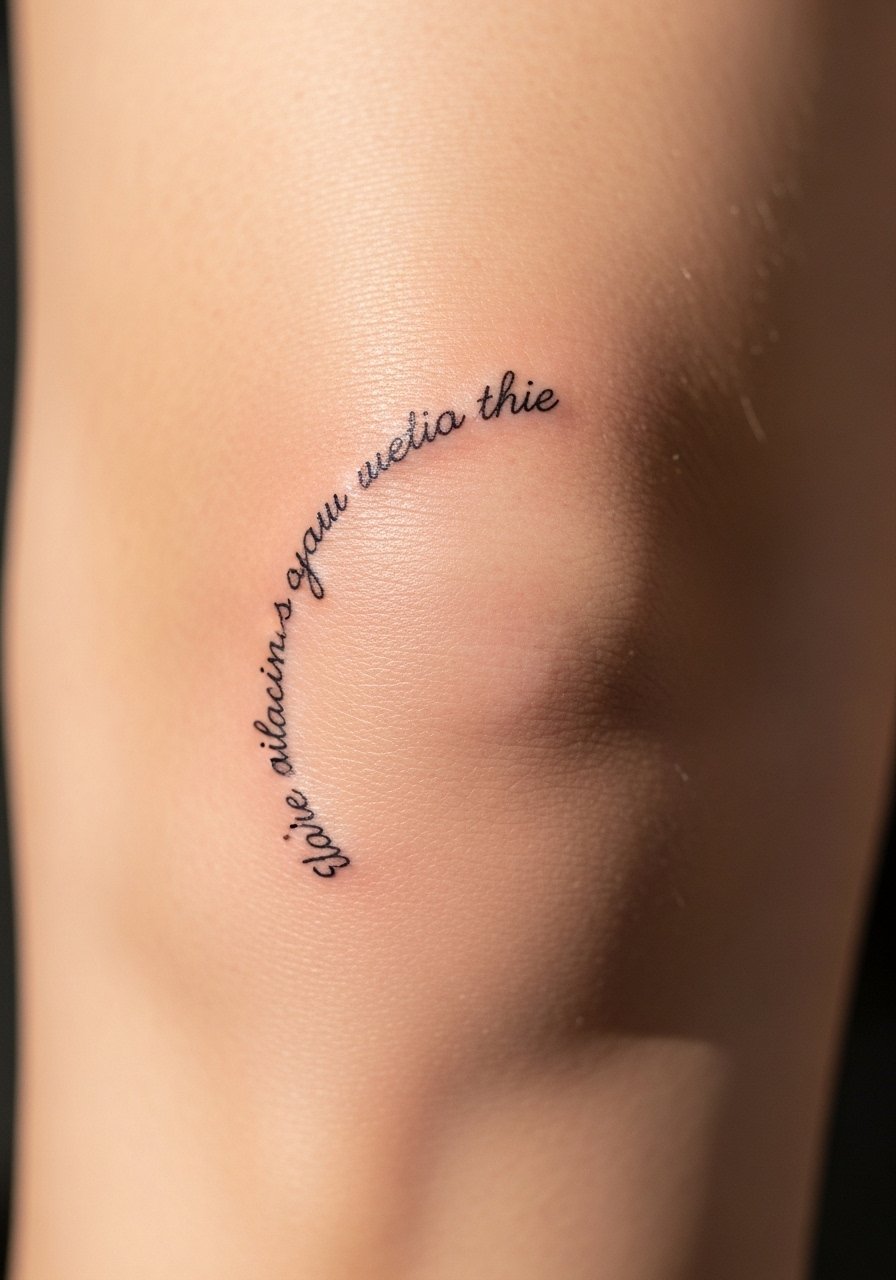
I saved this for a playful line I wanted to read when I sit. Knee cap placement is painful with sharp moments. Expect a 6 to 7 at times. The curve flatters short phrases. A typical mistake is expecting long sentences to wrap comfortably around the knee. Healed, knees are exposed and prone to mechanical wear, so letters will soften faster. Request slightly larger spacing and plan for a mid-year touch-up. Ask your artist to stencil it with your knee bent and extended so they can see how the phrase behaves with movement.
Tattoo Prep and Aftercare Essentials
After sitting through all those sessions, I learned which products actually help. Most artists I’ve talked to swear by these for different stages of healing. Below are grouped picks you can click to shop.
Aftercare Essentials:
- Aquaphor Healing Ointment, 14oz tube — Industry standard for first 3-5 days
- Saniderm Transparent Adhesive Bandage, 6-inch roll — Second skin healing method
- CeraVe Fragrance-Free Moisturizing Lotion — For days 4-14 healing
- Dr. Bronner's Unscented Castile Soap — Gentle tattoo cleaning
Before Your Appointment:
- Numbing Cream 5% Lidocaine, 30g — Apply 30-45 minutes before, ask your artist first
- Stencil Transfer Paper, 11×8.5 inches pack — Helpful for custom layout checks
Long-Term Maintenance:
- SPF 50 Sunscreen Stick For Tattoos, 0.5 oz — Prevents fading when exposed
- Mad Rabbit Tattoo Balm, 1.4 oz — Keeps healed tattoos vibrant
- Hustle Butter Deluxe, 2 oz — Vegan aftercare option
Optional Comfort Items:
- Tattoo Numbing Spray, 1 oz — Useful for touch-ups and sensitive spots
- Hydrocolloid Bandages, Pack of 10 Large — Alternative to Saniderm for small pieces
Frequently Asked Questions
Q: Will fine line tattoos blur into each other if I get a full sleeve?
A: In my experience, fine line sleeves need planned negative space. If you want many thin scripts, ask your artist to space lines and intentionally thicken core strokes. Artists I know leave about a thumb-width between phrases. For maintenance, I use Mad Rabbit Tattoo Balm on healed work to keep contrast.
Q: Do watercolor-style lyric tattoos need different aftercare than traditional ones?
A: From what I’ve seen, watercolor needs slightly gentler initial cleaning because the color is softer. Use a fragrance-free soap like Dr. Bronner's Unscented Castile Soap for the first two weeks. Also avoid heavy ointments that sit on color rather than letting thin washes breathe.
Q: How often do finger and hand lyric tattoos need touch-ups?
A: Hands and fingers wear fast. I usually tell people to expect a touch-up in six to twelve months. Use a barrier like a hydrocolloid bandage from the start and keep sunscreen on any exposed words. An artist I trust recommends planning touch-ups into the tattoo timeline for fingers.
Q: Can I use a numbing cream for sensitive placements like ribs or sternum?
A: Yes, but ask your artist first. I used a 5% lidocaine cream before a sternum session with permission. If your artist approves, apply about 30 to 45 minutes prior. I recommend Numbing Cream 5% Lidocaine, 30g and only under professional guidance.
Q: What’s the best way to keep script crisp after a year?
A: In my experience, the combo of sunscreen and a monthly balm is effective. I keep an SPF stick like SPF 50 Sunscreen Stick For Tattoos, 0.5 oz in my gym bag. Also schedule a touch-up around year one for any thin lines that softened.
Q: For a lyric paired with imagery, how do I tell the artist I want the words to last?
A: Bring both image references and examples of healed pieces. Ask them to prioritize the script with slightly higher pigment saturation and to separate decorative fills from the letters. During consult ask for photos of their healed work, not just fresh shots. If the artist recommends a protective bandage like Saniderm, I’ve found that Saniderm Transparent Adhesive Bandage, 6-inch roll helps early healing.
Q: How should I plan sessions if I want multiple lyric placements over time?
A: Plan them seasonally. I suggest scheduling larger pieces in cooler months to avoid sun and shorts. Also leave at least four weeks between sessions on adjacent areas for skin recovery. Bring a list of all lyric intents to each consult so the artist can advise on spacing and future integration. If you plan touch-ups, budget time for a six to twelve month revisit.
