
Someone I know spent months swiping through portfolios before realizing the real question was not which script looked nicest in a flat photo. It was which script would hold up on their skin, in their job, and after a summer on the beach. I visited five shops across Brooklyn and talked with an artist who specializes in fine line. Below are 15 small script ideas that balance style, placement, and how they age.
1. Fine line "Love" on the inner wrist

Someone I know picked this for a daily reminder that reads softly under a watch. The inner wrist takes low pain and a quick session, usually one to two hours, and it is great for clean single-word script. A common mistake is asking for ultra-thin one-pixel lines which fade into a faint gray within a year. Ask your artist for slightly heavier linework and even spacing so the letters stay crisp after healing. Expect a touch-up around year one if you want the original contrast restored. If you work in a setting that asks for covered wrists sometimes, the wrist gives flexible visibility control.
2. Cursive name down the ribcage

Fair warning, the ribcage rates high on typical pain charts but the intimacy is worth it for many. Artists split on ribs in a clear way. One camp says skin stretch and frequent movement blur fine line faster there. The other camp insists that with the right needle depth and slightly broader spacing the script will hold up. If you choose this, bring a curved mockup so the letters follow your rib line. Mention anticipated body changes like weight loss or pregnancy so the artist can place the letters where distortion is least likely. Plan for one or two sessions and a likely touch-up if you change size.
3. Single-word "Breathe" on the ankle

Most people pick ankle script for discreet motivation that peeks out in summer shoes. Expect light to moderate discomfort and a short single session. The key aging note is friction from socks and shoes. Ask for slightly more ink saturation near letter joins so the word does not break up after six months. A common handling mistake is placing the word too close to a bone edge where lines can wear unevenly. If you want visible contrast on darker skin, ask your artist about tiny dot shading behind the letters to create separation without color.
4. Floral-framed initial on the collarbone
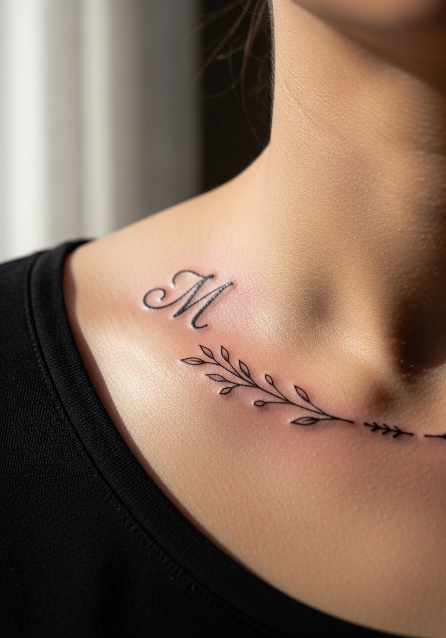
There is something about a letter framed in micro-vines that reads like jewelry without the weight. Collarbone placement is low on the pain scale and flat enough to keep linework steady as you age. In consultation, show photos of how you wear tops so the vines sit with your neckline. Avoid tiny, dense petals that clog; stipple shading in the leaves provides texture and holds better than micro color. Expect one session and a possible touch-up if the vines are very close to bone where healing is a bit slower.
5. Arched "Forever" on the inner forearm
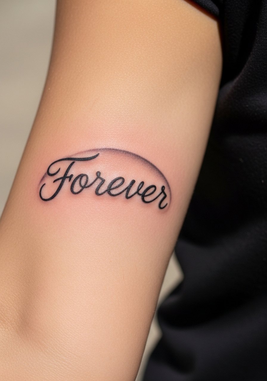
The inner forearm gives a long canvas that lets script breathe and keeps blowout risk lower than fingers or hands. The biggest mistake I see is asking for heavy flourish in a very small space. Tell your artist you want readable spacing and modest arch so letters stay legible years from now. Sessions are moderate in time. Expect the piece to show some softening at two years and a touch-up then if you want to restore original saturation. For memorial text, place slightly away from areas that get constant sun exposure.
6. Micro-word "Wild" along the finger edge

Finger scripts feel bold because they are tactile and always visible. A consultation tip is to ask for reinforced linework and to avoid overly thin joins. Fingers are high risk for early fading and occasional blowout because of thin skin and daily use. Expect a quick session but plan on touch-ups every year or two. If your job requires formal hand coverage, think about placement on the side of the finger instead of the top pad. For this placement, numbing can make your hand too still and produce uneven linework, so discuss pain management options with your artist.
7. Script with dot accents on the nape
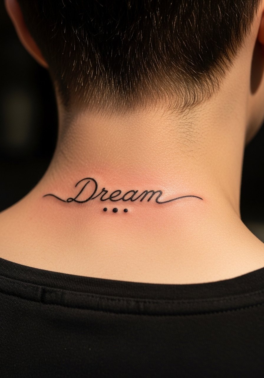
Nape script is great when you want something hair-dependent for reveal and conceal. Artists disagree about adding color there. Traditionalists prefer black for longevity while trend followers have been experimenting with faint pastels for a soft effect. If you like dots, ask for them as stipple work rather than flat color so they fade gracefully. The nape is two to three hours for placement and may need a touch-up at year two if hair rubbing or sun exposure is frequent. If your hairstyle often covers the spot, test a temporary transfer first to check visibility.
8. Cursive date on the inner thigh
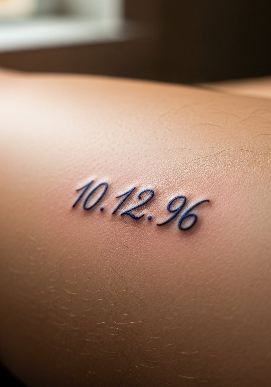
Inner thigh script reads private and holds up well because it sees limited sun and abrasion. Most people choose a single session and minor discomfort from sitting during application. A frequent misstep is setting a date too close to folds where the skin compresses. Ask the artist to place the numbers in a slightly flatter plane and to curve the lines to your leg’s contour. Healed look at six months tends to be slightly softened, and a touch-up at year two keeps numbers crisp if you want permanence.
9. "Serenity" with wave underline on the shoulder blade
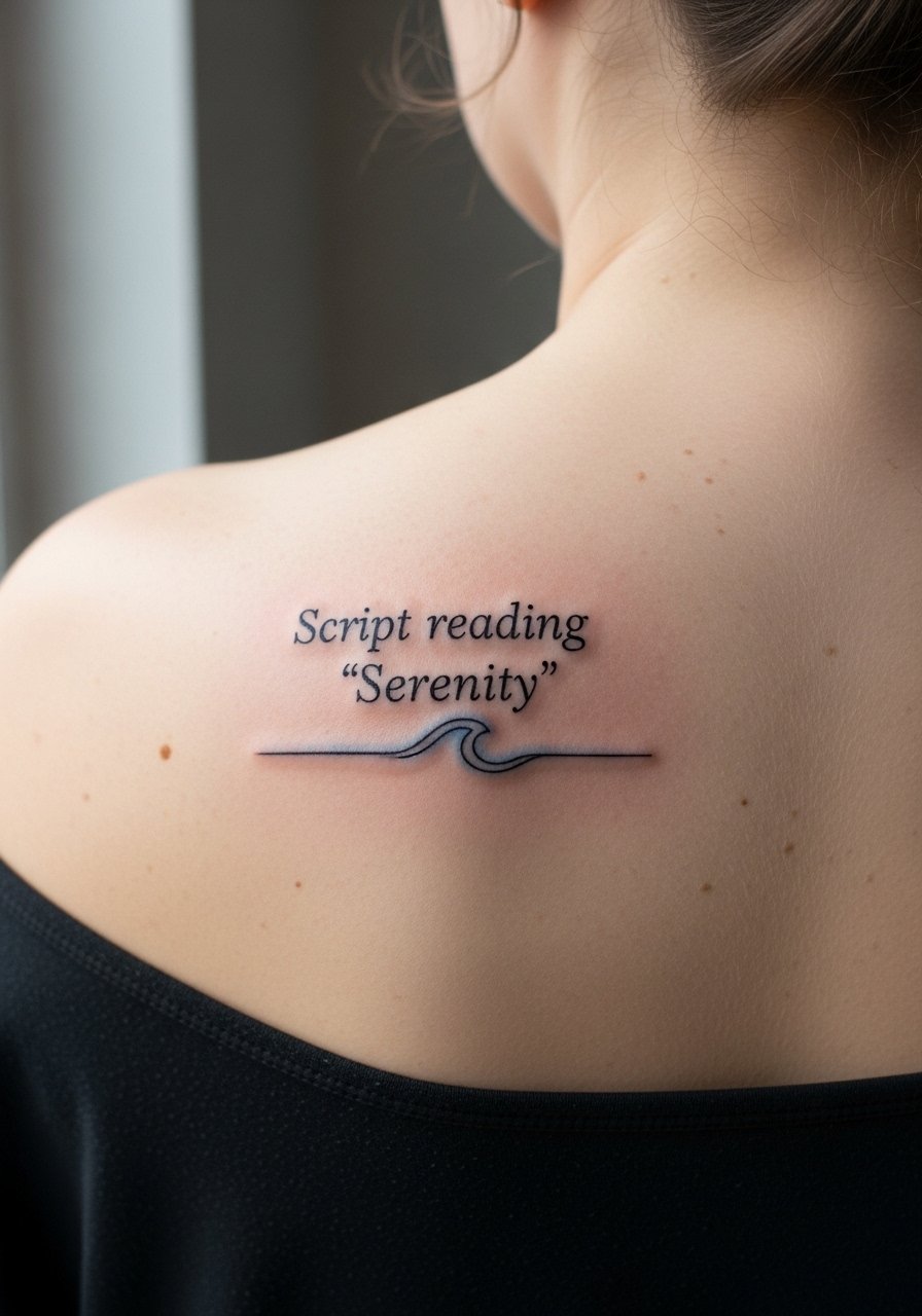
Shoulder blade script has room for motion and a low blowout risk due to thicker skin. Expect moderate comfort and one to two sessions. The blue wash trend adds a soft wash without overpowering black letters, and when done in a subtle layer it can age more gracefully than solid pastel fills. A mistake is asking for a heavy watercolor fill paired to fine script. That contrast can muddy quickly. For long-term legibility, keep the underline minimal and the letters well spaced. Touch-ups are uncommon here unless you want to refresh the wash.
10. Old English initials on the upper chest

Old English gives vintage weight even in small scale, but the style needs room so serifs do not turn into blobs. Chest placement manages visibility and reads clearly across shirts. Tell your artist you want stronger contrast between strokes and a slightly open serif to prevent future bleeding. Expect one to two sessions and more initial swelling than forearm pieces. If you have darker skin, a touch of gray shading behind the letters can help with photo visibility without changing the style. Career considerations matter, so place where collars can cover the piece if needed.
11. Vertical prayer line along the spine

Spine pieces look elegant because they follow the body’s central line. Pain is above average because the bone is close, but the visual payoff is strong. The controversy here is session count. Some artists recommend a single steady pass, others prefer splitting the work for even depth. Discuss session strategy in your consult. Vertical script can show a softer edge at two years so plan a touch-up if you want crispness maintained. Also mention any back shaving or skin treatments during booking since the area can be sensitive during healing.
12. "Bloom" with a petal border on the hip

The high hip curves lend themselves to an oval composition that moves with clothing and the body. A common mistake is overcrowding the petal border with too many tiny dots which heals into a patch. Ask for petal shapes with light stipple shading so the border ages like natural texture. Sessions are typically short and comfort ranges low to moderate. Because hips can shift with weight fluctuation, place the design along the hip bone to reduce distortion. Touch-ups at two to three years keep the petal edges crisp.
13. Micro coordinates tucked behind the ear

Coordinates are private and symbolic without spelling out meaning. Behind-ear placement is subtle but high on visibility in photos and during hair updos. The main mistake is asking for too small a typeface which fills in during healing. Use a clear monospace or very simple cursive and request slightly larger numerals than you think you need. The session is quick but the area can bruise in sensitive people. Expect a touch-up at year one if any digits soften and always preview the placement with a mirror mockup.
14. Minimalist signature-style script on the collarbone dip
A centered signature has a jewelry-like presence and sits flat for clean linework. The collarbone dip is forgiving for line consistency and low on blowout risk. The common error is copying a handwritten scrawl that loses legibility when shrunk. Bring a cleaned-up traced version and ask the artist to simplify any loops so the signature reads at small scale. Sessions are brief and touch-ups are rarely needed unless you want hairline tweaks to the tail of letters. If you want even contrast across different skin tones, ask about a touch of gray to lift the letters.
15. Tiny scripted quote tucked under the clavicle

There is special momentum in a short quote placed under the clavicle where it peeks from shirts. Expect a one-session job and low pain, though people with prominent bone feel more pressure. The typical mistake is choosing a long line of text that compresses letter spacing. Limit to one to three words for clarity and ask your artist to map the phrase to the curve of your collarbone so it reads naturally. Light sun exposure can soften contrast over time, so plan for a touch-up around year two if you want the original darkness preserved.
Tattoo Prep and Aftercare Essentials
Fragrance-free gentle foaming cleanser for tattooed skin. Use during the first three to five days to gently remove surface plasma and keep the area clean without stripping moisture. Clean twice daily for the first week then reduce as the tattoo scabs lessen.
Medical-grade second skin bandage, single-use sheets. Useful for the first 24 to 72 hours when you want a protective barrier that reduces friction and keeps contaminants out. Ask your artist if they recommend this for your placement.
Lightweight fragrance-free balm for daily moisturizing. Apply a thin layer after cleaning once the initial scab has formed to prevent over-drying and to support color retention during the first month.
Silicone scar sheeting, medical grade. For raised or hypertrophic healing, silicone sheeting can soften raised edges and improve texture once the tattoo is fully healed. Use only on healed skin and follow product instructions.
Reusable cold pack for immediate post-session swelling control. Apply intermittently during the first 12 hours to reduce swelling and bruising for sensitive areas like ribs or spine.
Broad-spectrum mineral sunscreen SPF 50 with zinc oxide. Once healed, daily mineral sunscreen protects fine line work from UV fading. Apply generously on exposed pieces.
Aquaphor Healing Ointment 14 oz. One mainstream occlusive option for the first 48 hours if your artist recommends it. Use sparingly and switch to a lighter balm after initial healing.
Fragrance-free moisturizing lotion for long-term care. Keep your healed pieces hydrated year round to help saturation and skin health.
Every tattoo is different. Always follow your artist's specific aftercare instructions. Consult a dermatologist if you have skin concerns or unusual healing issues.
Frequently Asked Questions
Q: Will a fine line wrist script blur faster than a bolder wrist script?
A: From what I have seen, fine line at the wrist can soften faster because of constant movement and frequent washing. The trade-off is subtlety. If longevity is your top priority ask for slightly heavier linework and predictable spacing. Plan on a touch-up around year one if you prefer the original crisp look.
Q: Are cursive ribs better for private designs than chest or should I pick a different spot to avoid distortion?
A: Ribs are private and intimate but they do stretch with body changes. If you expect weight fluctuation or pregnancy, choose an area that moves less like the collarbone or upper chest. If you still want ribs, map the script along natural curves and accept that a touch-up may be helpful after major body shifts.
Q: How can I make script more visible on darker skin tones without changing style?
A: A subtle shading wash or faint gray backing behind the letters can increase contrast without altering the script. Ask your artist for small stipple shading or slightly bolder strokes in key joins. Test a temporary transfer in photos to preview visibility before committing.
Q: What should I ask during a consultation to avoid a blurred finger or ankle script?
A: Ask about the artist’s healed portfolio for that exact placement, how they manage depth on thin skin, and their touch-up policy. Request a mockup sized to your measurements and discuss whether they recommend a slightly larger line weight for longevity.
Q: How long does a micro script behind the ear usually last before needing a touch-up?
A: Expect some softening by year one due to the thin skin and hair friction. Many people book a touch-up in the first 12 to 18 months to restore crisp digits or letters. Prevention through gentle care while healing helps, and a mockup preview prevents overly tiny type that fills in.
Q: Are there reliable places to find artists who specialize in fine line script?
A: Search Instagram tags like #DaintyScript or #FineLineScript, use Booksy and local studio pages, and read r/tattoos threads for healed photos. I found artists by visiting five shops across Brooklyn and by checking portfolios for healed images rather than fresh work. Trust the healed photos more than staged flash.
