
You can have the coolest tattoo idea in the world… and still end up feeling “meh” about it if the size is off. Too small, and details blur into a tiny dark smudge. Too big, and it can overwhelm your body’s natural lines. The sweet spot? A size that fits the design and flatters the placement like it was meant to be there.
Let’s make sizing feel simple, so you walk out with something that looks intentional, balanced, and “wow” from day one.
Step 1: Start With the Design’s “Detail Needs”
Not all tattoo ideas can survive being shrunk. The more detail your design has, the more room it needs to breathe.
Ask yourself:
- Does the design have tiny lines, shading gradients, or lots of little elements?
- Will it still read clearly from a few feet away?
- Would it look good if you squinted (seriously—try it)?
Quick sizing rule of thumb:
- Fine-line scripts + minimalist icons: can often work smaller if there’s enough spacing.
- Florals, animals, portraits, realism: usually need medium to larger sizes to keep detail crisp.
- Geometric + bold traditional styles: can be smaller, but still need clean edges and spacing.
Balance tip: If you love a detailed design but want it small, simplify it instead of shrinking it.
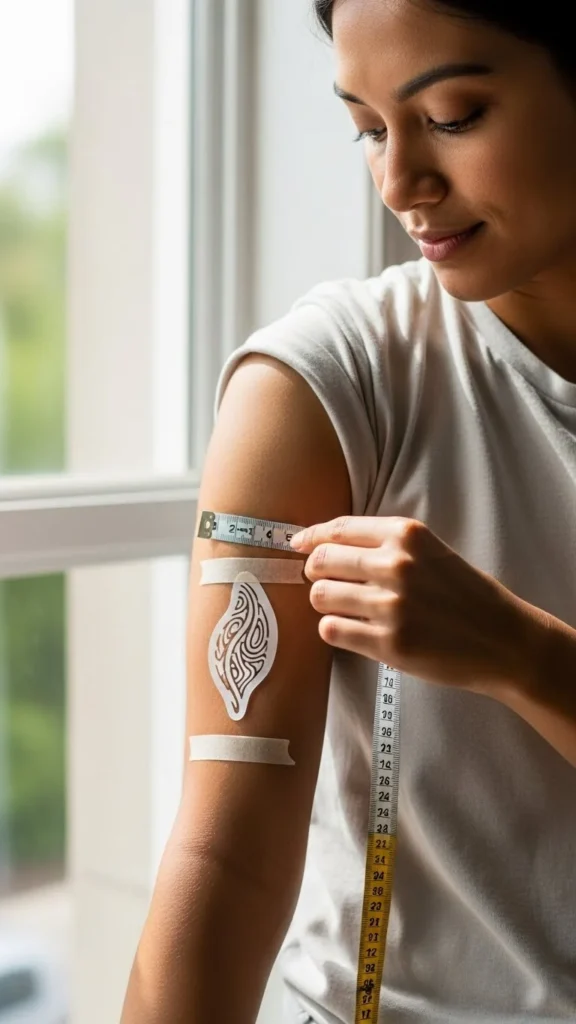
Step 2: Use Your Body’s “Natural Frame” for Proportion
Your body already has built-in visual guides—muscle curves, joints, and bone structure. A balanced tattoo respects those lines instead of fighting them.
Think in “frames,” not inches:
- Forearm: long rectangle
- Upper arm: rounded cylinder
- Shoulder cap: curved dome
- Calf: tapered column
- Ribs: wide, moving canvas
Try this trick:
- Place your hand over the area and note the “visual space.”
- A balanced tattoo usually fills about 60–80% of that space—leaving a clean margin around it.
Avoid this common mistake: sizing a tattoo based on how it looks on a phone screen. Screens flatten everything; bodies add curves and movement.
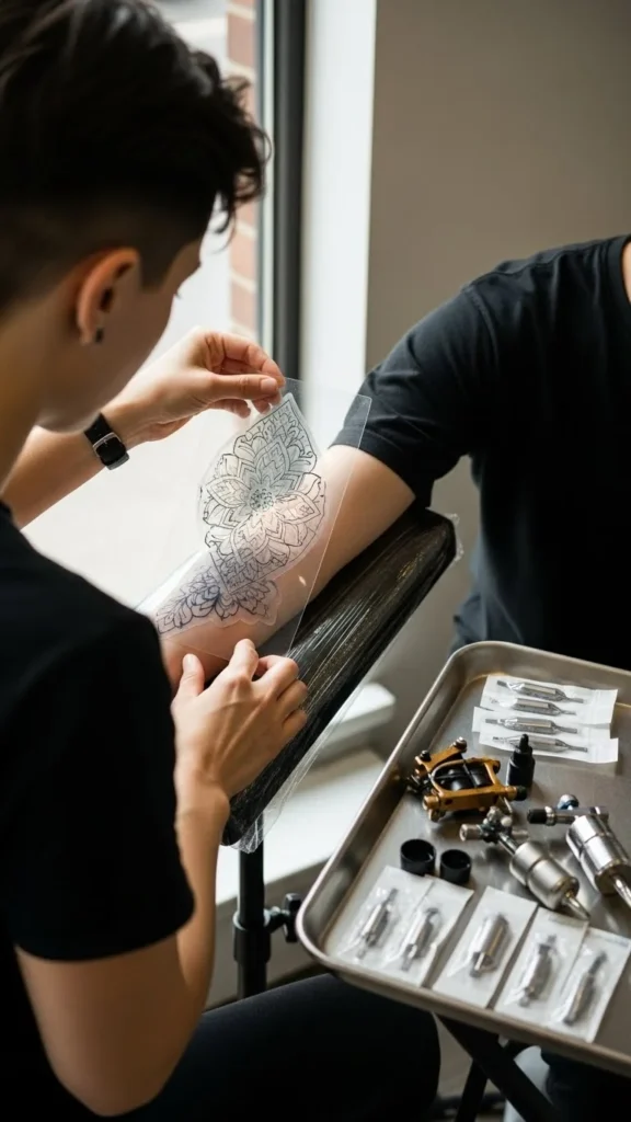
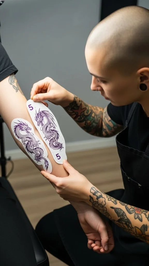
Step 3: Do the Mirror + Photo Test Before You Commit
Here’s where you catch sizing regrets before they become permanent.
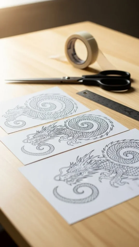
Do this at home:
- Print the design in 3 sizes (small, medium, slightly larger than you think you need).
- Tape each one to the placement area.
- Look in a mirror from different distances:
- close-up (1 foot)
- normal conversation distance (3–5 feet)
- across a room (8–10 feet)
- close-up (1 foot)
- Take photos in normal lighting and in darker lighting.
What you’re checking:
- Can you read the design instantly?
- Does it look centered and intentional?
- Does it feel like it “belongs” on that spot?
Pinterest-friendly truth: If it looks “cute” only up close, it’s probably too small.
Step 4: Consider How the Tattoo Will Age
Time changes tattoos. Skin moves, ink settles, and crisp micro-details can soften. A balanced size today should still look balanced years from now.
Aging-friendly sizing tips:
- Leave more spacing between lines than you think you need.
- Avoid packing tiny details into a tiny area.
- If your design has shading, give it enough room so it doesn’t blur together.
Design elements that often need more size:
- Faces (portraits)
- Animals with fur/feathers
- Landscapes
- Anything with lots of thin textures
Simple guideline: When in doubt, go a little bigger or simplify the design. Both protect the final look.
Step 5: Match Size to Placement Movement
Some body areas stretch and bend constantly—wrists, elbows, knees, fingers. A tattoo can still look amazing there, but sizing matters even more.
High-movement zones (size carefully):
- Wrist and inner wrist
- Elbow ditch
- Fingers and knuckles
- Ankle area
- Knee area
What usually works best:
- Slightly larger than “tiny” so the design stays readable when the skin shifts
- Cleaner shapes, bolder lines, fewer micro-details
Low-movement zones (more flexible):
- Upper arm
- Outer forearm
- Upper back
- Calf
- Thigh
These areas tend to hold detail well, so you can choose size more based on style and balance.
Step 6: Use a “Visual Weight” Checklist (Not Just Measurements)
Two tattoos can be the same size but look totally different in balance because of visual weight.
A tattoo feels heavier when it has:
- solid black sections
- dense shading
- thick outlines
- lots of packed elements
A tattoo feels lighter when it has:
- fine lines
- open space
- minimal shading
- fewer elements
Quick fix:
If your tattoo is visually heavy, it often looks more balanced when it’s slightly smaller or spaced out. If it’s visually light, it may need a bit more size so it doesn’t look lost.
Step 7: Ask Your Artist for a “Body-Scale Mockup”
A good artist doesn’t just say “3 inches.” They’ll help you fit the design to your shape.
Ask for:
- a stencil in multiple sizes
- placement options (slightly higher/lower, rotated)
- a quick sketch adjustment if the design needs simplification
What to tell them:
- “I want it readable from a few feet away.”
- “I want it to feel balanced with my arm/leg shape.”
- “I’m worried about details blurring—what size would you recommend?”
Artists think in flow and proportion all day. Let them do what they’re great at.
The takeaway
Sizing isn’t about picking a random number—it’s about readability, spacing, body flow, and long-term balance. Print it, tape it, mirror-test it, and trust the version that looks effortless on your body.
